
Doubling your conversion rate starts with how your storefront looks and feels. In today’s competitive cross-border eCommerce market, a well-designed storefront can make the difference between a visitor bouncing or buying. Your theme layout and visual setup directly shape the shopping experience, build brand trust, and influence purchasing decisions. This guide walks you through practical, high-impact tips for optimizing your Shoplazza storefront design to boost conversions and elevate your store's performance.
Note
Use this article as a pre-launch checklist. While not every suggestion must be implemented, selectively applying them based on your store’s needs can significantly improve the shopping experience and increase your conversion rate.
Home page: Your customer's first impression
Your homepage is where customers form their first impressions of your brand. A thoughtfully designed homepage can instantly build trust, highlight your unique value, and guide customers deeper into your store. This section covers key modules and design elements that shape the user experience from the very first click.
Page header optimization
The header sets the tone for your entire site. A clean, informative header makes navigation easier and ensures important updates are seen right away.
1. Logo image: Use a clear, high-resolution logo that aligns with your brand style and fits cleanly into the site header.
2. Banners: Share important store updates such as promotional events, product launches, or shipping delays. You can configure a built-in banner or use Setting up a Banner for more design flexibility.
3. Menu navigation: Avoid overwhelming customers with too many categories. Stick to a streamlined structure with up to three menu levels, which is the maximum supported in Shoplazza. For detailed setup instructions, see Navigation.
4. Search box: Improve product discovery with a smart search plugin like Smart Product Search . Enable features such as hot keywords, search suggestions, and search history to help customers find what they’re looking for. For setup steps, see Smart product search: Setting the search terms.
Banner design
The banner section is often the first visual element customers will notice. A well-designed banner captures attention and encourages them to explore further.
1. Clear theme focus: The homepage banner should highlight your store’s core message or a key promotion. Include a clear call to action such as Shop Now or Explore Collection to drive engagement.
2. Optimized loading speed: Banners are one of the first elements to load. Use theme-recommended dimensions and compress images to strike the right balance between quality and performance. For reference, see Recommended image sizes for theme cards.
Customer review section
Customer reviews build credibility and offer valuable social proof. Displaying real feedback on your homepage helps new visitors feel more confident about shopping with you.
1. Third-party review integration: Enable platforms like Google Reviews or Trustpilot to add credibility and social proof to your homepage. For setup instructions, see Setting up the Trustpilot Reviews app.
2. Built-in review features: Shoplazza supports native components such as customer review cards, testimonial sections, and Instagram image blocks. For setup guidance, see Setting up Shoplazza’s native reviews and Setting up the Instagram Show app. Aim to display more than 10 reviews for best impact.
Product or service introduction
Introducing your products or services on the homepage helps visitors quickly understand what your store offers and why it matters. This section is a space to convey value and differentiate your brand.
1. Merchant highlights: Use this section to communicate competitive advantages such as design awards, exceptional customer service, or fast, reliable shipping.
2. Brand story: Share your brand mission or values. Messages centered on sustainability, community, or quality help build emotional connection with customers.
Footer enhancements
A well-structured footer ties your homepage together. It helps customers navigate, find key information, and trust your store.
1. Back to top button: Include a floating 'Back to Top' button to improve navigation on long pages. For setup steps, see Improving navigation with a to the top button.
2. Footer navigation: Structure your footer with clear links to key pages like Terms of Service, Contact Us, and FAQs. For detailed instructions, see Editing the footer section in theme editor.
3. Contact information: Provide at least two contact methods, such as an email address and WhatsApp or phone number.
4. Payment icons: Show at least five recognizable payment methods to establish trust and transparency. For detailed setup instructions, see Setting up secure payment icons on your store’s footer.
5. Social media accounts: Include links to your active social channels to encourage multi-platform engagement.
Product details page: The core of your conversions
Once a customer lands on a product page, your goal is to remove doubts, highlight value, and make the path to purchase as smooth as possible. This section focuses on optimizing each element of your product details page to build trust and drive conversions.
Product title
The product title is often the first thing a customer reads. It should be clear and precise.
1. Keep it concise and informative: Limit your product title to 180 characters or less. Focus on core details such as brand, model, features, size, or usage. Avoid keyword stuffing, which may harm clarity and trust.
Main image specifications
Product images greatly influence customer confidence and conversion rates. They help customers visualize the item in real-world use.
1. Provide multiple high-quality images: Include lifestyle scenes, detail close-ups, various angles, and size comparisons. Adding video demos can increase average time on page and engagement by up to 20 percent.
Product description
The product description should offer a clear, detailed overview of what you're selling. It answers questions, highlights key features, and supports SEO.
1. Write clear, structured descriptions: Break the content into short paragraphs or bulleted lists. Focus on materials, dimensions, usage, care instructions, and benefits.
2. Use AI tools to save time: Shoplazza offers built-in tools to help you generate product copy quickly and effectively. See Generating product descriptions with AI and AI Operation Scenario: Enhance product content with DeepSeek AI for step-by-step guidance.
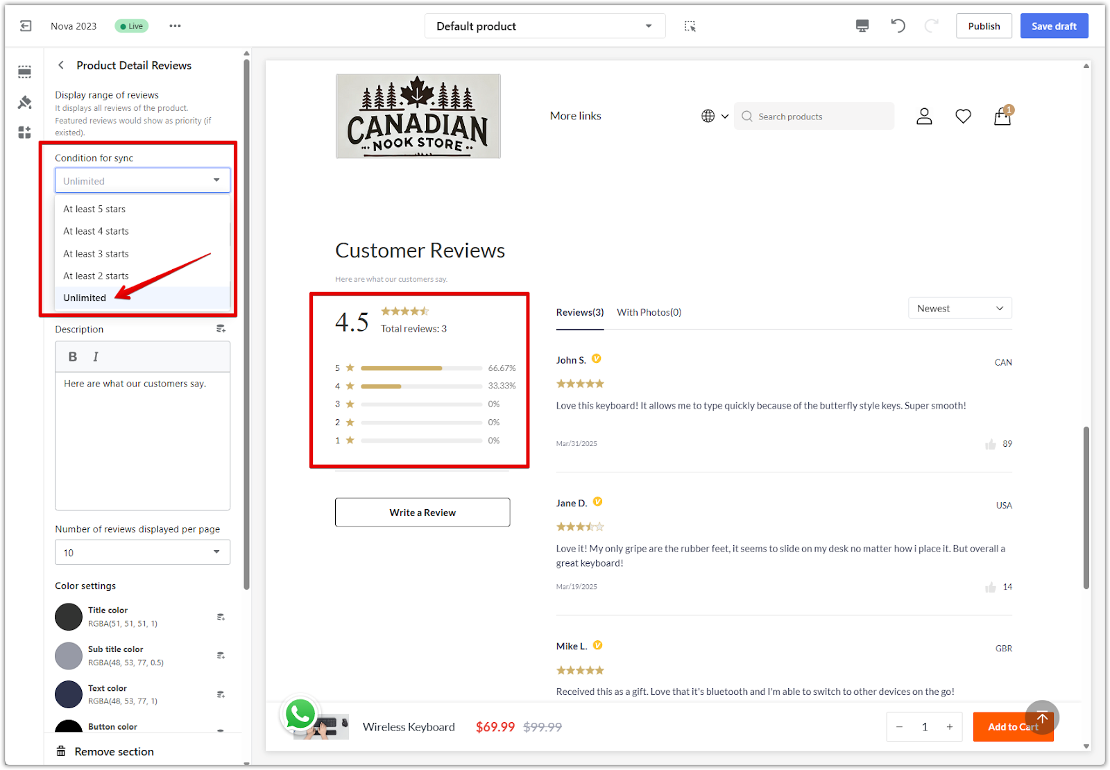
Customer reviews and social proof
Reviews help reduce uncertainty and increase trust. They are essential for social proof. Learn more about Setting up Shoplazza’s native reviews and Setting up Product Reviews as Featured and Verified.
1. Quantity and quality matter: Aim for at least 10 reviews per product. Showcase reviews that include photos or videos and highlight top feedback as featured or certified.
2. Show a mix of ratings: Including a few 3- or 4-star reviews makes the overall rating appear more authentic (for example, if choosing at least 3 star reviews, anything below 3 stars will not be displayed).
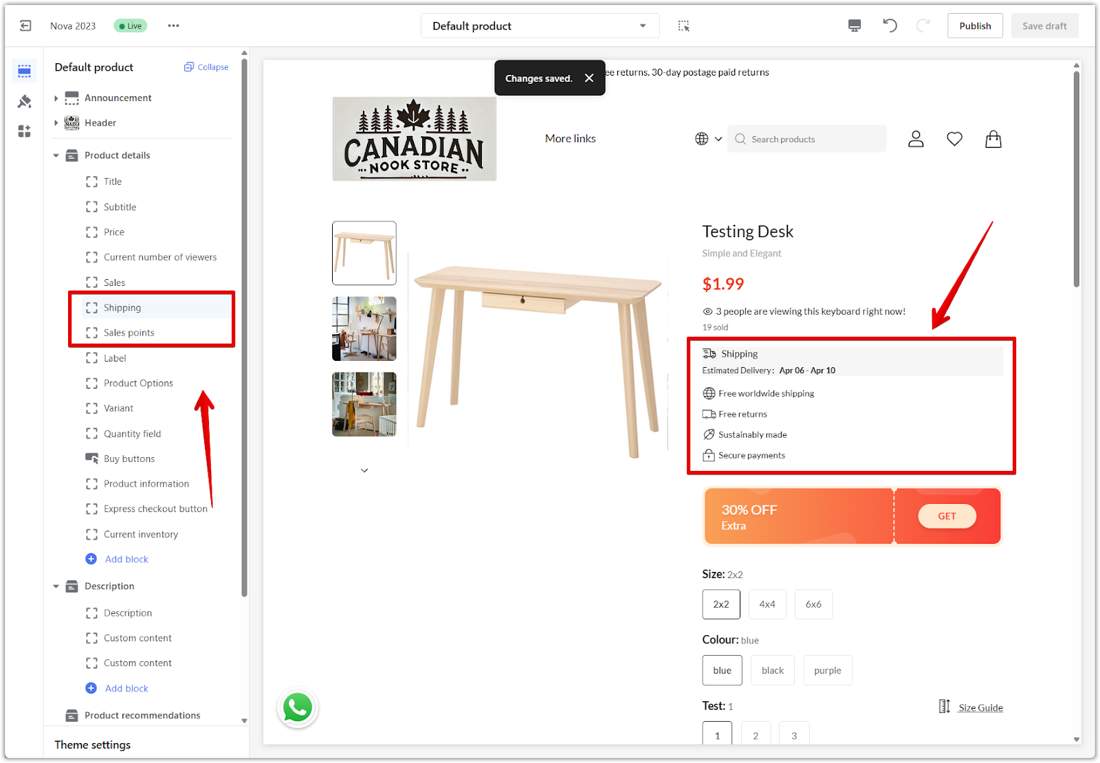
Online browsing and sales display
Use visual indicators to create urgency and show customer activity.
1. Current visitor count: Showing how many customers are browsing a product can help increase perceived popularity.
2. Sales volume cards: Use tools to display actual or virtual product sales. To set this up, see Displaying virtual sales of your products.
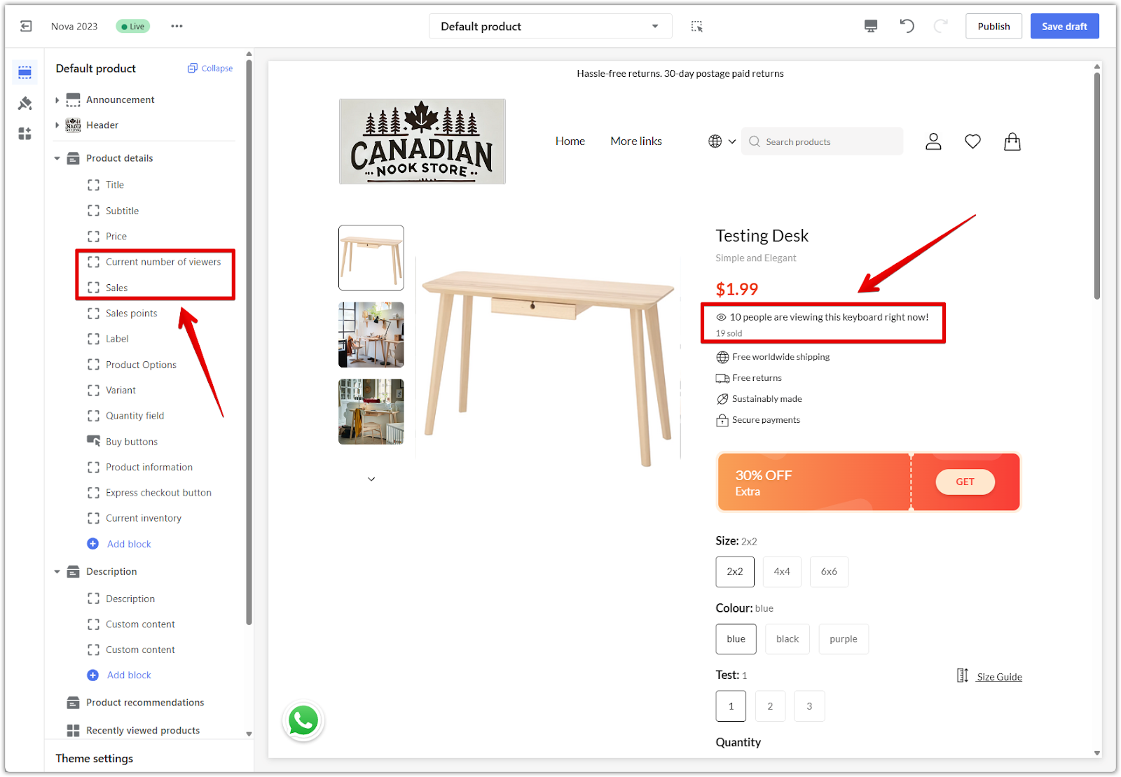
Delivery and return policy
Clearly listing shipping and return details improves transparency and customer confidence.
1. Shipping expectations: Share estimated delivery timelines and free shipping conditions, such as thresholds or regions.
2. Return policy: Make the return and exchange process visible and easy to understand. Consider using dedicated cards like delivery info or sales features to highlight these policies.
Collection page: A hub for product discovery
The collection (or album) page plays a key role in helping customers explore your products efficiently. An optimized layout, clear product information, and helpful filtering options can improve engagement and guide customers toward the right items.
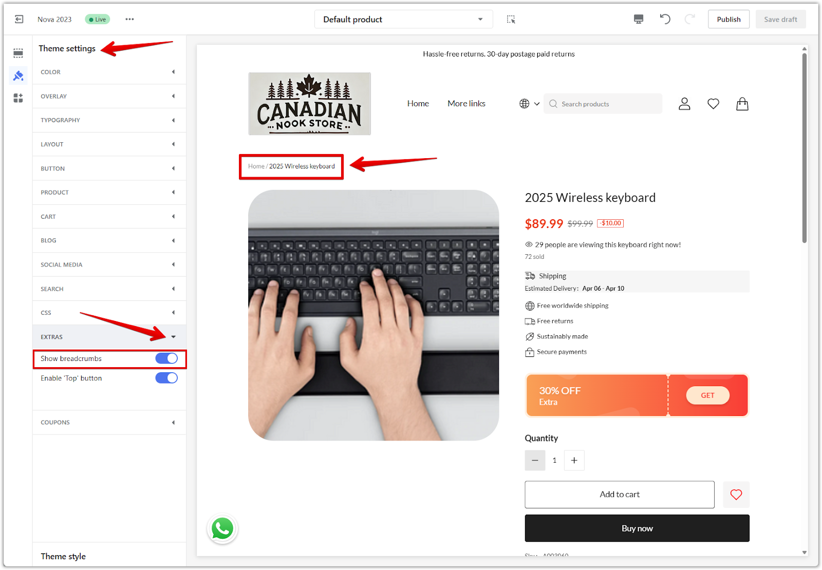
Breadcrumb navigation
Breadcrumbs show the customer’s path and make it easy to return to a previous page.
1. Enable breadcrumbs for better orientation: Display the full path from the homepage to the current product collection. This helps customers stay oriented while browsing. Go to your Shoplazza Admin > Online store, select your theme, and click Customize. In the theme editor, click Theme settings, then under the Extras dropdown, enable the Show breadcrumbs option.
Product display optimization
Clear visuals and pricing details make it easier for customers to compare and select products.
1. High-quality thumbnails: Use sharp, consistent product images. Add visual labels for promotions, new arrivals, or limited-time discounts.
2. Display pricing clearly: Show both the original price and current sale price to emphasize value.
3. Star ratings: Include visible customer ratings to increase trust and click-through rates.
Filtering and sorting
Advanced filters help customers narrow down choices, especially in large catalogs.
1. Multi-dimensional filters: Allow customers to filter by price, brand, rating, size, color, and other attributes. For setup, see Collection filters.
2. Sorting options: Provide sorting controls such as Most popular, Price: low to high, and Price: high to low. These help customers quickly organize products by what matters most to them.
Shopping cart page: Converting interest into action
The shopping cart page is a critical point in the purchase journey. It’s where customer intent meets hesitation, so every element should reinforce value, reduce friction, and encourage completion.
Coupons and discounts
Showing savings clearly can motivate customers to complete their orders.
1. Coupon input field: Make sure customers can easily apply a discount code before checkout. For setup steps, see Applying a Coupon code on the shopping cart.
2. Visible discount messages: Show applicable promotions, such as free shipping thresholds, bundle deals, or gifts with purchase. Display how much the customer is saving to increase conversion likelihood.
Shopping cart urgency and recommendations
Adding urgency and product suggestions can help drive last-minute decisions.
1. Countdown timer: Add a limited-time countdown in the cart to create a sense of urgency. This is especially effective during promotions. For guidance, see Booster Store Conversion | Cart countdown.
2. Product recommendations: Show personalized or frequently bought together items directly in the cart to encourage cross-selling. For setup, see Intelligent product recommendation | Shopping cart page.
Checkout page: Finalizing the purchase
The checkout page is your final opportunity to secure the sale. A clean layout, transparent pricing, and trusted visual cues can help reduce cart abandonment and boost conversion rates.
Choose the right checkout format
Shoplazza supports multiple checkout styles. Choosing the format that fits your business model can improve the customer experience.
1. Three-page checkout: Clearly separates shipping, payment, and confirmation steps. This format helps customers track their progress and review information before proceeding.
2. Two-page checkout: A balanced option that combines steps while keeping the flow manageable.
3. Single-page checkout: Ideal for cash-on-delivery or quick purchases, this format minimizes friction and works best for simpler checkout needs. To change the format, see Checkout page | Change your checkout style.
Customize the checkout page design
Design plays a big role in building trust at the final stage.
1. Add branding and visuals carefully: You can add custom images to areas of the checkout page using the theme editor. For guidance, see Setting up the checkout page in your theme editor. Avoid using too many visuals that might distract from payment fields or call-to-action buttons.
Fee transparency and trust-building
Clear cost breakdowns and trust signals reduce hesitation at the final step.
1. Break down all charges: Clearly display product subtotal, shipping fees, taxes, and any applied discounts or coupon codes.
2. Add trust elements: Include secure payment icons and links to your store’s terms and policies to build customer confidence. For guidance, see Displaying secure payment icons on your checkout page and Adding Terms of Service to the footer of checkout page.
Mobile and desktop adaptation: Optimizing for every screen
Your store needs to look and function perfectly on any device. Mobile and desktop users have different browsing habits and screen sizes, so adapting your layout ensures a smooth and professional experience across platforms.
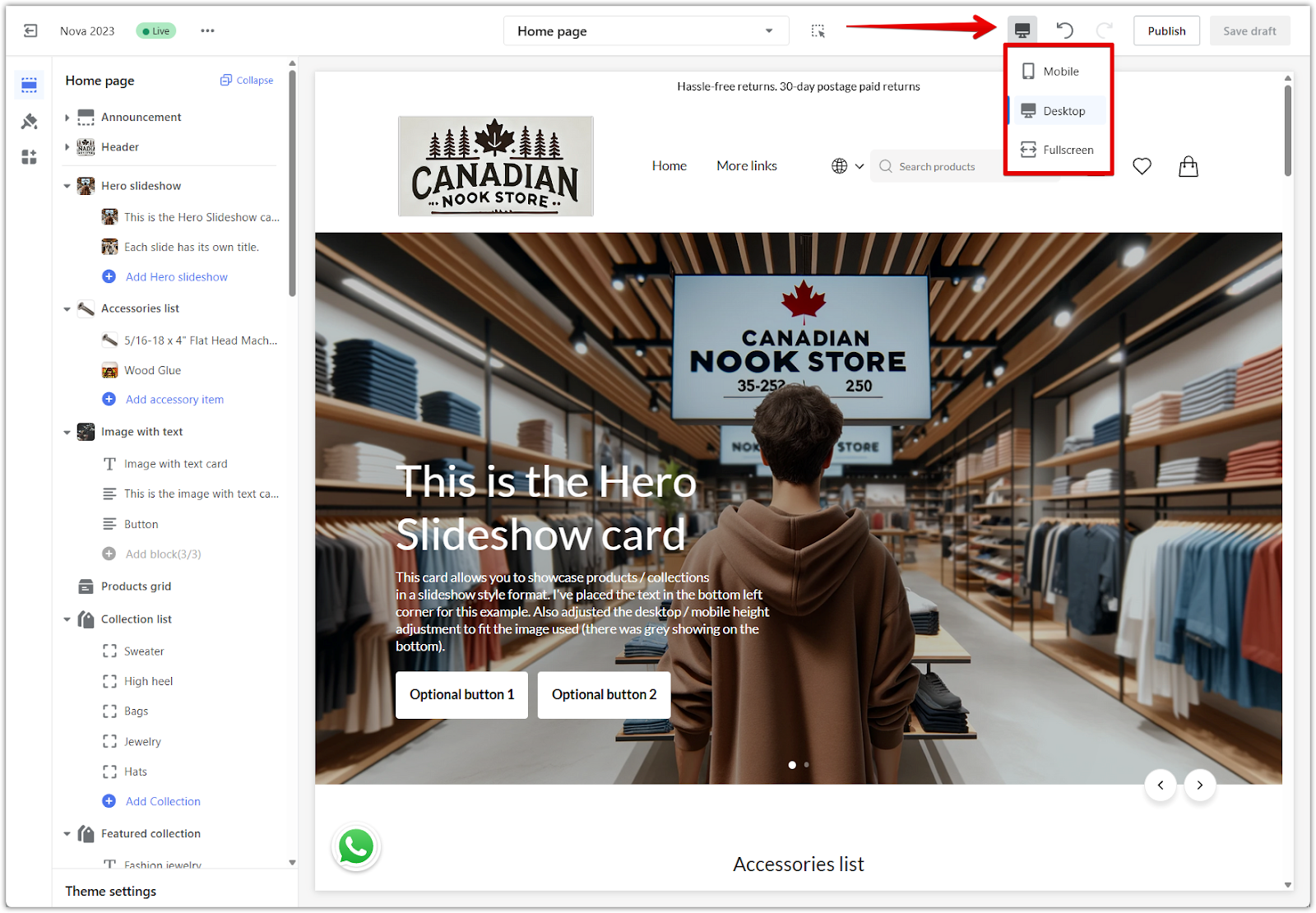
Preview both display modes in the theme editor
Shoplazza makes it easy to switch between device views when customizing your store.
1. Use built-in preview tools: Go to Shoplazza Admin > Online store, choose your theme, and click Customize. In the top toolbar of the theme editor, toggle between PC and Mobile views to preview how your storefront looks on different devices.
Optimize layout for desktop browsing
Desktop users often browse more deeply and view more content at once. Use this to your advantage.
1. Use wide layouts effectively: Take advantage of larger screens to display more product cards, banners, and navigation options without overwhelming the user.
2. Avoid visual clutter: Even with more space, make sure the design stays clean, with consistent padding and spacing between sections.
Optimize layout for mobile browsing
Most customers today shop from their phones. A mobile-friendly experience is essential.
1. Prioritize key content: Place important information, calls to action, and product images near the top of the screen to minimize scrolling.
2. Ensure tappable areas are accessible: Buttons and links should be large enough to tap without error, with appropriate spacing around them.
3. Improve mobile speed: Use compressed images and limit autoplay features to reduce loading time and improve responsiveness.
Customize visual elements by device
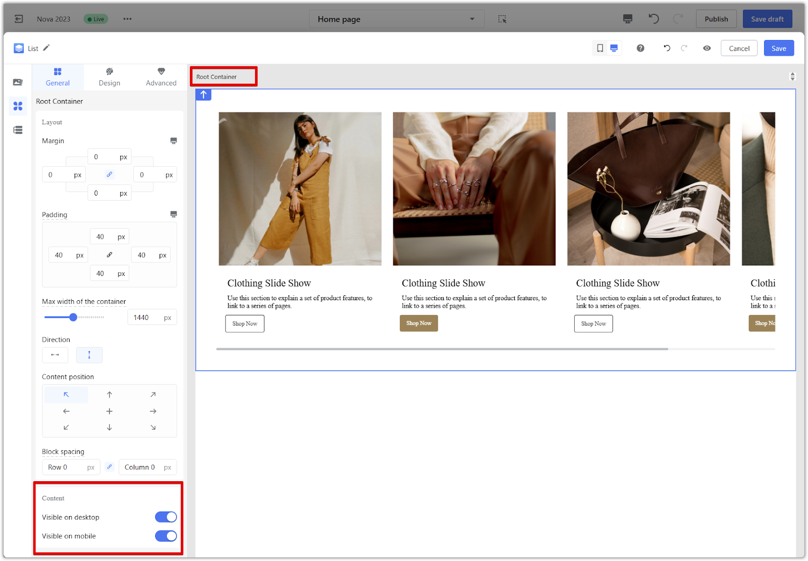
Some Shoplazza theme components allow different settings for desktop and mobile.
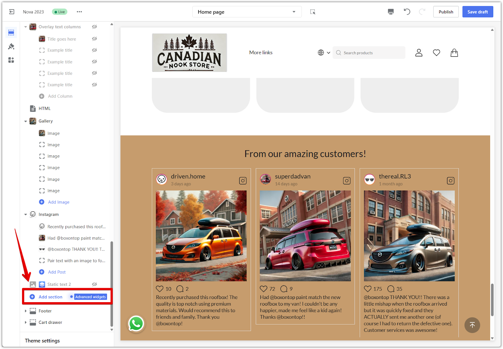
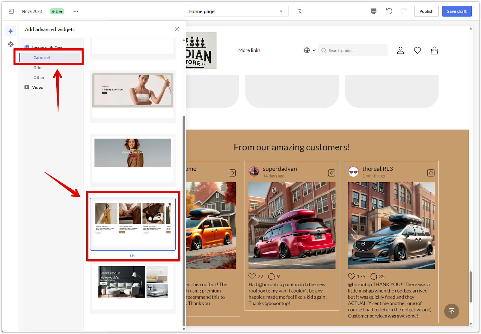
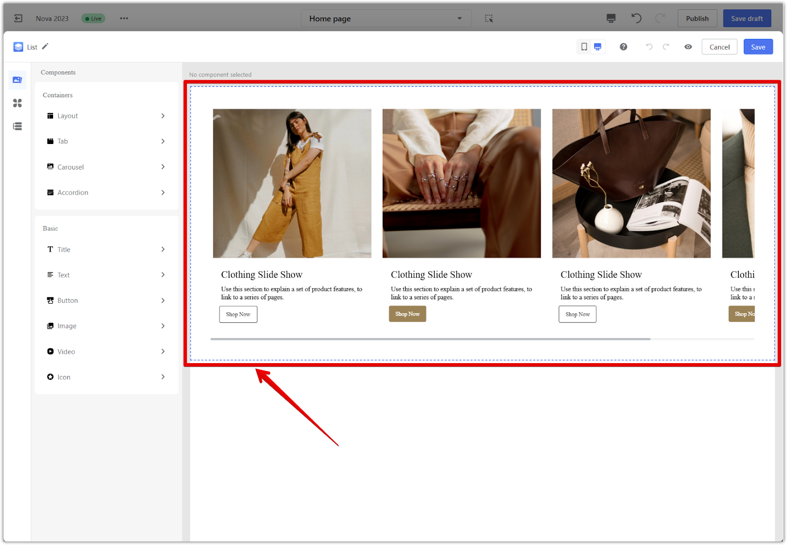
1. Tailor display by device: Components like slideshows or product list cards let you upload different images or adjust content per device. Use this flexibility to optimize readability and design across screen sizes.
2. Advanced customization: If you're using advanced cards, see Quick start to the page builder editor to learn how to display different content for desktop and mobile users.
Pushing your conversion rate higher starts with thoughtful design, strategic layout, and clear communication across every page. When you optimize each part of your storefront, from homepage to checkout, you create a shopping experience that builds trust, reduces friction, and drives results. Use this guide as a practical reference when preparing your store for launch or refining your existing setup to meet your goals.


Comments
Please sign in to leave a comment.