Page Builder is a versatile card editing tool developed by Shoplazza, designed for maximum efficiency and flexibility. It allows you to create visually stunning and customizable cards to enhance your e-commerce site’s appeal and improve the browsing experience for your customers. Below, we’ll explore the standout features of Page Builder and walk you through its core functions.
Key features of Page Builder
- Diverse component library: Explore the variety of interactive elements available to enrich your design.
- Flexible component combinations: Mix and match components to craft designs that align with your brand identity.
- Customizable styling options: Fine-tune colors, borders, shadows, and layout details to achieve a polished look.
Adding advanced cards to your theme
Advanced cards enable you to design dynamic and visually engaging sections for your store. These cards enhance your site's layout while providing a better shopping experience. Follow the steps below to add and customize advanced cards within your theme.
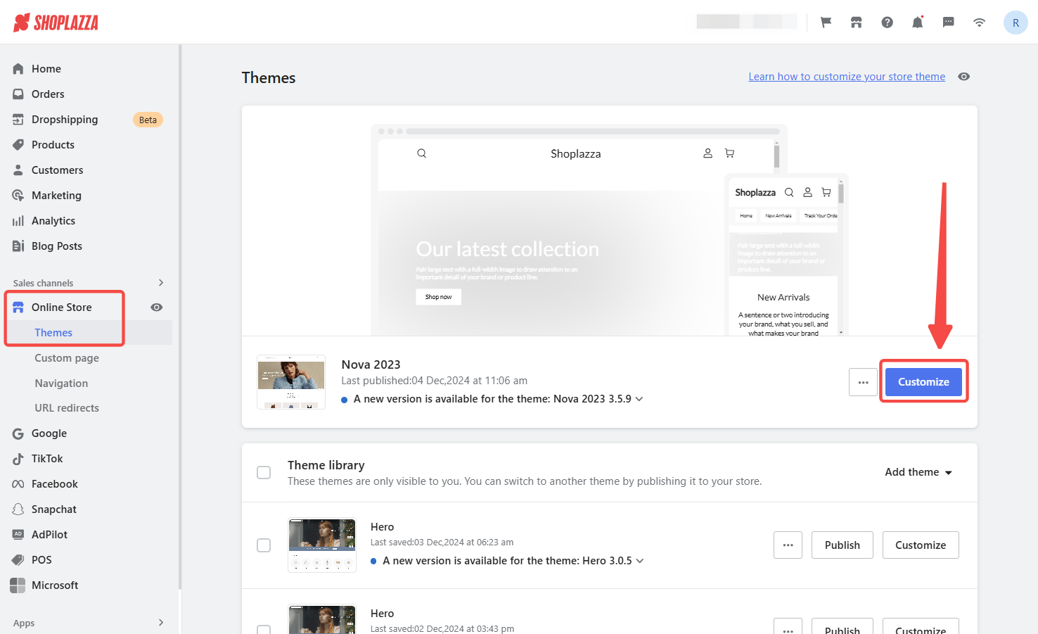
1. Add a card: Log in to your Shoplazza admin, go to Online Store > Themes, and click Customize.
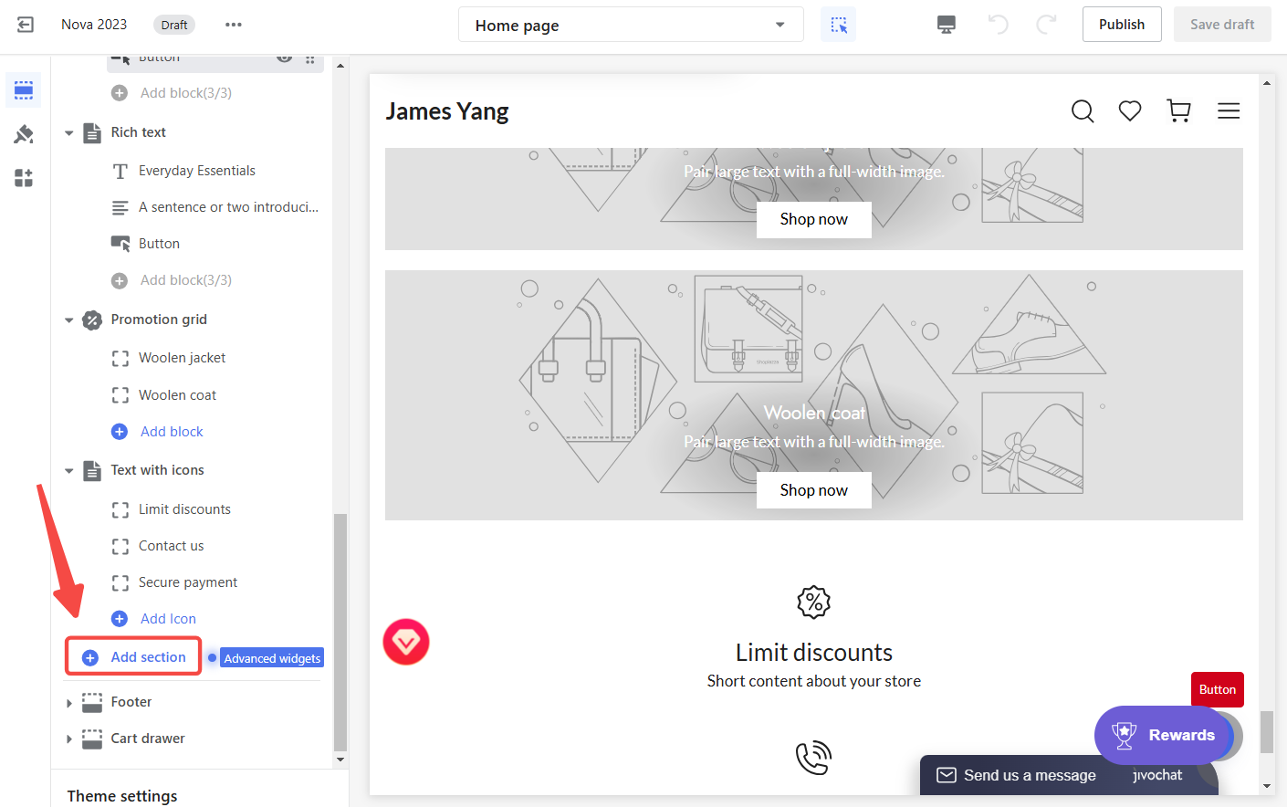
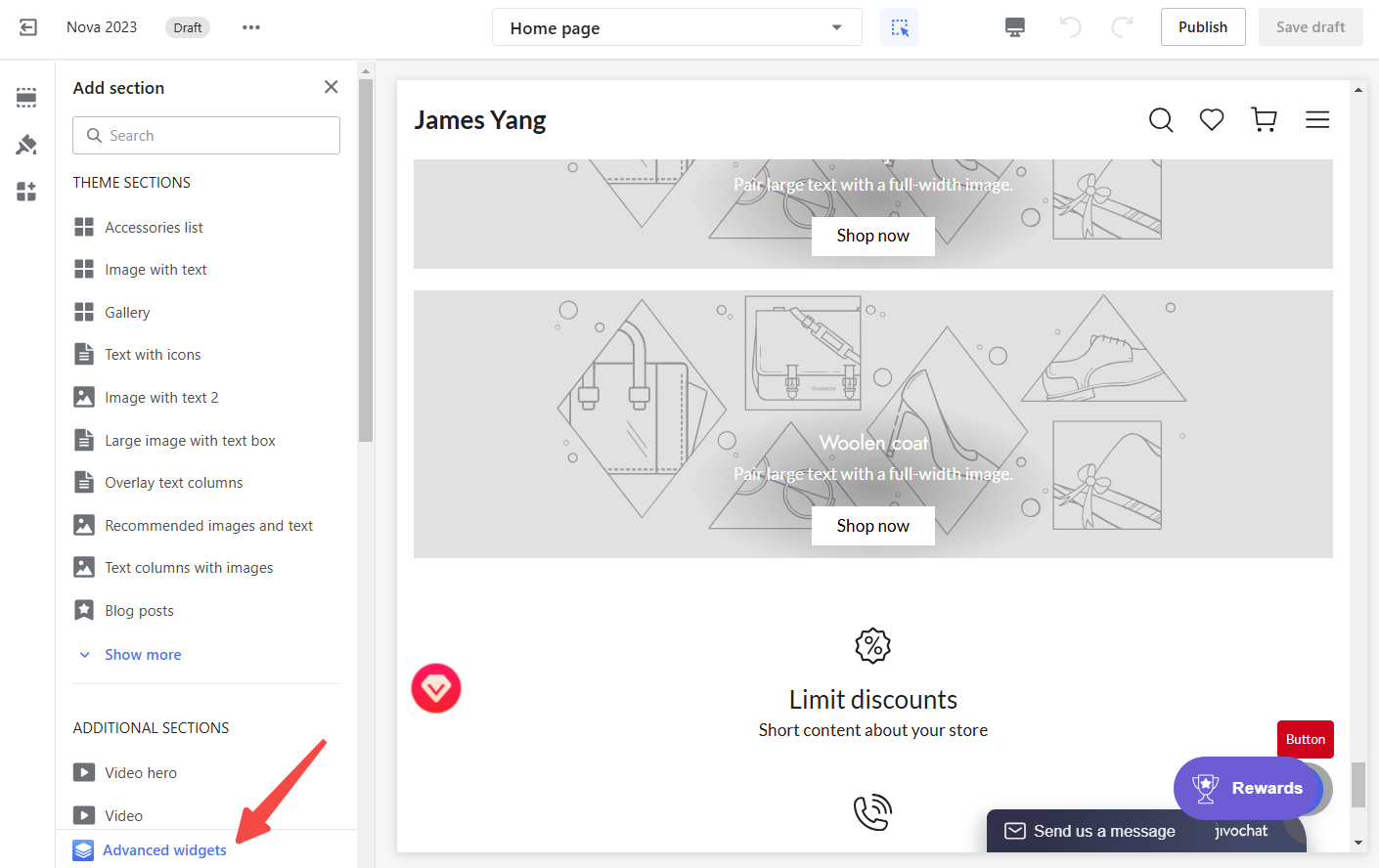
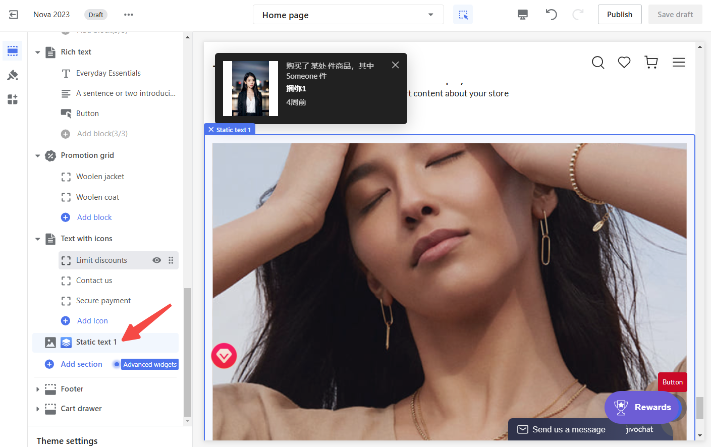
2. Add advanced widgets: In the theme editor, scroll down the Card List panel on the left, and click Add section and select Advanced widgets from the secondary menu.
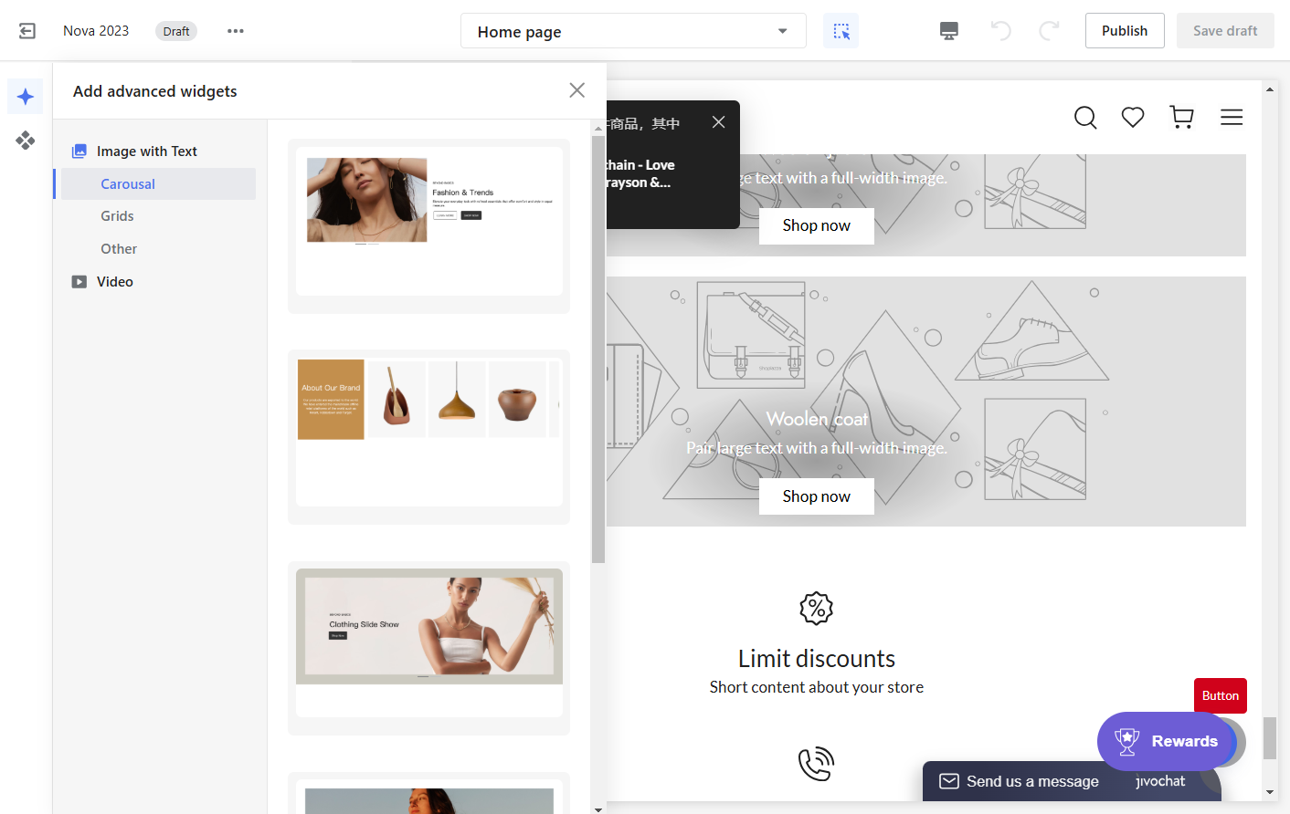
3. Edit the card: Choose an advanced card from the gallery. Click the card to automatically add it to your theme and open the Page Builder Editor for customization.
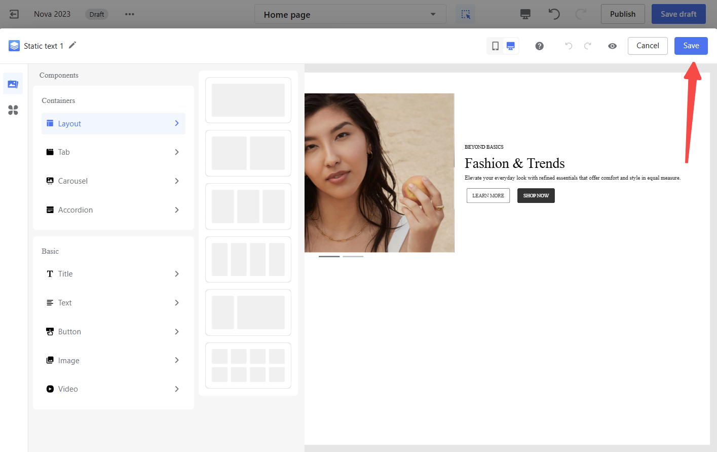
4. Save your card: After editing, click Save in the top-right corner of the Page Builder Editor to save your changes.
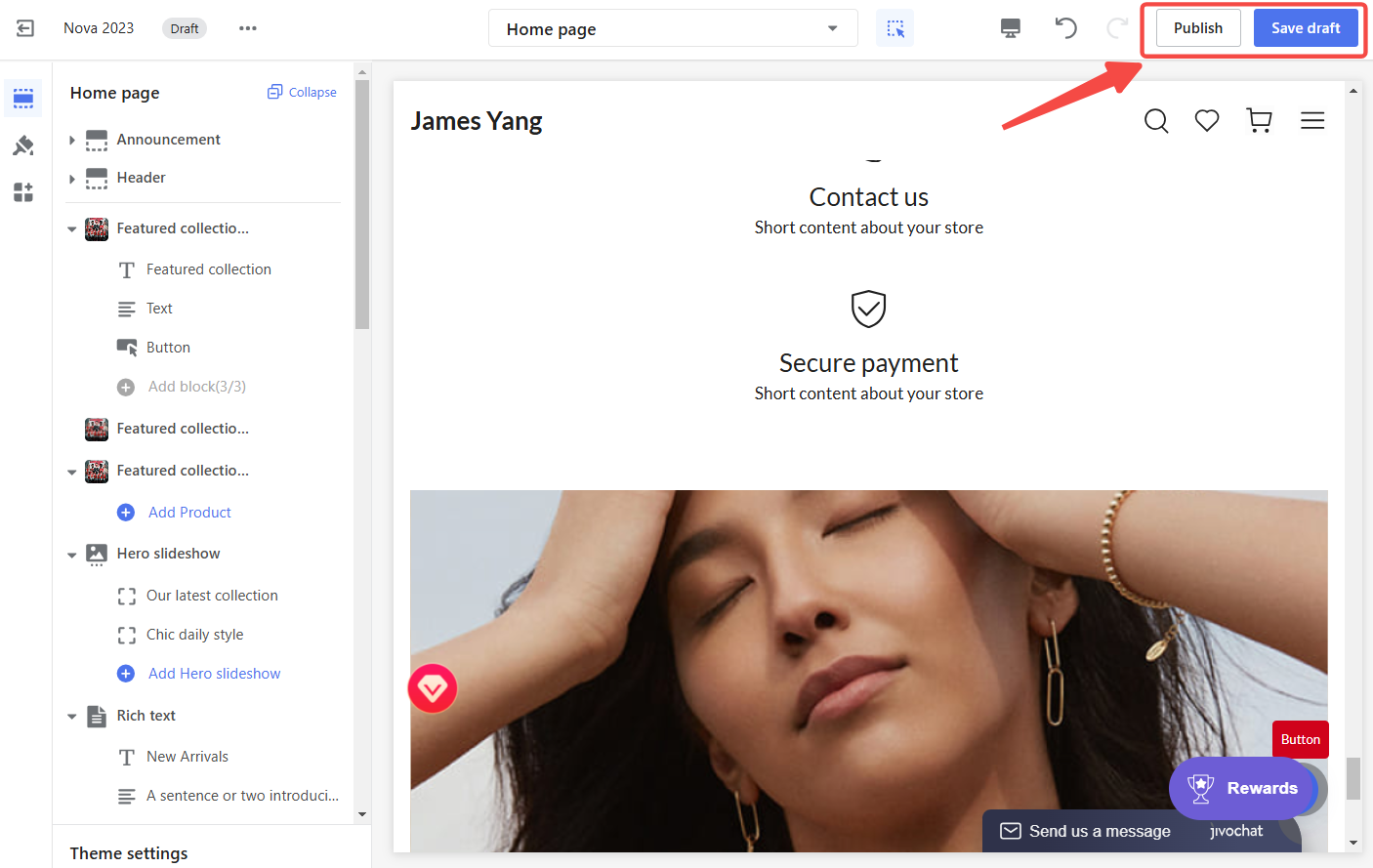
5. Publish your theme: Once your customization is complete, click Publish to make the changes live on your storefront.
Custom templates in the advanced card gallery
Custom templates allow you to save your card designs for reuse across different themes or stores, streamlining the design process and ensuring consistency. This feature simplifies customization and saves time when working with frequently used designs.
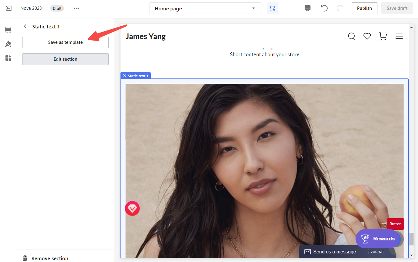
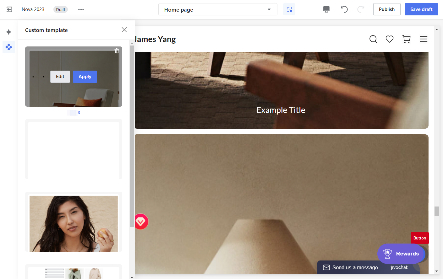
1. Save as a custom template: In the Added Cards list, click on an the advanced card. From the left-side configuration panel, click Save as Template to save the card as a custom template.
2. Using custom templates: If you want to reuse a card design across multiple themes or stores, save it as a custom template for easy access. Go to the Custom templates tab in the Advanced Card Gallery. Hover over the desired template to manage it:
- Use template: Add the card to your theme.
- Edit template: Open the Page Builder Editor to make changes.
- Delete template: Remove the template.
Core features of the page builder editor
The Page Builder Editor offers a user-friendly interface with powerful tools to help you design and customize your store. Its key features are designed to simplify the creative process and provide precise control over your layouts.
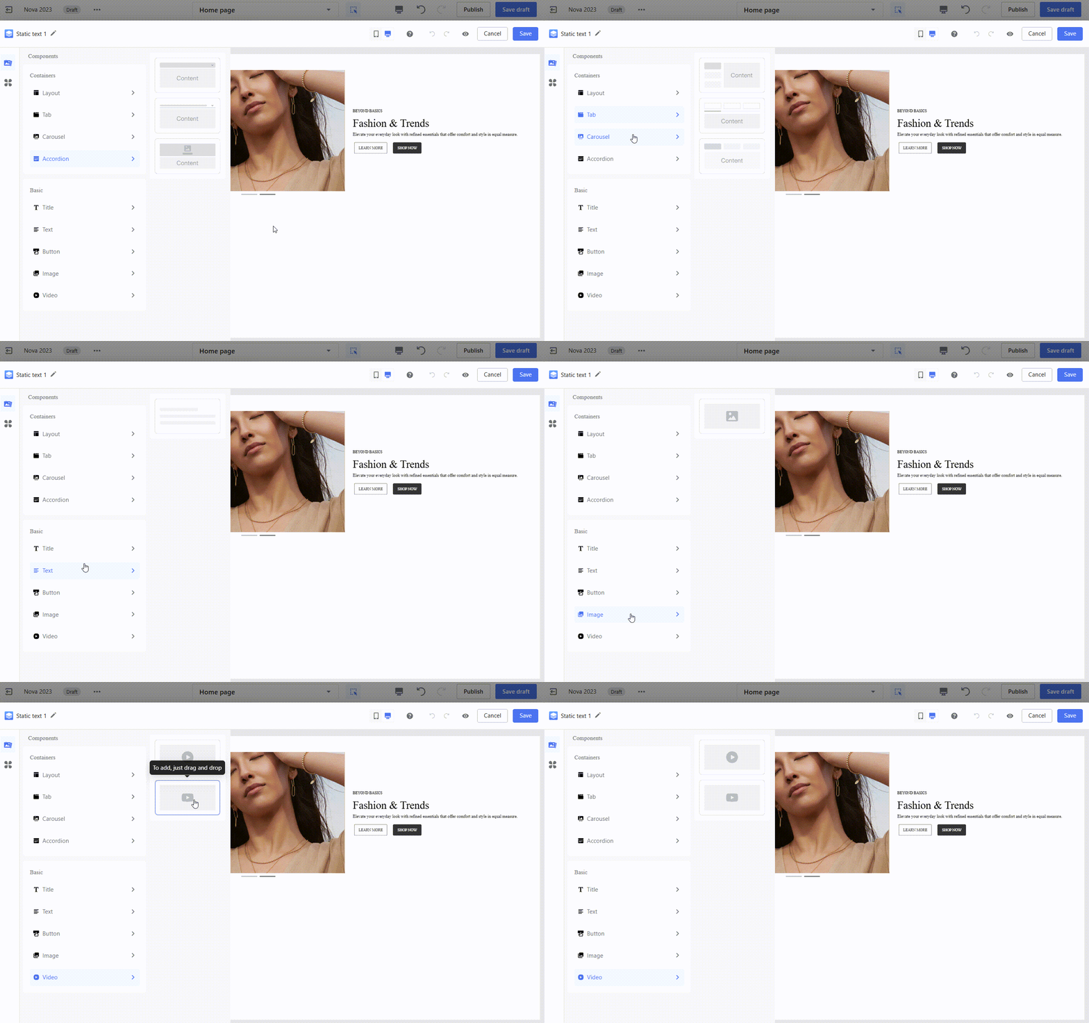
1. Components panel: Explore components via the left panel, categorized for easy navigation. Hover over a category to preview styles before adding them to your design.
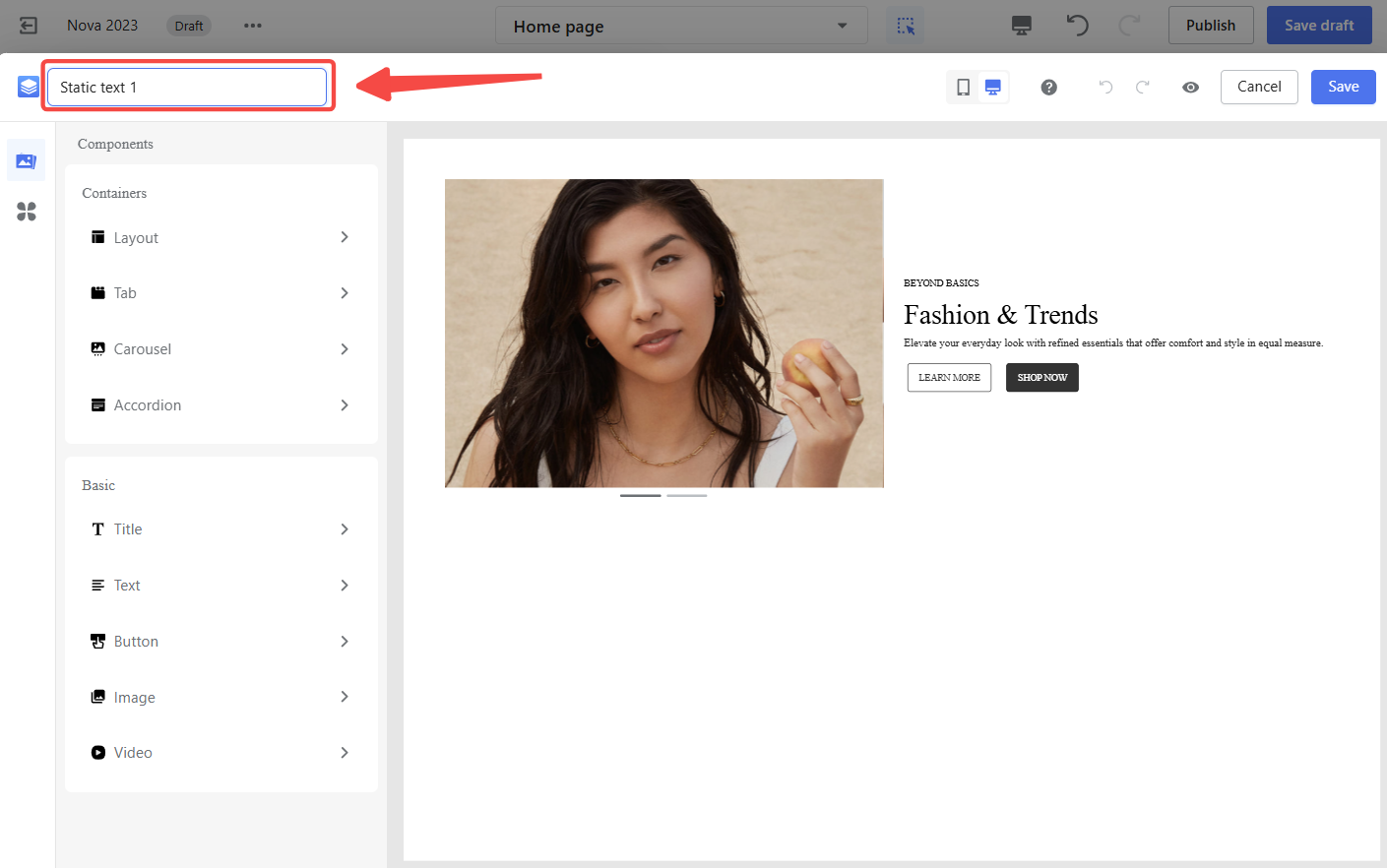
2. Top toolbar: The top toolbar provides quick access to essential design tools, allowing you to rename cards, switch between device views, and manage undo/redo actions for efficient editing.
- Rename Cards: Double-click the card name to edit.
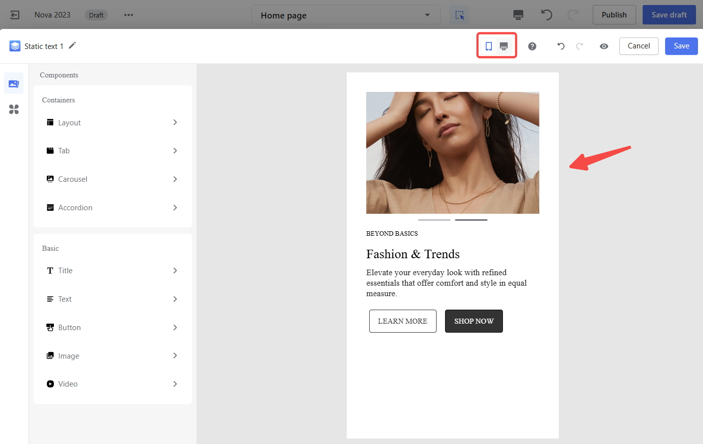
- Device Views: Switch between desktop and mobile previews to ensure your design looks great on any screen.
- Undo/Redo: Click the icons to undo or redo your last actions.
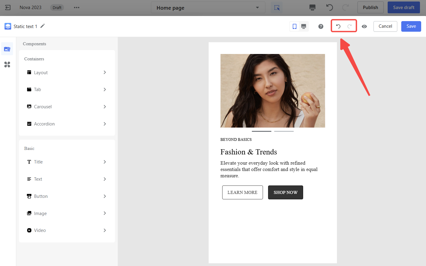
3. Configuration panel: Adjust the settings for selected components like text, images, or buttons. You can fine-tune details like margins, spacing, and alignment to get the perfect look.
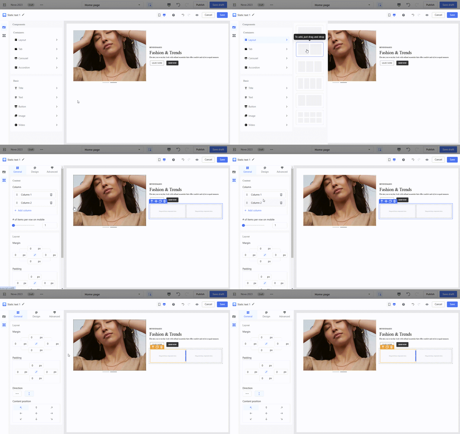
Component overview
The Page Builder Editor provides a variety of components to help you structure and enhance your card designs. These components are grouped into layout containers, functional containers, and elements, each serving a specific purpose in creating visually appealing and interactive designs.
1. Layout containers: These containers help organize your card’s content, offering flexible arrangements to match your design needs.
- Row Container : Ideal for single-row layouts with predefined proportions like 1/1, 1/2, and 1/3.
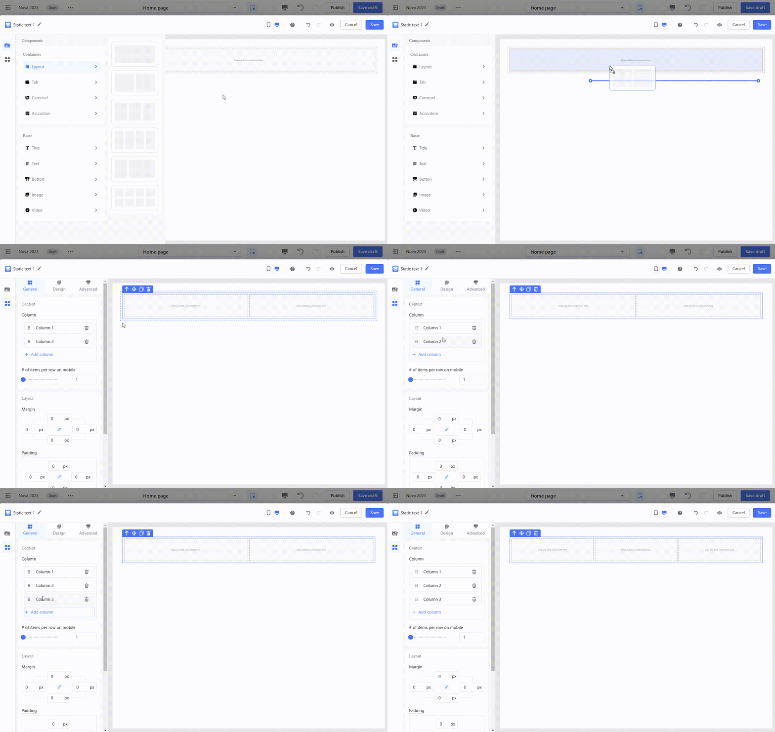
- Grid Container: Perfect for multi-row layouts, allowing you to customize the size and number of grid blocks in each row.
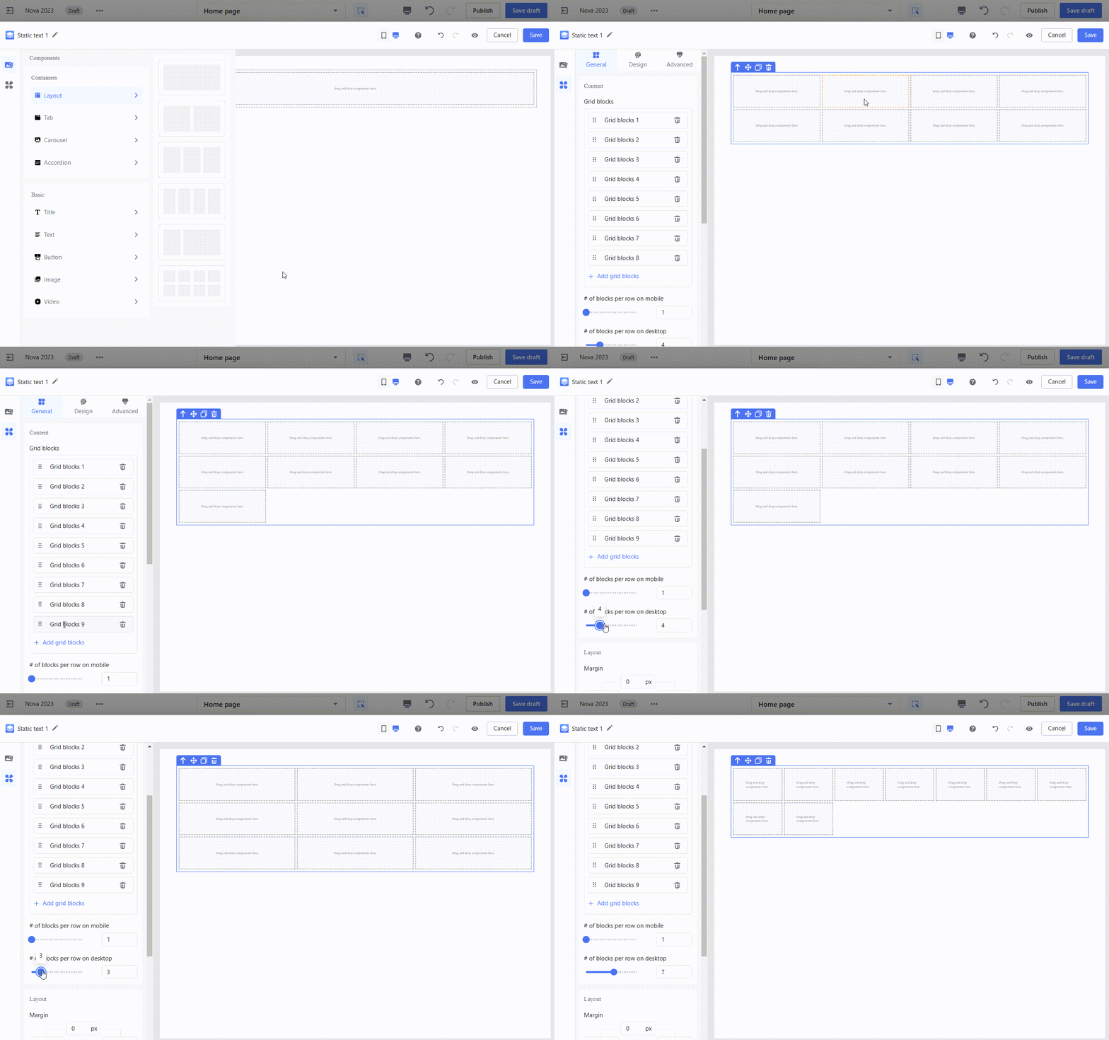
2. Functional containers: These interactive containers add dynamic features to your design.
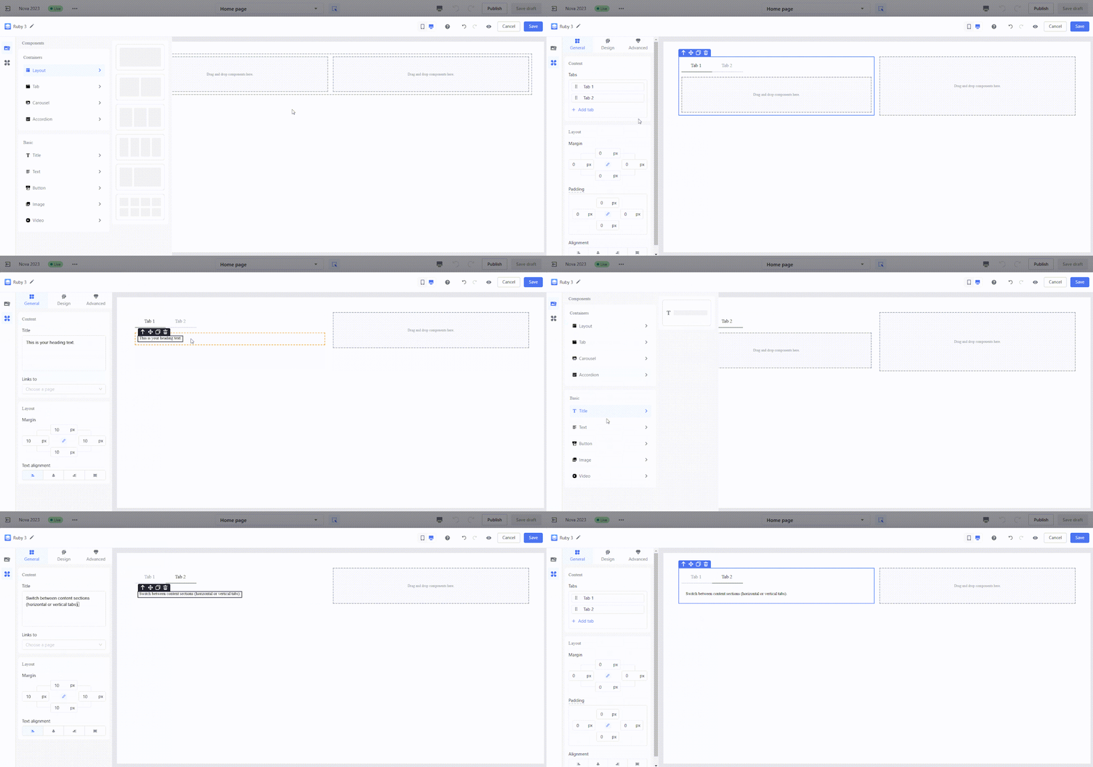
- Tabs: Use tabs to switch between different content sections. Tabs can be arranged horizontally or vertically.
- Horizontal tabs:
-
- Vertical tabs:

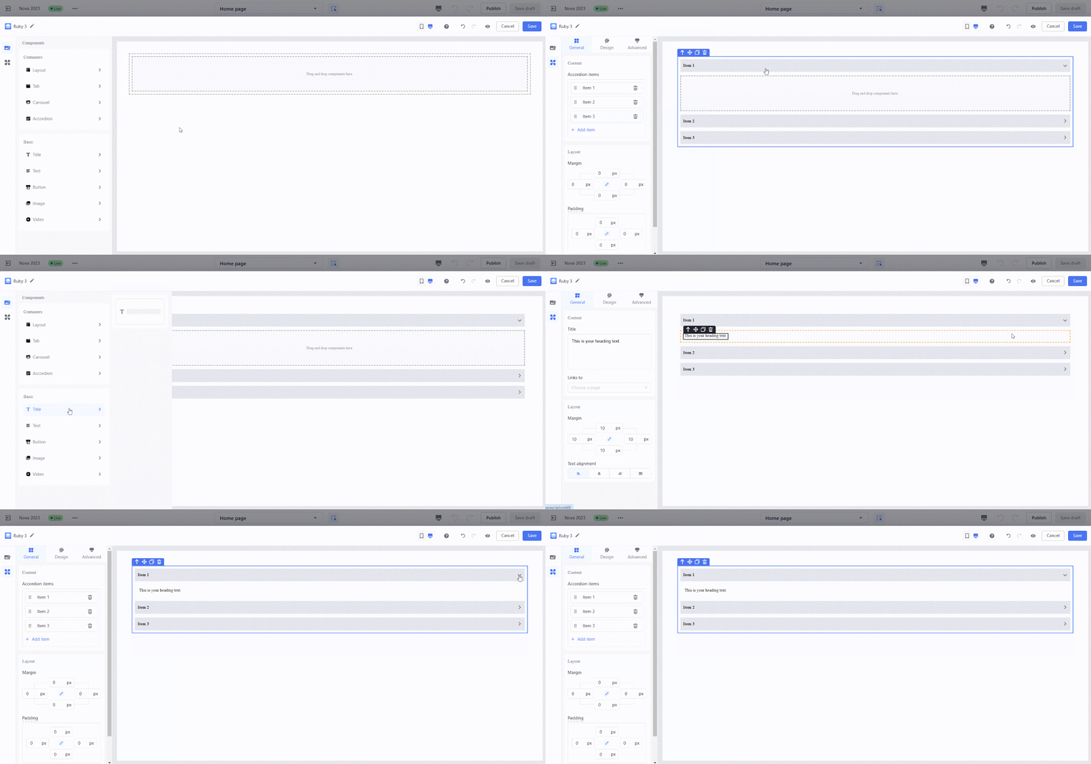
- Accordion: Create collapsible panels for FAQs or additional details. Two types are supported: conventional accordion and container accordion, where you can freely add content to the panels.
- Conventional accordion:
-
- Container accordion:

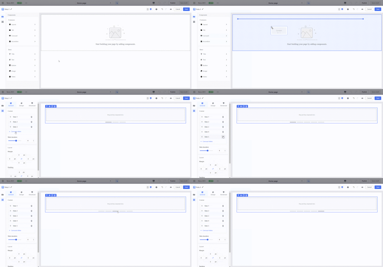
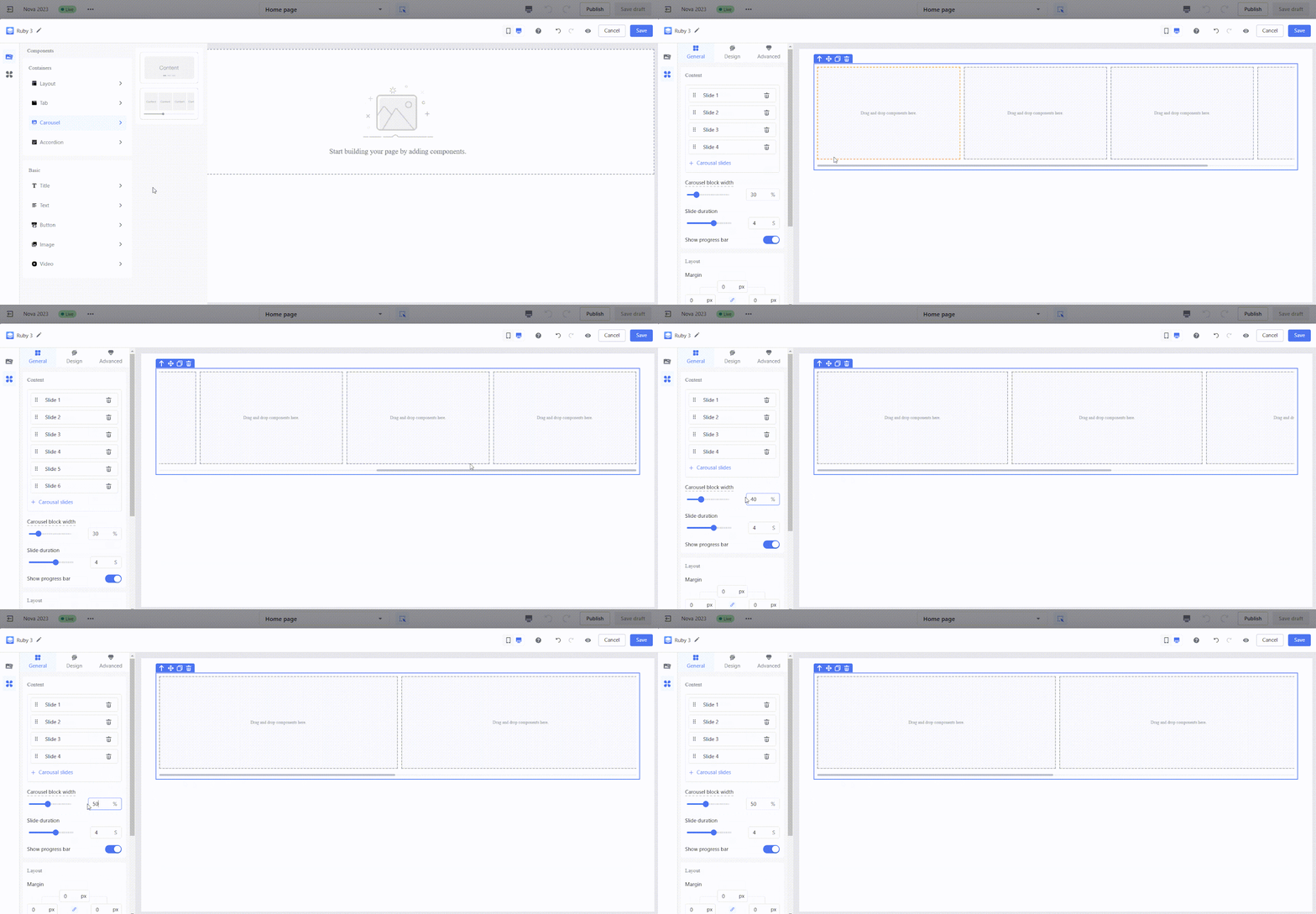
- Carousel: Highlight products or promotions with rotating content. Carousels can be single or list-based.
- Single carousel:
-
- List carousel:
3. Elements: Add visual or interactive elements to complete your design.
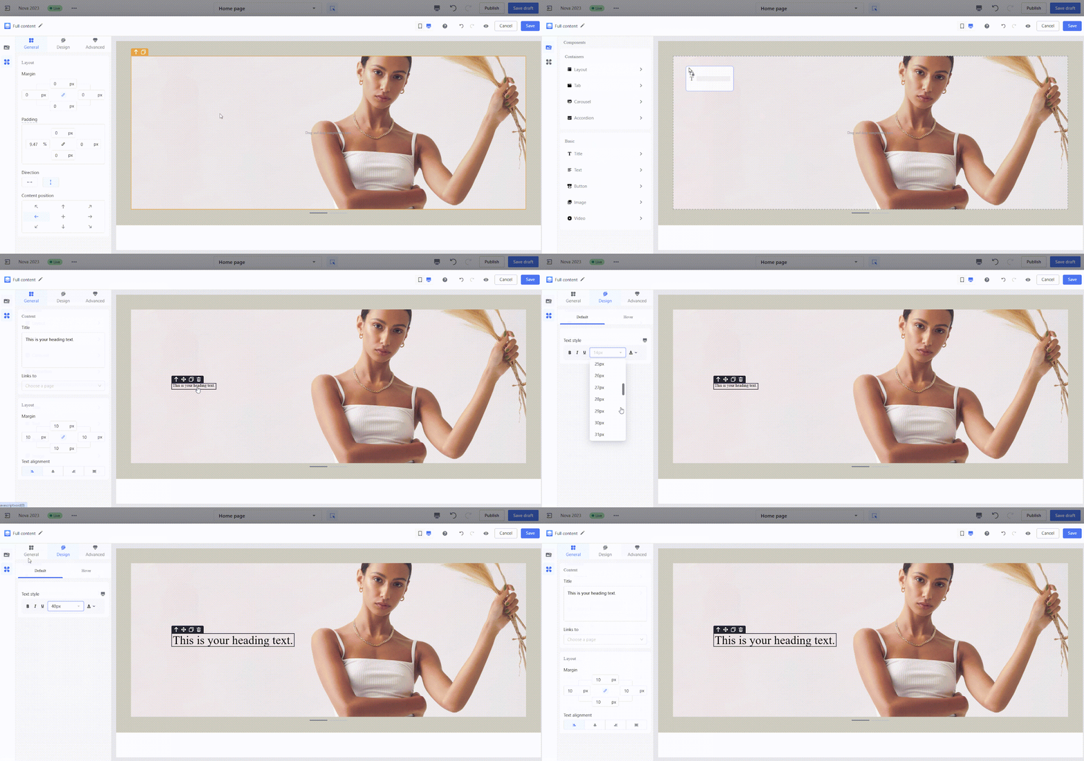
- Text: Add text content for titles or descriptions.
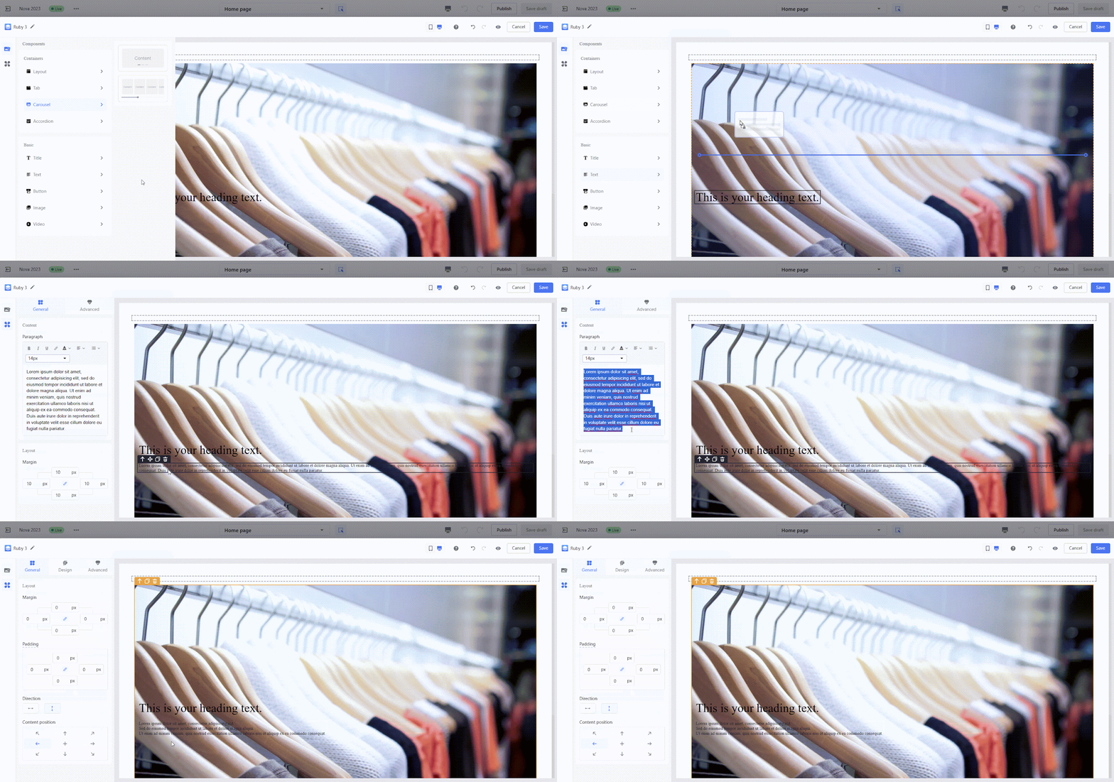
- Paragraphs: Use paragraphs for longer text content or explanations.
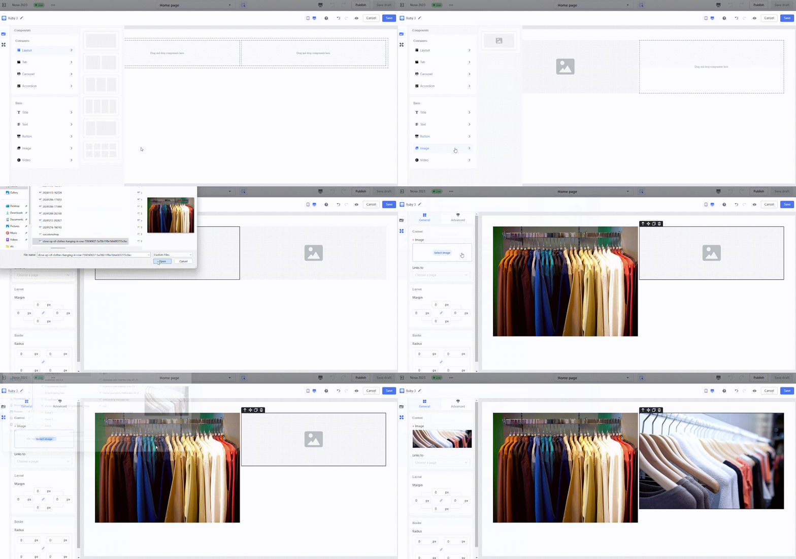
- Images: Add visual appeal with images.
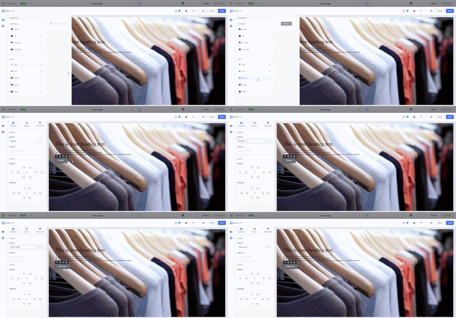
- Buttons: Create clickable buttons for call-to-action purposes.
- Videos: Upload local files or embed YouTube videos to showcase your products or brand.
- Local files:
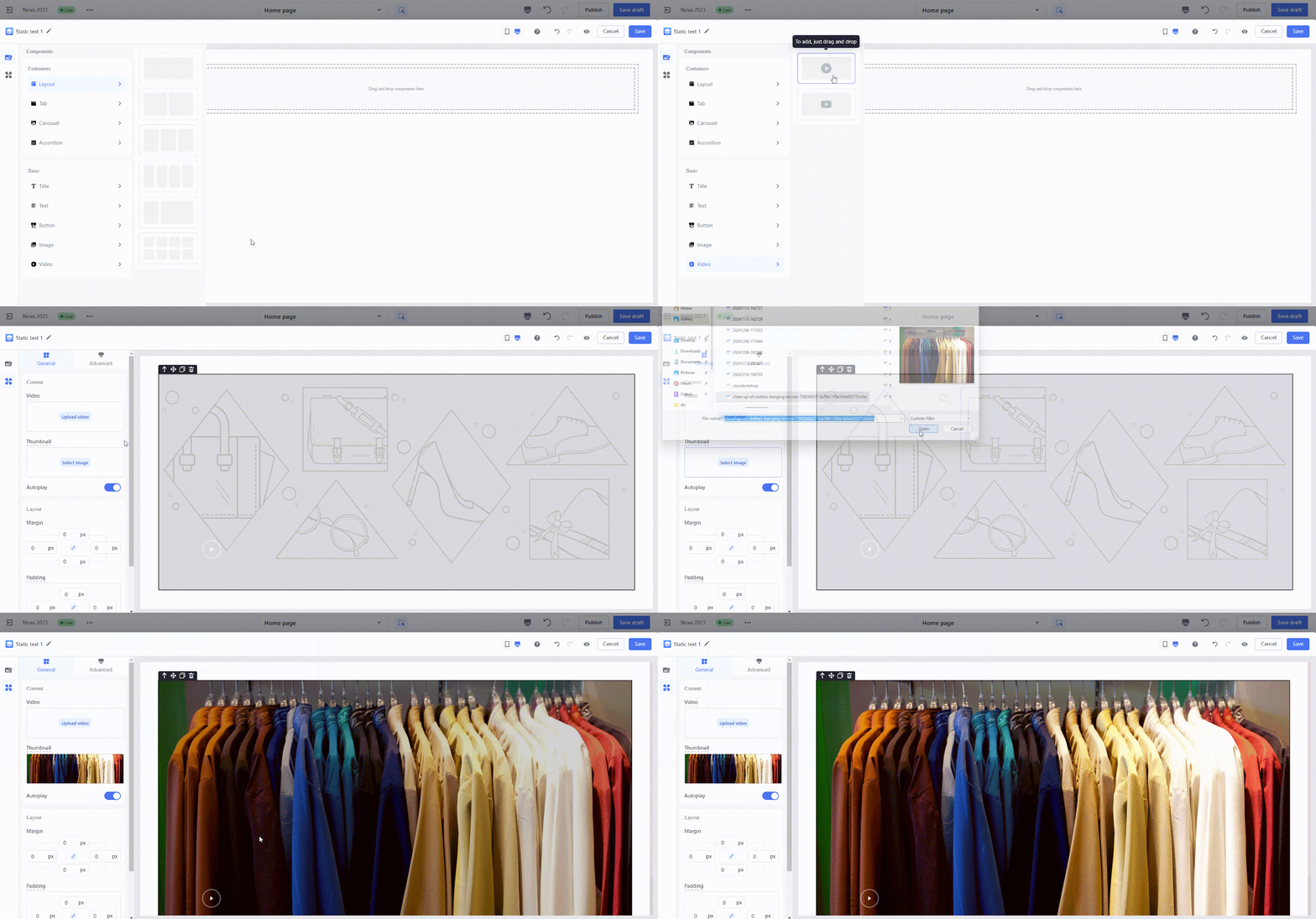
-
- YouTube video URL:
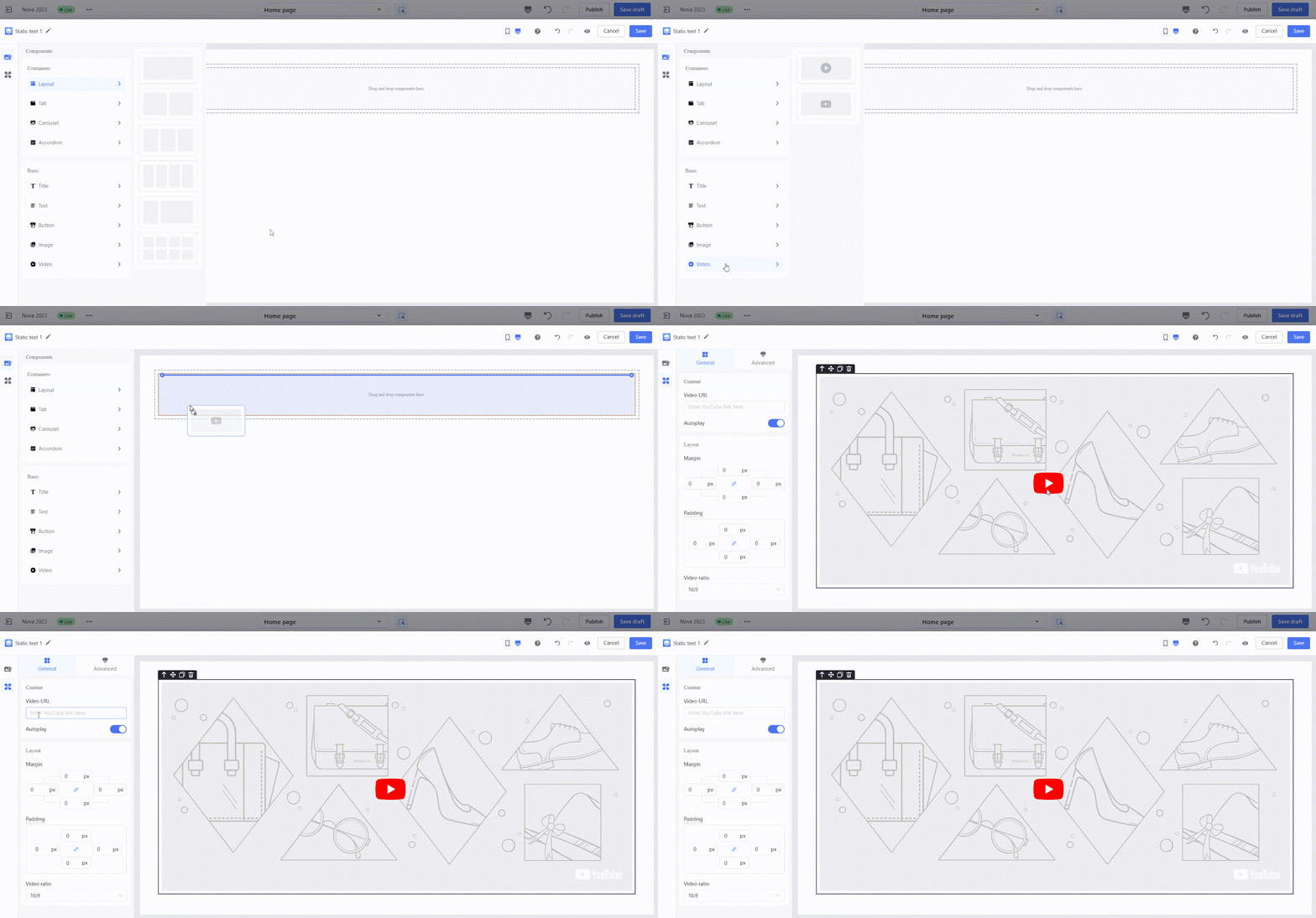
Managing and configuring components
The Page Builder Editor provides intuitive canvas operations and component configuration options, enabling you to design your cards with precision and flexibility. Here's an overview of the key features:
1. Dragging components onto the canvas: Drag components from the left panel and drop them onto the canvas to build your design. This simple process helps you create layouts quickly.
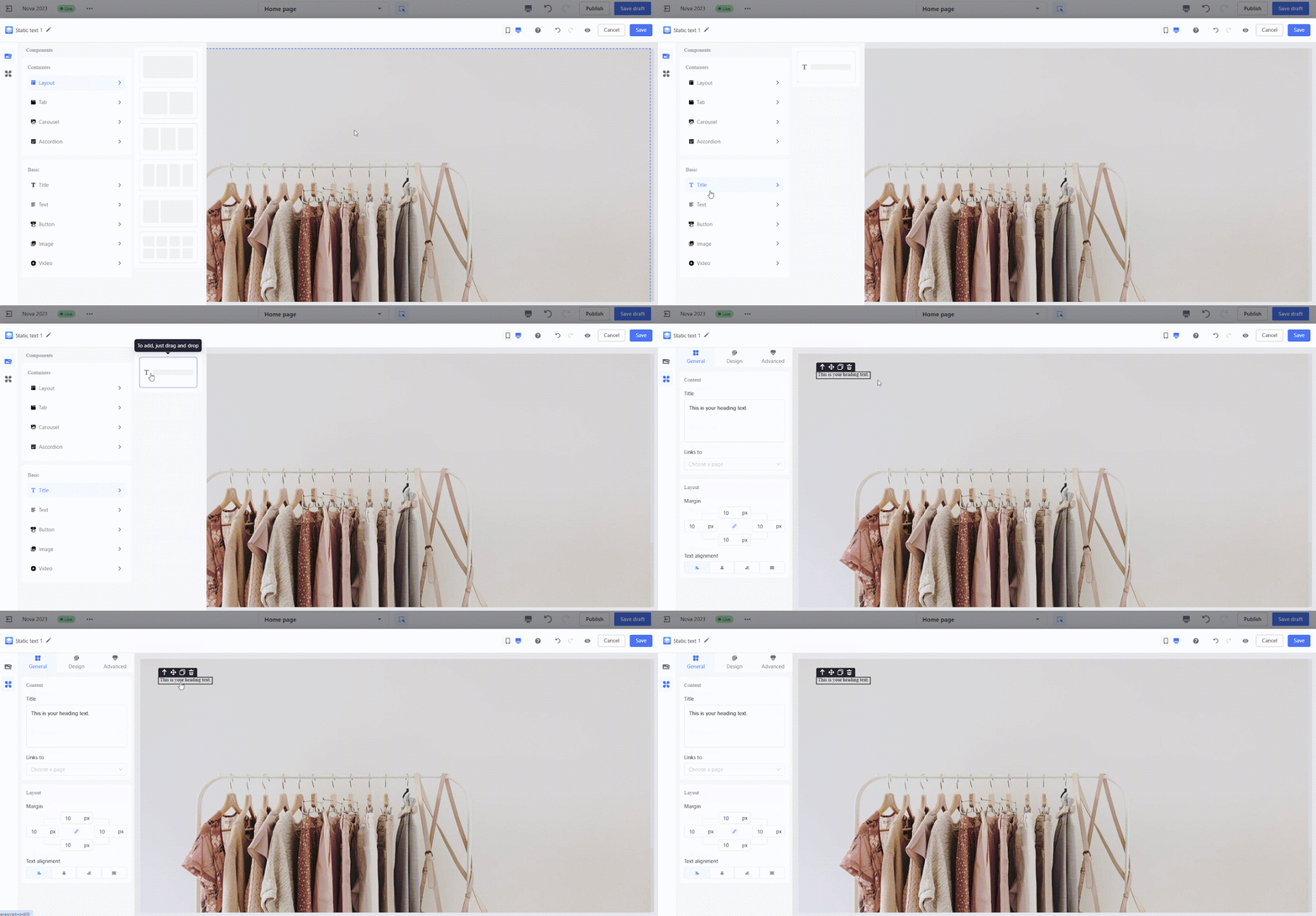
2. Adding components to specific positions: Easily position components within layout containers by dragging them to the desired spot. The layout direction (horizontal or vertical) can be adjusted to fit your design. A blue guiding line will show where the component can be placed.
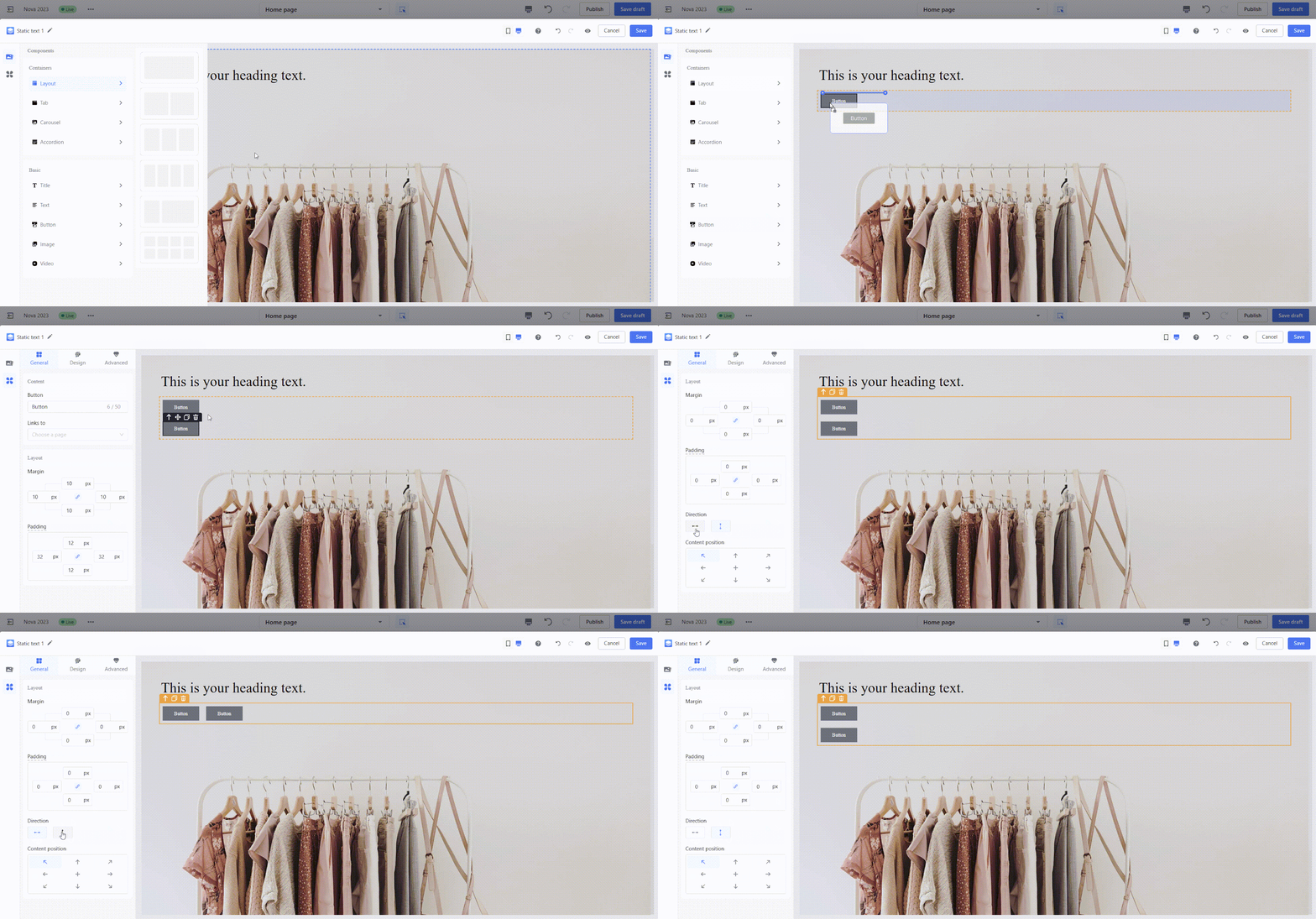
3. Basic component actions: Perform quick actions like selecting, duplicating, deleting, or resizing components directly on the canvas. These tools make it easy to refine and adjust your design.
- Select a component: Click on a component to highlight it. A quick action menu will appear in the top-left corner of the selected component.
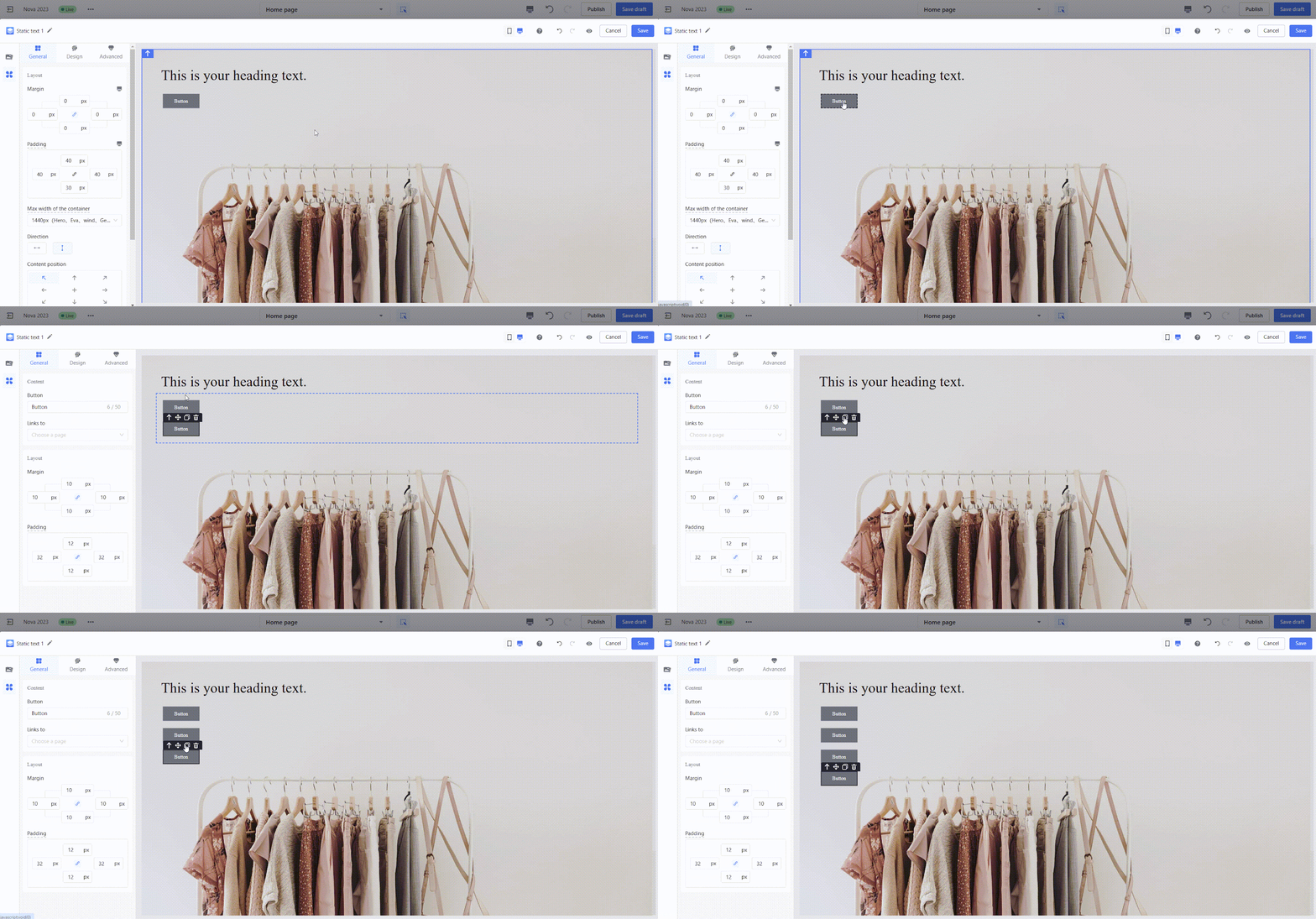
- Duplicate: Click the duplicate icon to copy the component. The duplicated component will be placed immediately to the right of the original.
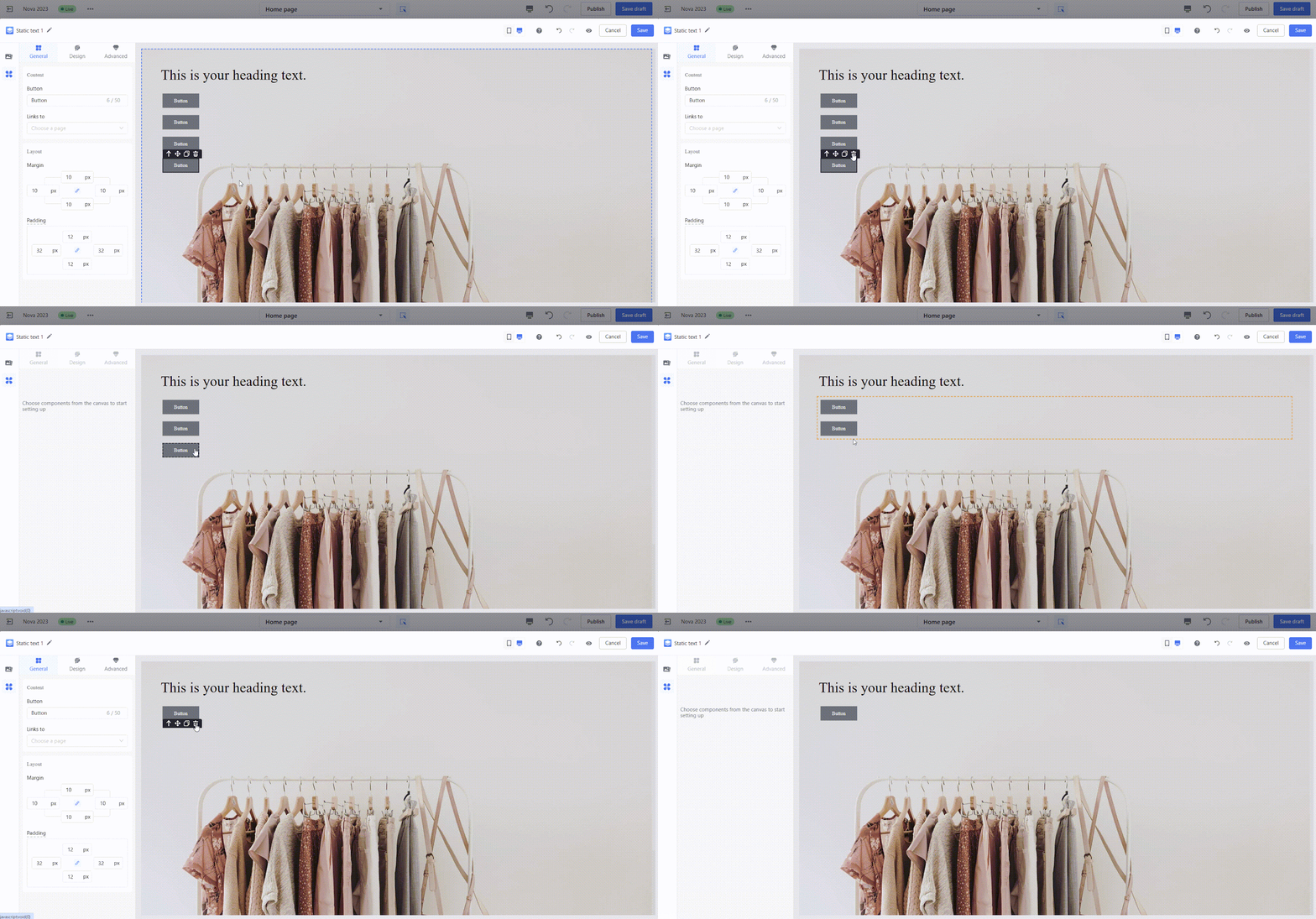
- Delete: Click the delete icon to remove the component from the canvas.
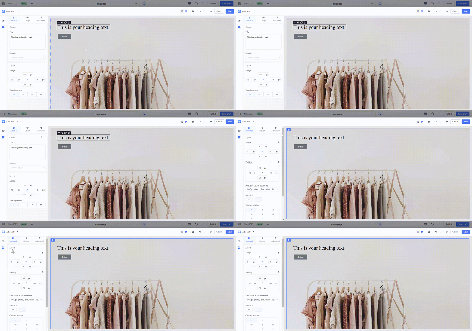
- Locate the layout container: Click the locate icon to switch the selection from the current component to its parent layout container.
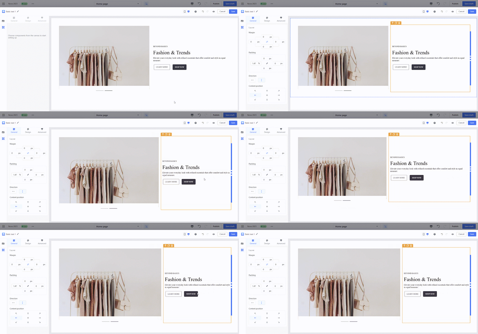
- Resize containers: Drag the layout adjuster on the canvas to quickly resize the layout container.
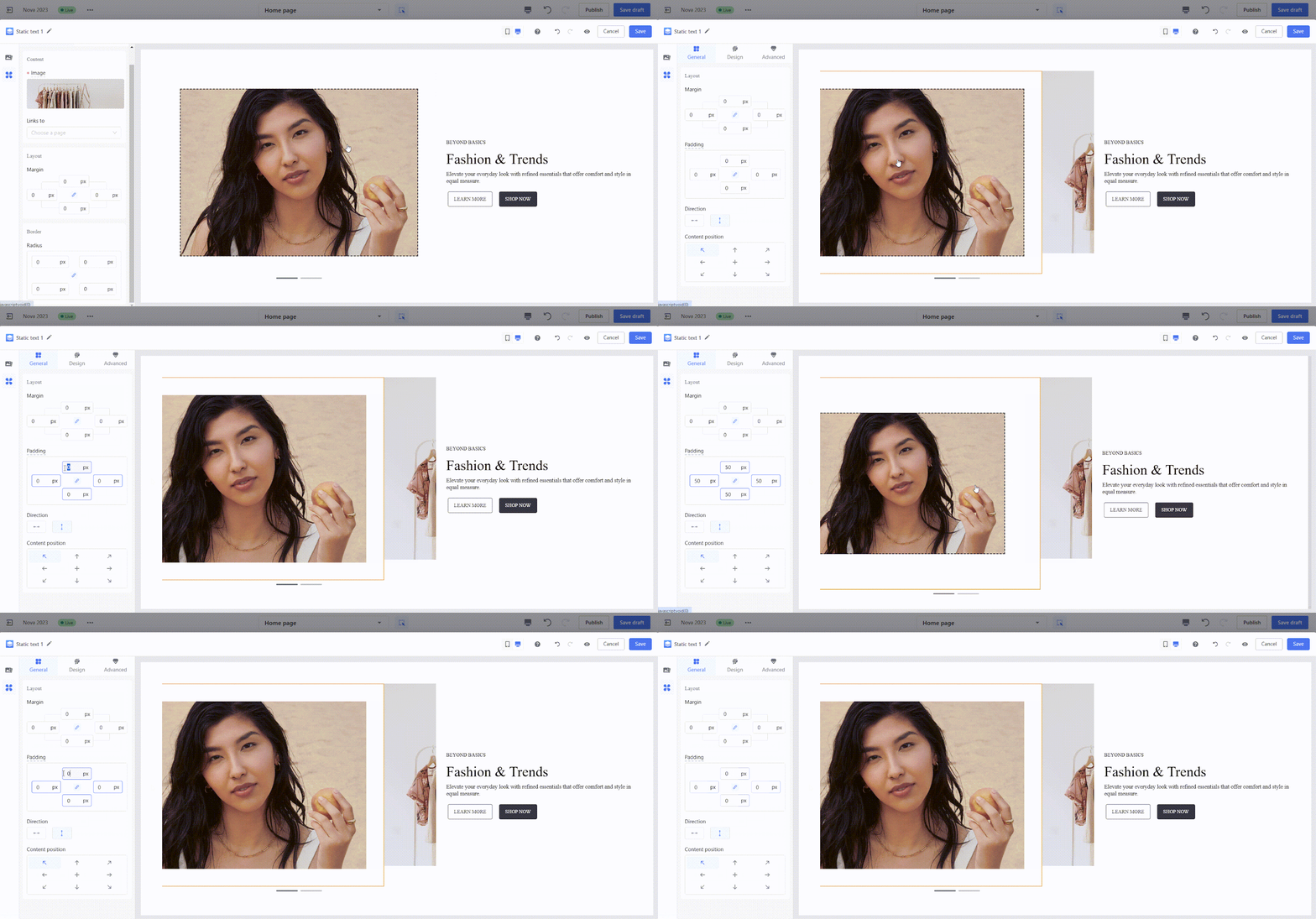
4. Adjusting margins: Margins help control spacing both inside and outside the component, ensuring the layout looks clean and organized.
- Inner margins: Inner margins: Adjust the padding between the component’s border and its content.
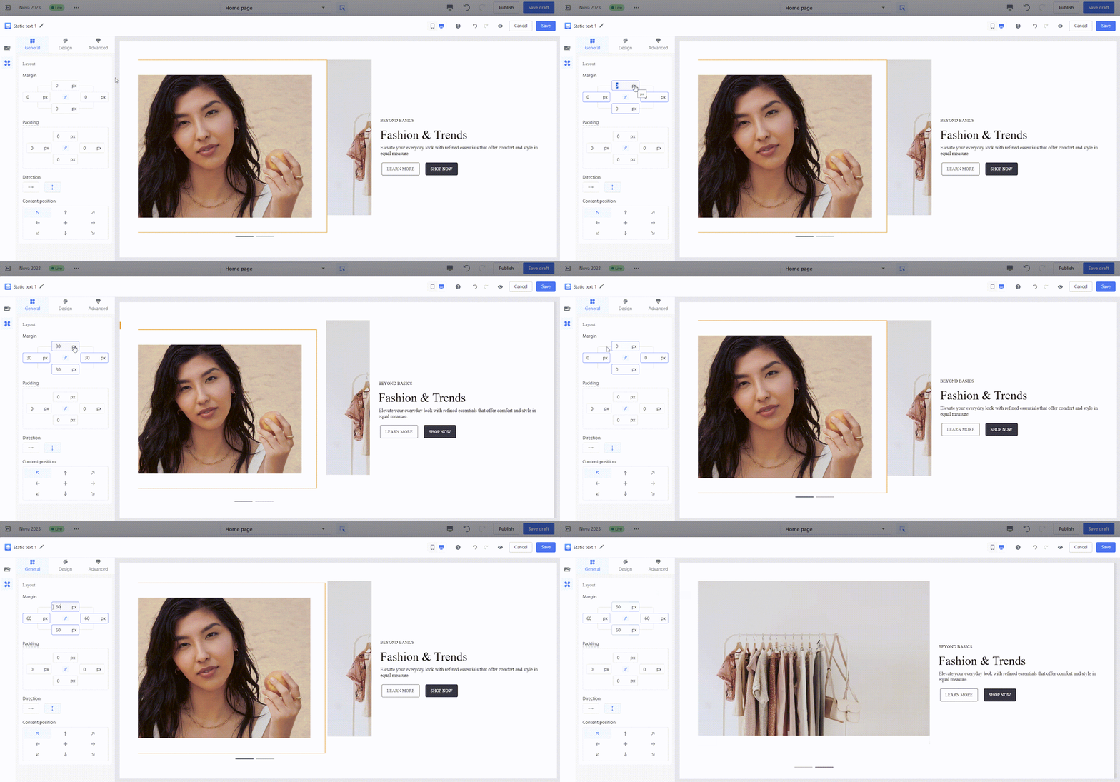
- Outer margins: Set the distance between the component and other components in the layout.
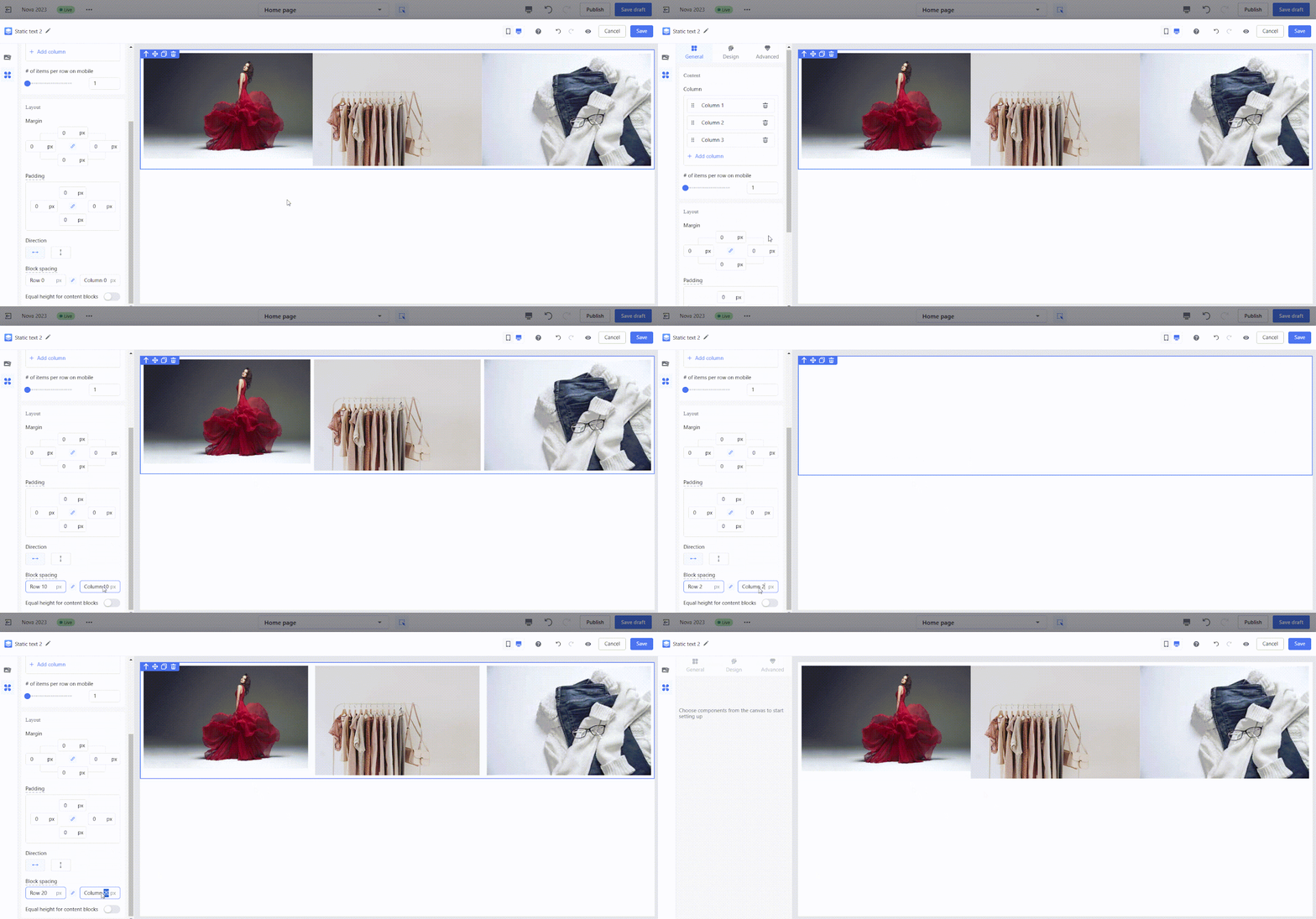
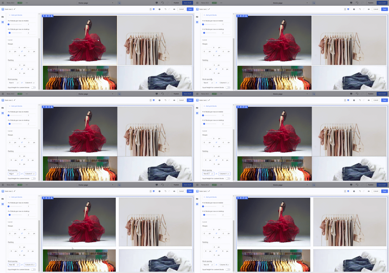
5. Adjusting spacing: Components with list properties (e.g., carousels, tabs, multi-column layouts) allow for quick adjustments to the spacing between items for better alignment.
- Column spacing (e.g., multi-column layouts): Adjust the spacing between columns in multi-column layouts.
- Row spacing (e.g., multi-column layouts): Fine-tune the spacing between rows in grid-style layouts.
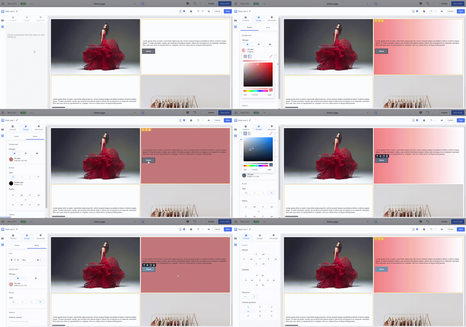
6. Interactive style adjustments: Customize styles for different states, including default, hover, and selected states. Adjust settings for backgrounds, fonts, buttons, and more to create engaging interactions.
- Example: Configure different styles for hover or selected states to achieve dynamic effects.
Common editing scenarios
These examples highlight how to use the Page Builder Editor to create practical and visually appealing designs for your e-commerce site. Follow these steps to build different layouts with ease.
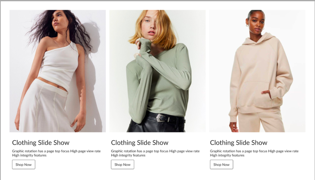
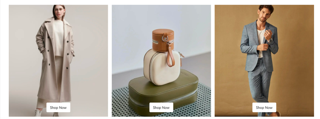
1. Image-Text columns: Create a balanced design using a three-column layout with images and text. Adjust spacing, text size, and colors to achieve a professional look.
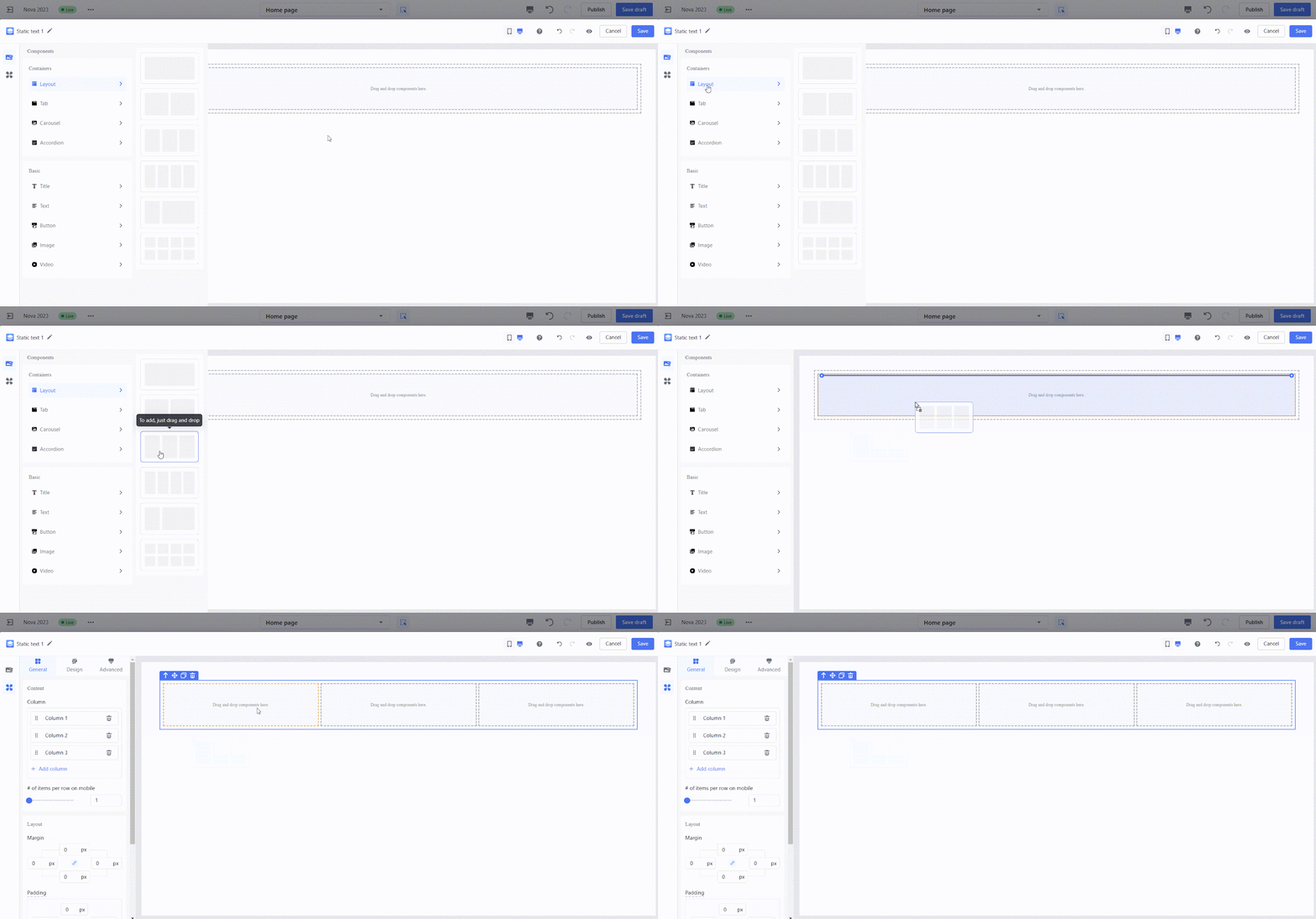
- Step 1: Select a three-column layout container and drag it onto the canvas.
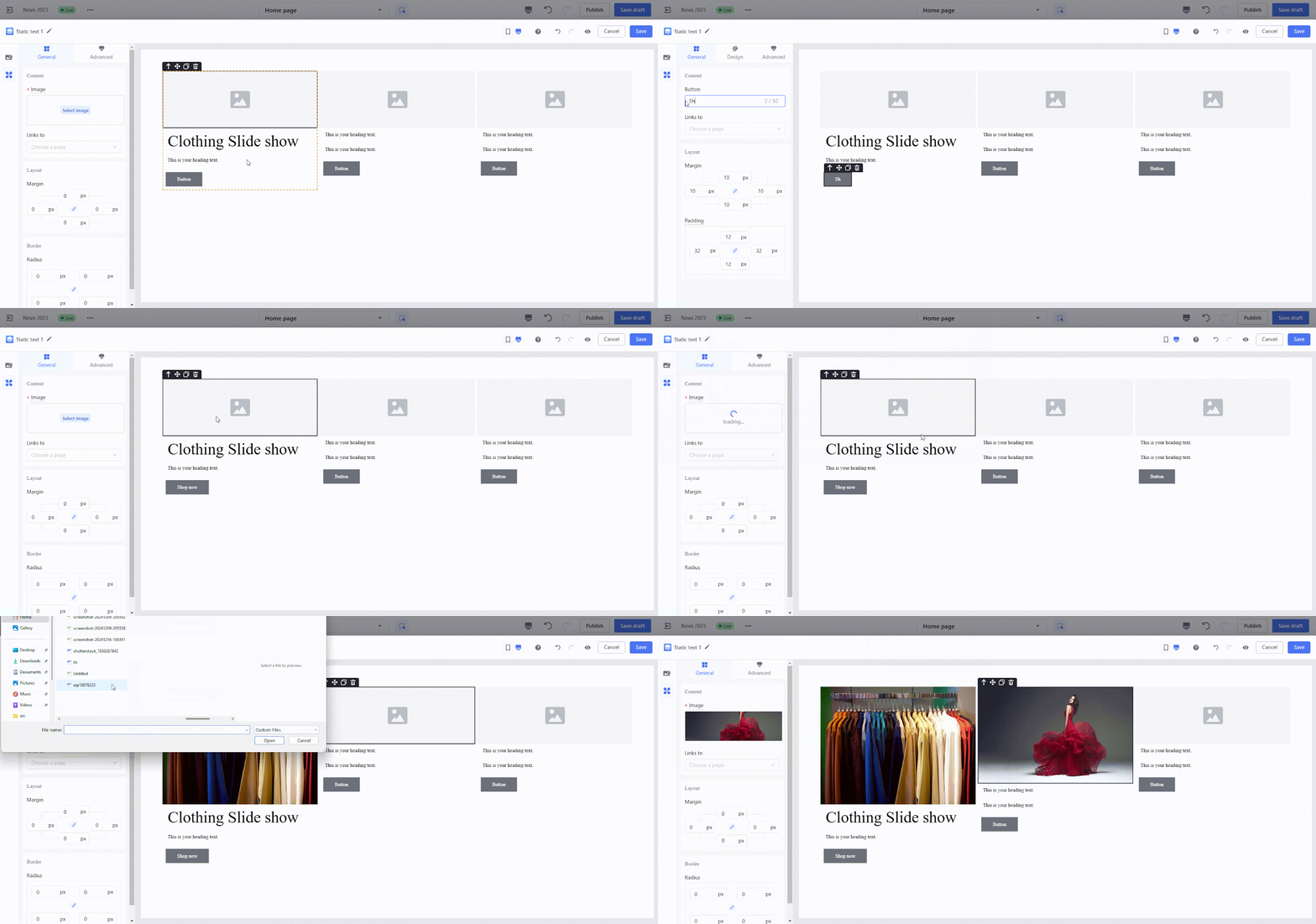
- Step 2: Modify the alignment direction of the sub-containers and drag content into each column in sequence.

- Step 3: Fill in the content, adjusting text size, colors, and spacing as needed to complete the design.
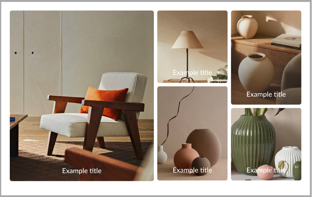
2. Overlay photo wall: Combine background images with text overlays for a creative design. Adjust container sizes and proportions for a unique visual effect.
- Step 1: Select a three-column layout container and drag it onto the canvas.
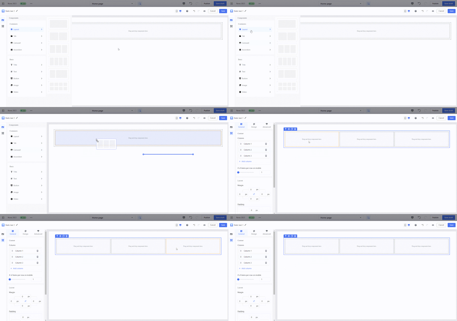
- Step 2: Use the size adjuster to modify the proportions of the sub-containers.

- Step 3: Add sub-containers into the smaller columns, then change their layout direction to vertical, creating two rows in each.

- Step 4: Fill each sub-container with image backgrounds and upload your chosen images. Overlay text onto the image backgrounds and position it as needed.
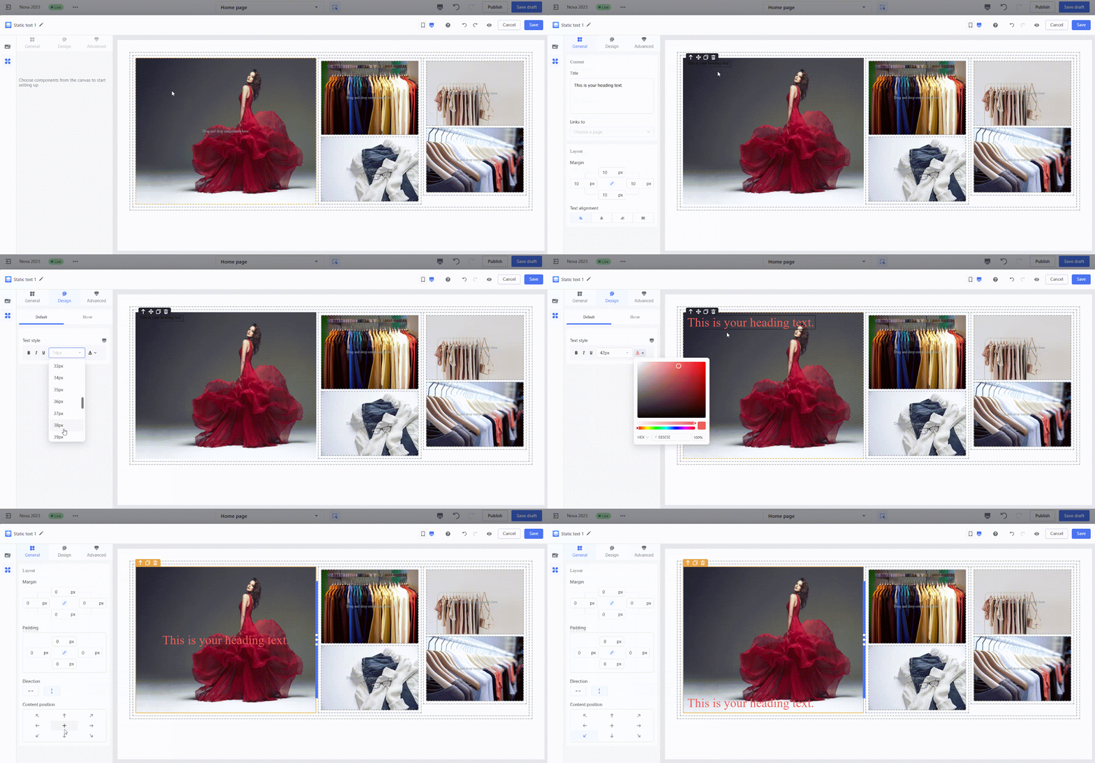
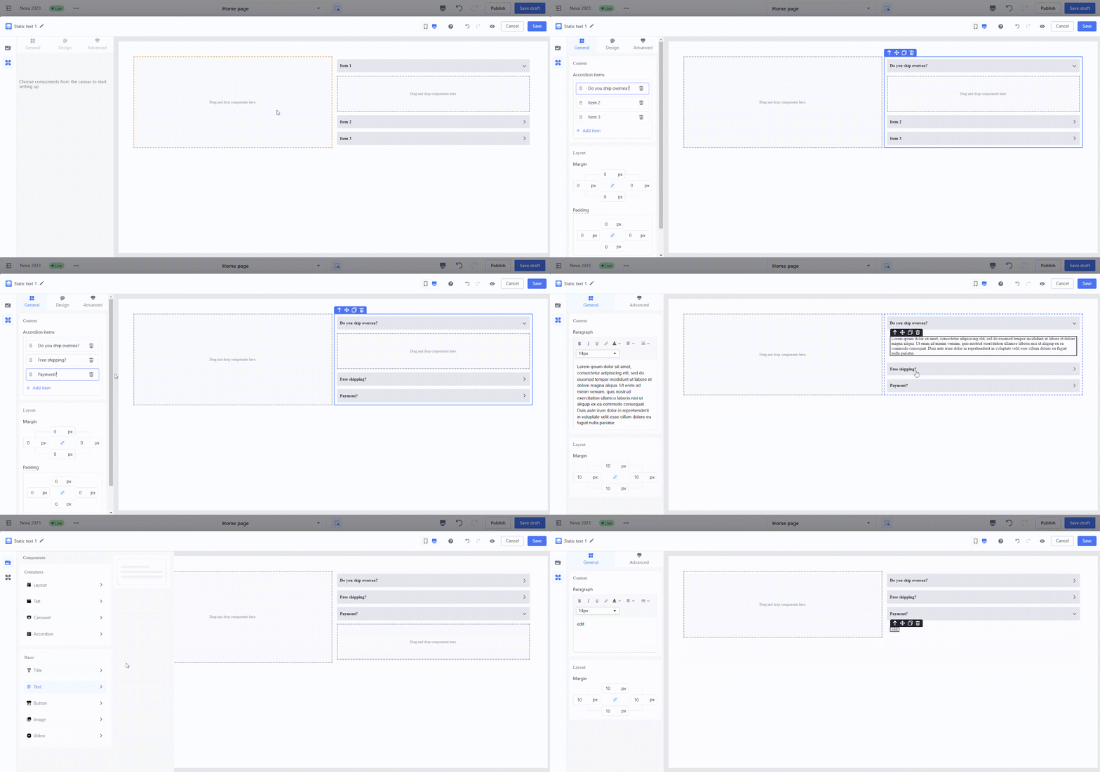
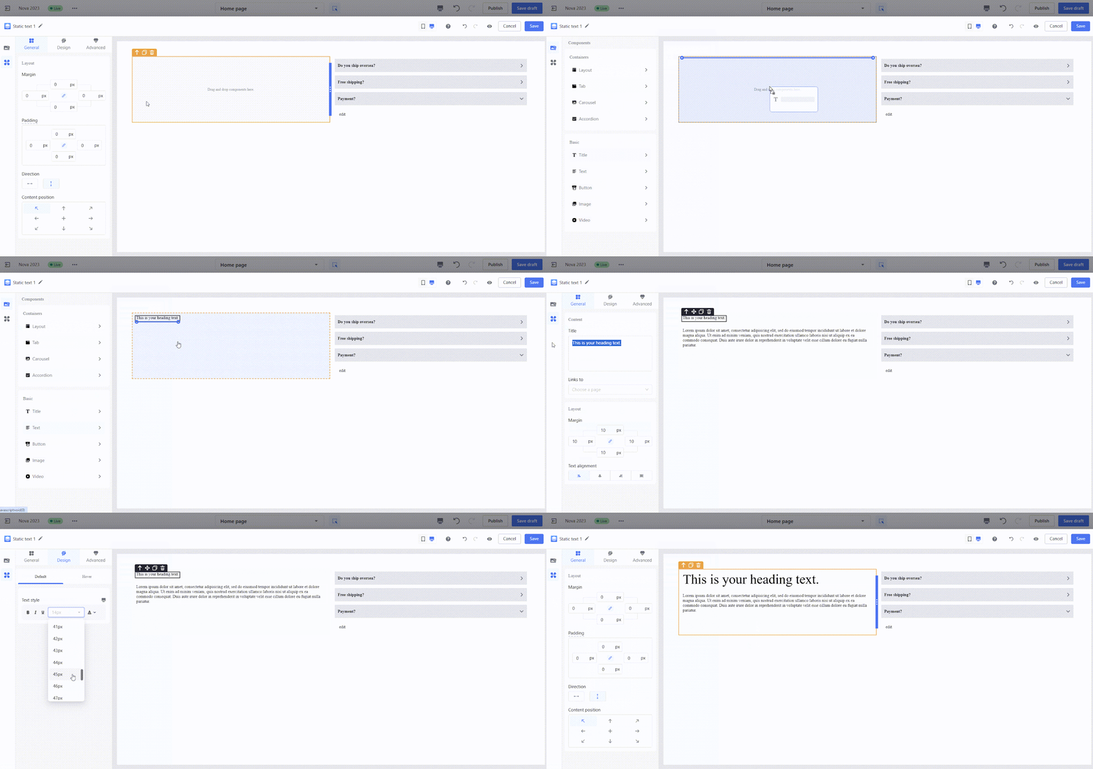
3. FAQ accordion style cards: Use layout containers and accordion components to build interactive FAQ sections for your site.

- Step 1: Select a two-column layout container and drag it onto the canvas. Add an accordion component to the right column.
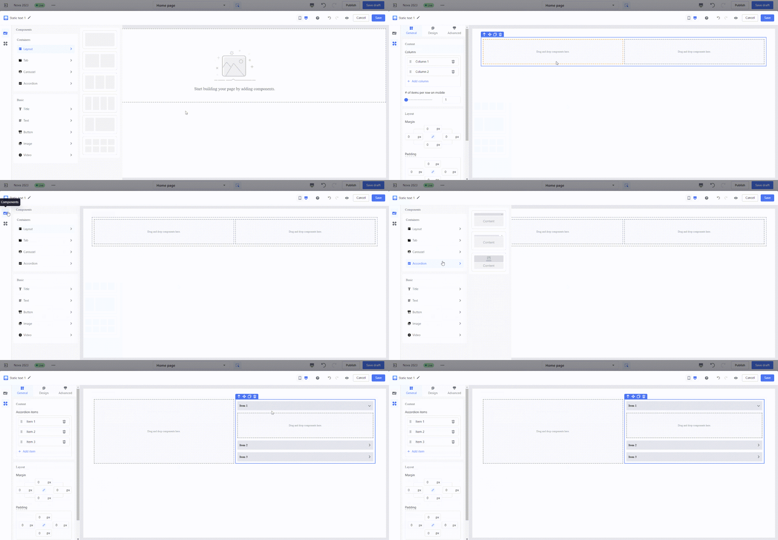
- Step 2: Enter text for the accordion panel titles in the configuration panel. Drag paragraph components into each panel's sub-container to fill in the content.
- Step 3: Drag paragraph components into the left column, configure the text styles, and complete your design.
Handy tips for efficient building
These tips will help you streamline your workflow and optimize your designs for both desktop and mobile devices.
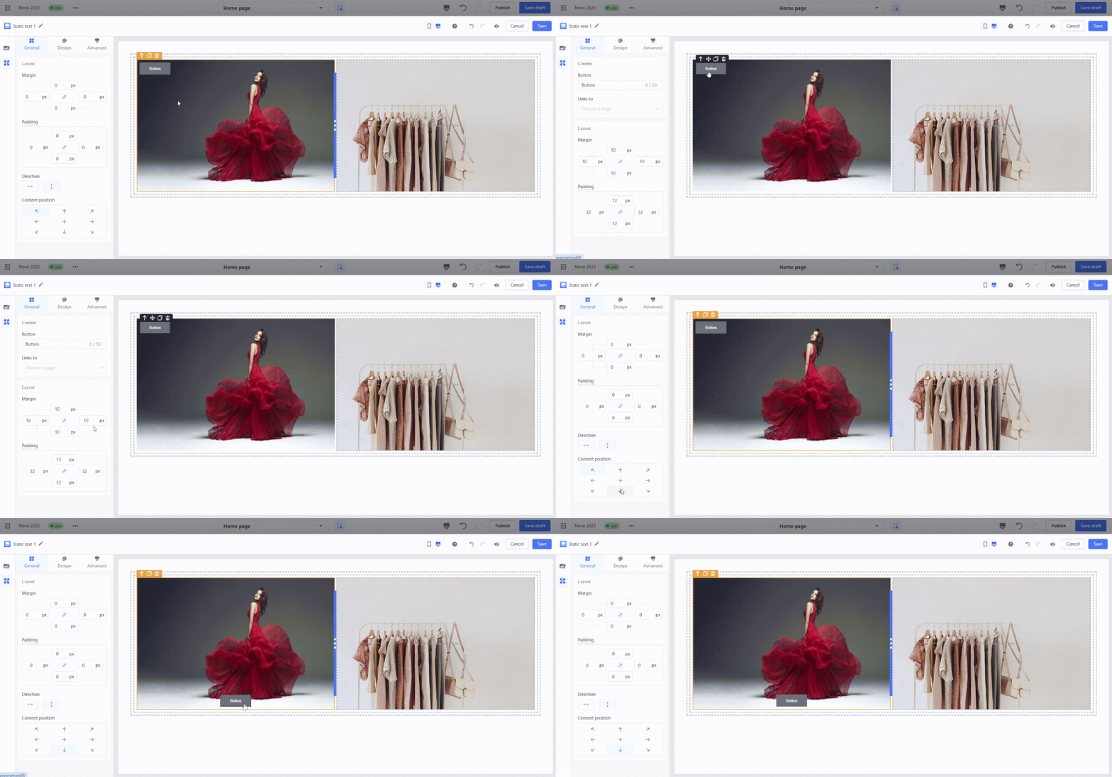
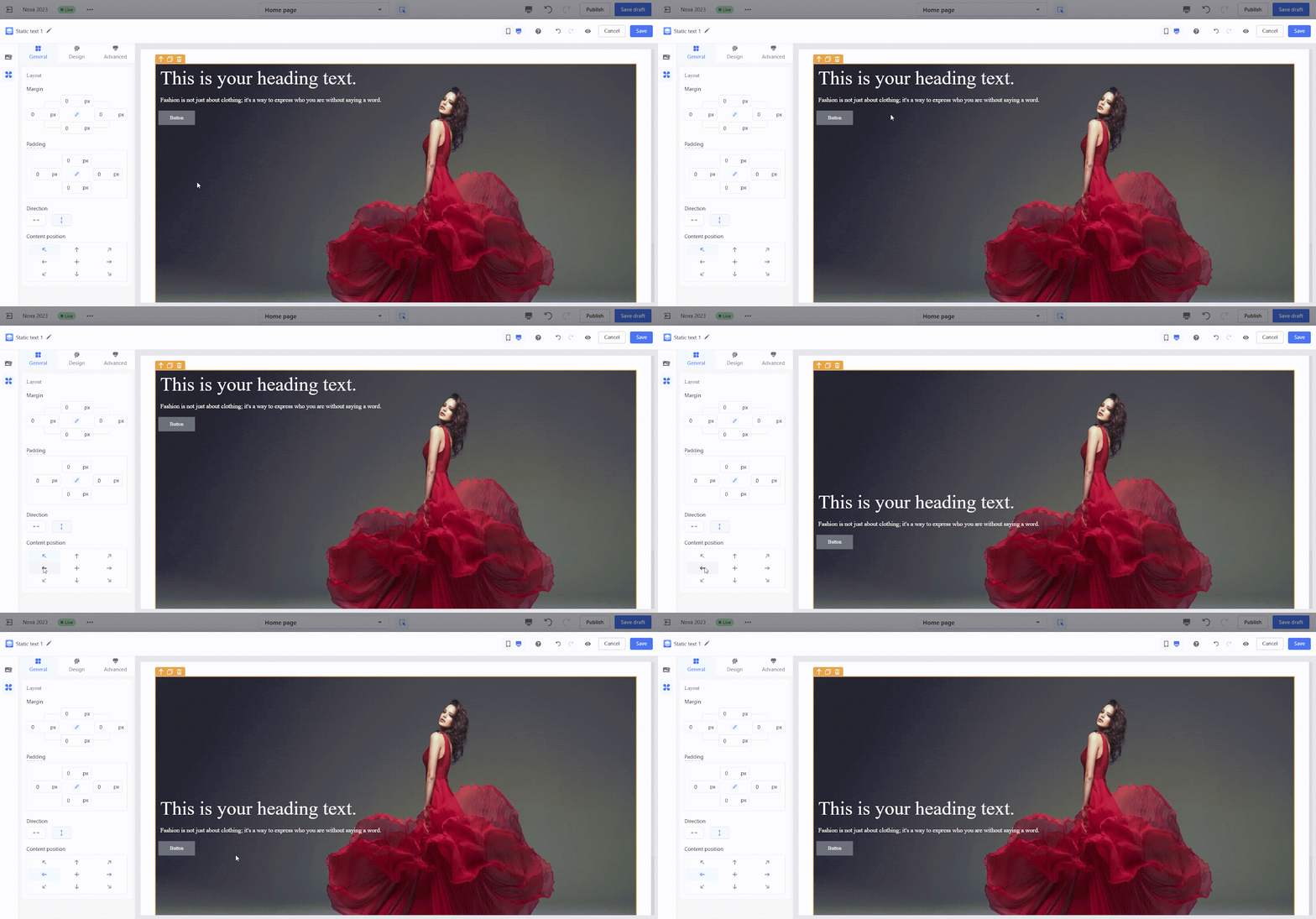
1. Quickly adjust content position: Use the Content Alignment option in the configuration panel to reposition text or buttons easily, ensuring a well-balanced layout.
- Example: Adjust text and button alignment to center-left for a more cohesive design.
2. Boost efficiency with copy-paste: Duplicate completed sections to reuse consistent styles across similar modules, saving time and maintaining uniformity.
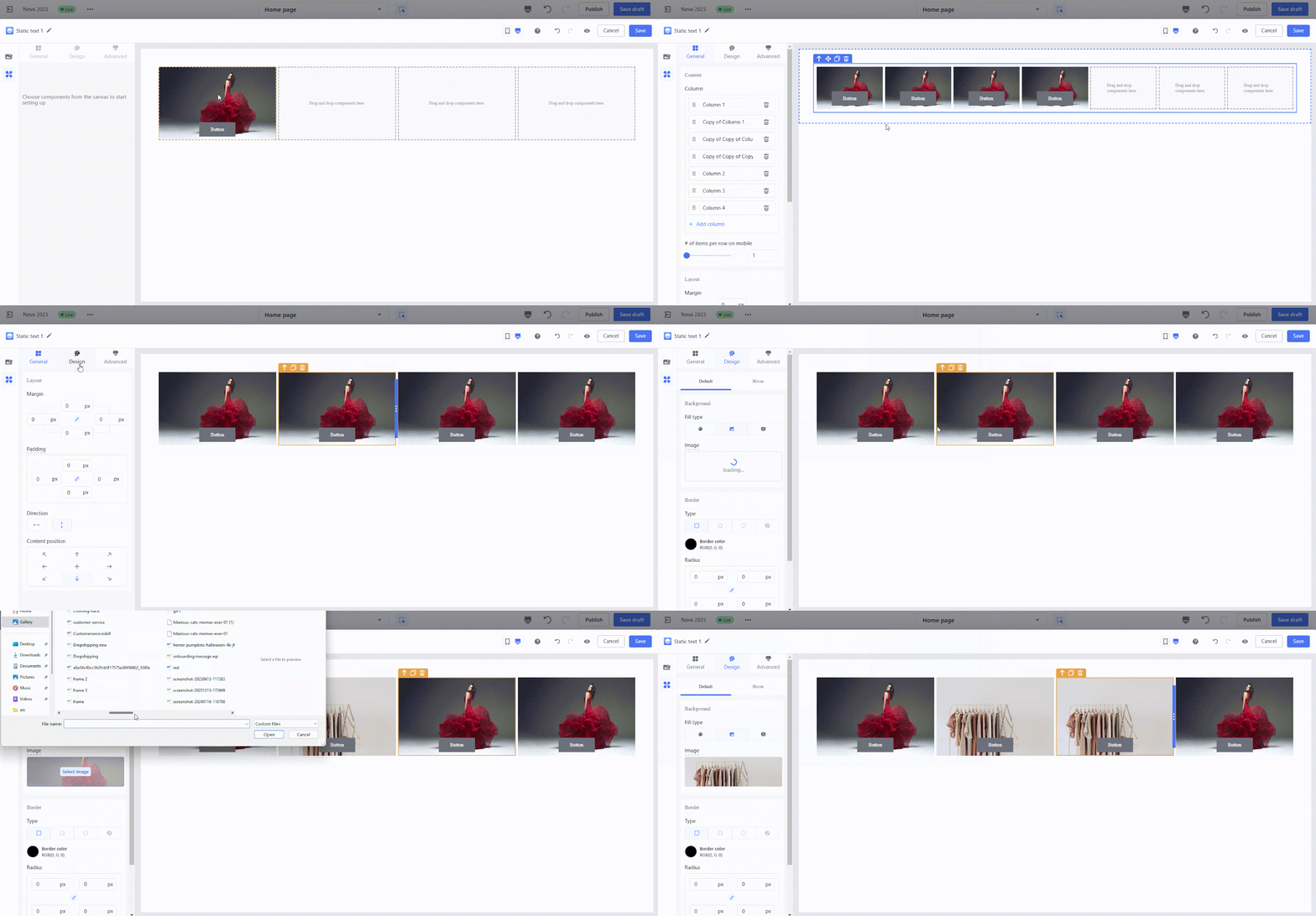
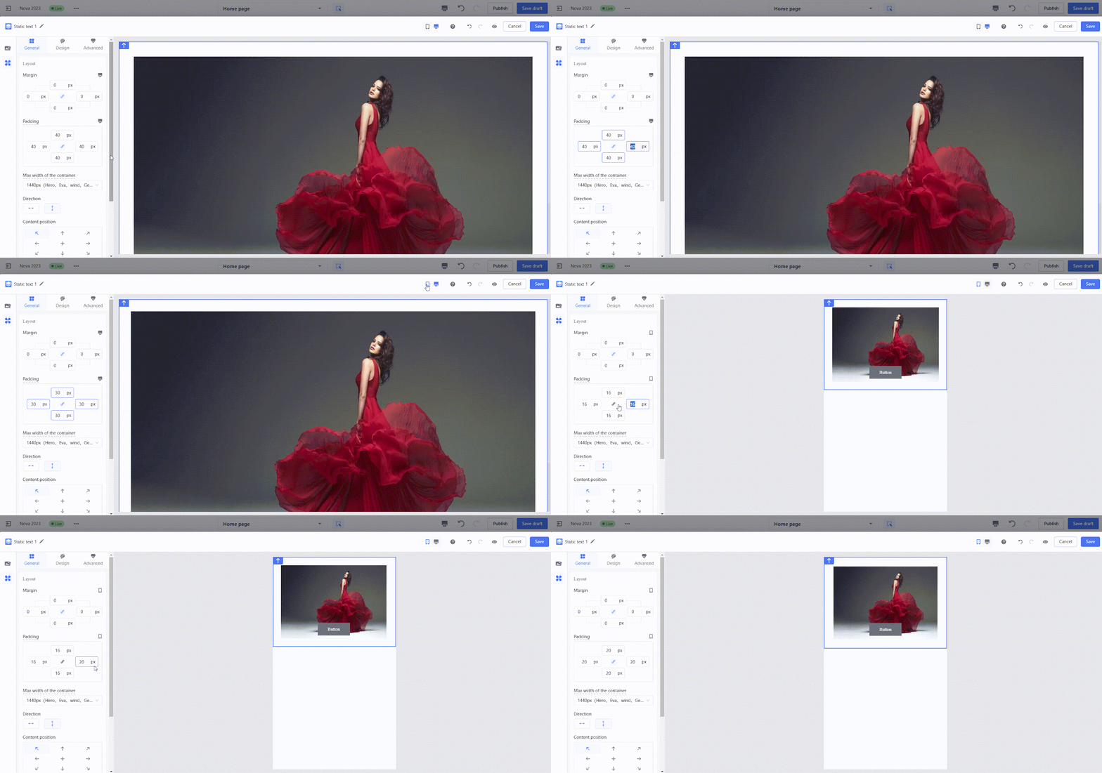
3. Optimize mobile and desktop views: Configure styles separately for mobile and desktop to ensure a seamless user experience on both devices. Adjust paddings, font sizes, and visibility settings for device-specific optimization.
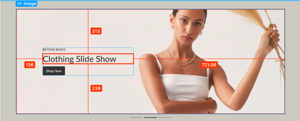
- Adjust component alignment: In some design scenarios, positioning components like buttons or text requires careful adjustment. For example, setting a 200px margin between a button and the top edge works well on desktop layouts but may cause alignment issues on mobile due to the narrower screen width.
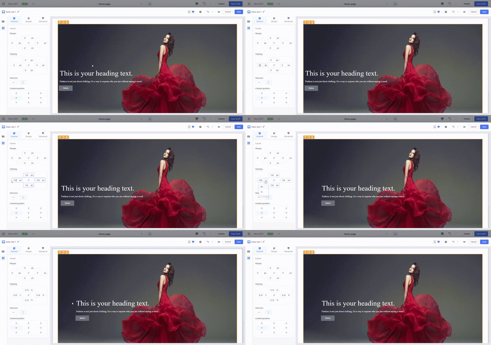
- Reposition components like buttons and text by:
- Step 1: Use the Content Alignment tool to align buttons or text. For example, move buttons and text to a center-left position.
-
- Step 2: Set the left padding of the layout container to 126px and switch the unit to %.
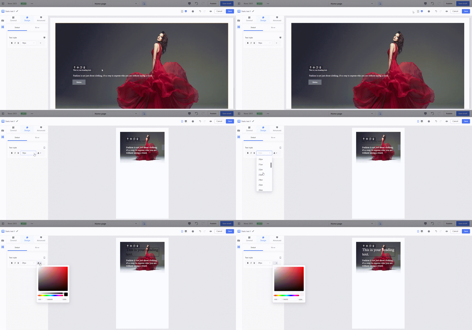
- Configure mobile font sizes: Larger font sizes suitable for desktop (e.g., >20px) may not display well on mobile. Adjust font sizes specifically for mobile to improve readability.
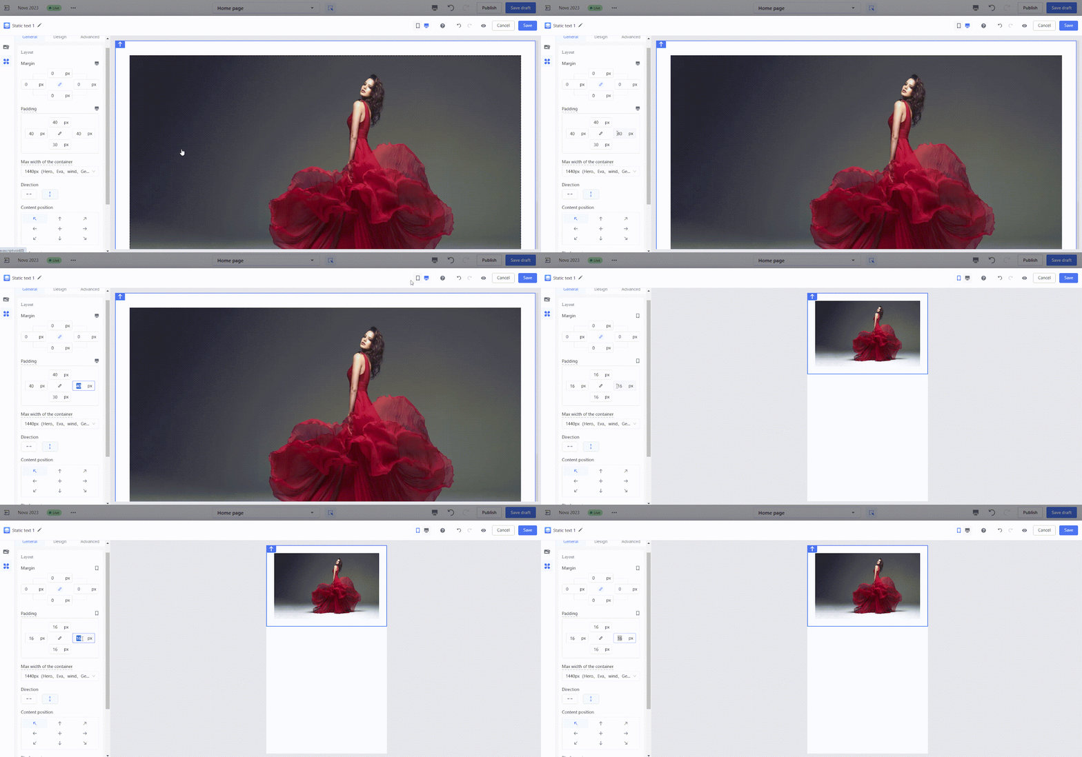
- Configure mobile and desktop paddings: Adjust the padding of the outermost container to adapt page spacing for each device.
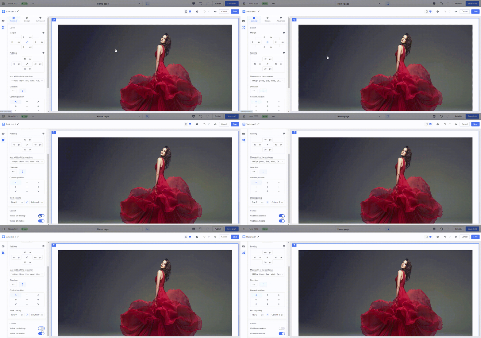
- Control card visibility: For layouts that differ greatly between desktop and mobile, use the PC Visible/Mobile Visible option to ensure cards are displayed appropriately for each device.
- Example: Configure two slideshow cards, one visible on desktop and the other on mobile. While both cards appear in the editor, only the appropriate card is displayed on the storefront based on the configured visibility.
Frequently asked questions
Find answers to common questions about using the Page Builder Editor.
1. How can I adjust card spacing to match different themes?
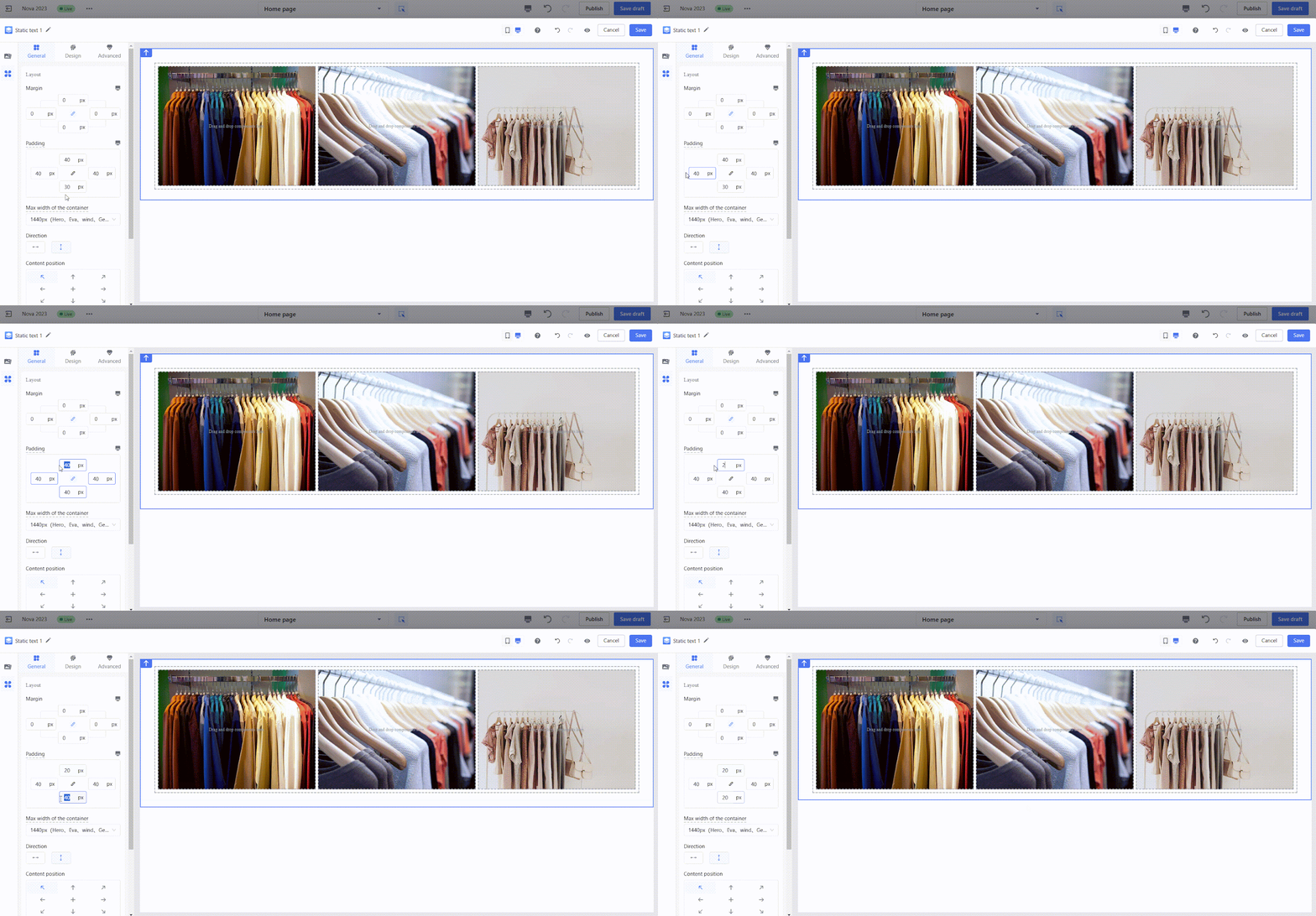
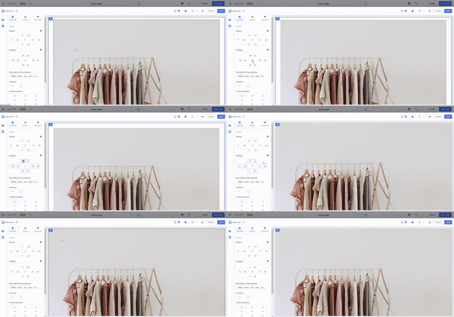
The width of the outermost container matches the page, but you can adjust its left and right padding to fit different themes or layouts:
- For themes: Every theme has its own spacing. Match the padding of the outermost container to the theme’s style.
- Example: If the Hero theme has a 40px margin on both sides, set the container’s padding to 40px in the editor to align perfectly.
- For full-width layouts: Some designs, like banners, need to stretch across the full width of the page. In this case, set the container’s left and right padding to 0.
- Example of regular layout (40px margins):
-
- Example of full-width banner:
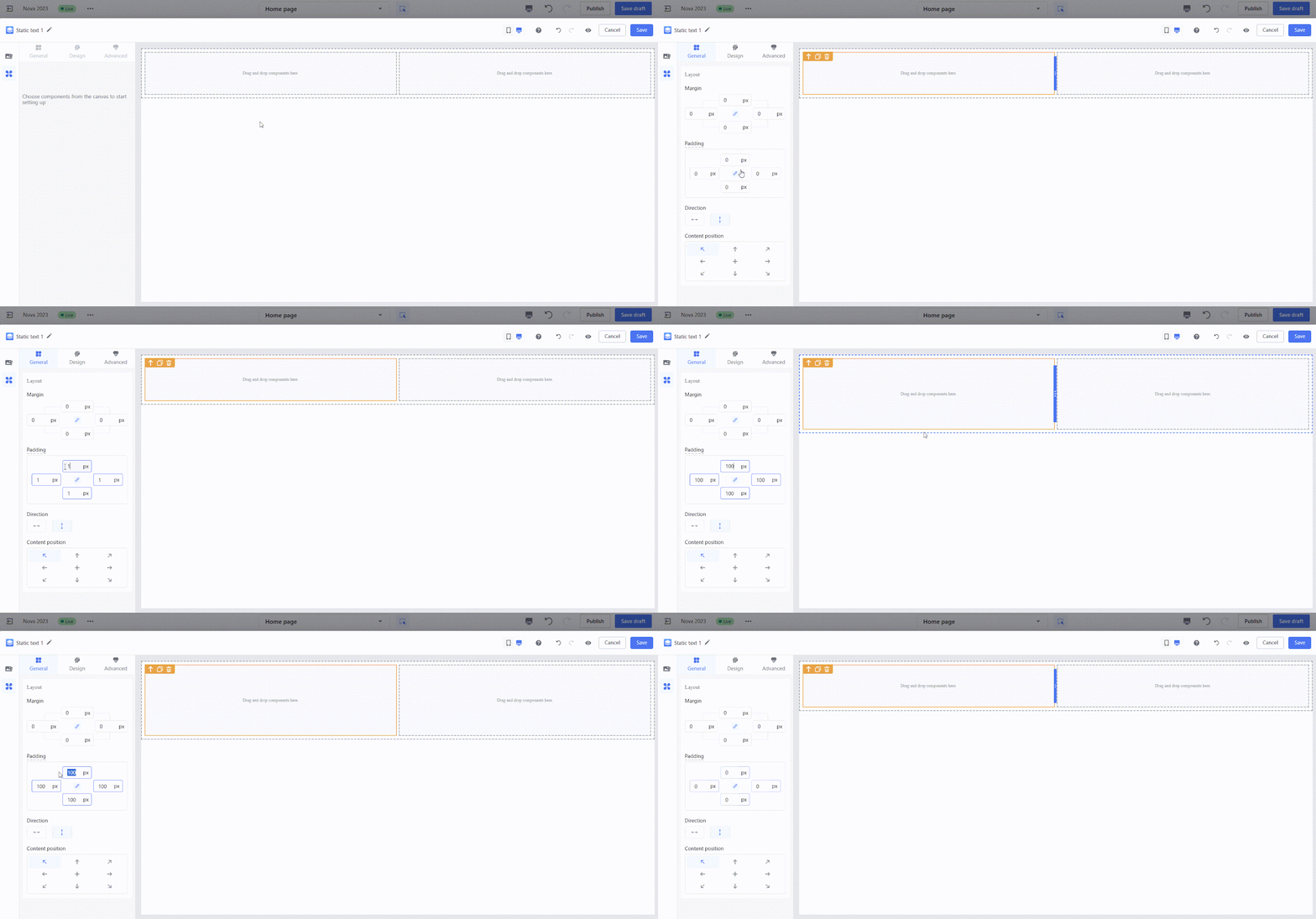
2. Why don’t my padding settings show on the storefront?
When you drag components into the canvas, the editor adds extra space around them by default to make editing easier. However, these default values don’t apply to the live storefront. Padding or margin styles will only appear on the storefront after you manually configure and save the values in the editor.
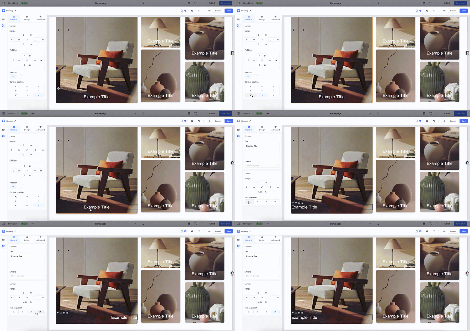
3. Why can’t I adjust the horizontal position of the title?
Titles span the entire width of their container, which prevents horizontal movement. To reposition titles, use the Text Alignment option to align them to the center or the right instead.
4. Is Page Builder compatible with all Shoplazza themes?
Yes, Page Builder works seamlessly with all Shoplazza themes and versions, so you can use it regardless of the theme you’re using.
Page Builder is a versatile tool that makes creating and customizing your e-commerce site easier and more intuitive. By understanding how to use its features effectively, you can create layouts that look great on all devices and fit seamlessly with your chosen theme. Take advantage of the flexibility it offers to design a storefront that truly reflects your brand.


Comments
Please sign in to leave a comment.