
Enhancing the way you connect with your audience through your website can significantly impact the overall user experience and efficiency of gathering valuable customer information. Form Tools offers a versatile approach to creating and customizing forms, allowing for a diverse range of effects on the front-end of your website. Currently, there are six widget types available for configuration within the Form Tools: Single Line Text, Multi-Line Text, Multiple Choices, Dropdown, and File Upload. This article will guide you through configuring these six widget types to create engaging and effective forms.
Accessing the Form tools app
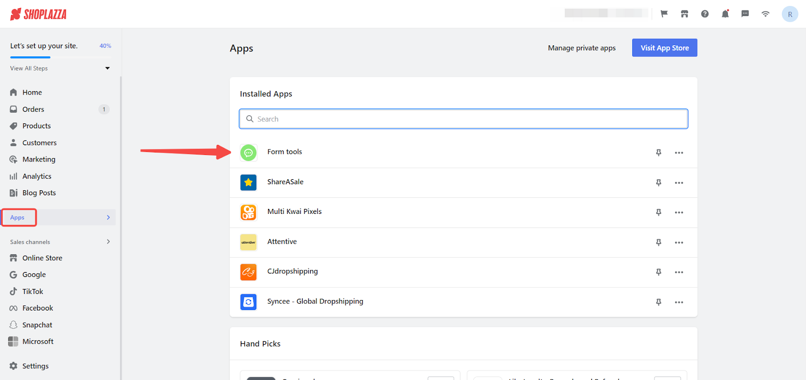
1. Access the app: From your Shoplazza admin, click on Apps. Search for the Form tools app among your installed apps and click to open it.
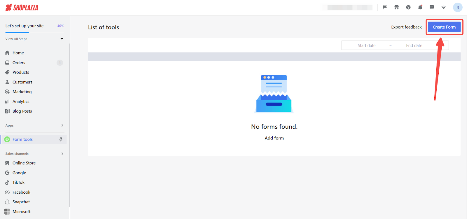
2. Create new form: Once in the app, begin by clicking the Create form button to initiate form setup.
Rule Configuration Overview
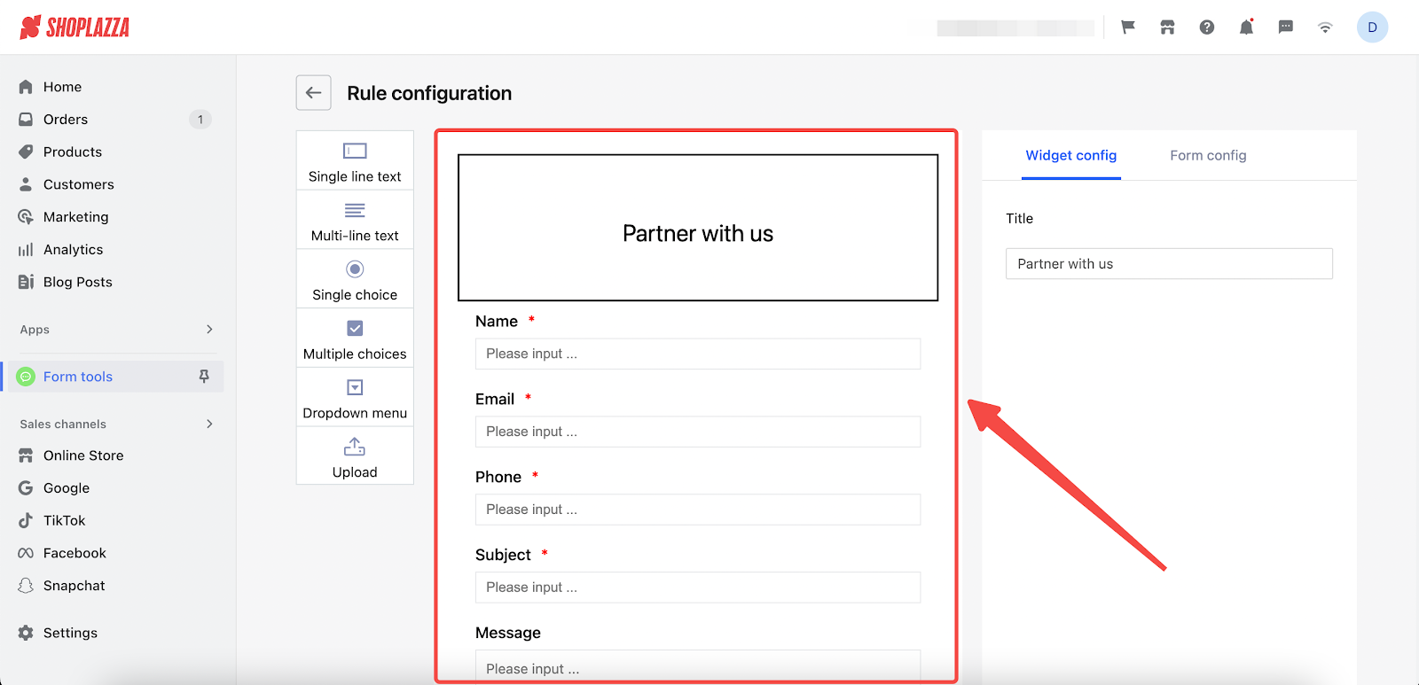
- Before diving into the specifics of each widget, familiarize yourself with the default settings on the Rule Configuration page, which includes a sample form titled "Partner with us" and fields such as Name, Email, Phone, Subject, and Message, demonstrating a range of input types from Single Line Text to Multi-Line Text.
Configuring Widgets
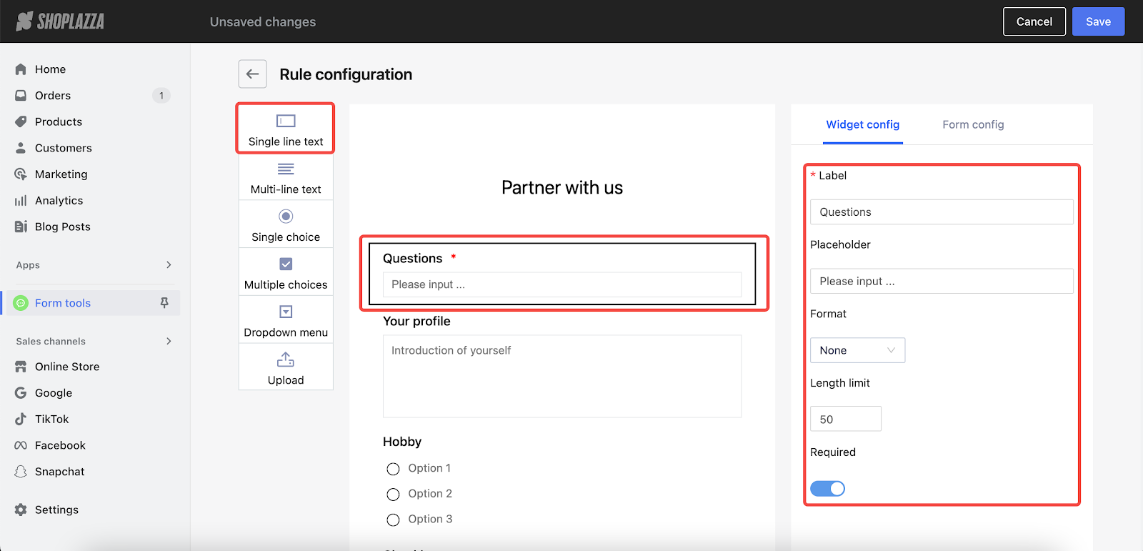
1. Single line text
- Label: Name your section.
- Placeholder: Provide text guidance to help users understand what information to enter.
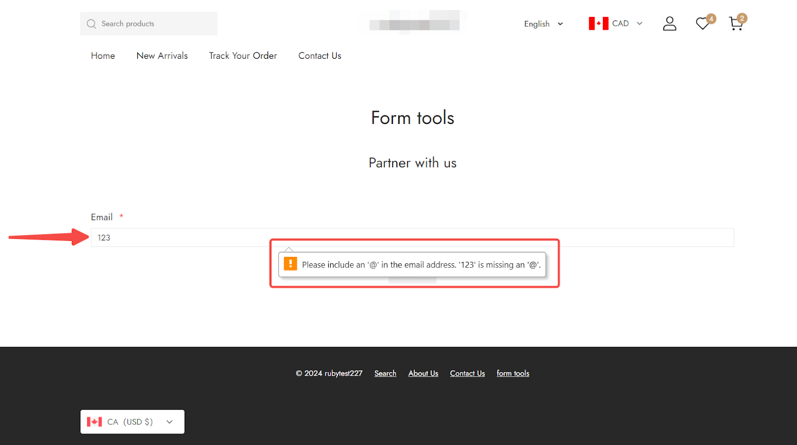
- Format: Choose from None, Number, or Email for text formatting.
- Length limit: Set a limit up to 1000 characters.
- Required: Toggle on/off to make this section mandatory.
Note
Email format ensures email address validation, and Number format accepts only numerical input.
- Preview the form with email and number format: To ensure your form is functioning correctly, visit your storefront and test the fields.

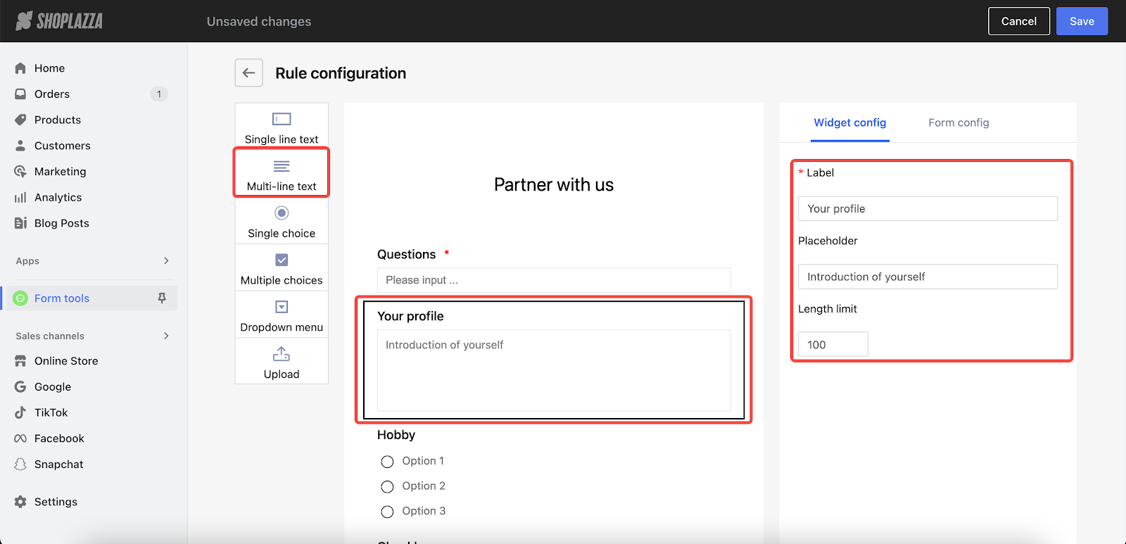
2. Multi-line text
- Label: Assign a name for this section.
- Placeholder: Offer guidance on the expected input.
- Length limit: Allow up to 1000 characters.
Note
This widget supports paragraph breaks for detailed information input.

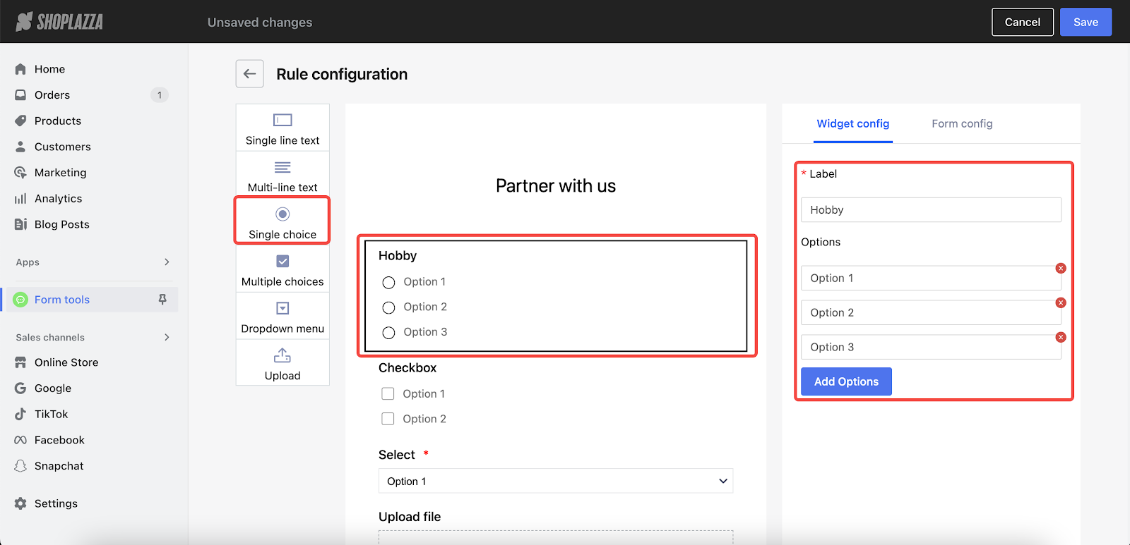
3. Single choice
- Label: Input a name for this section.
- Options: Edit the option text and click on Add Options to add more up to a maximum of 10.
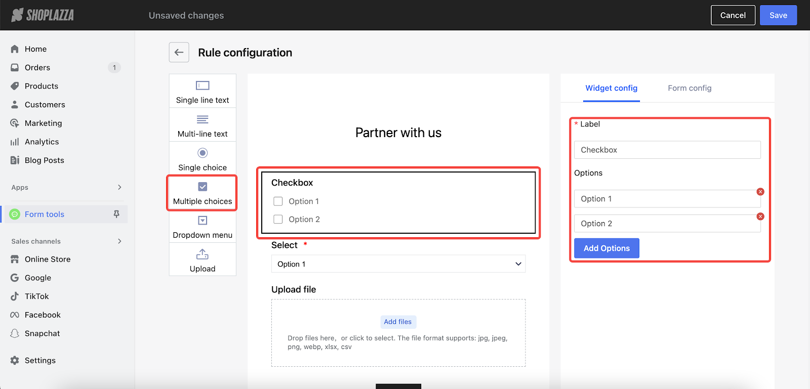
4. Multiple choices
- Label: Name this section.
- Options: Edit the option text and click on Add Options to add more up to a maximum of 10.
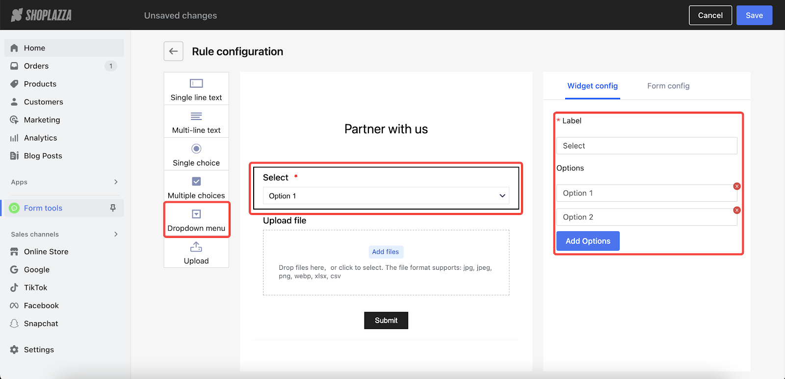
5. Dropdown menu
- Label: Define this section's title.
- Options: Edit the option text and click on Add Options to add more up to a maximum of 10.
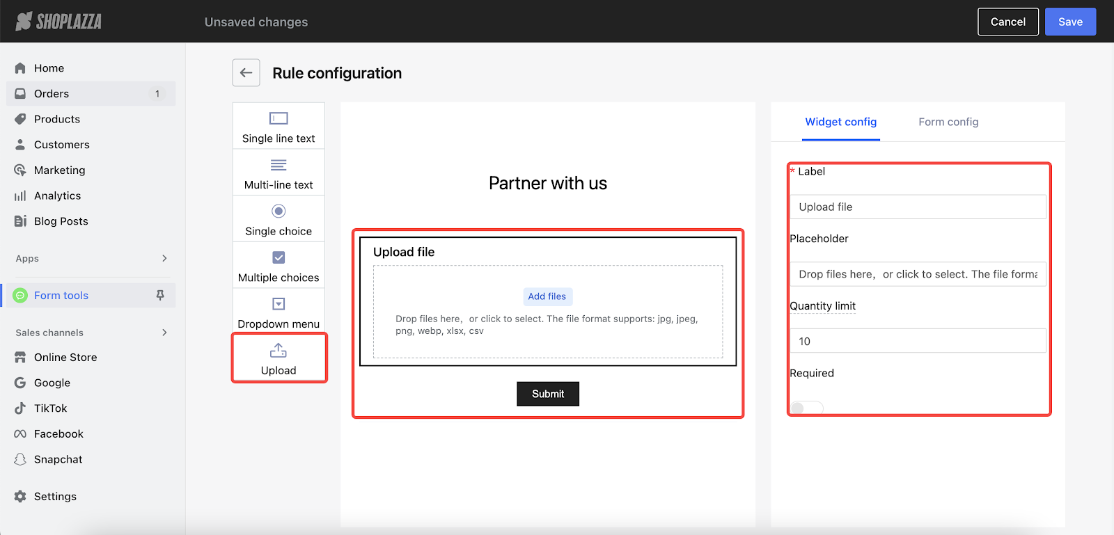
6. Upload
- Label: Input a name for this section.
- Placeholder: Input text guidance here to assist customers in understanding the kind of information they should provide.
- Quantity limit: Set a file limit up to 20.
- Required: Decide if this section is mandatory.
Note
Files should be under 5MB, acceptable formats include jpg, jpeg, png, webp, xlsx, and csv.
Adjusting Position
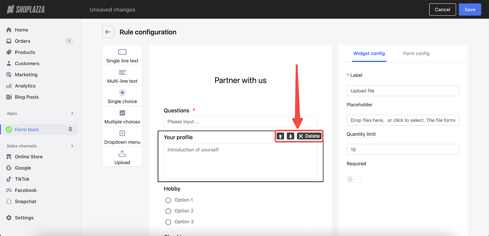
- Refine form layout: Adjust the arrangement of form elements to your preference using the Up and Down arrows for sequencing or the Delete button to remove unnecessary fields.
By configuring these widgets in the Form Tools, you can create customized forms that not only gather essential customer data but also enhance the interaction between your online store and your customers. This customization leads to a better understanding of your customer base, improved user experience, and ultimately, increased engagement and sales.


Comments
Please sign in to leave a comment.