The App design section in MoCart lets you tailor your app to your needs. With a simple drag-and-drop feature, you can create or modify content on a canvas. This article serves as a quick look at the various interfaces that will be part of your app. For more in-depth guidance, see the articles linked at the end of this page.
This article is only an introduction and preview to the interfaces your app will contain. For detailed instructions, please refer to the linked articles at the end of this article.
Homepage interface
This is the first page your customers will see when they open your app. The design you choose here plays a big part in shaping your brand image.

Collections page
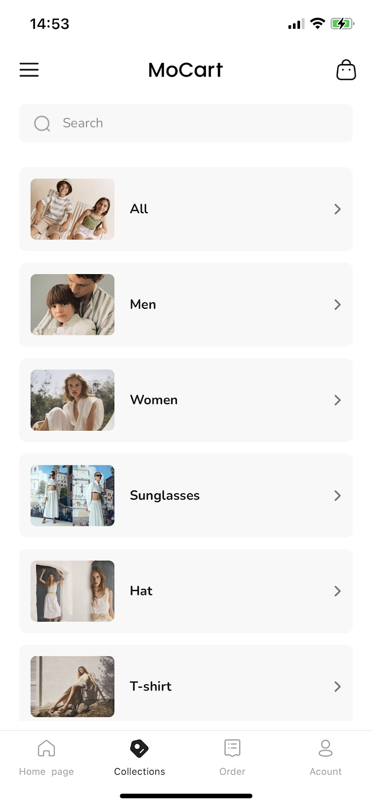
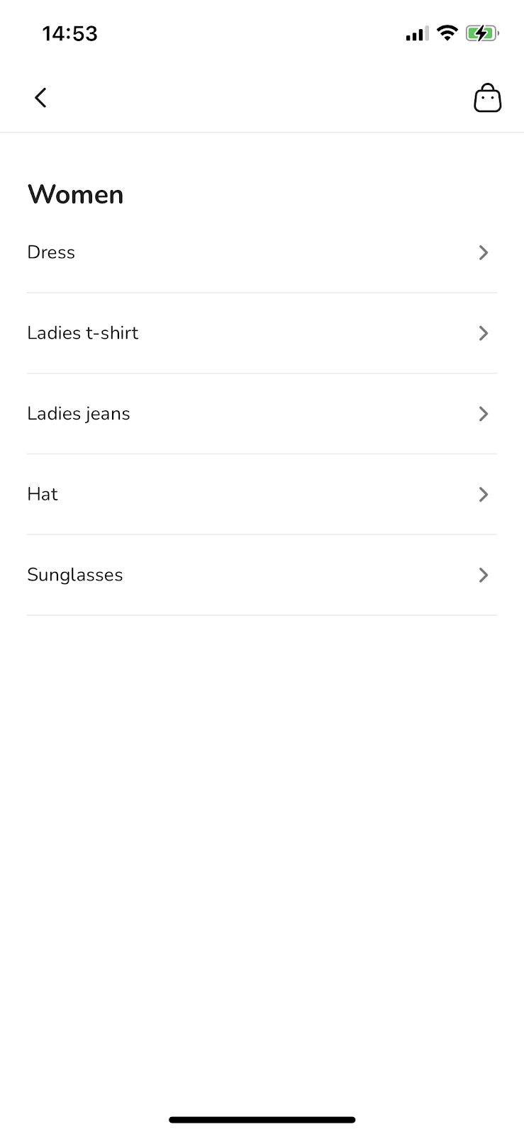
The collections page displays a menu with multiple collections and subcollections. Adding this page to your app's bottom navigation bar makes it easy for your customers to access. It presents a streamlined view of all your collections.
 |
 |
Note
For easier navigation, name your collections based on what they contain. For more on this, see Customizing menus in your MoCart app.
Shopping cart page
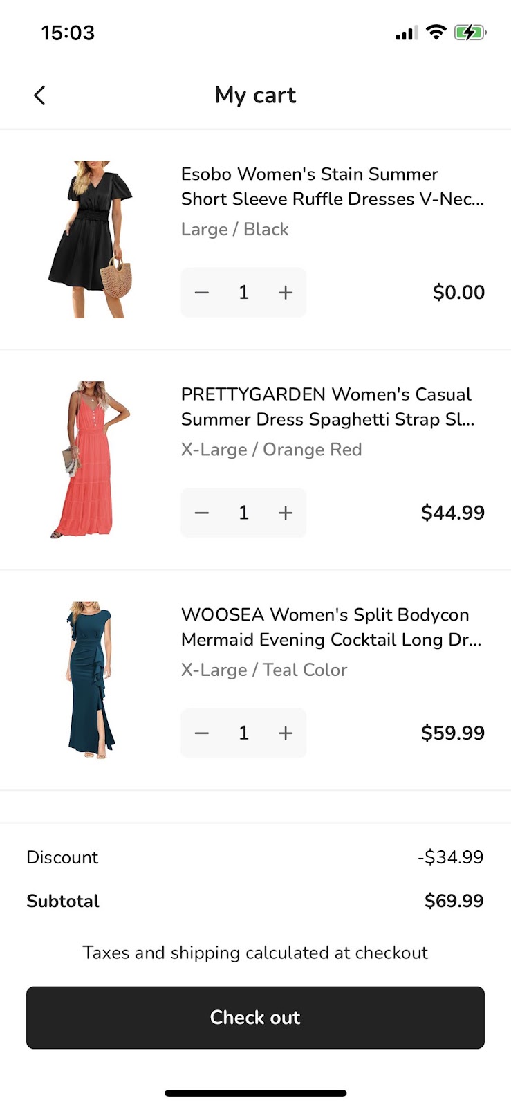
This page lets your customers view all items added to their cart.
Order page
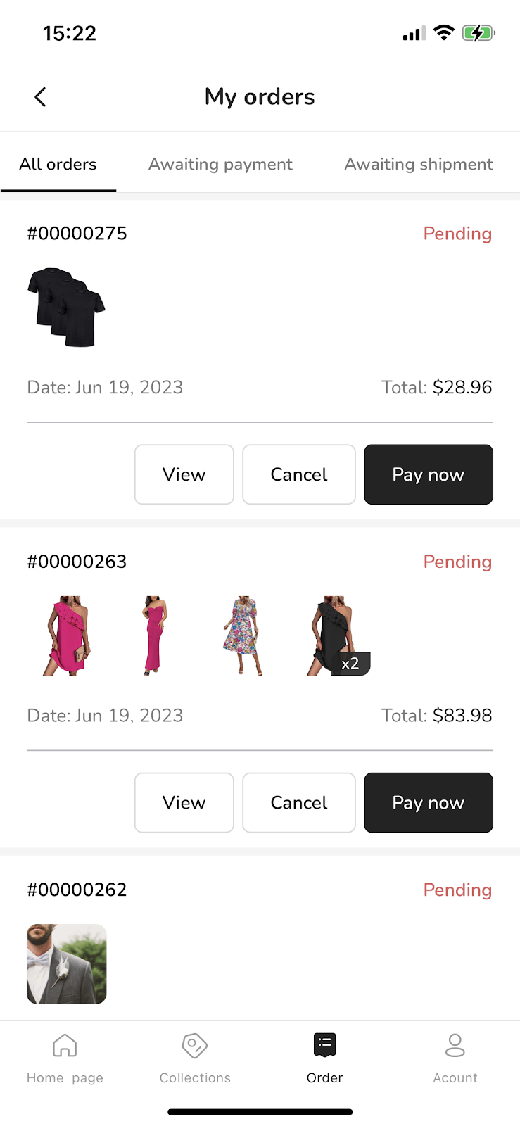
This page lets your customers view their order history, including both completed orders and those still in pending.
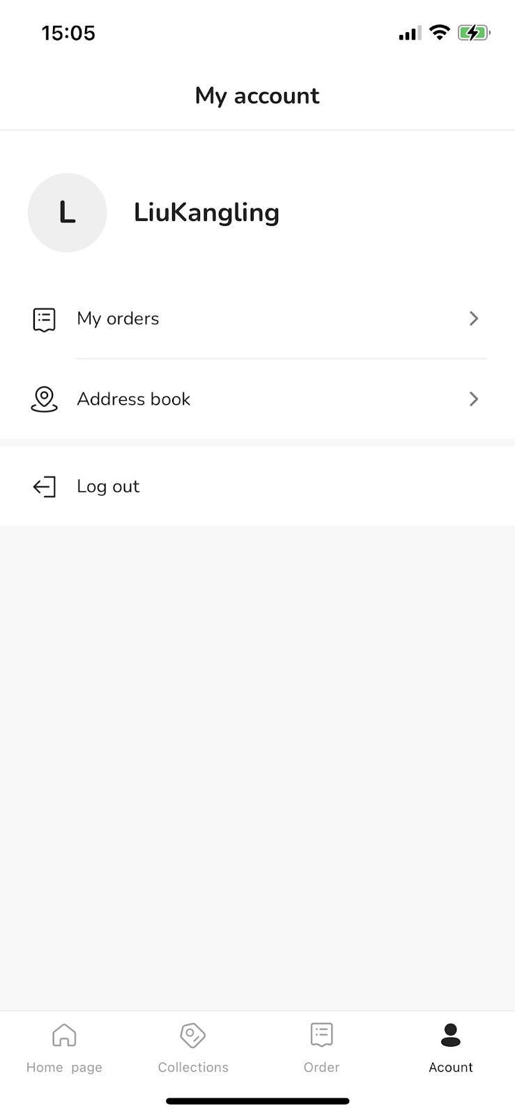
Account page
Customers can access various sections from here to view their orders or manage shipping addresses. Note that access to this page is available only to customers with an account.
Customized page
You have the freedom to add extra personalized content to your app by editing the menu section. This can include blogs, social media links, or size charts.


Comments
Please sign in to leave a comment.