
As eCommerce traffic costs continue to rise, landing pages have become essential for building trust and turning visitors into customers. A well-designed landing page can significantly boost conversion rates by guiding users from initial interest to final decision. This guide explores the logic behind high-converting landing pages and how to design and optimize them effectively.
Recommended analysis tools
Before designing your landing page, gather insights from competitor websites using reliable analysis tools. These tools can help you uncover hidden data and identify what works in your niche.
1. Traffic and ranking tools (e.g.,SimilarWeb ): Understand your competitor’s traffic sources, ad strategies, and top-performing channels across paid, organic, and social media.
2. Keyword and SEO tools (e.g.,SEMrush ,Ahrefs ): Analyze advertising logic, discover high-performing keywords, and avoid ineffective or overly competitive terms.
3. Advertising strategy tools (e.g.,BigSpy ,AdSpy ): Track global ad placements and refine your cross-channel delivery strategies based on what top competitors are doing.
Landing page conversion logic
While landing page design varies across industries, the core logic behind successful pages remains consistent: guiding users through the stages of awareness, trust, and decision-making. This logic can be broken down into four pillars: stimulating interest, enabling efficient browsing, building trust, and driving conversion.
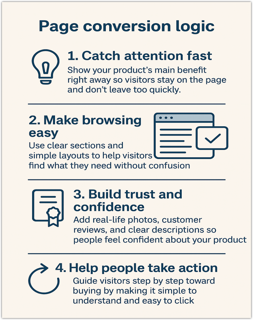
Stimulate interest
The first impression matters. Your landing page must immediately engage visitors and reduce bounce rates by delivering value within seconds.
1. 3-second rule: Present attention-grabbing copy, scenario-driven visuals, and a clear call-to-action (CTA) within the first screen to address customer needs instantly.
2. Ad consistency: Ensure strong alignment between the ad and landing page. Misleading content disrupts narrative flow and increases bounce rates, hurting your ad performance.
3. Consistent visual style: Use a unified design language with no more than three core colors to keep the layout clean and visually appealing.
Efficient browsing
Present information in clear sections to help visitors quickly find what they need. A streamlined layout improves readability, reduces decision fatigue, and keeps users engaged. Aim to keep the entire landing page within 3 to 5 scrollable screens.
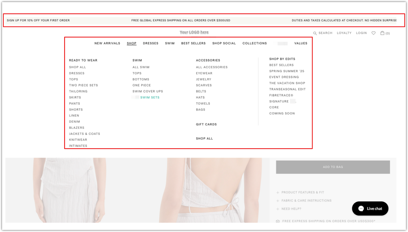
1. Header design: Create a streamlined top section with fixed elements. Your landing page header should stay consistent and accessible as visitors scroll. It guides browsing and introduces promotions, all while reinforcing your brand identity. A well-designed header includes functional navigation, key user tools, and attention-grabbing announcements.
- Logo: The logo should reflect your brand’s style and link back to the homepage. A professional-looking logo helps set a strong first impression.
- Search bar: Commonly shown as a magnifying glass icon. Enhance it using an Smart product search to display popular search terms, related keywords, and autocomplete suggestions.
- Personal center: When not logged in, hovering should show a prompt like “Register/Login.” Clicking takes the visitor to their account management page.
- Shopping cart: A small red bubble shows the current number of items in the cart. Clicking the icon lets customers view or edit their cart.
-
Carousel bulletin board: Use a rotating announcement banner to highlight time-sensitive updates or customer-focused messages. This offers a better visual impact than a static board and keeps users informed without cluttering the interface. Example messages include:
- “Launching new products for spring and summer 2025 – buy now.”
- “Register to enjoy 10% off your first order.”
- “Free worldwide shipping on orders over $300.”
- Menu navigation: Keep your navigation clear and concise. Use a tiered menu structure with hover effects to reveal more categories without overwhelming visitors. Limit the depth to three levels. The first-level menu should summarize key product categories, with subcategories shown only on hover to maintain a clean layout.
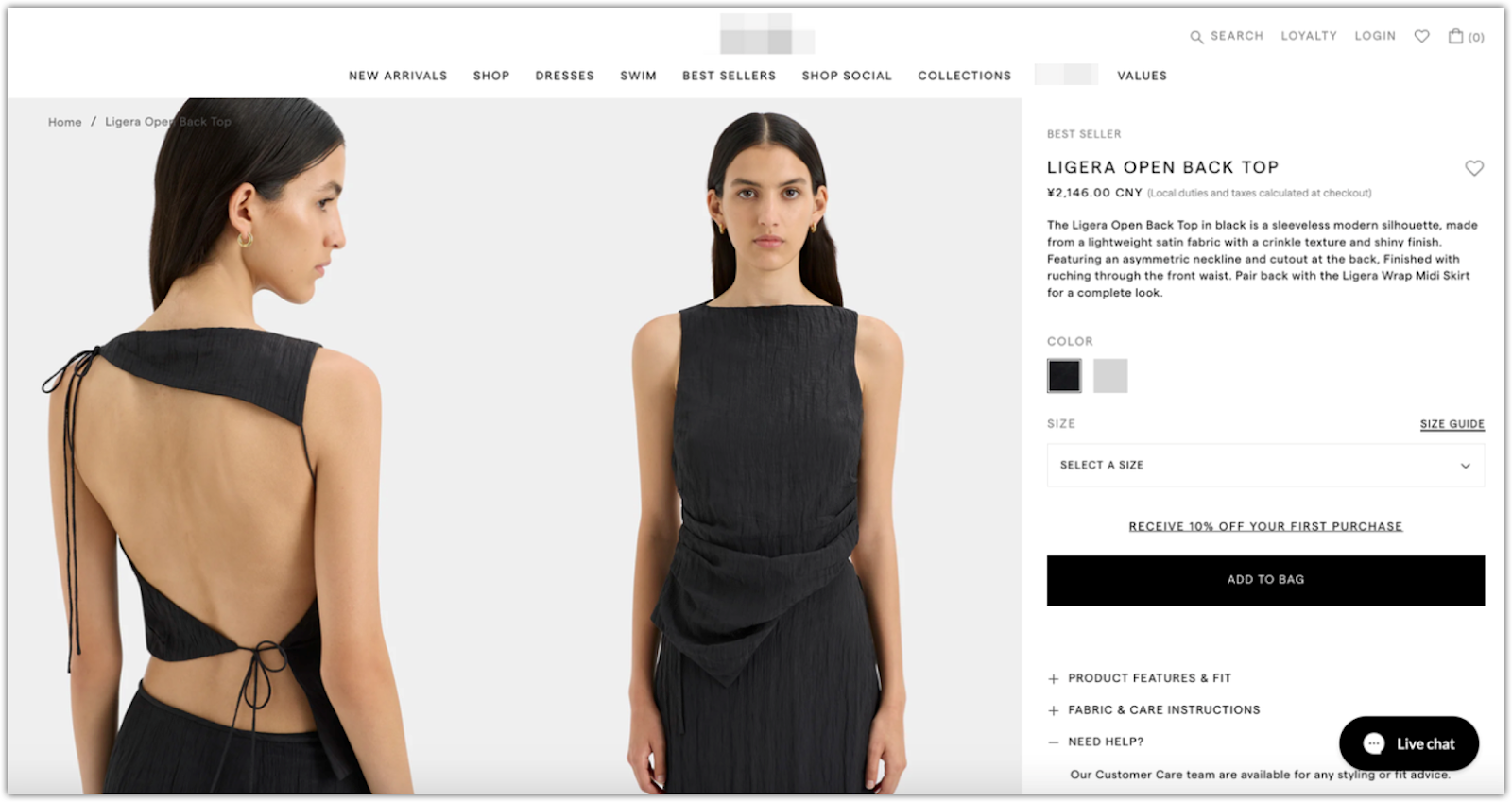
2. Product section: Present key product information in a structured layout. The main body of your landing page should guide visitors through product details with a logical visual flow. This section must capture attention, communicate value, and make it easy to explore features and options. Structure the content into visual and informational layers to support different user behaviors.
- Title and main images: Display the product name clearly, followed by a concise subtitle to explain selling points. Use multiple images from different angles to give a complete visual experience.
- Detailed product description: Include important specifications such as materials, fit, sizing reference, and regional availability. Make sure the content is easy to scan while still informative enough for decision-making.
- Local currency pricing: Automatically detect the visitor’s IP address to show prices in their local currency. Clearly indicate if taxes are included to prevent confusion at checkout.
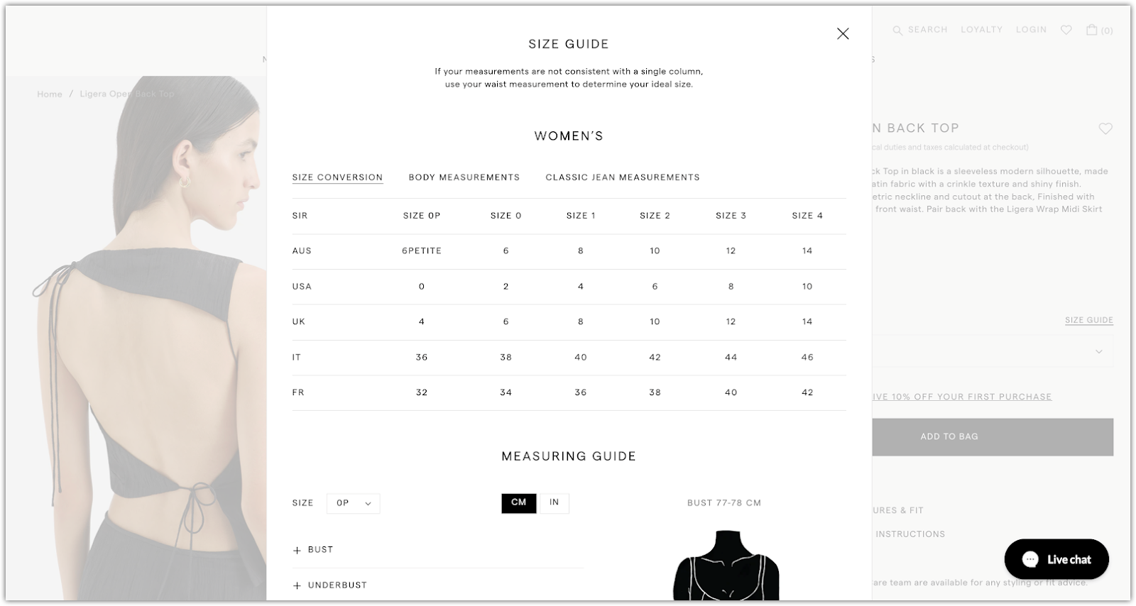
- Style and variant selection: Allow customers to choose product options (e.g., size, color, style) with intuitive controls. Show inventory status, and include a size chart using both metric and imperial units for clarity.
-
Information layering for readability:
- Always-visible content: Keep core product features immediately visible so users can understand the value at a glance.
- Collapsible content: Use dropdowns or expandable sections for secondary content like usage instructions, scenario-based FAQs, or test reports to reduce visual clutter.
-
Trust-building elements: Add visual indicators like:
- Number of current viewers
- Total sales volume
- Secure payment icons
- Shipping and delivery time guarantees
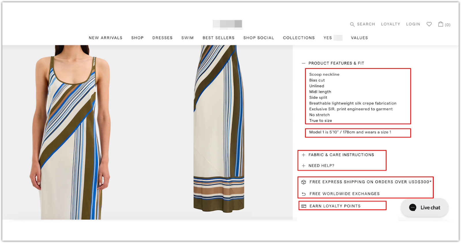
3. Decision-making layer: Drive action with clear CTAs and purchase incentives. Once a visitor has explored the product details, your landing page should guide them toward making a purchase. This section focuses on creating a smooth path to conversion by ensuring your calls to action are always visible, and your product offerings are reinforced with smart upsell tactics.
- Clear CTA buttons: Add a prominent and visually distinct “Add to Cart” or “Buy Now” button. Use an Add to Cart setting app to ensure the CTA remains visible even as users scroll, minimizing hesitation and making it easy to take action.
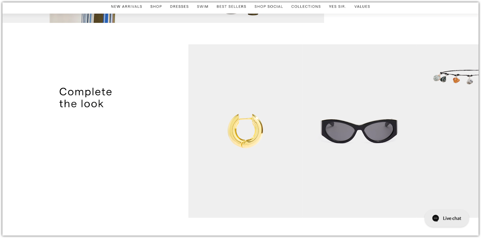
- Cross-selling and product recommendations:
Encourage higher order value with complementary product suggestions:
-
- Bundled sets: Offer packages that combine related products at a discounted rate.
- Matching products: Recommend items that pair well with the main product, such as accessories or coordinated items.
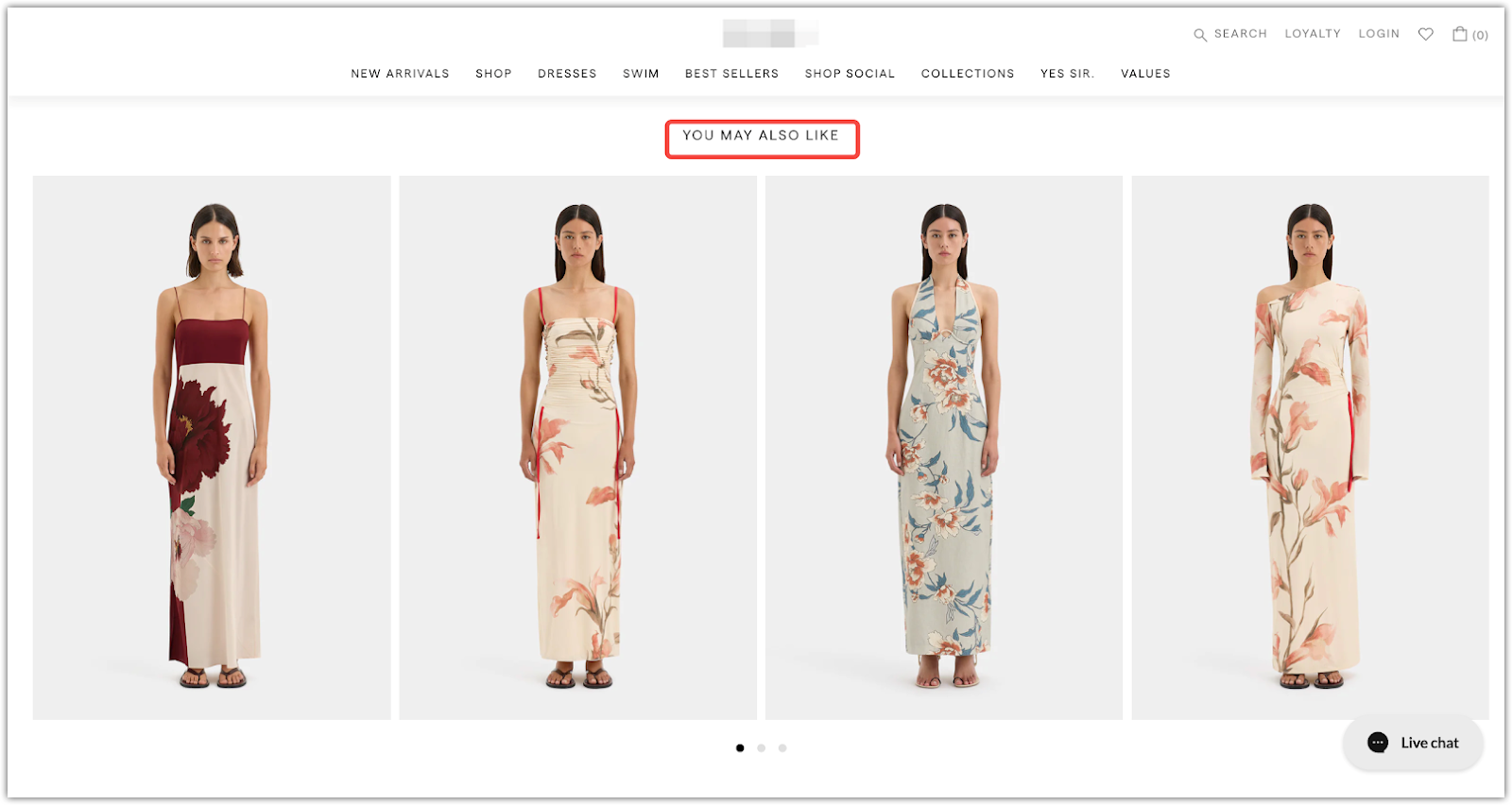
- You may also like: Use browsing behavior or popularity trends to surface related products that spark further interest.
4. End-of-page design: The final section of your landing page should provide reassurance, build emotional connection, and offer ways to stay engaged. It’s your last chance to support decision-making, extend brand presence, and capture future conversions.
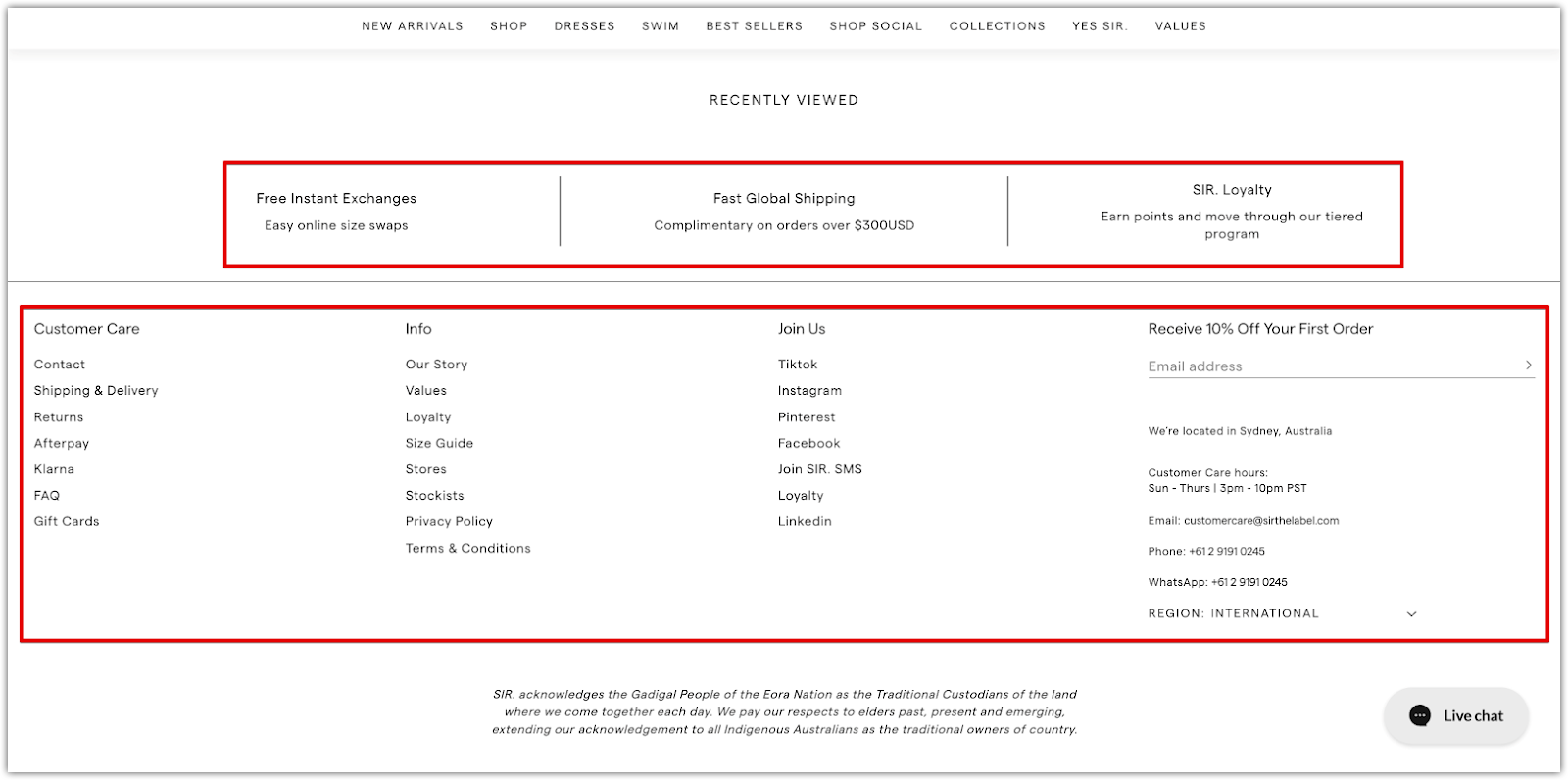
- Policy transparency: Use clear visuals and plain language to explain key policies like payment methods, return procedures, and delivery timelines. This helps reduce uncertainty and boosts buyer confidence.
- Brand stories and values: Share your brand’s mission, history, or design philosophy to create emotional resonance with your audience. Authentic storytelling can help convert casual visitors into loyal customers.
- Social media links: Connect your landing page to your brand’s social platforms. Encourage customer engagement, highlight user-generated content, and shape a broader brand narrative through the community.
- Email subscription form: Keep it minimal to avoid overwhelming the design. Offer a small incentive (such as a discount or exclusive access) to encourage sign-ups and create an opportunity for remarketing.
- Customer service hours and support links: Clearly display service availability and the corresponding time zone. Include a link to your FAQ page or help center to answer common questions and reduce the volume of repeat inquiries.
Increase the frequency of trust interventions
Throughout the landing page, insert multiple touchpoints that reinforce trust. These elements help customers feel more confident in their purchase decision by providing real-world validation and professional endorsements.
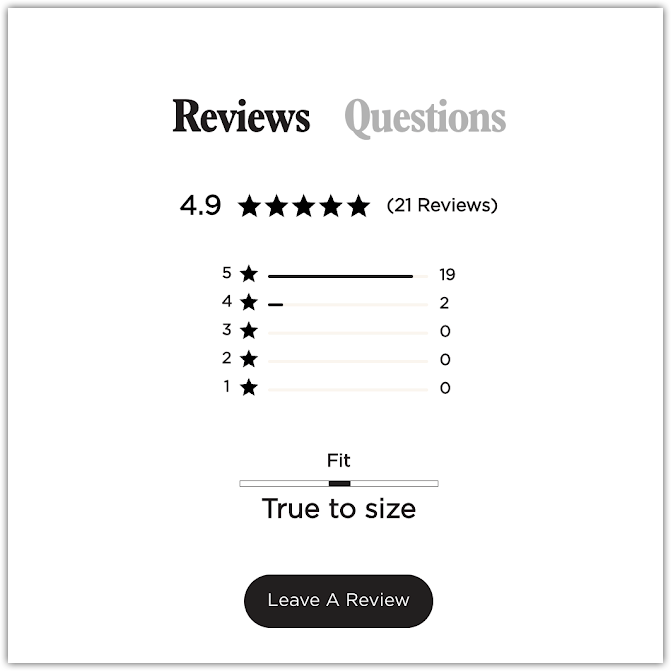
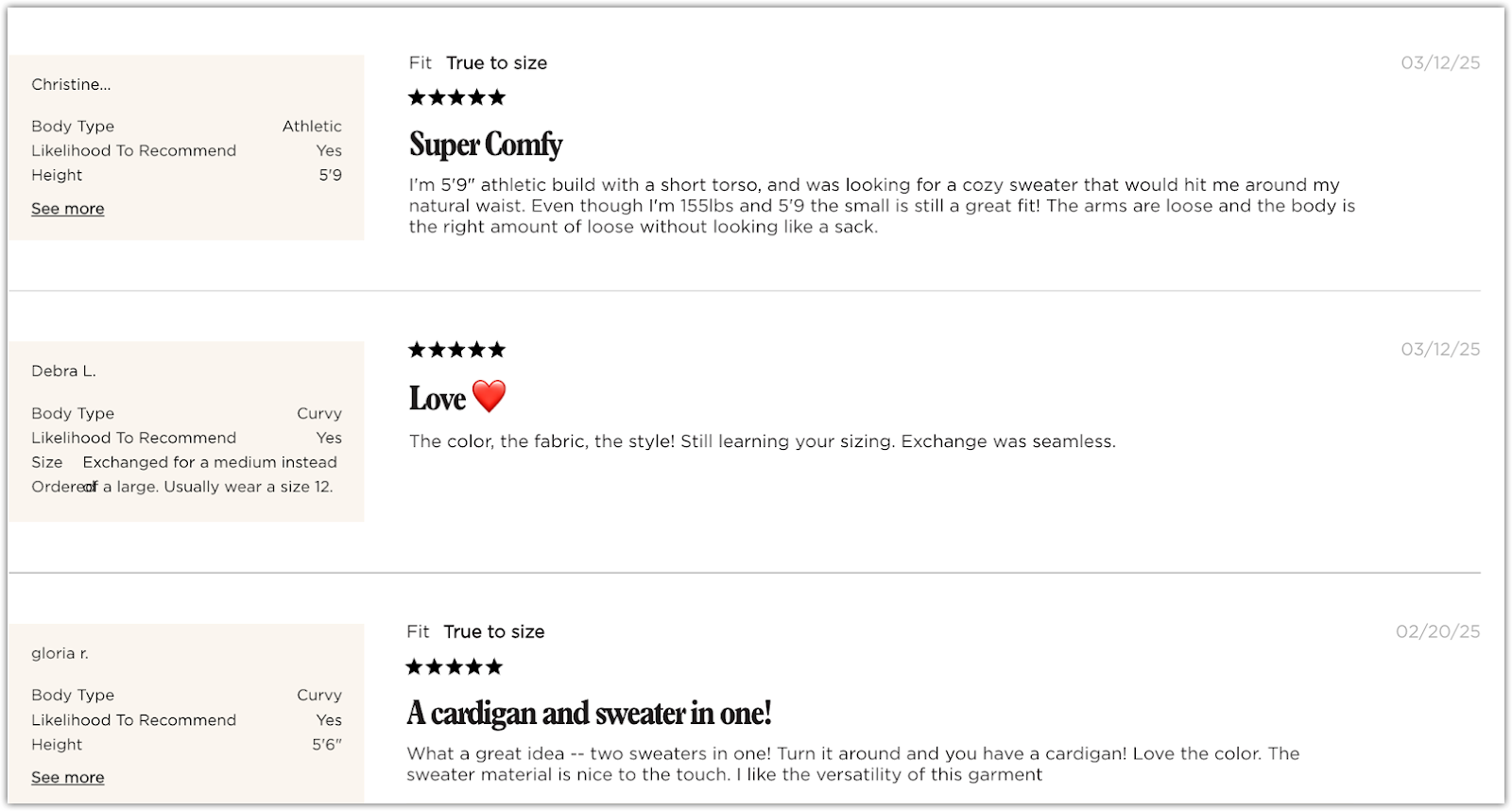
1. Customer review wall: Highlight real reviews to create social proof. Prioritize fresh content with user-generated images or videos and show a mix of star ratings to improve authenticity. This not only builds trust but also helps answer potential objections.
2. Authoritative endorsements: Display third-party validations to strengthen credibility. Examples include:
- ISO certifications
- Membership badges from industry associations
- Features or reviews in credible media outlets
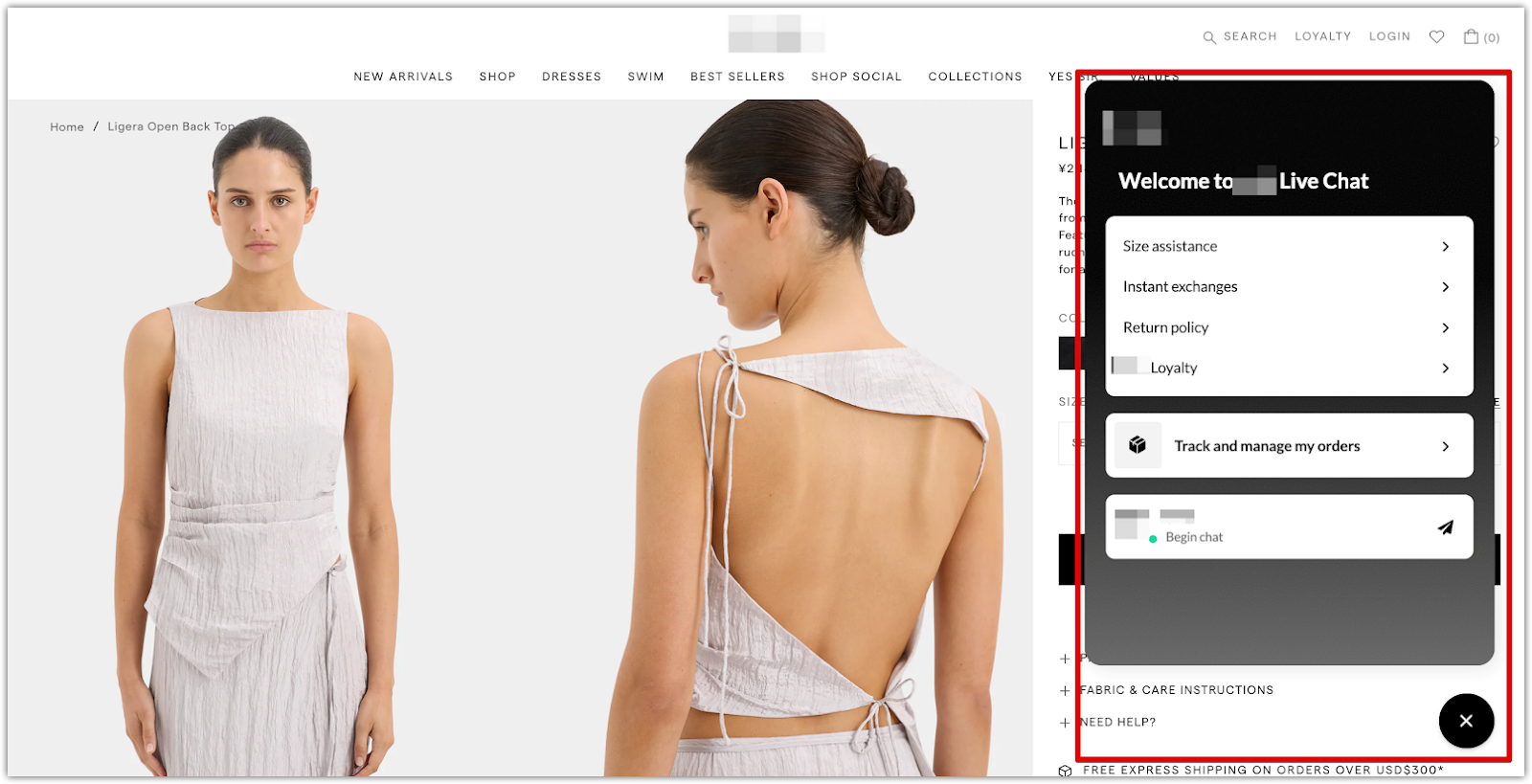
3. Online chat support: Add a chat icon that connects users to either automated or live assistance. Use a chatbot to answer common questions and escalate complex issues to human support. This hybrid model improves resolution speed and ensures users feel supported throughout their journey.
Conversion drive
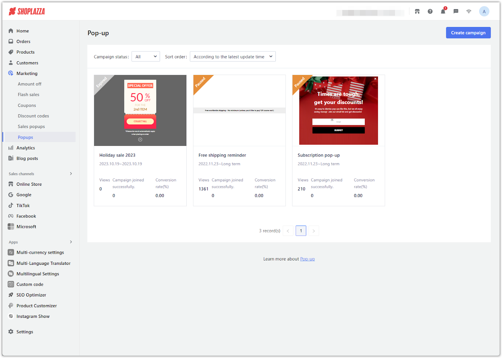
Your landing page should be designed with the user’s decision-making journey in mind. Use conversion-focused components such as pop-ups strategically and sparingly to guide users toward completing their purchase without overwhelming them.
1. Component adaptation principle: Design your pop-ups to match the customer’s current stage in the buying process:
- Awareness: Introduce your brand with subtle prompts.
- Consideration: Highlight product benefits, reviews, or free shipping.
- Decision: Offer discounts or bundle suggestions.
- Exit intent: Use urgency-based messaging to retain visitors who are about to leave.
Control the frequency of pop-ups and limit them to no more than three per page to keep loading times fast and the user experience smooth.
2. Scenario-based pop-up configuration: Apply the right pop-up at the right moment to increase engagement:
- Subscription pop-up: Trigger after a short delay (such as 3 seconds) to avoid interfering with first-screen content. Clearly explain the benefit of subscribing.
- Add to Cart pop-up: After a customer adds an item to their cart, suggest related or complementary products to encourage larger orders.
- Retention pop-up: When a visitor moves to close the page, trigger a message designed to keep them engaged. Use attention-grabbing visuals and language that emphasizes what they might miss out on if they leave (e.g., “Wait! You’re about to miss 10% off”).
Landing pages are more than just product showcases. They are strategic tools for guiding user behavior and building brand trust. From choosing the right tools to applying conversion-driven design principles, creating a high-performing landing page requires ongoing testing and refinement. In a world where every second counts, optimizing each element can turn casual browsers into loyal customers.


Comments
Please sign in to leave a comment.