
The Product carousel section is a built-in feature in the Shoplazza Hero theme series, which includes Hero, Halloween, and Modern. It lets you add a scrollable product slider to your homepage—perfect for showcasing featured items in a clean, dynamic layout. This homepage product carousel helps highlight specific collections without cluttering the design, making it easier for shoppers to browse your store at a glance.
Adding the section
The Product carousel section adds a clean, scrollable layout that highlights featured products and makes it easier for visitors to explore your store.
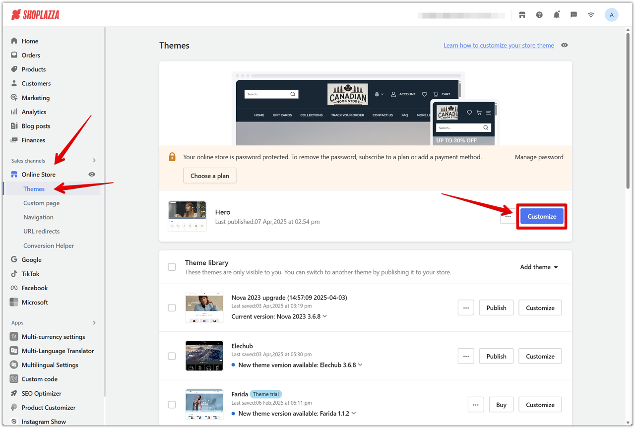
1. Open the theme editor: Go to Shoplazza admin > Online store > Themes > Customize to access the theme editor.
2. Click Add section: In the left-side panel, click Add section to browse all available sections in the Hero theme.
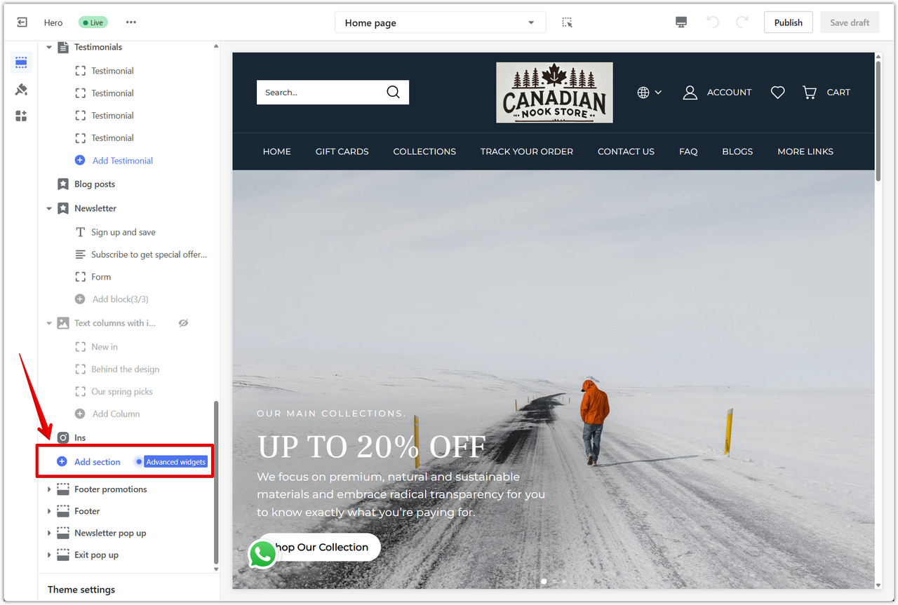
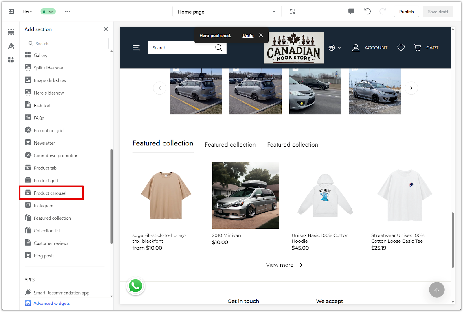
3. Select Product carousel: Under Additional sections, choose Product carousel to add it to the layout.
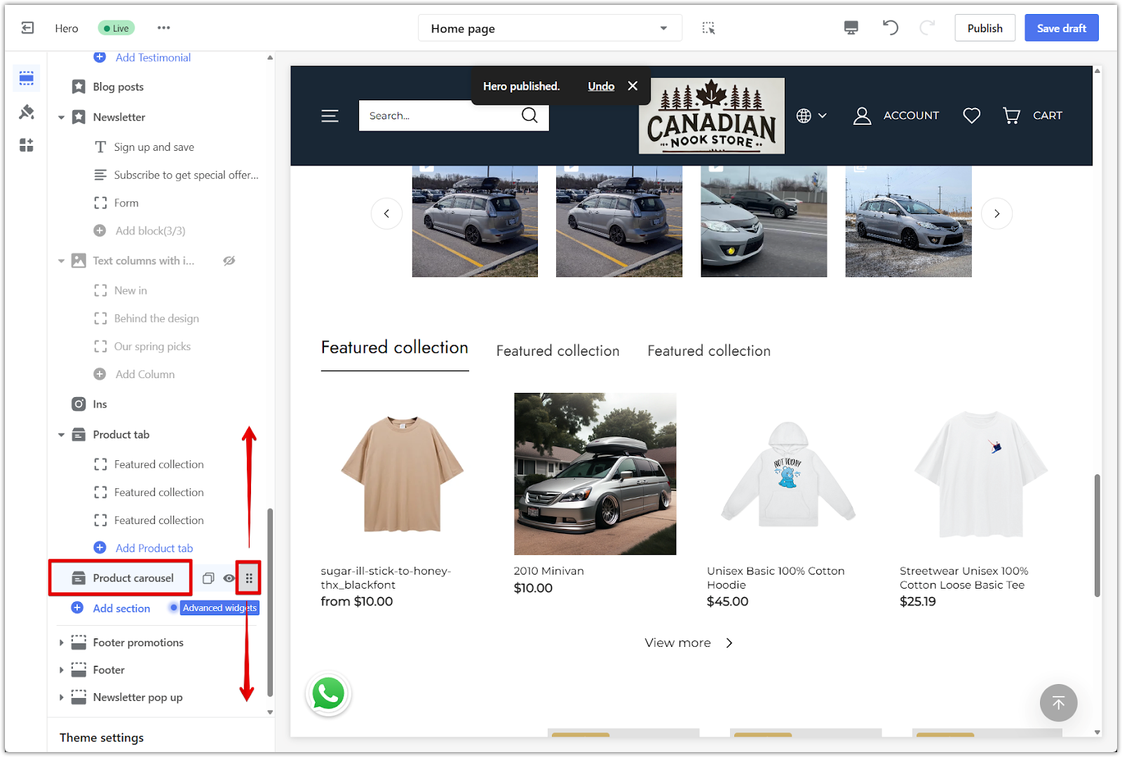
4. Move the section: Use the drag icon next to the section name to place it anywhere on the homepage.
Editing content
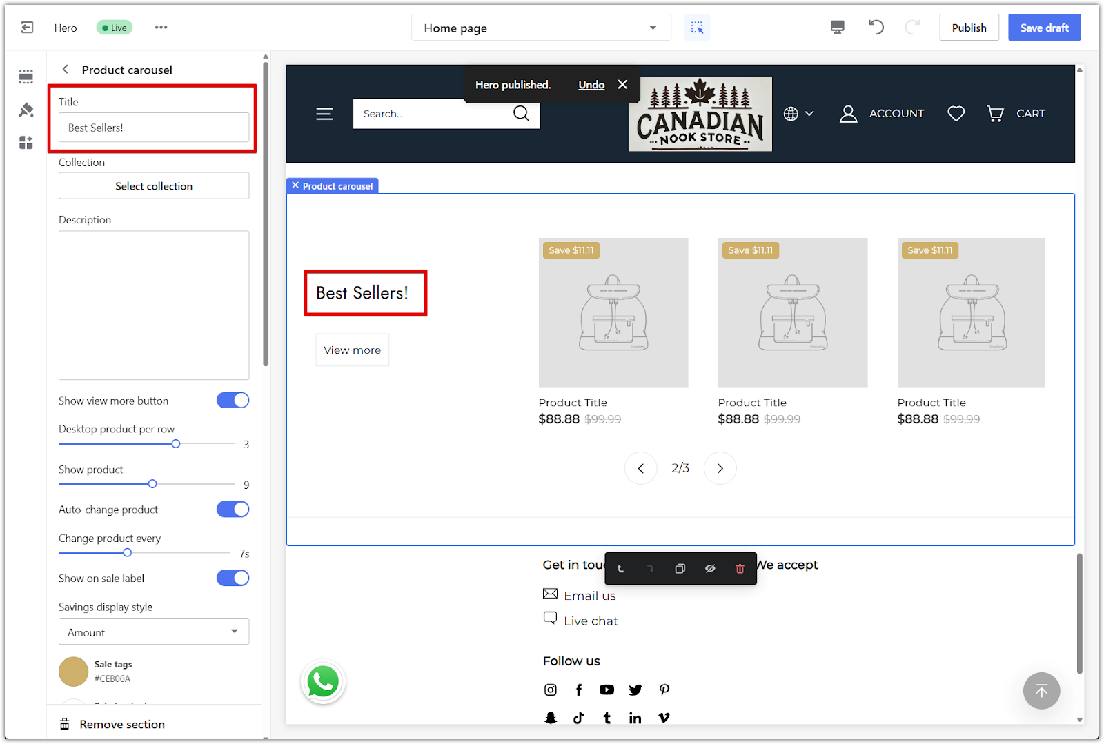
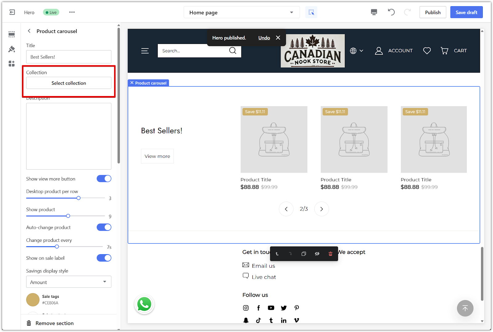
After adding the section, click the Product carousel section title in the editor to open its settings. From there, update the text and connect a collection to reflect what you want to feature.
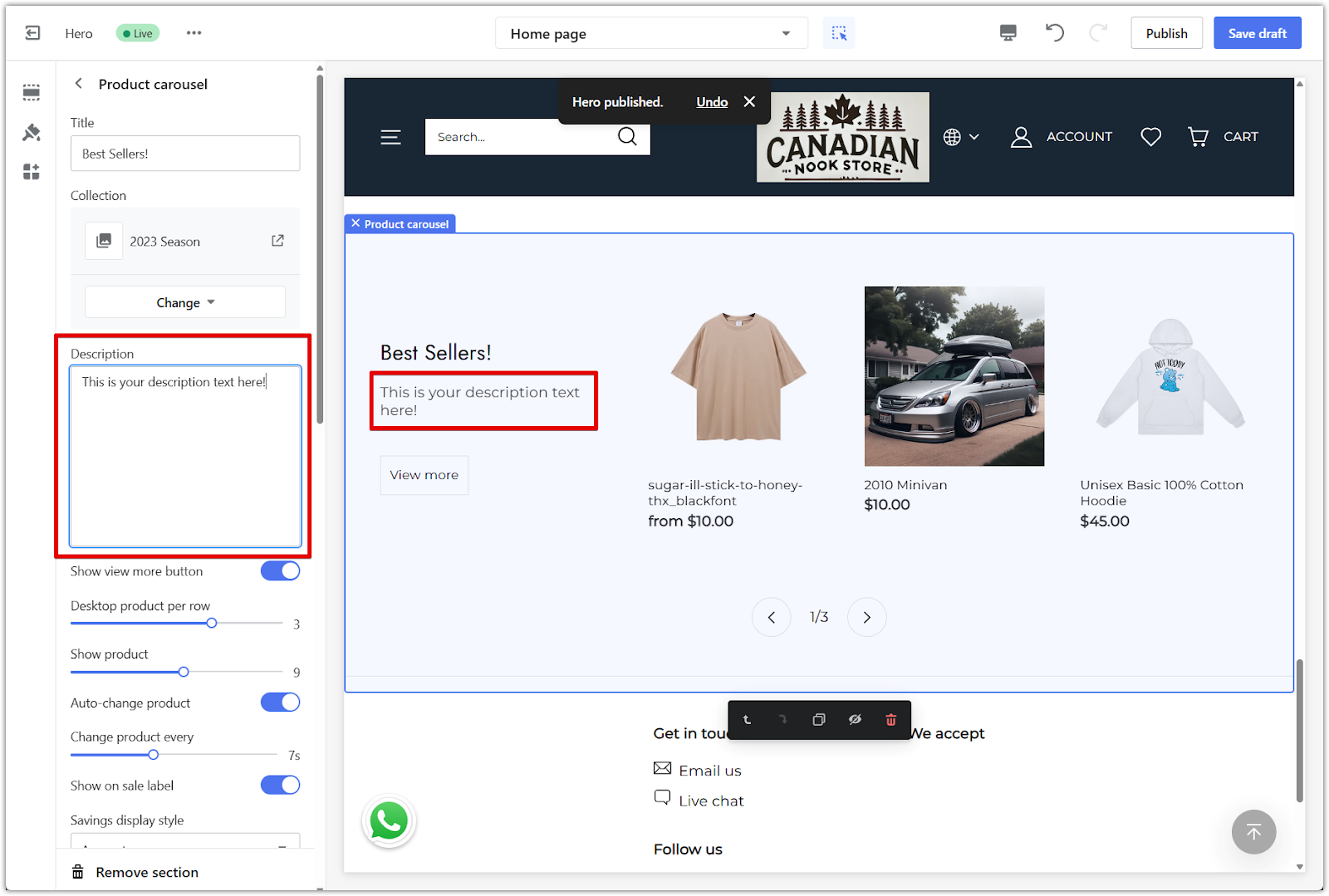
1. Heading: Add a title for the section, like Best Sellers or Just Dropped, to introduce the products in the carousel.
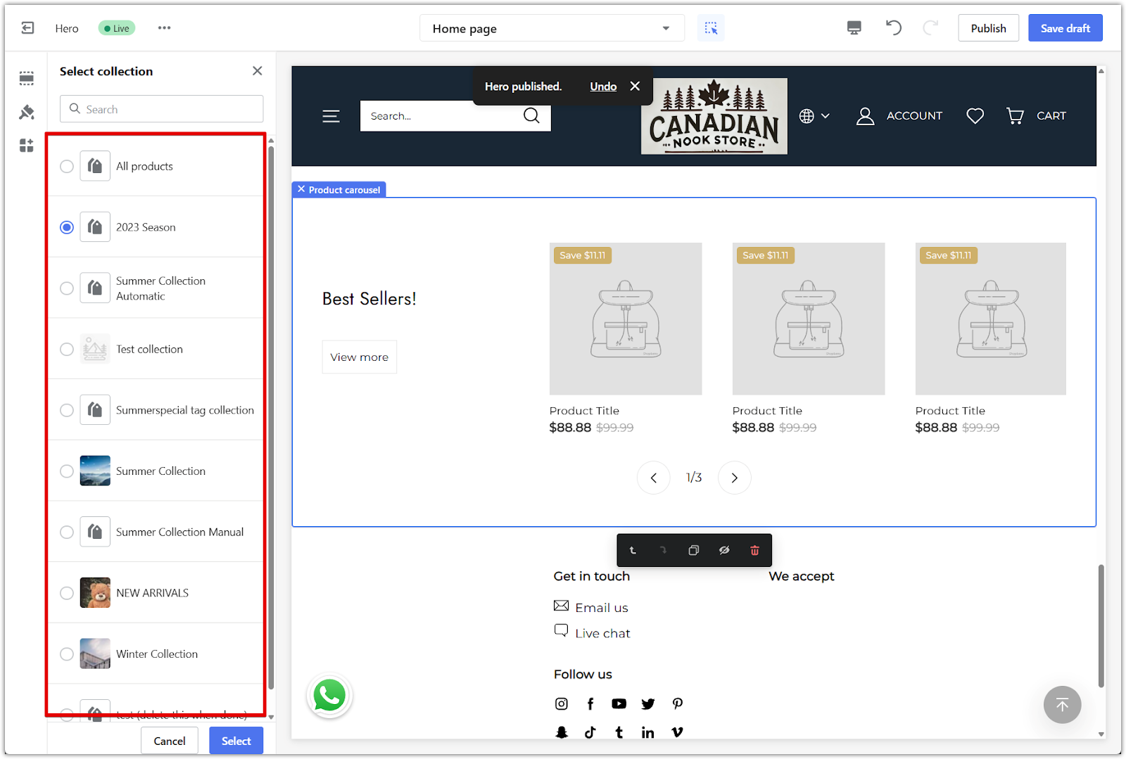
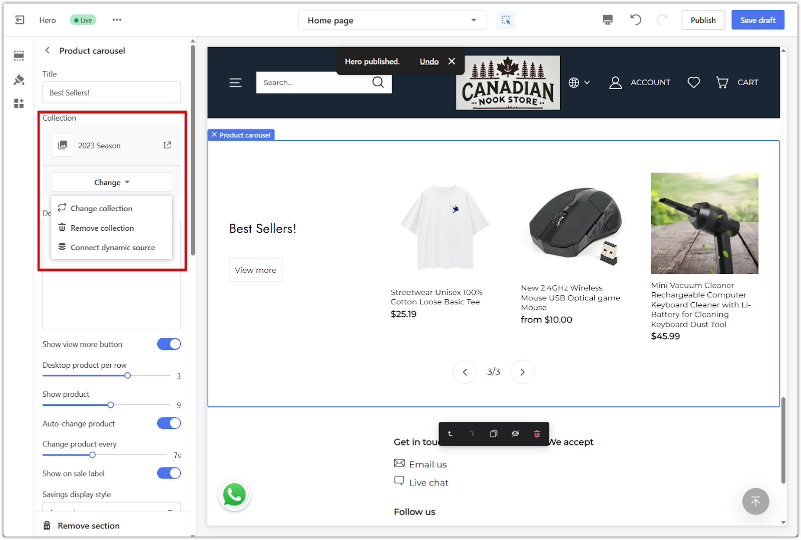
2. Collection: Select an existing product collection to display in this section. This controls which products will appear in the scrollable layout. Use the Change button to switch collections, remove one, or connect a dynamic source. If you're new to collections, follow the steps in Creating product collections. To link a dynamic source, see Setting up Metafields.
3. Description: Add a short message beneath the heading to give more context about the collection—like what's included or why these products are featured.
Product settings
Adjust how products are displayed in the carousel and how the slider behaves for visitors browsing your homepage.
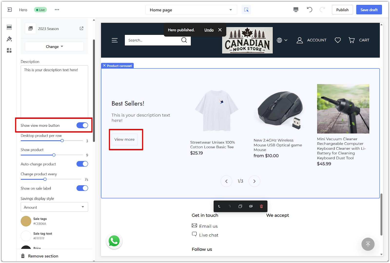
1. View more button: Turn this on to display view more under the carousel. This links directly to the full collection page, making it easier for shoppers to explore more products.
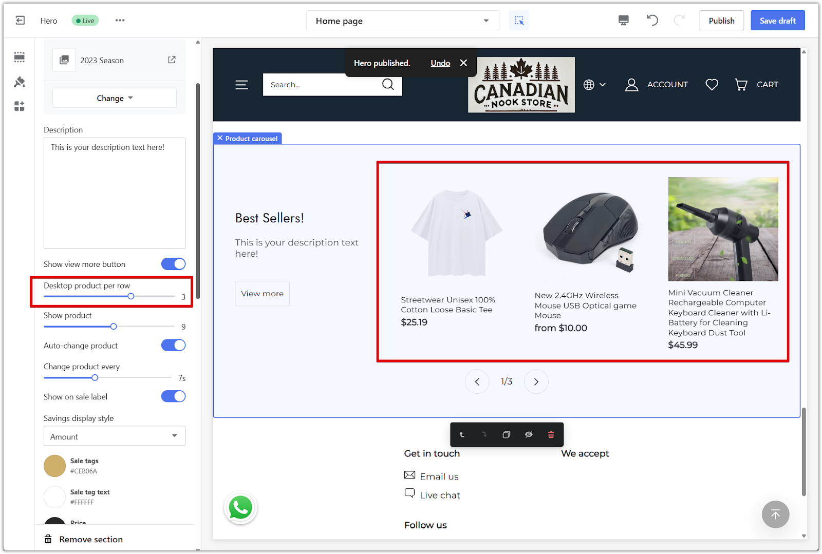
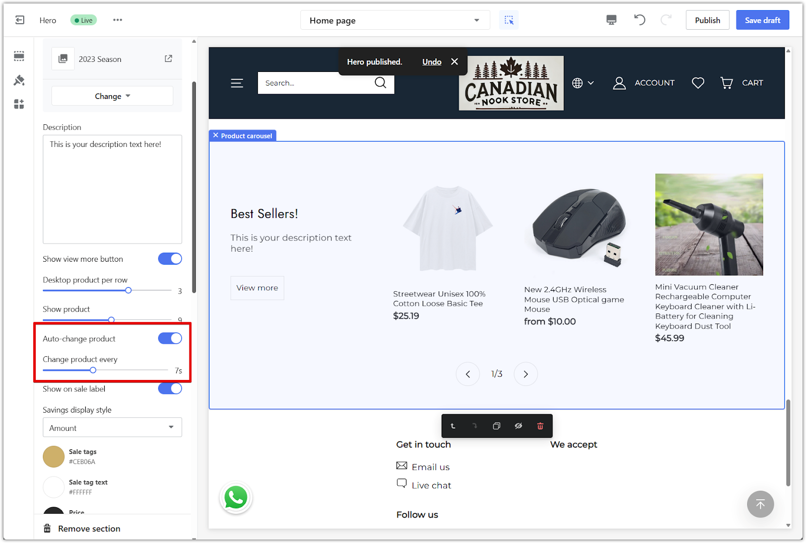
2. Products per slide: Use the slider to set how many products are shown at once on desktop. This controls how wide the carousel appears and how much customers can view in a single glance.
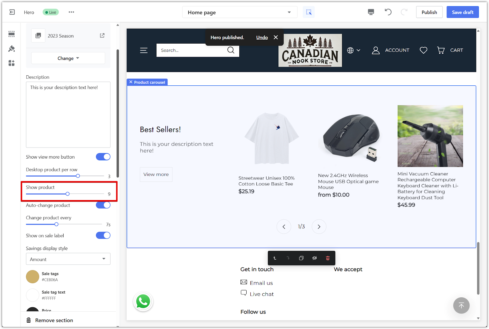
3. Show products: Limit how many products from the collection are displayed in the carousel. This is useful for keeping the layout simple, especially if your collection includes many items.
4. Auto-change products: Toggle this on to enable automatic sliding. You can also adjust how many seconds pass before the carousel scrolls to the next group of products.
Style and layout
Match the look of the Product carousel with the rest of your homepage using the available style settings. These options help keep everything visually consistent and easy to browse.
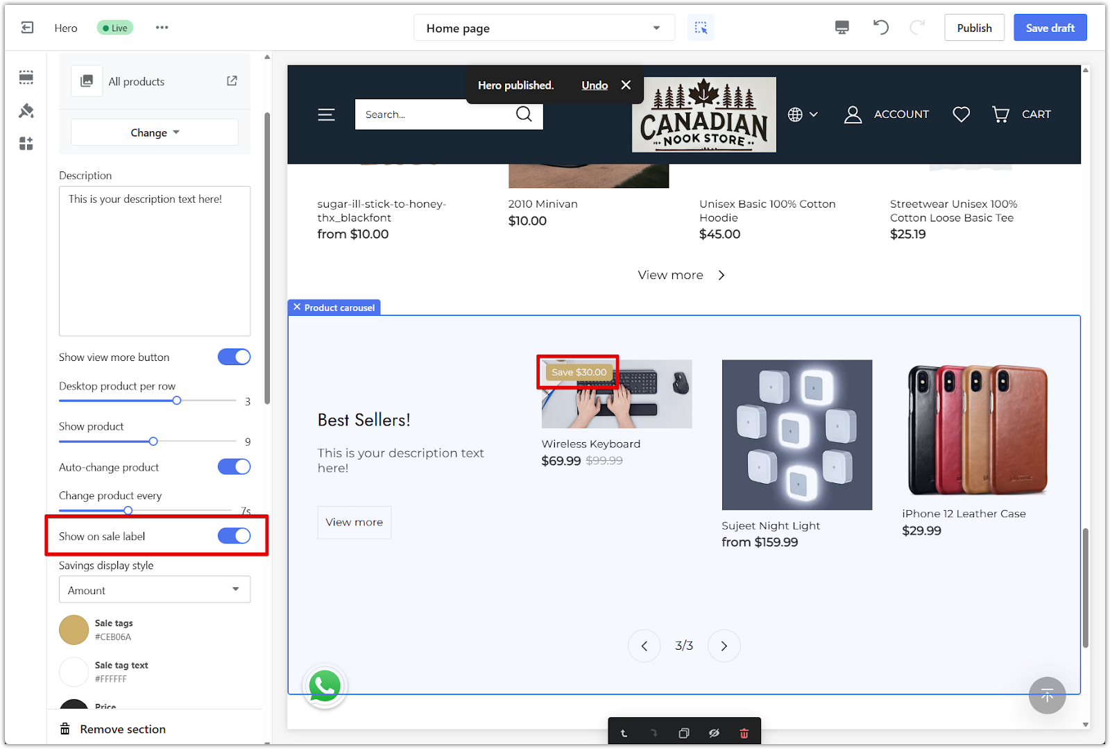
1. Show on sale label: Toggle this on to display a label on products that are currently discounted. Use the color settings below to match the label with your store's look.
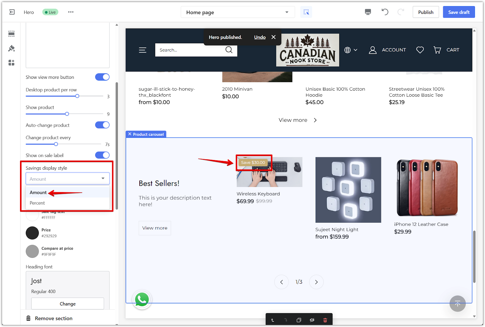
2. Savings display: Choose how discounts appear on each product. You can show either the amount saved or the percentage.
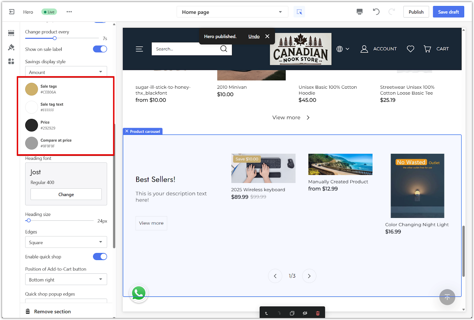
3. Colors: Adjust the background, text, and button colors using the color palette. This helps the section blend with your overall theme.
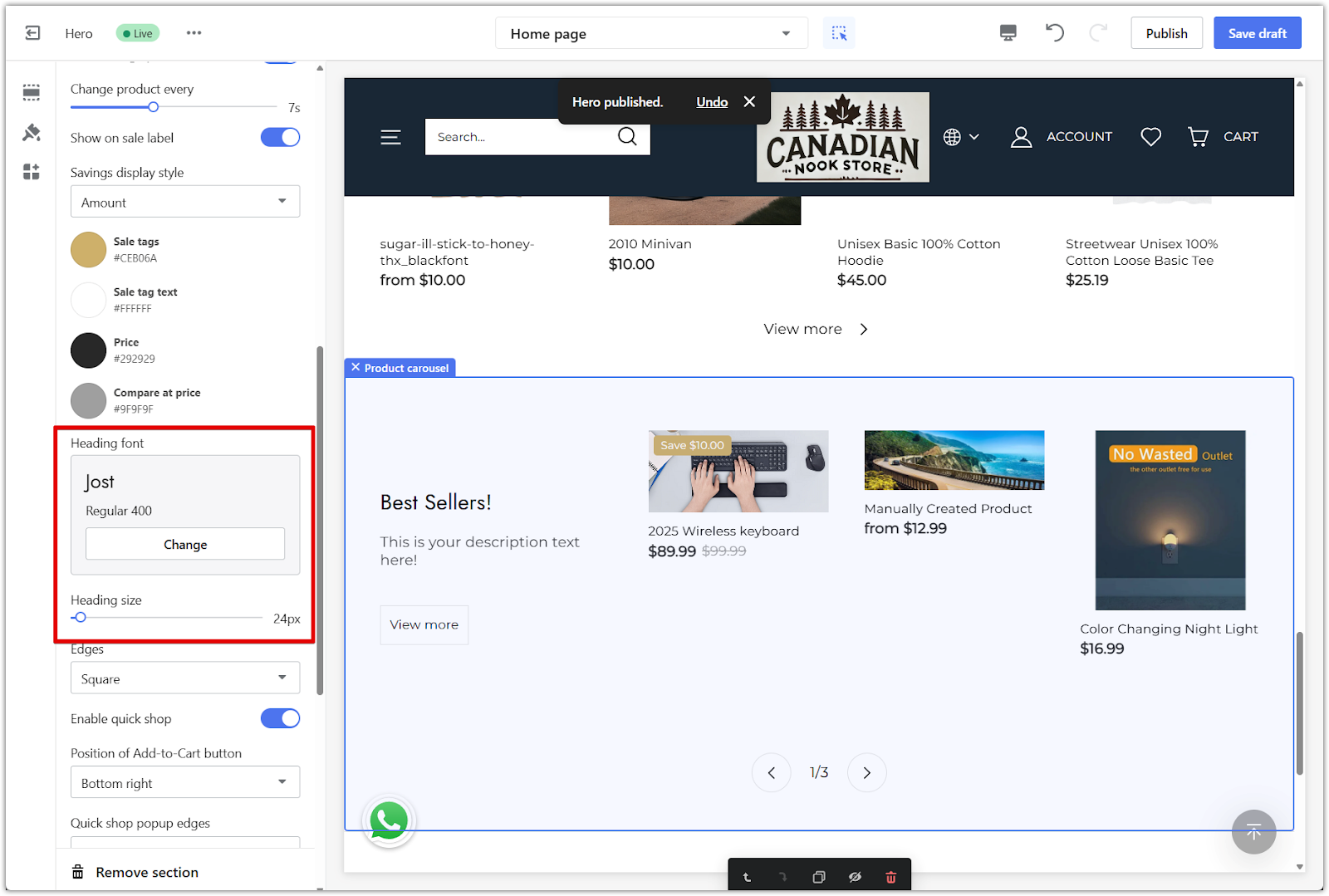
4. Fonts: Change the heading font and size to match your store's branding. Use the Change button to browse available fonts.
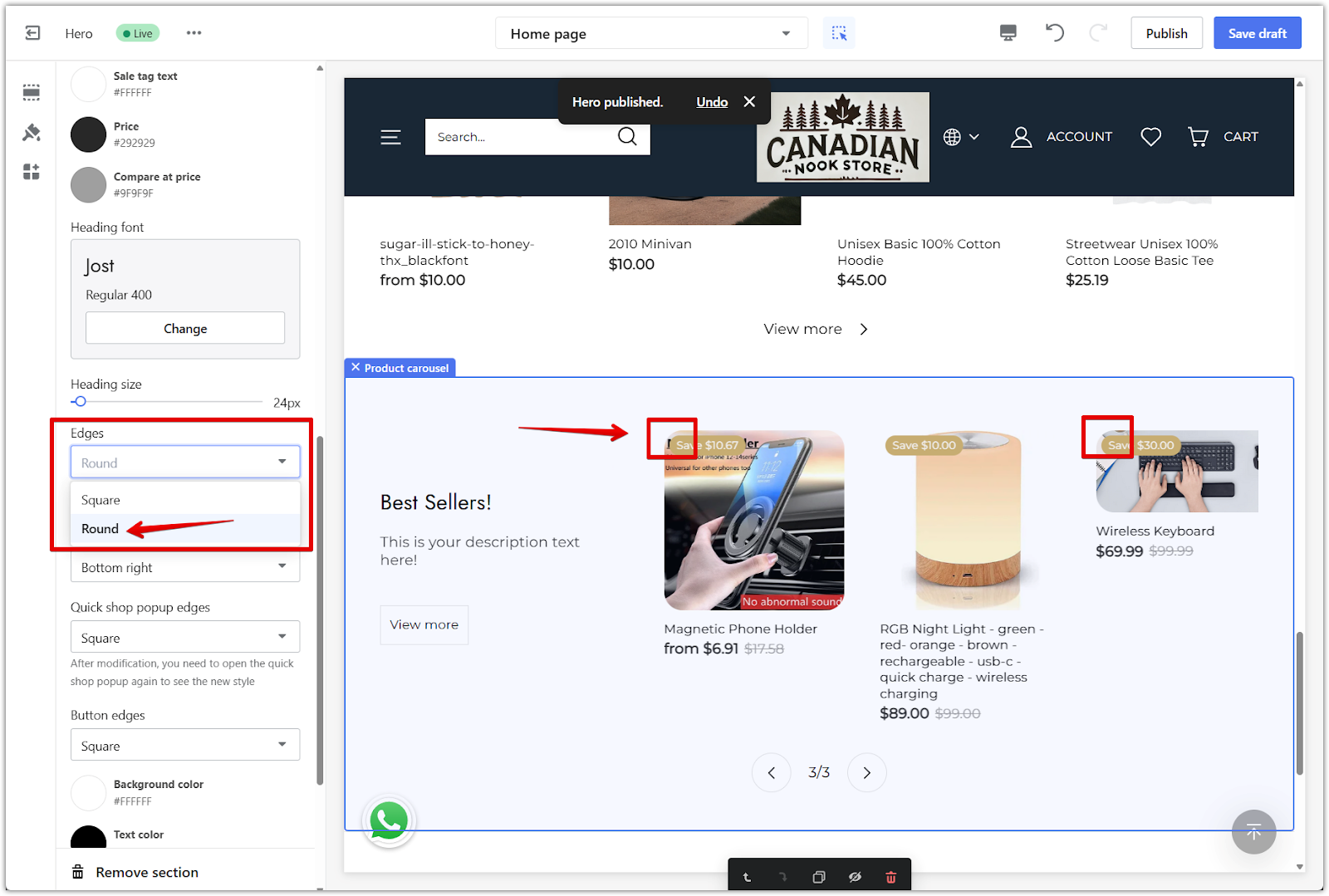
5. Card edges: Select the shape of the product card corners. Choose between square, slightly rounded, or fully rounded styles.
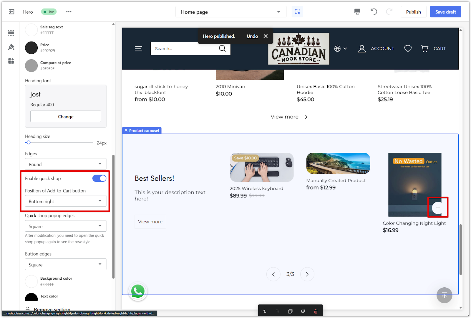
6. Enable quick shop: Turn this on to let shoppers preview product details and add items to the cart directly from the carousel. You can also choose the position of the add-to-cart button and set the style of the popup edges.
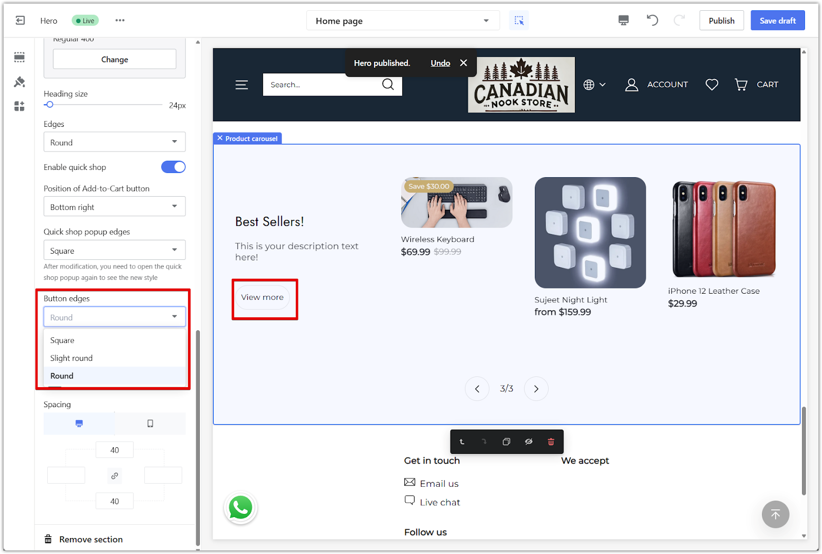
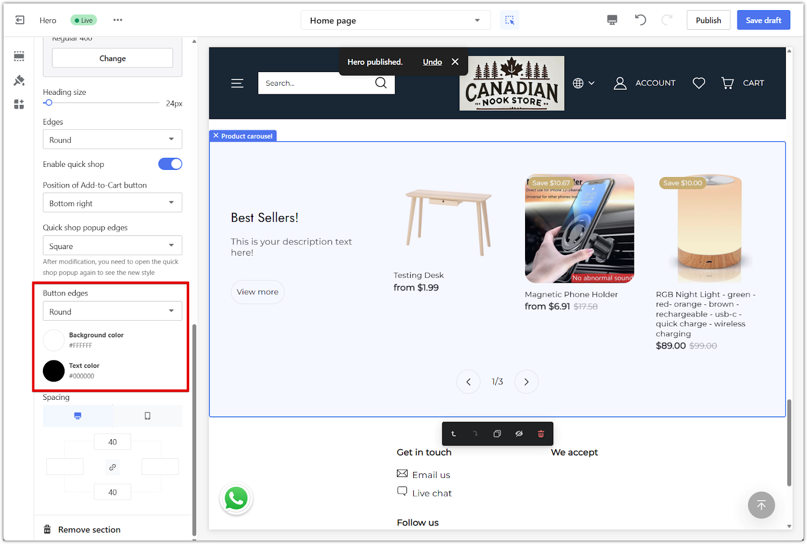
7. Button edges and colors: Adjust the edge style and colors of the View more button to match your theme. Choose between square, rounded, or pill-shaped corners and select both background and text colors.
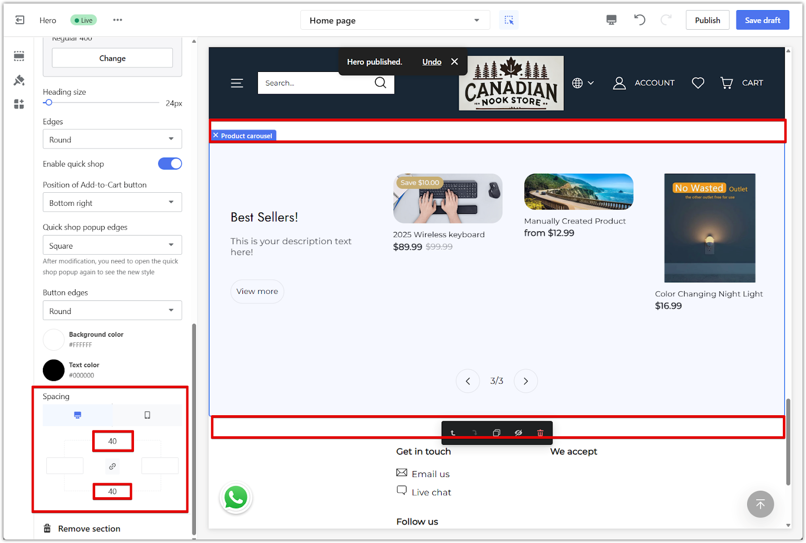
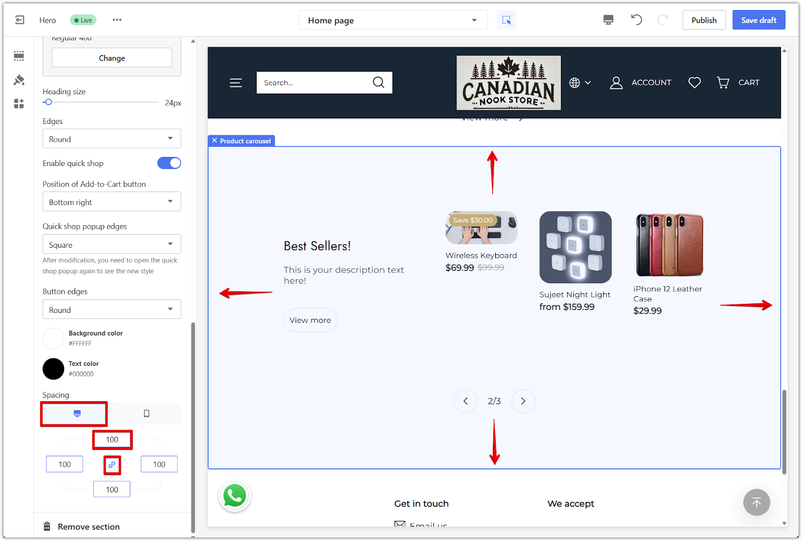
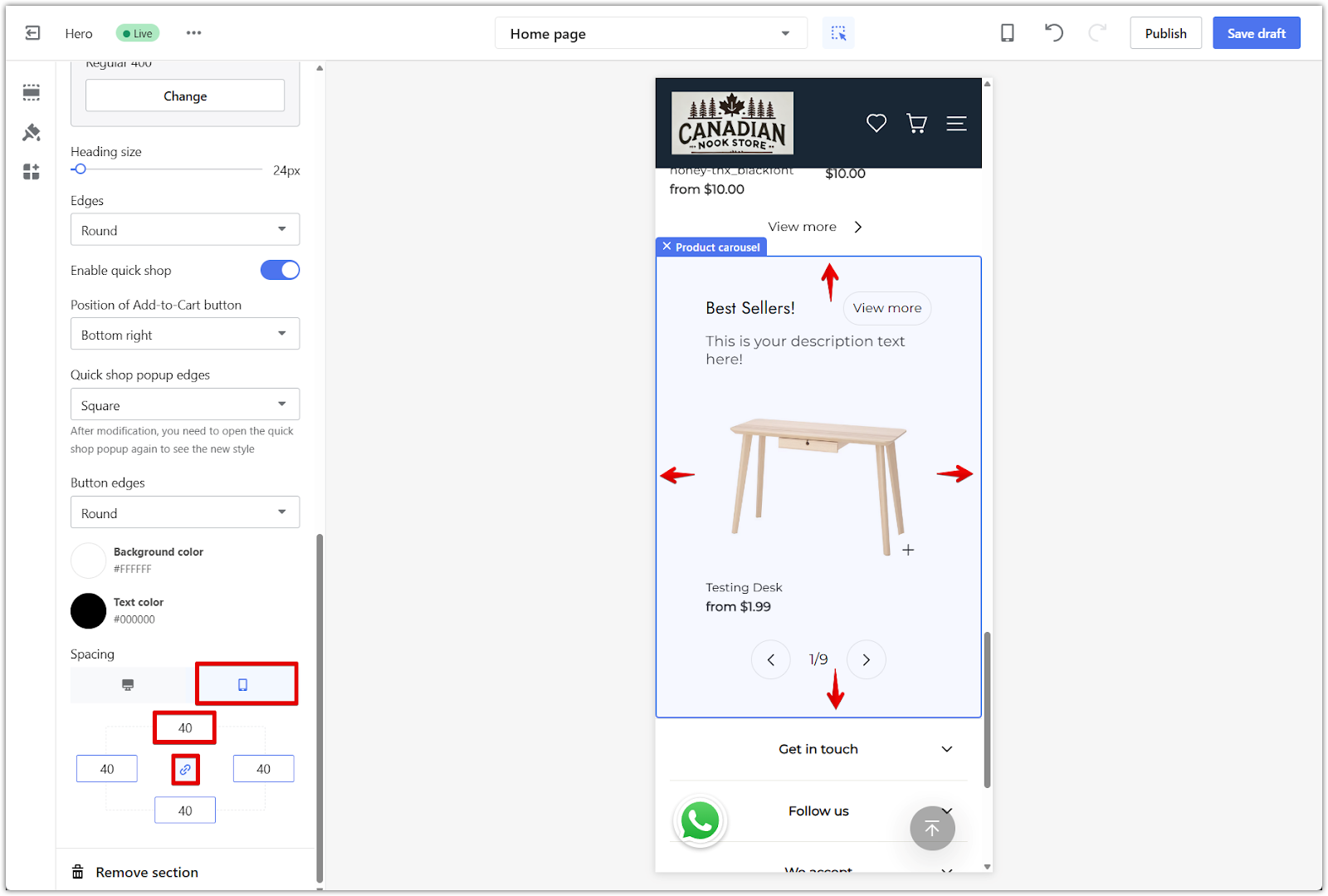
Section padding
Use the padding settings to create extra space around the Product carousel. This helps the section stand out while keeping the layout clean and balanced.
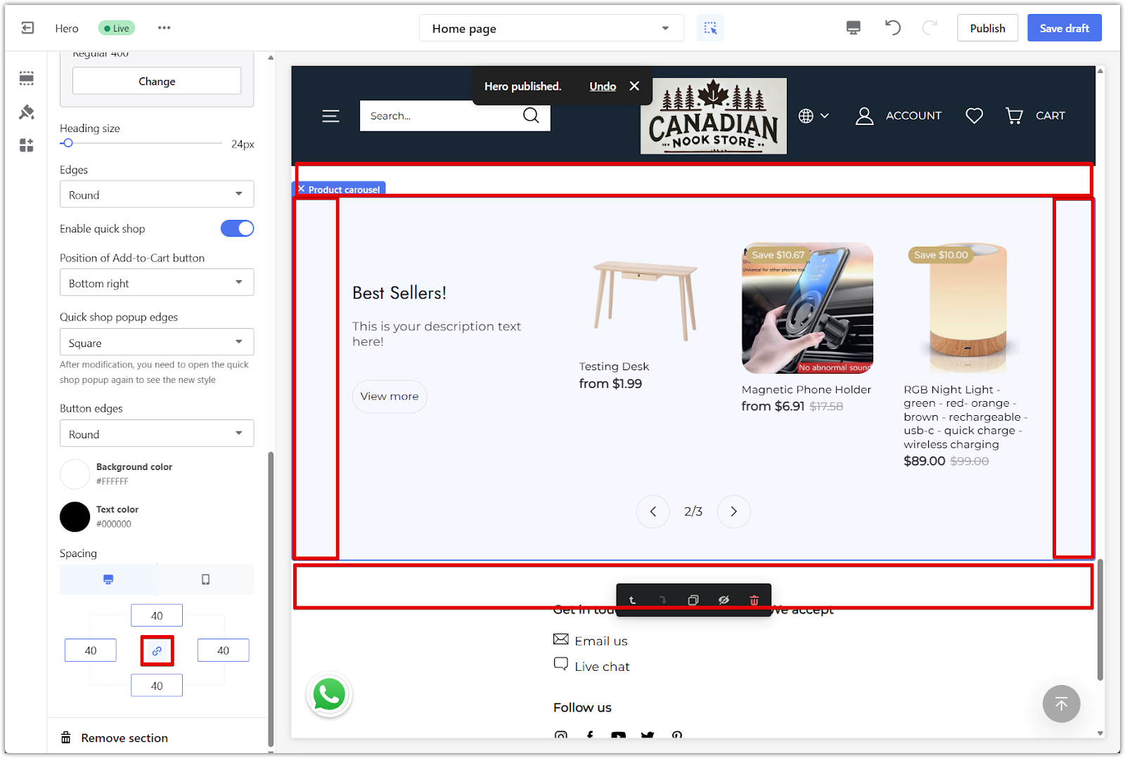
1. Adjust padding: Enter values in pixels to add space on the top, bottom, left, or right of the section. Use the link icon to apply the same value to all sides, or disable it to set each side individually.
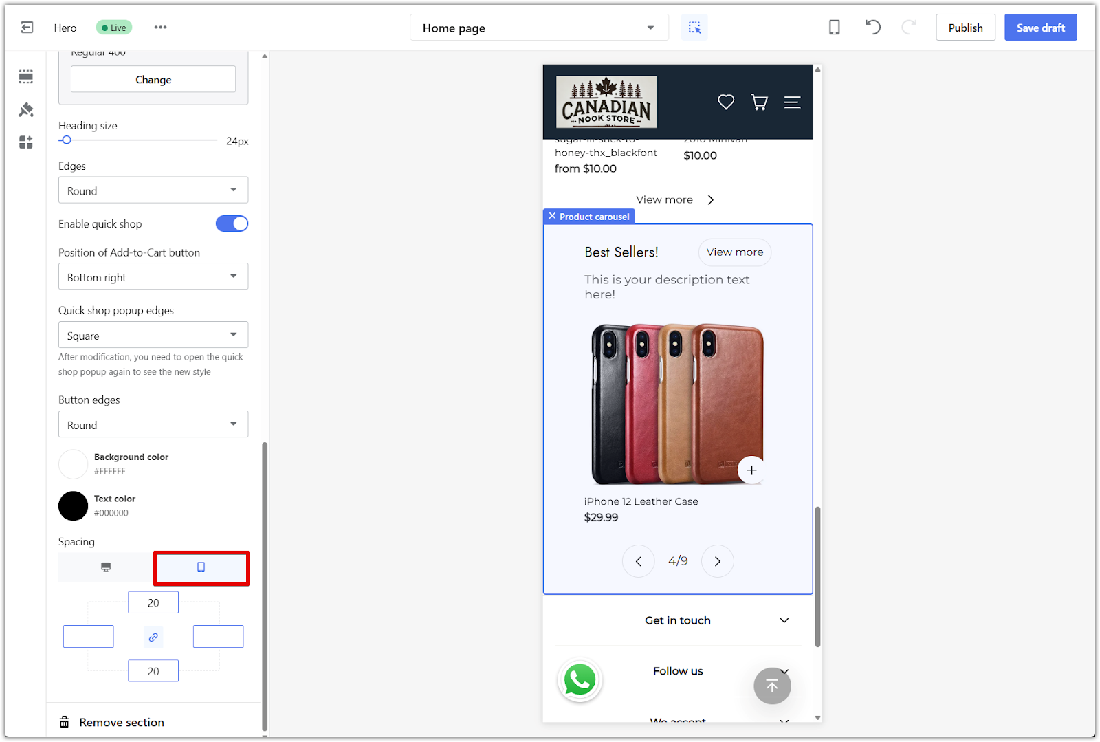
2. Preview layout: Use the device icons above the spacing controls to switch between desktop and mobile views. This lets you see how the spacing looks on different screens.
3. Example spacing: For a balanced layout, try setting all sides to 40px or 100px, depending on how much space you want around the section.
If you're using the Hero theme series and want a clean way to showcase products on your homepage, the Product carousel section is a flexible option that helps keep your layout engaging and easy to browse.


Comments
Please sign in to leave a comment.