A products grid card allows you to showcase your products in a clean, organized grid layout on your homepage. This section makes it easier for customers to browse collections and discover featured items, enhancing their shopping experience. Follow the guide below to add and customize a products grid card in your theme editor.
Accessing the theme editor
To start adding your products grid card, navigate to the theme editor, where you can locate and set up the section for your store’s homepage.
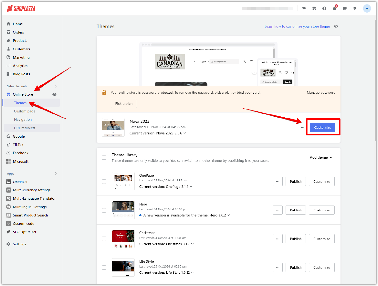
1. Open the theme editor: Go to your Shoplazza Admin > Online store > Themes and click Customize next to your selected theme.
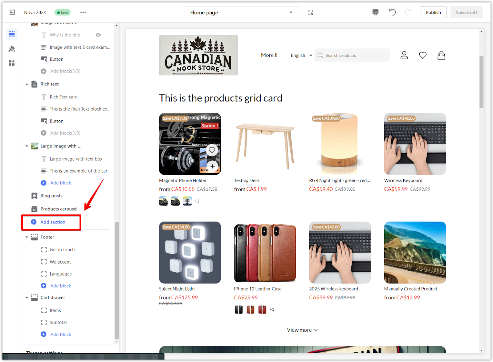
2. Locate the products grid card section: Find the Products grid section in the left-hand menu of the theme editor. If it’s not already added, click the Add section, scroll down to Show more under Theme sections, and select Products grid card to include it on your homepage.
Customizing the products grid card
This section covers how to tailor your products grid card to match your store’s branding and highlight your featured products.
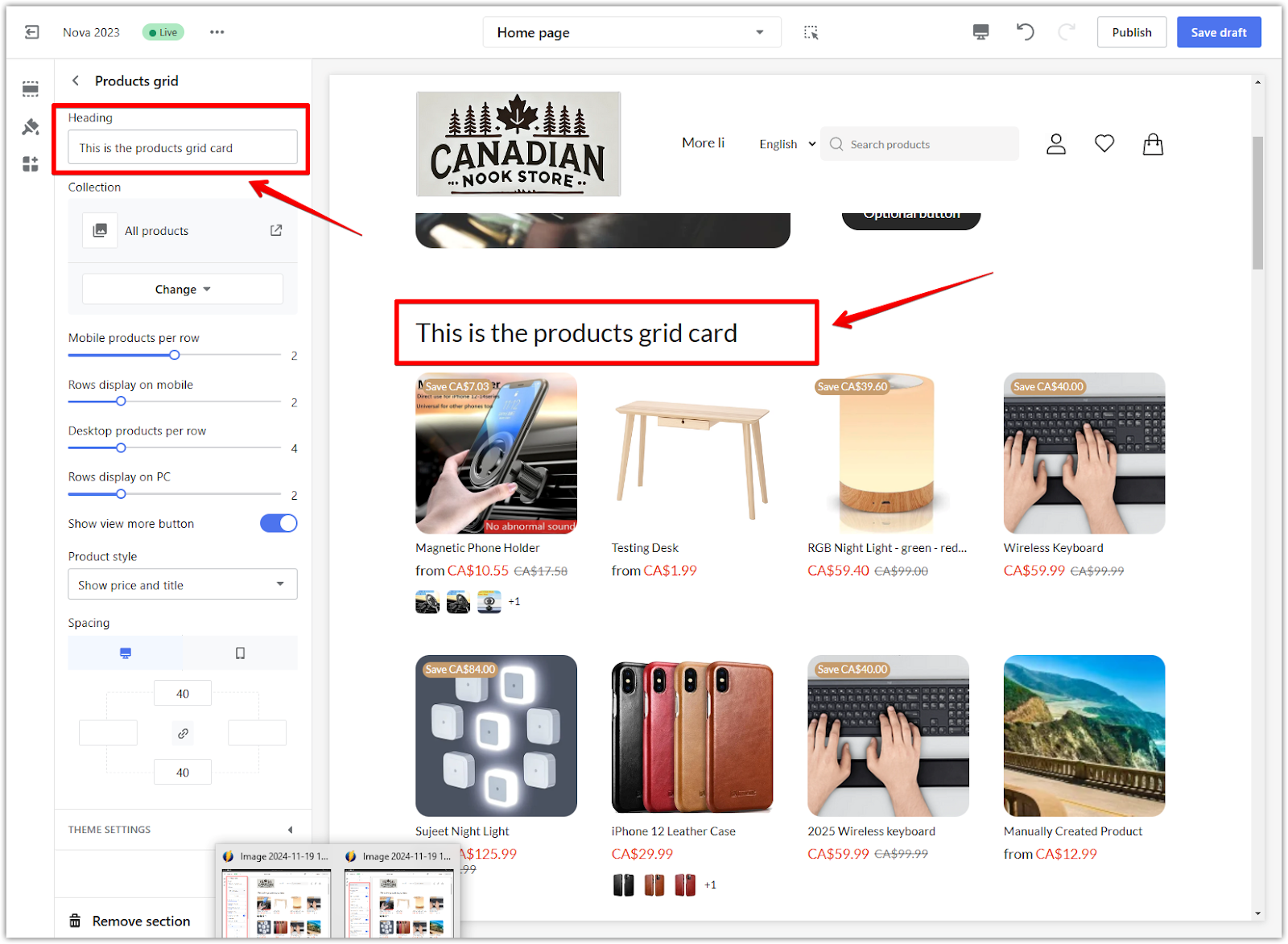
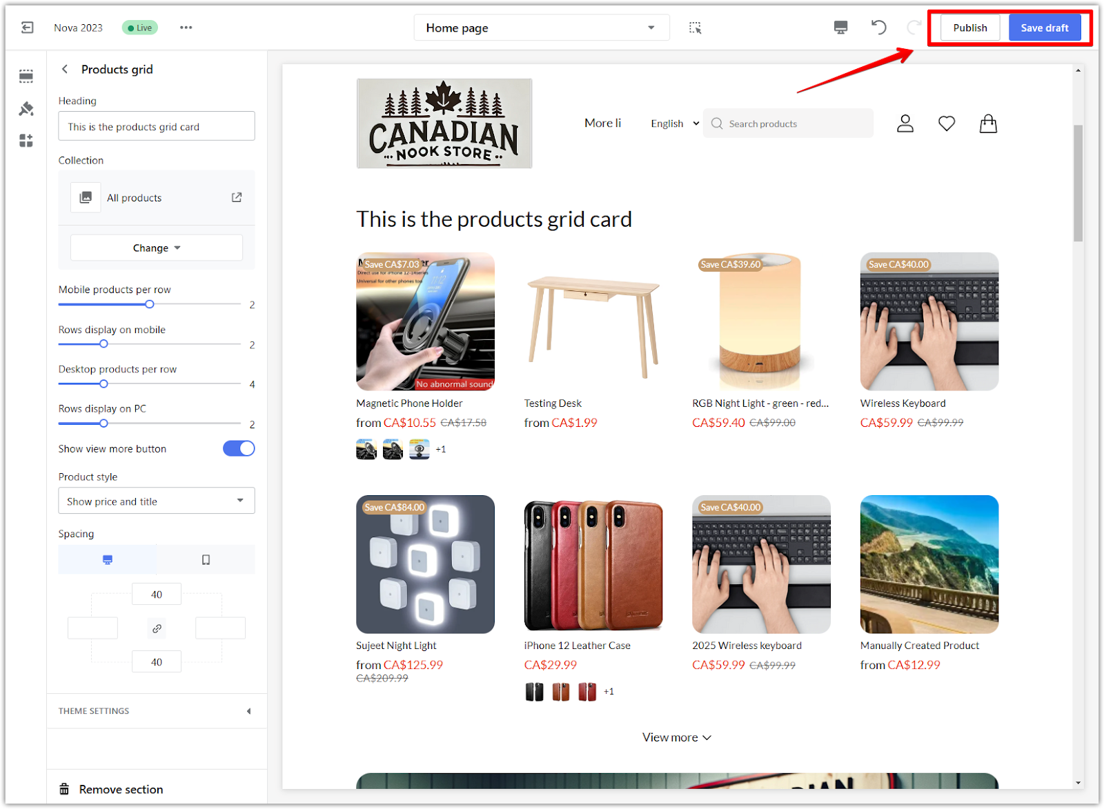
1. Edit headings: Update the heading text to make it relevant and engaging.
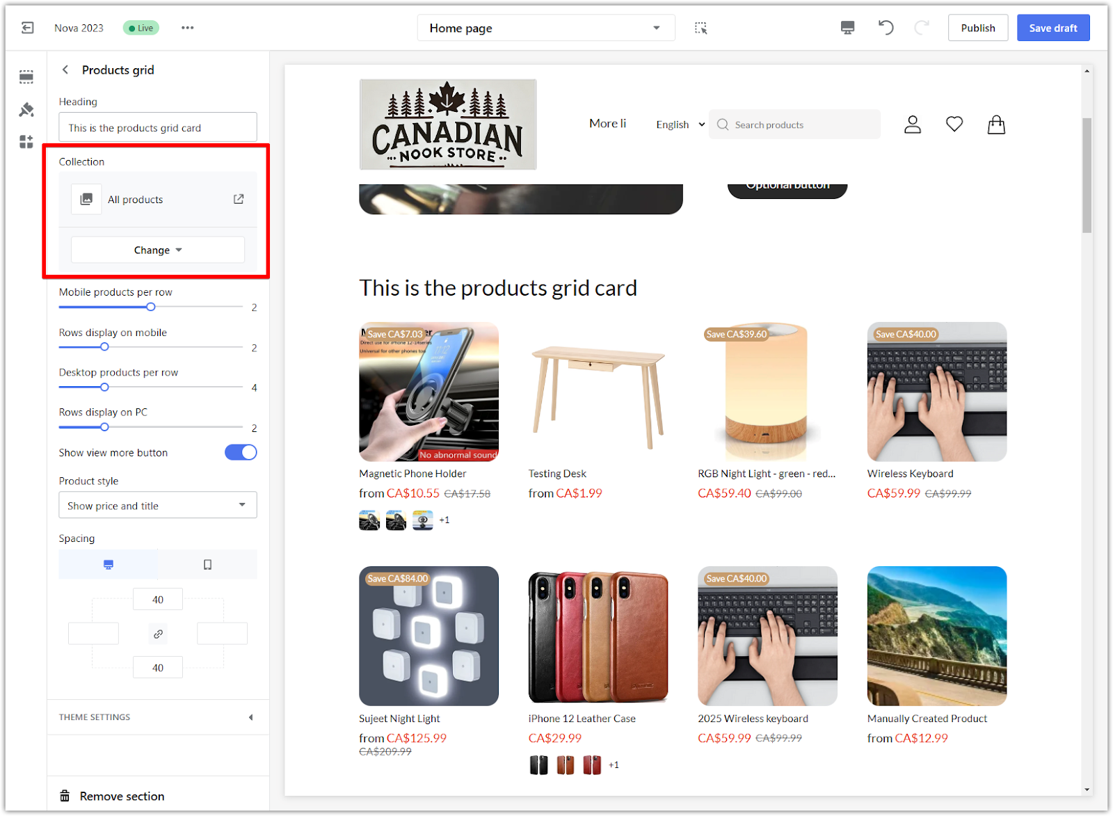
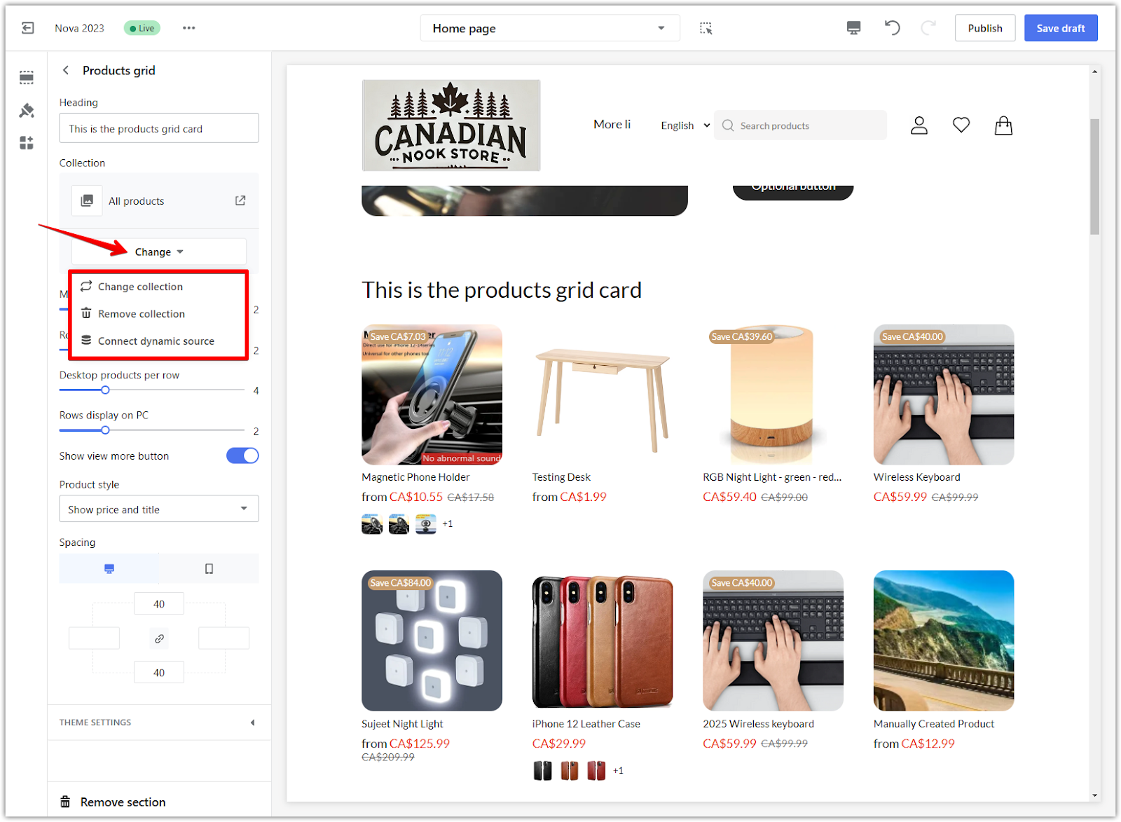
2. Add collections: Customize the products displayed in the grid by using the Collection dropdown. You can manage collections with the following options:
- Change collection: Select a pre-created collection from your Shoplazza storefront to showcase specific products.
- Remove collection: Remove the existing collection if it’s no longer needed.
- Connect dynamic source: Automatically pull products based on specific criteria like tags or product types. For example, linking to a "Sale" tag ensures the grid always shows discounted items. For more details on connecting dynamic sources, refer to Setting up Metafields.
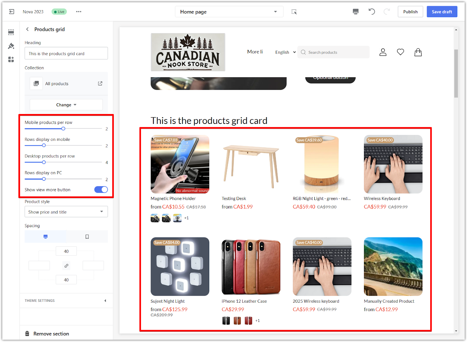
3. Adjust display settings: Fine-tune how the products appear on different devices:
- Mobile products per row: Set the number of products displayed in each row on mobile devices.
- Desktop products per row: Adjust the number of products displayed per row on desktop screens.
- Rows display on mobile/PC: Choose the number of rows to show on mobile and desktop views.
- Show view more button: Toggle this option to display a "View more" button linking to the full collection.
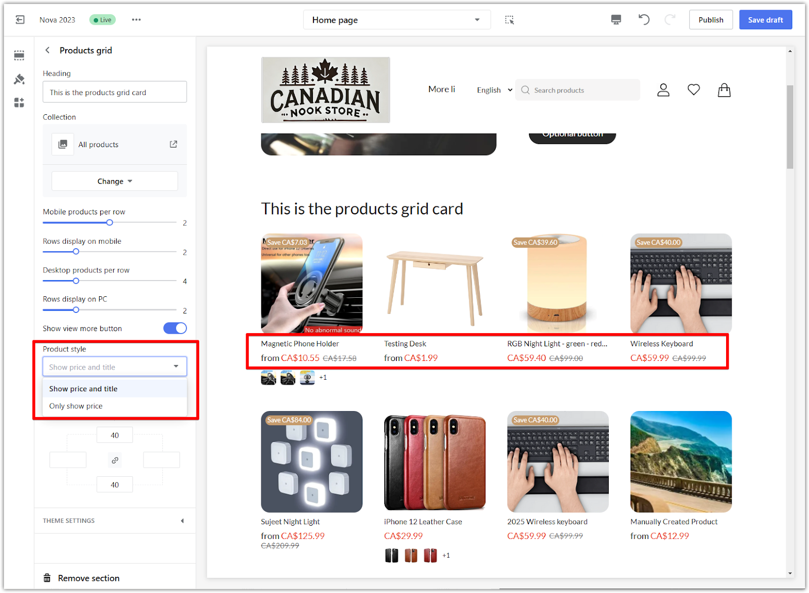
4. Choose product style: Use the Product style dropdown to display price, title, or both beneath the product images.
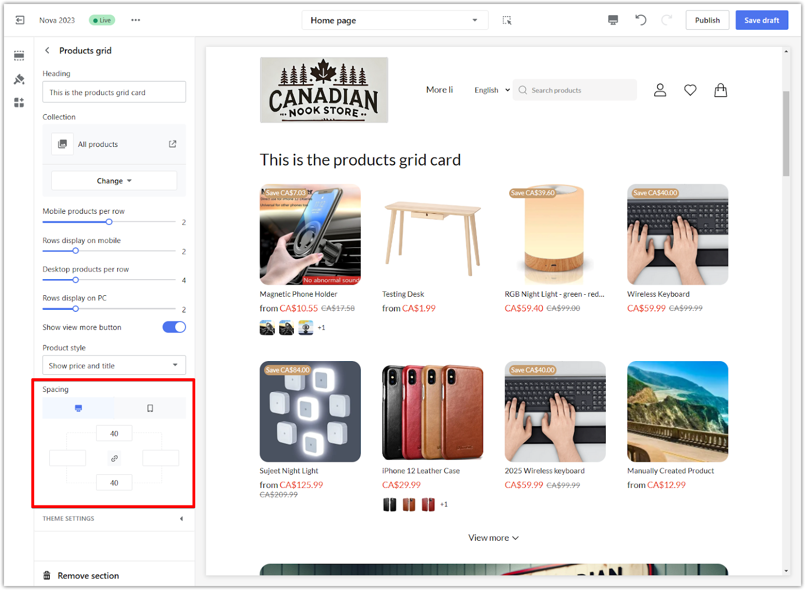
5. Adjust section spacing: Use the padding editor to add space around the grid. Enable the "linkage icon" for consistent spacing on all sides or disable it to adjust each side individually. Example: Adding 40px padding creates a balanced appearance.
6. Save your changes: After setting up your products grid card, click Save draft to store your progress. Once everything is finalized, click Publish to make your updates visible on your store. Save regularly to prevent losing your work.
Modifying additional features
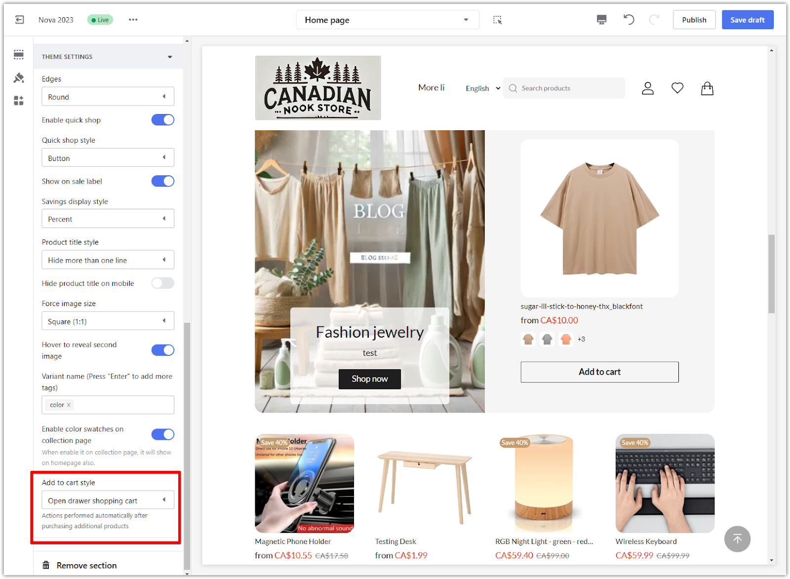
The Theme settings section provides options to adjust the appearance and functionality of all cards that showcase collections or products, including the Products grid section. Changes in this section are not specific to the selected card but will apply globally to all sections in your theme that feature collections or products. This ensures consistency across your storefront and simplifies managing shared settings.
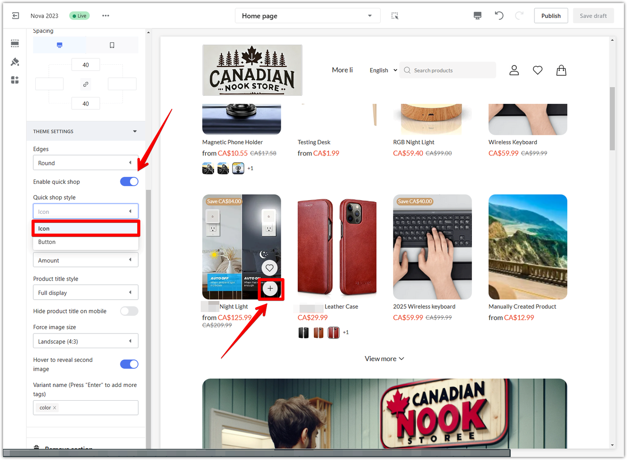
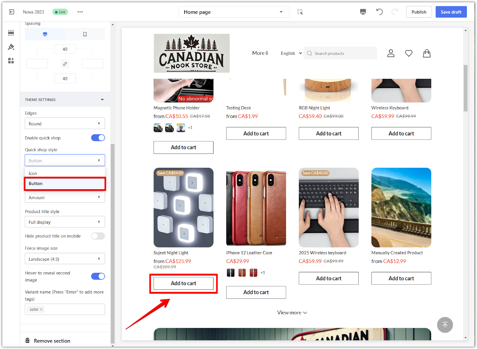
1. Enabling quick shop: Toggle Enable quick shop allows customers to add items directly to their cart and choose either the Icon style to display a small cart icon overlay or the Button to display a prominent “Add to cart” button.
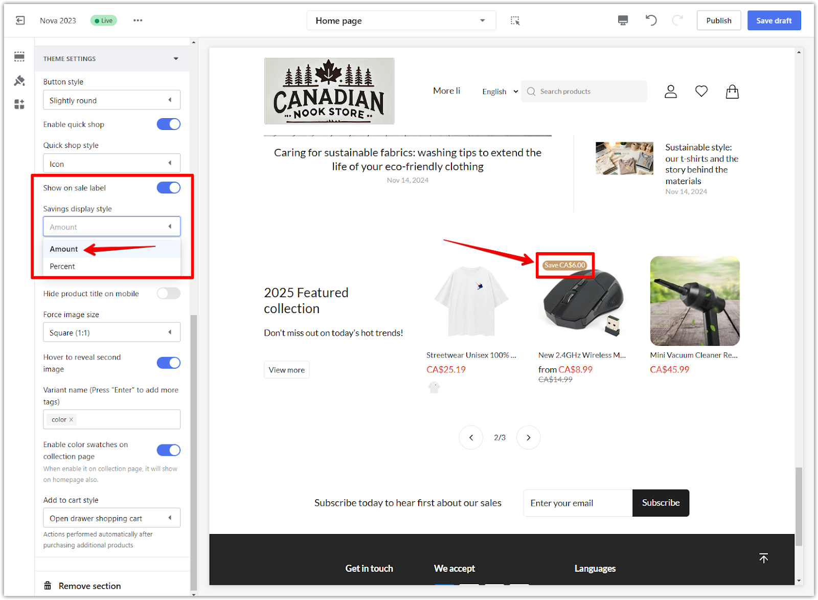
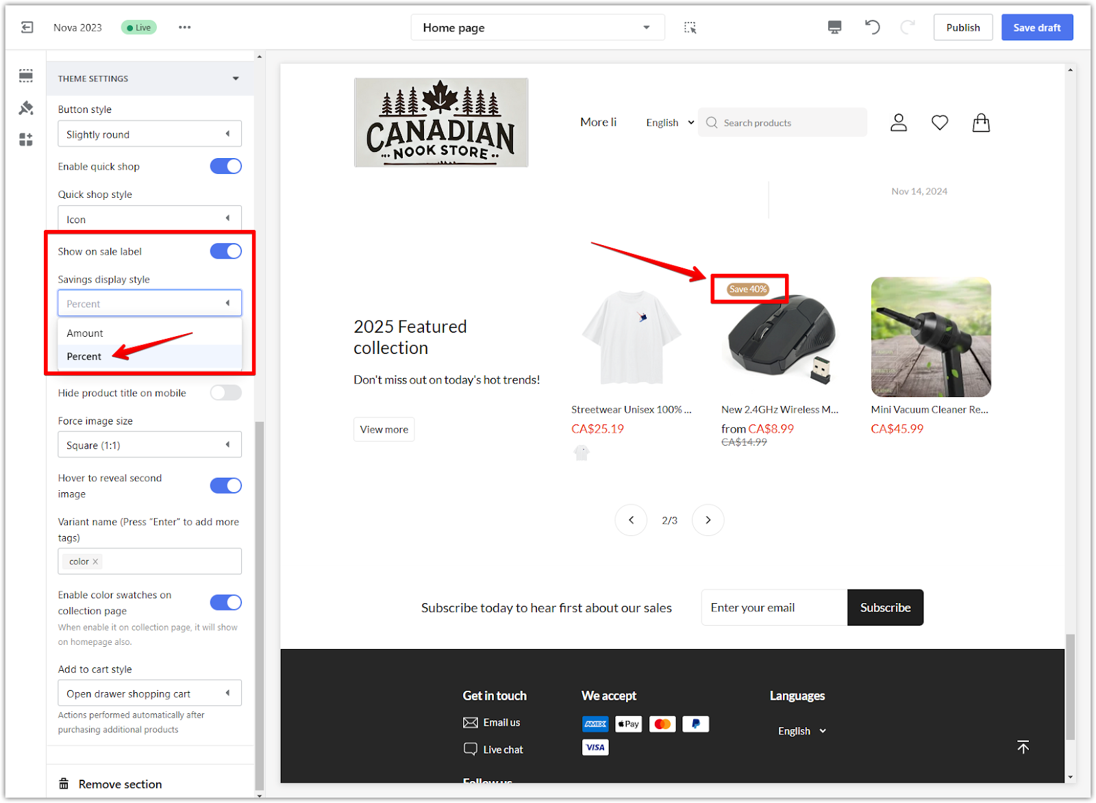
2. Display on-sale labels and style: Highlight discounted products by turning on the Show on sale label. Select Amount to display the discount as a fixed dollar value or Percent to show it as a percentage.
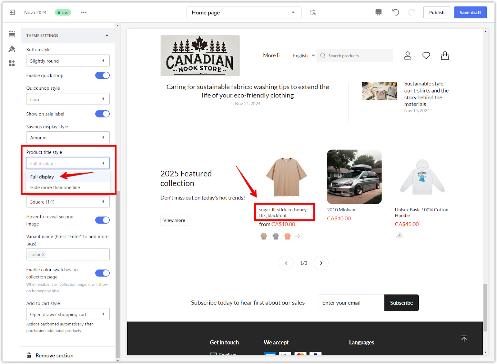
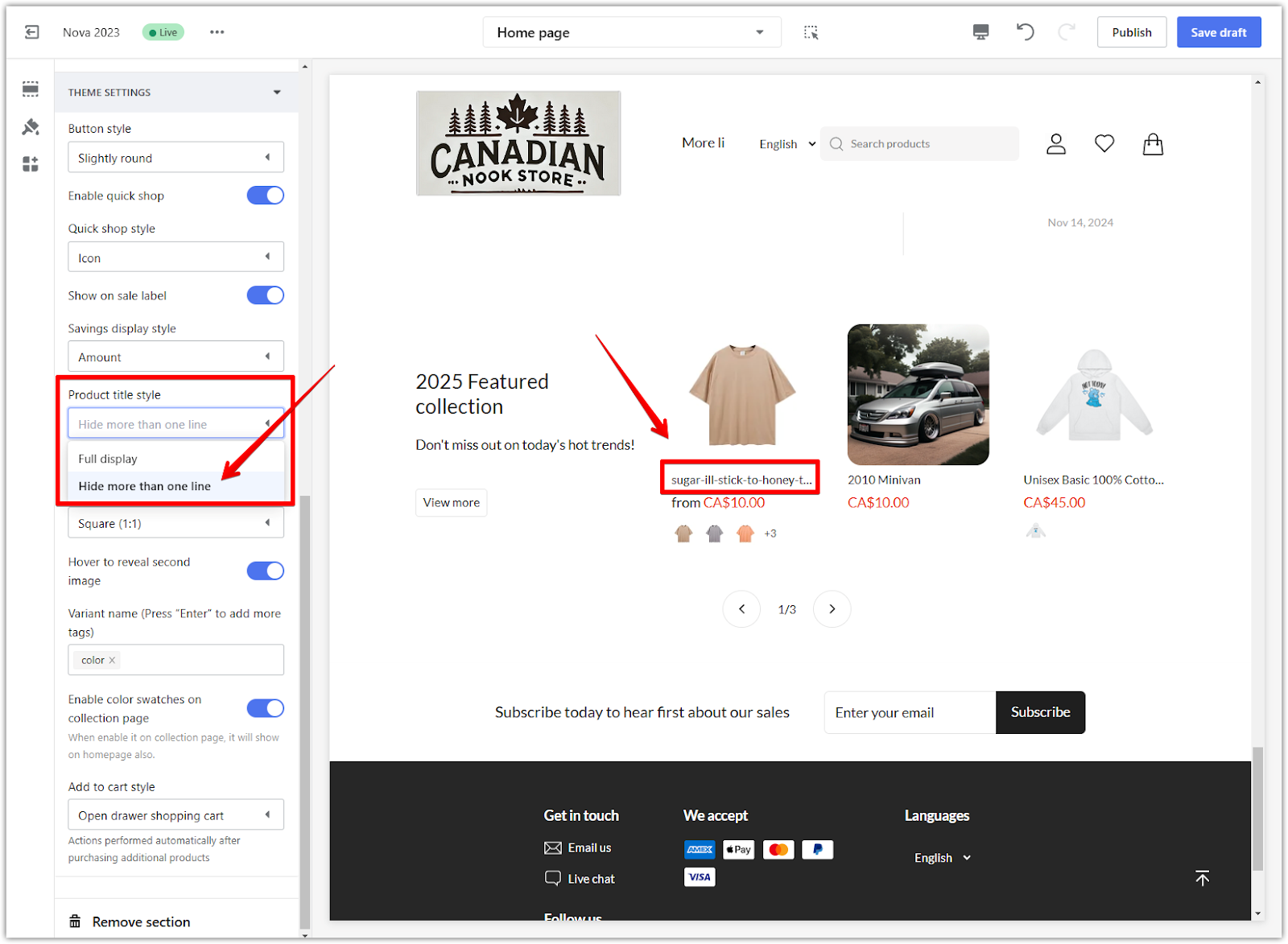
3. Product title style: Select Full display to show the complete product title or Hide more than one line to truncate longer titles for a clean look.
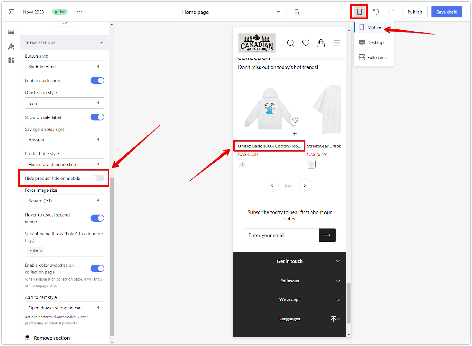
4. Hide product title on mobile: Change the preview window to Mobile to view in Mobile mode. Enable this option if you prefer to hide product titles on mobile devices for a cleaner look.
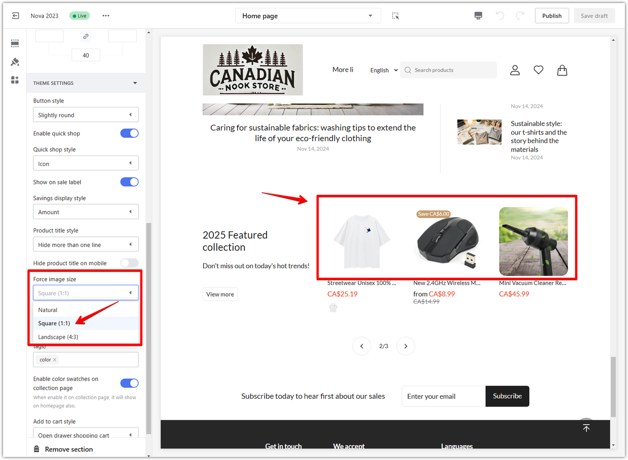
5. Force image size: Pick an aspect ratio for product images. Options include Natural (original size), Square (1:1), or Landscape (4:3) for different layouts.
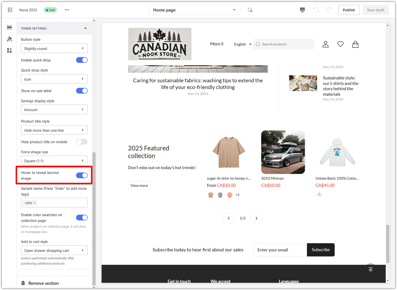
6. Hover to reveal second image: Toggle this setting to show a secondary product image when customers hover over an item.
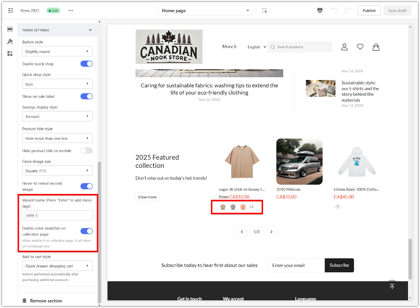
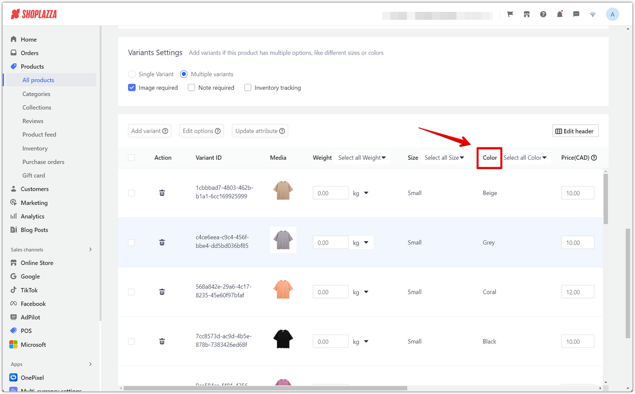
7. Variant name and images: Add variant names (e.g., "Color") in the Variant name field to display different product options. Ensure the names match the attributes set on your product page under Products > All products > Select product > Variants settings. This alignment allows the system to show the correct images for each variant, enhancing the customer experience.
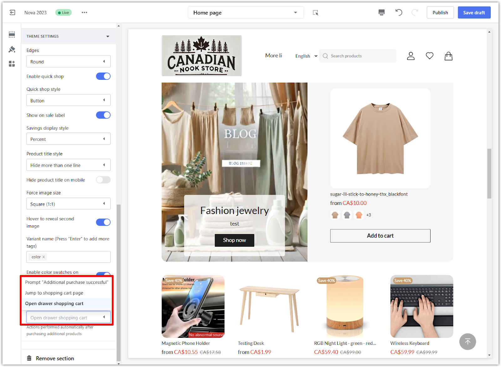
8. Add to cart style: Choose the action after a customer adds a product to their cart:
- Open drawer shopping cart: Displays a side drawer with the cart contents.
- Jump to shopping cart page: Redirects customers to the shopping cart page.
- Prompt "Additional purchase successful": Shows a confirmation message, allowing customers to continue shopping.
A well-optimized products grid card is a valuable tool for showcasing your products in a structured and visually appealing way. Thoughtful customization of headings, layouts, and display options allows you to create a user-friendly shopping experience that draws attention to your products and encourages engagement. Tailoring the theme settings ensures your storefront aligns perfectly with your brand, making it easier for customers to explore and shop confidently.


Comments
Please sign in to leave a comment.