
Age Verification: Age Gate 18+ is an app built for age verification. Merchants can add an age confirmation pop-up or an embedded verification widget to their storefront to block visitors who do not meet the age requirement. It is suitable for product categories that carry an age restriction, such as alcohol, tobacco, and e-cigarettes.
Usage Steps
1. Install the App
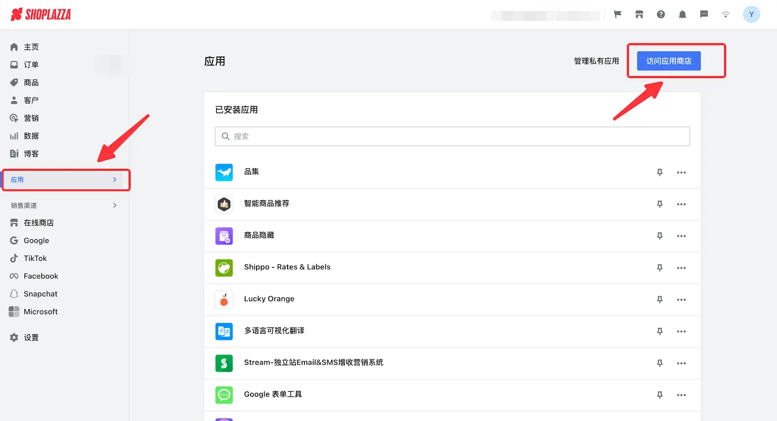
1.1 Log in to your Shoplazza Admin, click Apps, and open the Shoplazza App Store, search for “ Age Verification: Age Gate 18+ ” and click Install.
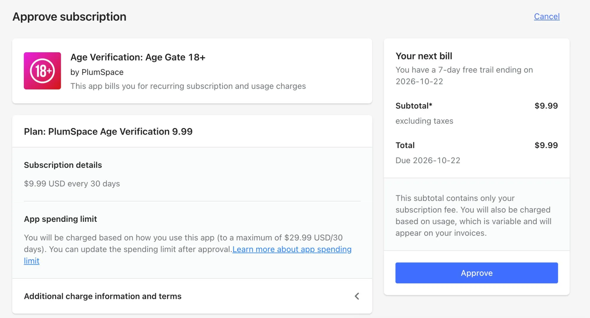
1.2 You will be redirected to the Approve subscription page. Review the plan and billing details, then click Approve to start your free trial and complete the installation. If you do not wish to continue, click Cancel in the top-right corner to exit.
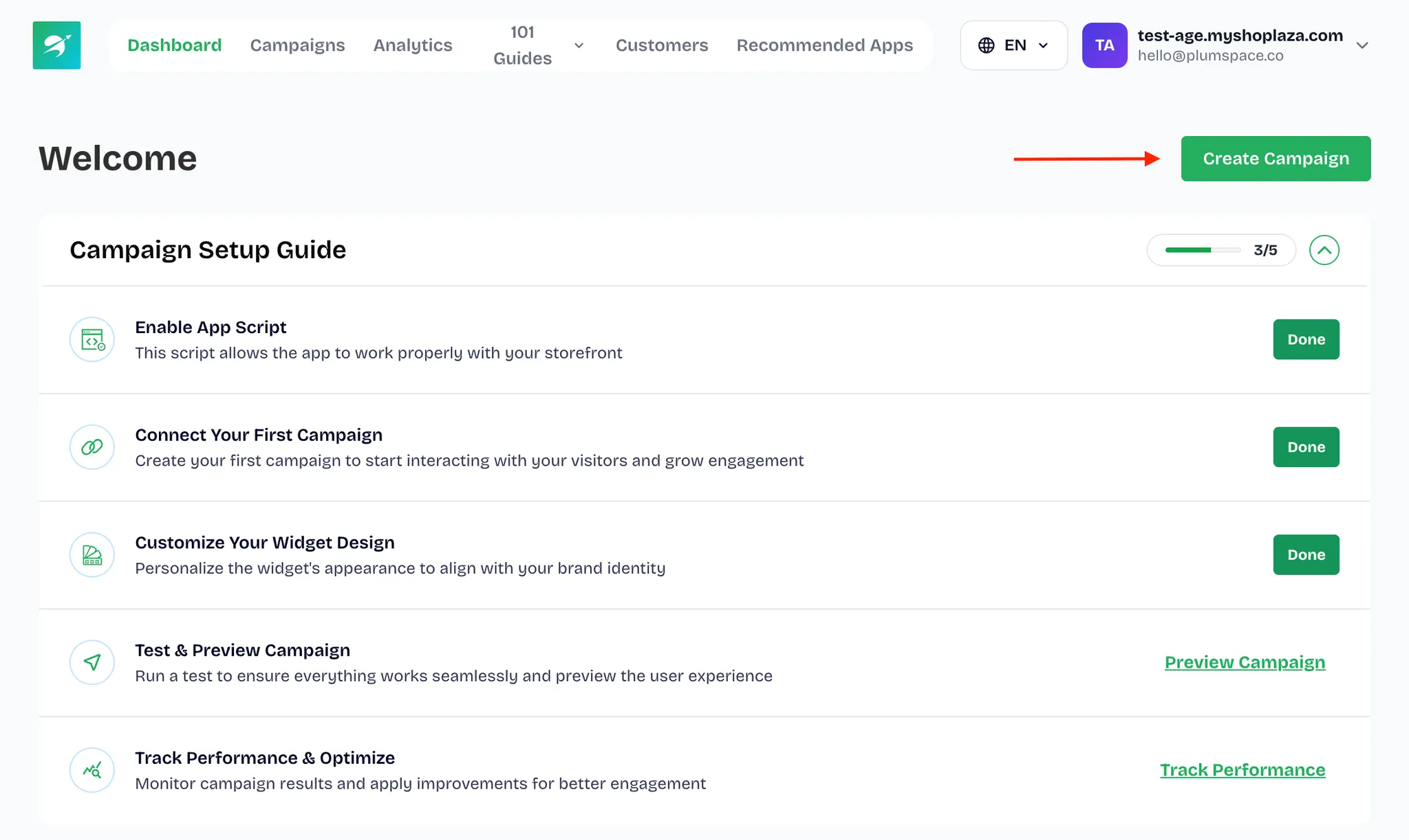
1.3 Once the installation is complete, you will be taken to the “Age Verification: Age Gate 18+” app, where you can start using it.
2. Create the Age Verification Widget
2.1 In the app, click Create Campaign.
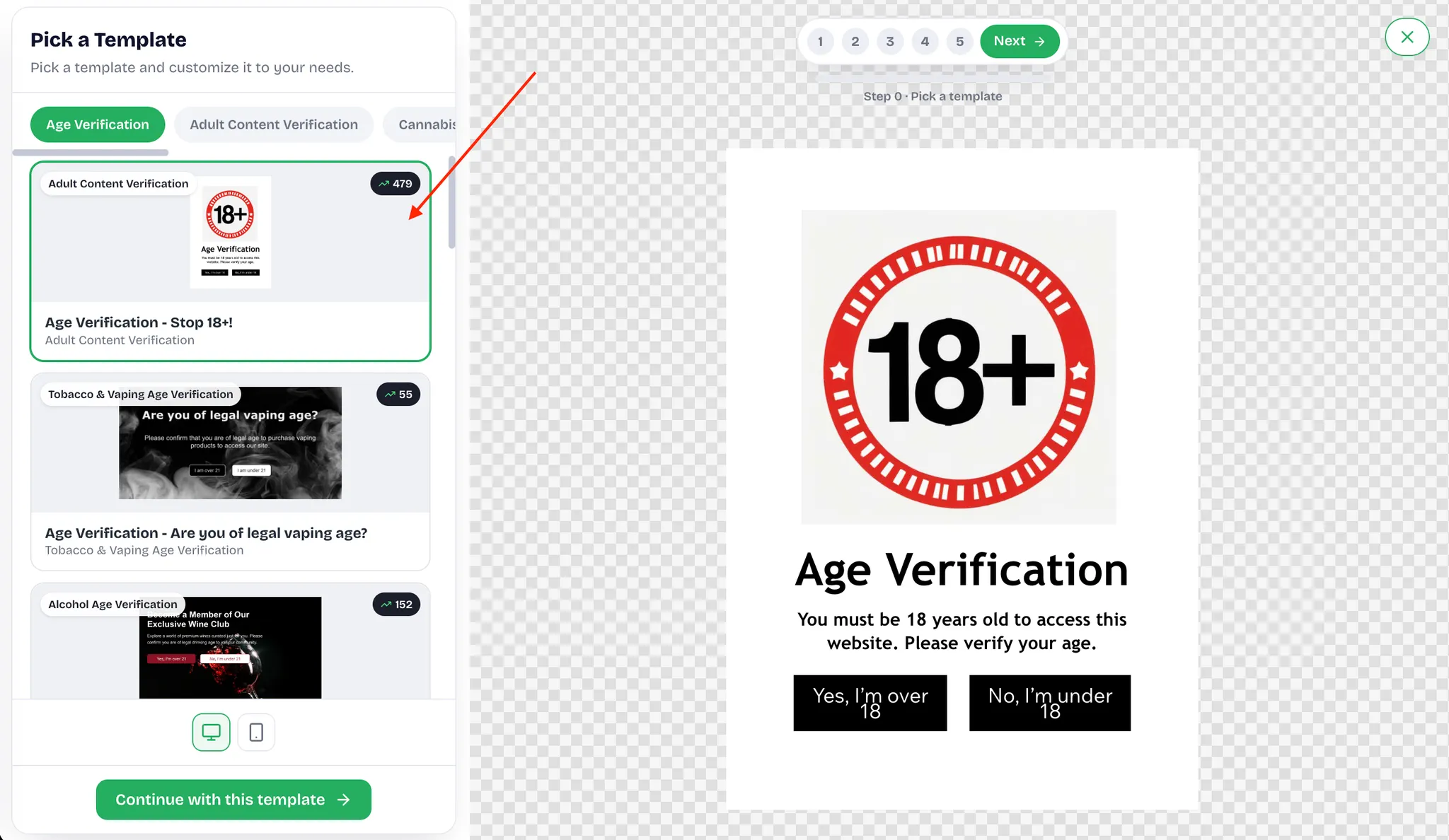
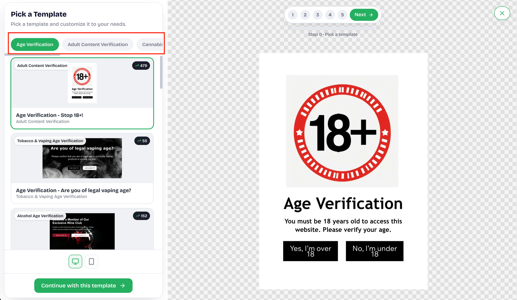
2.2 Select a template that suits your needs. If there are many templates, use the filters to locate one quickly, then click Continue with this template to apply it.
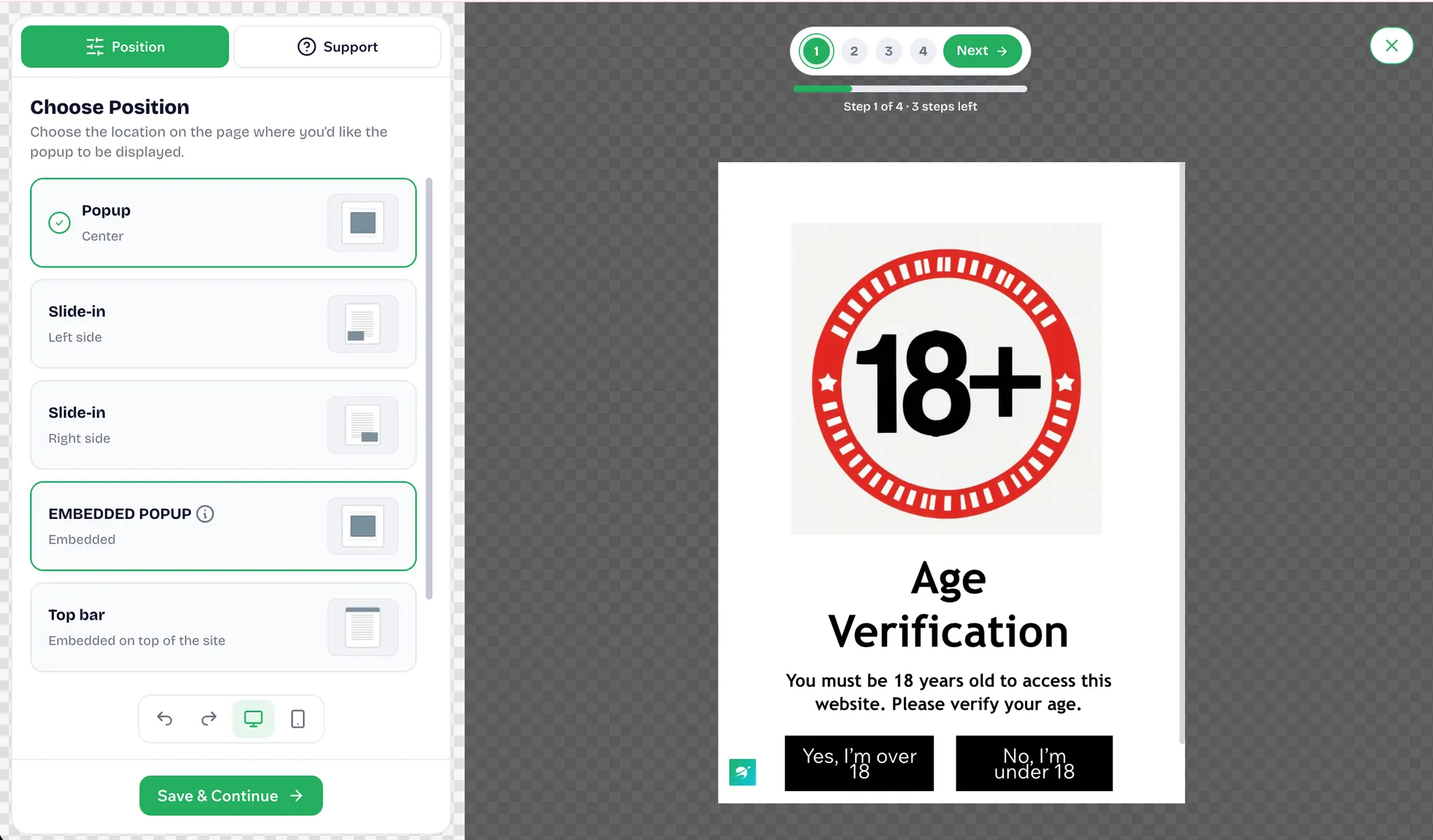
2.3 Proceed to Step 1 and choose where the widget will be displayed.
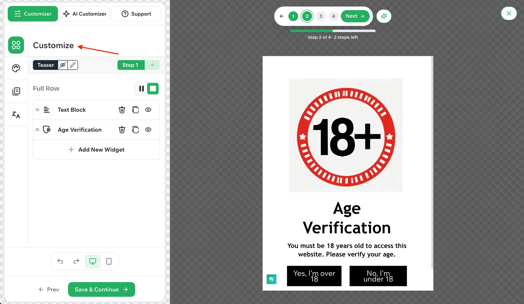
2.4 Proceed to Step 2, delete the marketing copy that comes with the template, and replace it with text that explains the age verification.
- Then adjust the widget style as described in “About Widget Appearance Settings” below. You can also generate it with AI; see “About Using AI Tools” below.
2.5 If you are happy with the style the template presents, click Save & Continue to move to the next step.
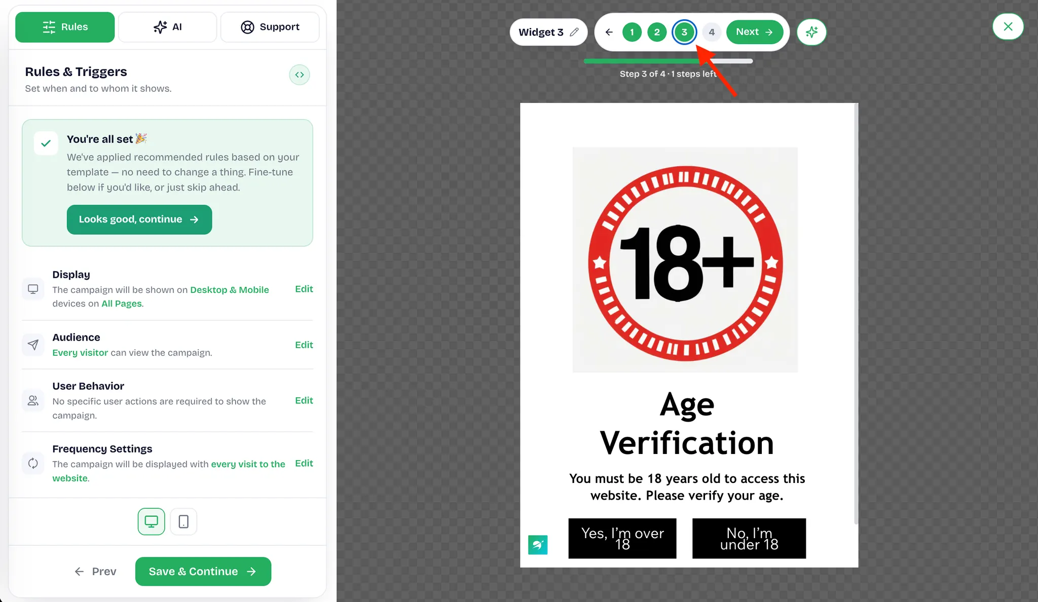
2.6 In Step 3, click the pencil icon to edit the campaign name and configure the rules and conditions.
- There are four sections: Display, Audience, User behavior, and Frequency settings. See “About Rules and Conditions” below.
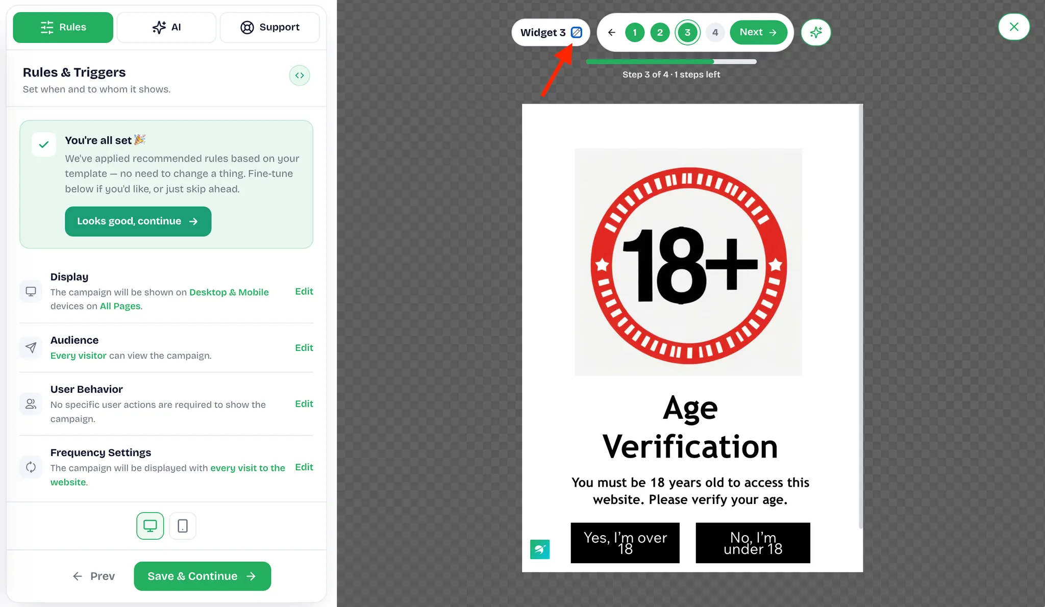
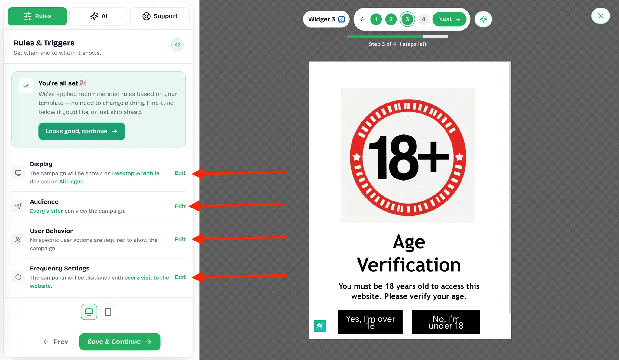
2.7 Once the configuration is confirmed, click Save & Continue to go to Preview & Go Live.
- See "About Preview & Go Live" below.
3. About Rules and Conditions
When you configure the rules and conditions for the widget, there are four sections: Display, Audience, User behavior, and Frequency settings. Age verification is normally shown to all visitors across the store, so apart from the display position and the frequency, the remaining conditions can be enabled as needed.
3.1 Display
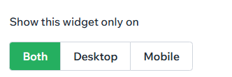
The Display section mainly controls which devices the widget appears on and which pages or moments trigger it.Here you can configure Show this widget only on and Trigger event.
- Show this widget only on: select desktop, mobile, or both.
-
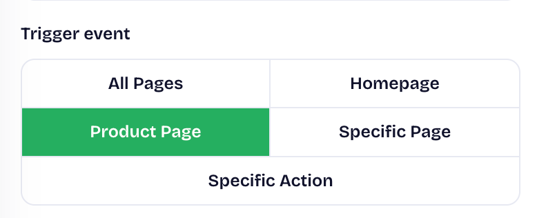
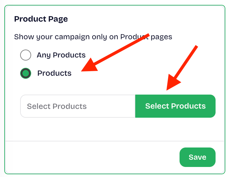
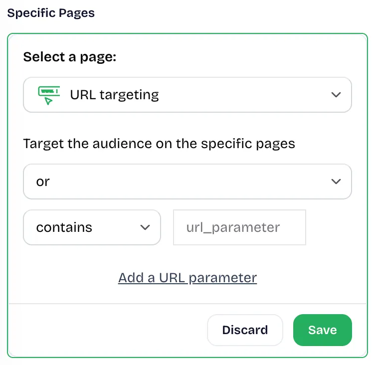
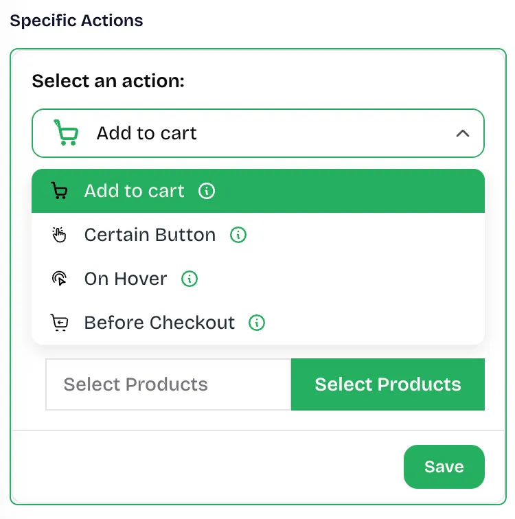
Trigger event: choose where or when the widget appears. There are three options.
-
Product Page: if you want the widget to appear on product pages only, click Products to browse and select the products.
-
Specific Page: add multiple URL parameters to display the widget when visitors reach the specified pages.
-
Specific Action: select a specific action as the trigger for the widget.
3.2 Audience
- Here you can select Show this widget to everyone or Specific people.
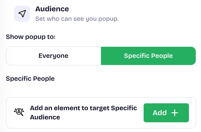
- Select Everyone to show the widget to all visitors.
- Select Specific people to narrow the audience with the following conditions:
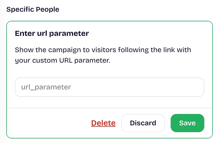
- Enter URL parameter: Add a URL parameter to your link so that your widget can be seen only when following a specific link with this parameter.
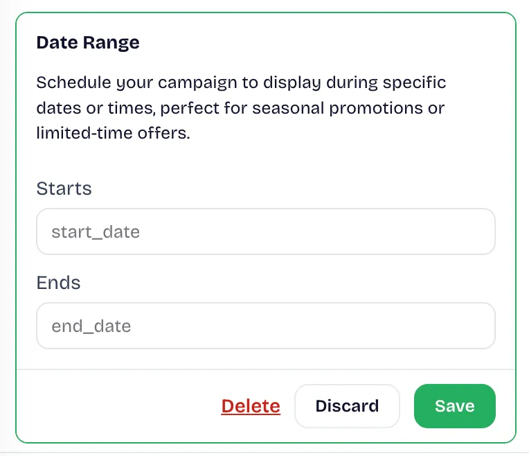
- Date range. Only show your offer if it triggers within the start and end date you specify with this setting.
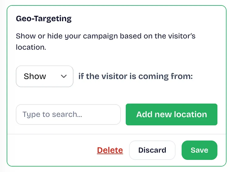
- Geo-Targeting.Only show your offer to visitors from the locations you choose with this setting.
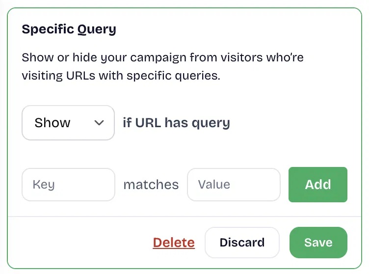
- Specific Query. Only show your offer to visitors who visit URLs with the specific query parameters you specify with this setting.
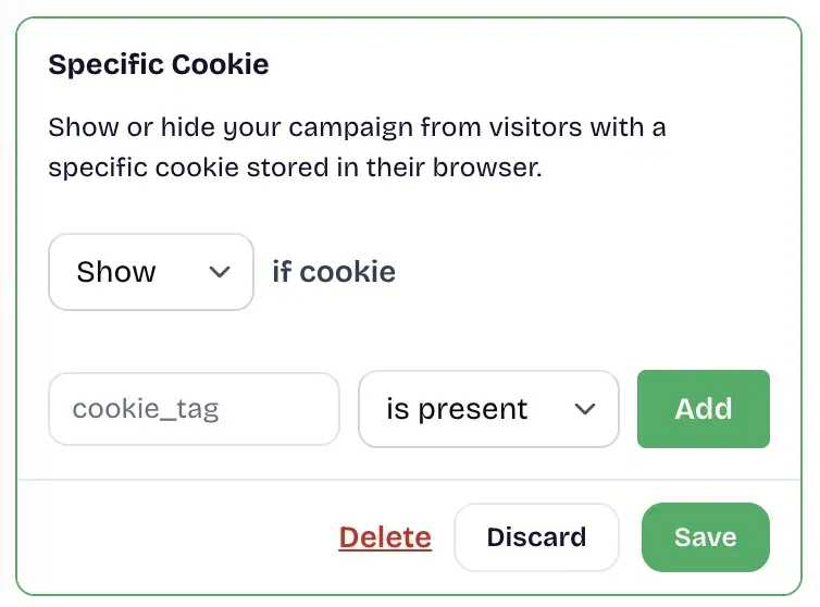
- Specific Cookie. Only show your offer to visitors who have the cookie you specify stored in their browser with this setting.
- UTM Campaign. Only show your offer to visitors who arrive from the UTM campaign you specify with this setting.
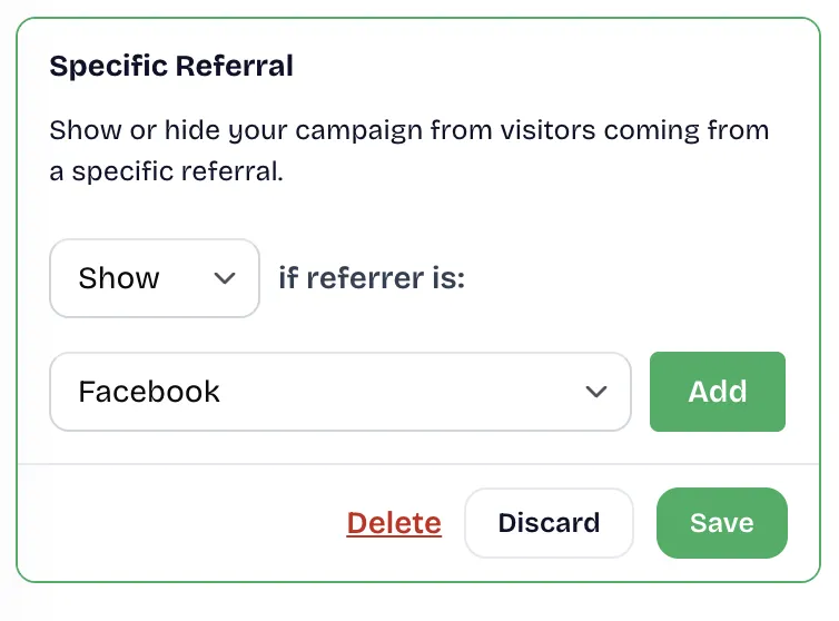
- Specific Referral. Only show your offer to visitors who arrive from the referral source you specify with this setting.
3.3 User behavior
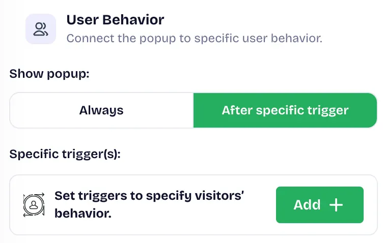
Here you can choose when the widget is triggered. You can show it always, or after specific triggers. There are three specific triggers, and all of them are delayed triggers rather than prompts that appear as soon as a visitor enters the store.
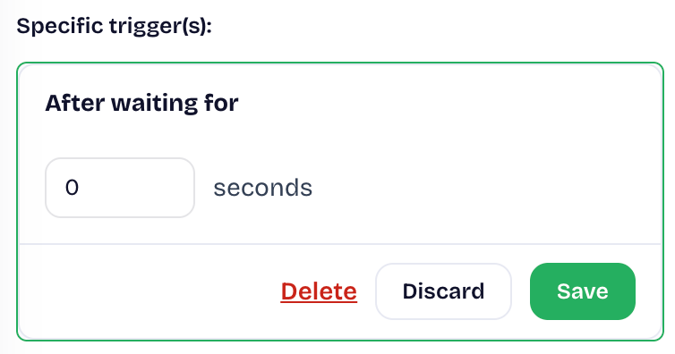
- After waiting for: the widget appears only after the visitor has stayed on the page for the set period of time.
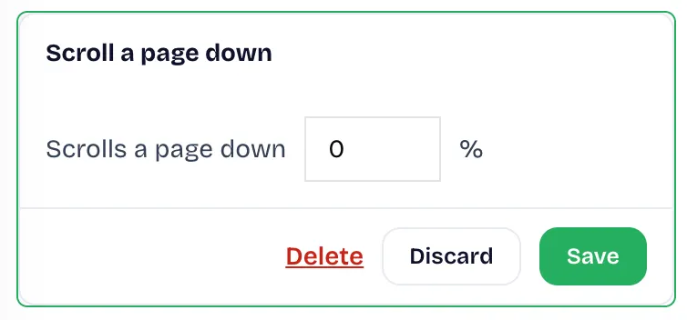
- Scroll a page down: the widget appears after the visitor has scrolled through a set percentage of the page, which confirms browsing interest and avoids interrupting visitors as soon as they arrive.
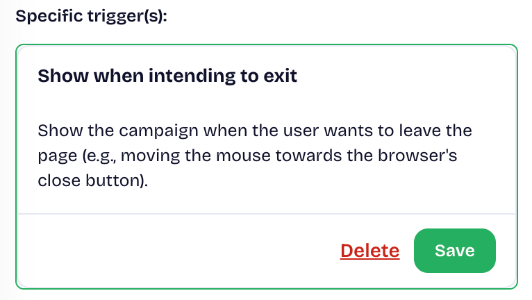
- Exit intent: the widget appears when the visitor is about to leave, which makes it a useful last-chance prompt. The original documentation states that this option works on desktop only.
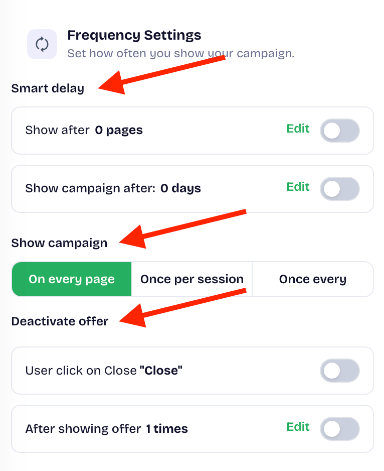
3.4 Frequency settings
Here you can set how often the widget is displayed and define when it should be shown and when it should no longer appear.
4. vAbout Preview & Go Live
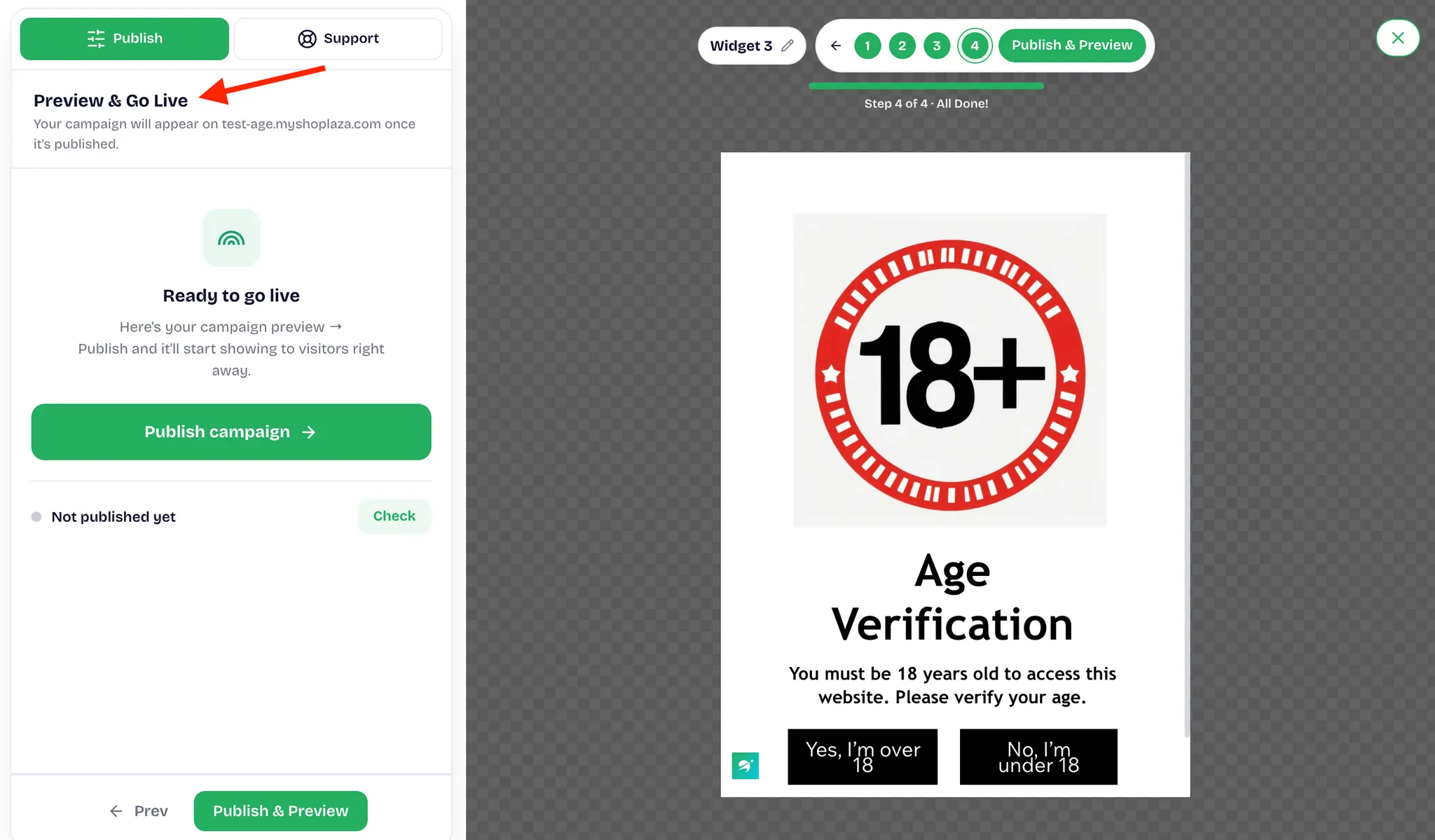
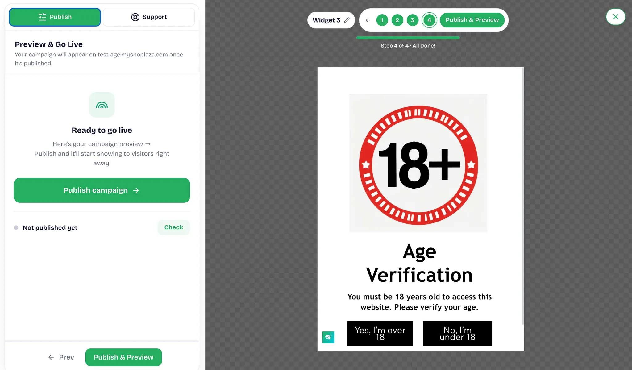
Once the rules and triggers are configured, click Save & Continue to open Preview & Go Live. The Ready to go live block is on the left, and the campaign preview is on the right. The publishing method differs between the two widget types, pop-up and embedded.
4.1 Pop-up
A pop-up does not need to be embedded in your store's code, so you can publish it directly from this step.
- In the Ready to go live block on the left, click Publish campaign. The widget takes effect for store visitors immediately.
- Status shows whether the campaign is live on your store. If it displays Not published yet, visitors cannot see the widget. After publishing, click Check to refresh the status.
4.2 Embedded Widget
An embedded widget must be added to your store before it can go live.
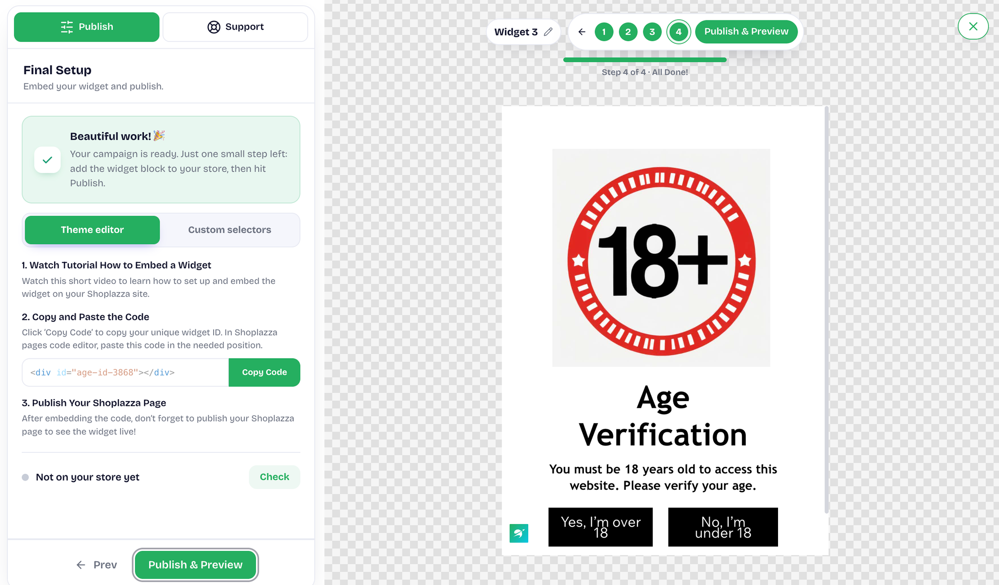
- In the Final Setup panel, choose one of the two embedding methods: Theme editor or Custom selectors.
- Click Copy Code to copy the code that belongs to this widget, then paste it into the Shoplazza page code editor wherever you want the widget to appear.
- Publish the page in Shoplazza. If the page is not published, the widget will not be displayed.
- If the bottom of the panel shows not on your store yet, the code has not been found in your store. After you embed the code and publish the page, click Check to refresh the status, then click Publish & Preview.
- Once published, the campaign is activated automatically, and you can check how it looks on your storefront.
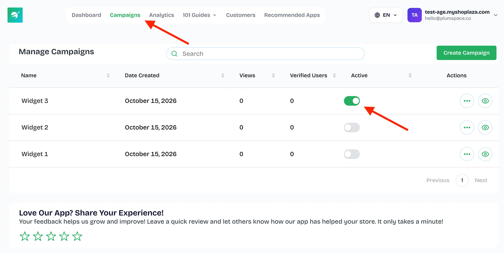
- To disable the widget, go to the Campaigns page, find the widget you created, and turn off the switch in the Active column.
5. About Widget Appearance Settings
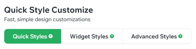
On the Appearance tab, which is also the Design tab, the settings are divided into three sections. Adjust them as needed; you do not have to change every item.
5.1 Quick Styles
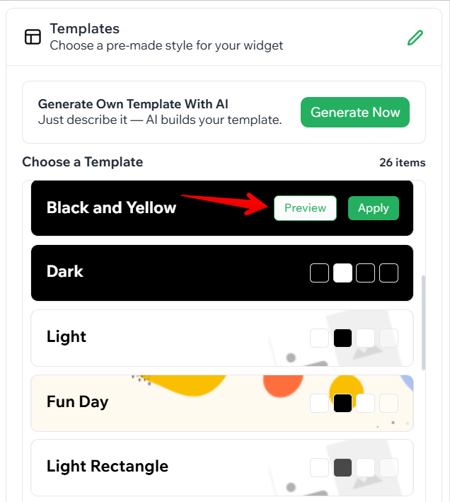
- Templates changes the color theme. Click Preview to check the result, then click Apply once you are satisfied.
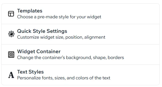
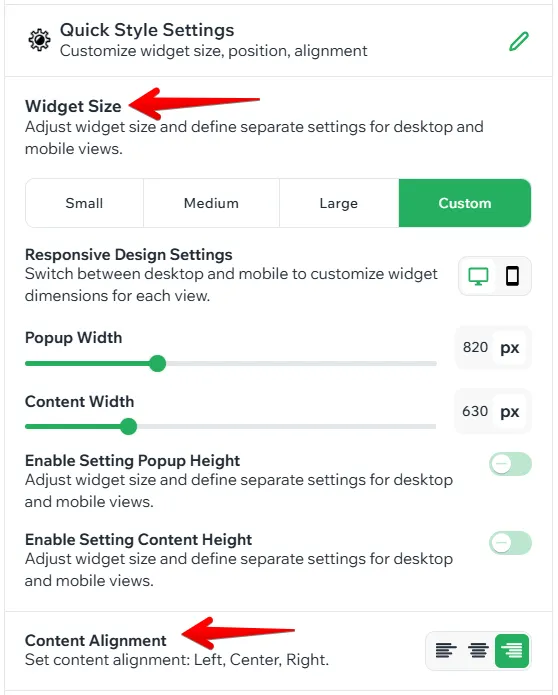
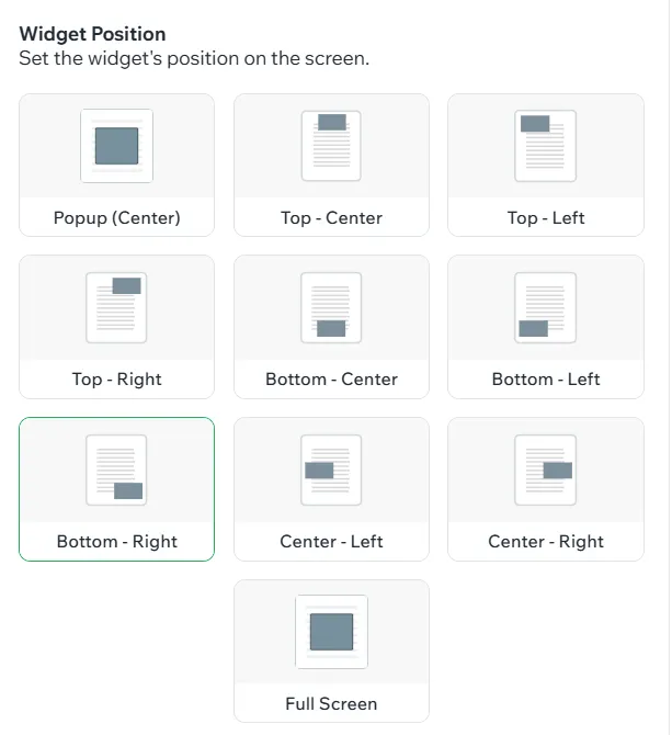
- Quick Style Settings sets the widget size and content alignment, and for a pop-up you can also specify the exact position.
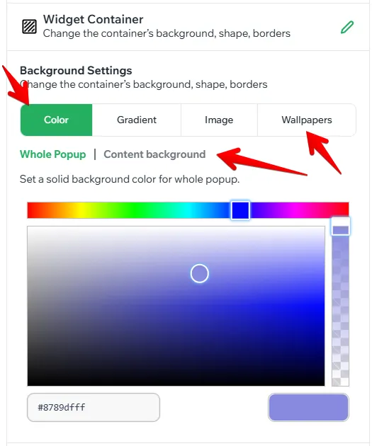
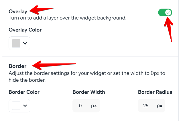
- Widget Container changes the background of the widget or of its content, either from the wallpaper library or by uploading a local image, and also lets you adjust the border style and turn the overlay on or off.
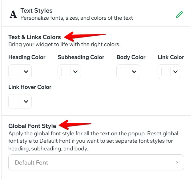
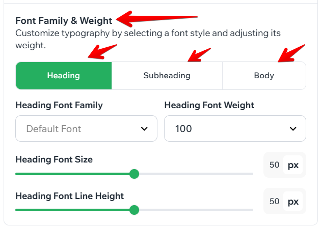
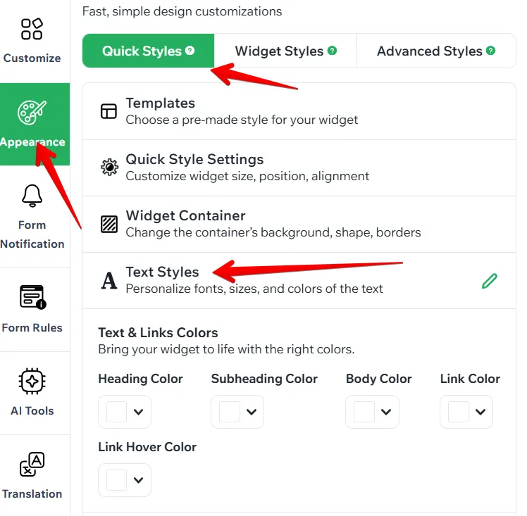
- Text Styles sets the font family, font weight, and font size for headings, subheadings, and body text separately.
5.2 Widget Styles
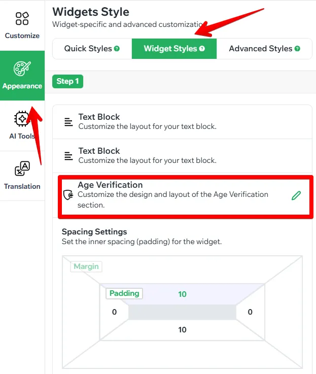
In the Widget Styles section, you can customize every element of the widget separately: the text block, the widget container, the Accept and Reject buttons, and the restriction message. To open the settings of an element, click the pencil icon next to it.
-
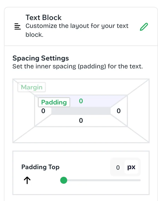
Text Block: Here you can adjust the inner spacing (padding) around the widget text.
- Click the pencil icon next to Text Block.
- In Spacing Settings, click the side you want to change (top, right, bottom, or left) in the padding preview.
Drag the slider or enter the exact value in pixels.
-
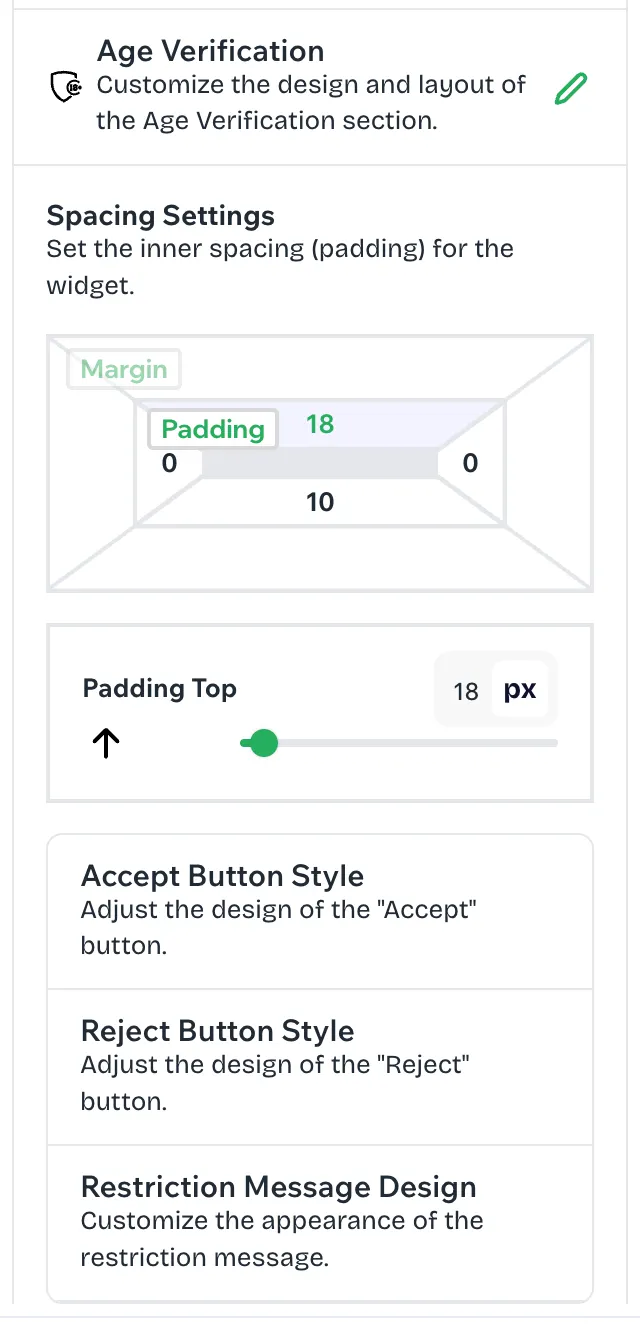
Age Verification: Here you can set the inner spacing (padding) for the whole widget. This section also gives you access to the style settings of each widget element: Accept Button Style, Reject Button Style, and Restriction Message Design.
- Click the pencil icon next to Age Verification.
- In Spacing Settings, set the top, right, bottom, and left padding of the widget.
- Click any of the elements below the spacing settings to customize its design.
-
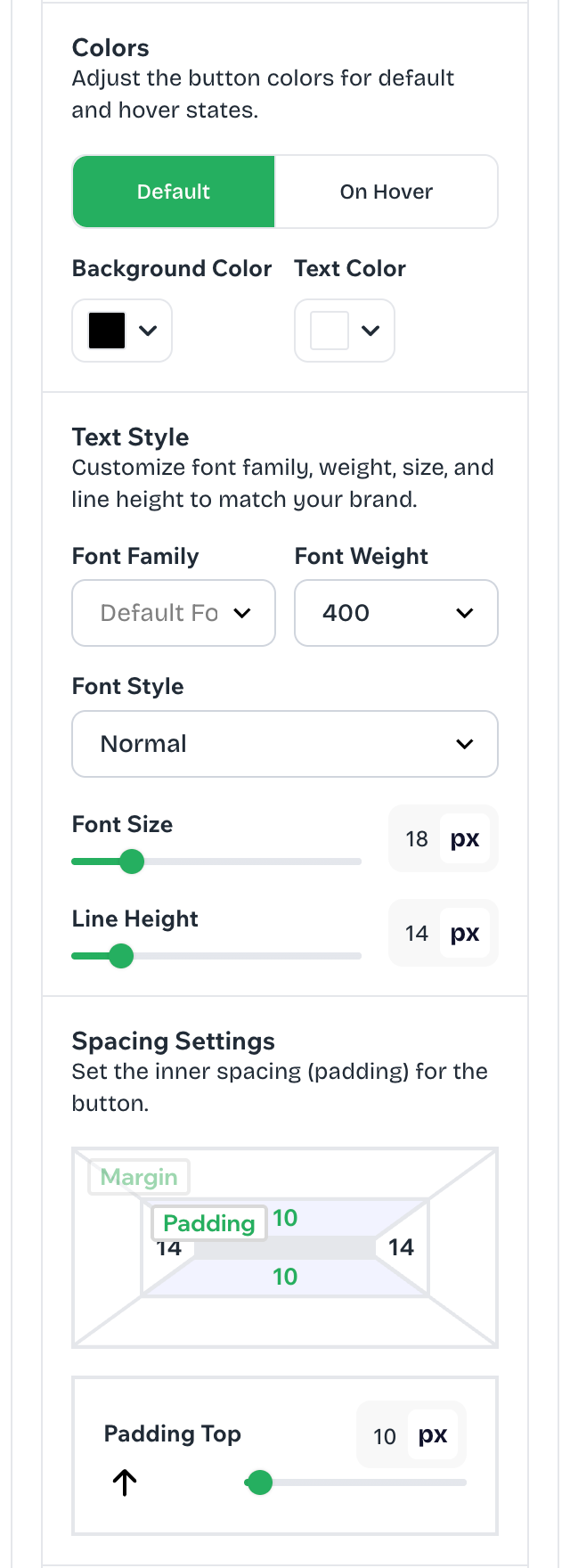
Accept Button Style: Here you can customize the look of the “Accept” button.
- Click Accept Button Style in the Age Verification settings.
- Colors: Select the Default or On Hover tab and choose the background color and text color for each state.
- Text Style: Choose the font family, font weight, and font style, then set the font size and line height.
- Spacing Settings: Set the inner spacing (padding) of the button for each side.
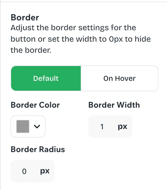
- Border: Select the Default or On Hover tab and set the border color, width, and radius. To hide the border, set the width to 0px.
-
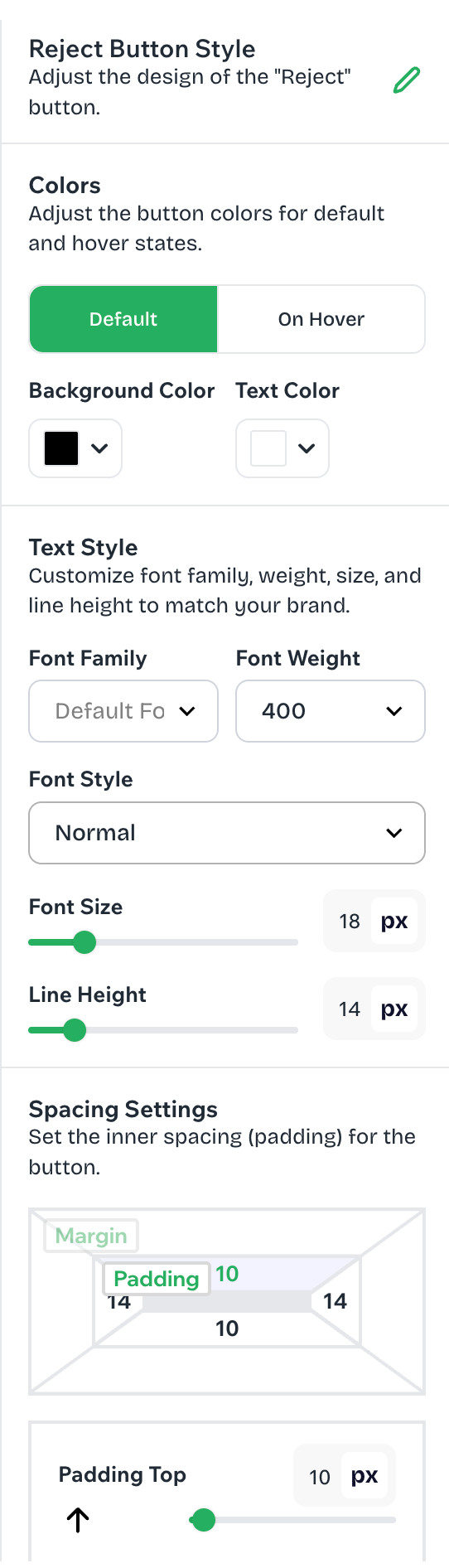
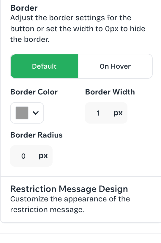
Reject Button Style: Here you can customize the look of the “Reject” button. It has the same settings as the Accept button, so you can style the two buttons differently, for example, to make the “Accept” button stand out as the main action.
- Click Reject Button Style in the Age Verification settings.
- Colors: Set the background and text colors for the Default and On Hover states.
- Text Style: Choose the font family, weight, and style, then set the font size and line height.
- Spacing Settings: Set the inner spacing (padding) of the button for each side.
- Border: Set the border color, width, and radius for the Default and On Hover states. To hide the border, set the width to 0px.
-
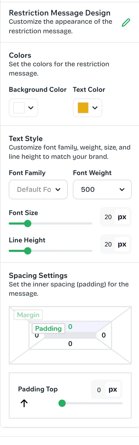
Restriction Message Design: Here you can customize the message visitors see when they don’t meet the age requirement.
- Click Restriction Message Design in the Age Verification settings.
- Colors: Choose the background color and text color of the message.
- Text Style: Choose the font family and font weight, then set the font size and line height.
- Spacing Settings: Set the inner spacing (padding) around the message for each side.
5.3 Advanced Styles
In the Advanced Styles section, you can find the following settings:
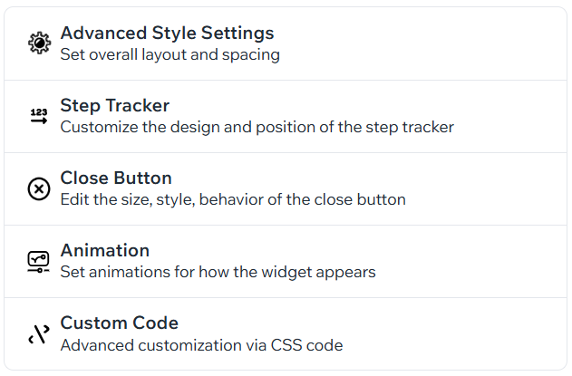
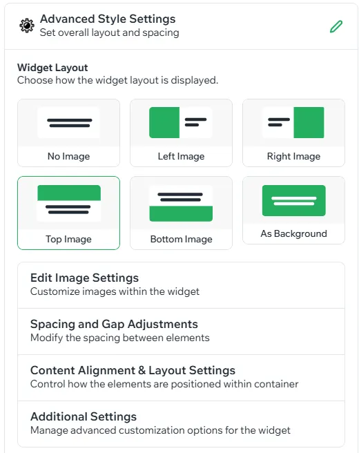
- Advanced Style Settings: Here you can control image settings, spacing, alignment & layout settings for the whole widget.
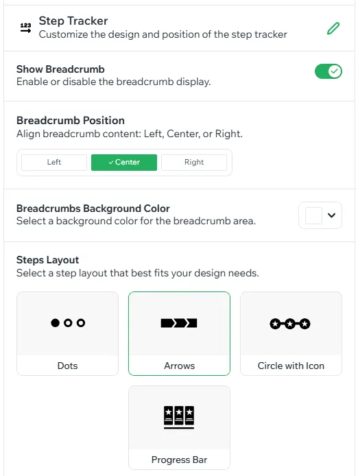
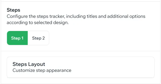
- Step Tracker: Here you can add a step tracker for your multi-step form, choose the steps layout and specific colors and styles to match your brand.
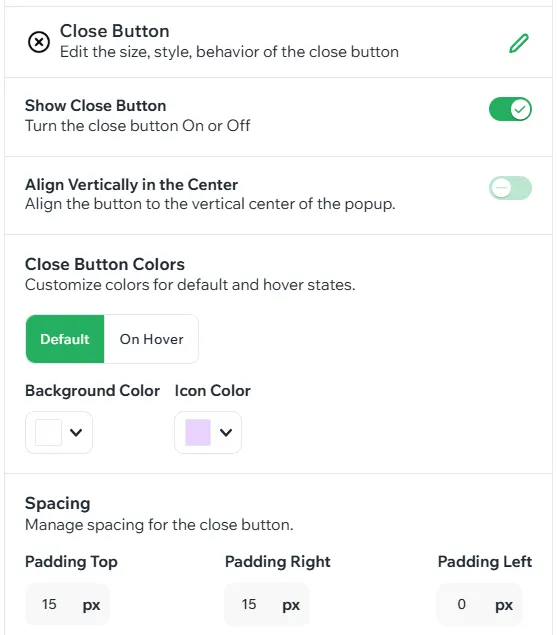
- Close Button: Add a close button to your widget by enabling this feature. Here you can also customize the look of the button.
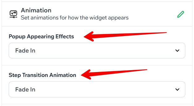
- Animation: Click on the dropdown and pick an animation effect for your pop-up here.
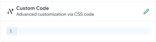
- Custom Code: If you lack any style settings, you can always add your own CSS code in this section.
6. About Using AI Tools
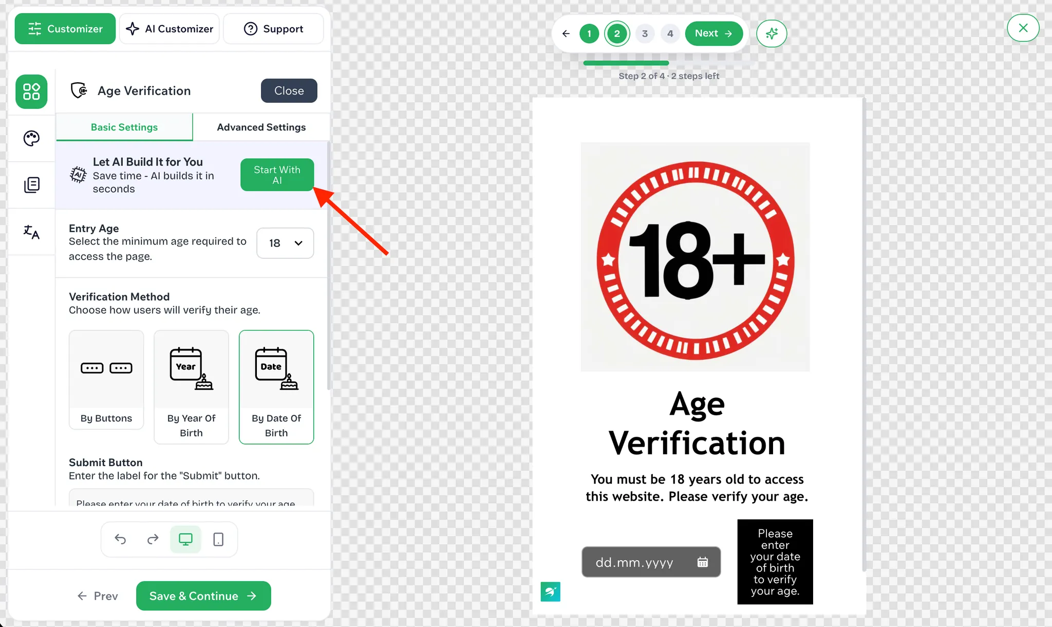
AI tools are available in Step 2 of the editor, Layout & Design, and can generate or adjust the widget for you.
6.1 Open the AI Generator
- Click the AI Customizer tab at the top of the side panel.
- Or click Start With AI in the Let AI Build It for You banner on the Basic Settings tab.
- Or click the sparkle icon next to Save & Continue in the top-right corner.
6.2 Generate Content with AI
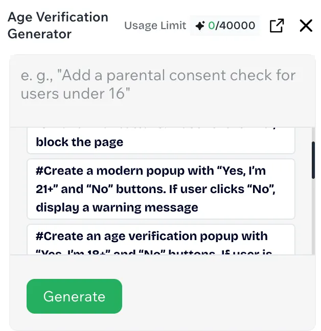
- The generator panel opens for the widget you are currently editing. For the age verification widget, for example, it is the Age Verification Generator.
- Describe what you need in the prompt field, for example, “Add a parental consent check for users under 16.”
- If you are not sure what to write, click one of the suggested prompts below the field as a starting point.
- Click Generate, and the result appears in the live preview on the right.
- If adjustments are needed, fine-tune the result manually on the Customizer tab, then click Save & Continue.
6.3 Good to Know
- Usage Limit at the top of the panel shows how many AI credits you have used out of your total allowance.
- Use the expand icon to open the generator in a larger window, or click X to close it.
- The more specific the prompt, the better the result. State the minimum age, the button labels, and what should happen to underage visitors: display a message, block the page, or redirect to a URL.
- The original documentation notes that this section is still being developed and that more features will be added over time.
7. About how to use the translation tab?
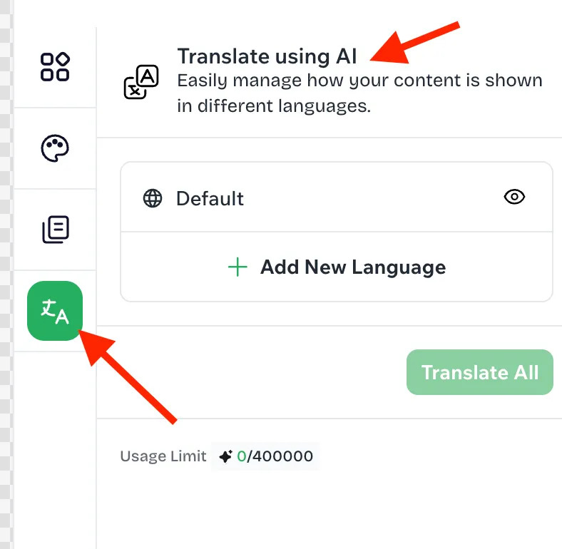
You can translate the widget into multiple languages on the Translation tab.
7.1 Click Add New Language, select the languages you need, then click Continue with languages.
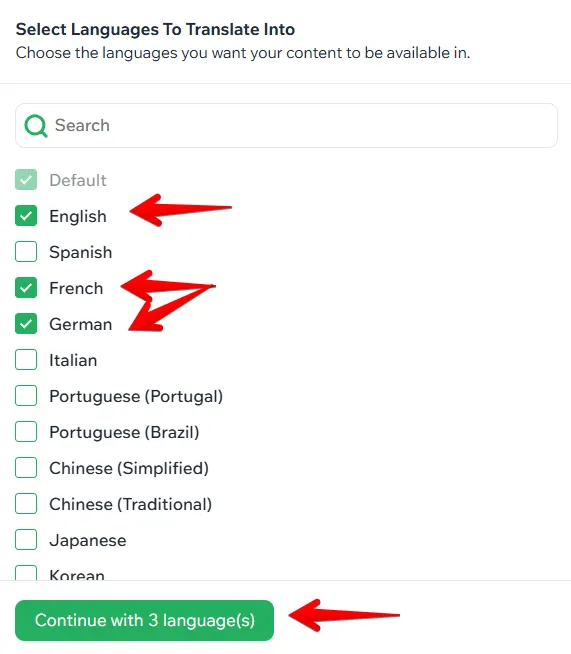
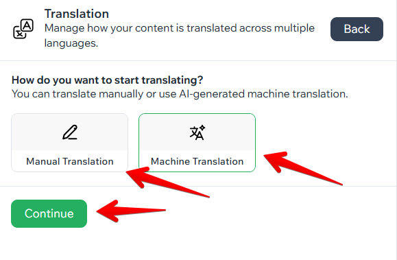
7.2 In the next step, choose the translation method: manual translation or machine translation.
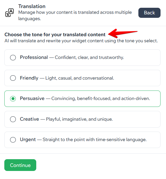
7.3 If you choose machine translation, you also need to select the tone of the content.
7.4 Your translations are ready once this is done.
8. About Widgets
8.1 Text Block, Subtitle, and Title
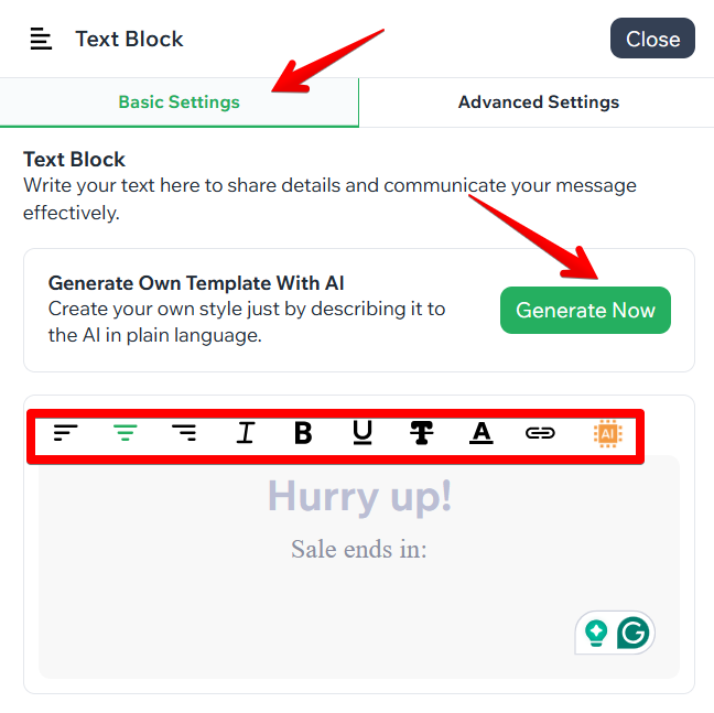
Use these elements to tell visitors what the widget is for. The editing tools in this section help you highlight important information and draw the visitor's attention to it.
- In Basic Settings, enter your text or generate it with AI, then format it with the tools on the toolbar.
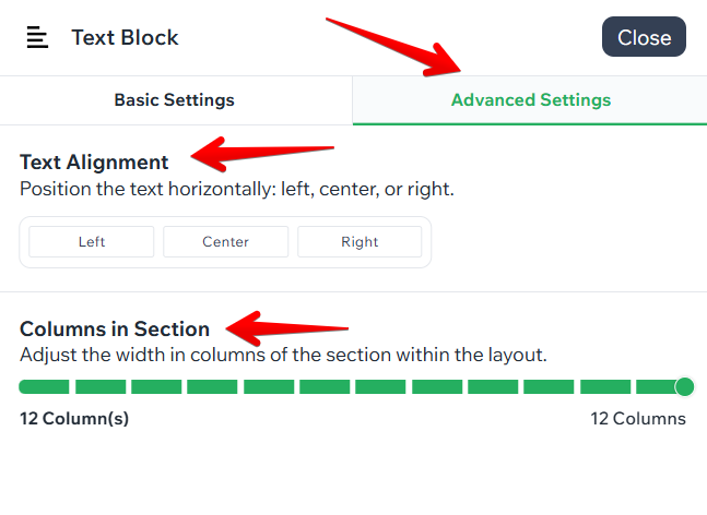
- In Advanced Settings, adjust the text alignment and set the number of columns in the section.
- Change the text style under the Appearance tab > Quick Styles > Text Styles.
8.2 Image
Images directly affect how visitors respond to the widget, so it is advisable to replace the placeholder image that comes with the template.
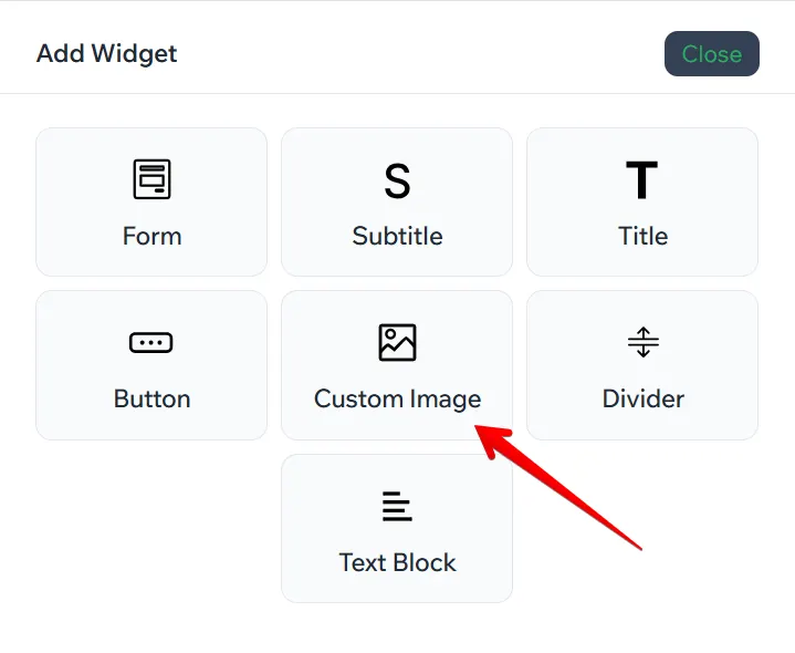
- Find the custom image section in the element list and add it.
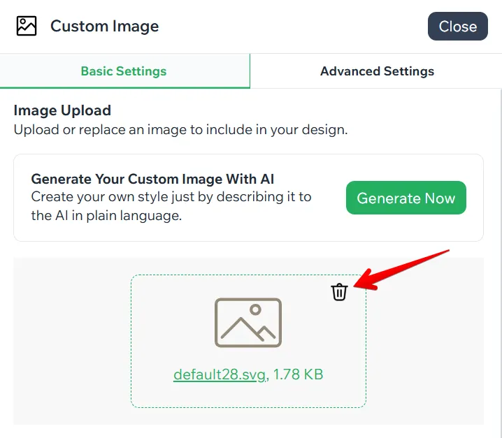
- Delete the default image.
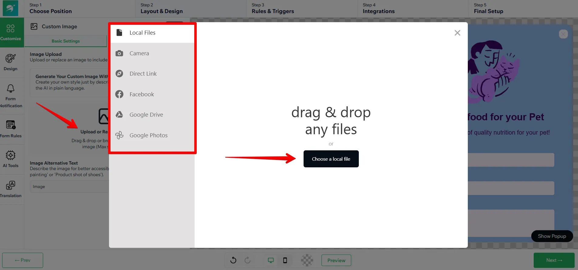
- Click Upload or Replace Image and choose the most convenient way to add an image.
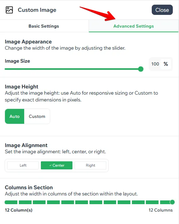
- In the section, set the image size, height, alignment, and number of columns.
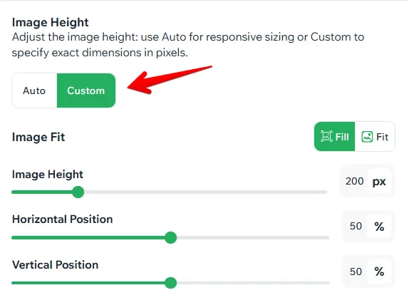
- The image height can be set to Auto or Custom. If you choose Custom, additional fields appear: image height, horizontal and vertical position, and whether the image is filled or fitted.
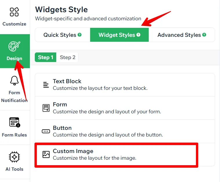
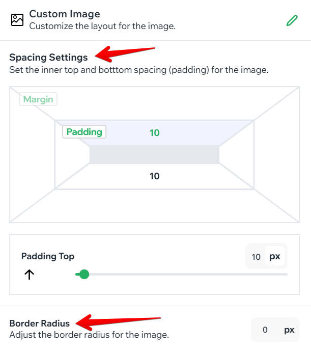
- Other styles are available under the Design tab > Widget Styles > Custom image, where you can change the image spacing and the border radius.
8.3 Age Verification Widget
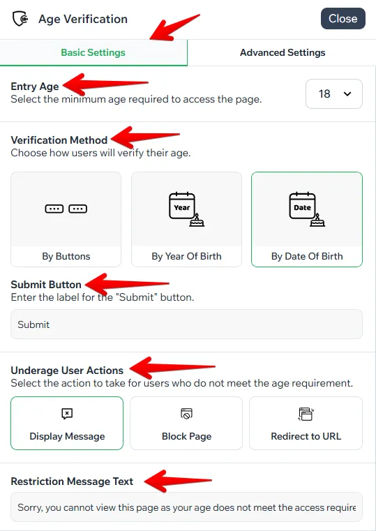
- In Basic Settings, select the entry age for your users, choose the verification method, and underage user action, and customize the button text and the restriction message text.
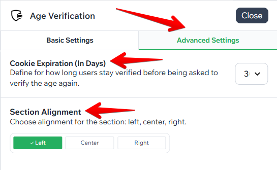
- In Advanced Settings, set up cookie expiration (for how long the user’s choice or entry will be saved in cookies, and the age verification pop-up will not appear for the same user). Choose the right alignment option for this section.
- Other style settings are available under the Design tab > Widget Styles > Age Verification.

Comments
Please sign in to leave a comment.