
The basic components of Page Builder. Without needing any code, you can simply drag and drop components onto the canvas to create cards. You can design various types of cards based on your needs, such as text-and-image columns, floating photo walls, Q&A cards, and more.
Process for Adding Advanced Cards to a Theme
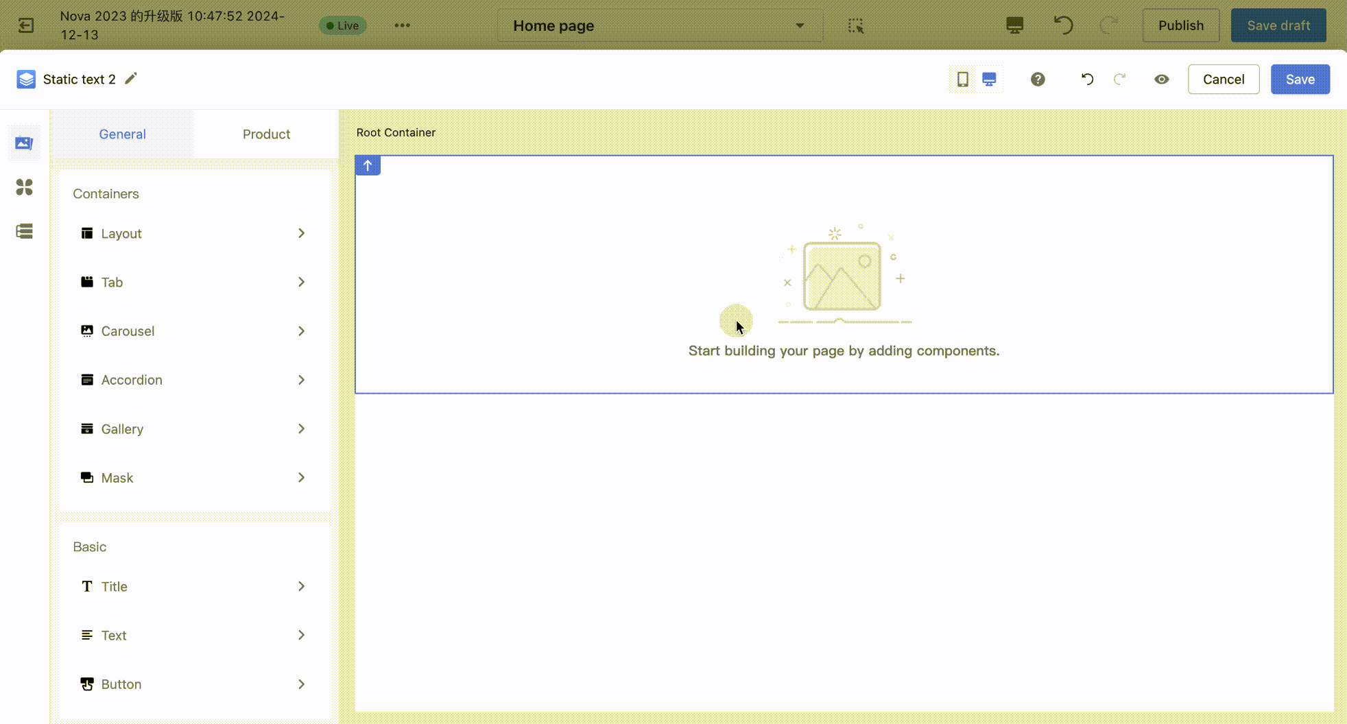
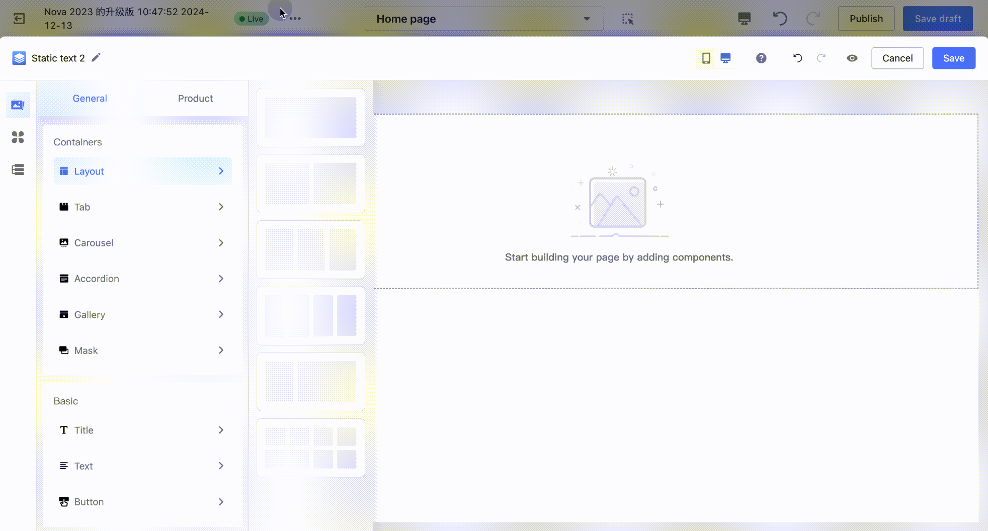
Step 1. Add a Card
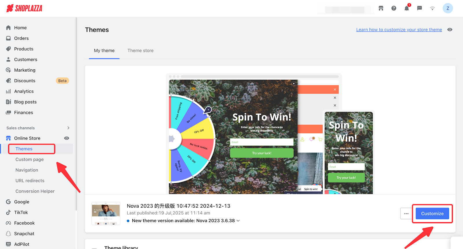
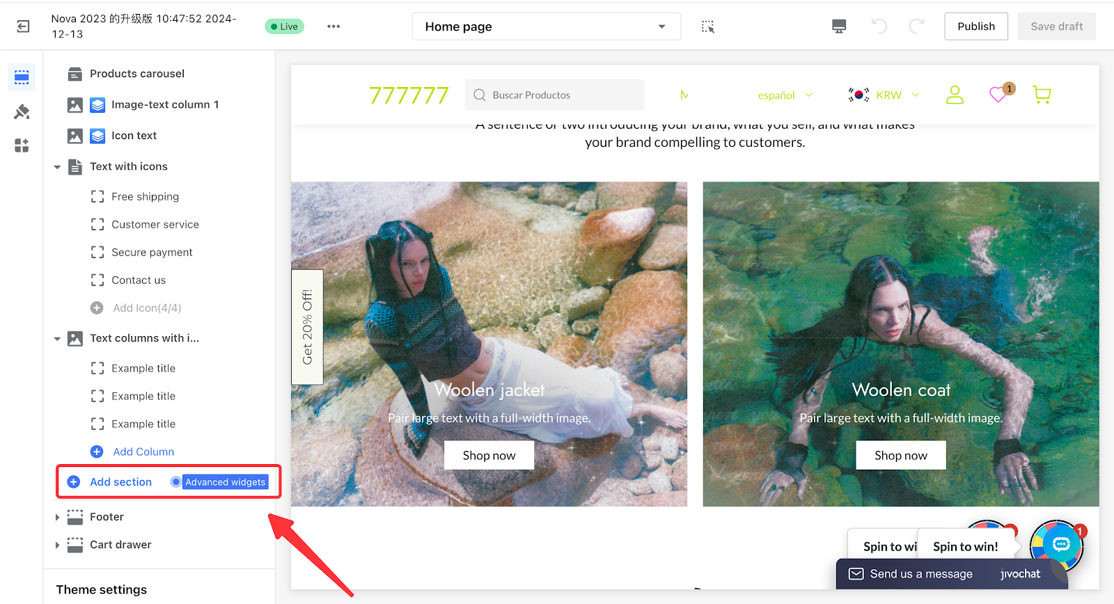
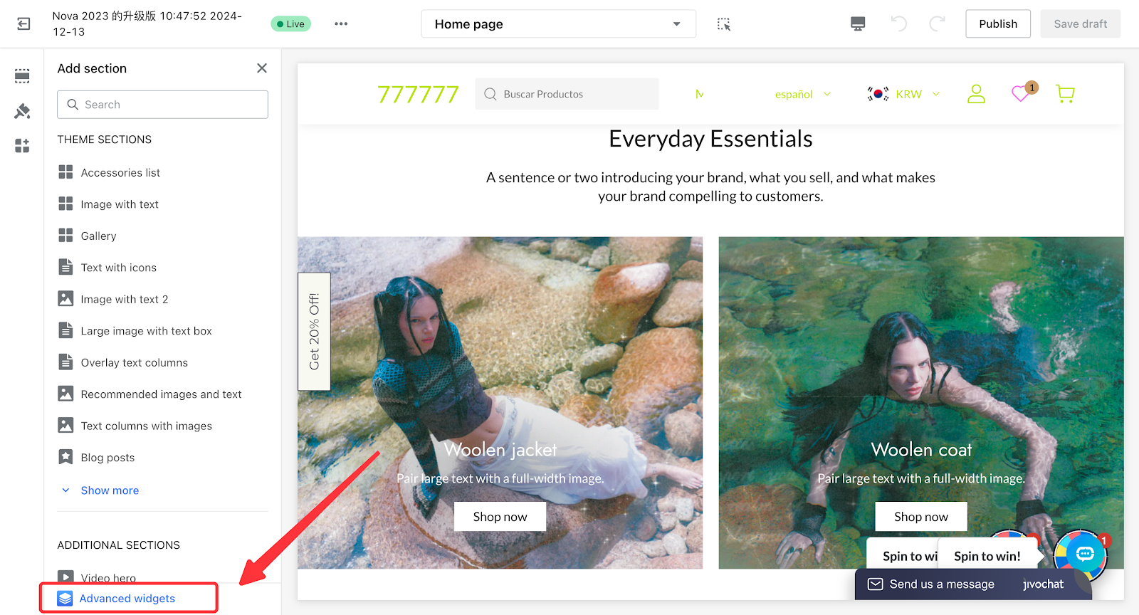
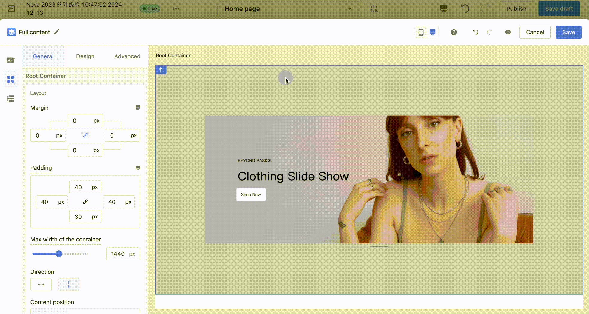
Log in to your Shoplazza admin, go to Online Store > Theme Editor > Edit to enter the theme editor. Scroll down to the bottom of the card list in the left panel, click the Add Card button, and then in the secondary panel, click the entry to the Advanced Card Marketplace.
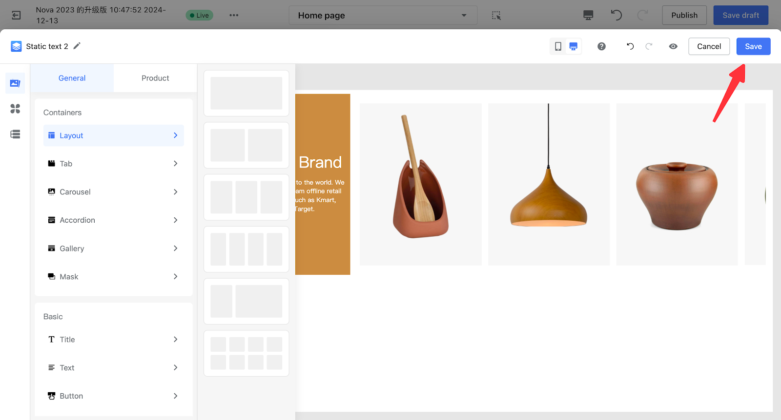
Step 2. Edit the Card
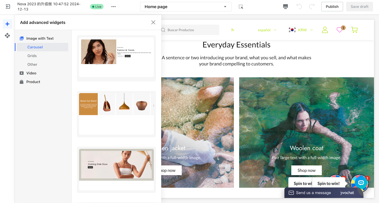
In the Advanced Card Marketplace, select an advanced card and click it to automatically add it to your theme. The Page Builder editor will open at the same time, allowing you to edit the card.
Step 3. Save the Card
After finishing your edits, click the Save button in the top-right corner of the Page Builder editor to save the card to your theme.
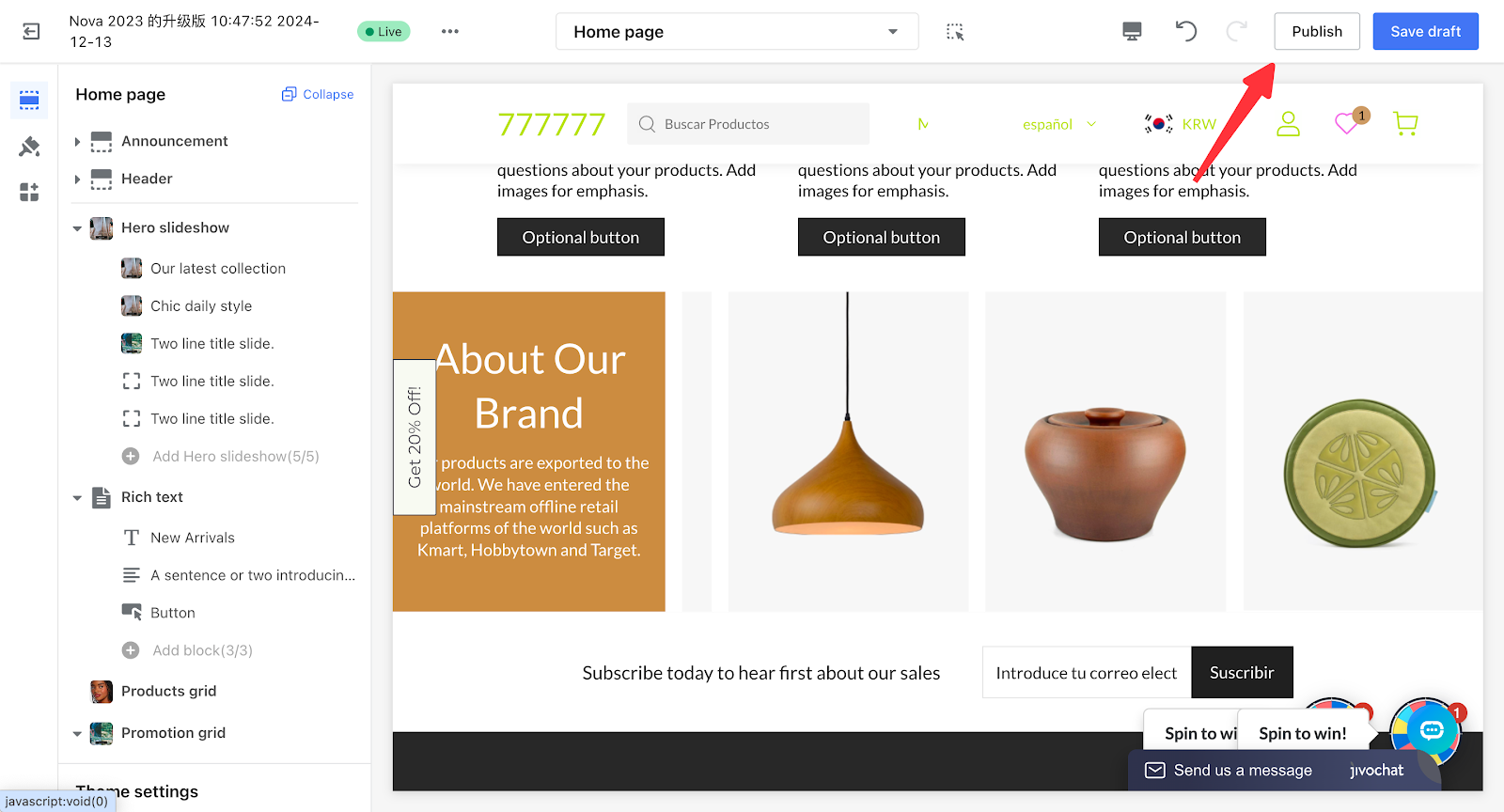
Step 4. Publish the Theme
After completing the theme edits, publish the theme for the changes to take effect on the storefront.
Component Description
General Components
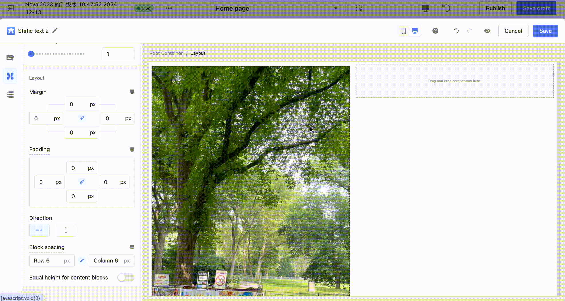
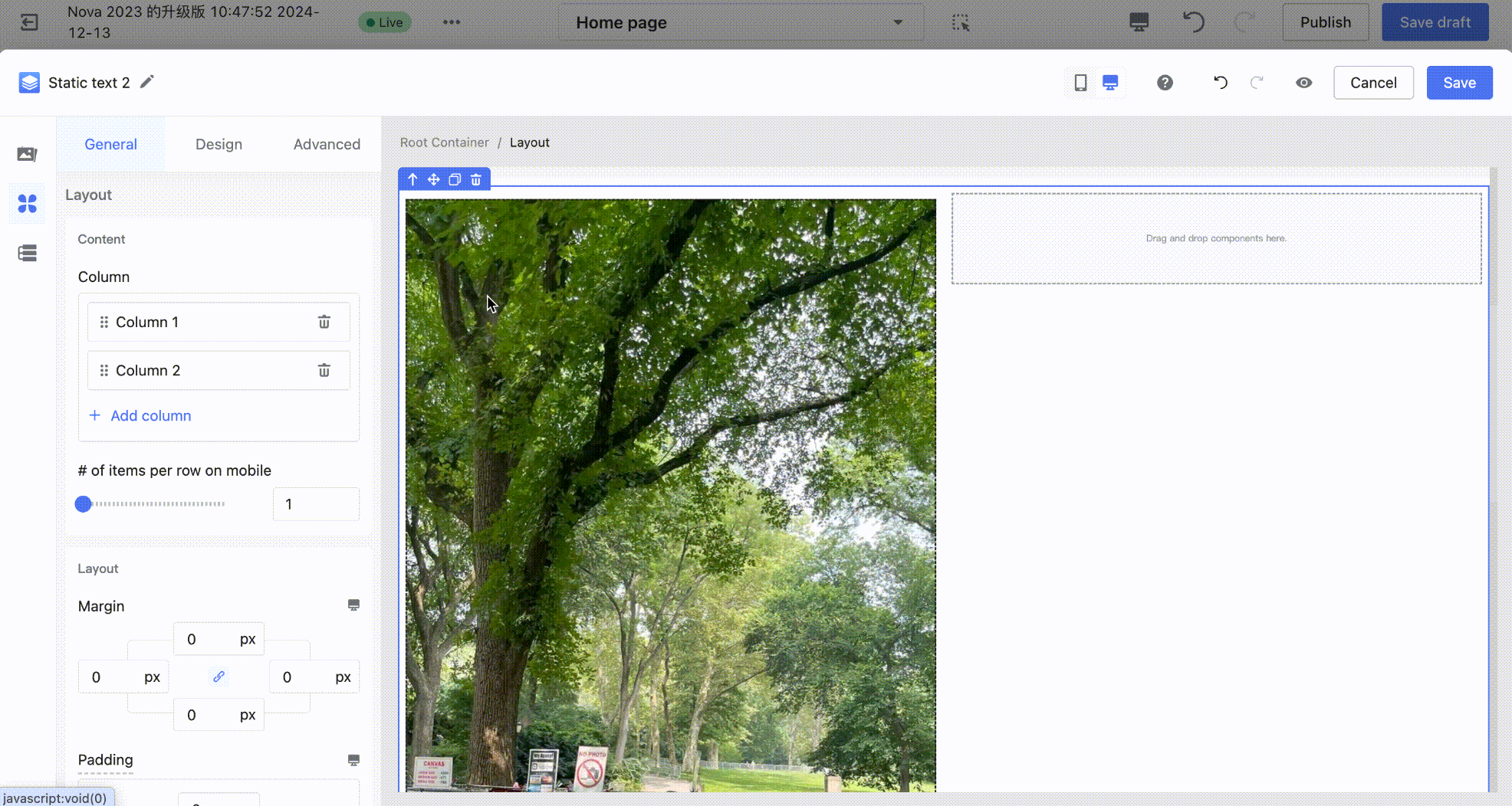
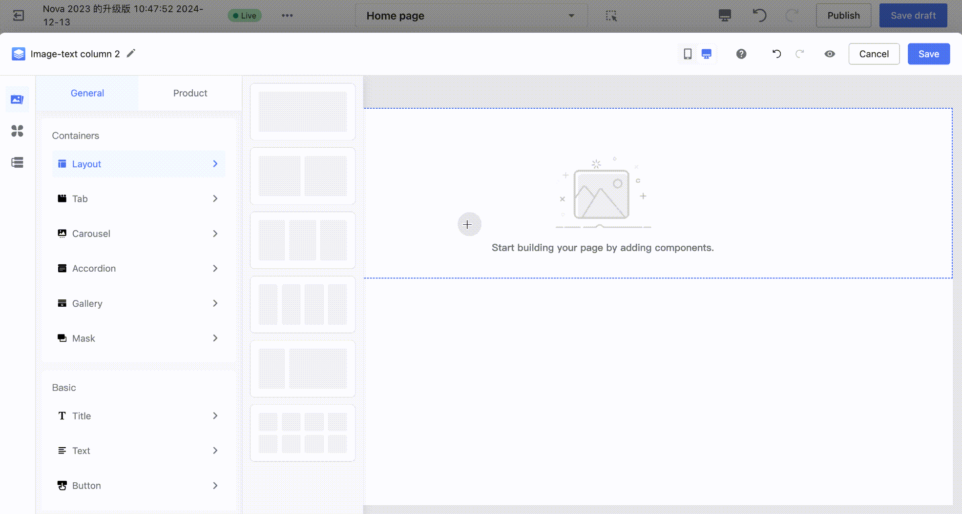
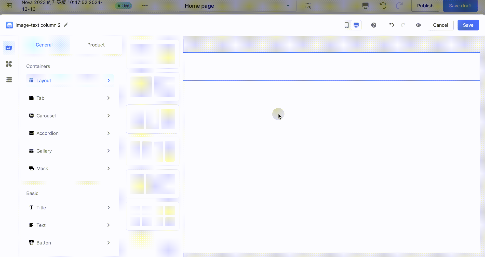
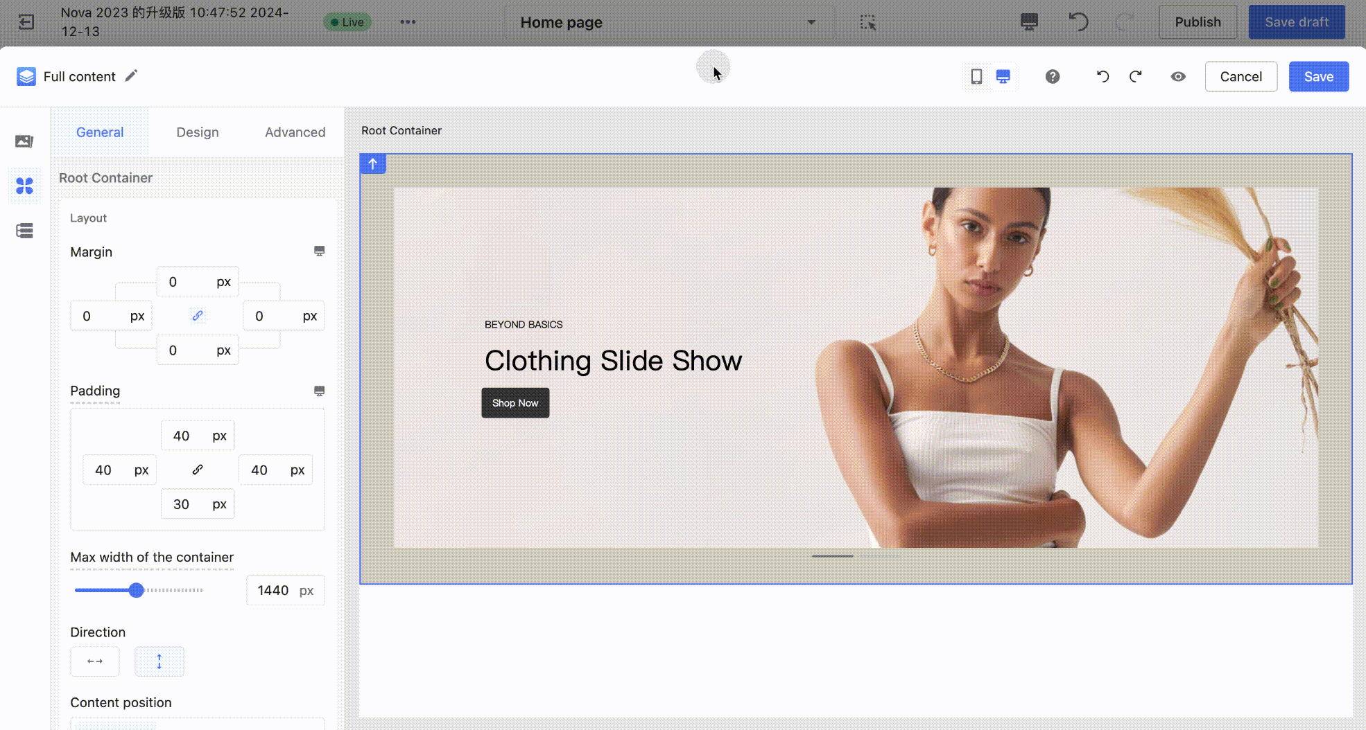
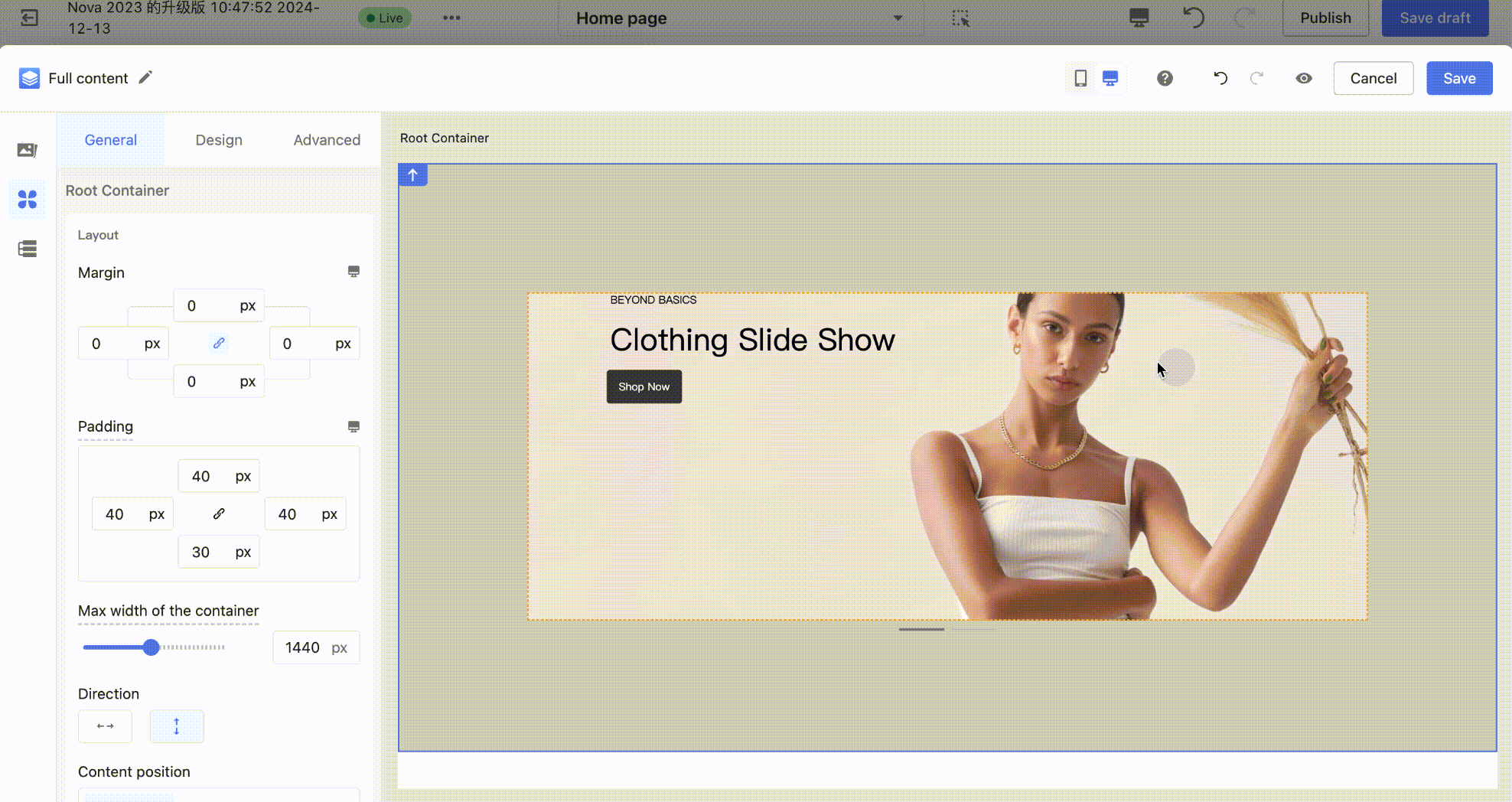
1. Layout Containers
Note
A container box used to hold card content. The Page Builder editor provides layout containers with different arrangement styles, allowing you to drag content (such as images, titles, and paragraphs) into the layout to complete card customization.
|
Category |
Description |
Editing Example |
|
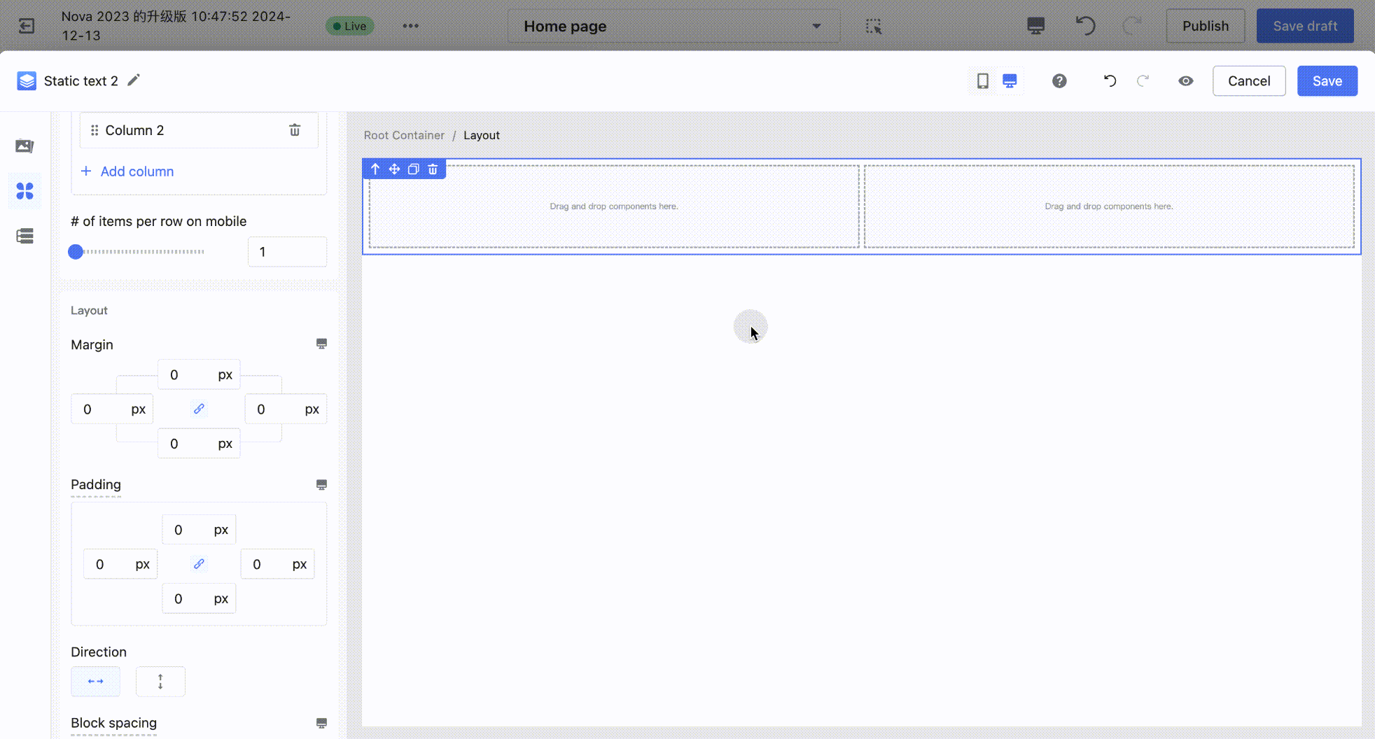
Row Container |
Only supports single-row display, dividing the container into several sub-containers proportionally, with the following layout styles: 1/1 1/2 1/3 1/3 + 2/3 |
|
| Grid Container | A grid container that supports multi-row display, allowing you to customize the size and number of grid blocks in each row. |
|
2. Functional Container
A container component with specific interactive features.
|
Category |
Description |
Editing Example |
|
Tabs |
You can switch content by toggling between tabs. The following types of tabs are supported:
|
|
|
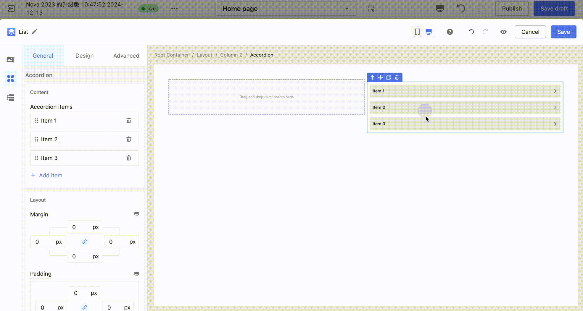
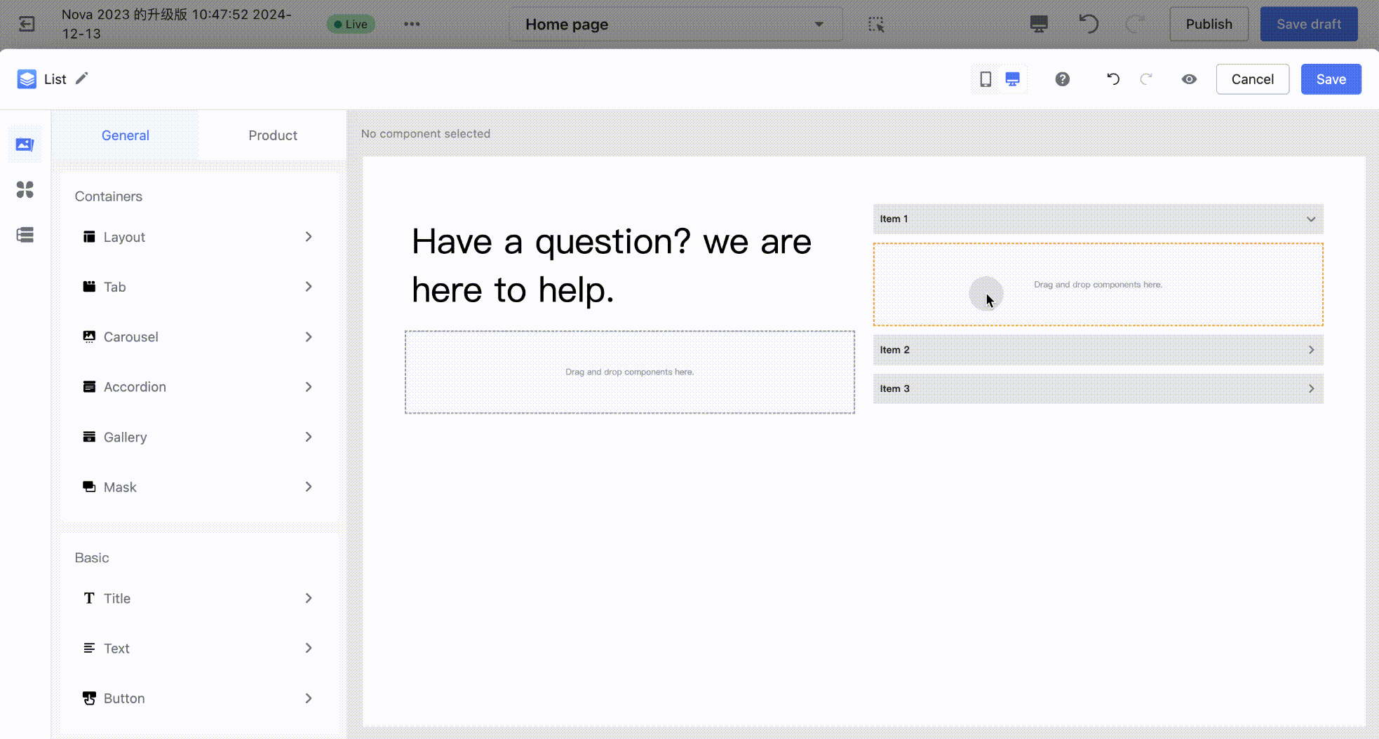
Accordion |
Each panel’s content can be expanded or collapsed. The following types of accordions are supported:
Accordion panels serve as container boxes, allowing you to freely add content for customization. |
|
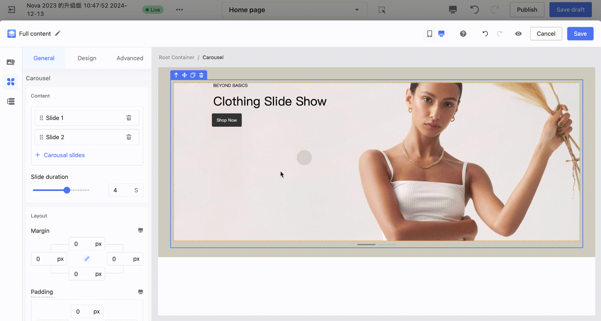
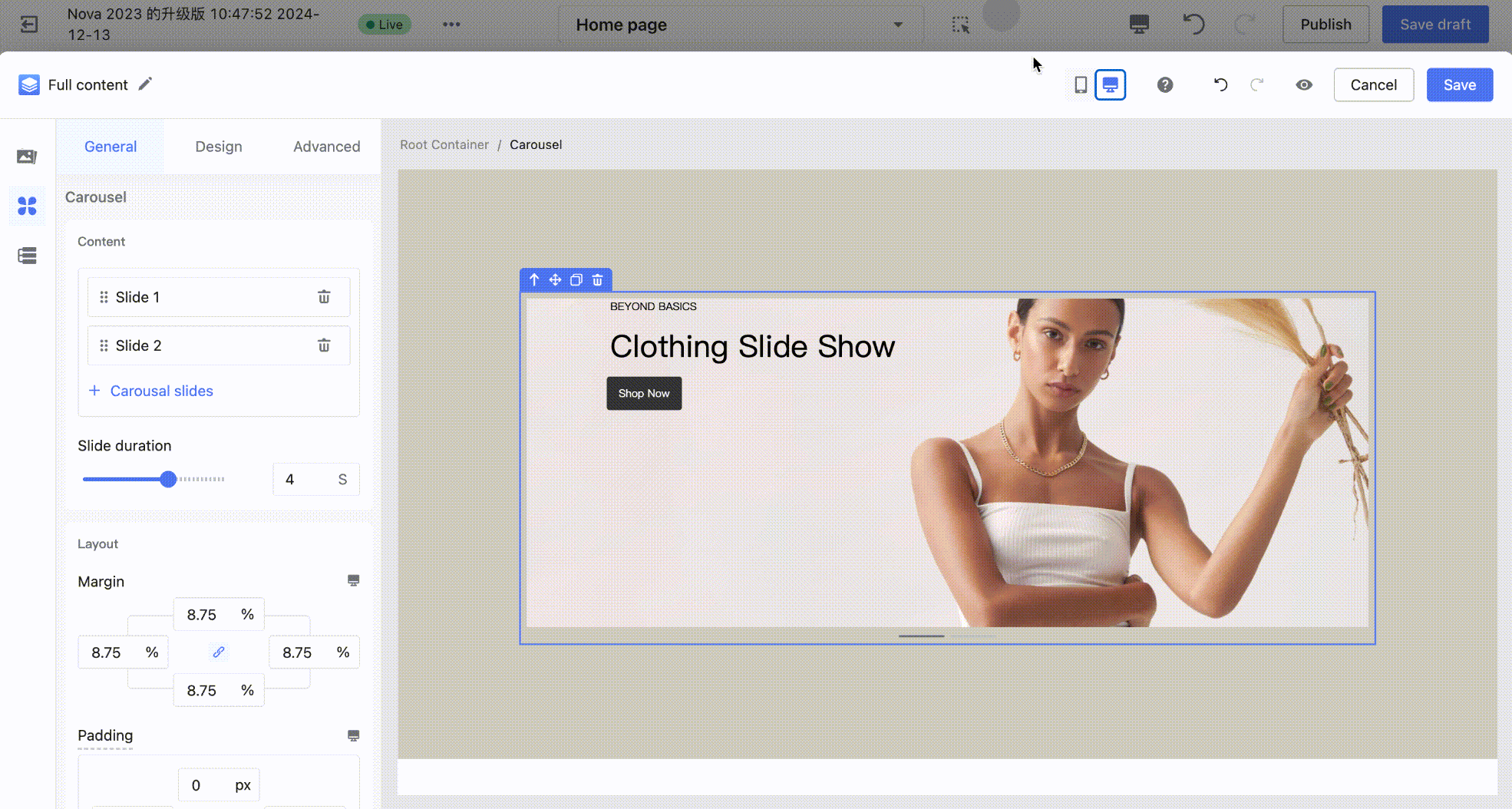
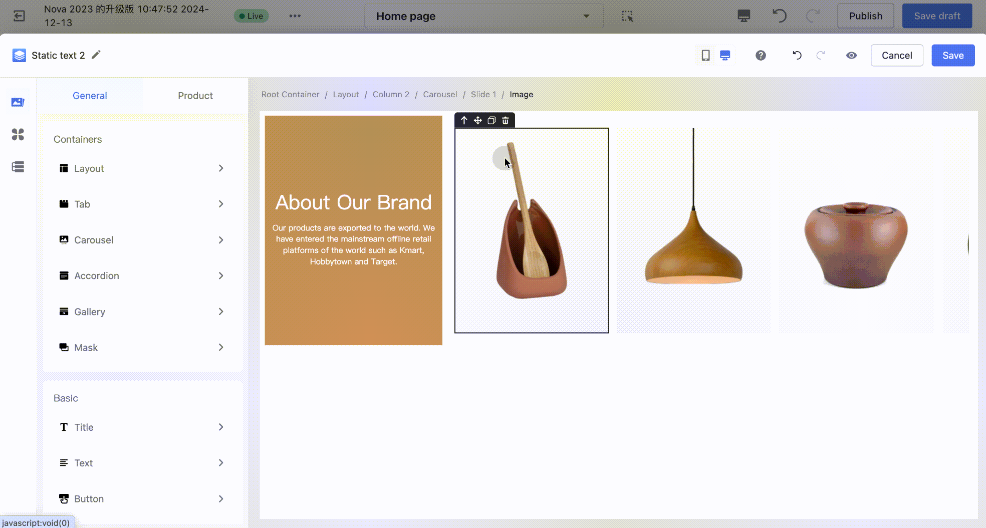
| Carousel |
Content can be displayed in a rotating slideshow. The following types of carousels are supported:
|
|
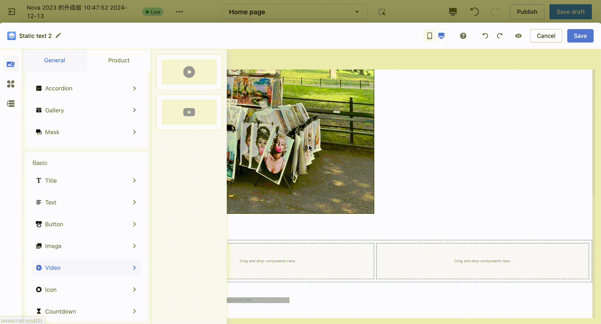
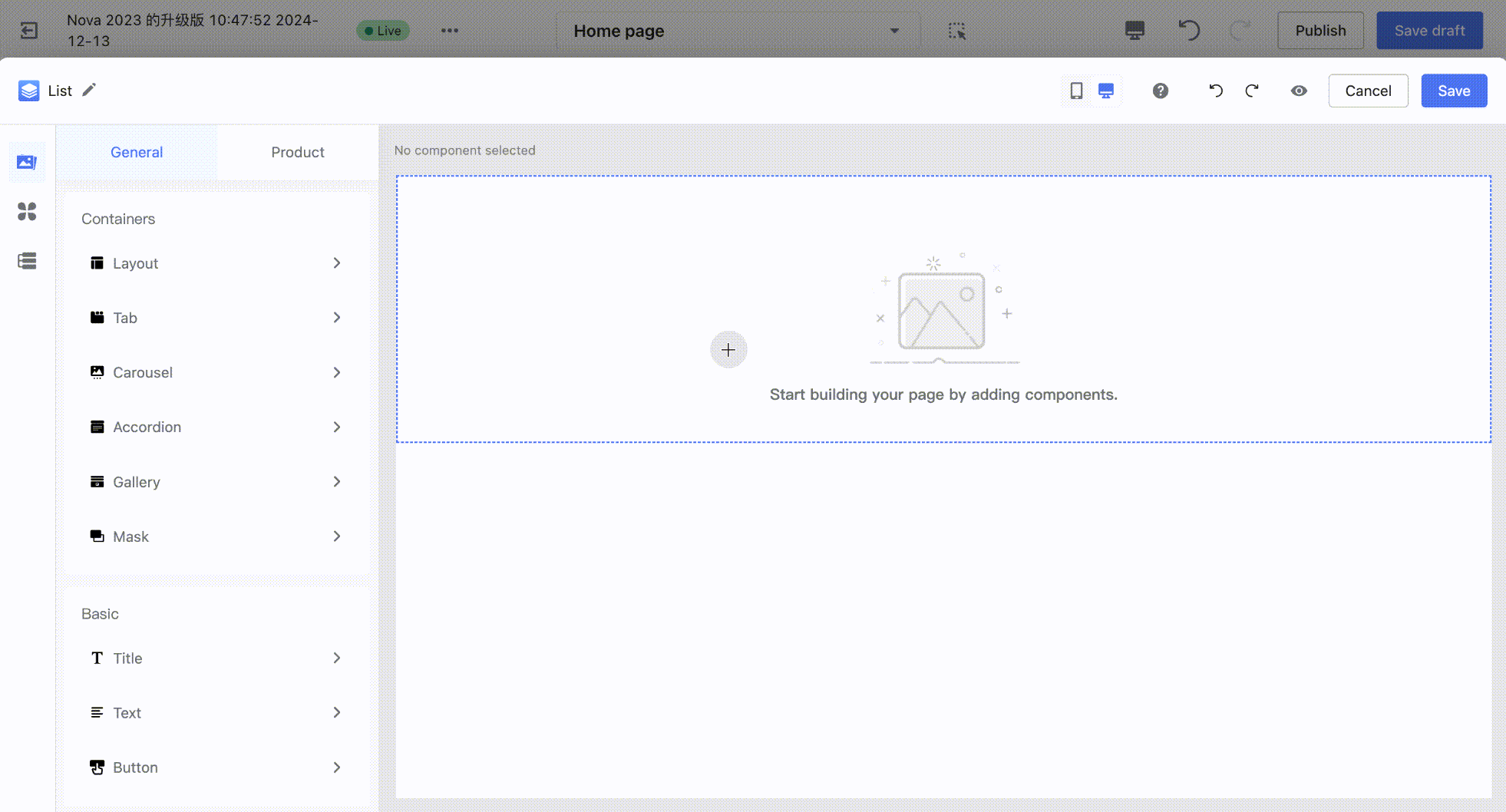
3. Basic
|
Category |
Edit Example |
| Title |
|
| Text |
|
| Button |
|
| Image |
|
| Video |
|

Introduction to Basic Component Configuration Items
-
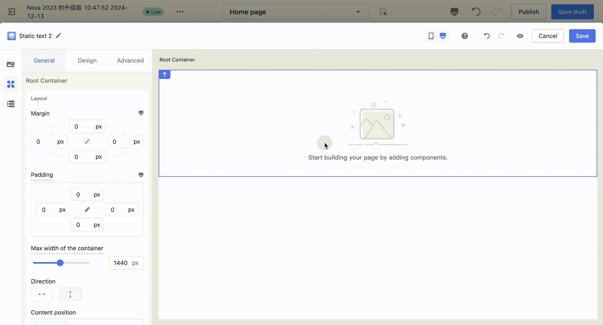
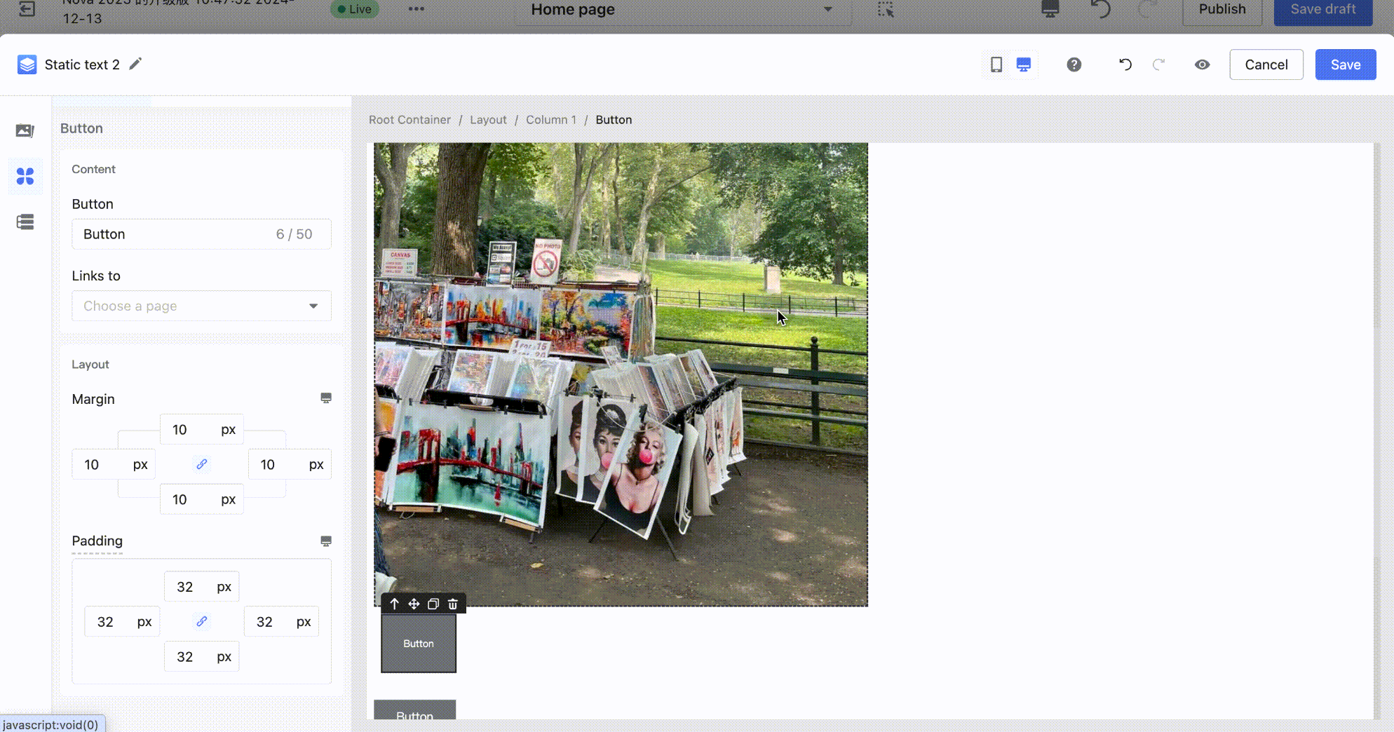
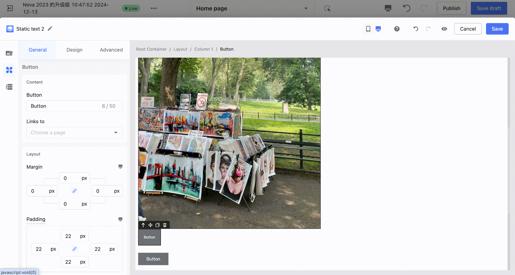
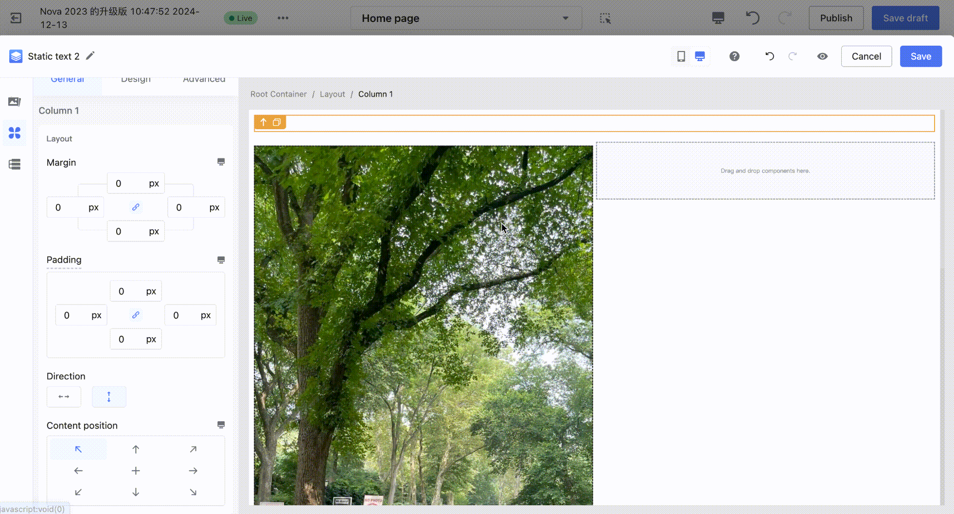
Component Margin Adjustment:
- Padding Adjustment: Padding refers to the distance between the component border and its content. It also determines the range of content that can be displayed within the component. By adjusting the padding, you can control the amount of spacing (white space) between the content and the component border.
-
- Margin Adjustment: Margin refers to the distance between a component and adjacent external components.
-
Spacing Adjustment: For some components with list properties, such as carousel, tabs, and layout containers (multiple columns in one row), you can quickly adjust the spacing between list items.
- Column Spacing (using layout container as an example)
-
- Row Spacing (using layout container as an example)
- Interaction Style Adjustment: Page Builder supports a wide range of style configuration options and allows setting styles for different interaction states.
Example: By configuring the background, fonts, buttons, etc. for default, hover, and selected states, you can achieve dynamic interactive effects.
Common Building Scenarios
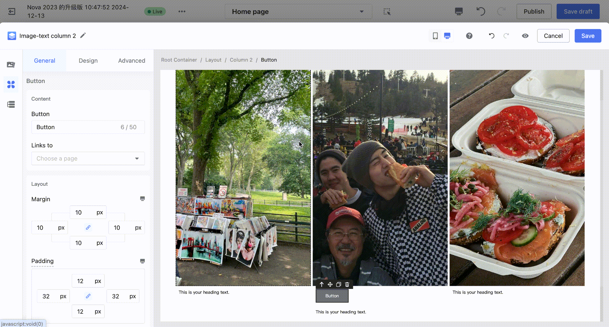
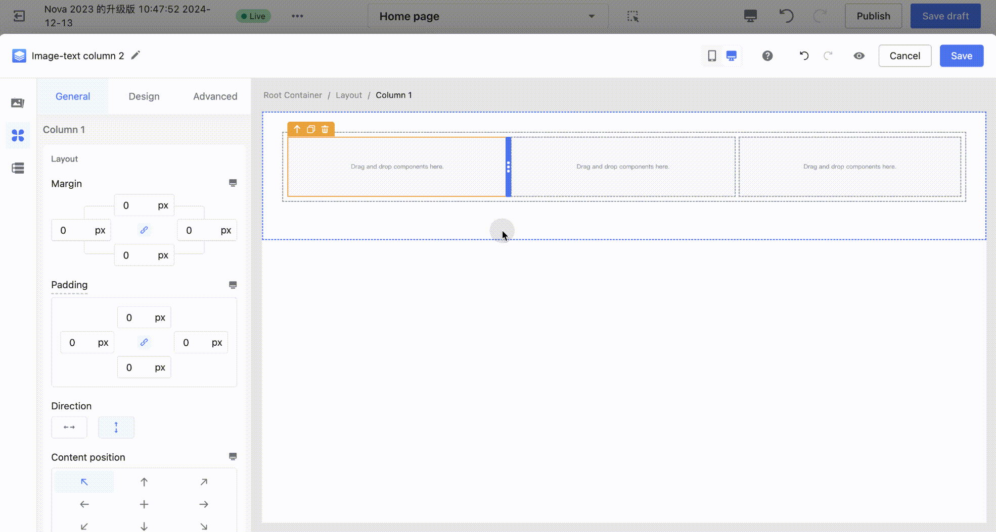
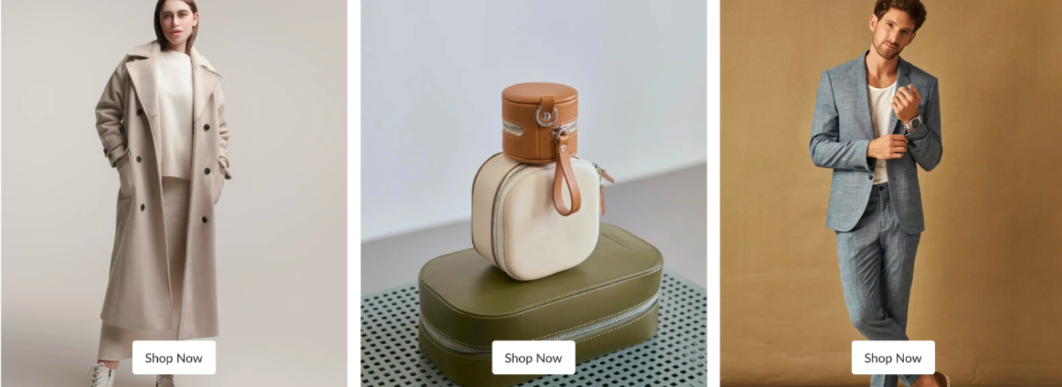
Case 1: Layout Container – Image & Text Columns
Example Card:
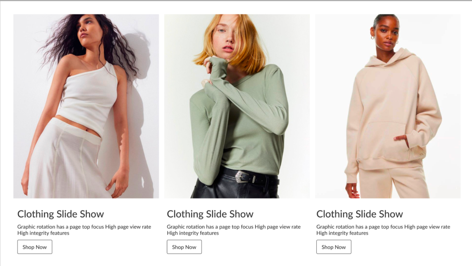
- Step 1: Select a one-row three-column layout container and drag it onto the canvas.
- Step 2: Adjust the arrangement direction of the sub-containers according to the content layout, and drag the content into each column’s sub-container in order.
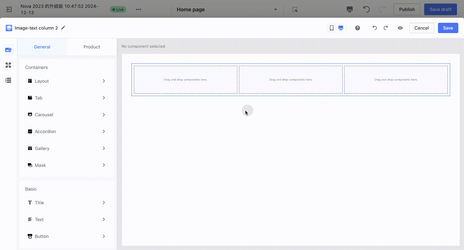
- Step 3: Fill in the content, adjust the font size, color, spacing, and other styles to complete the setup.
Case 2: Layout Container – Overlay Photo Wall
Tips
- To achieve text overlaying the image: simply fill the container with a background image and then drag the text into the container.
- To create an irregular layout style: the sub-containers expand according to the size ratio of the content. You only need to ensure the image proportions match the target layout style.
Example:
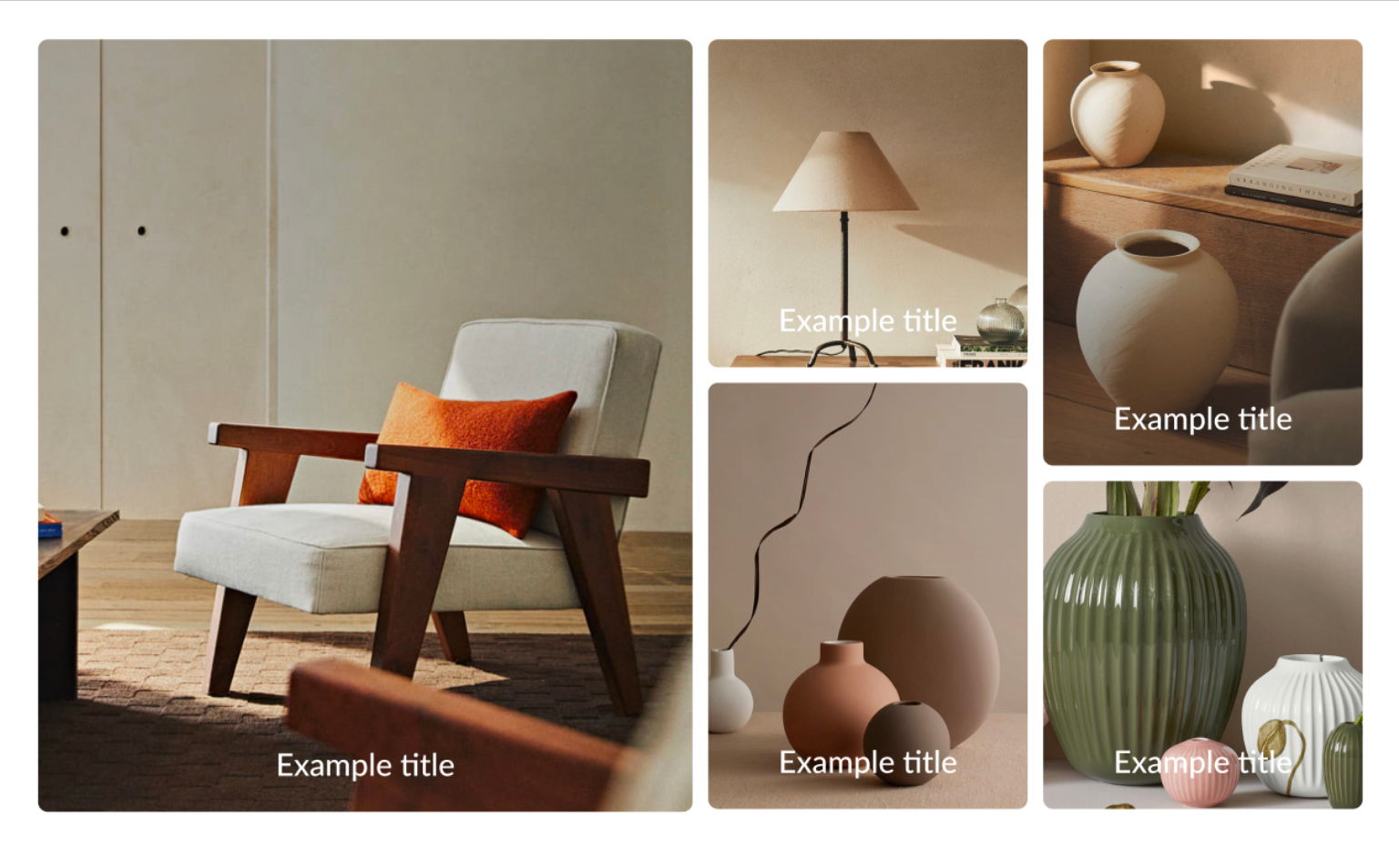
Step 1: Select a one-row, three-column layout container and drag it onto the canvas.
Step 2: Use the size adjuster to quickly adjust the proportions of the sub-containers.
Case 3: Layout Container + Accordion: Q&A Card
Example:
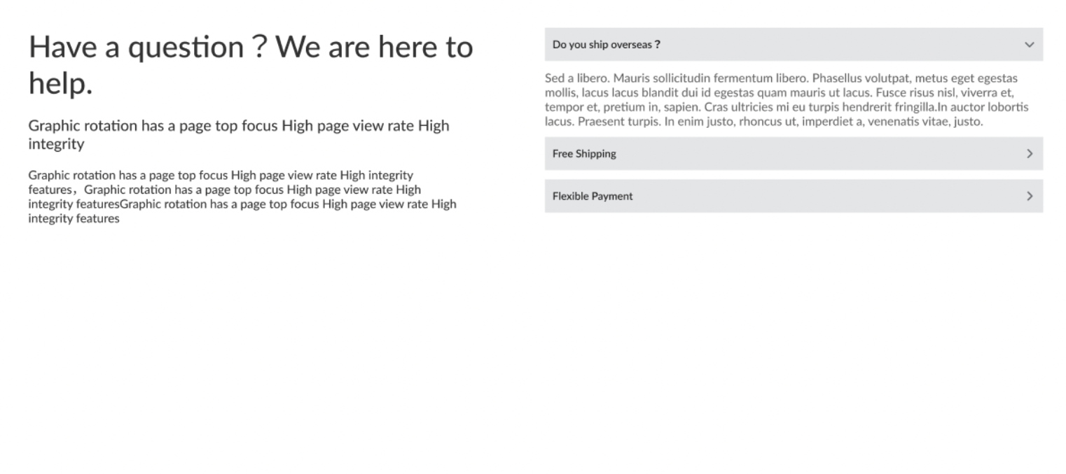
Step 1: Select a one-row, two-column layout container and drag it onto the canvas. Then, add an accordion component to the container on the right.
Step 2: In the accordion panel list, enter text to configure the panel titles. Then, drag a paragraph component into the sub-container of each corresponding panel and fill in the content.
Step 3: Drag a paragraph component into the left panel, fill in the content, and configure the text style to complete the setup.
Case 4: FAQ
For detailed instructions, please refer to the tutorial:Page Builder | Setting Up FAQ Cards.
- Common Building Techniques
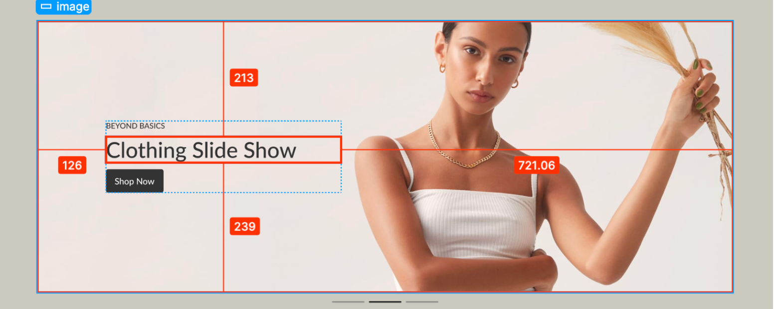
1. Quickly adjust content placement.
When configuring cards where some text floats on top of an image, we usually use the image to fill the container background, then drag components such as buttons and text into the container and position them at the desired location, as shown in the image below:
- At this point, you just need to click the parent container of the button, go to the Content Position settings, and click the corresponding position to quickly adjust it.
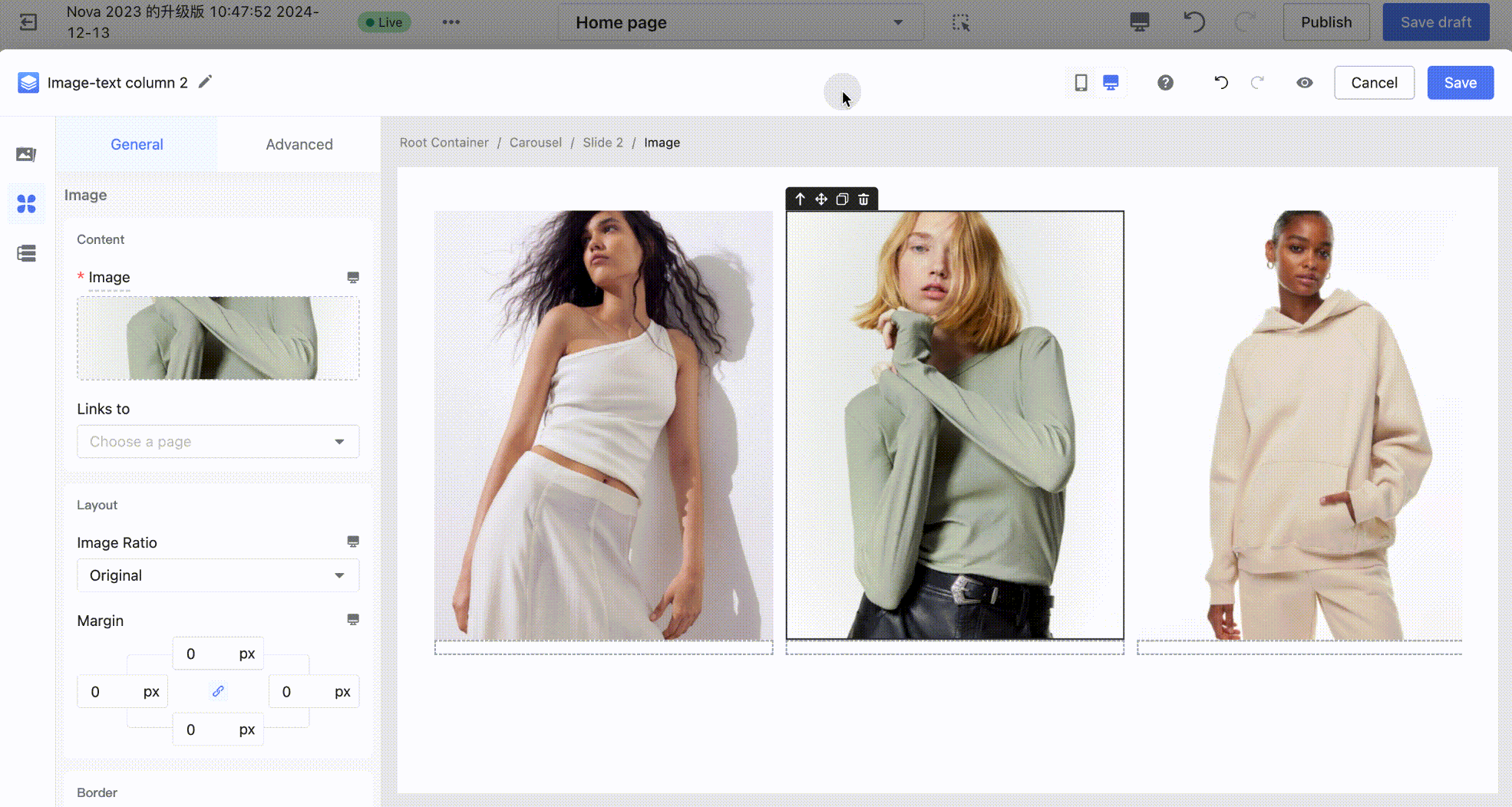
2. One-Click Copy to Improve Building Efficiency
- For cards with multiple modules and the same layout arrangement, such as image-text columns, you can use the copy function to improve efficiency.
- First, build one image-text column. Then click the copy button in the upper left corner to duplicate the same sub-container on the right side, and simply modify the content for other layouts.
3. Adjust Mobile Styles
Due to the width difference between desktop (PC) and mobile, many styles cannot adapt to both simultaneously. For such cases, some configuration options in the Page Builder support separate settings for mobile and desktop.
- Use "%" to adjust padding and margins.
In some building scenarios, you may need to adjust the position of components such as fonts or buttons. For example, if the button and heading text are set about 200px from the top, applying a fixed margin-top of 200px directly may cause layout issues on mobile devices because of the narrower width.
- Only two steps are needed to solve this type of issue:
Step 1: Select the parent container, then use the Content Position function to adjust the button and text to the center-left position.
Step 2: Set the left padding of the parent container to 126px, then switch the unit to "%".
- Configure Mobile Fonts
Due to the width difference between PC and mobile devices, a title font size that displays correctly on PC (usually >20px) may not fit well on mobile. This issue can be resolved by configuring the mobile font size separately.
- Configure Mobile Page Padding
The page padding on PC and mobile devices is usually different. You can adjust the padding of the outermost container separately to adapt to both platforms.
- Configure Card Visibility on PC and Mobile
In some Page Builder scenarios, the styles and interactions on mobile and PC differ significantly, and a single card may not meet the styling needs of both platforms. In this case, you can use the "Visible on PC / Visible on Mobile" setting on the outermost container to control whether the card is displayed only on PC or only on mobile. This allows you to build cards separately for each platform.
Note
This setting does not take effect in the theme editor but will be applied on the customer-facing side. For example, if you configure two slideshow cards—one visible on PC and one visible on mobile—both cards will appear in the theme editor, but on the live site they will display according to the configured rules.
- Common Questions
1. Different themes have different page margins. How to configure page margins in Page Builder?
A: The outermost container has the same width as the page. You can adjust the left and right padding to control the spacing between the card and the page, so it fits different themes and design scenarios.
Theme adaptation: Each theme has different page margins. Adjust the outermost container’s padding according to the left and right margin of the theme you are using, so it matches the style of the theme’s cards.
- For example, the Hero theme has a left and right page margin of 40px. In the Page Builder editor, set the outermost container’s left and right padding to 40px (as shown below).
- Different design scenarios: Some scenarios require full-width display, such as banner posters. In this case, set the outermost container’s left and right padding to 0 (as shown below).
2. How to understand the reserved padding in layout, tab, carousel, and other components?
A: Container components are structured with two layers of boxes. When dragging a component onto the canvas, the reserved padding is only for easier selection and editing in the editor—it will not be displayed on the live site (C-end). Therefore, the padding and margin values are 0 by default, and the style will only take effect on the live site after manually inputting the desired values.
3. Why does adjusting the horizontal position of the title component via Settings > Content Position sometimes not take effect?
A: Due to the nature of the container: the title box occupies the entire row, leaving no extra space to move it horizontally. You can adjust the alignment of the title using the text alignment feature to center or right-align it.


Comments
Please sign in to leave a comment.