
The Products module is designed to streamline the essential task of product design. It includes a variety of practical features, collectively known as the Product Design Tool. These features include Upload Art, AI Design, Add Text, Layers, HD, Cliparts, and Saved Artworks, providing a comprehensive toolkit for customizing products. This guide will help you navigate and utilize the Products module effectively, covering everything from creating a new product to managing layers and finalizing your designs.
Getting started with product design
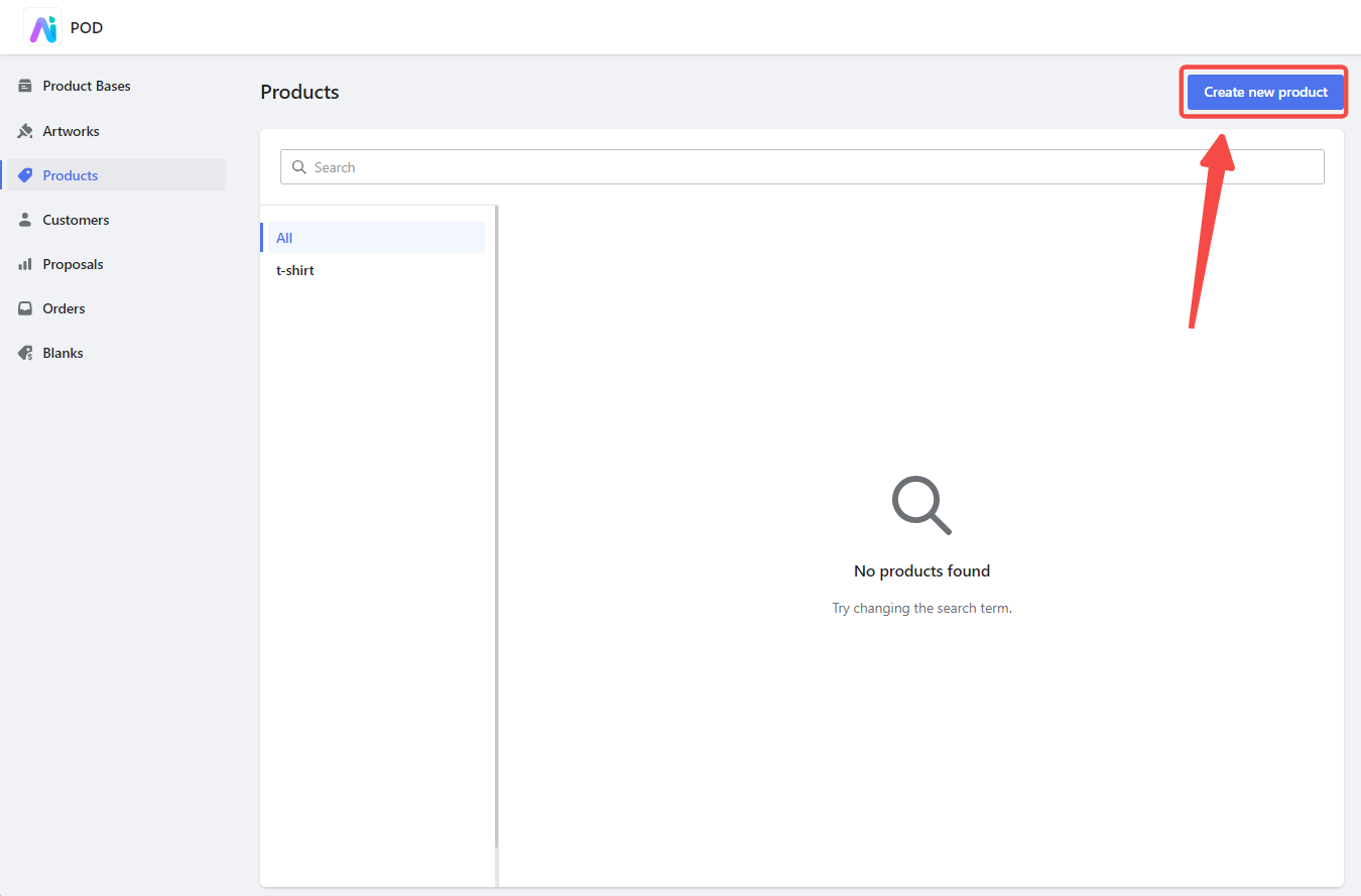
1. Create a new product: Navigate to the Products module and click Create new product to start customizing a new product.
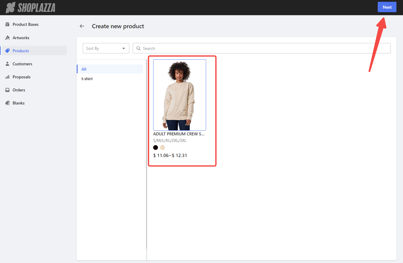
2. Select a product base: Choose an existing Product Base from the preview page and click Next to proceed.
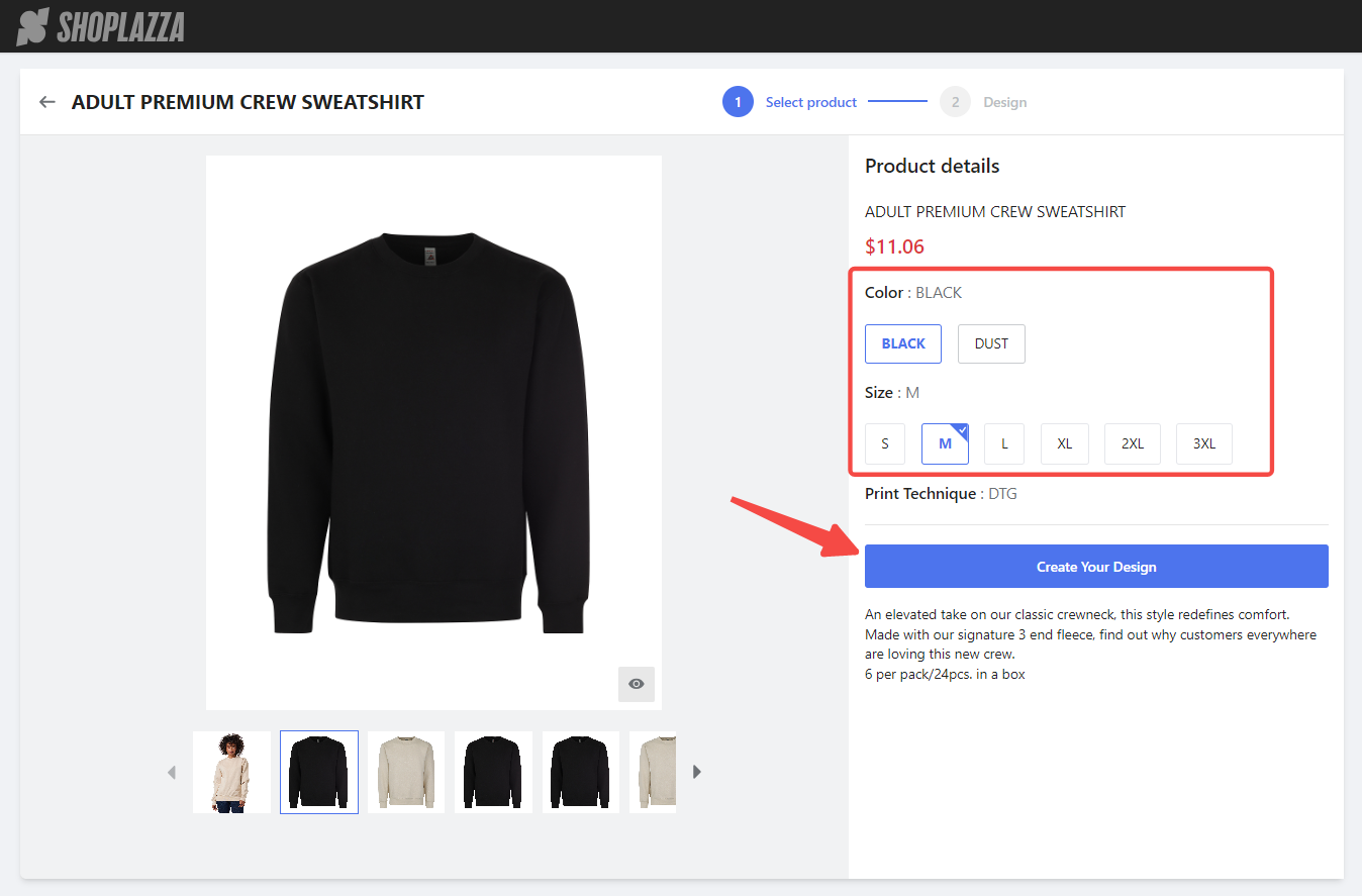
3. Choose colors and sizes: On the style details page, select the desired colors and sizes on the right side. Then, click Create Your Design to begin designing.
Utilizing design tools
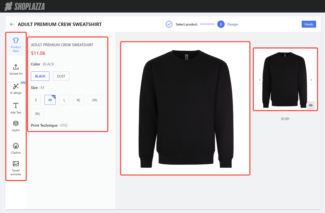
The design tool interface includes a toolbar, task area, design canvas, and preview area.
- Left toolbar: Access Product Base, Upload Art, AI Design, Add Text, Layers, Cliparts, and Saved Artworks.
- Task area: Displays detailed options for each function module when clicked.
- Design canvas: Move, resize, rotate, and delete design elements.
- Preview area: View the design in different colors and styles, with a larger image for detailed inspection.
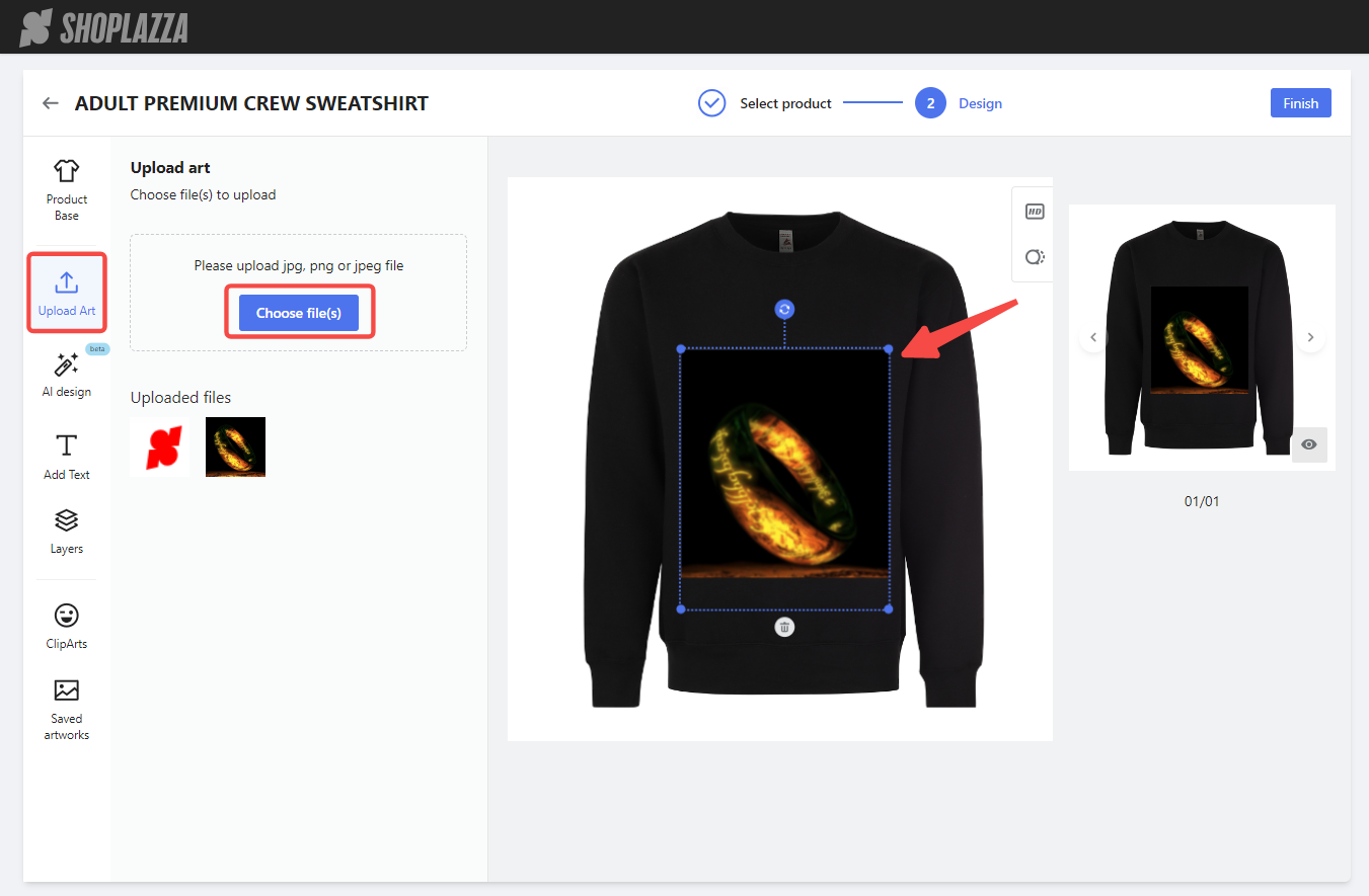
1. Upload Art: Click Upload Art to add local images. Use the design canvas to move, resize, and rotate the images. Supported file types are jpg, png, and jpeg.
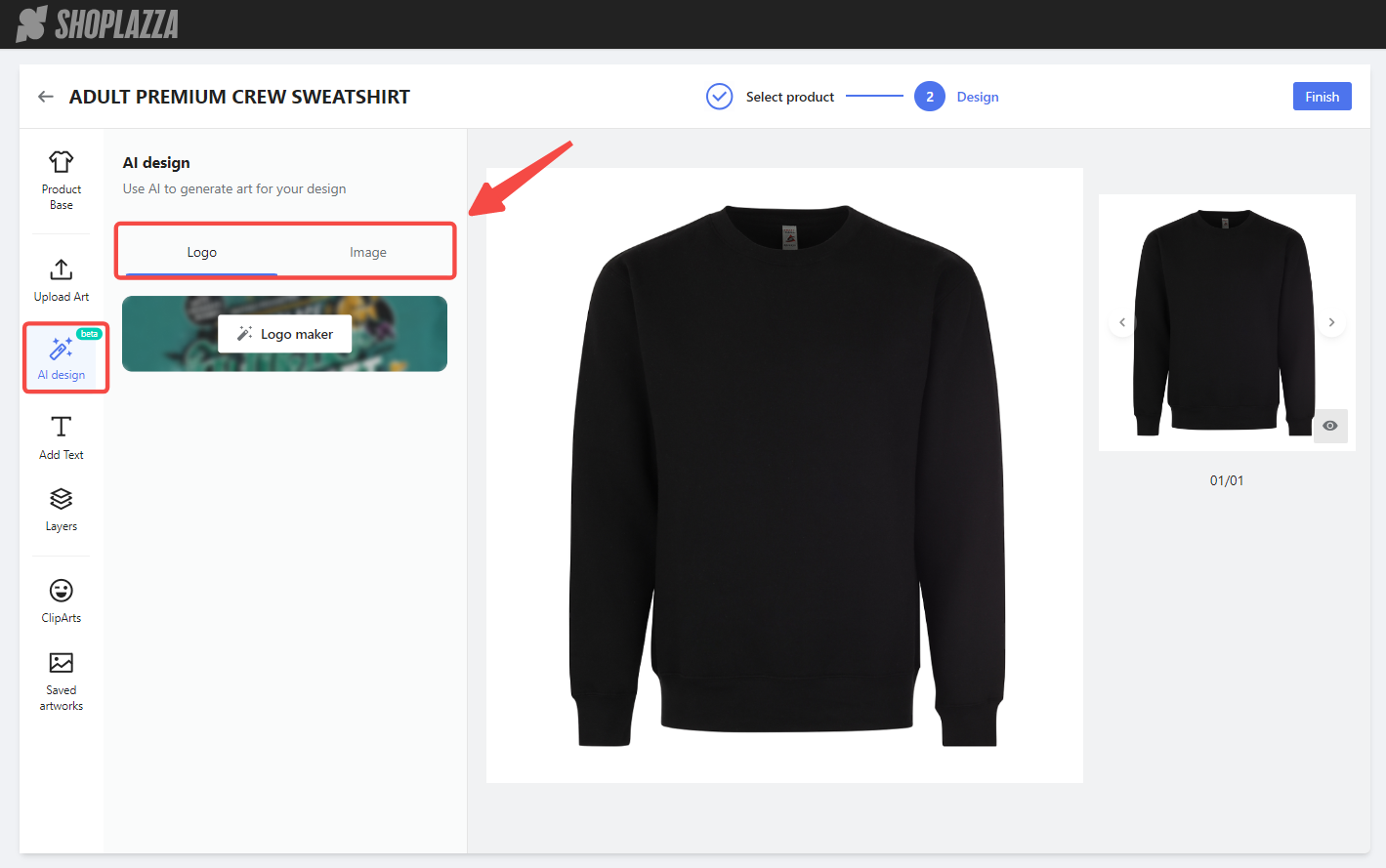
2. Use AI design: If you prefer to generate new images, use the AI Design tool. Click AI design and choose between two options: Logo or Image.
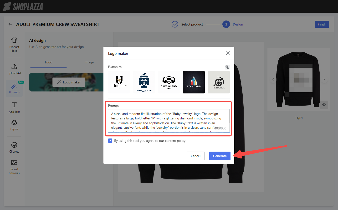
- Logo: Click Logo maker to generate logos based on text prompts. Input a detailed description of your desired logo. After agreeing to the content policy, click Generate. Ensure the description is detailed and uses expressive language to capture the essence and emotion of the logo you envision.
- Example description: A sleek and modern flat illustration of the "Ruby Jewelry" logo. The design features a large, bold letter "R" with a glittering diamond inside, symbolizing the ultimate in luxury and sophistication. The "Ruby" text is written in an elegant, cursive font, while the "Jewelry" portion is in a clean, sans-serif font. The overall color scheme is gold and black, giving the logo a sense of opulence and elegance.
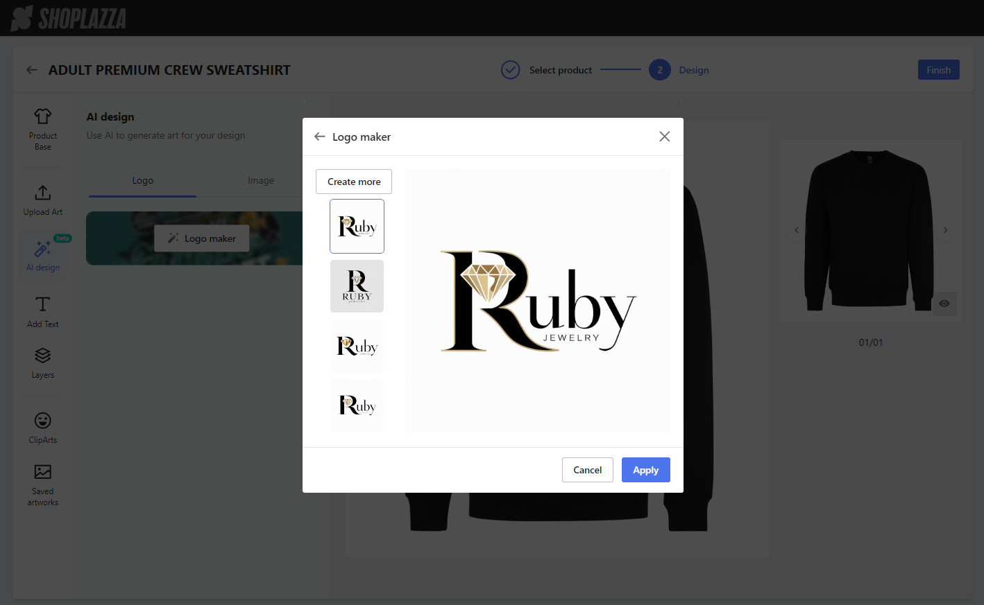
Example result:
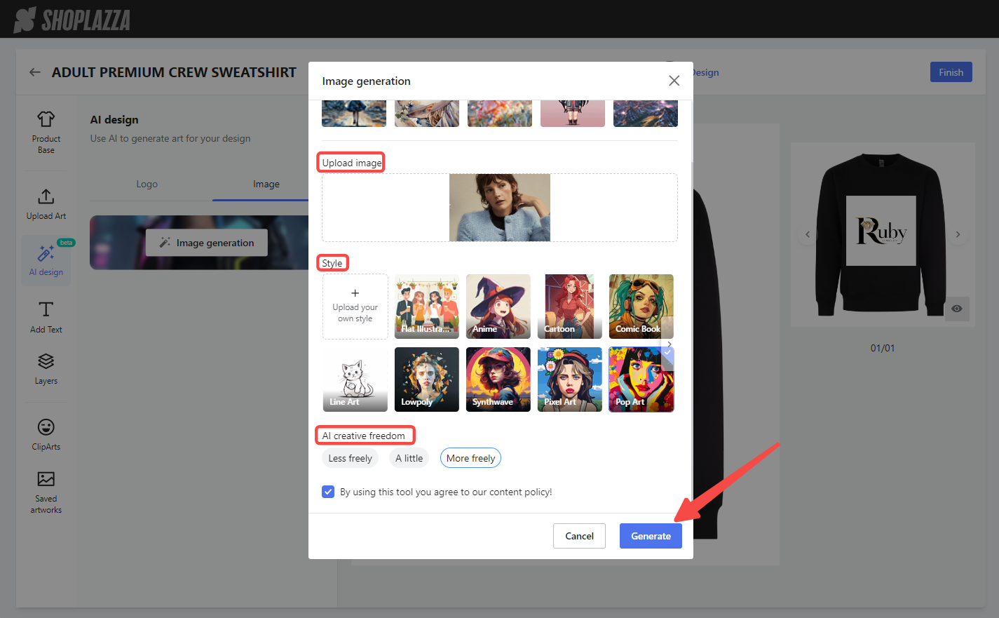
- Image: Click Generate to create images based on uploaded pictures. Select the image ratio, style, and AI creative freedom. After agreeing to the content policy, click Generate.
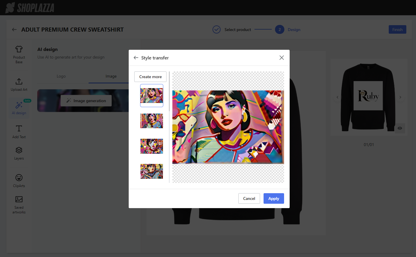
Example result:
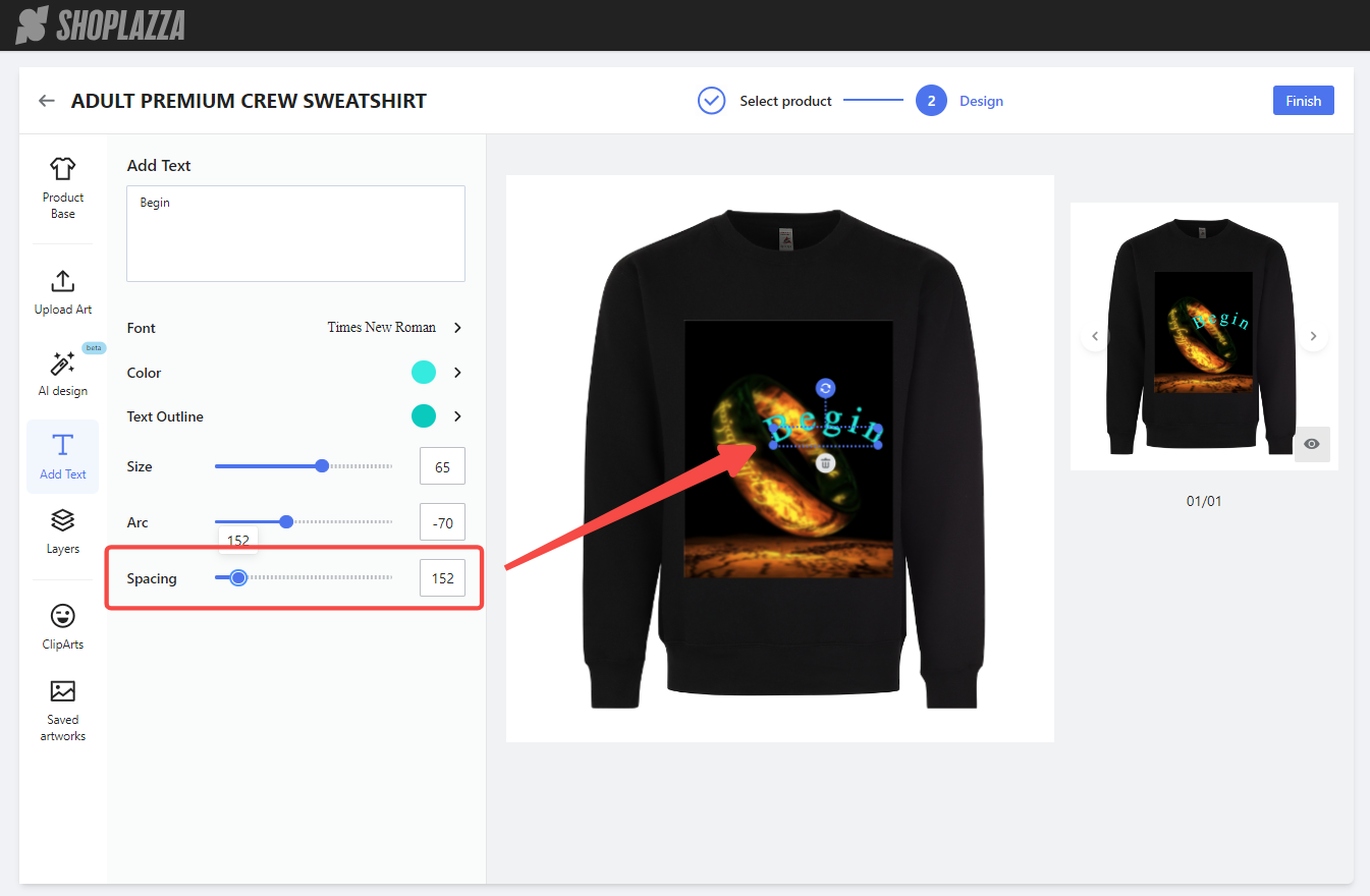
3. Add Text: In the Add Text section, enter the your text. Edit text options and adjust text placement on the design canvas. Preview text effects in the preview area.
- Input Text: Enter the text to be added.
- Font: Choose the preferred font.
- Color: Select the text fill color.
- Text outline: Choose the outline color for the text.
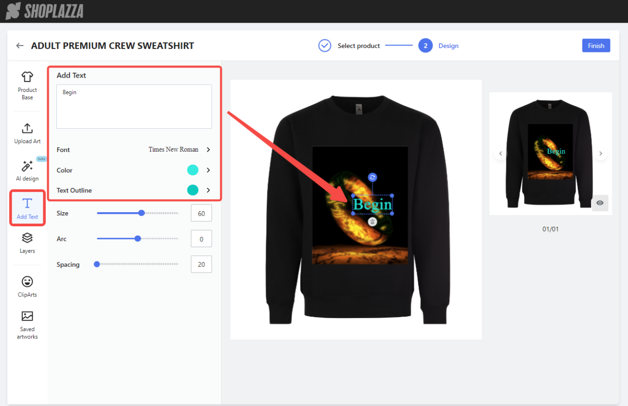
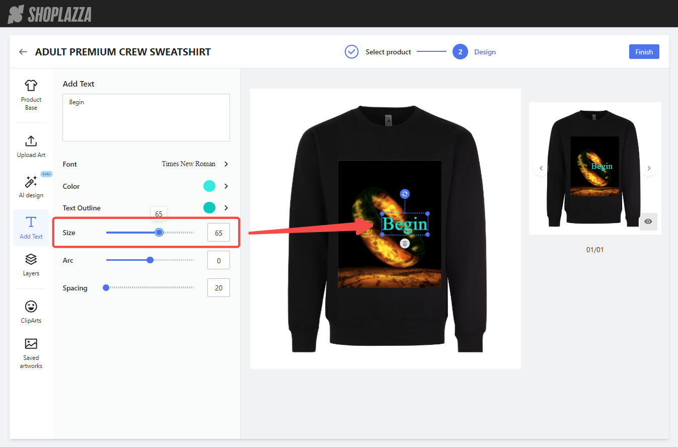
- Size: Set the font size.
- Arc: Adjust the curvature of the text.

- Spacing: Set the spacing between characters.
Manage Layers and Elements
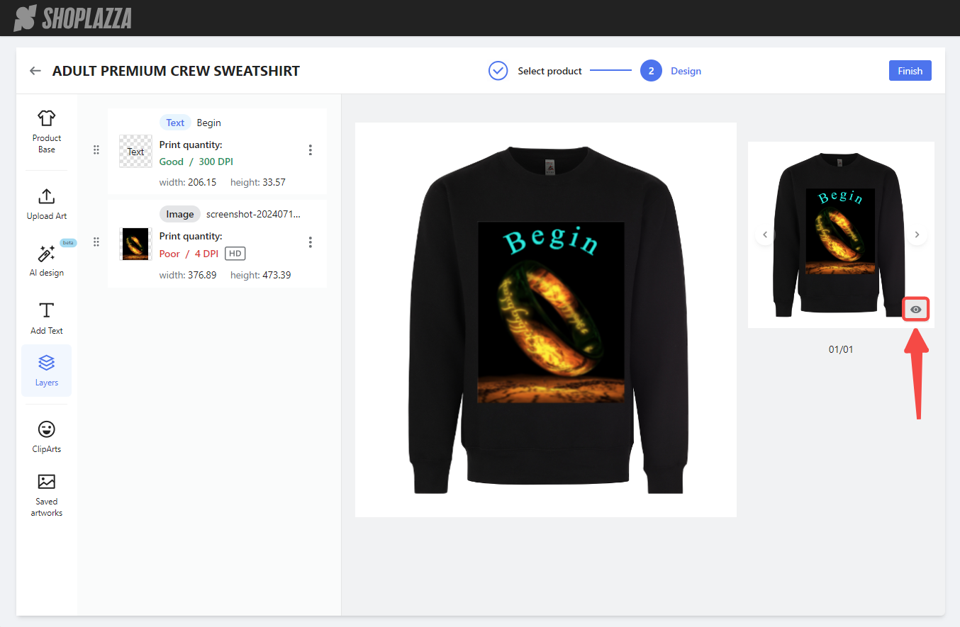
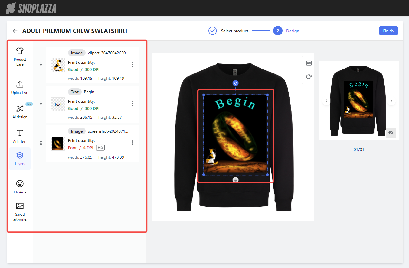
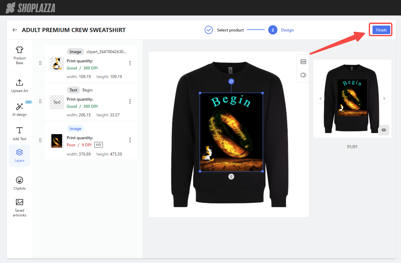
1. Manage Layers: The Layers feature allows viewing and managing all elements in the design.
- Task area: View thumbnails and detailed information for each element, including type, name, print quality, and size. The system automatically rates print quality with Excellent, Good, Average, or Poor based on DPI.
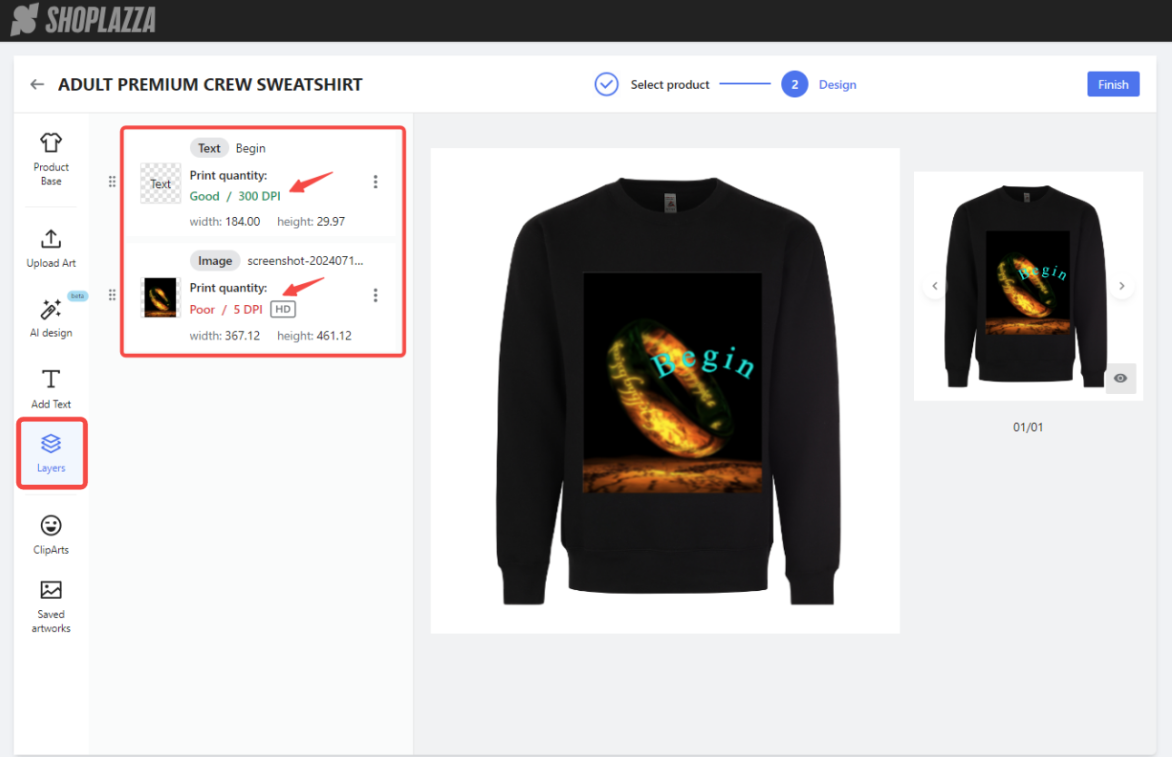
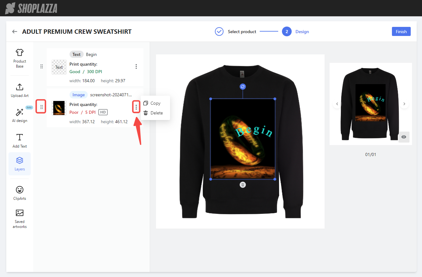
- Drag and Drop and Options menu: Adjust the stacking order of elements by dragging layers, and copy or delete elements from the options menu.
- Design canvas: Select, move, resize, rotate, and delete elements.
- Preview area: Preview the overall effect of the design on the product. Click the eye icon for a larger view.
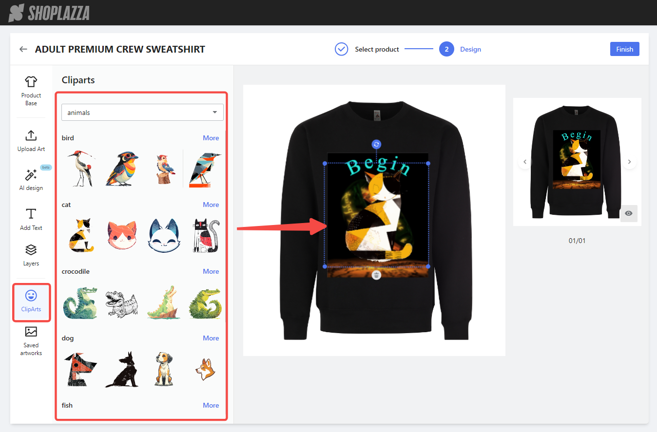
2. Use Cliparts: Browse various categories like Animals, Fantasy, and Flowers in the Cliparts library. Select and add cliparts to the design, then edit them on the design canvas and in the Layers section.
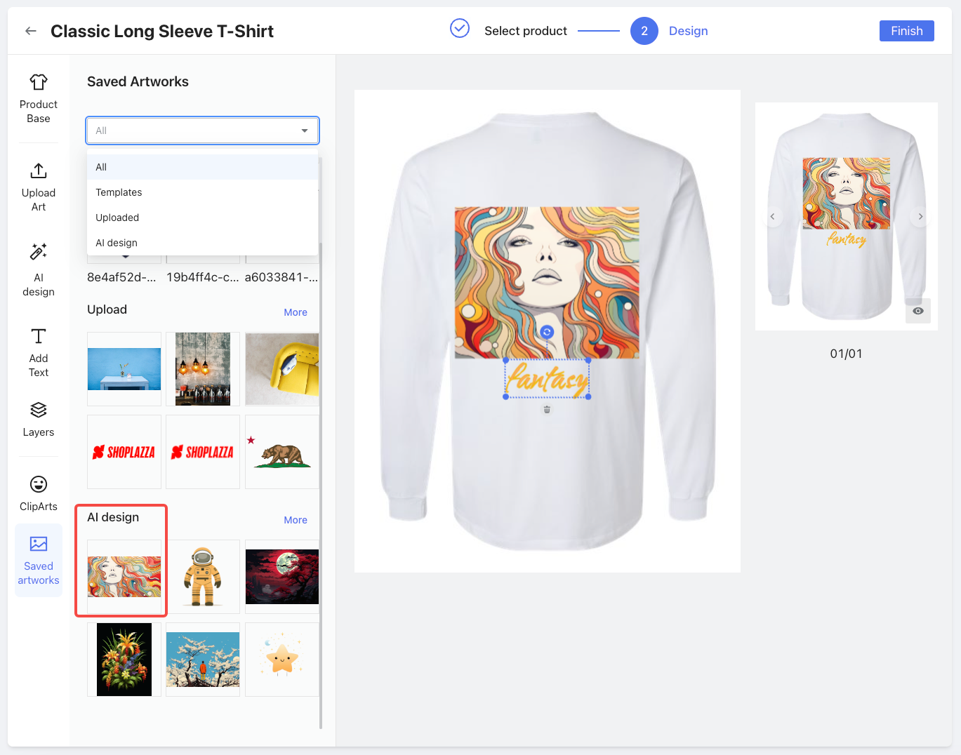
3. Access Saved artworks: Find uploaded images, AI-generated designs, and more in the Saved Artworks section. Categories like Templates, Uploaded, and AI Design help quickly locate the needed materials.
Note
Only saved and uploaded designs are visible in this section; newly created designs will not appear until they are saved.
Finalizing and reviewing designs
1. Additional tools: Besides the main features, the design tool offers additional tools for a more efficient experience.
- Layer functions: Click any layer to access relevant functions on the right side of the design canvas.
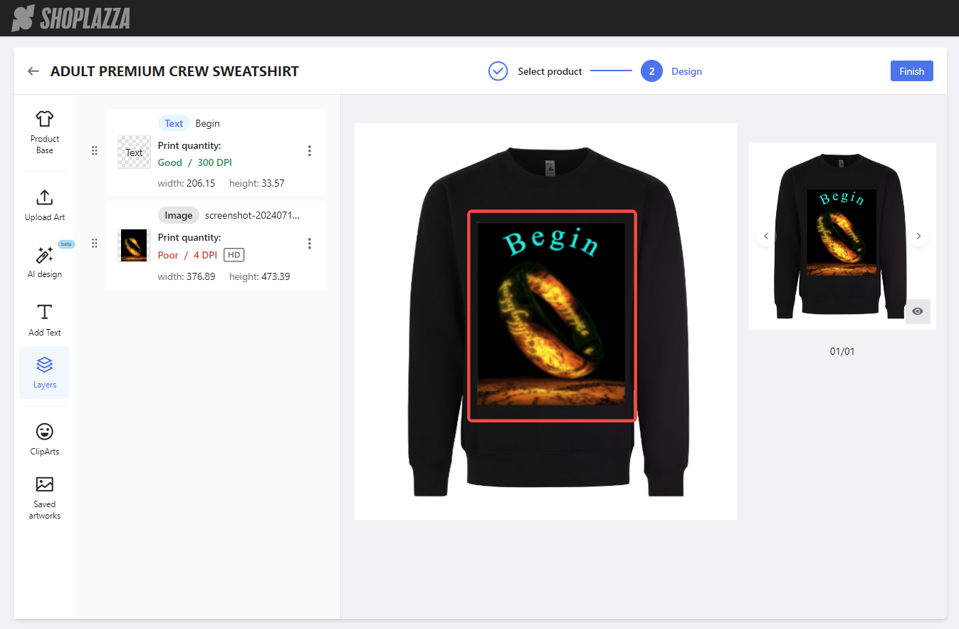
- HD enhancement: If an uploaded image is not clear enough, click the HD button to increase the resolution. Each click doubles the DPI, up to a maximum of 1500px by 1500px. A notification will appear if the maximum resolution is reached.

2. Finish and preview: When the design is complete, click Finish to return to the Products page.
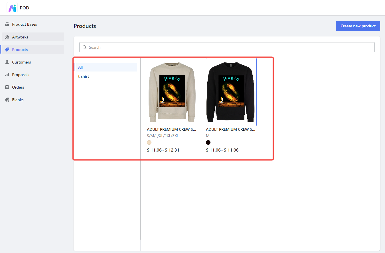
3. Review custom products: Here, preview all custom products created, including thumbnails, names, sizes, colors, and prices. Click any custom product to view detailed information.
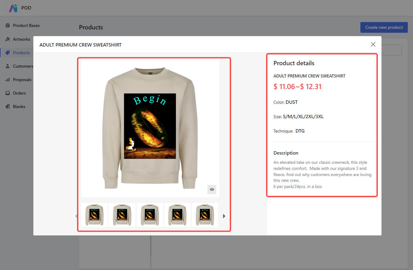
4. Examine product details: Review the product details. The left side shows a large image of the design, with thumbnails or arrows to switch views and an eye icon for a larger preview. The right side lists product details such as name, price, color, size, printing technique, and description.
Following these steps helps you effectively use the Products module to create and manage custom products, ensuring a streamlined design process and high-quality output for your customers.

Comments
Please sign in to leave a comment.