The header section is essential for every page in your store. It acts as a navigation tool, guiding your customers to find their needs, such as their cart or key product categories. A well-structured header improves user experience, encouraging customers to explore your store and ultimately helping increase conversions.
Setting up your header
Customizing your header is important for branding and providing a seamless user experience. This section walks you through the steps to configure and personalize your store’s header.
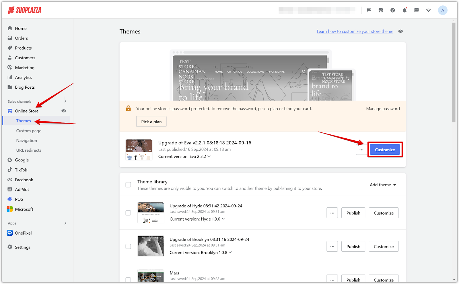
1. Access your theme editor: From your Shoplazza admin, go to Online store > Themes and click Customize. This will bring you to the theme editor, where you can start making changes to your store’s header section.
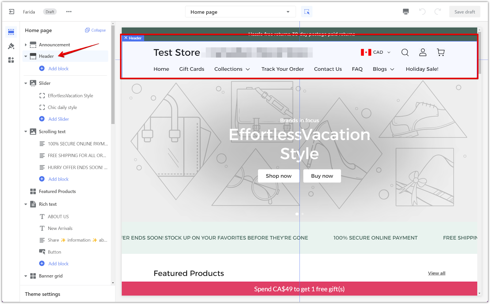
2. Select the header section: In the theme editor, click on the default Header section to begin customizing. The header section includes all the important elements visible at the top of your store.
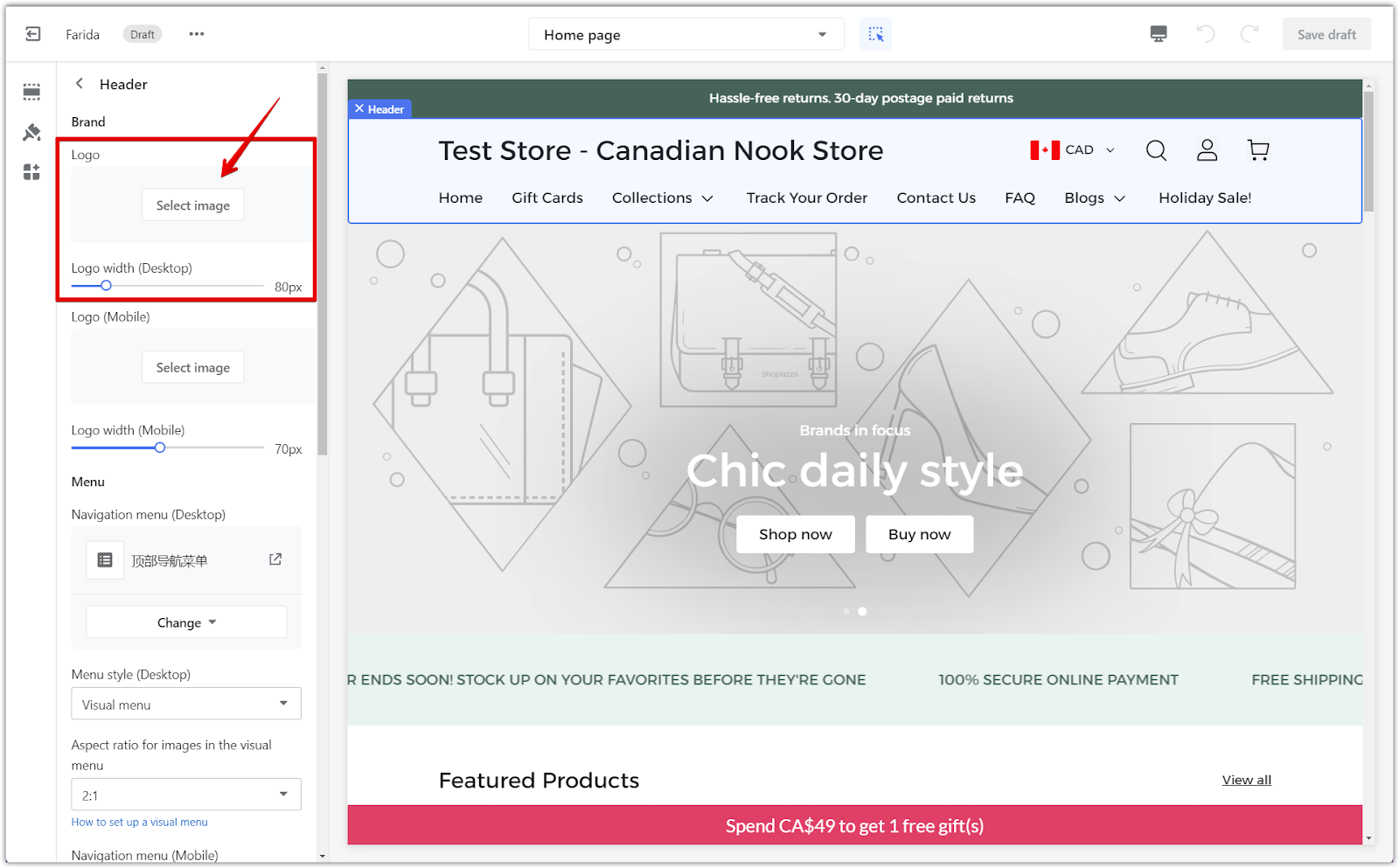
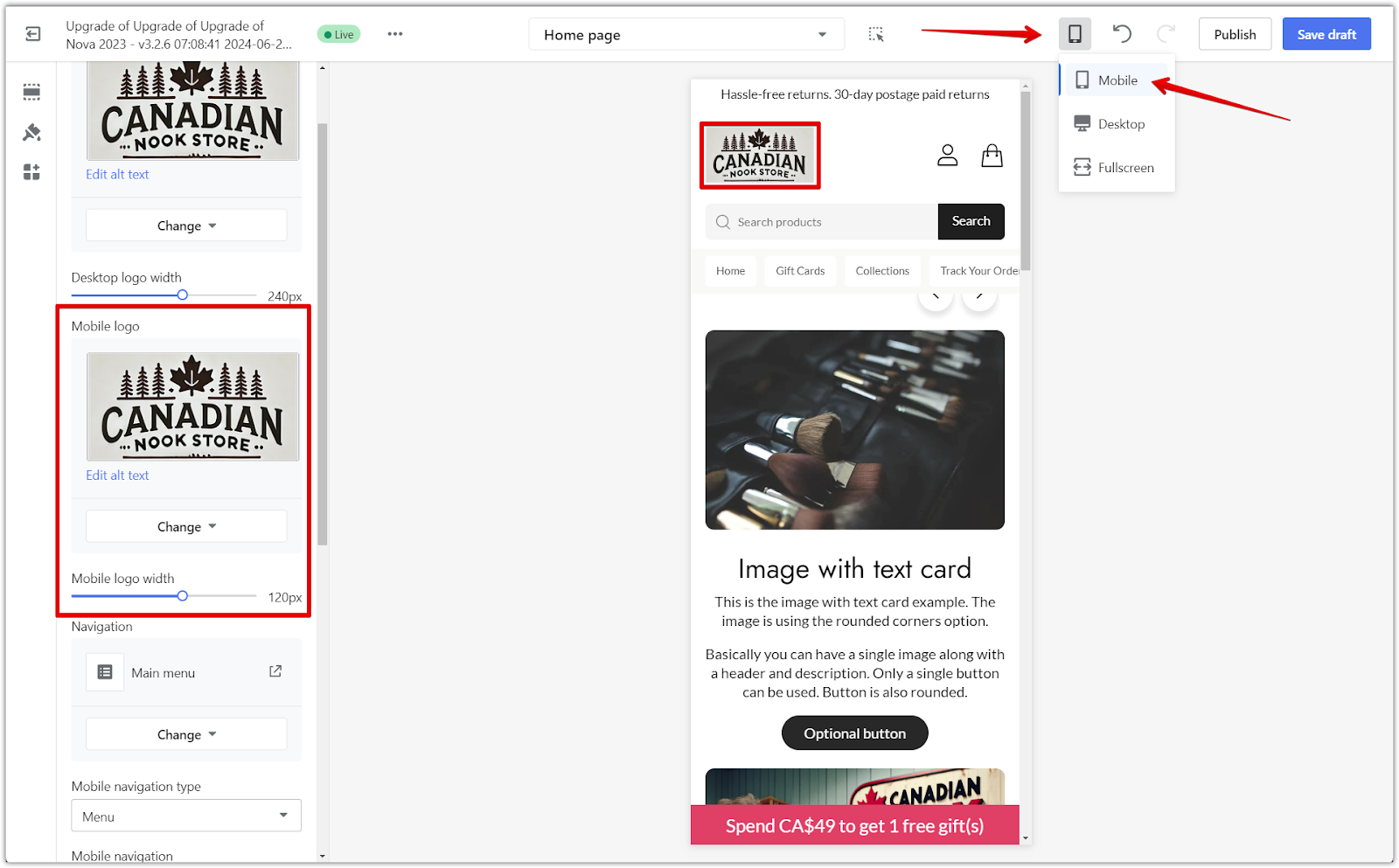
3. Add your logo: Click Select image to upload and assign a logo to the header. This allows you to brand your store, making it easily recognizable to your customers. Use the Desktop logo width slider to modify the size of your logo (measured in pixels). Adjusting the size ensures that your logo is displayed clearly without being too small or too large on desktop screens.
4. Adjust desktop logo size: Use the Desktop logo width slider to adjust the size of your logo (measured in pixels) for desktop devices. This ensures your logo looks appropriate on larger screens.
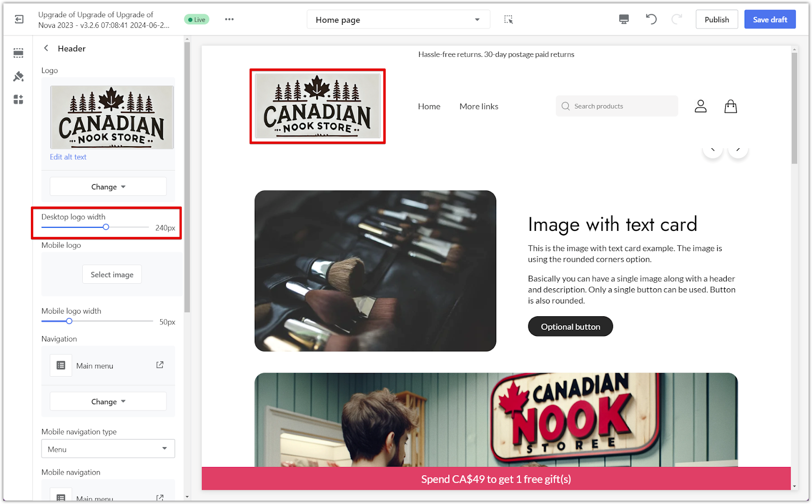
5. Customize mobile logo settings: Click Select image to upload and assign a logo to the header for mobile devices. Adjust the Mobile logo width settings to ensure your logo is optimized for mobile devices. To preview the changes, use the drop-down menu at the top of the editor and select Mobile to see how it will appear on smaller screens.
Editing the navigation menu
Your store’s navigation menu is crucial for helping customers find products and key sections. Customizing it allows you to offer a better browsing experience.
1. Modify your header menu: In the Navigation block, click Edit menu to update your header menu (e.g., Home, New Arrivals). This allows you to change the links displayed in your header, helping customers easily find key areas of your store.
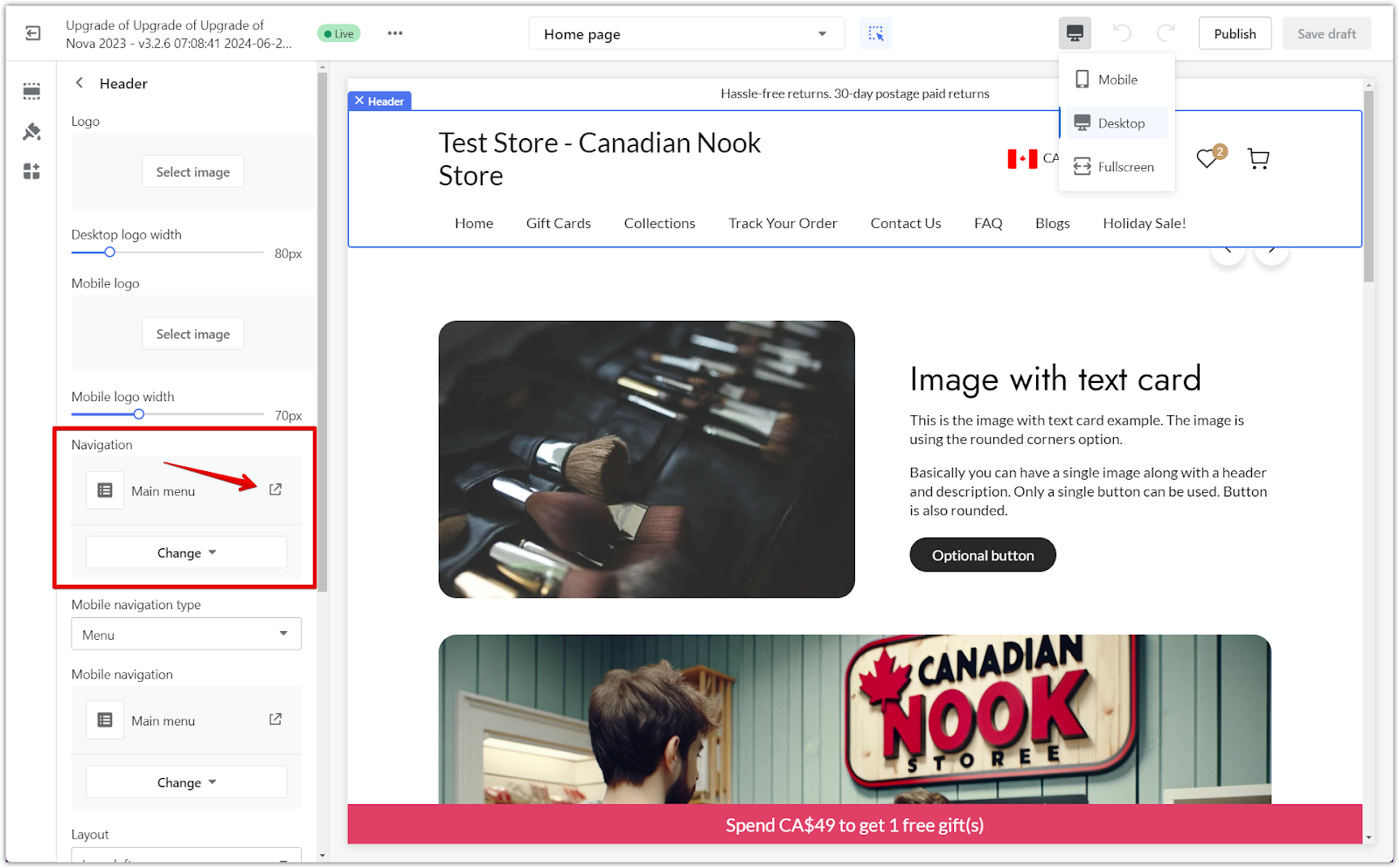
2. Change the menu: Use the Change menu option to switch to a different menu list or remove the current one. This feature is useful if you want to update or simplify the navigation options for your customers.

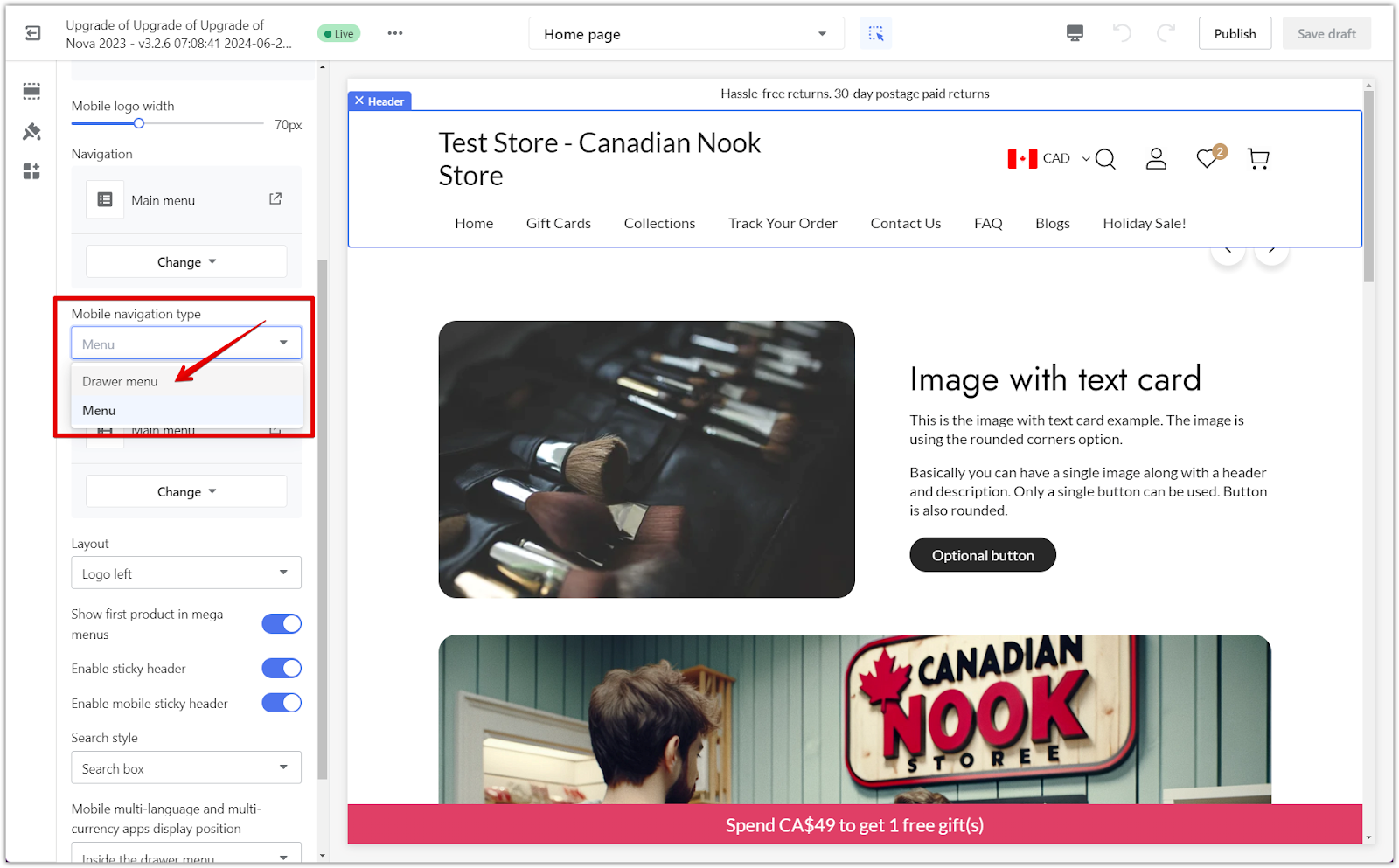
3. Mobile header layout settings: To optimize the user experience on mobile devices, modify the mobile navigation type by choosing between the drawer menu or the regular menu. The drawer menu hides the navigation, while the regular menu displays it at the bottom of the header. Selecting the appropriate type improves the mobile browsing experience by making the header less cluttered.
Customizing the header layout
Choosing the right header layout impacts how customers interact with your store. This section covers how to adjust the placement of key elements like the logo and navigation links.
1. Select layout style: In the Layout menu, choose a layout such as Logo left, Logo center, Menu left/logo center, or Logo left/menu left. These options let you determine the placement of your logo and menu items, creating a visually appealing header layout.

2. Manage additional header settings:
- Show first product in mega menus: Displays the first product photo in the header menu, which can help highlight key products directly in the navigation.
- Enable sticky header: This feature keeps the header visible at the top of the page as customers scroll down, making it easier for them to navigate back to important sections.
- Enable mobile sticky header: Allows the sticky header to function on mobile devices as well, ensuring a smooth experience for mobile shoppers.

Note
To display the first product image, a cover photo for the collection must be uploaded before this setup can take effect.
Setting up search and multilingual options for mobile devices
Enabling a search function and offering support for multiple languages or currencies can help improve your customers’ shopping experience. For mobile devices, you have specific options to display multilingual and multi-currency settings in a way that enhances usability.
1. Search style options: You can choose how the search bar is displayed, regardless of the device. Customize the search bar to either show as an icon or a full search box in the header, allowing customers to search efficiently from any page.
- None: Disables the search function if it’s not needed in your store.
- Icon: Displays a small magnifying glass icon that opens the search box when clicked.
- Search box: Shows both a search box and a magnifying glass icon, allowing customers to search directly from the header.

2. Multilingual and multi-currency settings (mobile-specific): For mobile devices, you can choose where the language and currency options appear. These settings are especially helpful for stores targeting international customers:
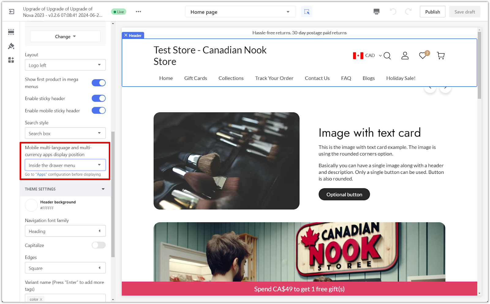
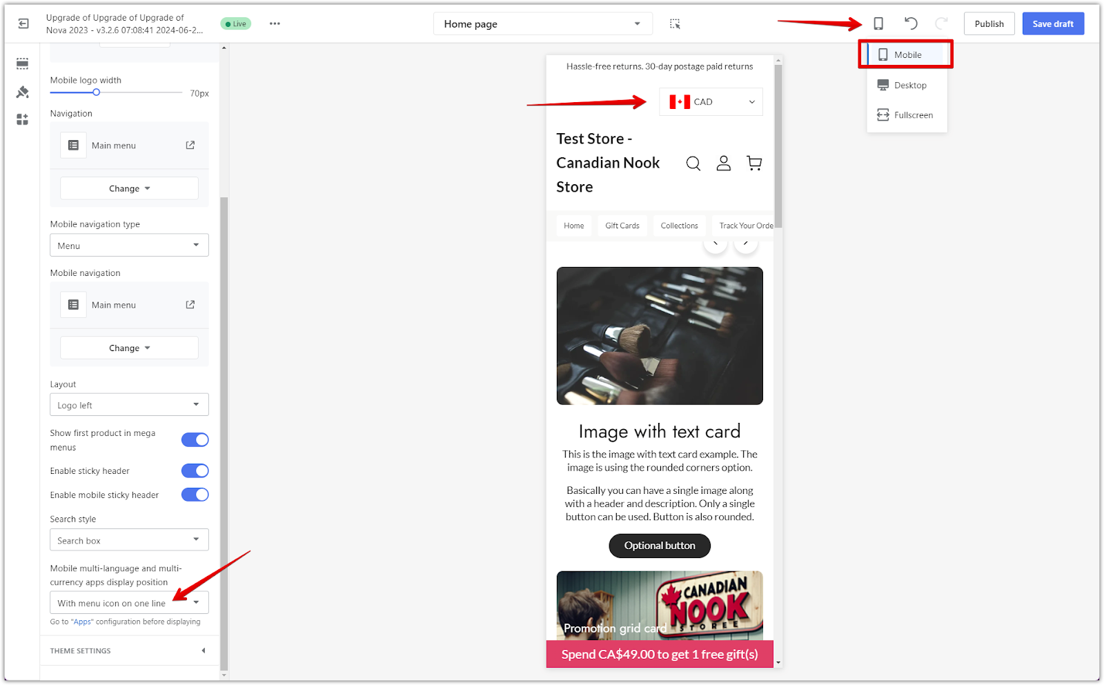
- With menu icon on one line: This option displays the language and currency selection directly in the mobile header for quick access.
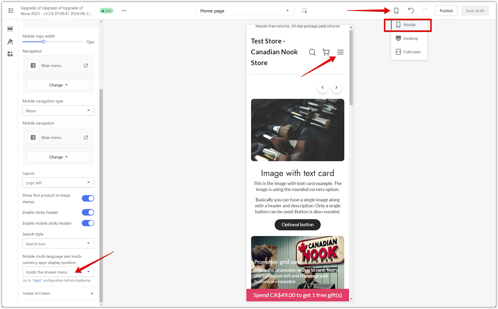
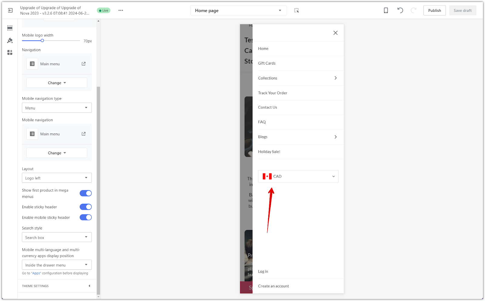
- Inside the drawer menu: Here, the language and currency options are located within the mobile menu and are accessible only after opening the drawer. This helps keep the header clean while allowing access to international shopping options.
Note
Multilingual and multi-currency settings must be installed as extensions before they can appear in the theme editor. For more information on which apps are needed, click here .
Customizing layout settings
Your layout settings allow for finer control over the visual aspects of your header. This section guides you through color, font, and shape adjustments.
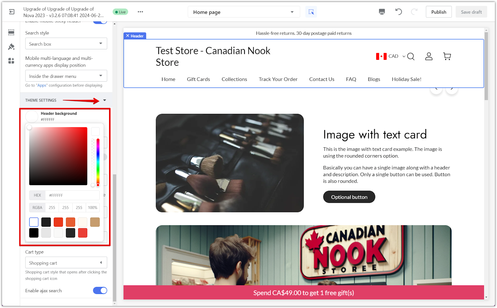
1. Change header background color: In Theme settings (bottom left corner), use the color palette to adjust your header’s background color. This helps to match your header with your overall store theme and branding.
2. Set navigation font: In the Navigation font family, you can choose a font from Main Theme settings > Typography. Selecting a clear and readable font enhances your store’s professional look and feel.
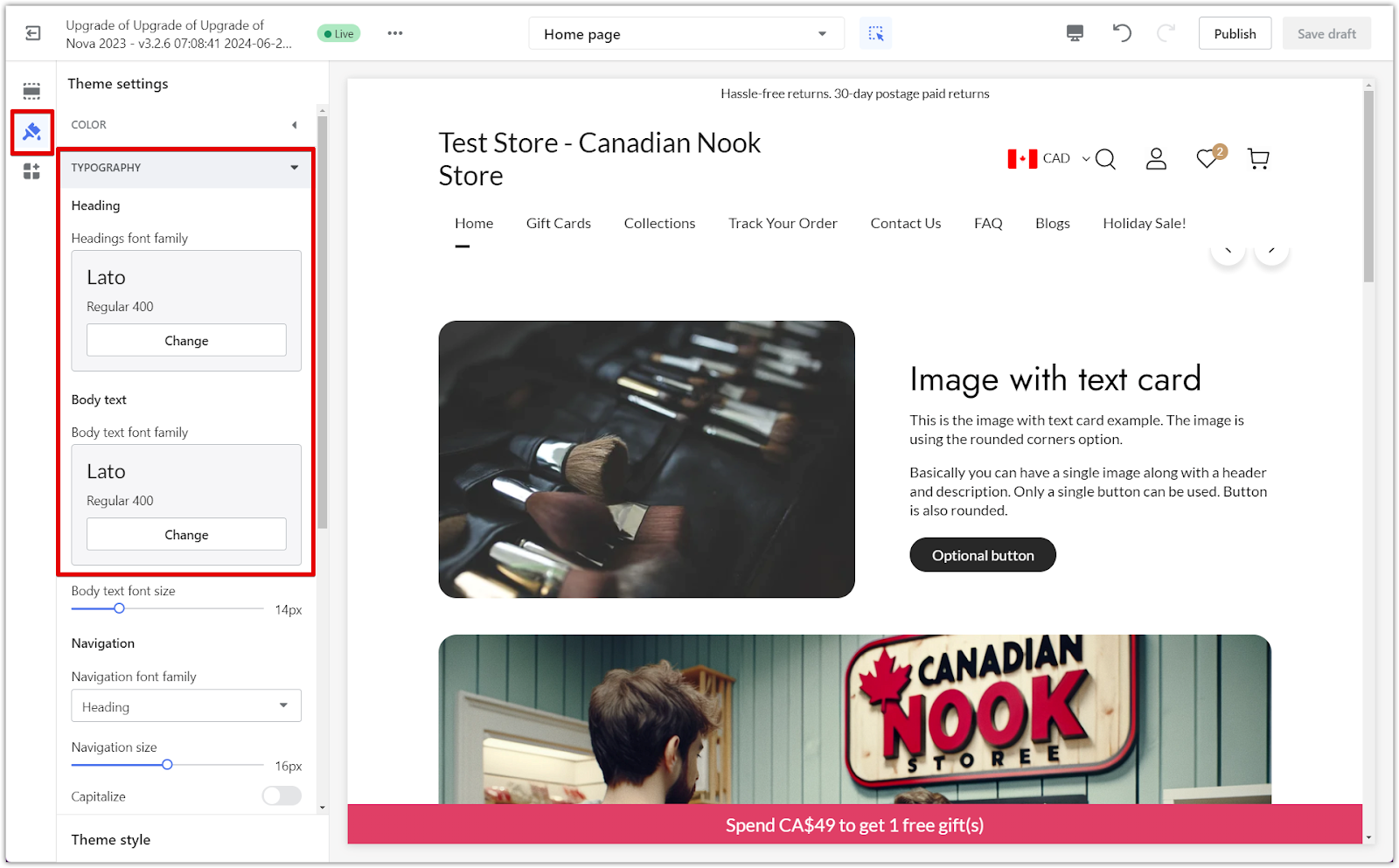
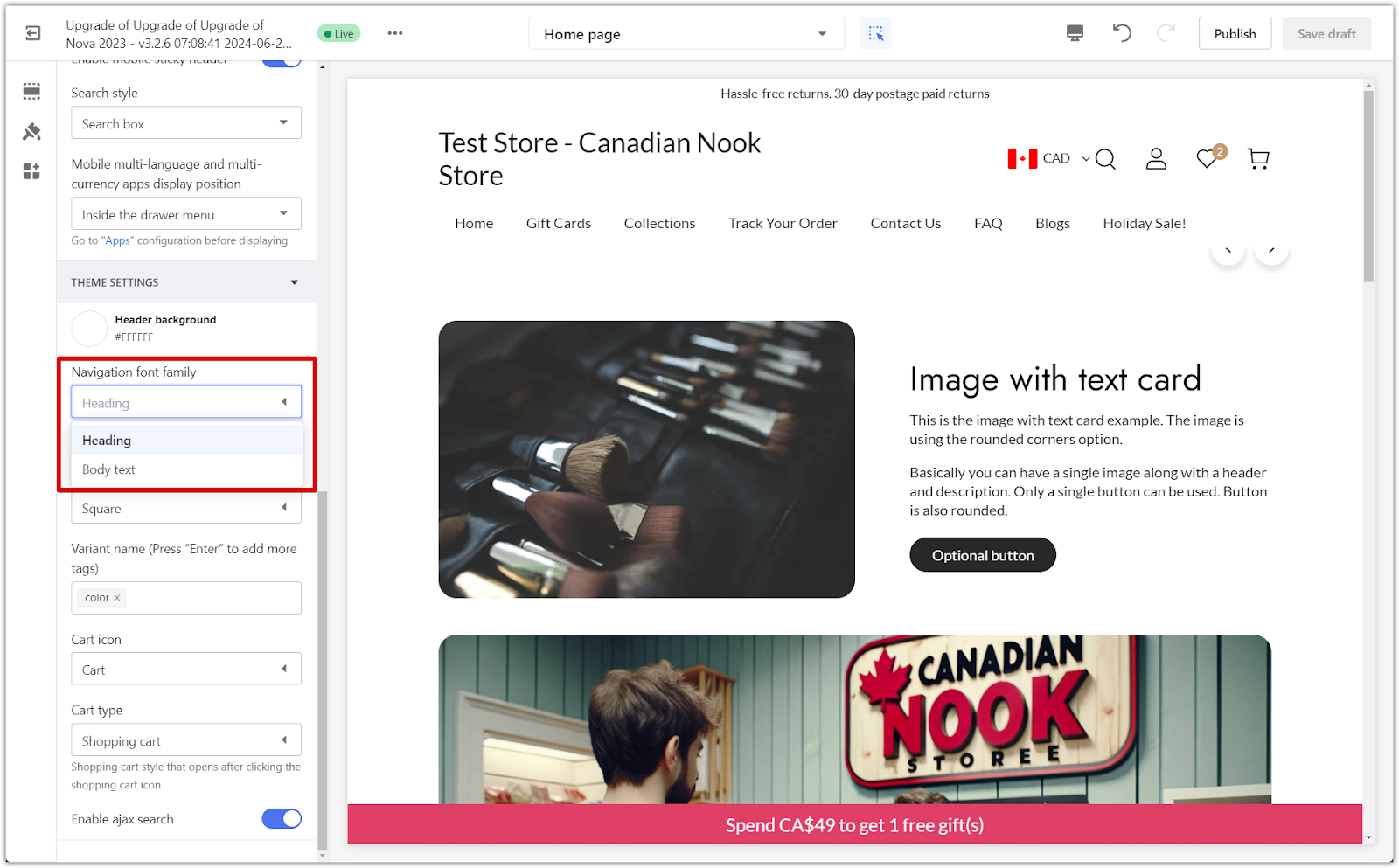
3. Capitalize menu text: Enabling the Capitalize option will automatically convert all your menu text to uppercase, giving the header a bold and uniform appearance.

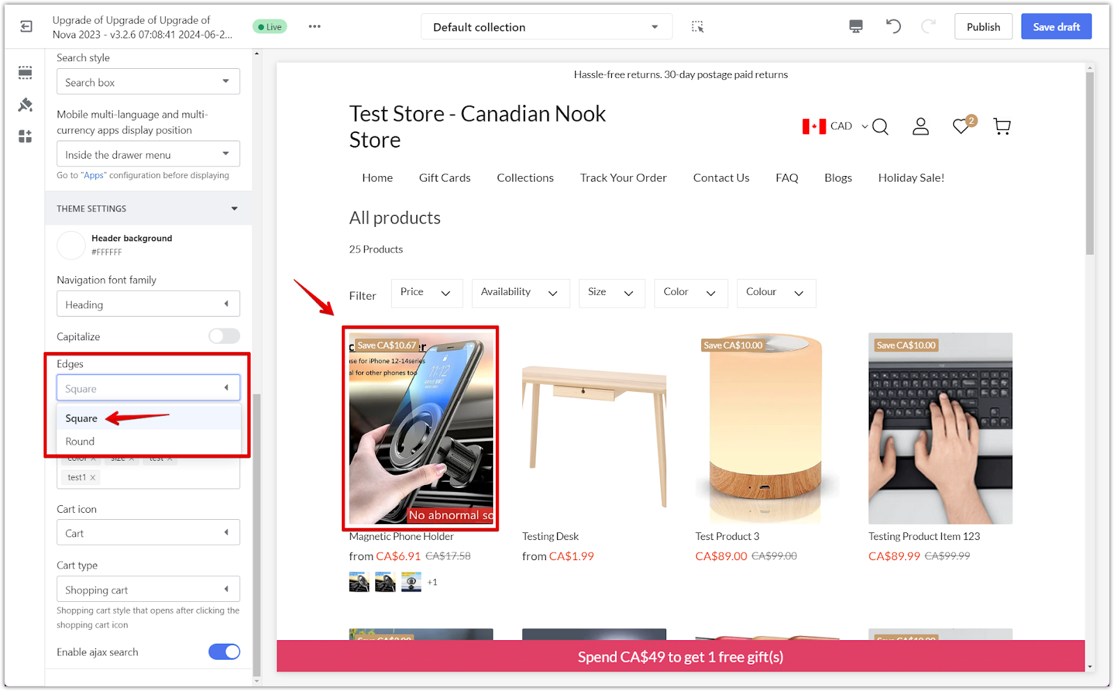
4. Adjust element shapes: In Edges, choose between displaying elements as Square or Round. This subtle change can make a big difference in the overall design, depending on the style you're aiming for.
Variant name feature
This feature controls how images appear for products with specific variant names, offering consistent visual feedback when selecting different product options.
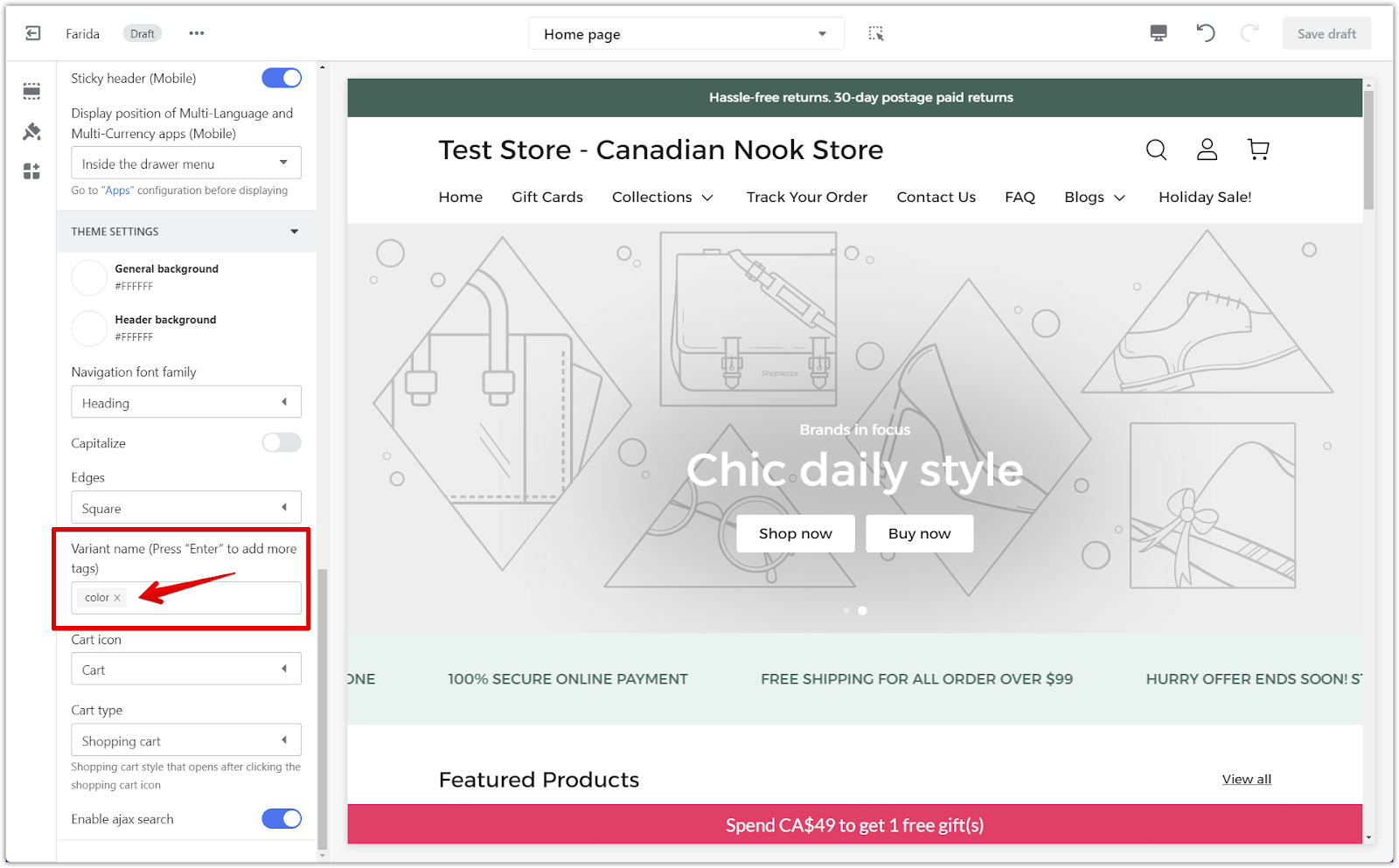
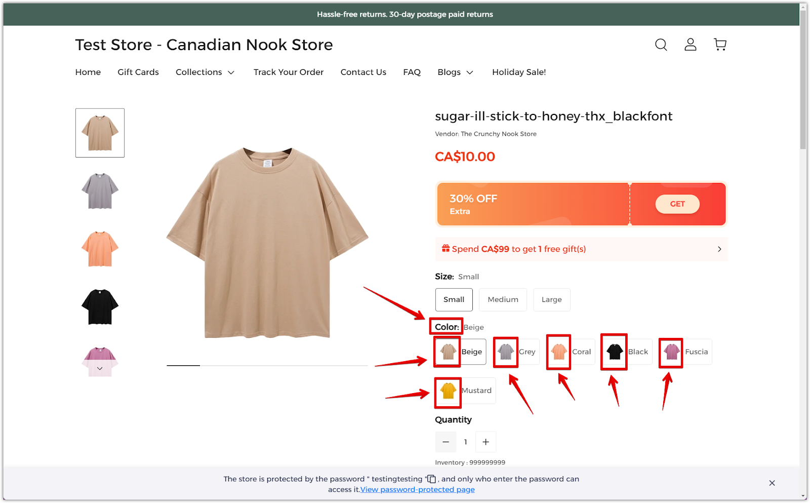
1. Displaying images for specific variants: When specific variant names (e.g., "Color: Beige," "Color: Grey") are added to the Variant name field, ensure these tags match the attribute names set on your product page. This alignment ensures that the corresponding images appear in the variant selection area, helping customers see the related images when they choose a variant.
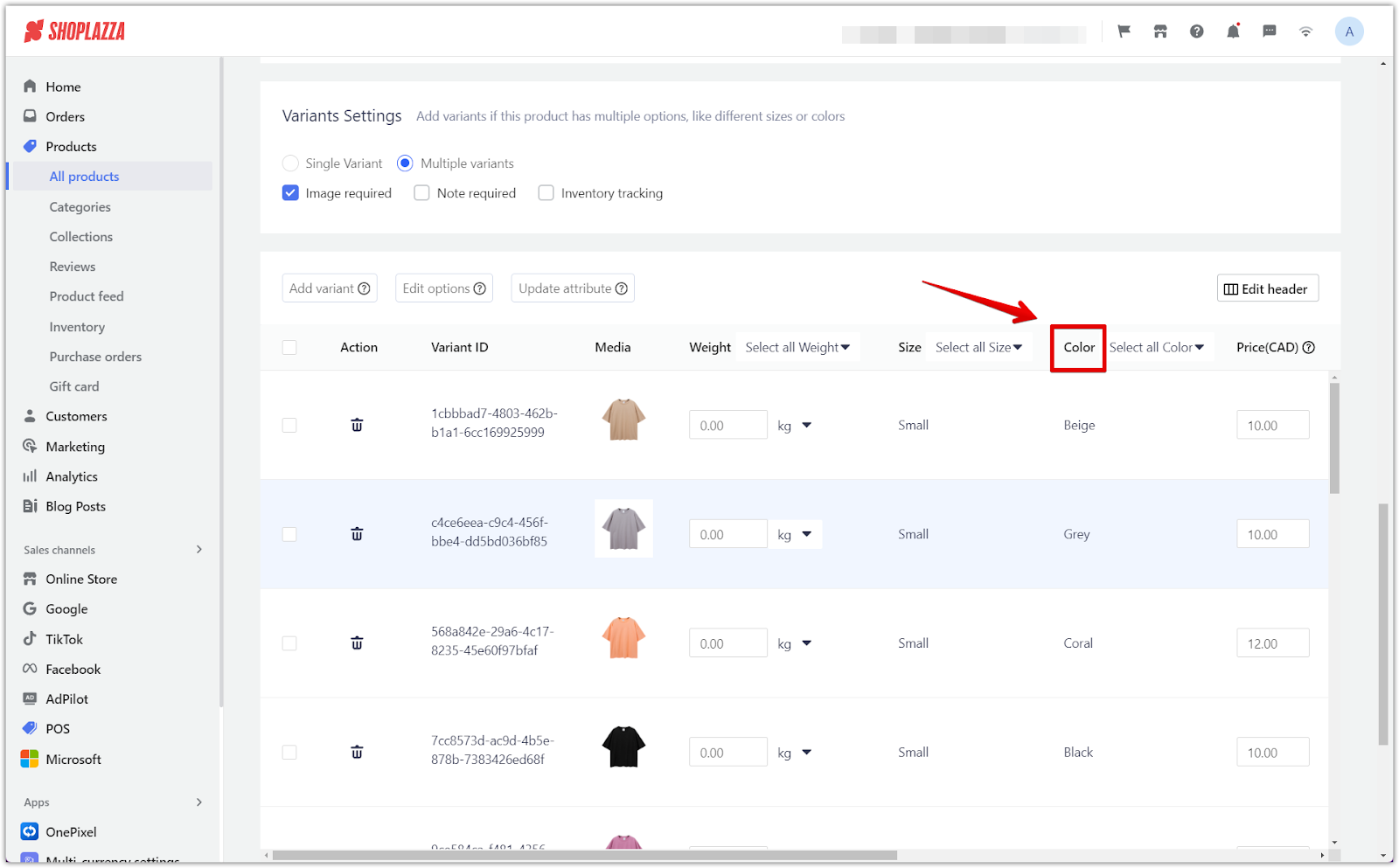
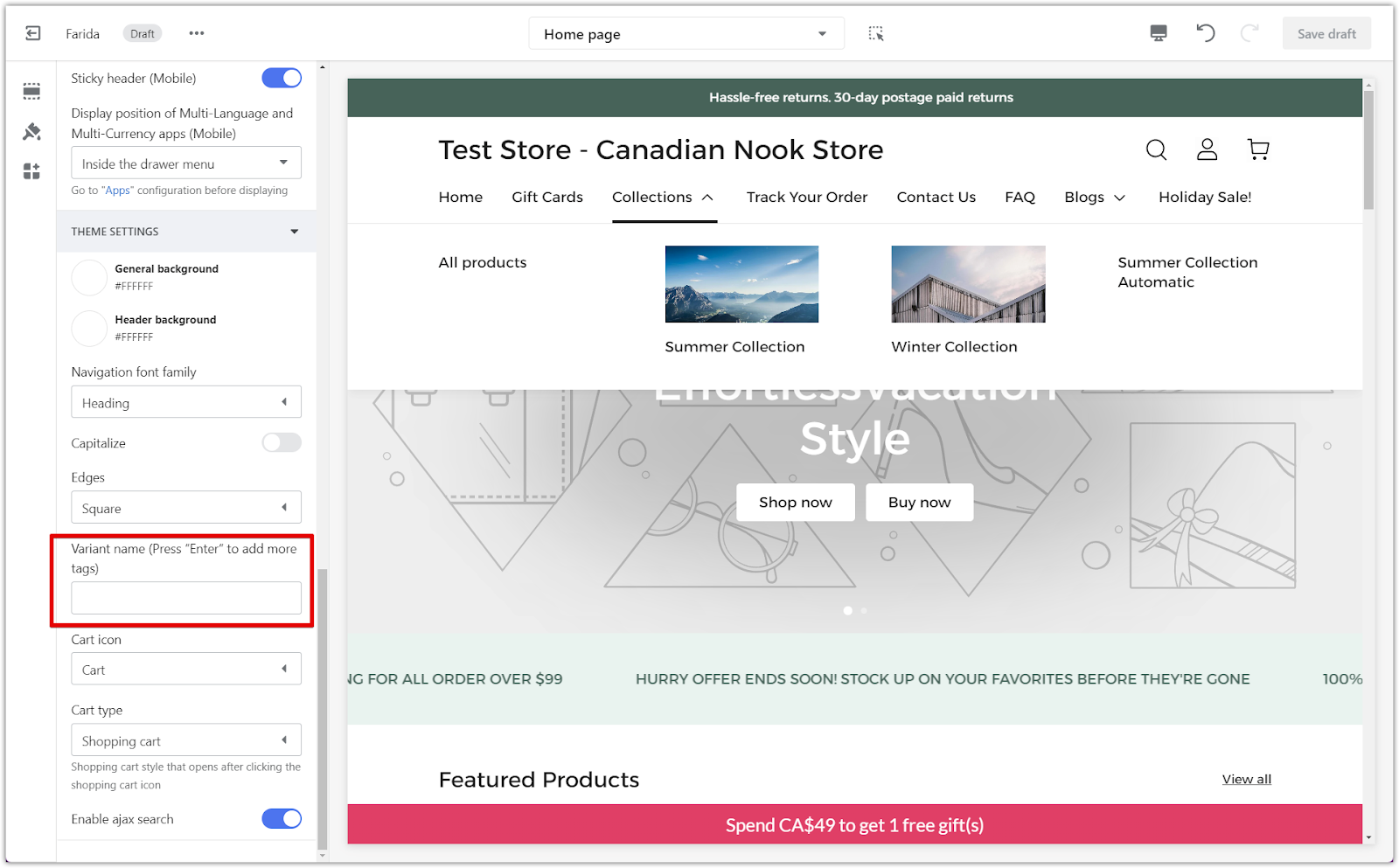
2. No images if left empty: If the Variant name field is left empty, no images will be shown in the variant selection area, which can make it unclear for customers when selecting variants.

Customizing cart settings
The cart settings allow you to personalize the way customers interact with their shopping cart. This section explains the available options.
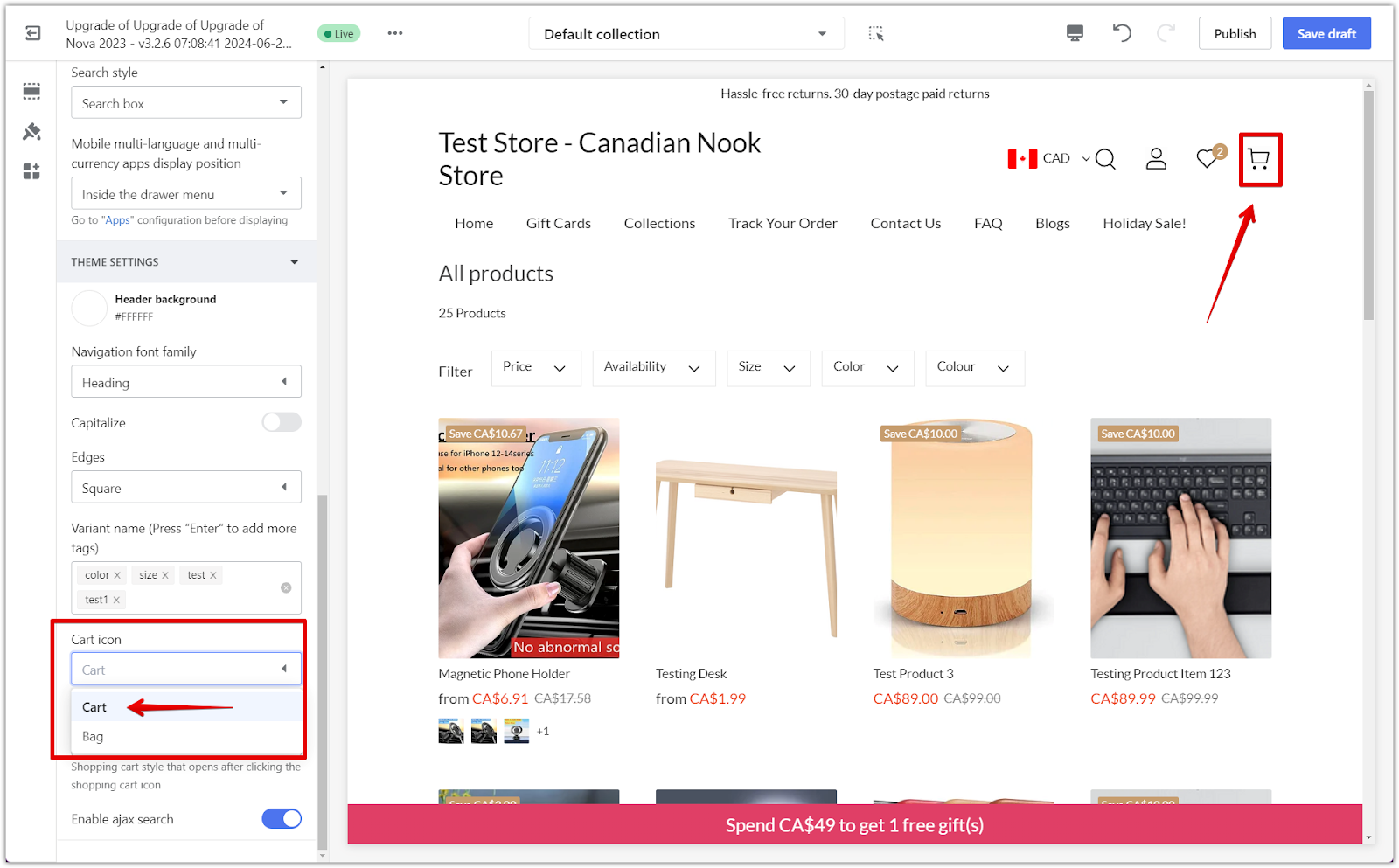
1. Edit cart icon: Change the cart icon to either a Shopping cart or a Shopping bag. This simple tweak allows you to personalize your store’s shopping experience according to your branding.
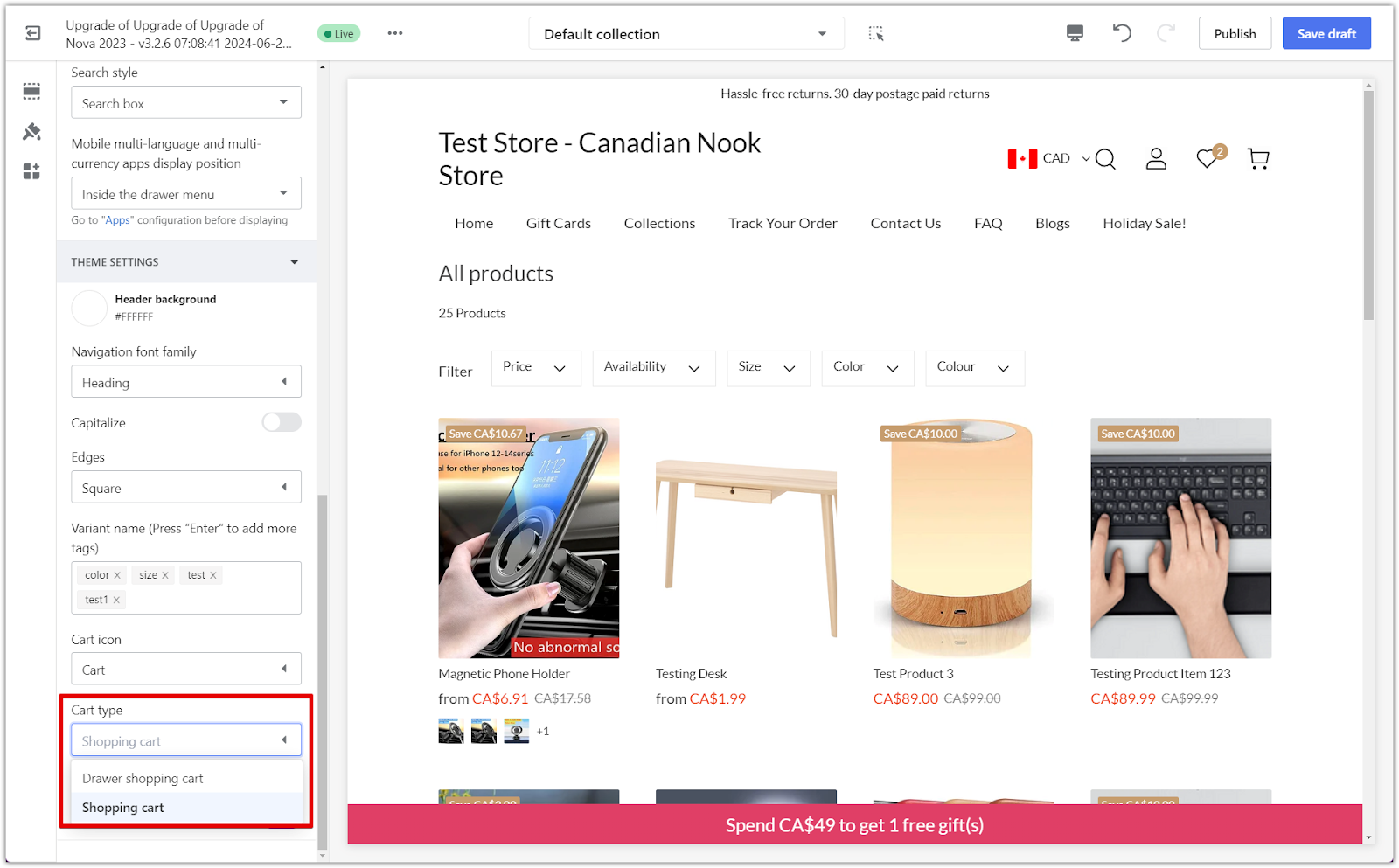
2. Cart type: This setting allows you to choose how the cart behaves when a customer adds an item. You can select from the following options:
- Shopping cart: When a customer adds an item to their cart, they are redirected to the shopping cart page to review their order.
- Drawer shopping cart: This option opens a sliding cart on the right side of the page, allowing customers to continue shopping without navigating away from the current page.
Search functionality
Search functionality makes it easier for customers to find what they need. Here, you’ll learn how to enable and customize the Ajax search option for a more dynamic user experience.
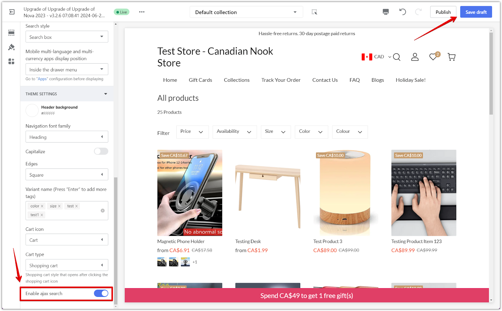
1. Enable Ajax search: Enabling this feature allows search results to appear in a dropdown as customers type into the search box. This makes it easier for them to find products while navigating away from their current page. Once your changes are complete, click Save draft to save your edits and publish them when ready.
Setting up your store’s header and other theme settings effectively can greatly improve your customers’ browsing experience. Ensuring smooth navigation and clear product displays makes it easier for shoppers to find what they’re looking for and feel confident in their purchase decisions. Take advantage of the available customization options to align your store’s appearance and functionality with your brand, creating a welcoming and intuitive experience for your audience.


Comments
Please sign in to leave a comment.