
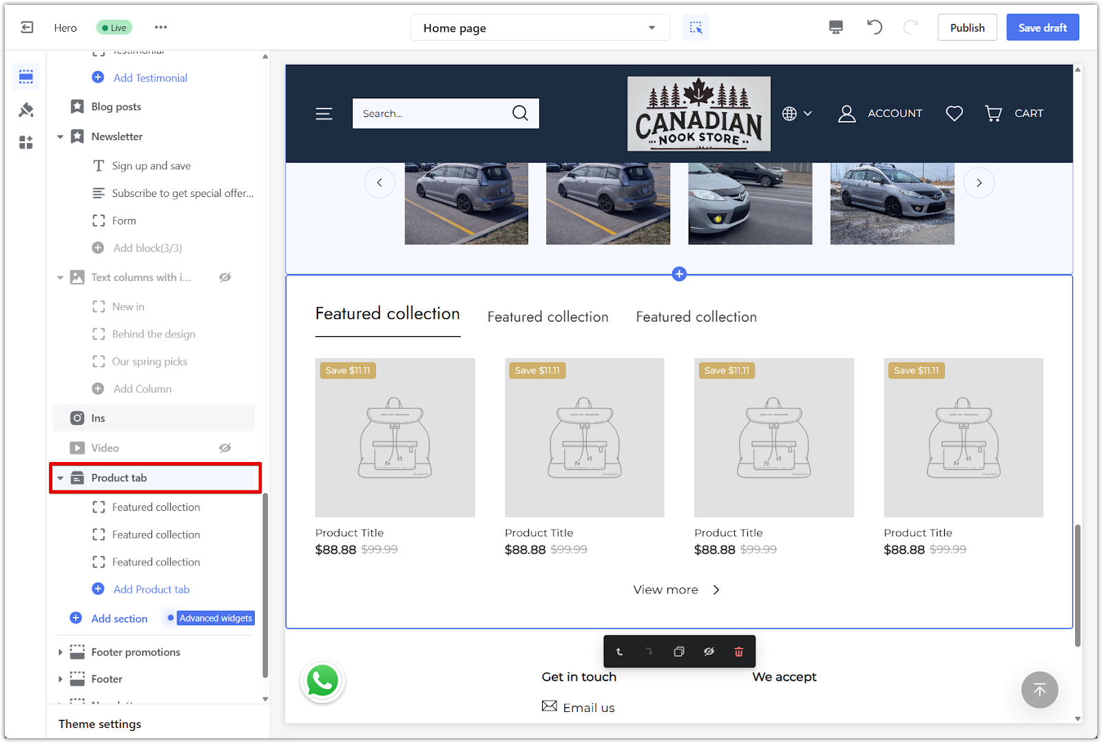
The product tab section helps organize your storefront by collection, making it easier for customers to explore your catalog and find what they need. This clean layout is especially useful for stores with large inventories, as it keeps everything tidy while highlighting key product categories.
In this guide, you’ll learn how to add and customize the product tab section in the Hero theme series, which includes the Hero, Halloween, and Modern themes — all manageable directly from your Shoplazza theme editor.
Adding a product tab section
The product tab section is added directly from the theme editor and customized by opening the section settings.
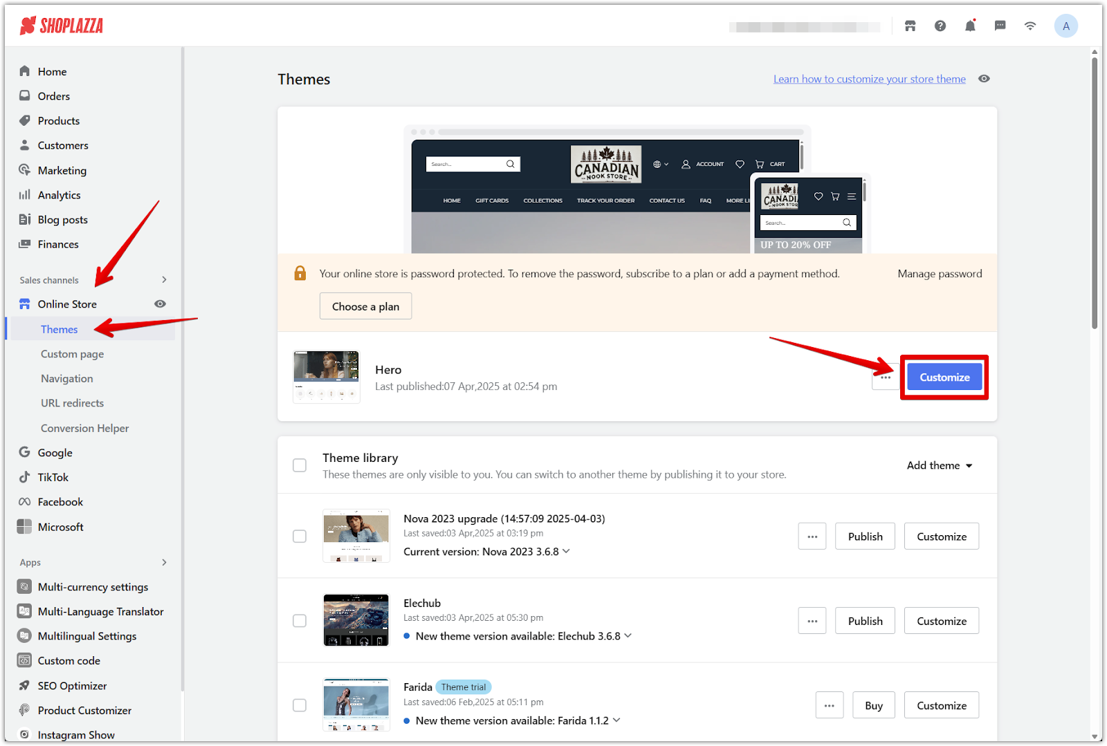
1. Go to your Shoplazza admin: Head to Online Store > Themes and click Customize beside your active theme.
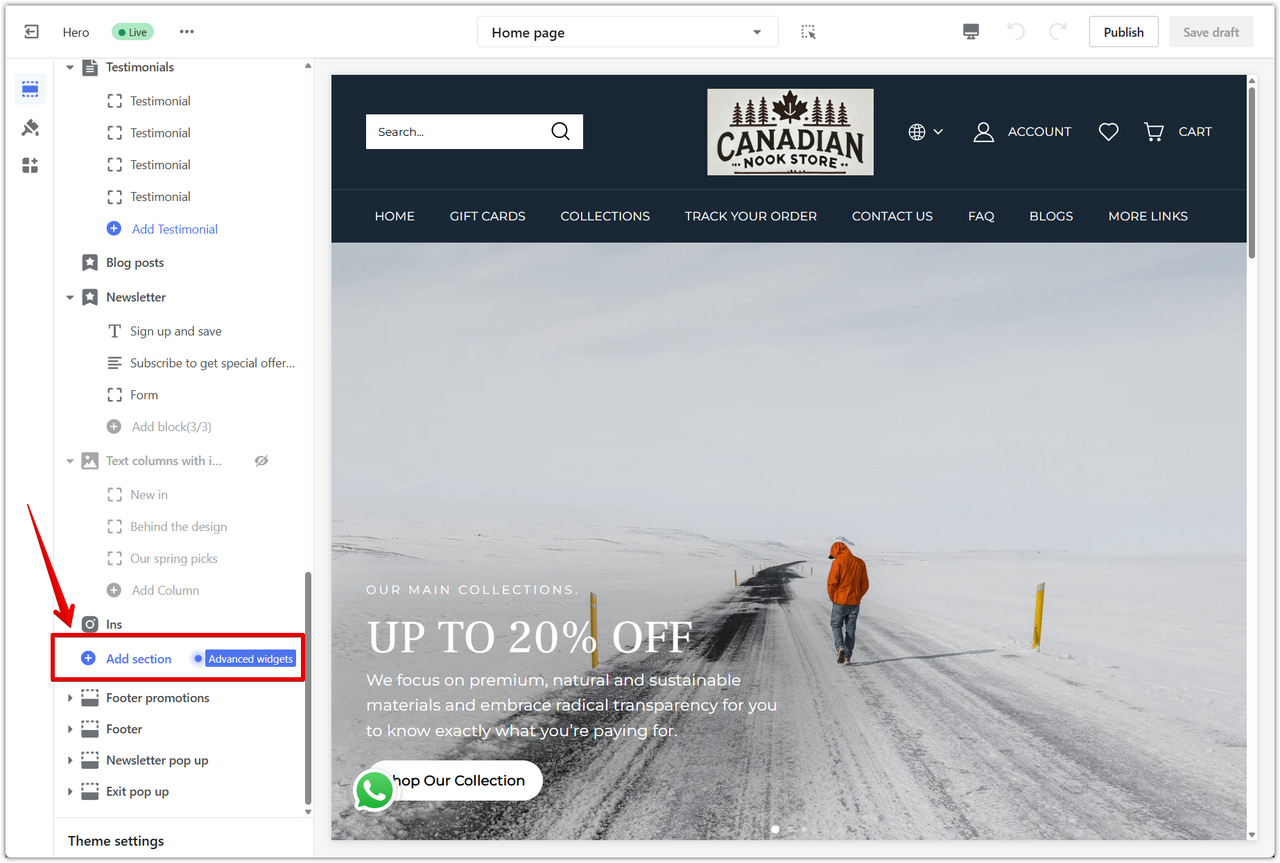
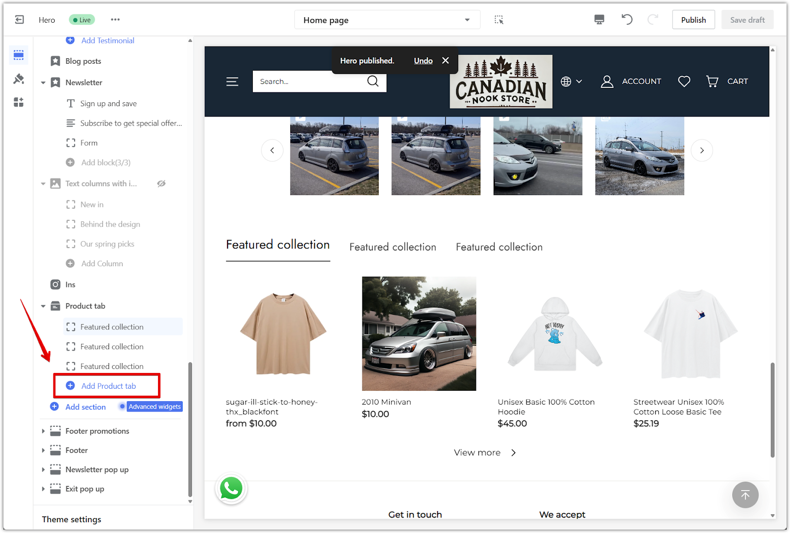
2. Add the section: Click Add section in the left panel, scroll through the Additional sections, and select Product tab to insert it into the layout.
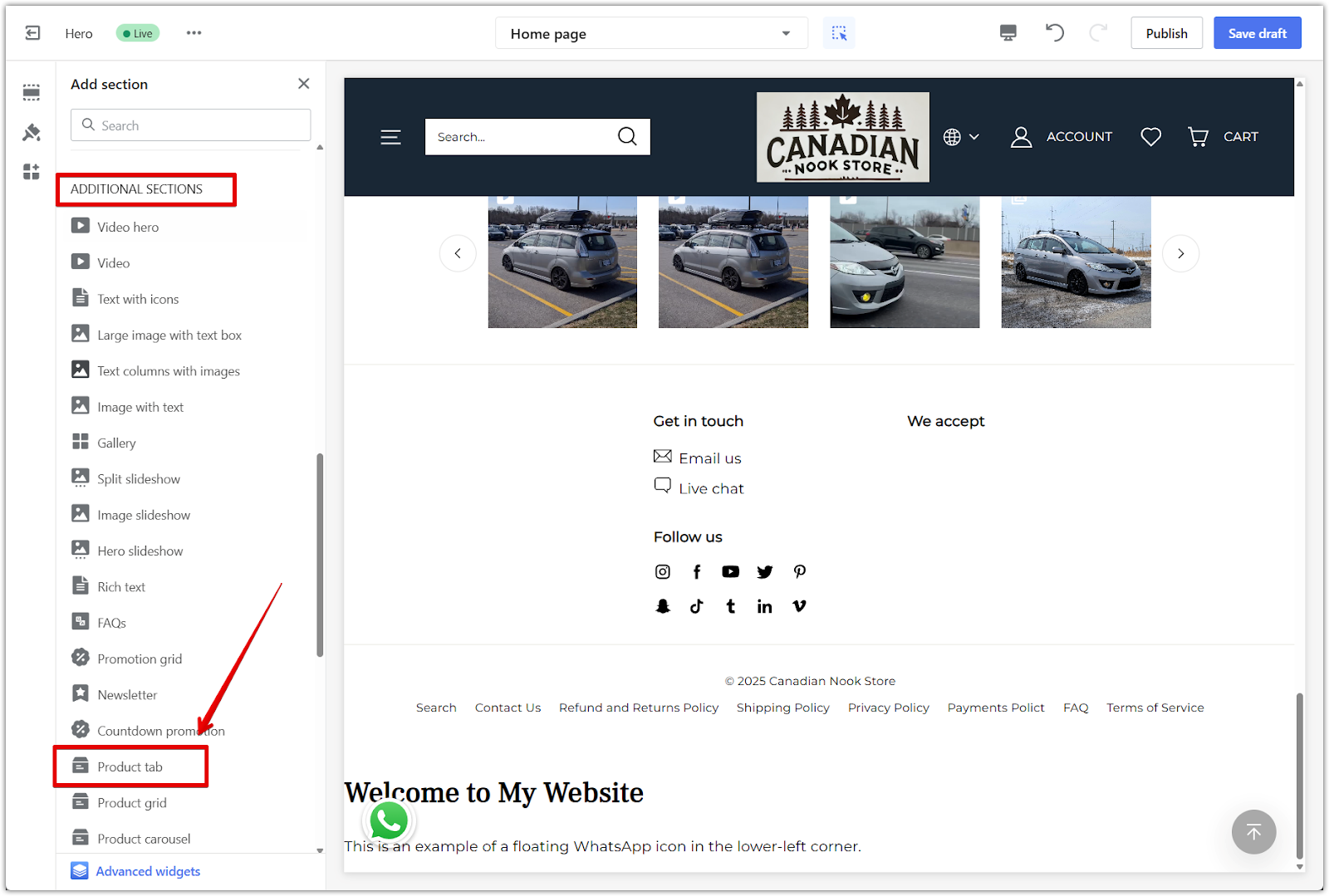
3. Open the settings panel: Click the Product tab title in the left sidebar to access the section settings.
4. Add more tabs: Use Add Product tab to include more collections.
Customizing the layout and display
Once the section is added, use the settings panel to adjust how products appear on different devices and how your promotions are displayed.
1. Choose product layout: Set how many products and rows display on mobile and desktop using the dropdown menus and sliders.
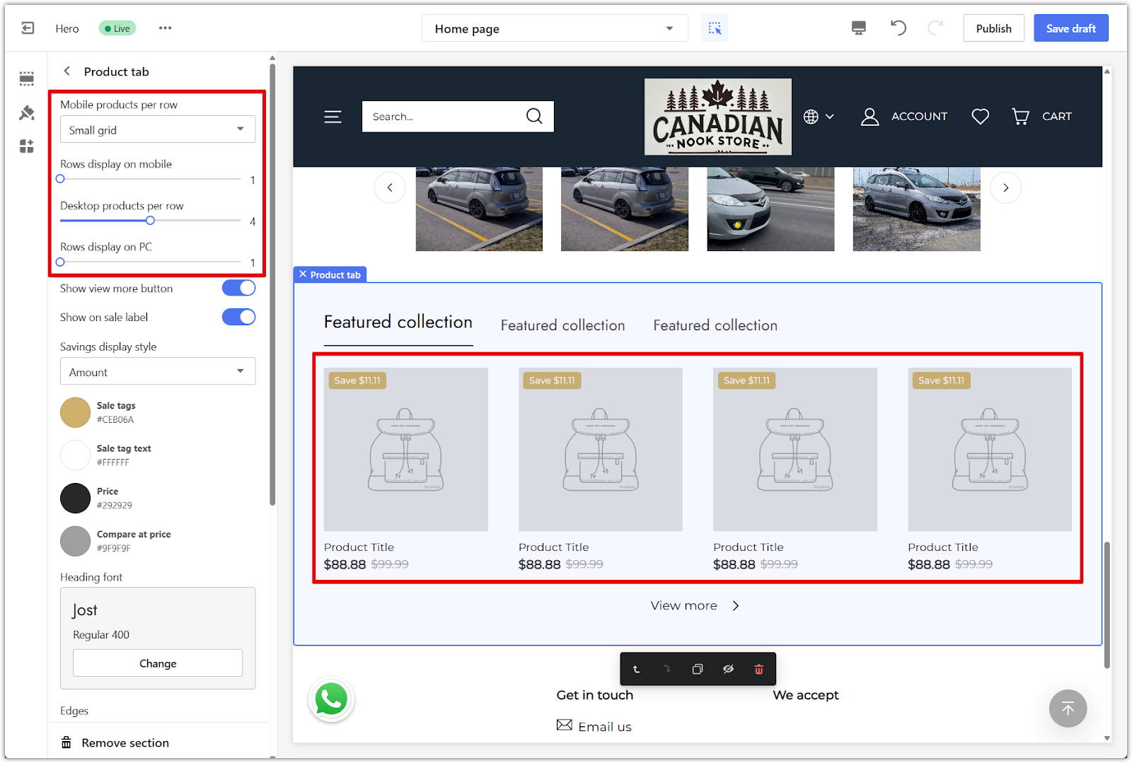
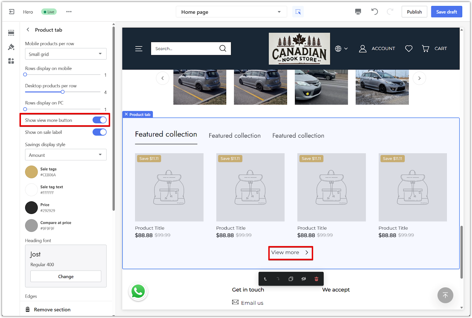
2. Show more products: Toggle on Show view more button to let customers load more products from the same collection.
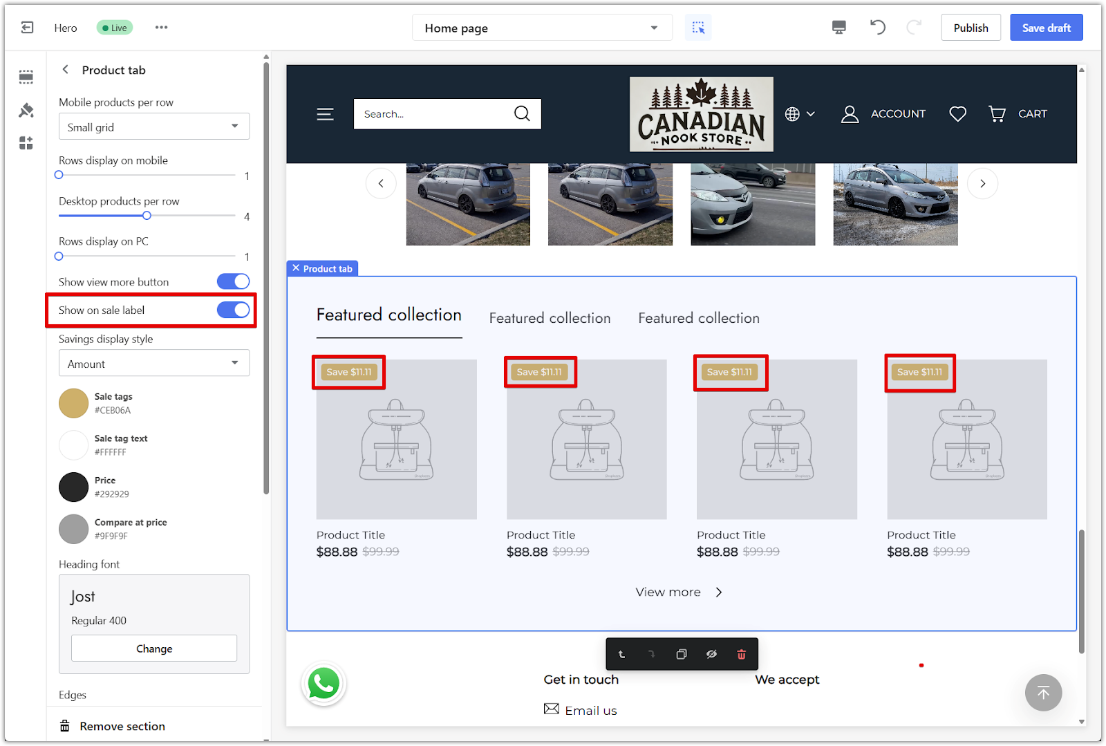
3. Display sale tags: Turn on Show on sale label to highlight discounted items with a label.
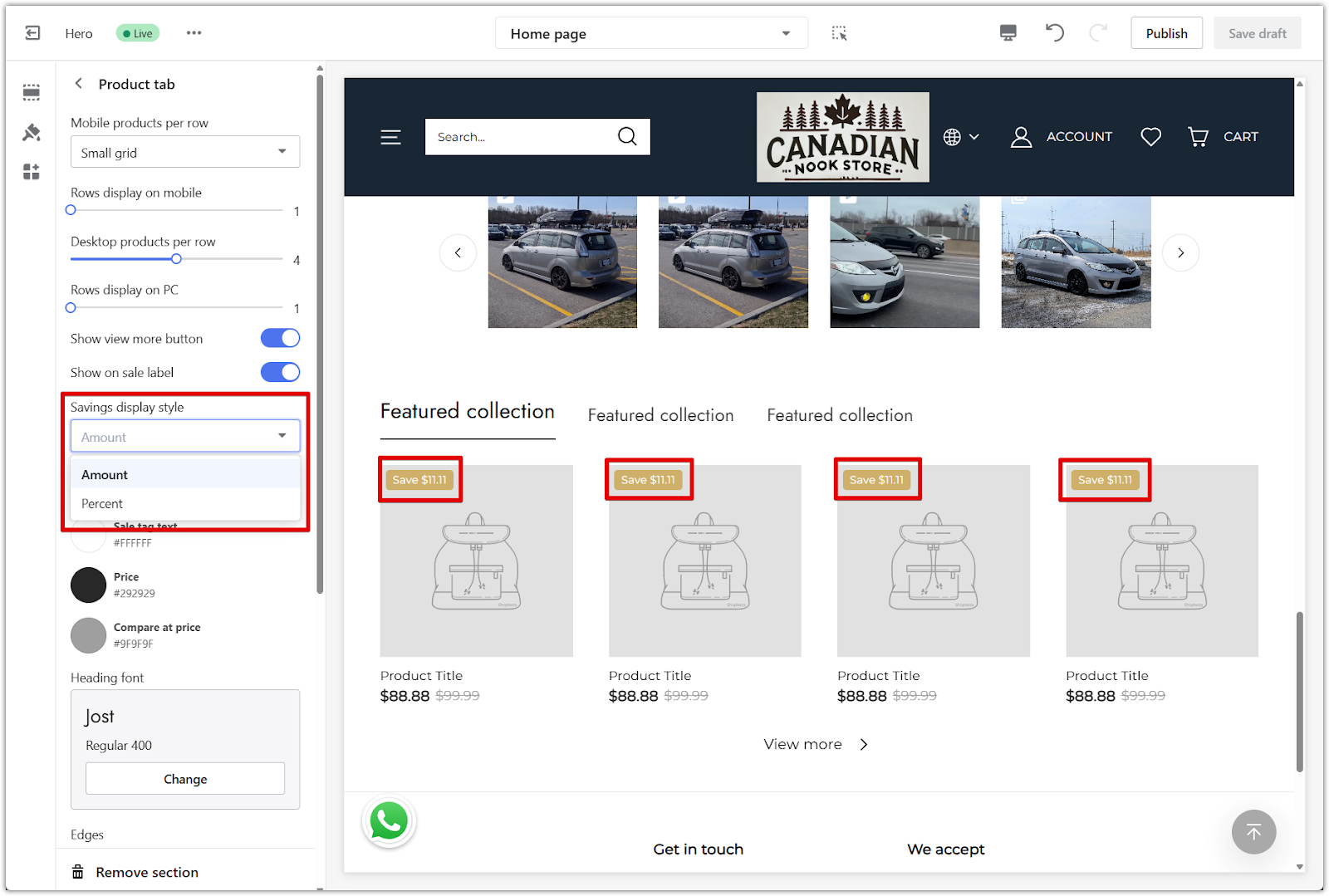
4. Set savings format: Choose Amount or Percentage from the Savings display style dropdown.
Styling the section
Design elements like colors, fonts, and corners can be adjusted to match the rest of your storefront.
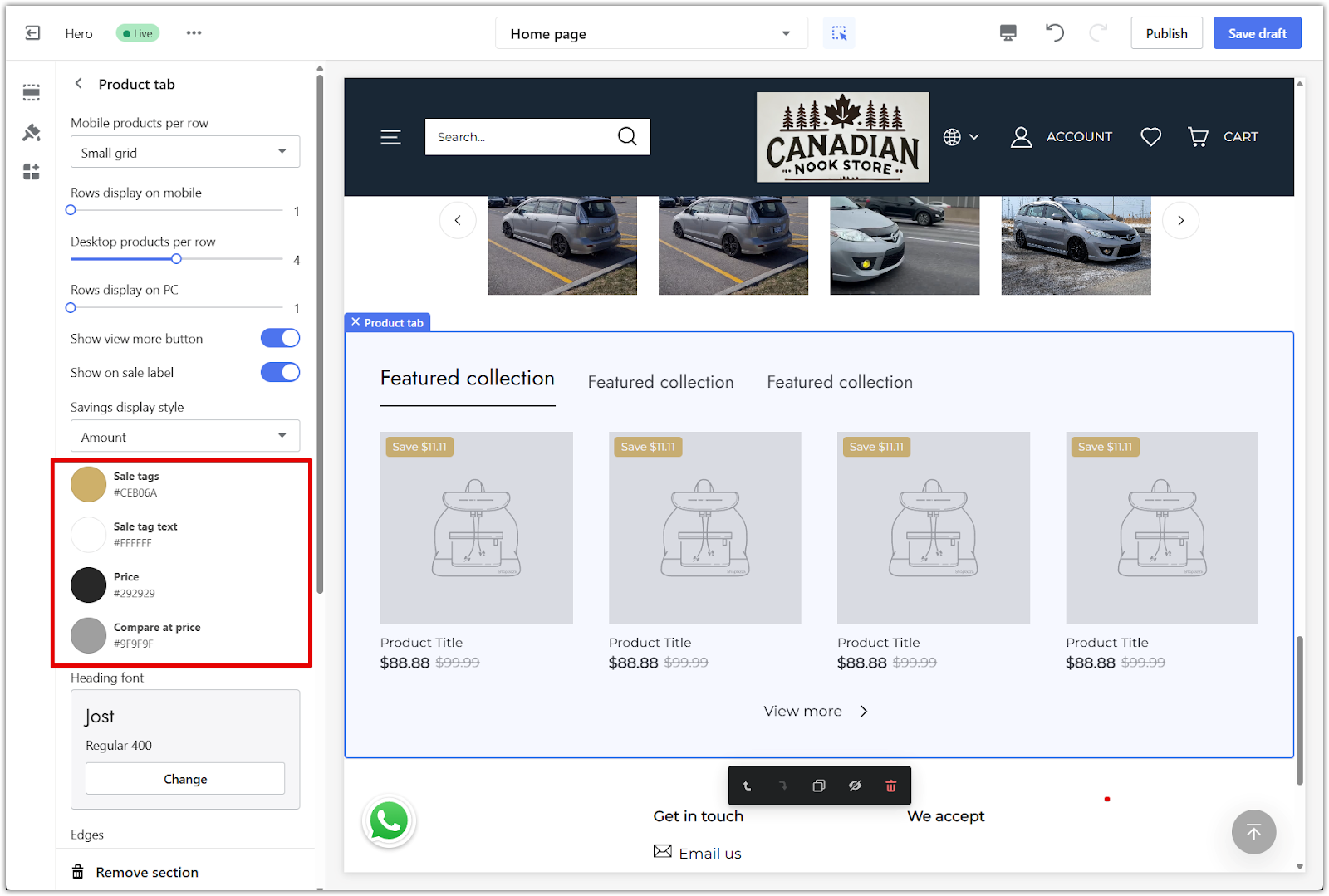
1. Edit tag and price colors: Customize the sale tags, sale tag text, price, and compare-at-price colors.
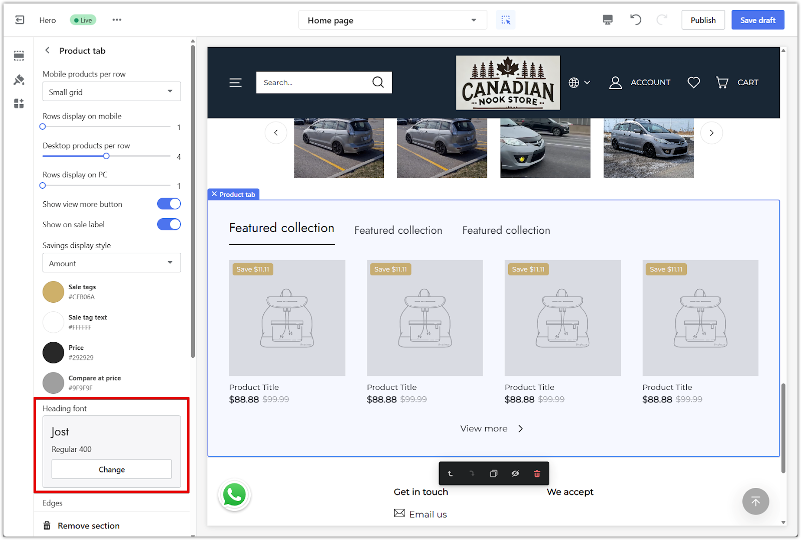
2. Choose a font: Use the Heading font setting to select the font style used in the section.
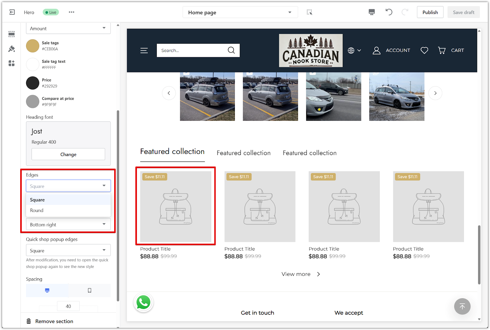
3. Adjust edges: Select from square or rounded corners using the Edges dropdown.
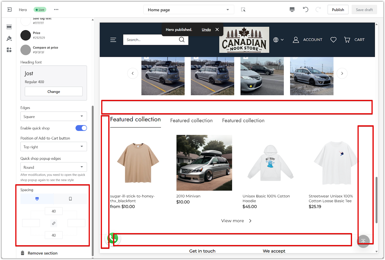
Quick shop and spacing
Fine-tune how product cards behave and how the section sits within the overall page layout.
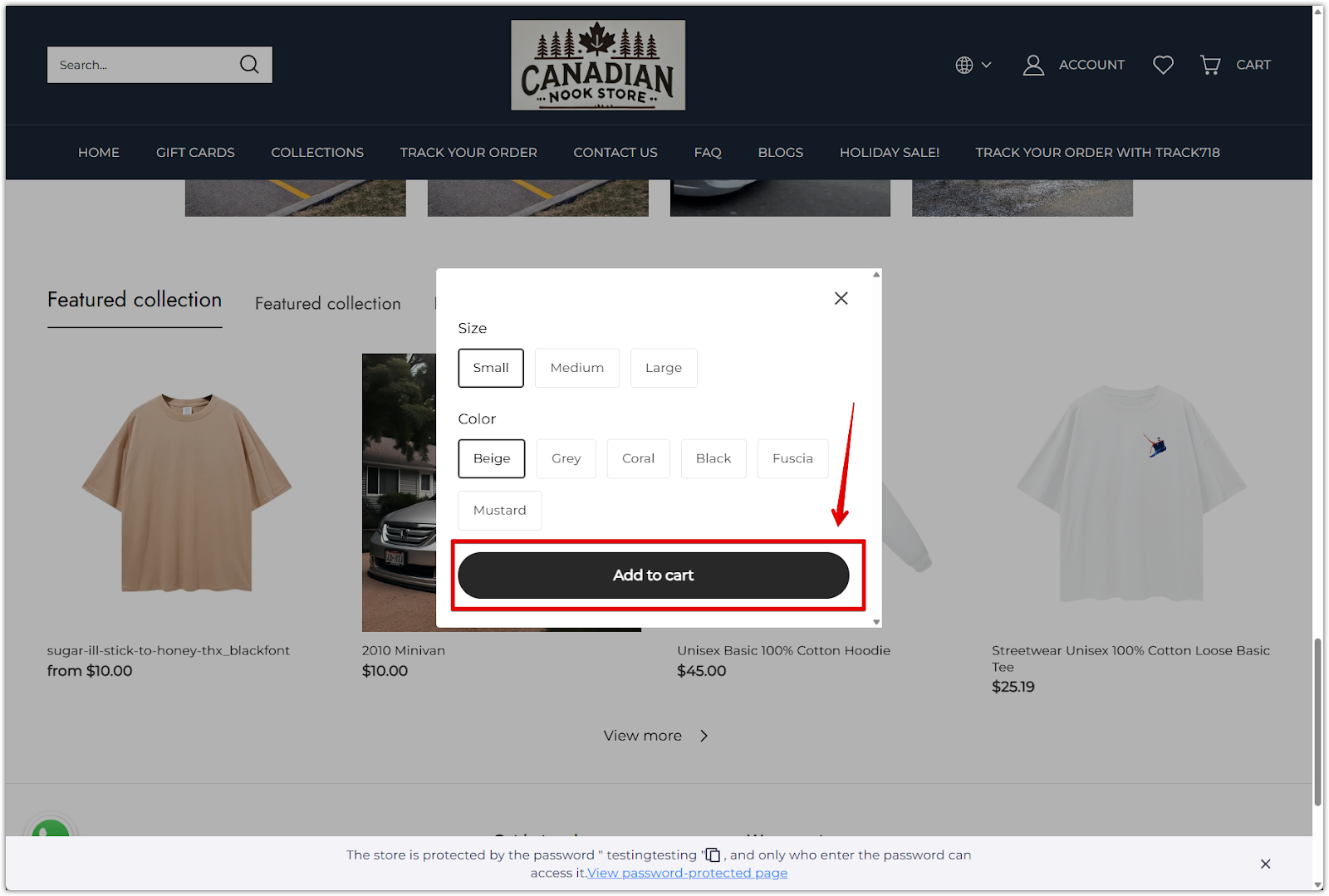
1. Enable quick shop: Turn on the Enable quick shop toggle to allow customers to view product details in a popup.
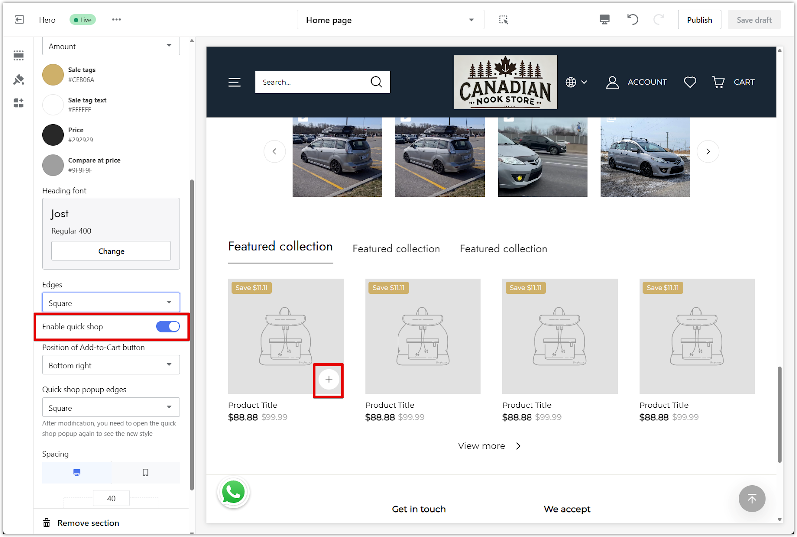
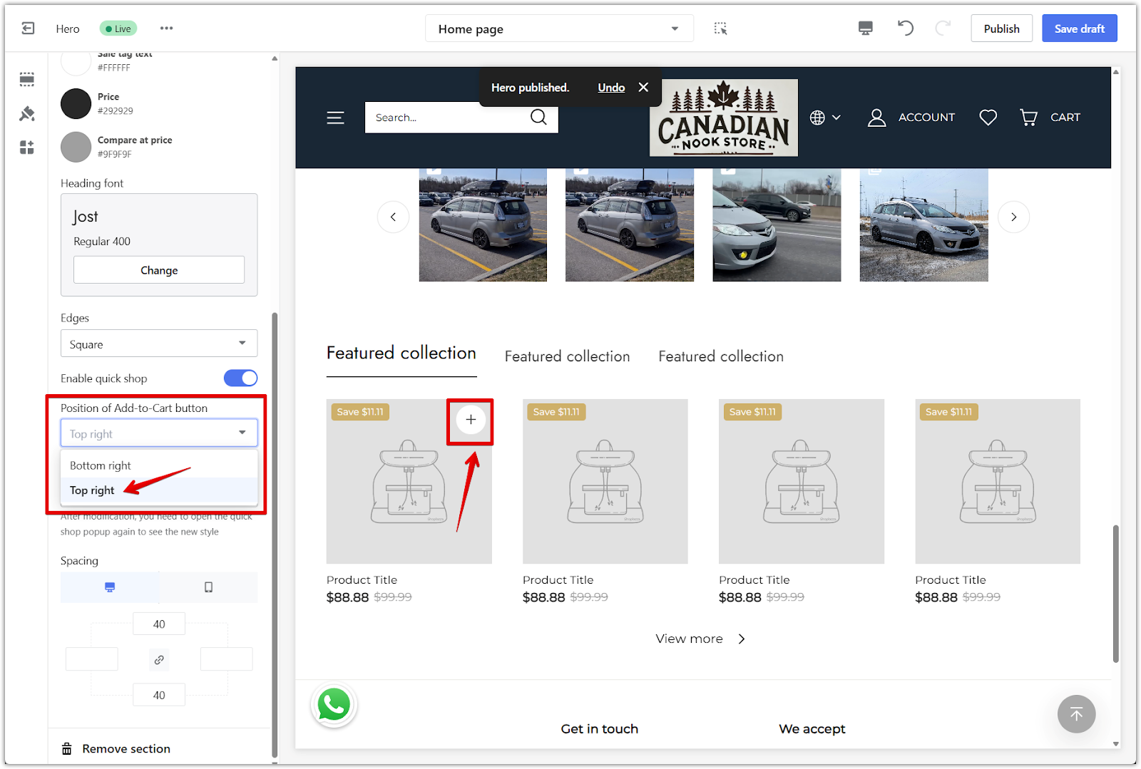
2. Set button position: Choose where the Add to cart button appears within the product card.
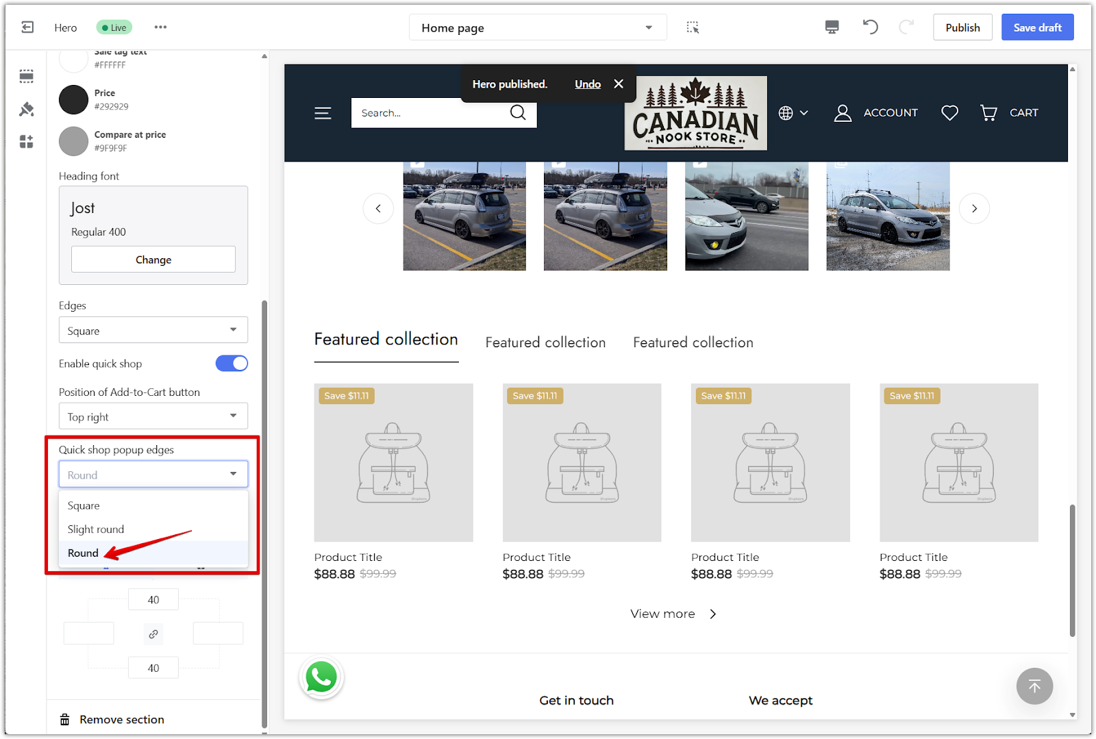
3. Popup edges: Select an edge style for the quick shop (Add-to-cart) button.
4. Adjust section spacing: Enter padding values in pixels to control the spacing around the section. Use the linkage icon to keep spacing consistent on all sides or adjust each one separately.
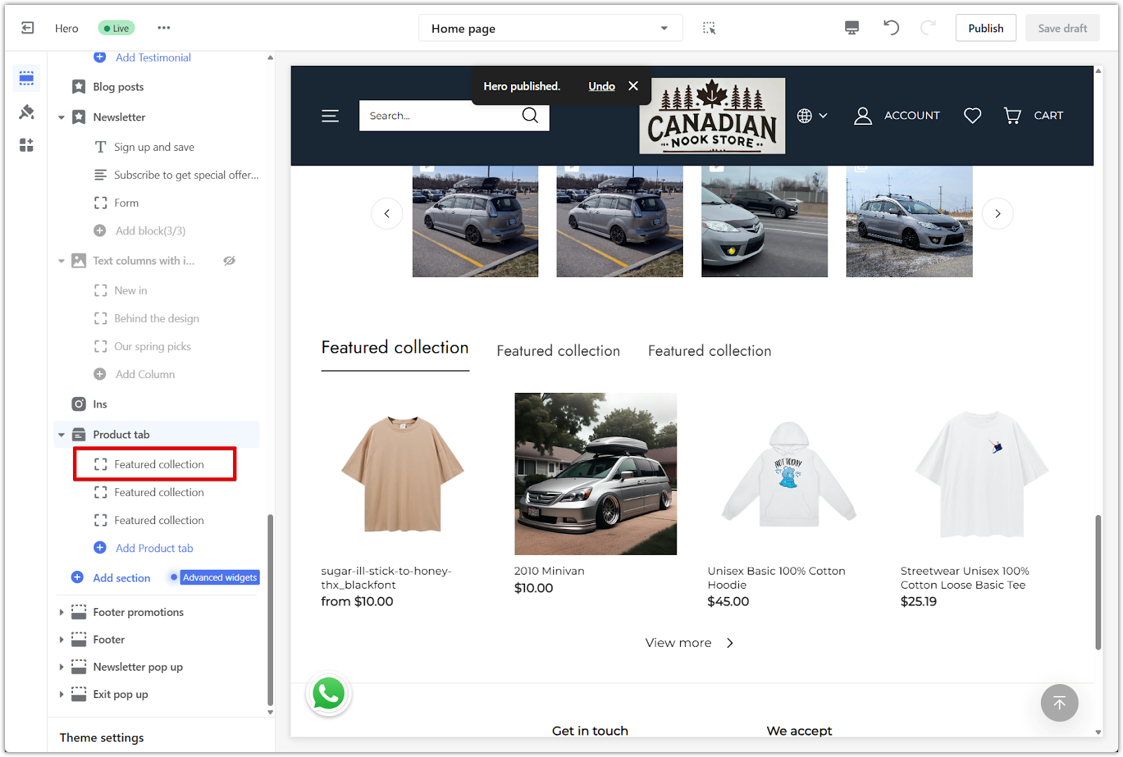
Editing your product tabs
Each tab represents a collection. You can rename the tabs and assign a collection to each one.
1. Edit the tab title: Click the tab block under Product tab, then enter a custom name in the Title field. This text appears as the tab label on your storefront.
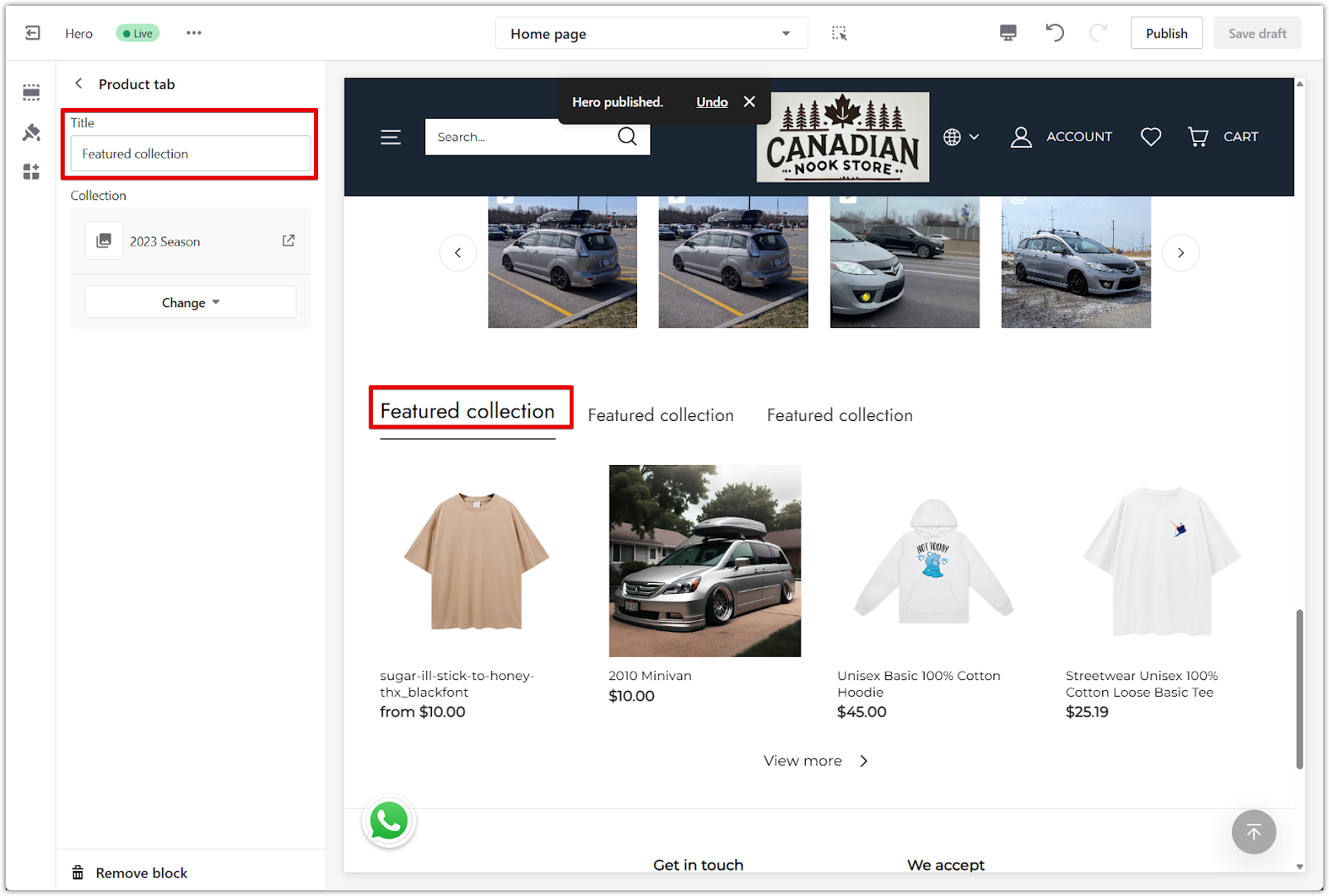
2. Assign a collection: Click Select collection to open the collection list. Choose the collection you'd like to display under this tab.
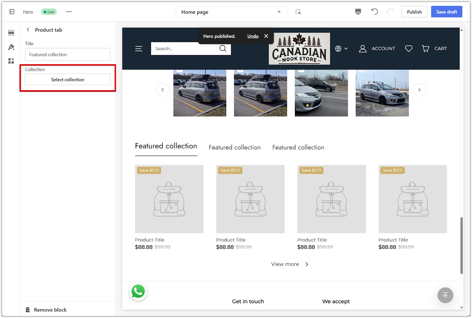
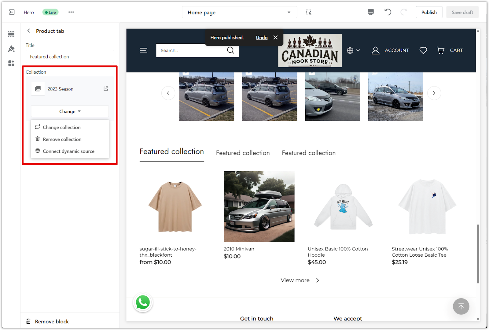
3. Update or remove a collection: After a collection is selected, use the Change button to swap it out, remove it, or connect a dynamic source. For full steps, see Setting up Metafields.
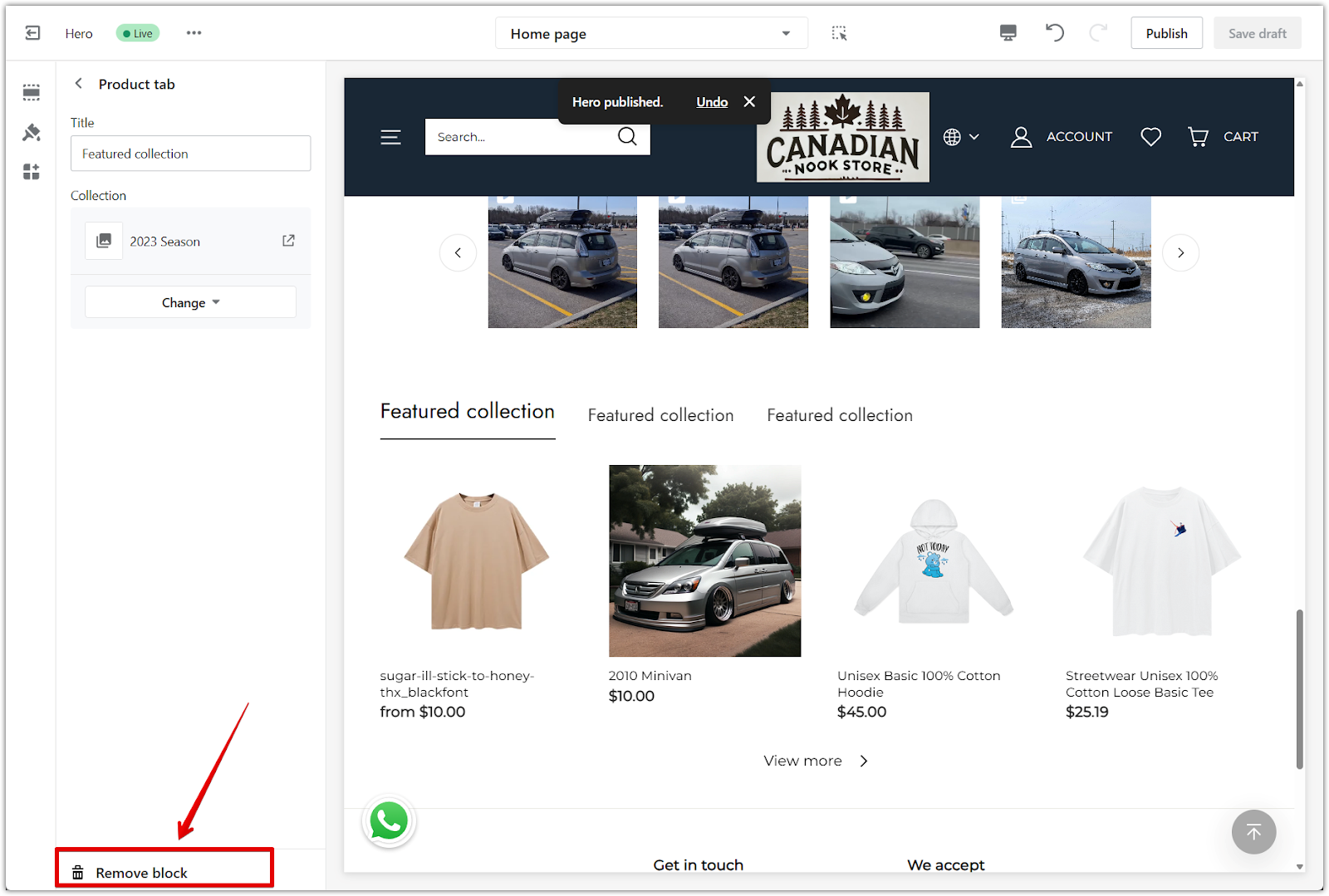
4. Remove a tab block: To delete a tab, scroll to the bottom of the block settings and click Remove block.
The product tab section helps present your collections in a clean, organized layout. It’s an easy way to improve the customer browsing experience and highlight key product categories.


Comments
Please sign in to leave a comment.