
The built-in toolbar module in the Reformia theme integrates four core functions: Text Group, Quick Access Group, Site Switcher Group, and Secondary Menu. It helps merchants quickly build a clear and efficient storefront display and navigation system, providing customers with a smoother shopping experience. This article will introduce these four functions in detail, including their purposes, configuration methods, and display effects, helping merchants get started quickly, fully utilize the practical value of the toolbar module, and improve overall store operation efficiency.
Steps
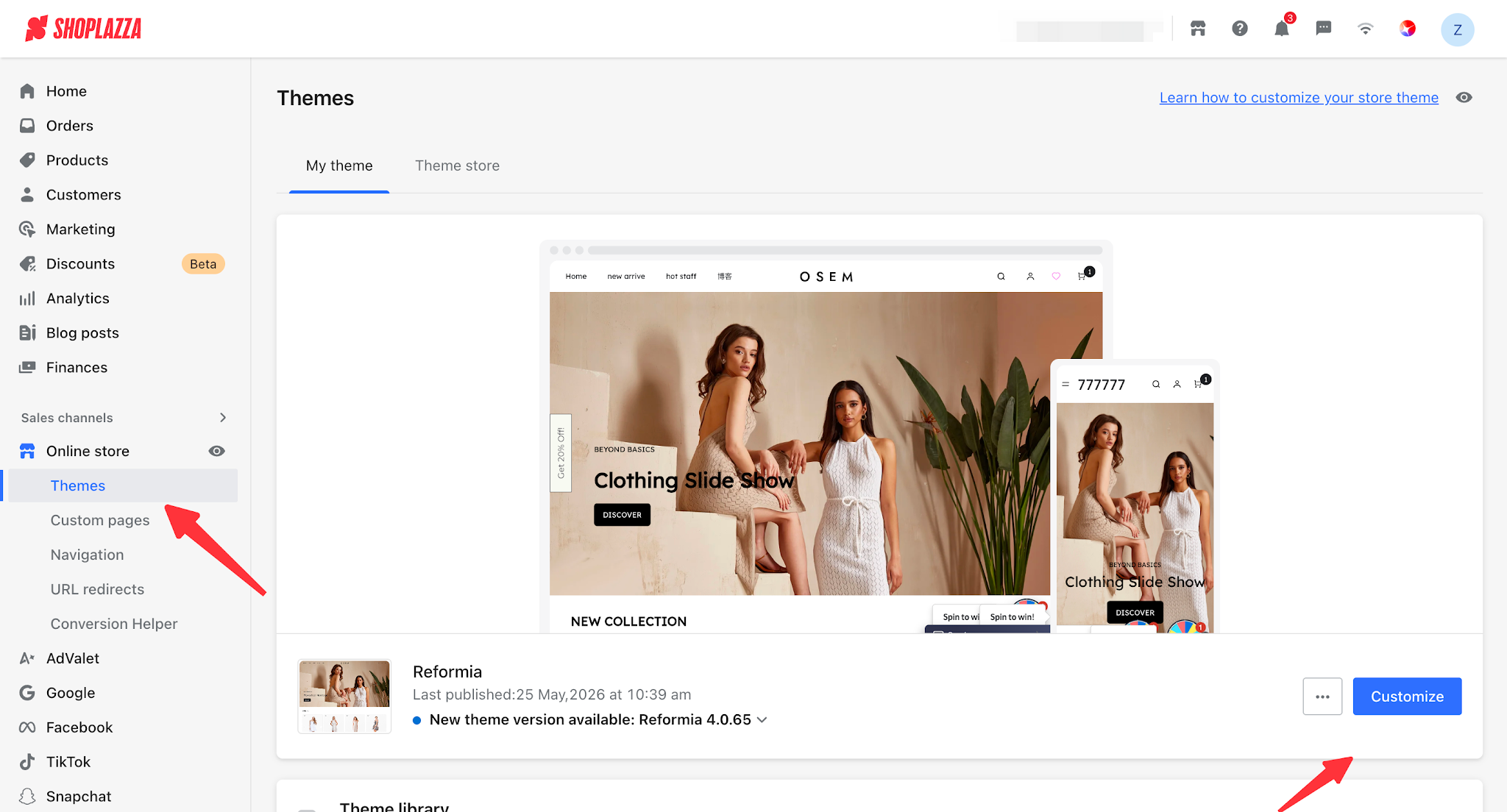
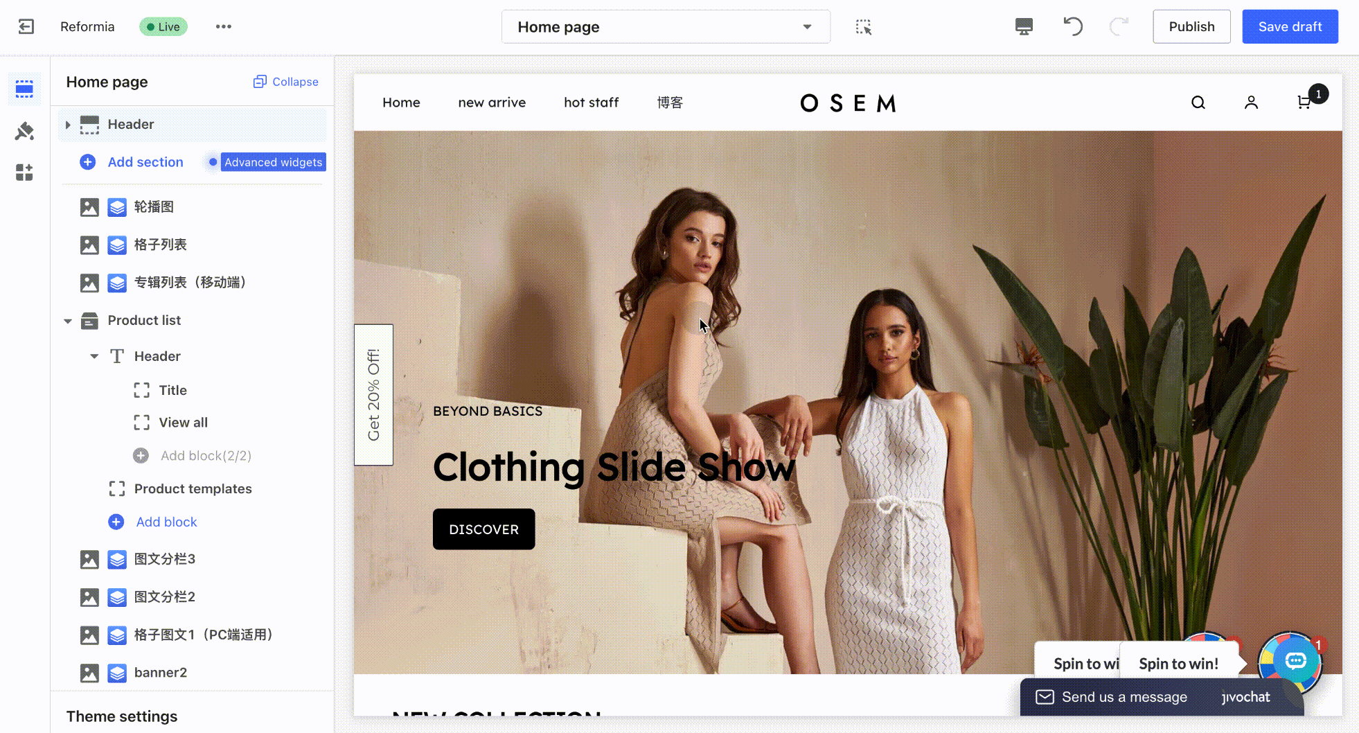
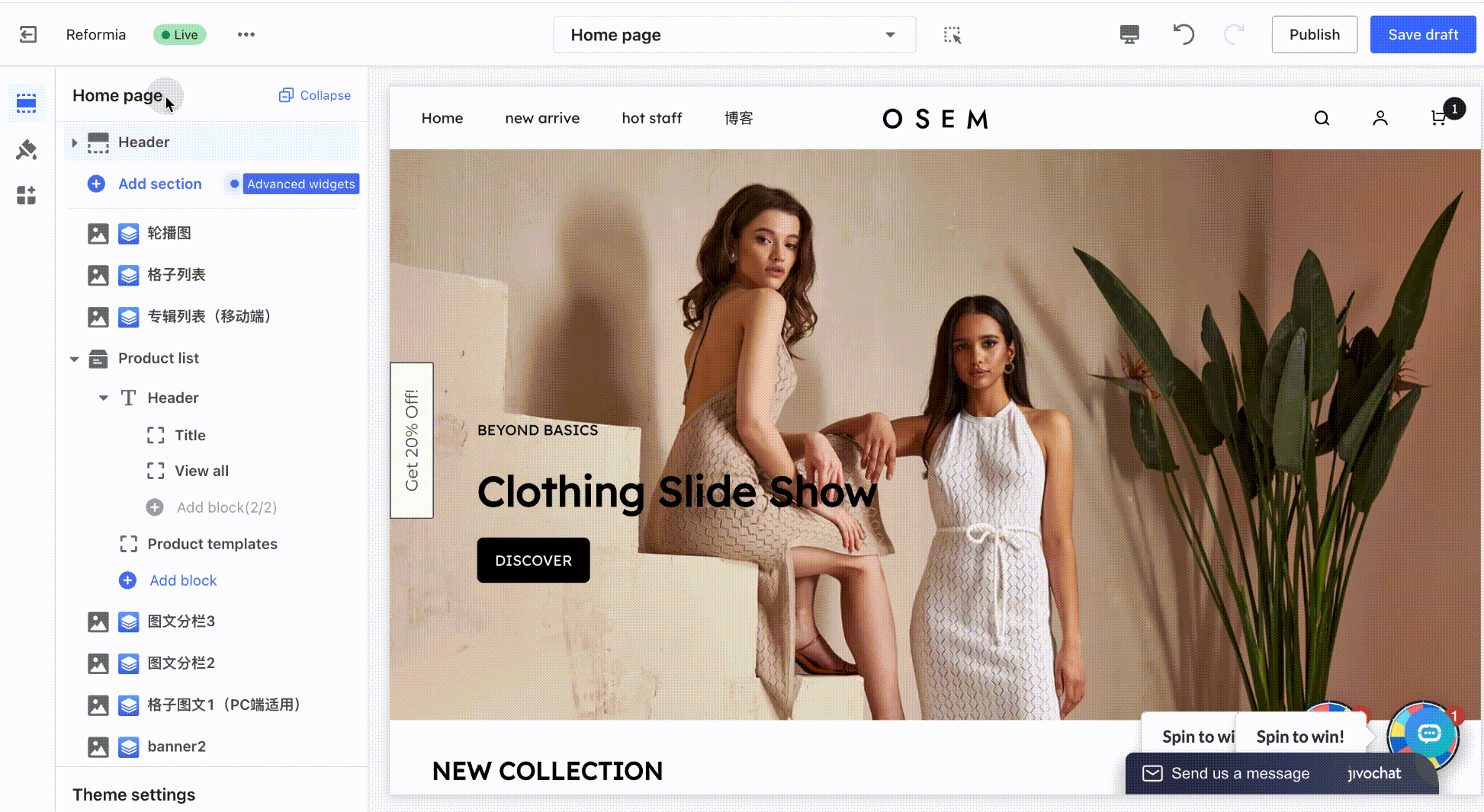
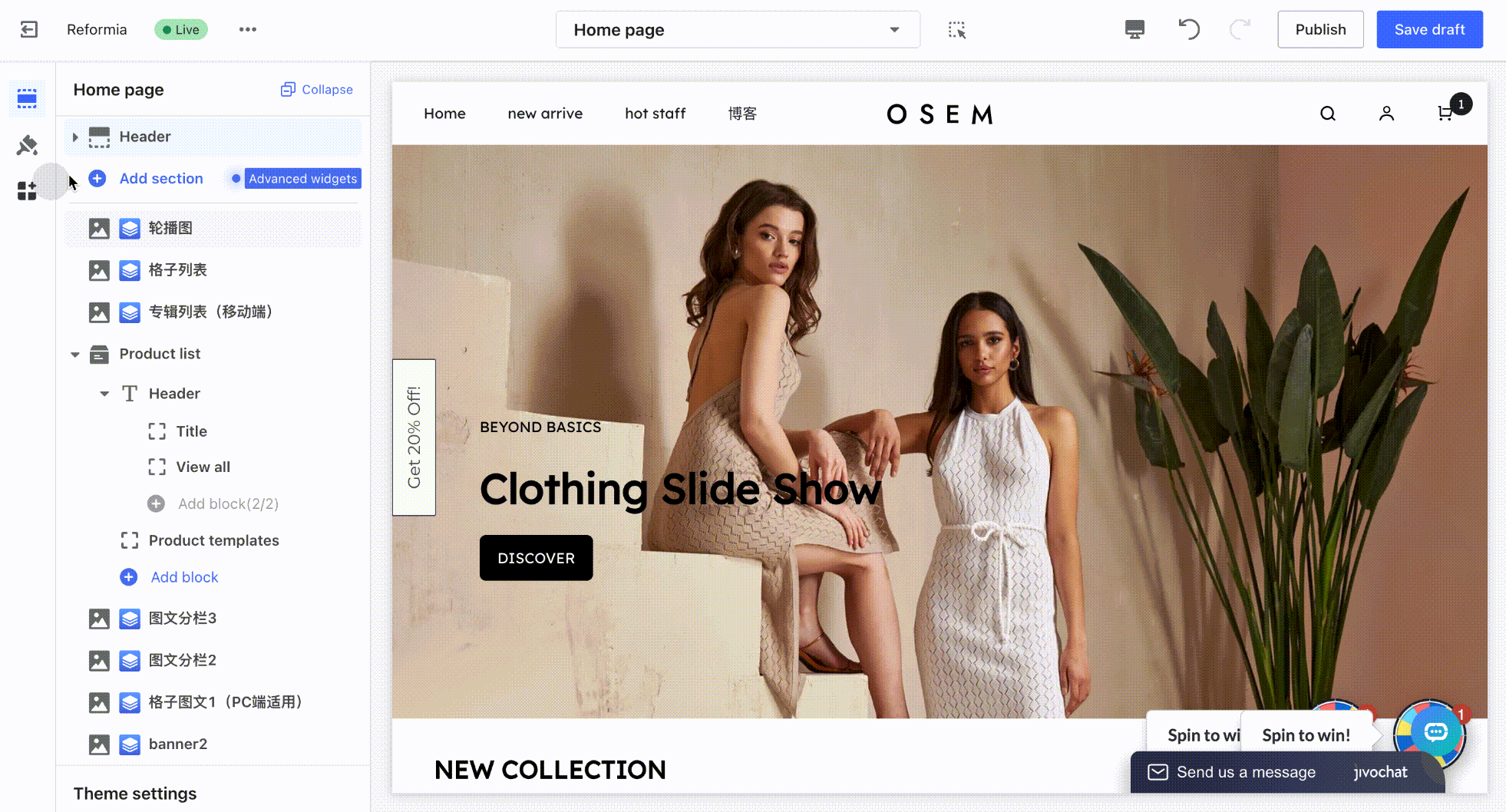
1. Log in to your Shoplazza admin panel, go to Online Store > Theme Customization, and click the Edit button to enter the theme editor.
Text Group
The Text Group is mainly used to display text-based announcements, notifications, and operational messages. It delivers key information to customers in a concise and clear manner, serving purposes such as information reminders, promotional explanations, and service notices.
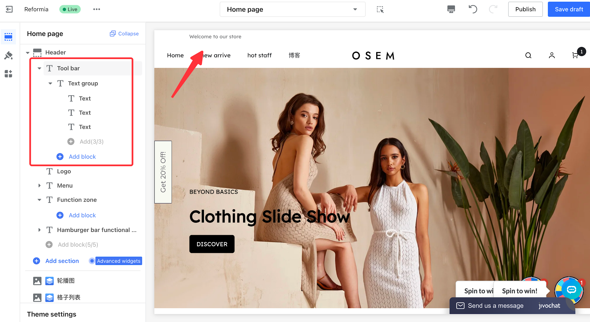
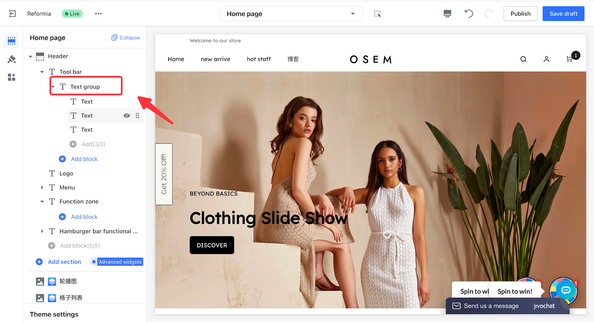
1. Expand > Toolbar > Text Group to add multiple text items.
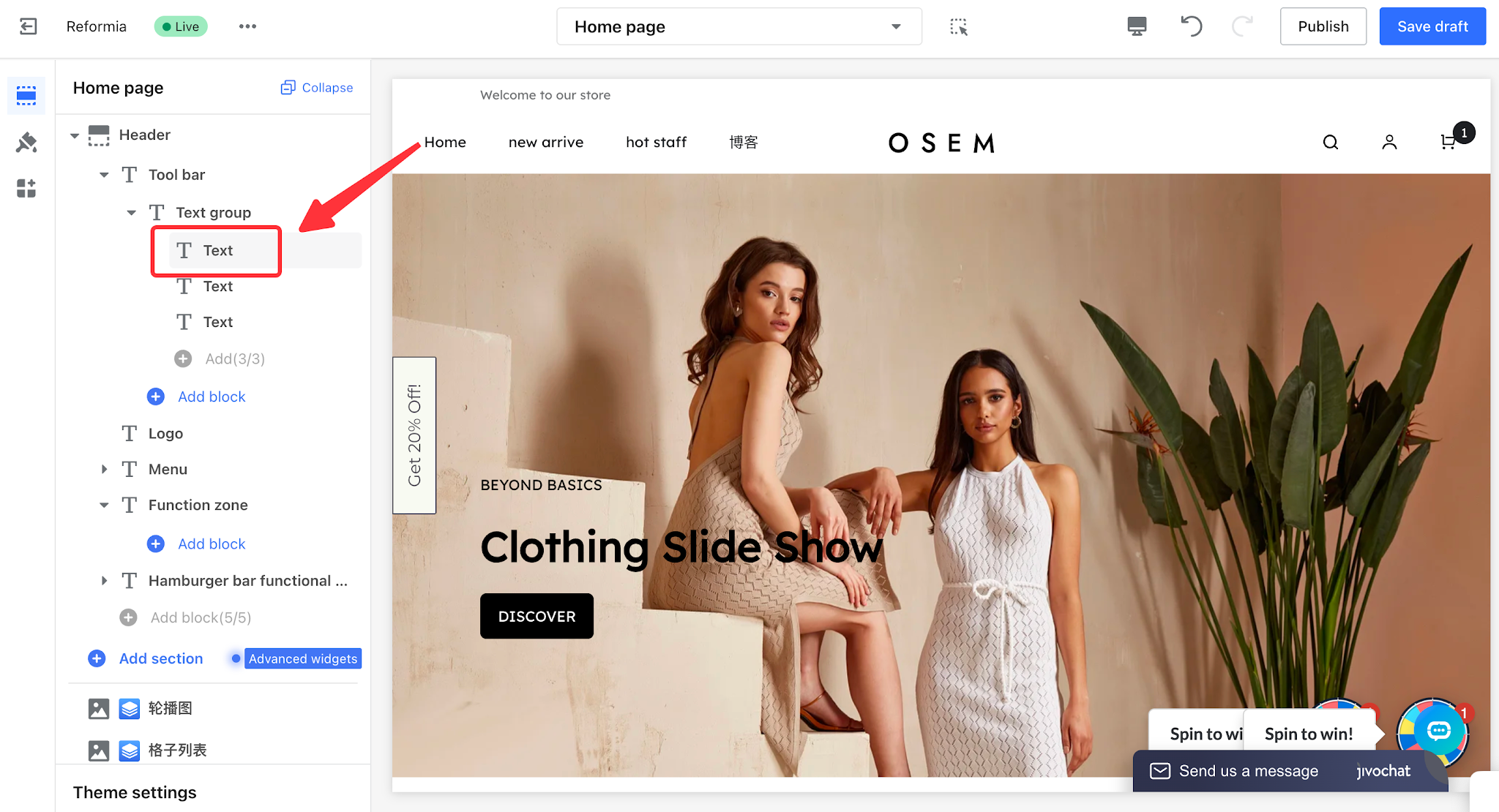
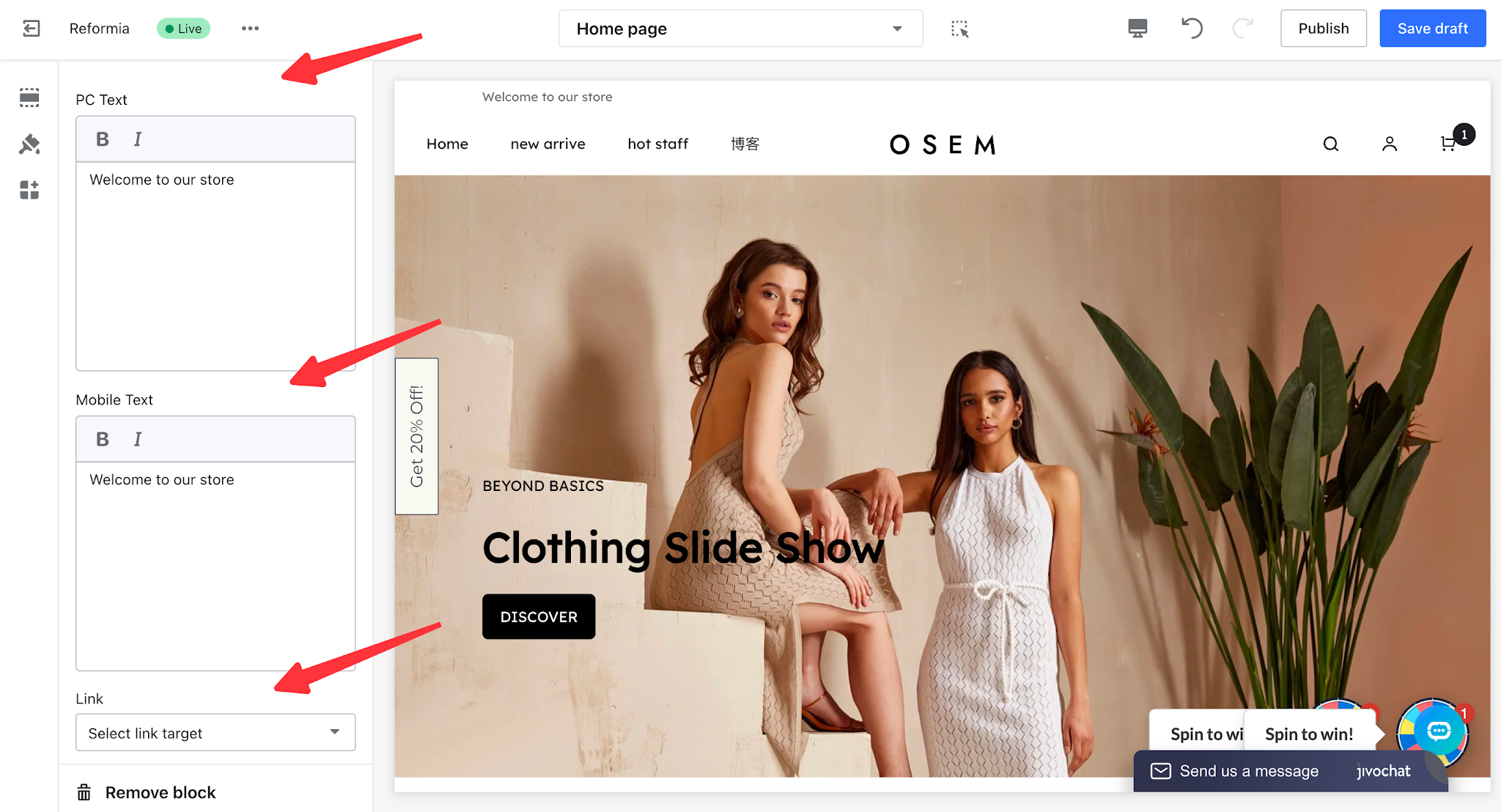
2. Click the text item to edit the text content for both desktop and mobile devices separately. You can also configure the link destination page for the text.
3. Click Text Group to configure the display effect of the text group.
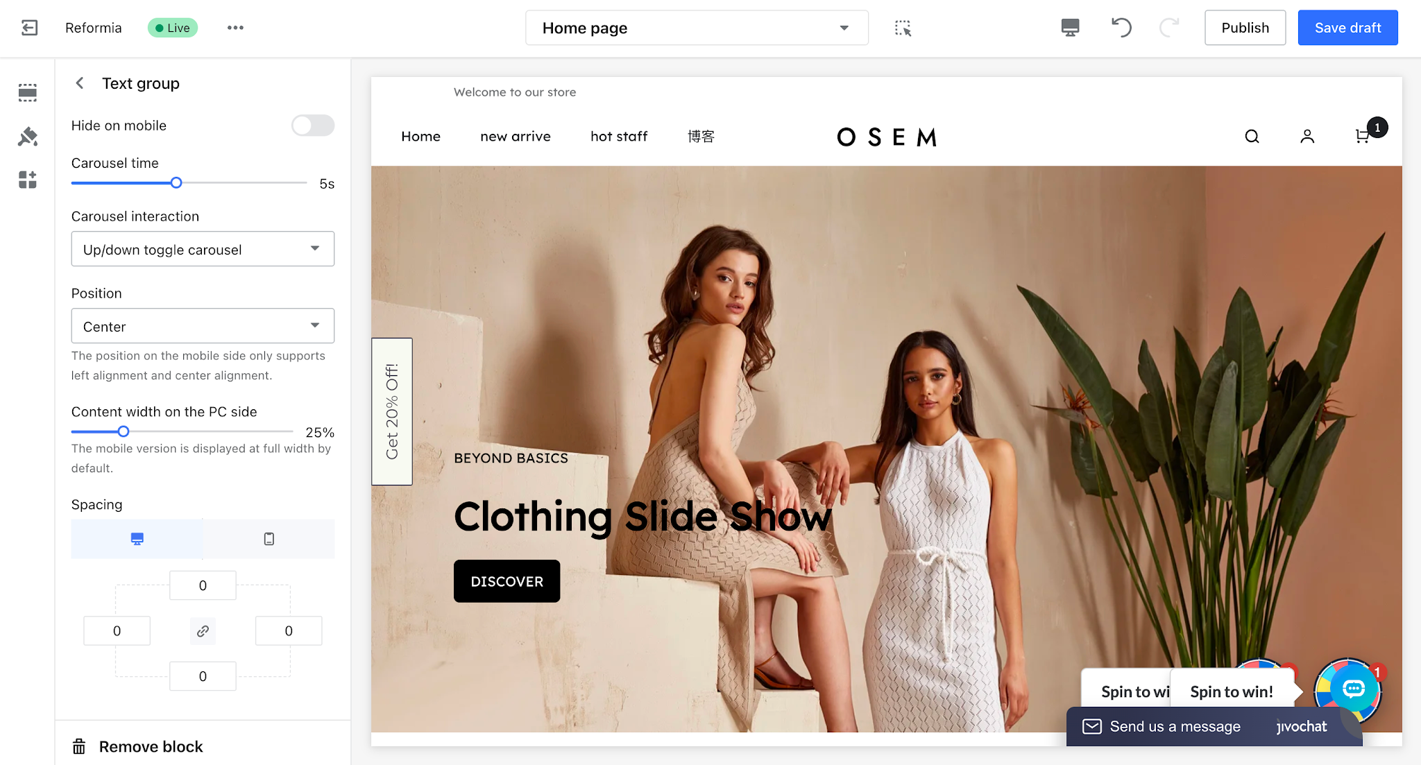
- Hide on Mobile: When enabled, the text group will not be displayed on mobile devices.
- Carousel Duration: When multiple text items are added, you can set the carousel duration to control how often the text switches.
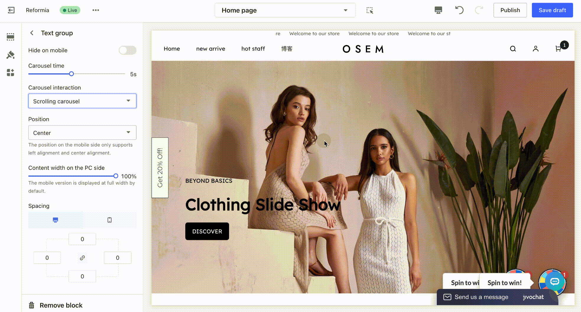
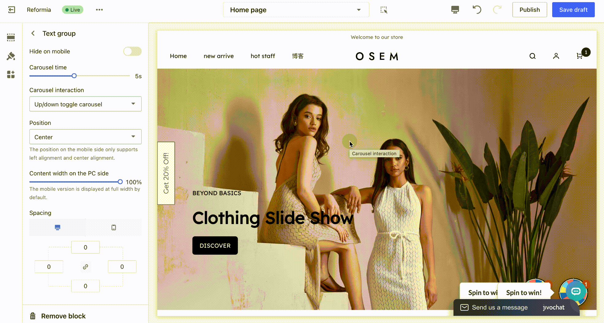
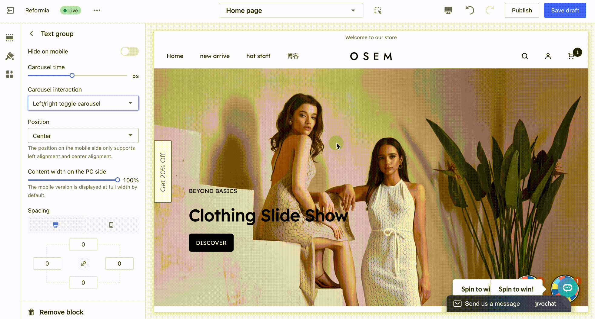
- Carousel Interaction: Three interaction styles are available: scrolling carousel, vertical switching carousel, and horizontal switching carousel.
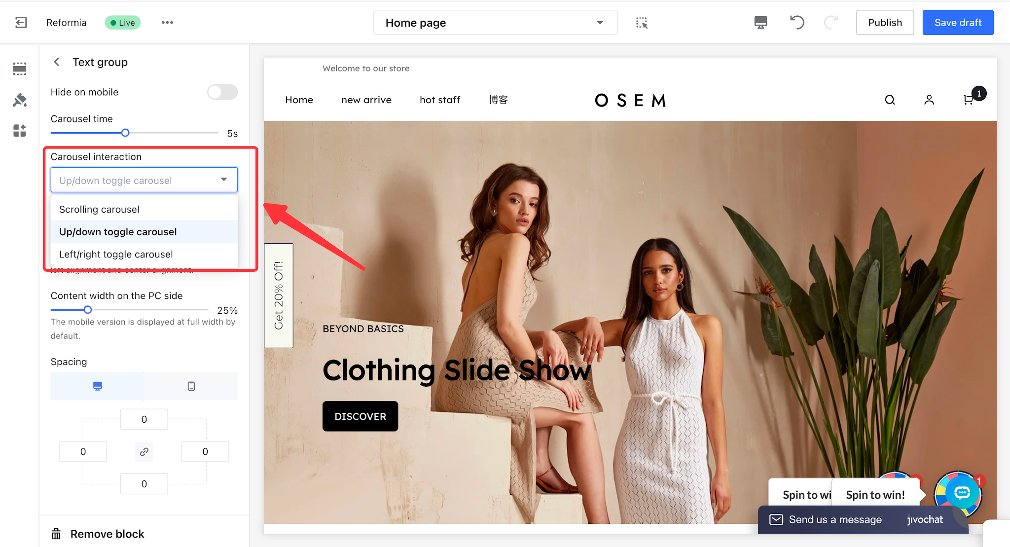
Scrolling Carousel:
Up/Down Toggle Carousel:
Left/Right Toggle Carousel:
- Position: You can set the alignment of the text group to left, center, or right.
- Desktop Content Width: You can set the content width of the text on desktop devices, while the mobile version is displayed in full width by default.
Note
On mobile devices, only left and center alignment are supported.
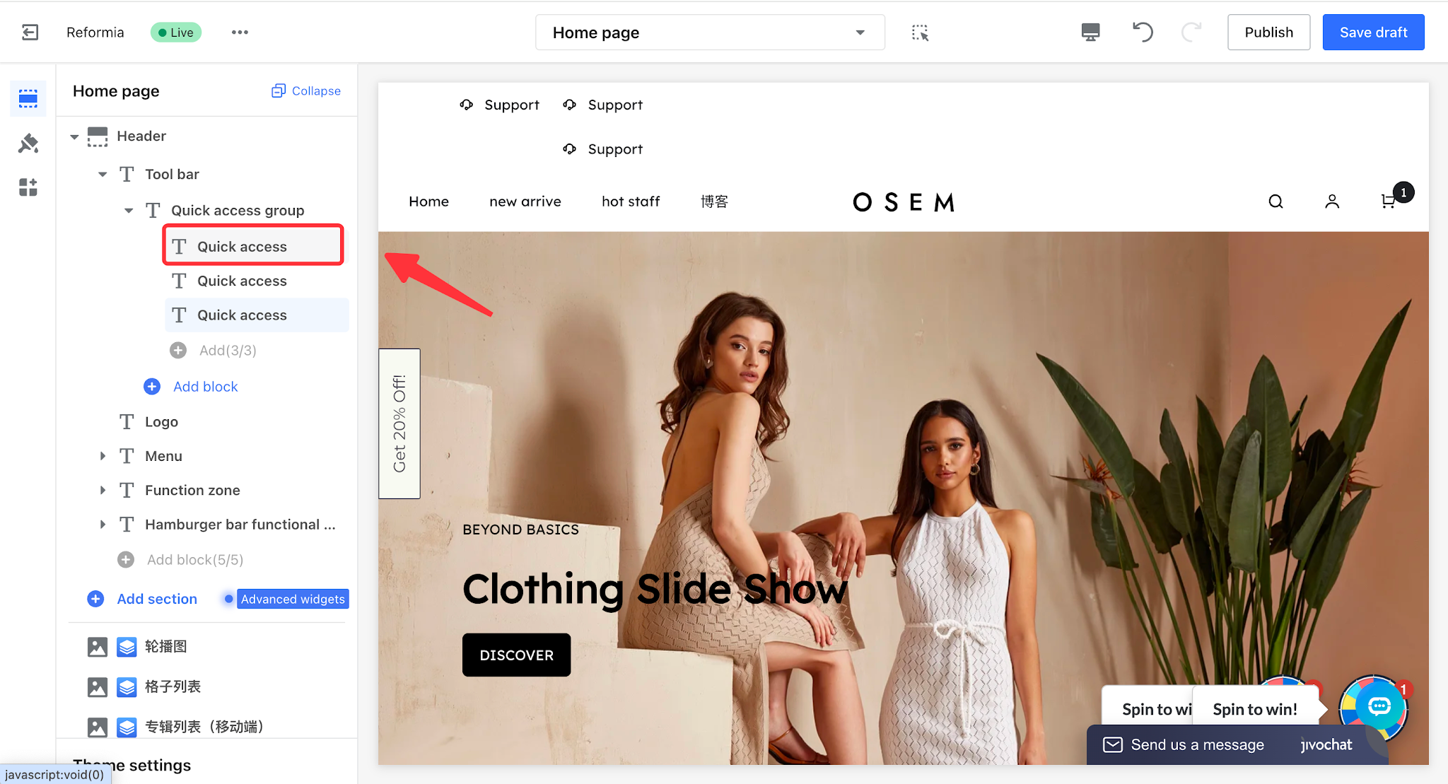
Quick Access Group
The Quick Access Group is designed to provide customers with fast access to key pages, improving usability and page navigation efficiency. After configuration, the corresponding function icons will be displayed in the toolbar. Customers can click the icons to quickly view content through pop-up windows or be redirected directly to the related pages, enabling a more efficient and convenient interactive experience.
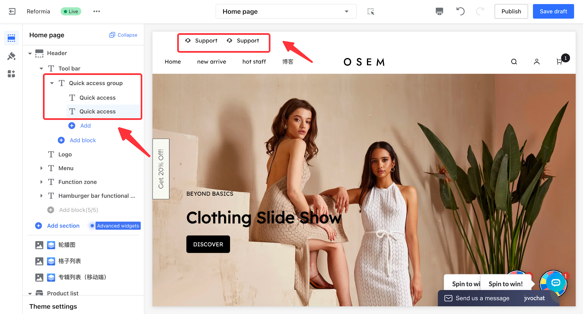
1. Click to Header > Tool bar > Quick Access Group, where you can add multiple quick access entries.
Note
A maximum of 3 quick access entries can be added.
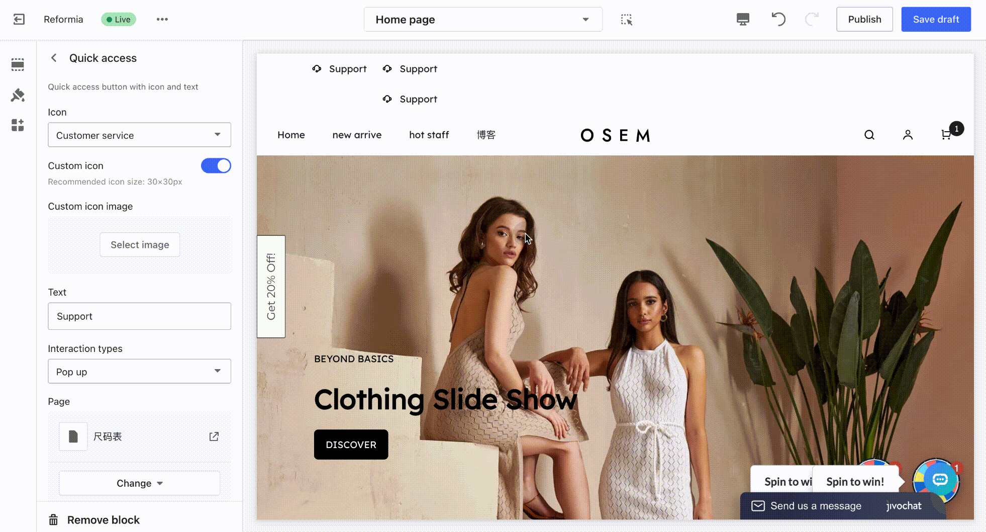
2. Click a quick access entry to configure its display settings.
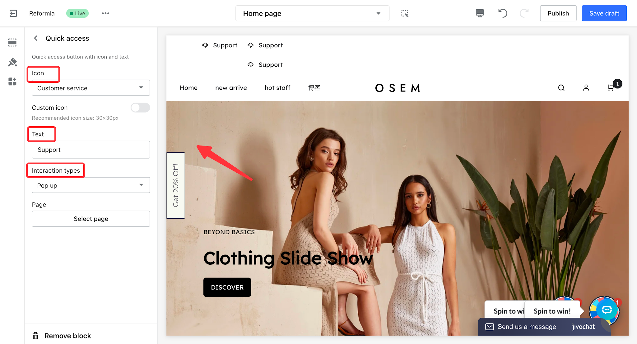
- Icon: You can choose from the theme’s built-in icons or use a custom icon for display.
- Text: After entering text, it will be displayed next to the icon as a prompt or label.
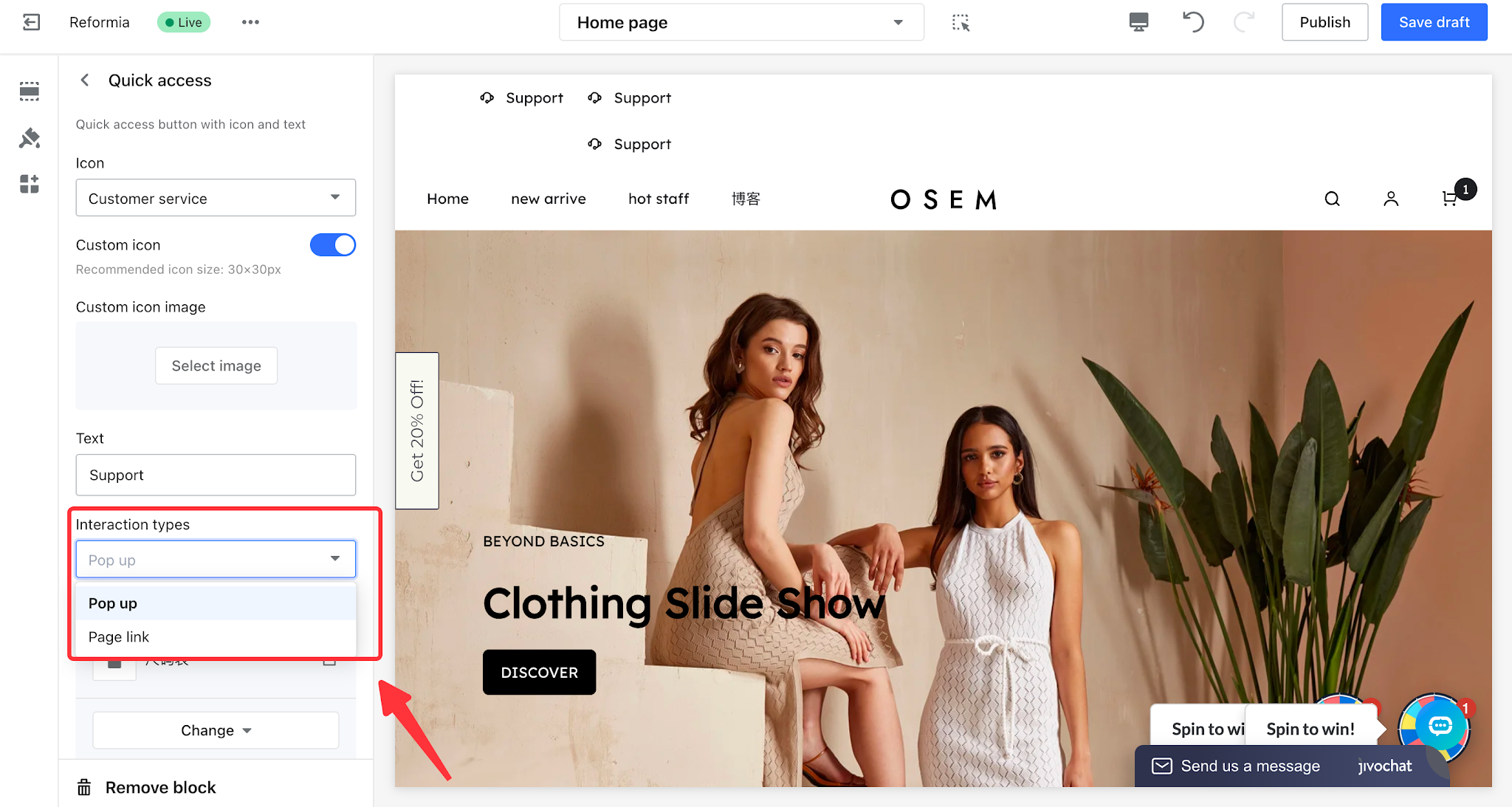
- Interaction Type: Includes pop-up and page redirect options.
- Pop-up: Displays content in a pop-up window on the current page without redirecting.
- Page link : Redirects users within the current page without opening a new window.
Pop-up Effect Preview:
Page link Effect Preview:
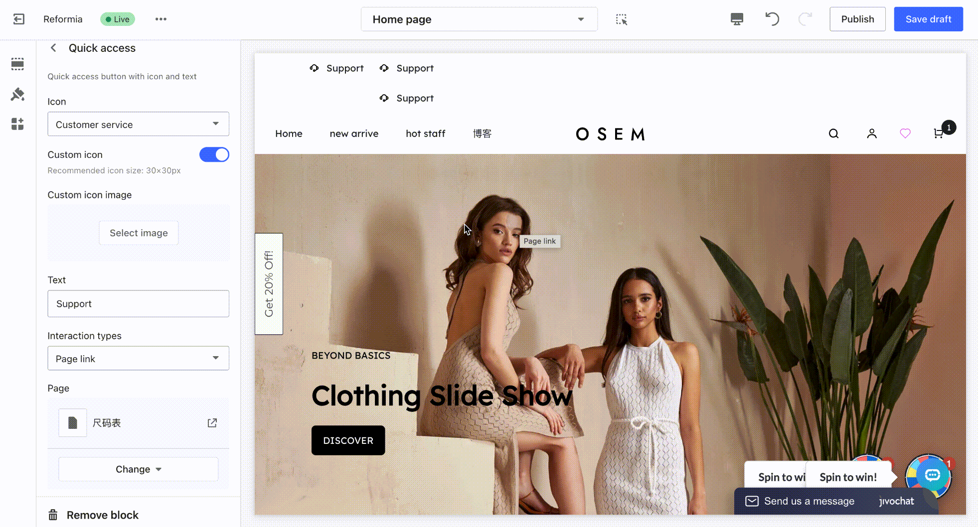
- Select Page: Only custom pages can be selected for display. To learn how to create a custom page, please refer to: Create a Custom Page.
3. Click the Quick Access Group to configure the display settings.
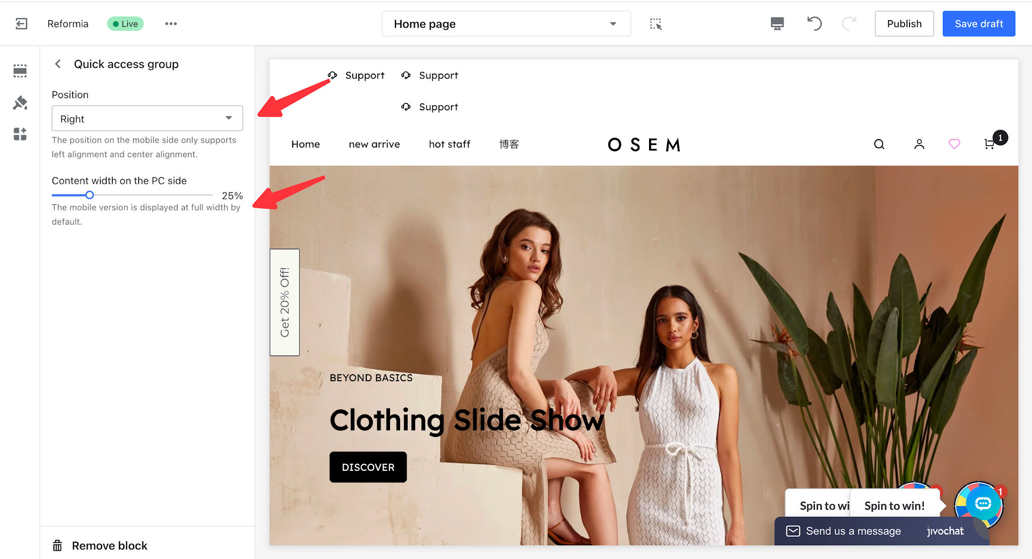
Position: You can set the Quick Access Group alignment to left, center, or right.
- Desktop Content Width: You can configure the content width of the Quick Access Group on desktop devices. On mobile devices, it is displayed at full width by default.
Note
On mobile devices, only left and center alignment are supported.
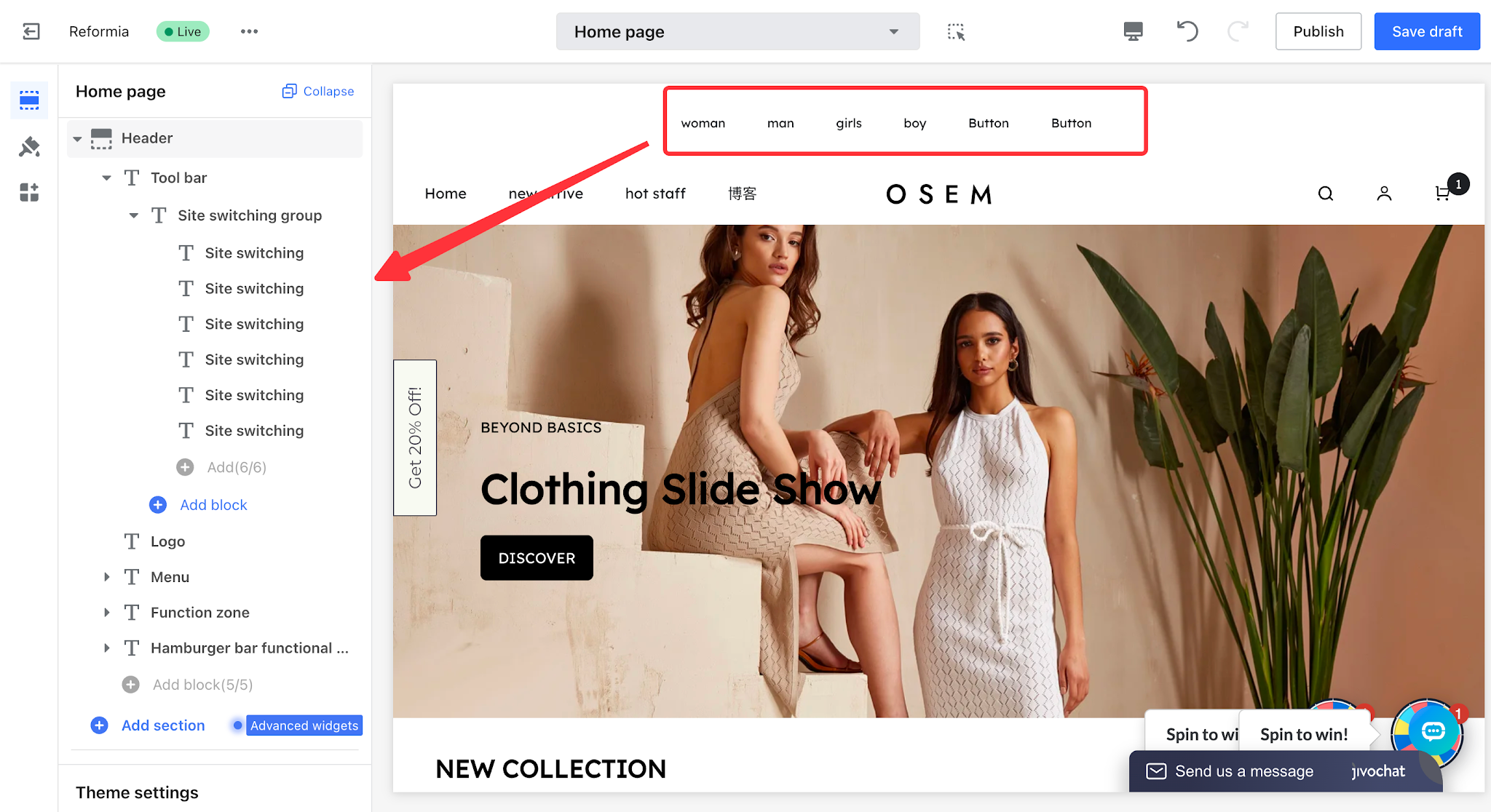
Site Switching Group
The Site Switching Group is mainly used to help merchants flexibly configure multiple independent websites for different categories or themes, such as women’s clothing, men’s clothing, and children’s clothing. Customers can quickly view and switch to their target site from the website header, enabling a more accurate, efficient, and convenient browsing and shopping experience.
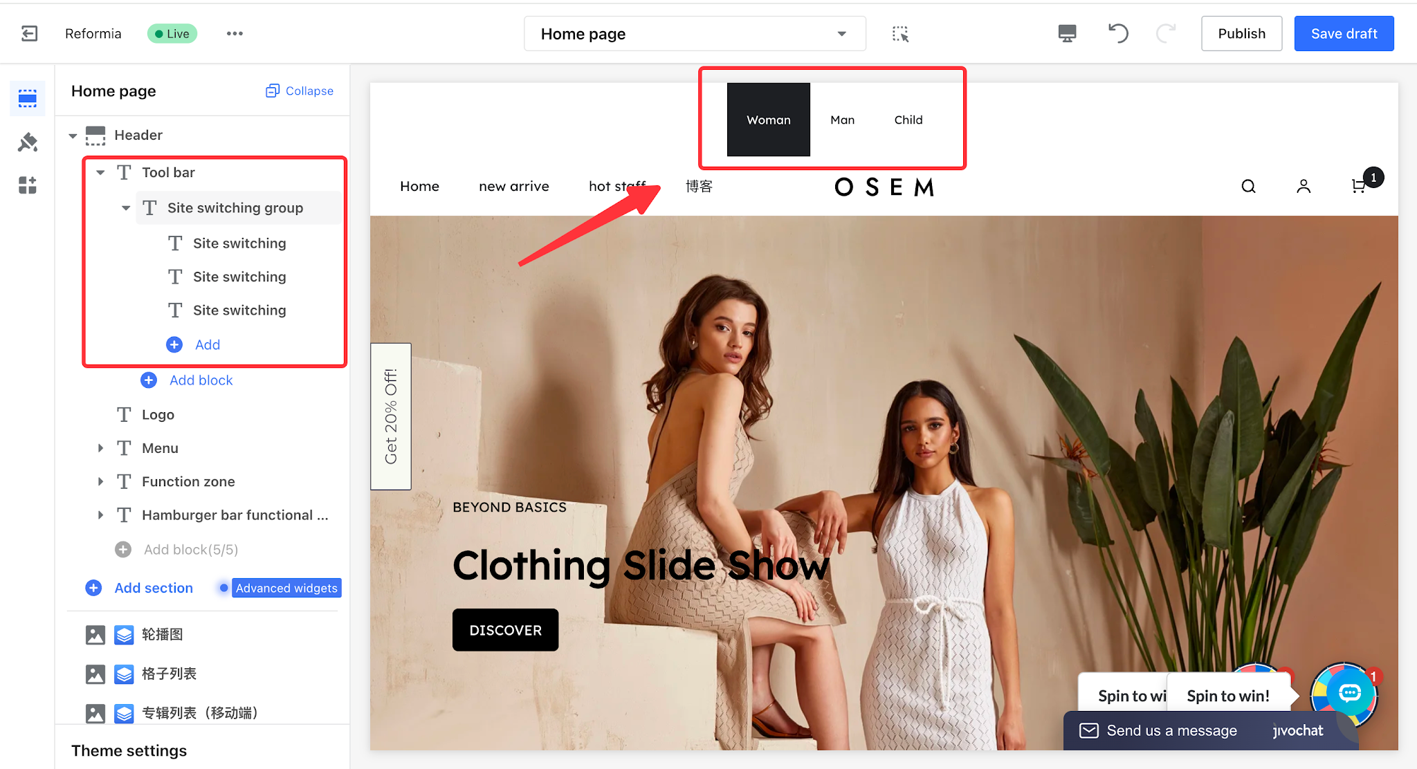
1. Click to Header > Tool bar > Site Switching Group, where you can add multiple site switch options.
Note
A maximum of 6 site switch options can be added.
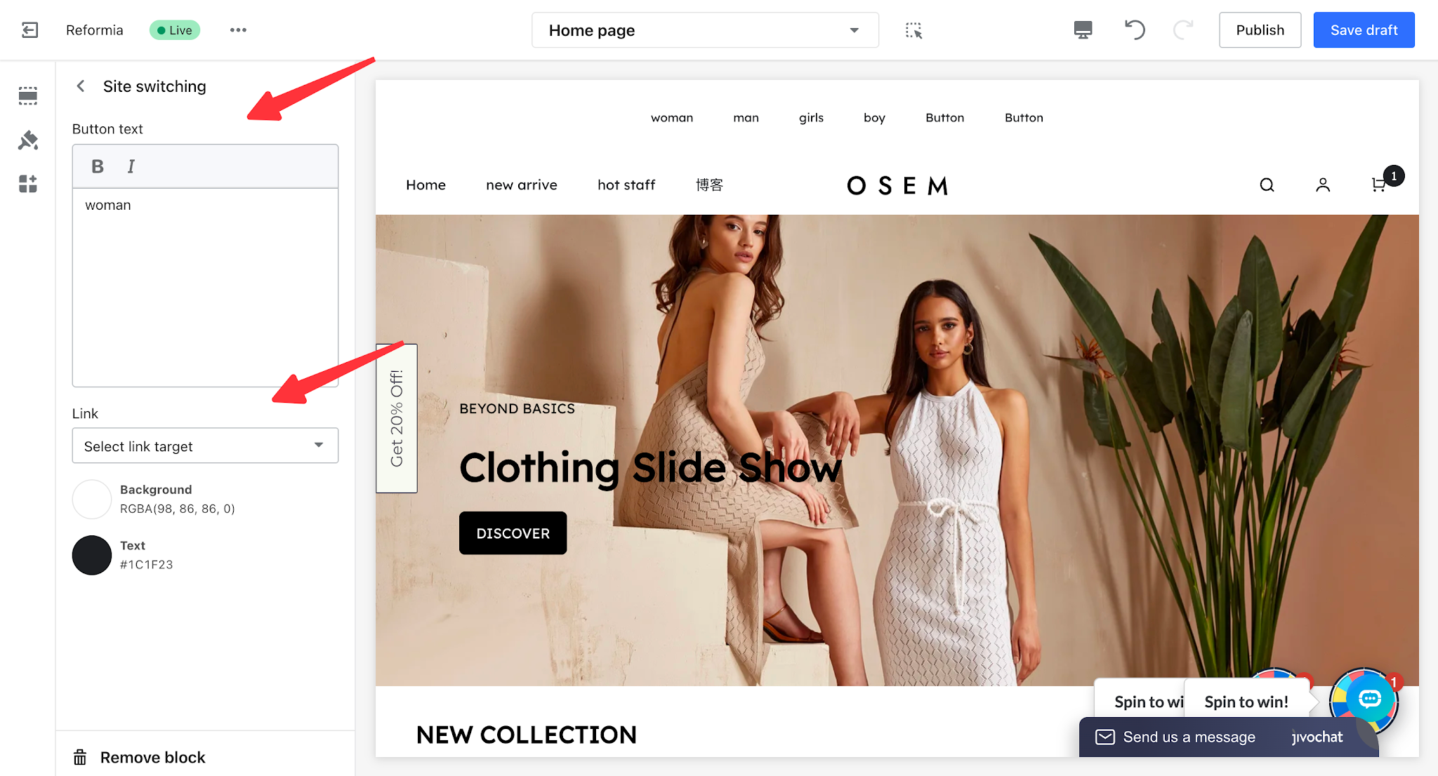
2. Click a site switch option to configure the button text, text background, and text color. You can also set a redirect link for the corresponding site.
3. Click the Site Switching Group to configure the display settings.
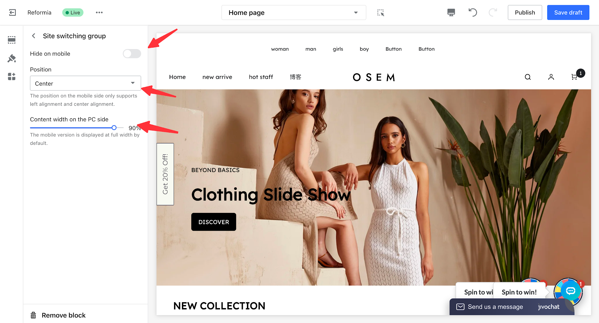
- Hide on Mobile: When enabled, the Site Switcher Group will not be displayed on mobile devices.
- Position: You can set the alignment of the Site Switcher Group to left, center, or right.
- Desktop Content Width: You can configure the content width of the Site Switcher Group on desktop devices. On mobile devices, it is displayed at full width by default.
Note
On mobile devices, only left and center alignment are supported.
Secondary Menu
The Secondary Menu is an important part of the store’s navigation system. It is mainly used to provide quick access links to related store pages, allowing customers to quickly locate and visit various pages within the store.
This menu displays only first-level menu items, offering a clean and simple structure that helps improve navigation efficiency and optimize the user browsing experience.
1. Before setting up the Secondary Menu, you need to configure the navigation menu first. For the configuration process, please refer to: Create Navigation Menu.
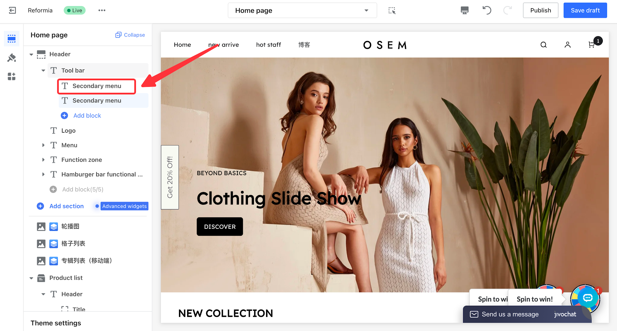
2. Click to Header > Toolbar > Secondary Menu, then click Add Content to add a secondary menu.
Note
A maximum of 2 secondary menus can be added.
3. Click the Secondary Menu to configure its display settings.
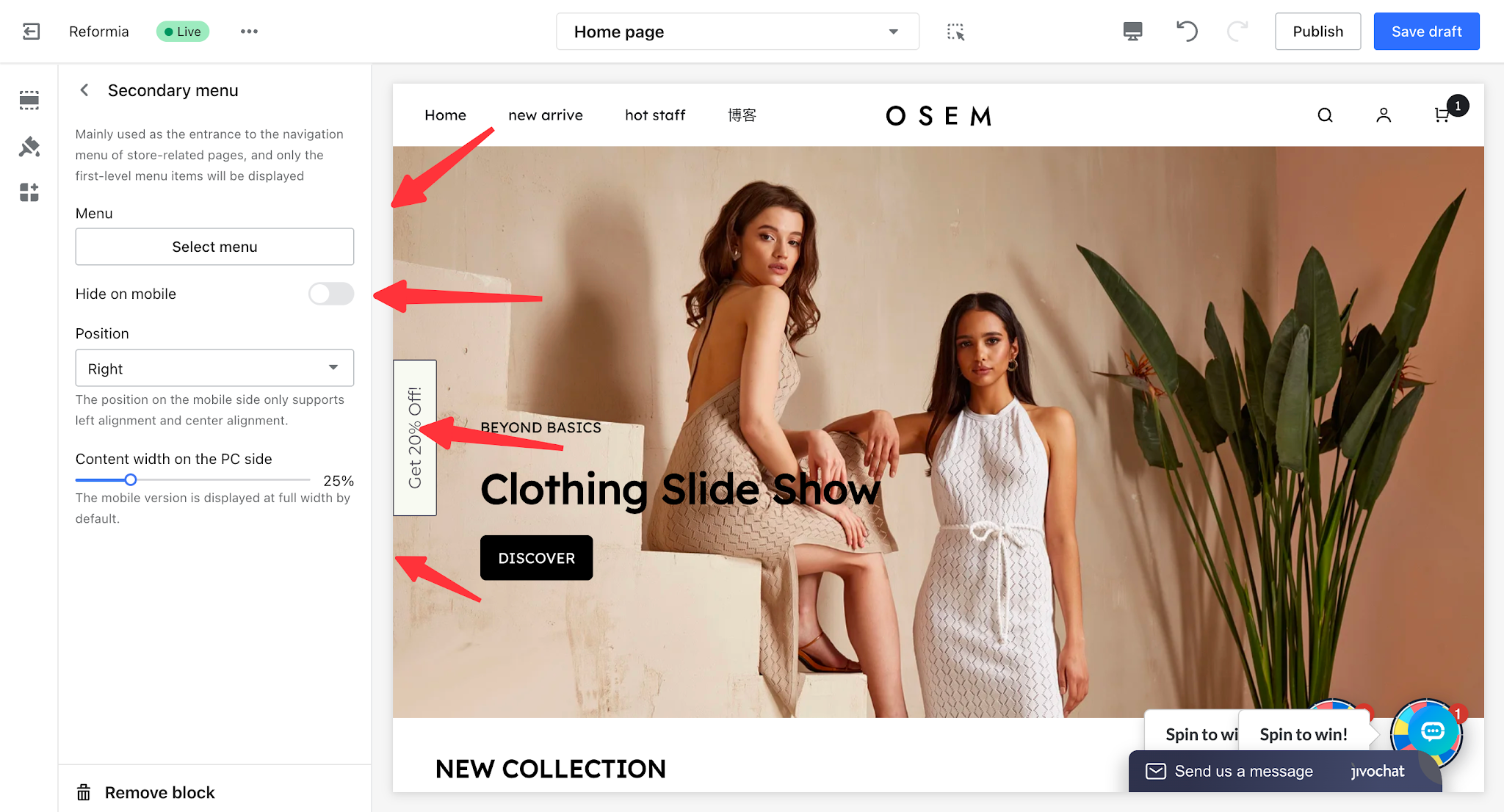
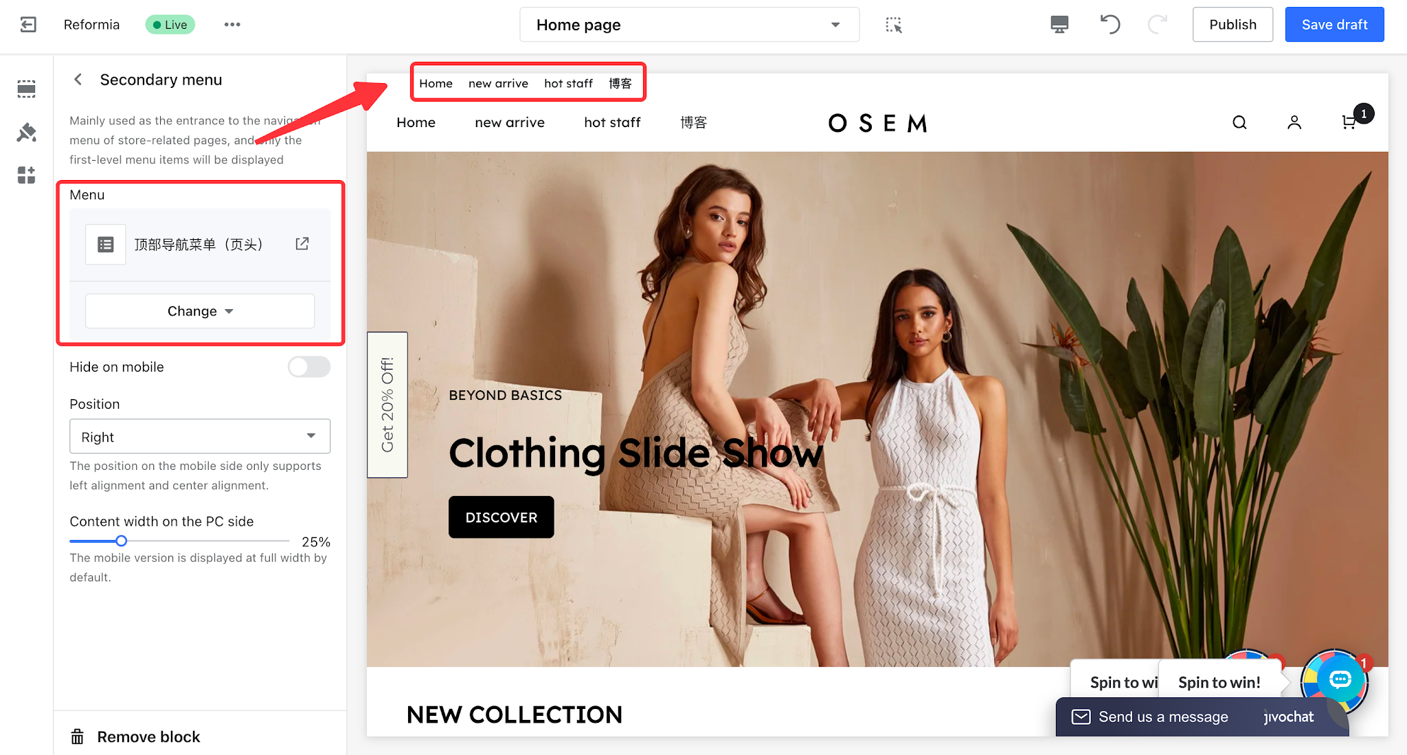
- Menu: You can select a configured menu to be displayed in the toolbar.
- Hide on Mobile: When enabled, the Secondary Menu will not be displayed on mobile devices.
- Position: You can set the alignment of the Secondary Menu to left, center, or right.
- Desktop Content Width: You can configure the content width of the Secondary Menu on desktop devices. On mobile devices, it is displayed at full width by default.
Note
On mobile devices, only left and center alignment are supported.


Comments
Please sign in to leave a comment.