
Compared with other themes, the Reformia theme has comprehensively upgraded the filtering interaction, supporting more flexible and intuitive configuration of filtering and sorting functions. This is a key feature for enhancing the shopping experience and improving store conversion rates. This article will provide a detailed introduction to how to configure and display filtering and sorting functions on the collection page in the Reformia theme. While improving shoppers’ product discovery efficiency, it also enables merchants to manage product display logic more easily, thereby effectively increasing overall store conversion rates.
Preparation
Before configuring filters and sorting on the collection page in the Reformia theme, you need to first set up the collection filters. The setup process can be found in Collection Filters.
Steps
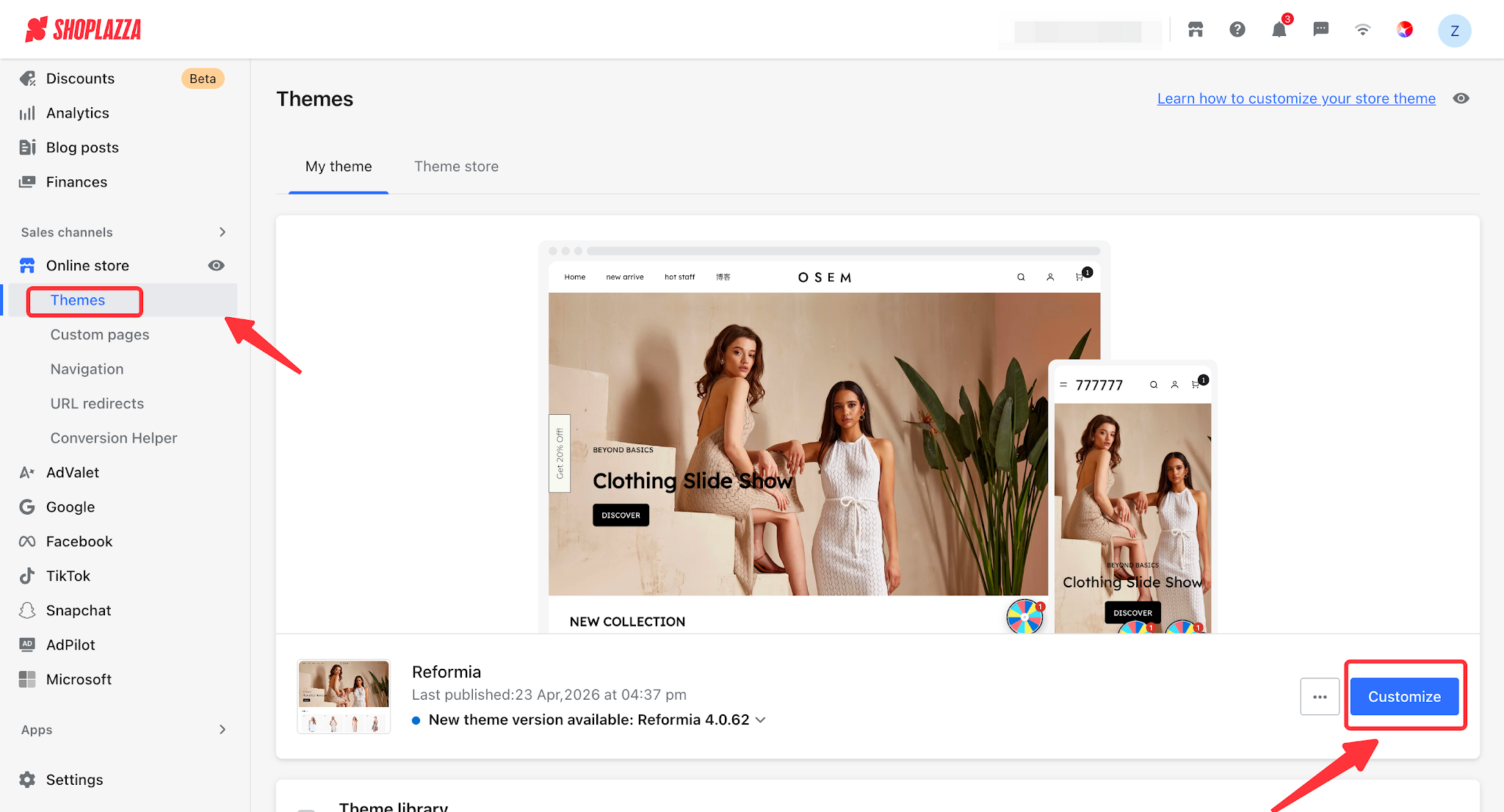
1. Log in to your Shoplazza admin panel, go to Online Store > Themes, and click the Customize button to enter the theme editor.
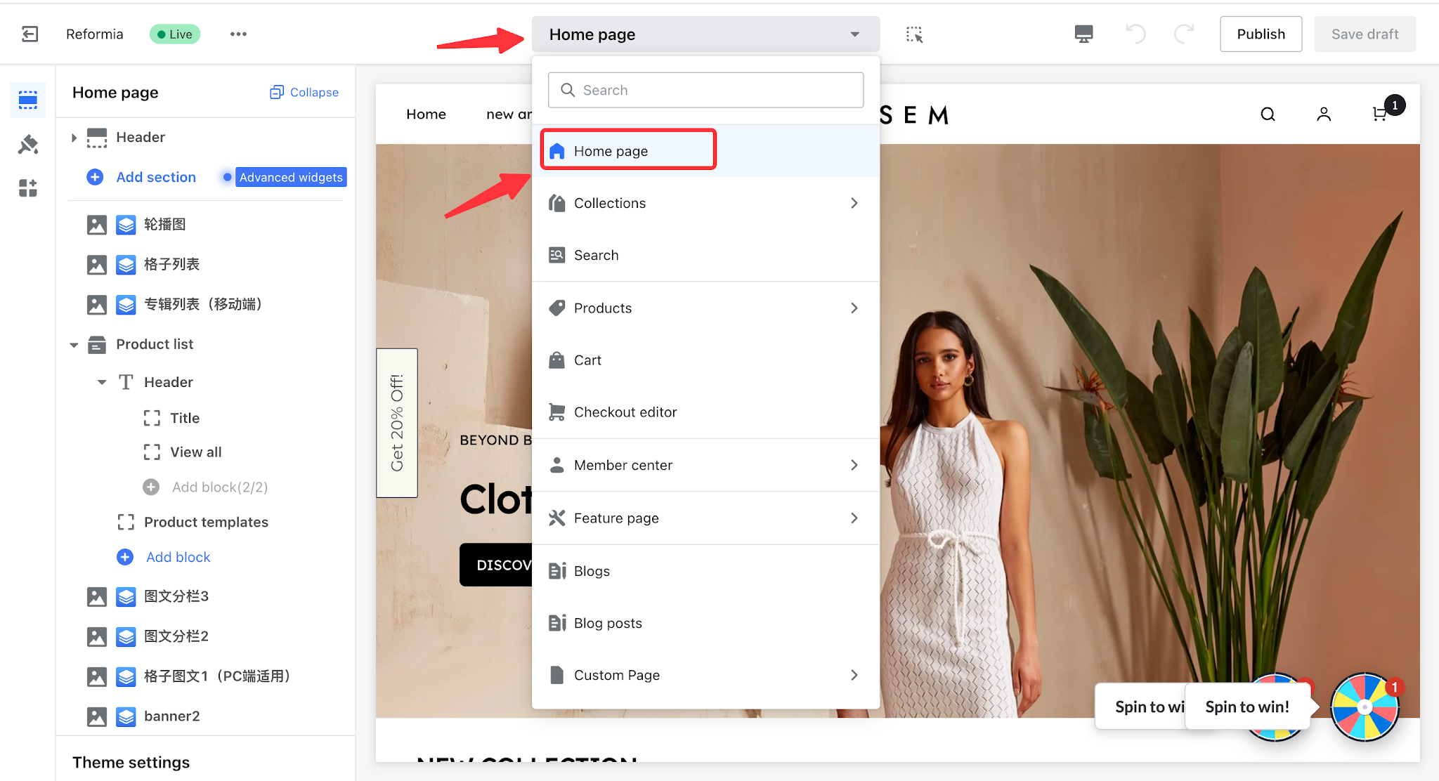
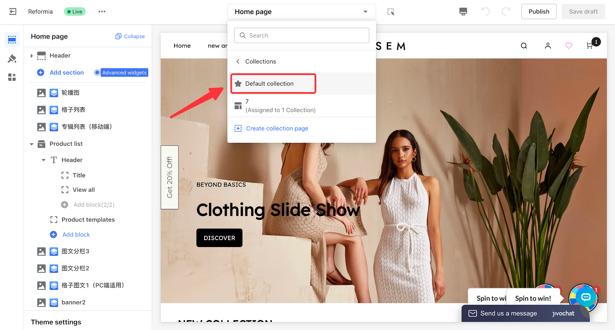
2. Click the dropdown in the header, then select Collection > Default Collection Details.
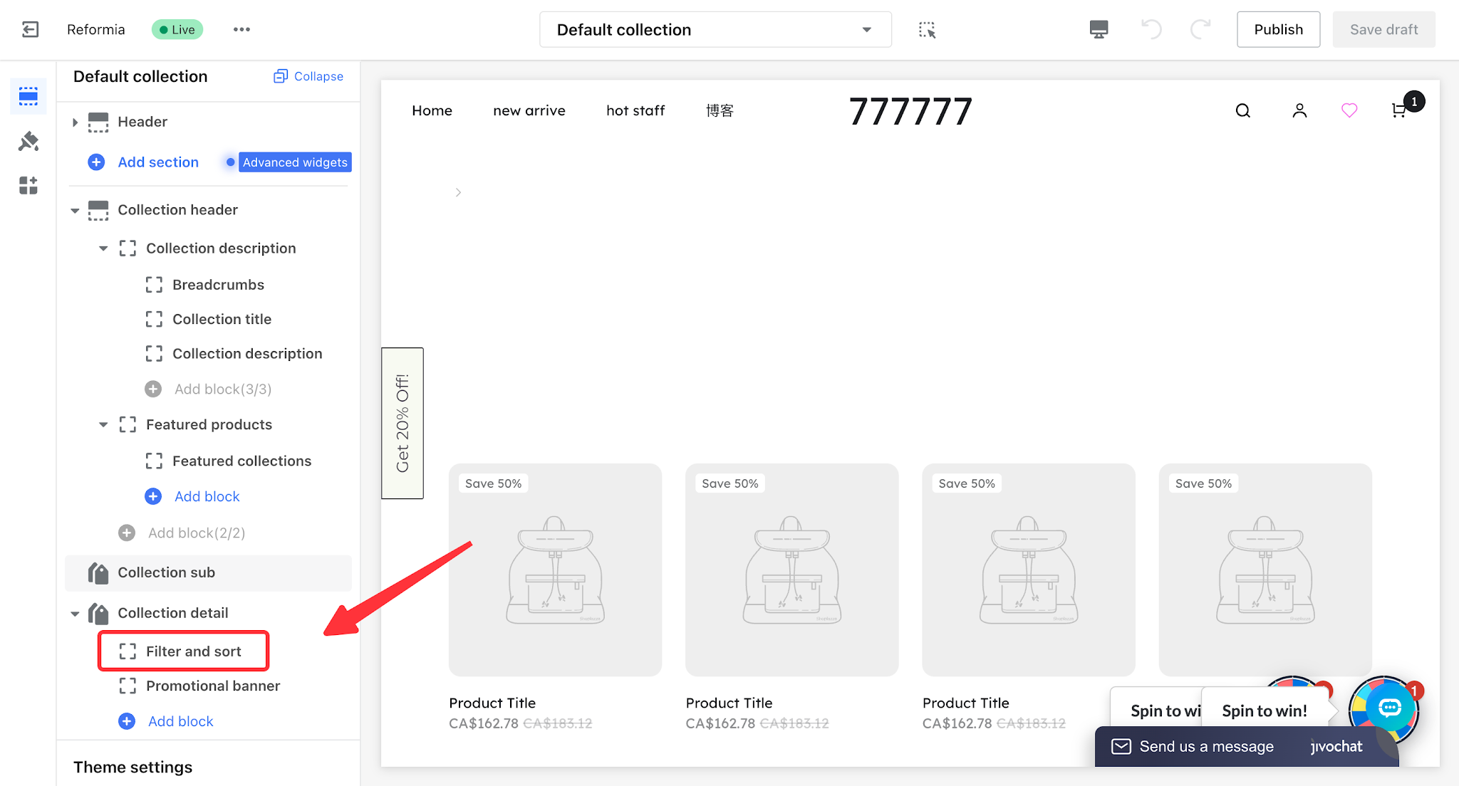
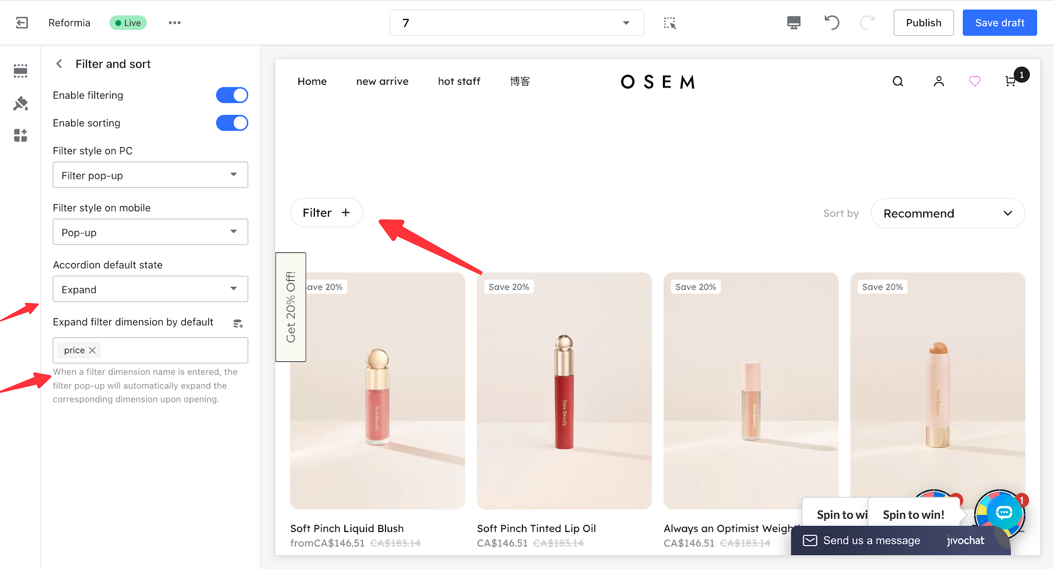
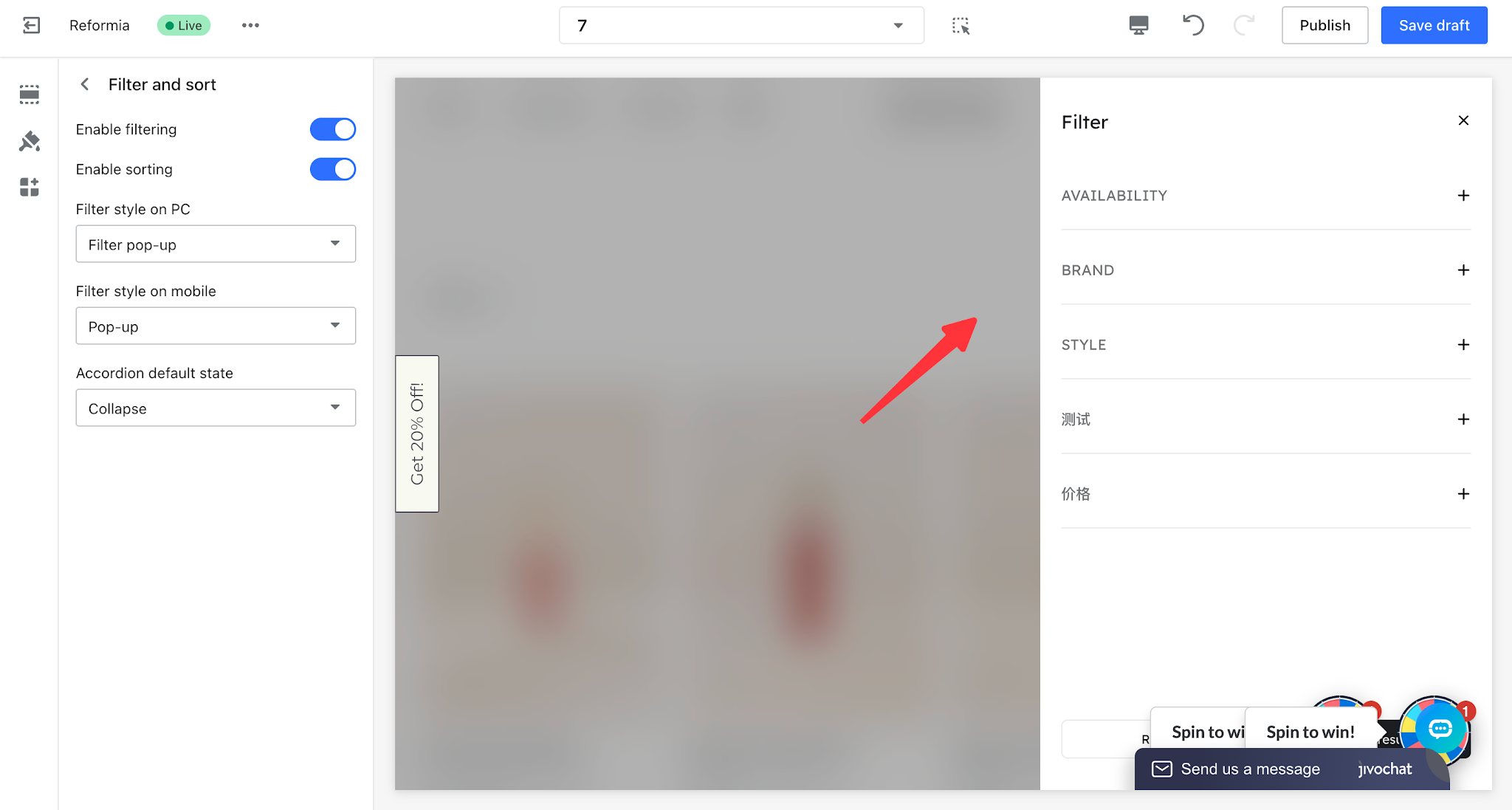
3. Click the Filters and Sorting section in the Collection Details card to enter the editing page.
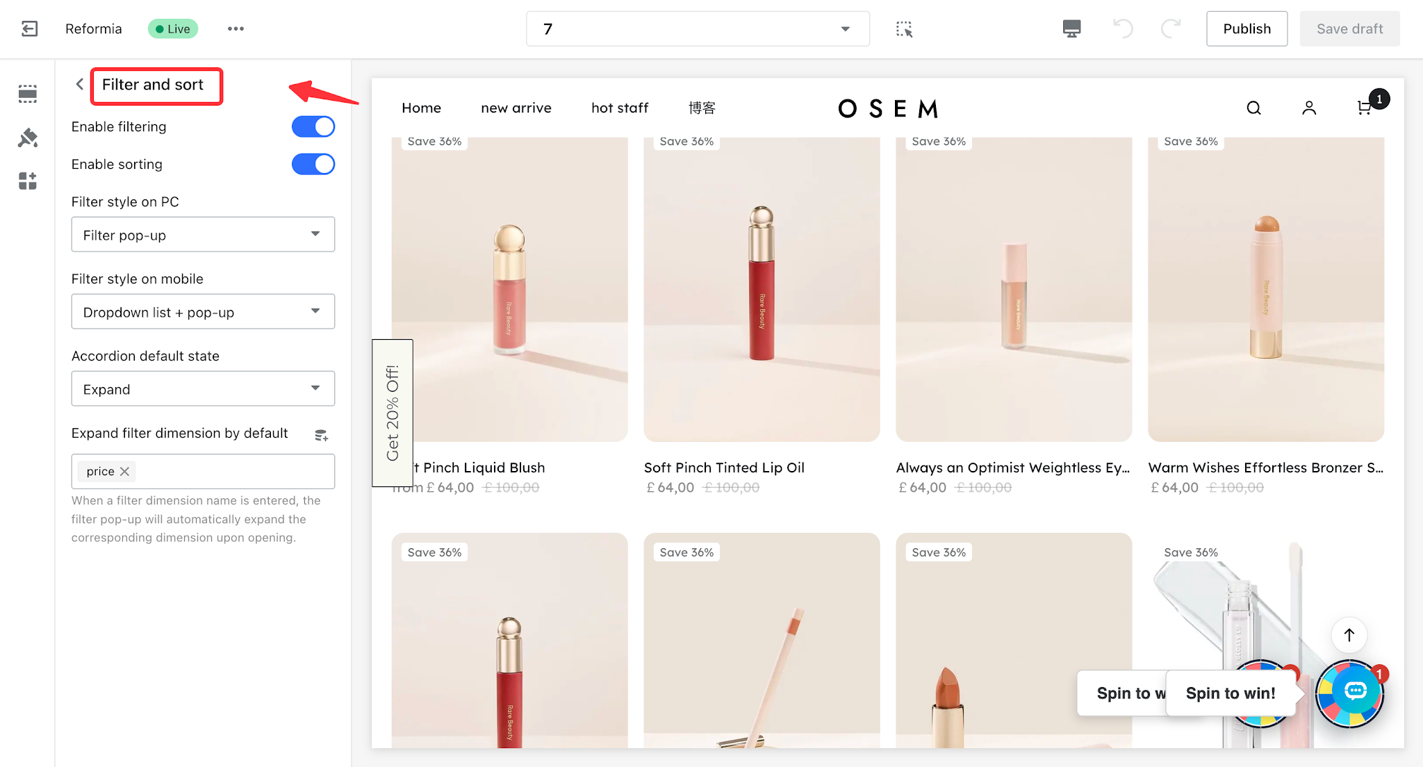
Note
By default, the filter and sort buttons are enabled automatically. If you do not want to display one or both of them, you can turn the buttons off.
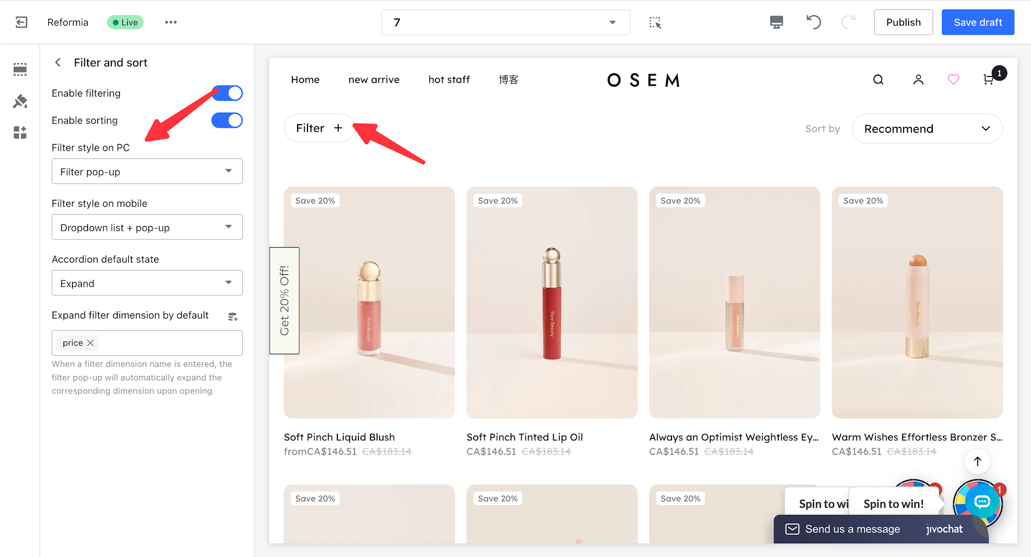
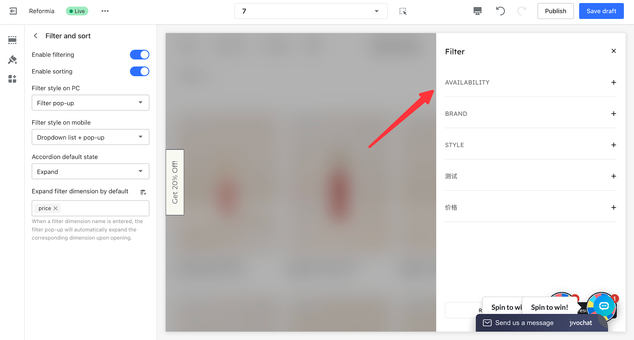
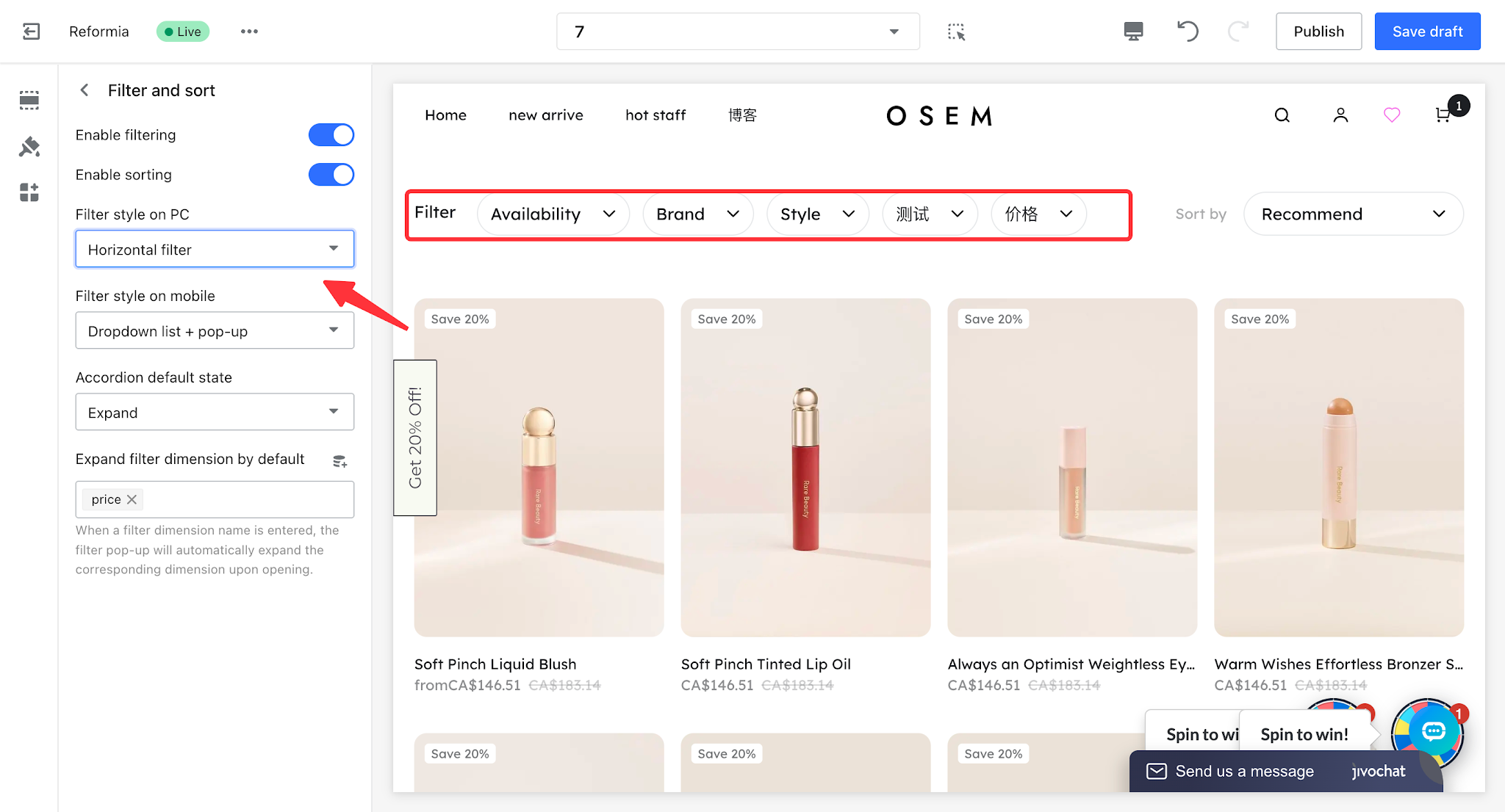
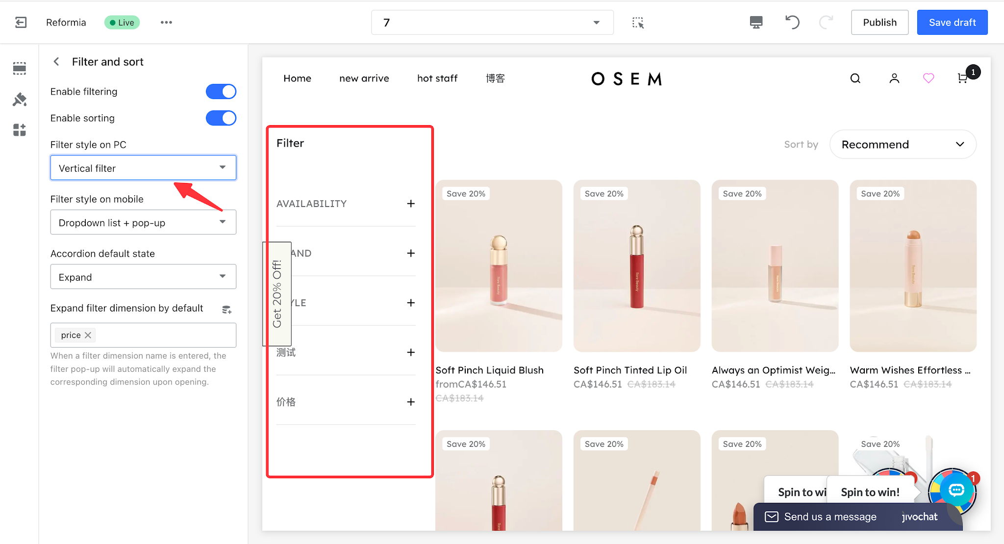
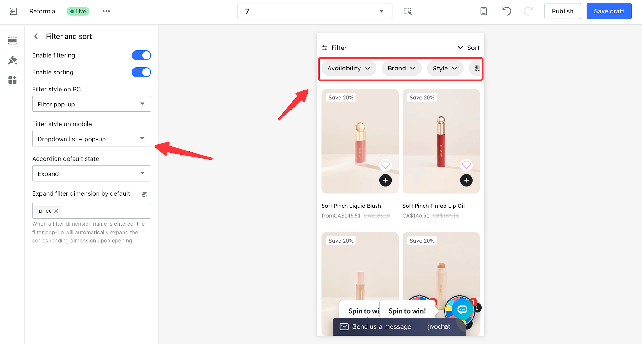
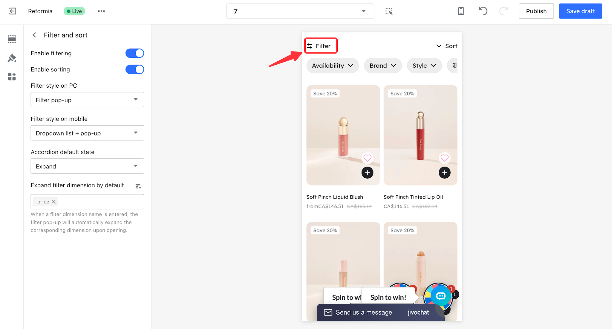
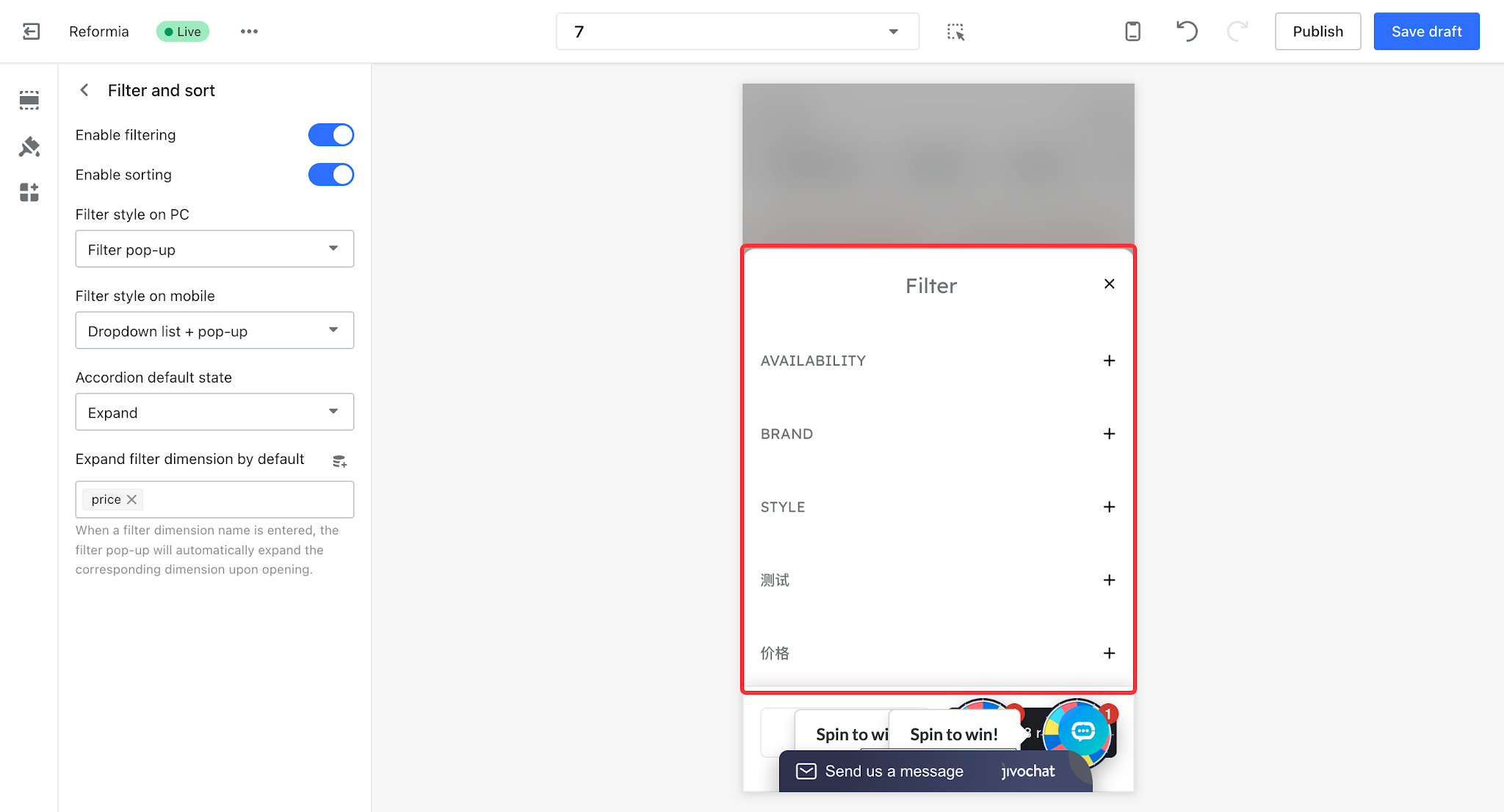
4. There are three types of filter interaction styles on the desktop version. You can switch between them by clicking the PC filter style type.
- Filter pop-up: Clicking the filter button opens a modal window that displays all filter dimensions in a centralized view, suitable for scenarios with many options.
- Horizontal filters: Filter options are displayed directly at the top, suitable for cases with fewer dimensions where quick switching is needed.
- Vertical filters: Each filter dimension is collapsed in a sidebar, and more options can be expanded by clicking. This is suitable for scenarios with multiple categories where a compact interface is preferred.
5. There are two types of filter interaction styles on the mobile version. You can switch between them by clicking the mobile filter style type.
- Dropdown list + popup: Filter dimensions are arranged horizontally at the top. Clicking a specific dimension will show a dropdown list for selection. Clicking the filter button will open a modal window displaying all filter dimensions.
- Popup: Clicking the filter button opens a full-screen modal where users can select filter dimensions step by step.
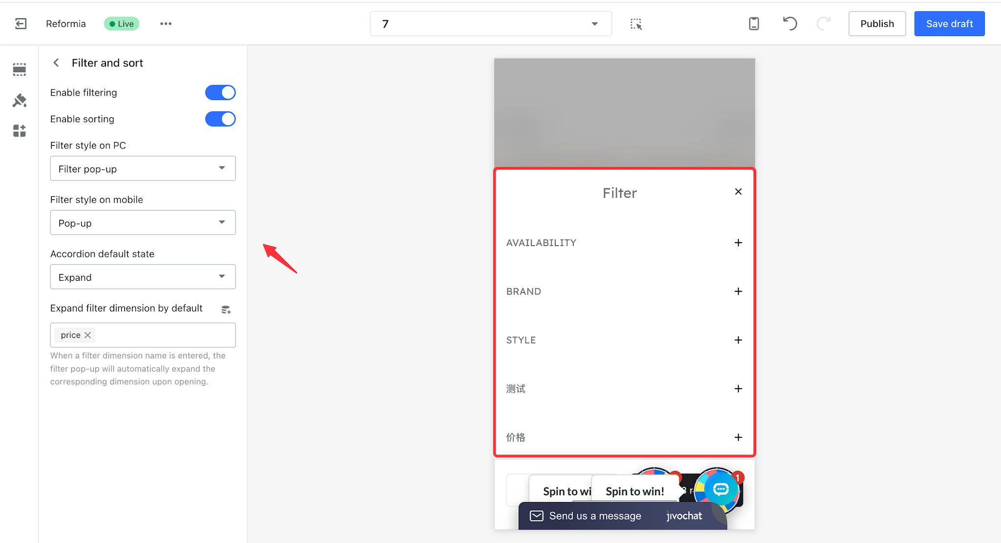
6. The accordion default state and the default expanded filter dimensions only apply to the filter popup and other styles that include the filter popup.
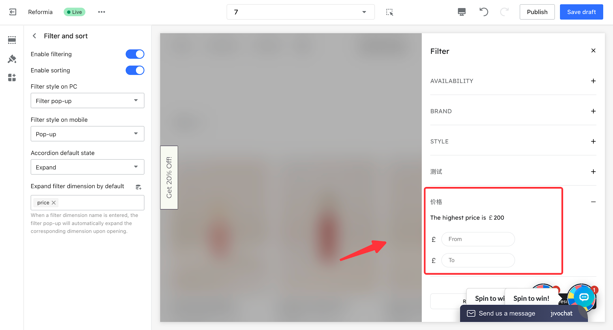
- When the accordion default state is set to expanded, you can configure which filter dimensions are expanded by default. For example, if you want the 【Price】 filter dimension to be expanded by default when the popup opens, you can enter the dimension name into the “Default Expanded Filter Dimensions” field. After clicking the filter button, the 【Price】 filter section in the popup will be expanded by default, while other filter dimensions will remain collapsed.
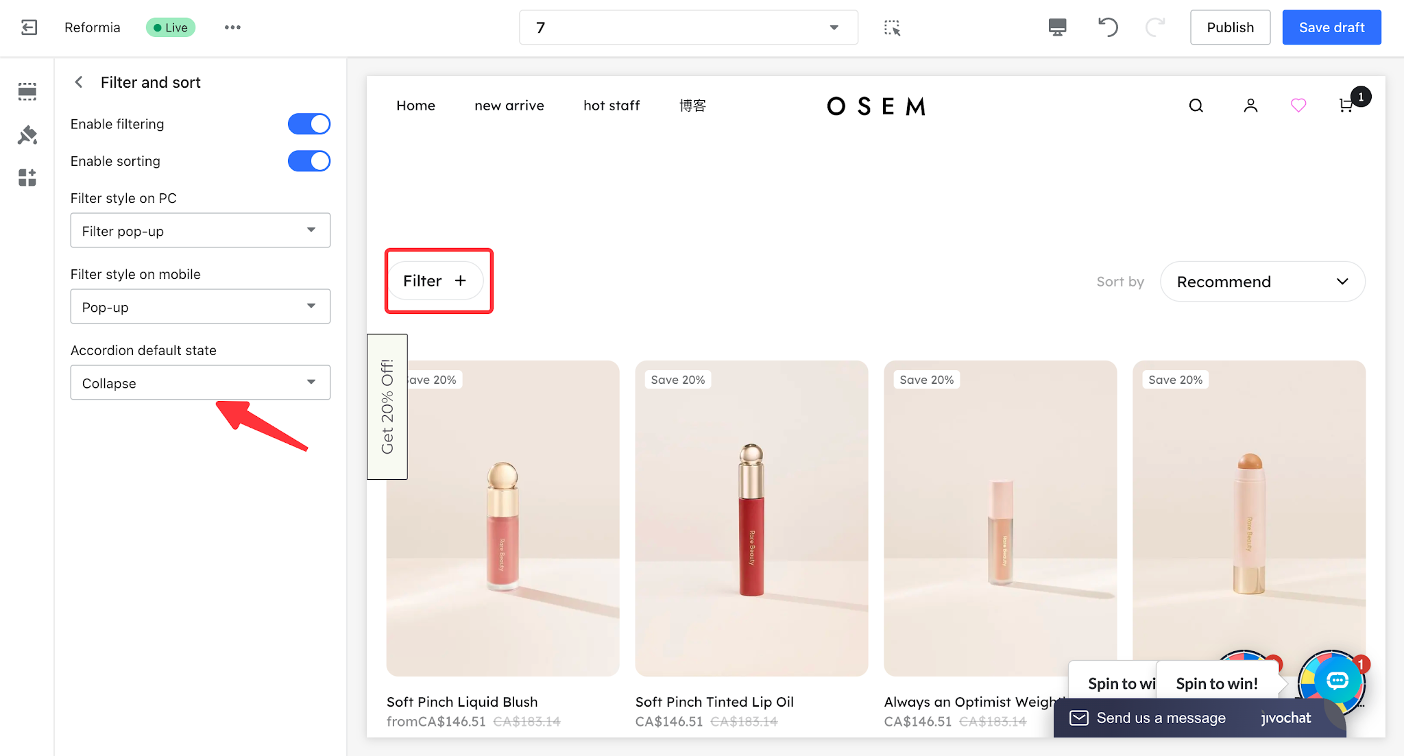
- When the accordion default state is set to collapsed, you cannot configure default expanded filter dimensions. In this case, all filter dimensions are collapsed by default without expanded options. After clicking the filter button, all filter sections will be displayed in a collapsed state, and users need to click each dimension to expand and view its options.
Note
Sorting options can only be enabled or disabled; custom modifications are not supported.


Comments
Please sign in to leave a comment.