
Page Builder has launched the Product Type component. This powerful component helps you easily create beautiful product cards that display product information in a visually appealing and intuitive way. These cards effectively capture customers' attention, encourage purchase decisions, and thereby enhance your store's conversion rate. We invite you to try the Product component to optimize your store's browsing and shopping experience.
Add Product Type Cards to Your Theme
Step 1: Add a Card
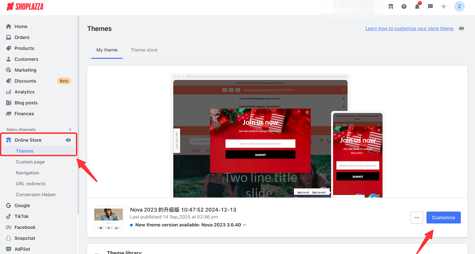
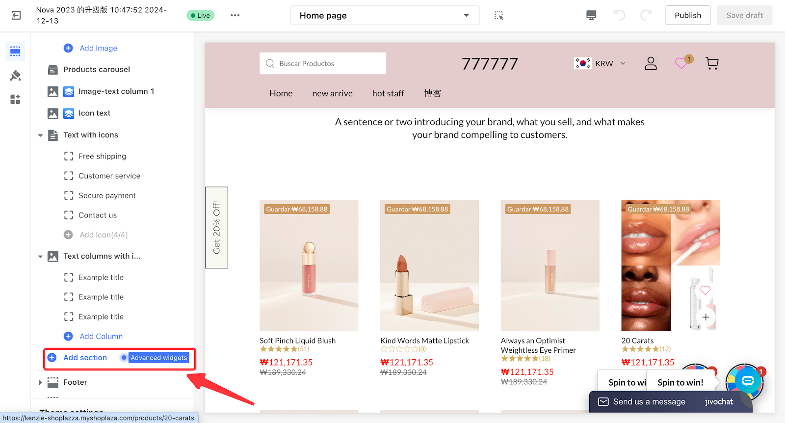
- Log in to your Shoplazza admin, go to Online Store > Theme Editor > Edit to enter the theme editor. Scroll to the bottom of the card list on the left panel, click the Add Card button, and then select Advanced Card Plaza in the secondary panel.
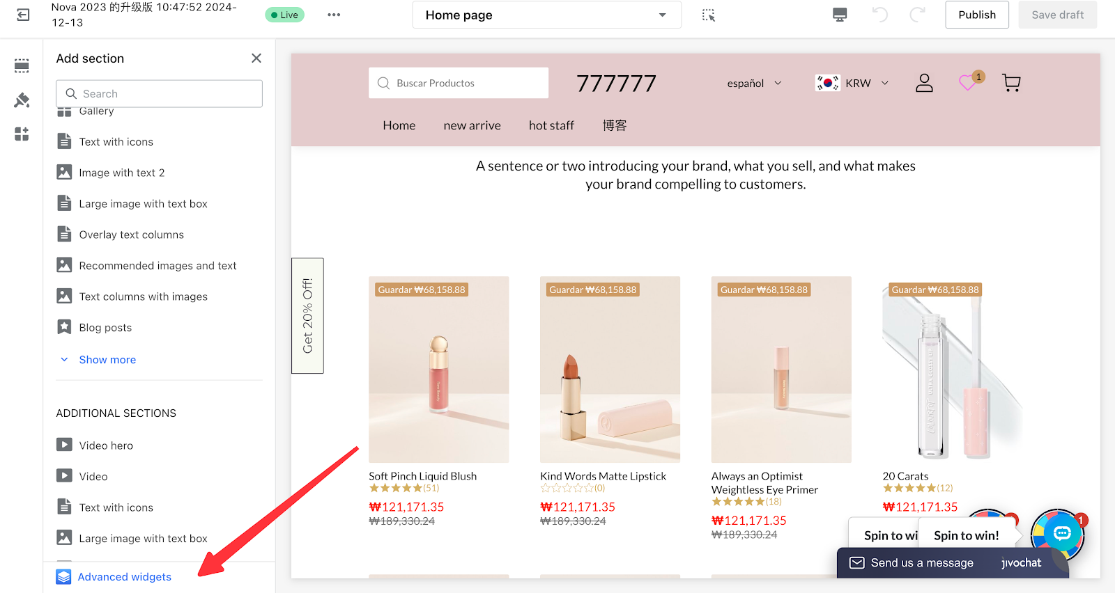
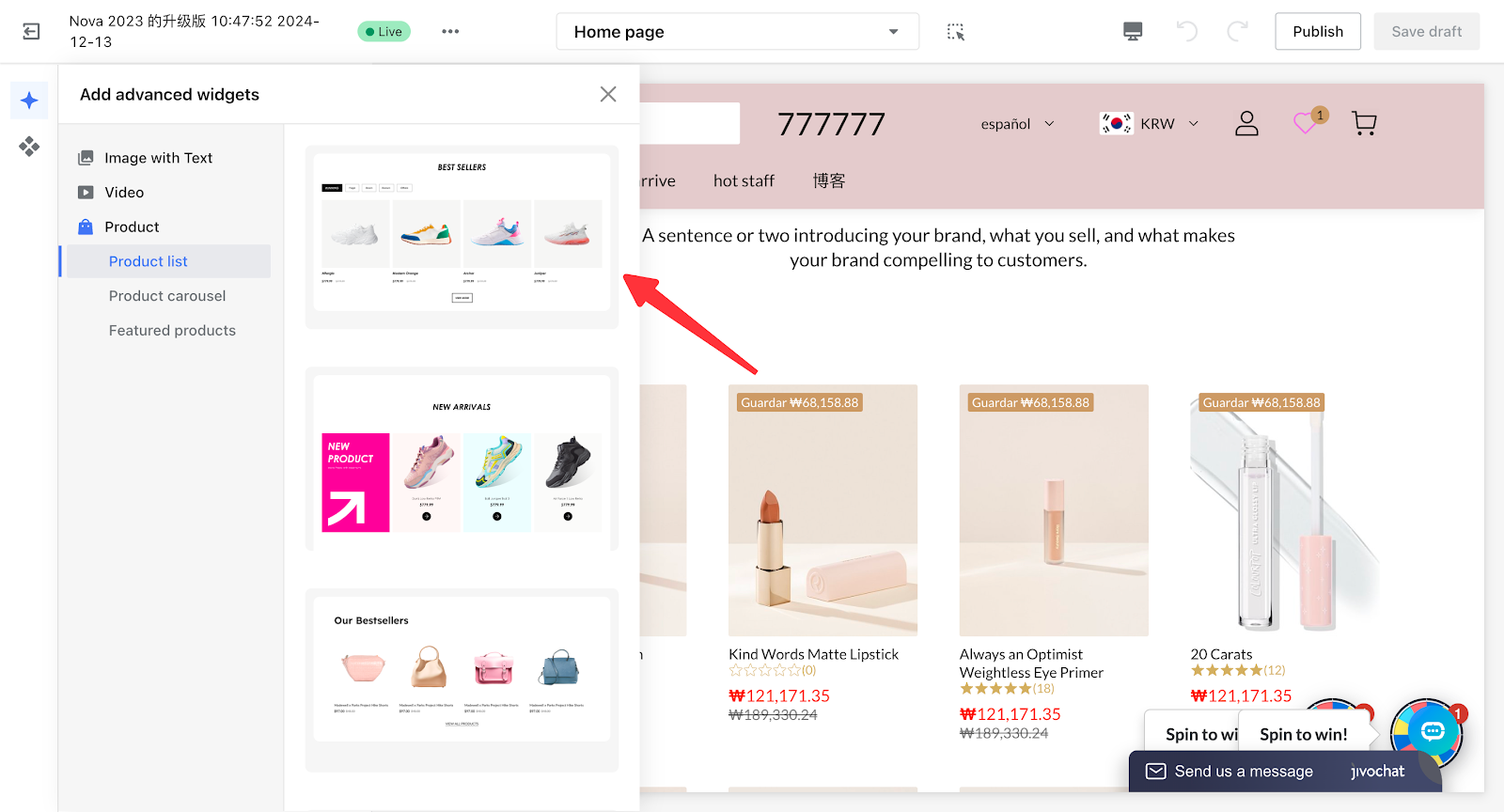
Step 2: Advanced Widgets
- In the Advanced Widgets, click the primary category "Product" in the card section. From the list, select the desired card template and click on it to automatically add the card to your theme. This will also open the Page Builder editor, allowing you to edit the card.
Step 3. Bind the data source
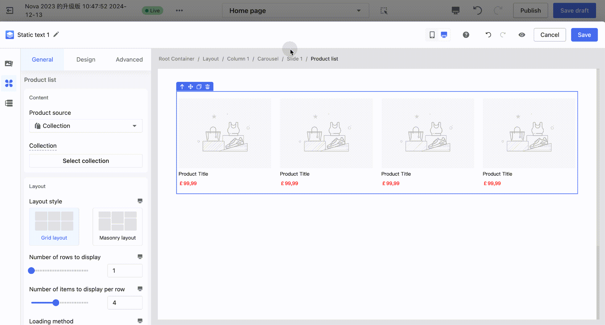
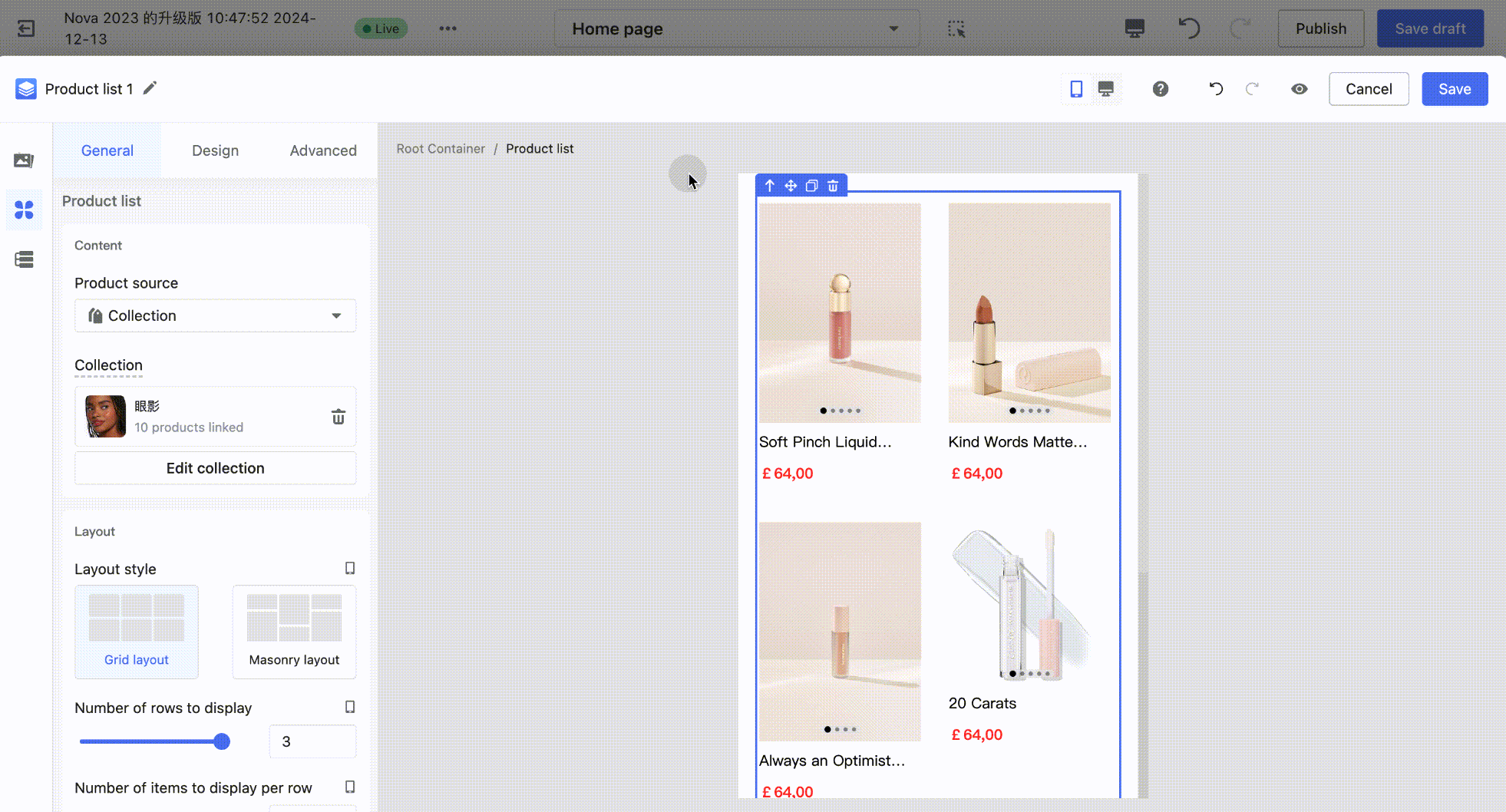
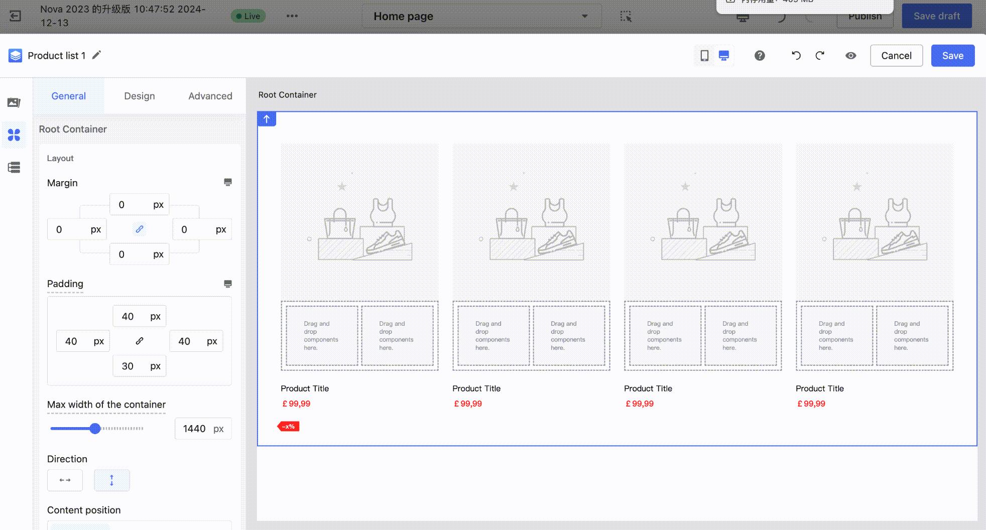
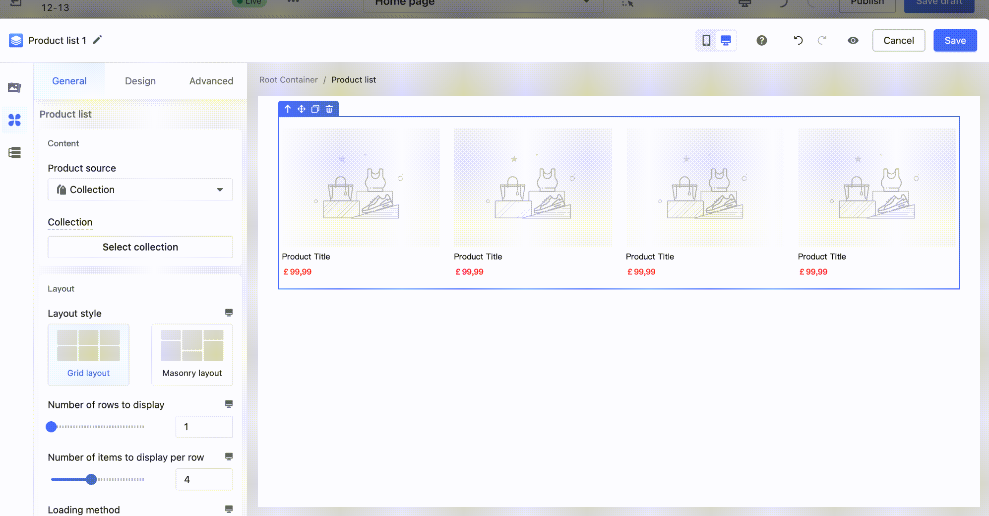
- On the canvas, click to locate the "Product List" group. In the left configuration panel, click Select Products/ Select Collection. Complete your selection in the pop-up window to bind the products.
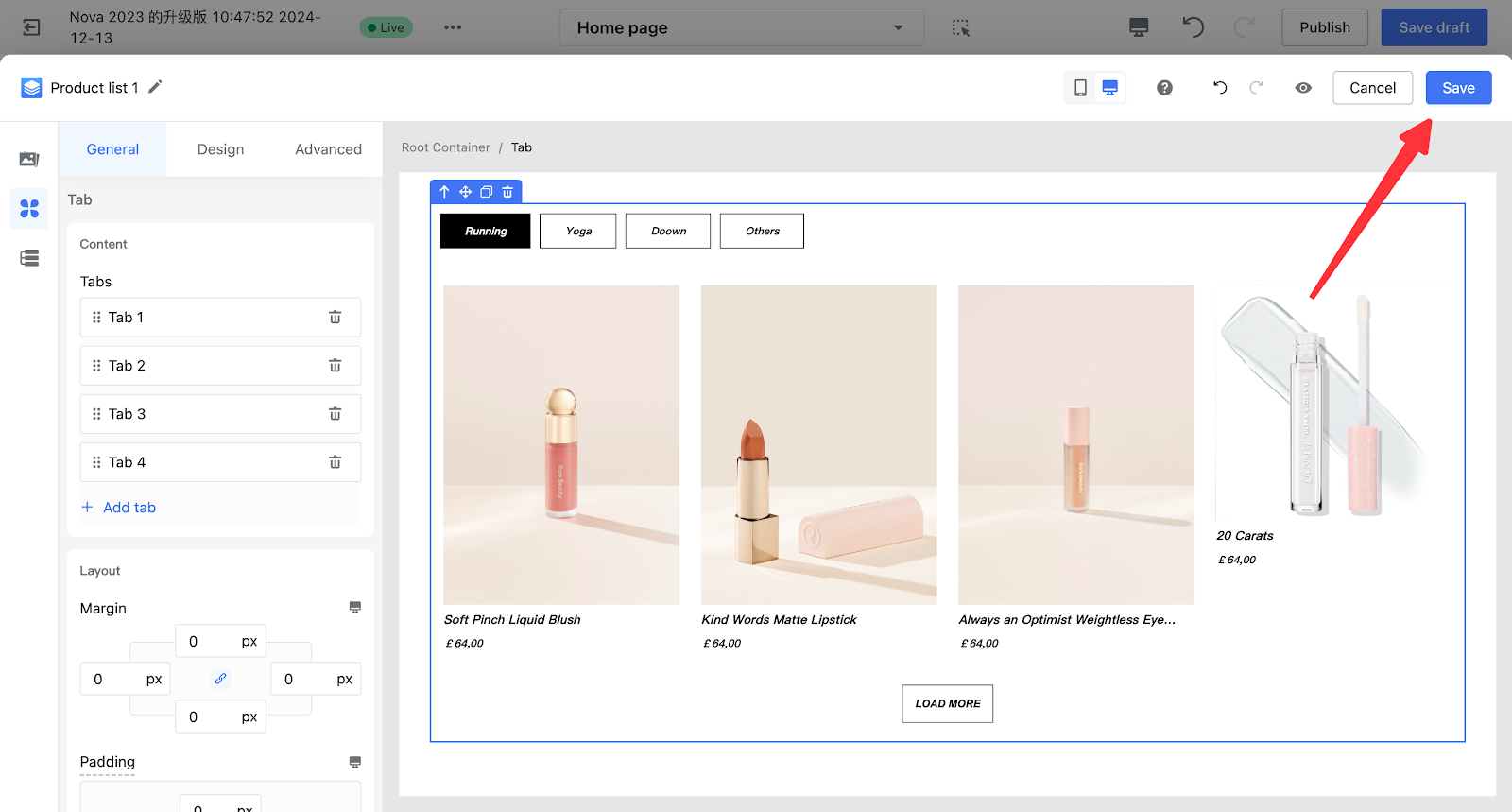
Step 4. Save the card
After finishing the edits, click the "Save" button at the top right of the Page Builder editor to save the card to your theme.
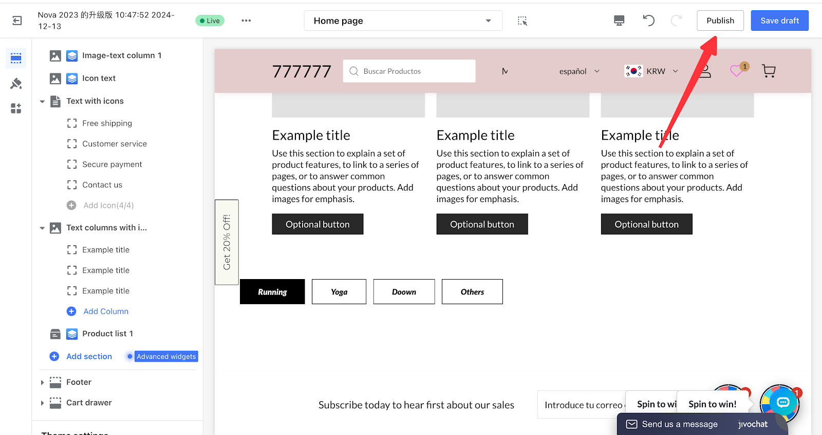
Step 5. Publish the theme
After finishing the theme edits, publish the theme to make it effective on the storefront.
Component Description
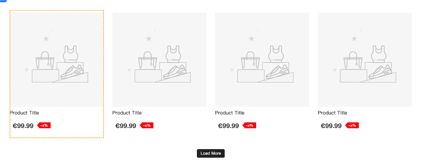
1. Basic Product Component
| Category | Component | Description | Edit Example |
| Product Title | / | Product title, displayed in text format. |
|
| Product Price |
Product Price |
Product price, displayed in text format. |
|
| Icon + product price | Consists of an icon and product price, commonly used in promotional scenarios. |
|
|
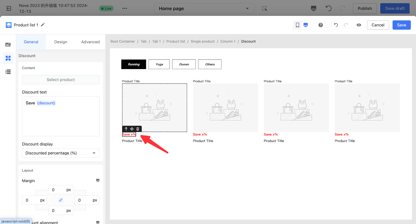
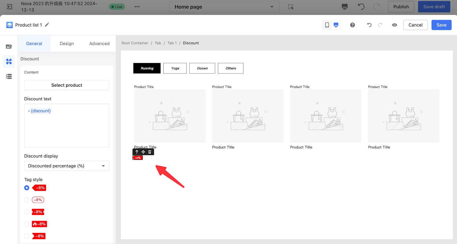
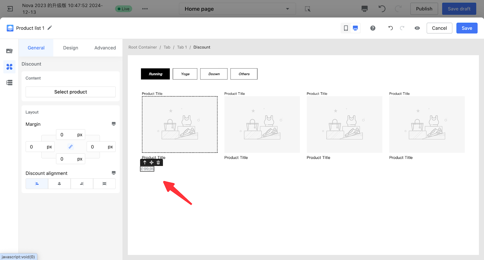
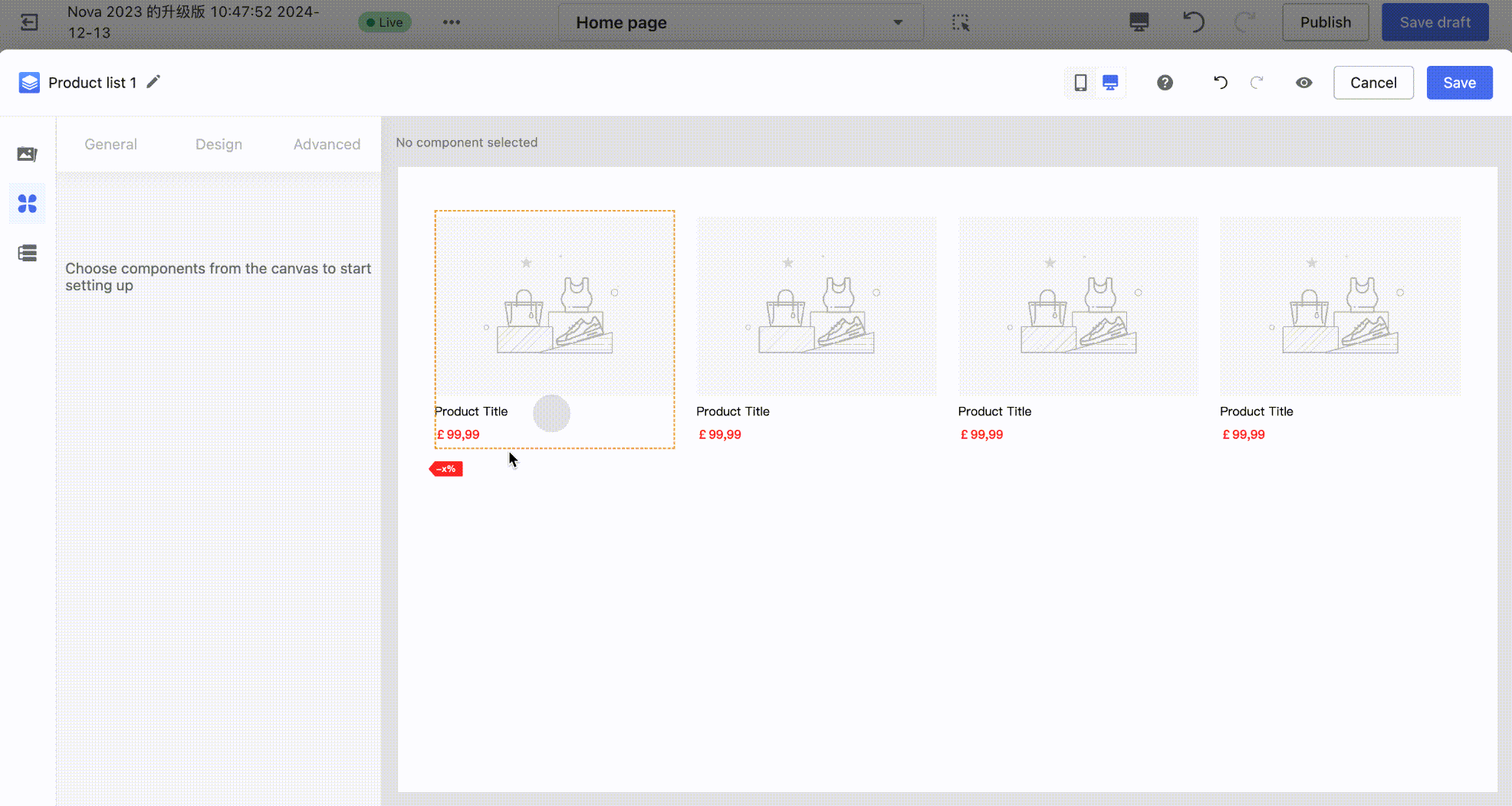
| Discount | Discount 1 (Text) | Discount value, presented in text form. |
|
| Discount 2 (Label) | Discount value, presented as a label. |
|
|
| Strikethrough price | Original product price, displayed in strikethrough style. |
|
|
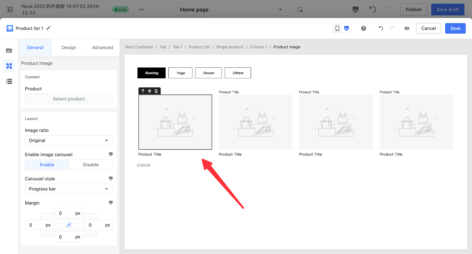
| Product image |
/ |
Displays the product image. |
|
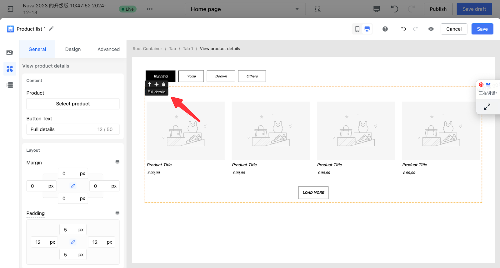
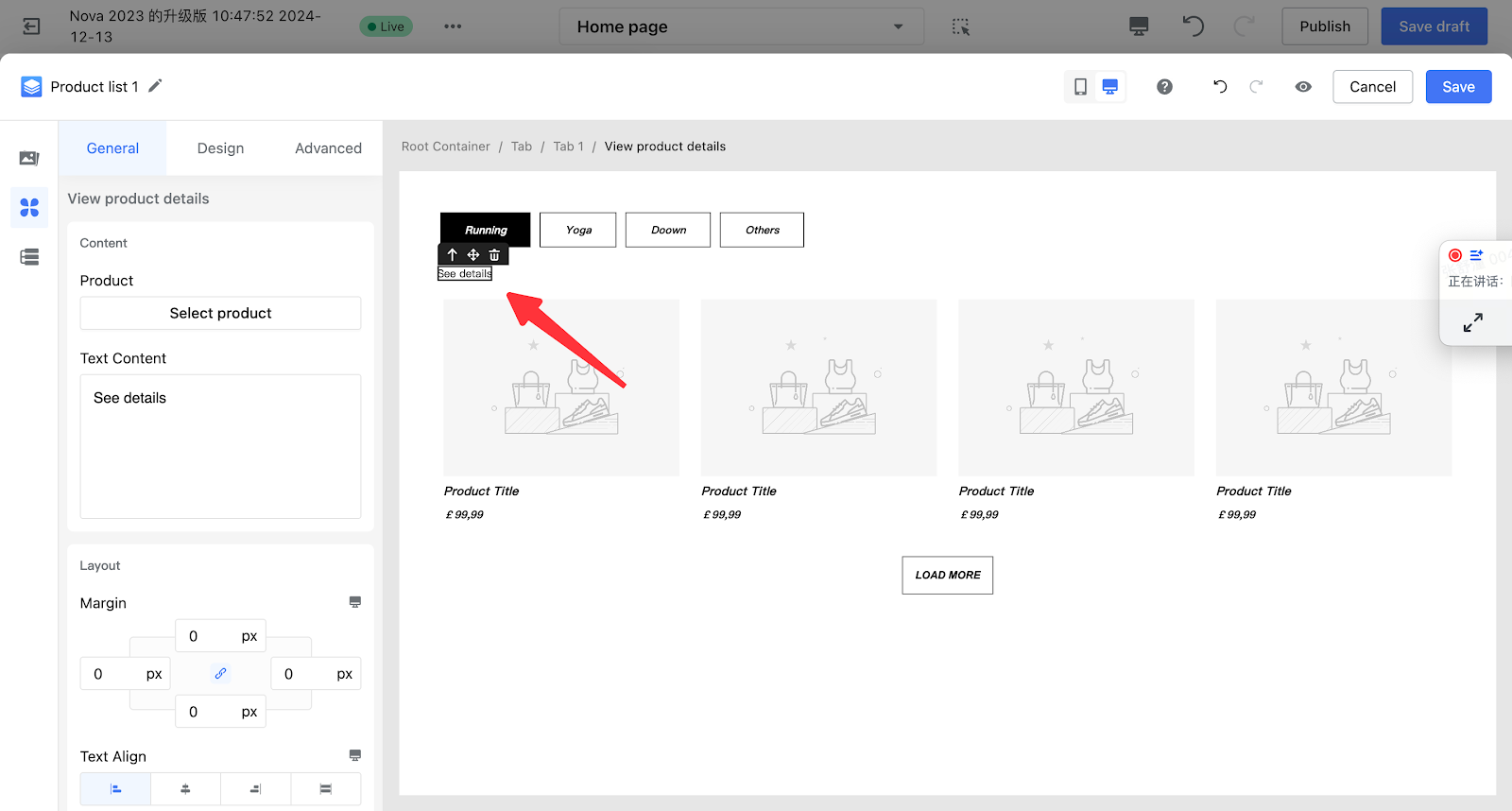
| View product details | View Product Details 1 (Button) | Displayed in button form. Clicking it will redirect to the corresponding product details page. |
|
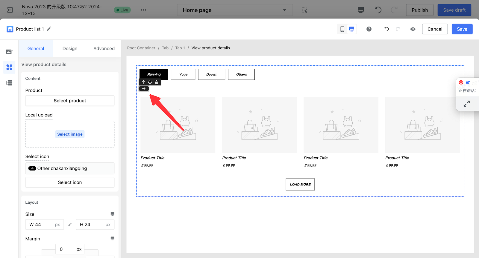
| View Product Details 2 (Icon) | Displayed as an icon; clicking it navigates to the corresponding product detail page. |
|
|
| View Product Details 3 (Text) | Displayed in text form; click to navigate to the corresponding product detail page. |
|
2. Product Blocks / Product Lists
Note
- Single product / Product List are composed by arranging the basic product components above according to specific layout rules.
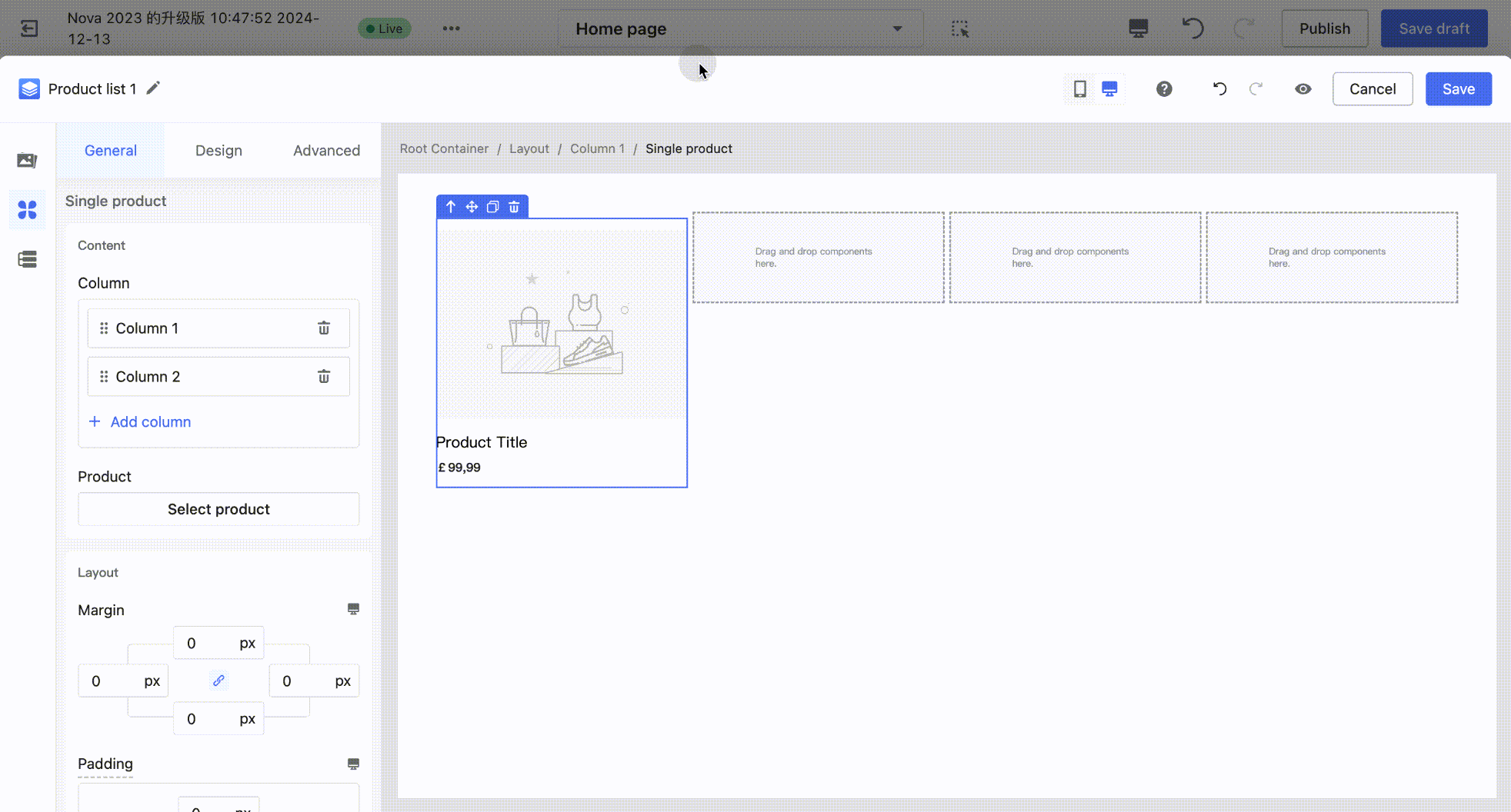
- Single Product: Displays the product information of a single item.
- Product List: Displays the product information of multiple items, consisting of multiple product blocks.
| Category | Component | Description | Edit Example |
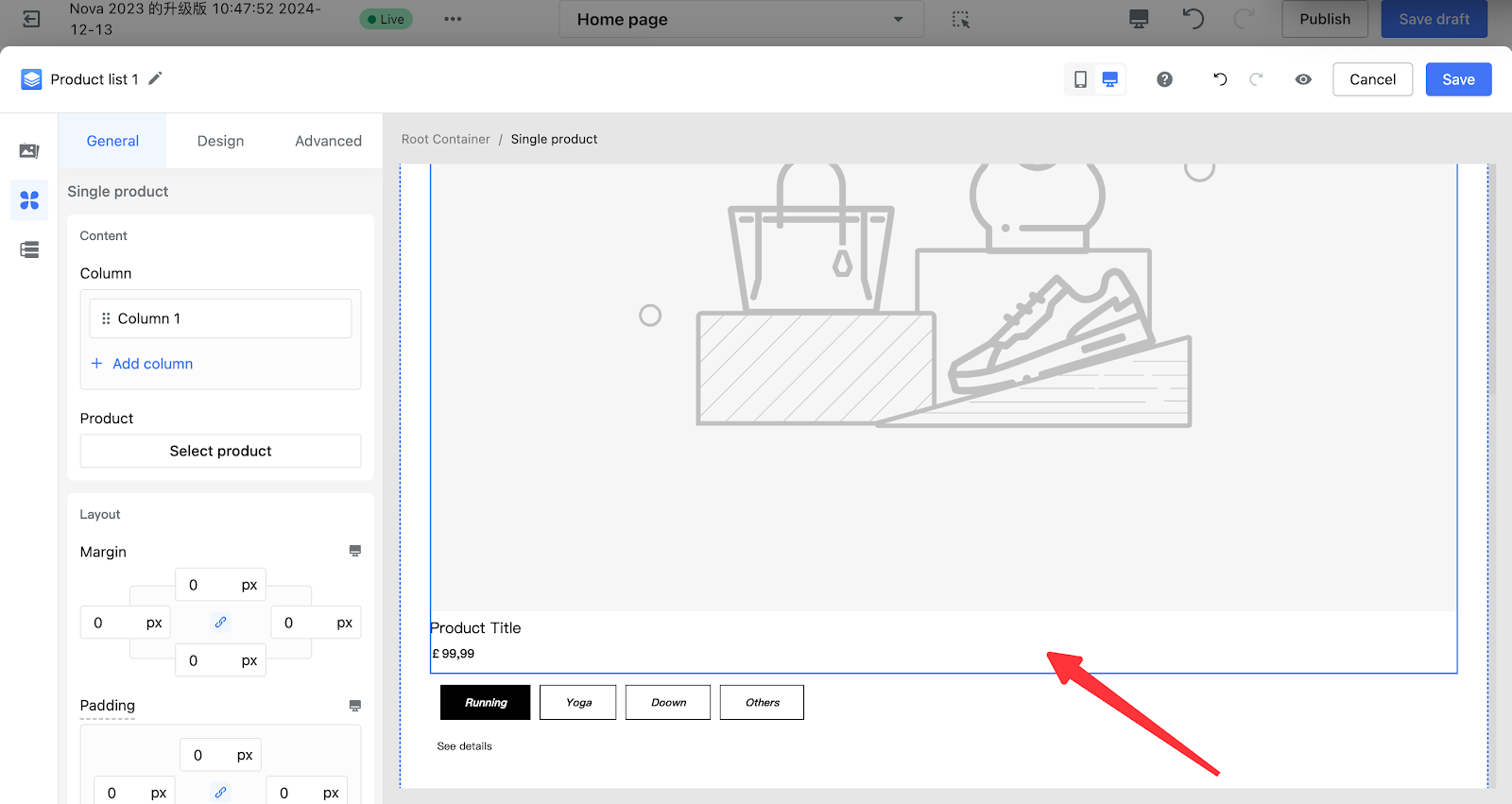
| Single product |
Single Product Block 1 (Vertical Layout) |
Displays a single product's information in a vertical layout, with the default order as:
|
|
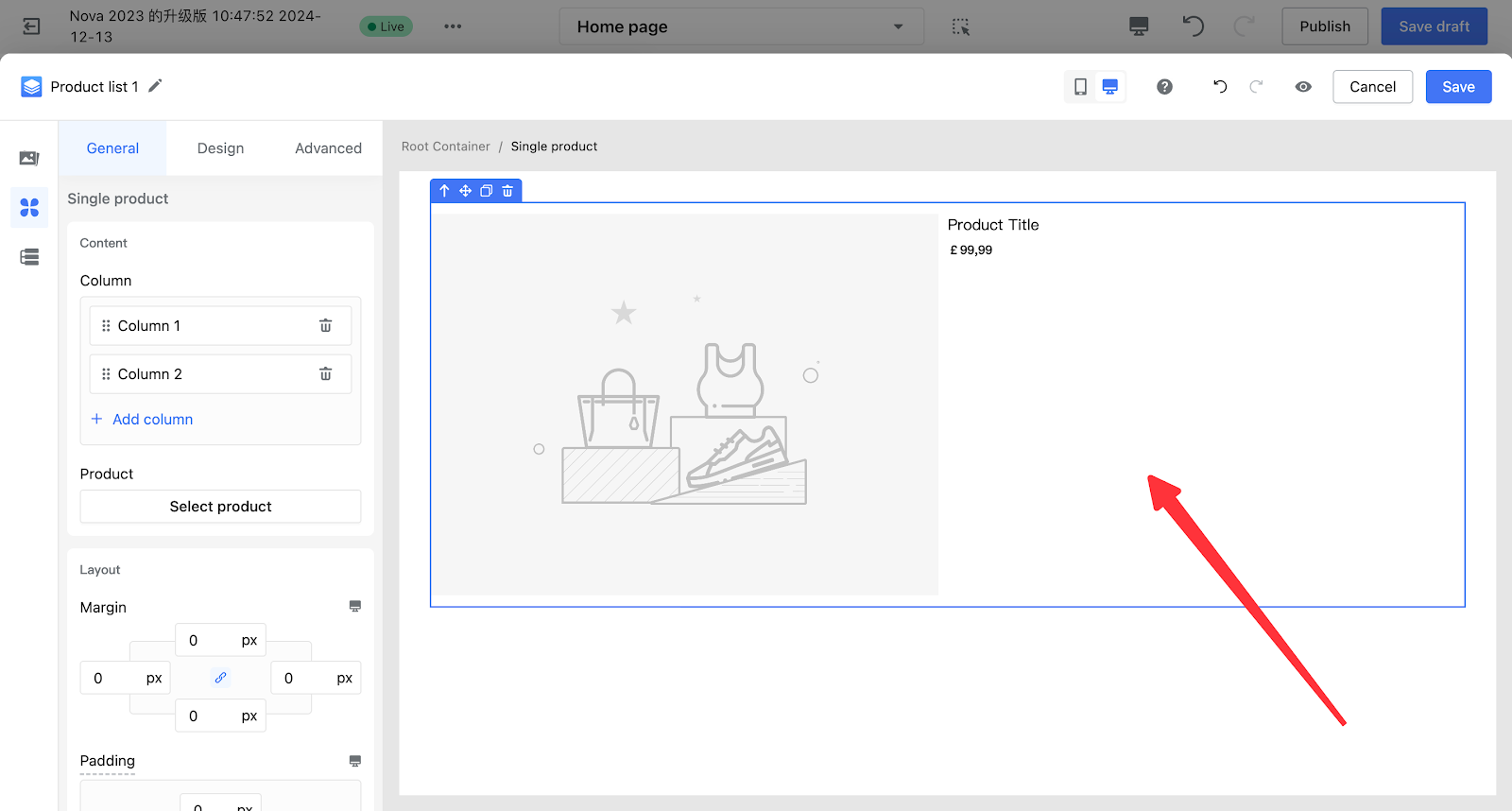
| Single product block 2 (horizontal layout) |
Displays a single product's information in a horizontal layout, with the default order as: Left side:
Right side:
|
|
|
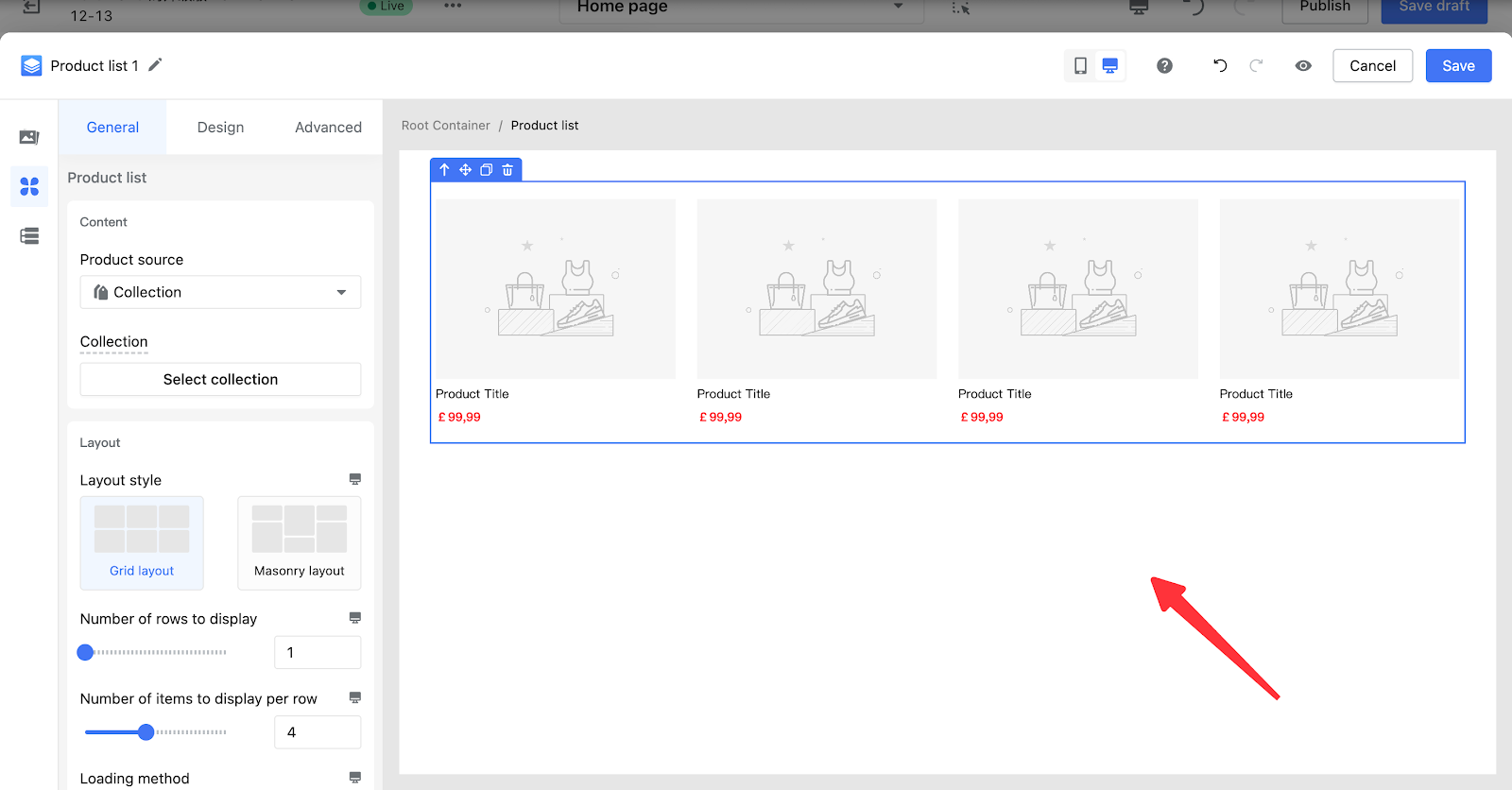
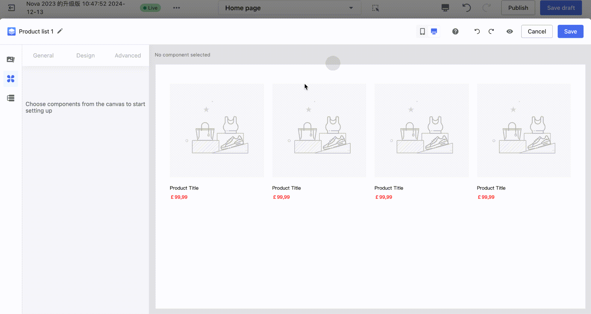
| Product List | Product list 1 (vertical) |
Displayed in single or multiple rows, each product's information is arranged vertically by default as follows:
|
|
|
Product list 2 (horizontal) |
Displayed in single or multiple rows, each product's information is arranged horizontally by default as follows: Left:
Right:
|
|
|
| Product carousel 1 |
Displays multiple products in a carousel. Each product's information is arranged vertically by default as follows:
|
|
|
|
Product carousel 2 (3D carousel) |
Displays multiple products in a carousel with a 3D effect. Each product's information is arranged vertically by default as follows:
|
|
Overview of General Editing Operations
Customizing Product Type Cards
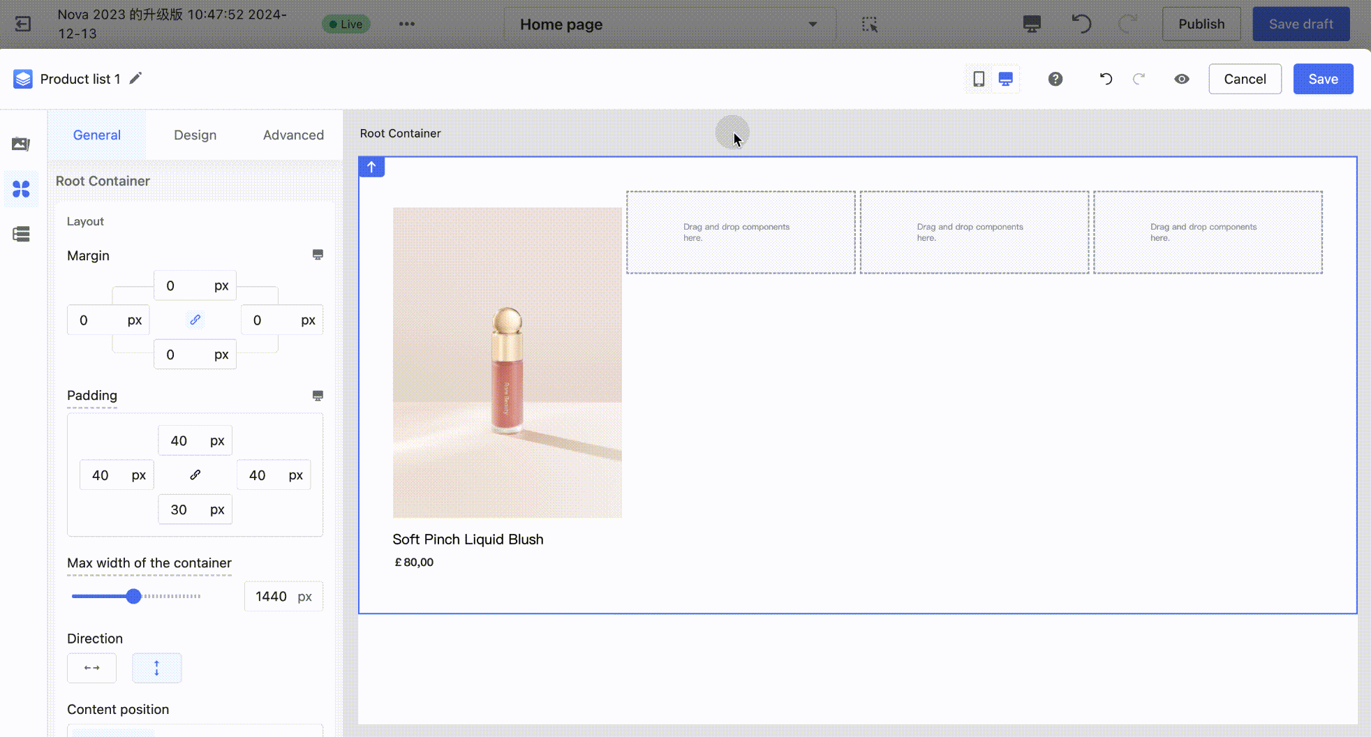
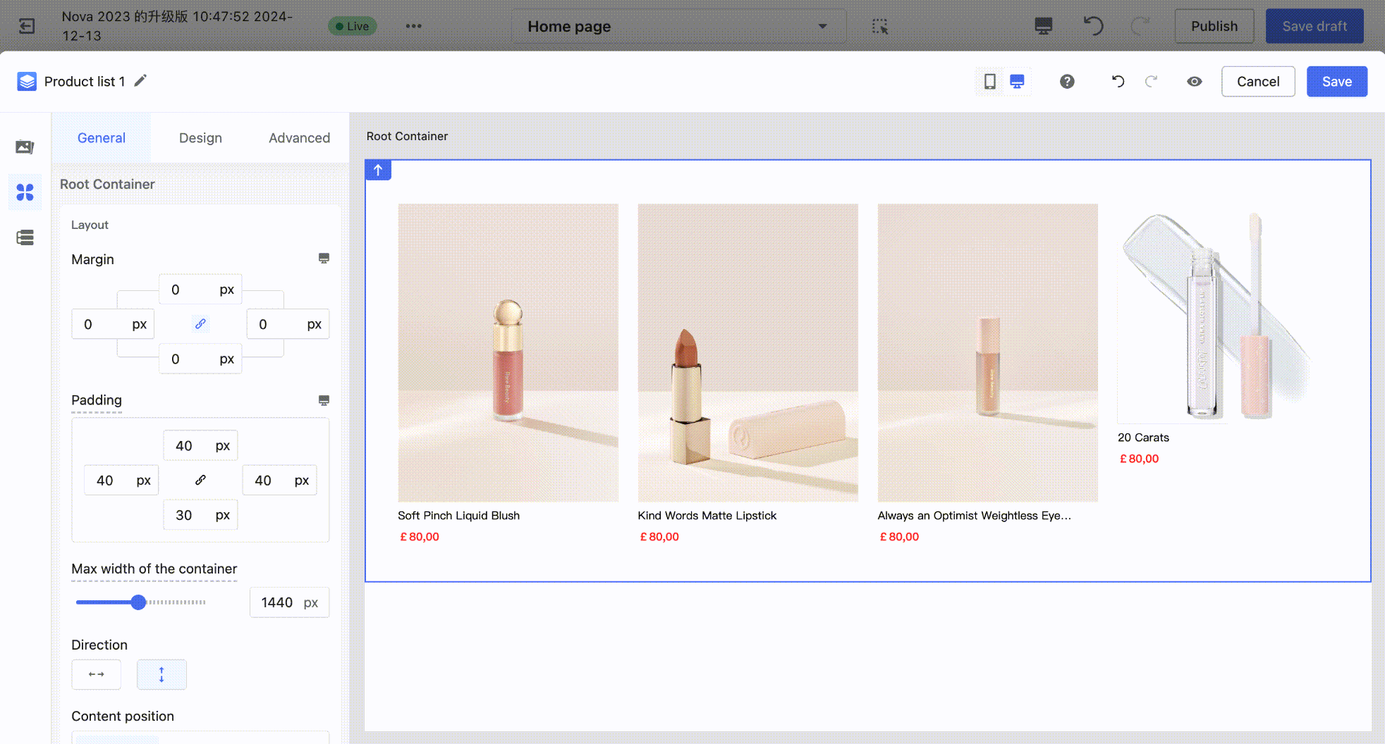
The product list/single product components by default only include the product image, title, and price to allow for quick setup. At the same time, they also support custom combinations of product components, adjusting component styles, and layout customization.
1. Add Product Components
Product components are located in the left component panel. Switch to the "Product Components" category, select the desired component (e.g., Discount), and drag it onto the canvas, placing it within the product block of the product list.

2. Remove Product Components
On the canvas, click to select the product component you want to remove, then click the delete icon in the top-left quick actions to delete it.
3. Adjust Component Style
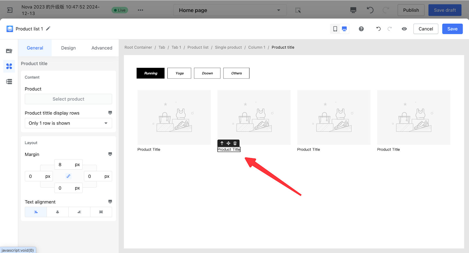
Example: To modify the product title's color or font size, click to select the product title component on the canvas. In the left configuration panel, switch to the Style tab, then click the text color picker to customize and choose your desired color.
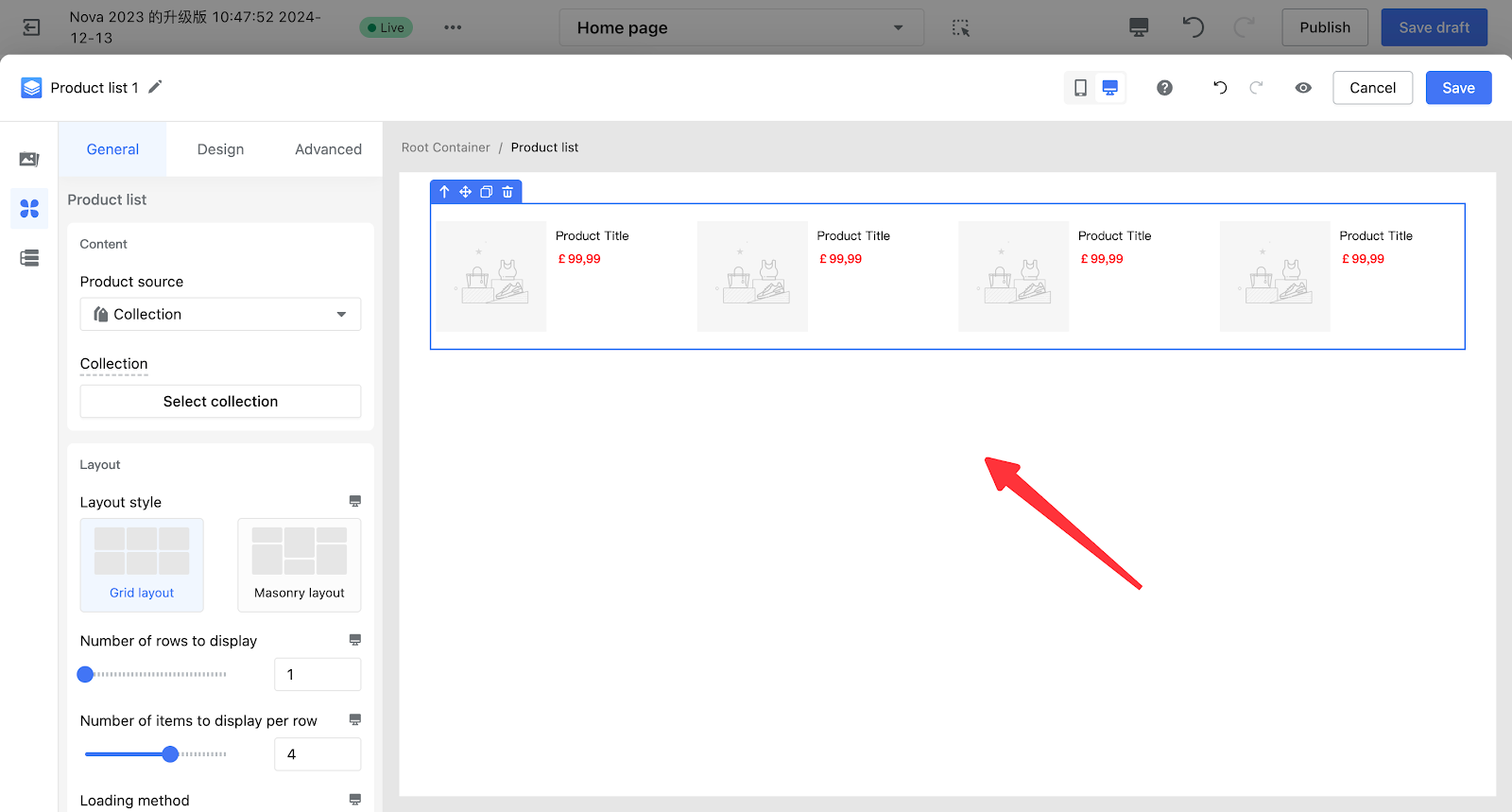
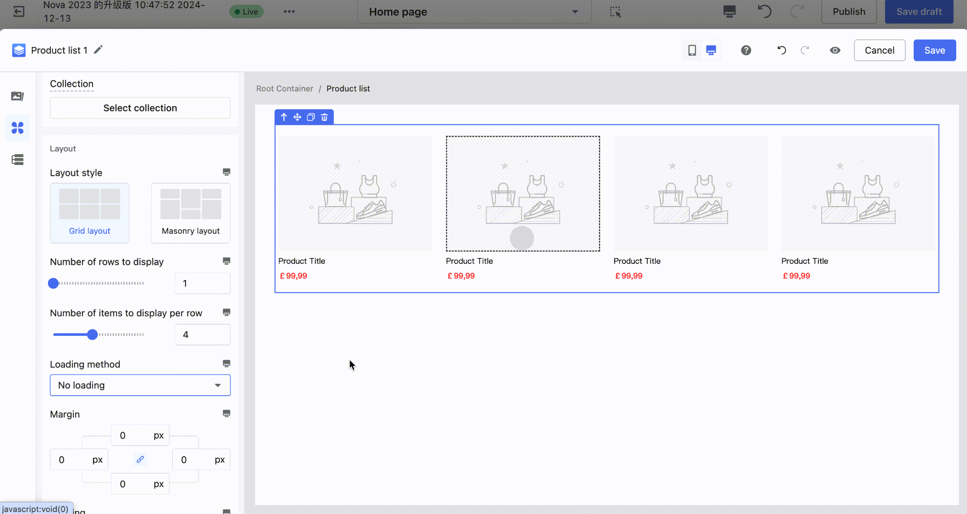
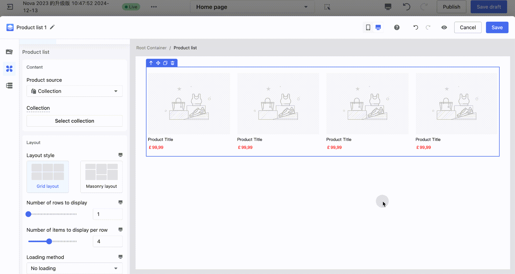
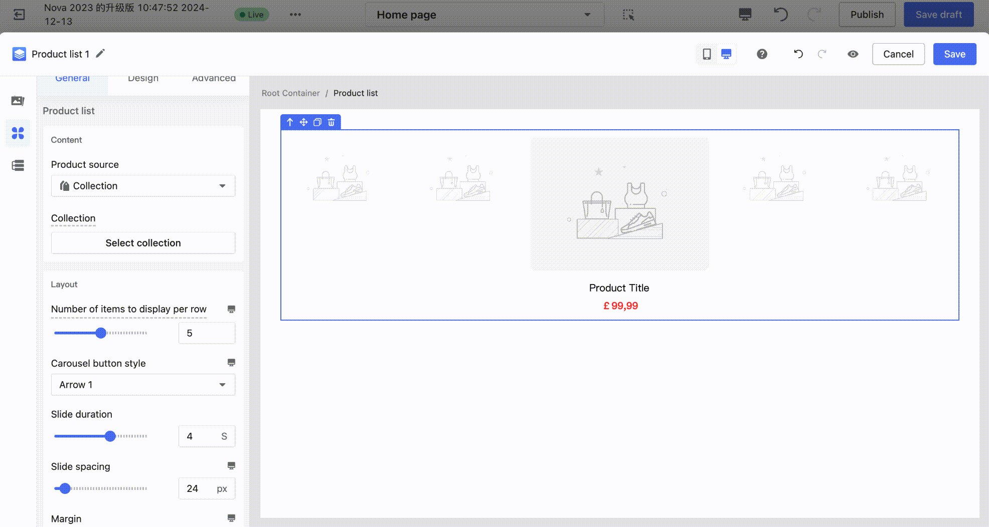
4. Adjust List Layout
Note
Click to select the product list component on the canvas. In the left configuration panel under the Layout section, you can adjust the layout using different settings. Separate configurations are supported for both PC and mobile devices.
| Component | Description | Editing Example |
| Product List |
Configure Layout Style: You can set different product arrangement styles through Layout Style. Supported options:
|
|
|
Configuration of the Number of Products on the First Screen: The number of products displayed on the first screen = Number of display rows × Number of products per row. You can configure this by adjusting the number of display rows and the number of products per row. |
|
|
|
Configuration of Loading Method: The loading method can be configured to support:
|
|
|
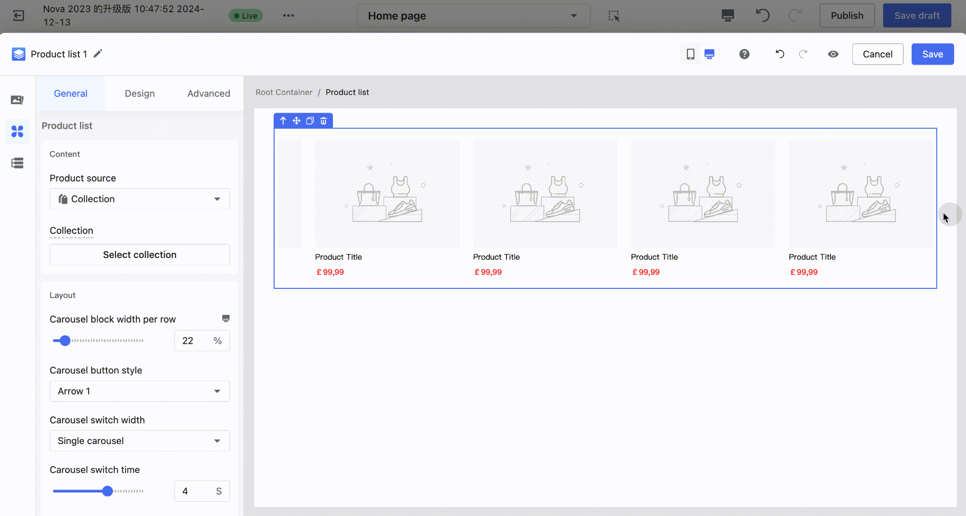
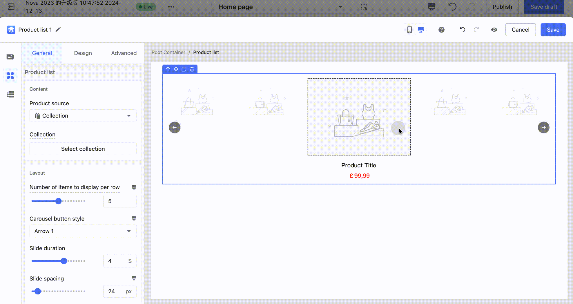
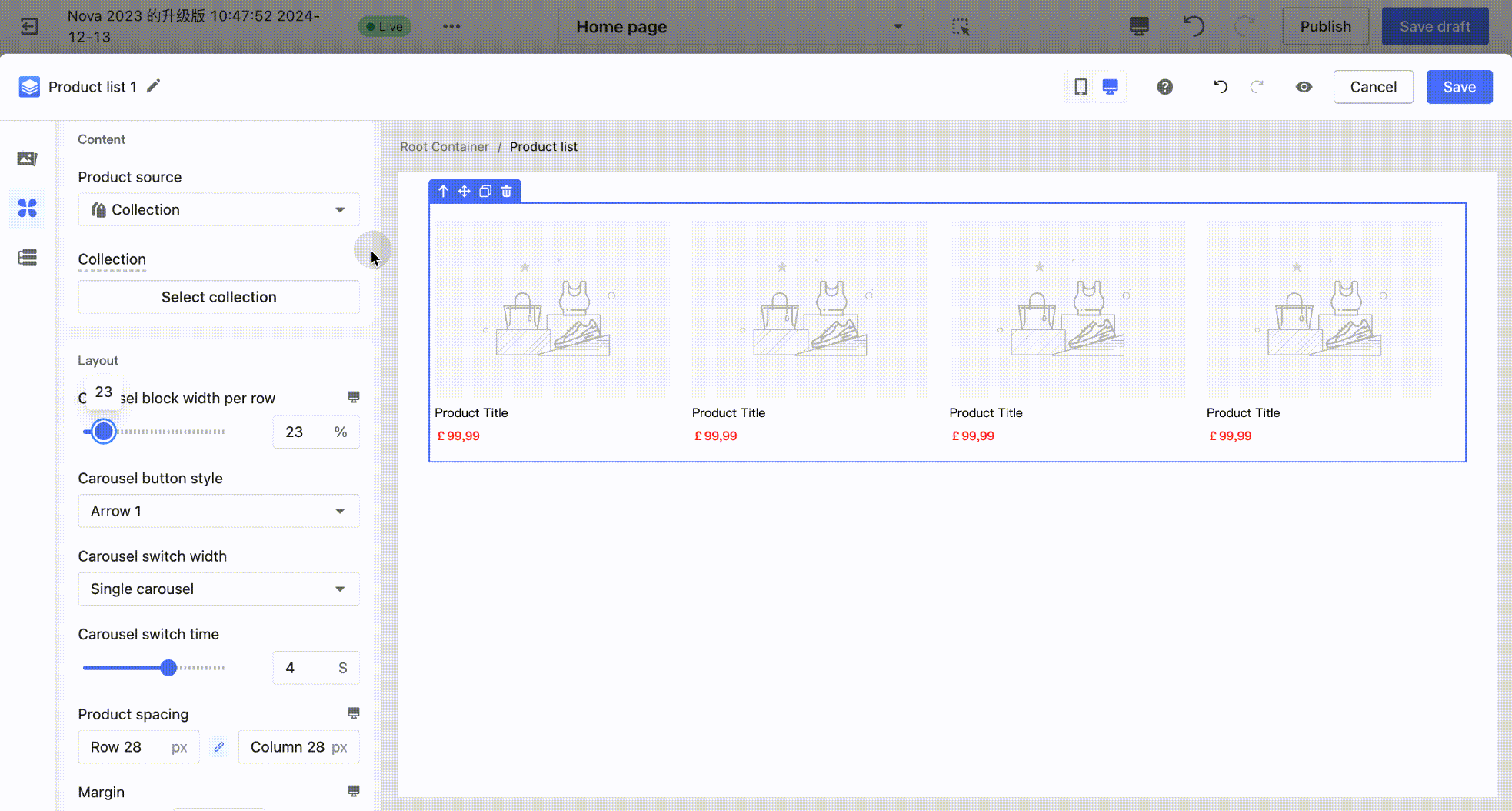
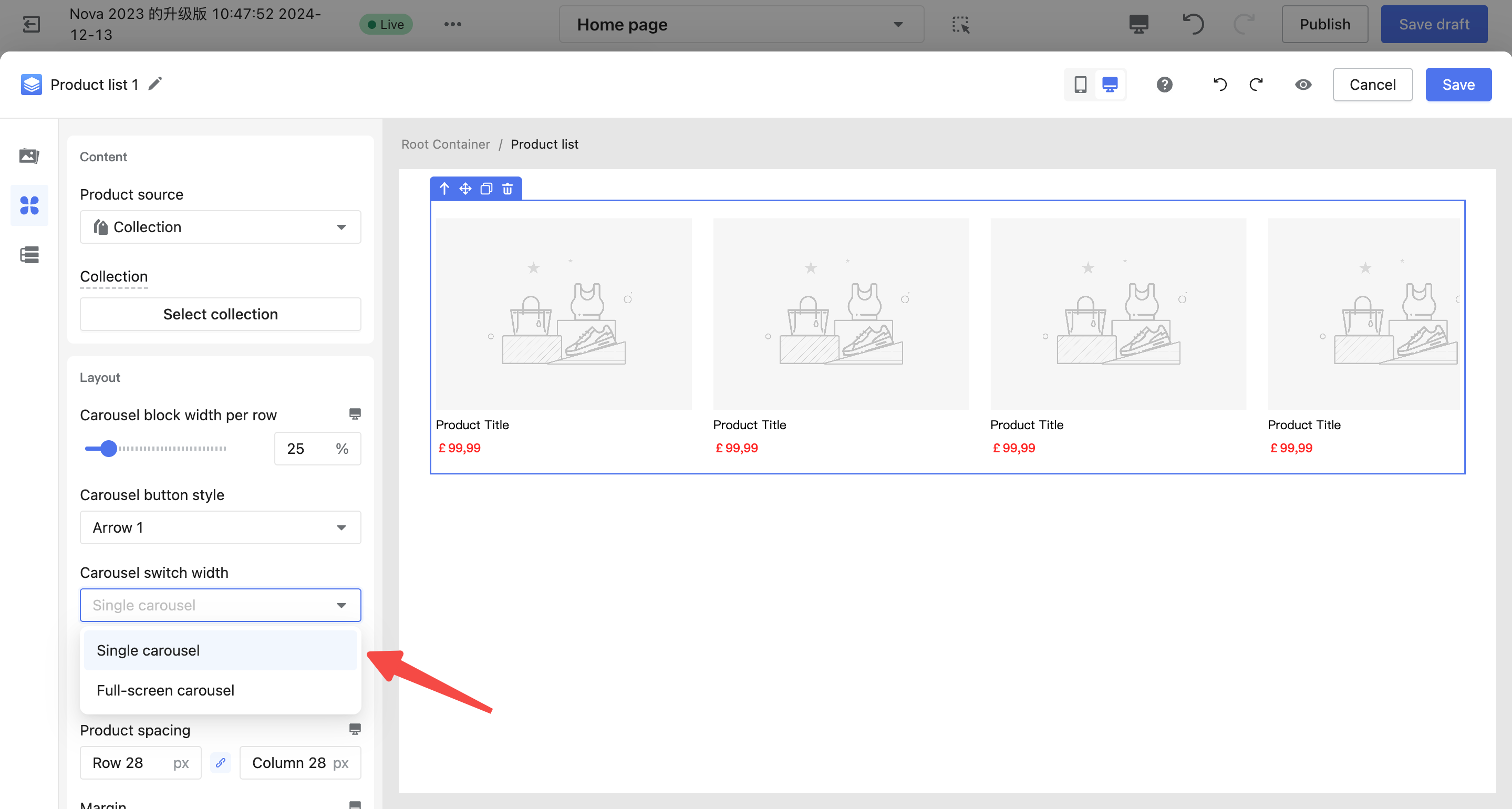
| Product List Carousel 1 |
Configuration of Product Carousel Rows: The number of rows can be configured by adjusting the display rows. |
|
|
Configuration of the Number of Products on the First Screen: The number of products can be configured by adjusting the carousel block width. For example, setting the width ratio to 50% will display 2 products per row. Note: The number of products displayed on the first screen is determined by both the carousel block spacing and the block width ratio. For instance, if spacing exists, setting the width ratio to 50% may not fully display 2 products, and the ratio should be reduced to 49%. |
|
|
|
Configuration of Carousel Slide Quantity: The carousel slide quantity can be configured by adjusting the carousel slide width, supporting:
|
|
|
| Product List Carousel 2 (3D Carousel) |
Configuration of Products Per Row: The number of products per row can be configured by adjusting the display count per row. Note: Due to style limitations, the 3D carousel only supports an odd number of products per row. |
|

Common Setup Tips
- Flexible Adjustment of Product Component Layouts
Changing Product List Layout
- Different components within the product module have default layout styles, such as horizontal/vertical product blocks or horizontal product lists. Product information is displayed in a default two-column layout (left and right). You can flexibly adjust the layout using the capabilities of the product block container.
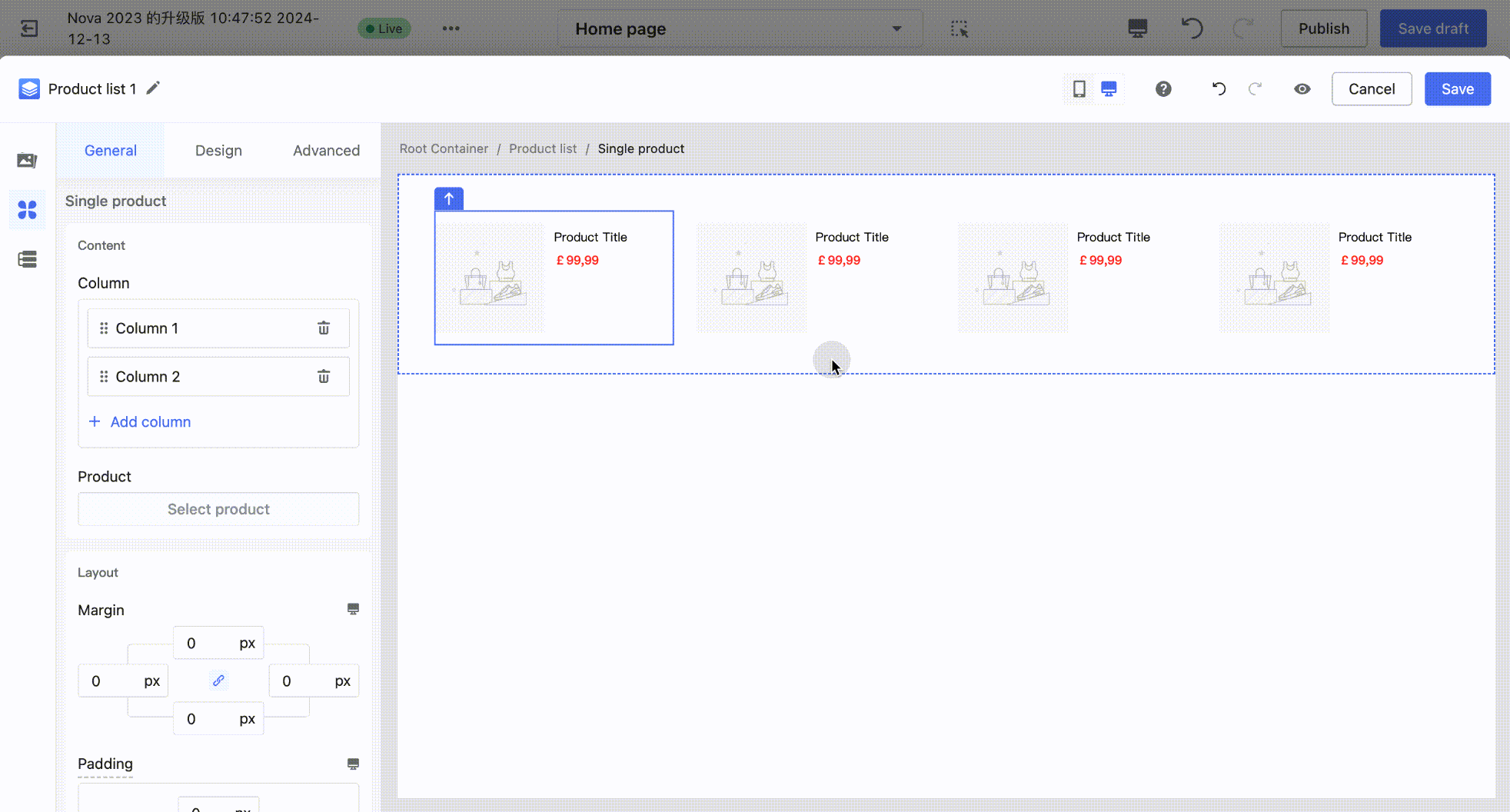
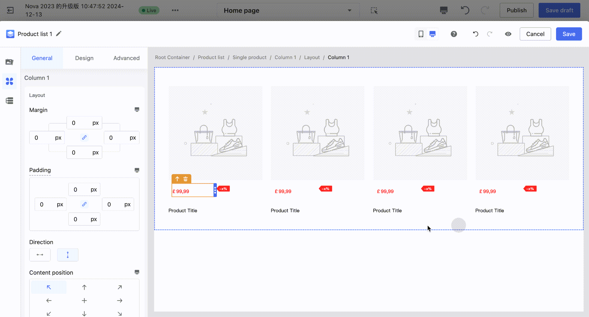
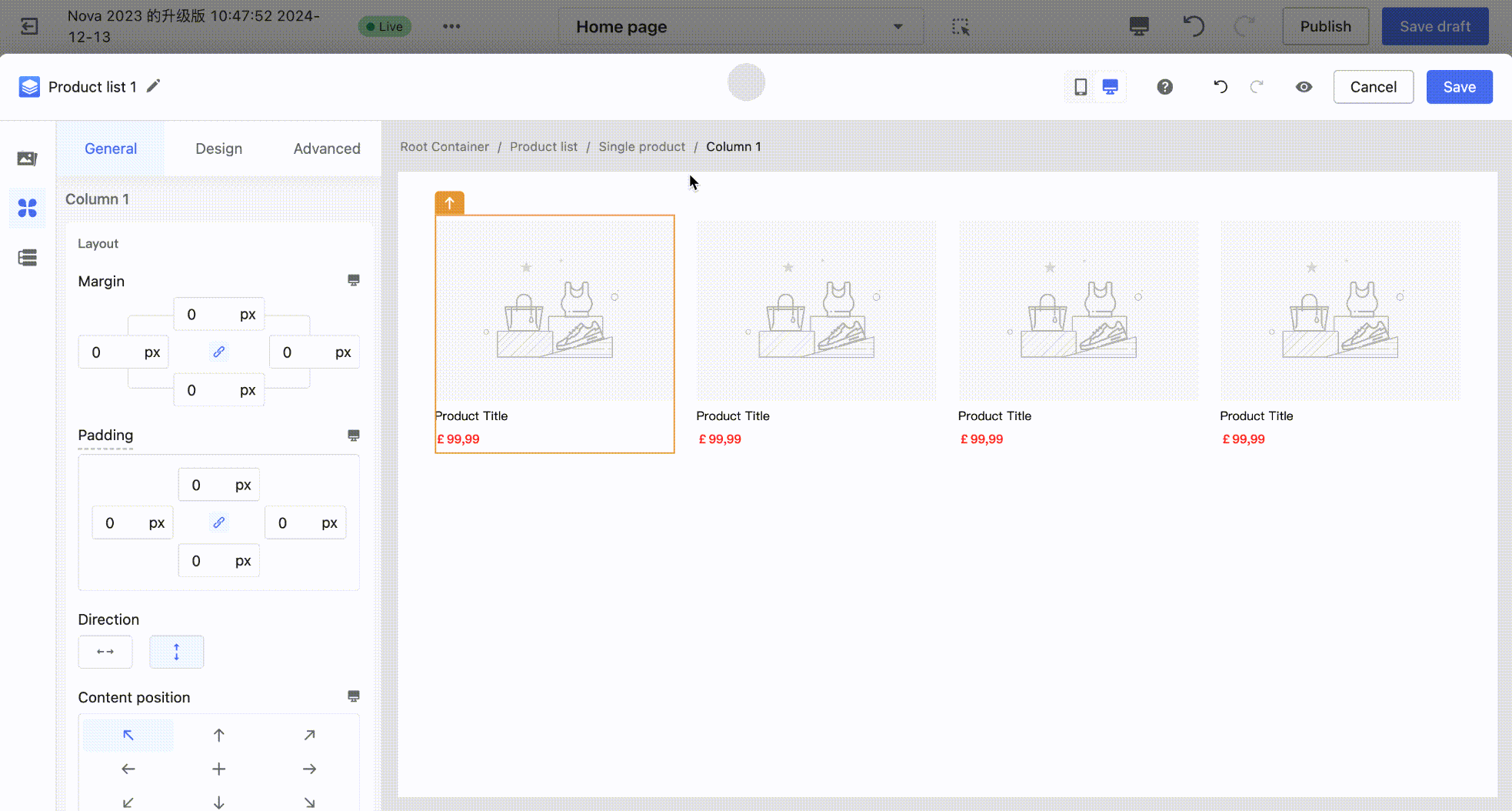
1. Add or Remove Sub-Containers: On the canvas, click to select a single product container (blue outline). In the left-side configuration panel, click Add/Delete Column, and the corresponding sub-containers (yellow outline) within the single product container will be added or removed accordingly.
2. Add or Remove Sub-Containers: On the canvas, click to select a single product container (blue outline). In the left-side configuration panel, click Add/Delete Column, and the corresponding sub-containers (yellow outline) within the single product container will be added or removed accordingly.
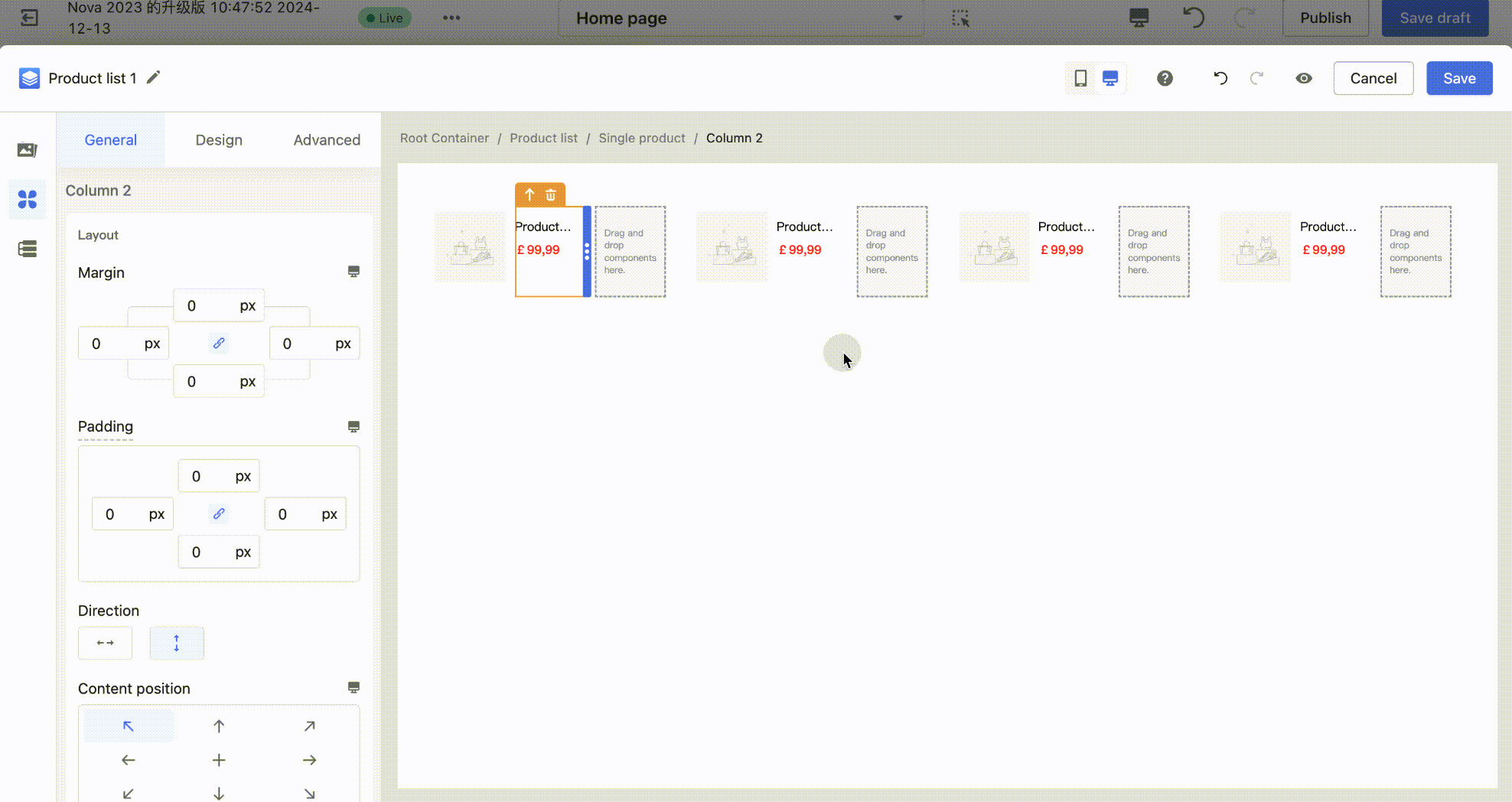
3. Switch Sub-Container Arrangement Direction: On the canvas, click to select a single product container (blue outline). In the left-side configuration panel, click Switch Arrangement Direction to quickly complete the operation. Example: Change a horizontal arrangement to a vertical arrangement.
- Product Information Layout Adjustment
In the product component, the arrangement of product information can only follow the parent container (the sub-container of a single product – yellow outline) and supports a single direction: horizontal or vertical. If you want to create a layout where the overall arrangement is vertical, but the price and discount components are arranged horizontally (as shown in the figure below), additional configuration is required.
1. On the canvas, click to select the sub-container of a single product (yellow outline). In the left-side component panel, drag a 2-column layout container into the sub-container of the single product container.
- Drag the Price and Discount components into the left and right sub-containers (columns) of the upper layout container, respectively.
- Click to select the left sub-container of the layout container, then drag the container's size adjuster to set an appropriate spacing between the Price and Discount components.
Data Binding
All product components support binding to a product data source. For a single product component, the data source must be bound within the single product container. For a product list component, the data source must be bound within the list container. Once bound, all product components inside (such as product images, prices, etc.) will follow the parent container's data source and cannot be modified individually.
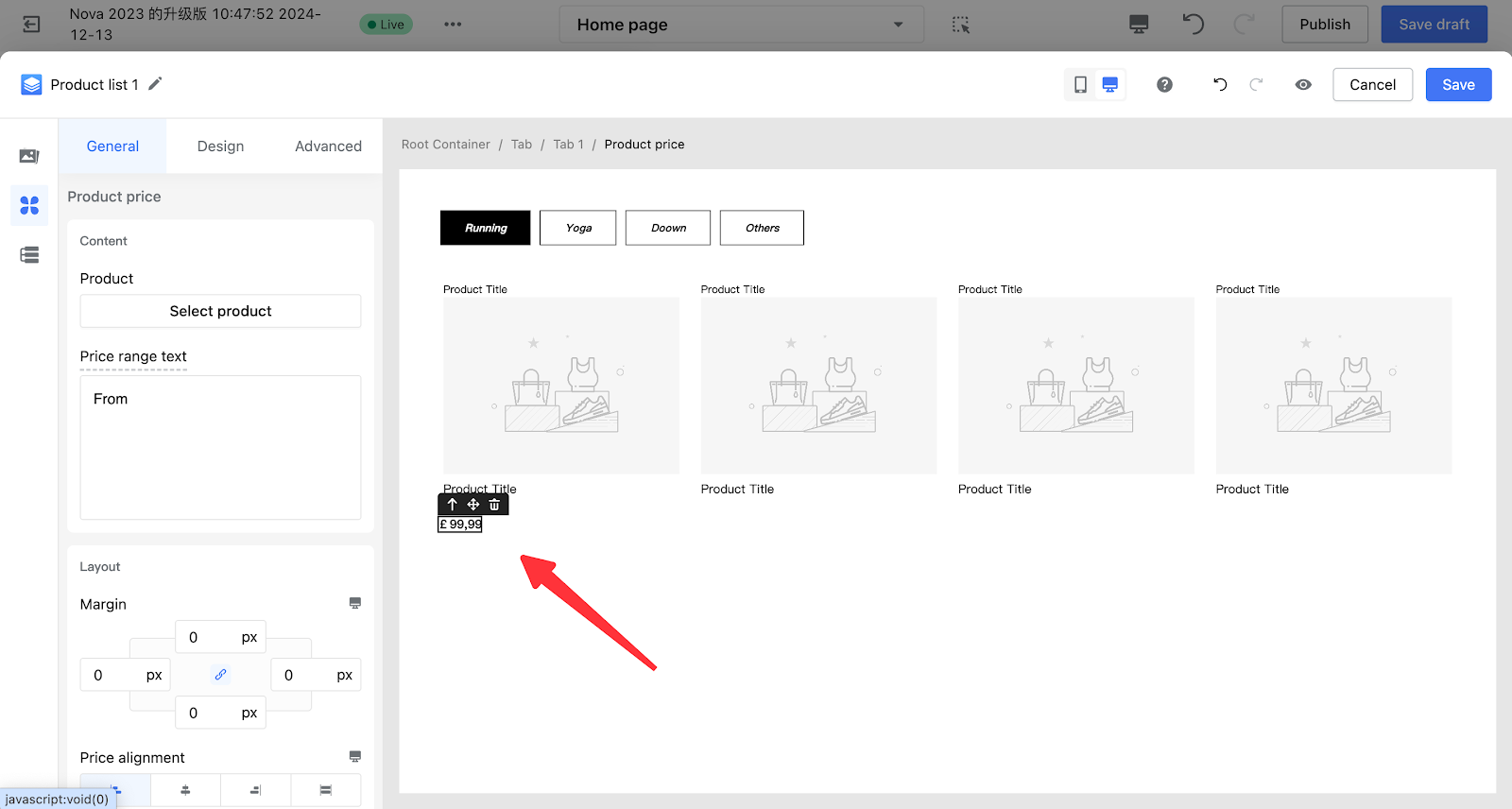
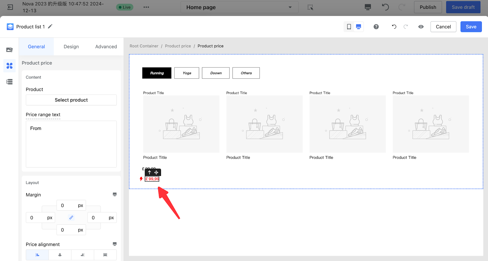
- Binding Product Image / Price / Discount / View Product Details to a Product Data Source (Example: Product Price):
Click to select the product price component on the canvas. In the left-side configuration panel, click Select Product, then check the products you want to bind in the popup window.
- Binding a Single Product Component to a Product Data Source:
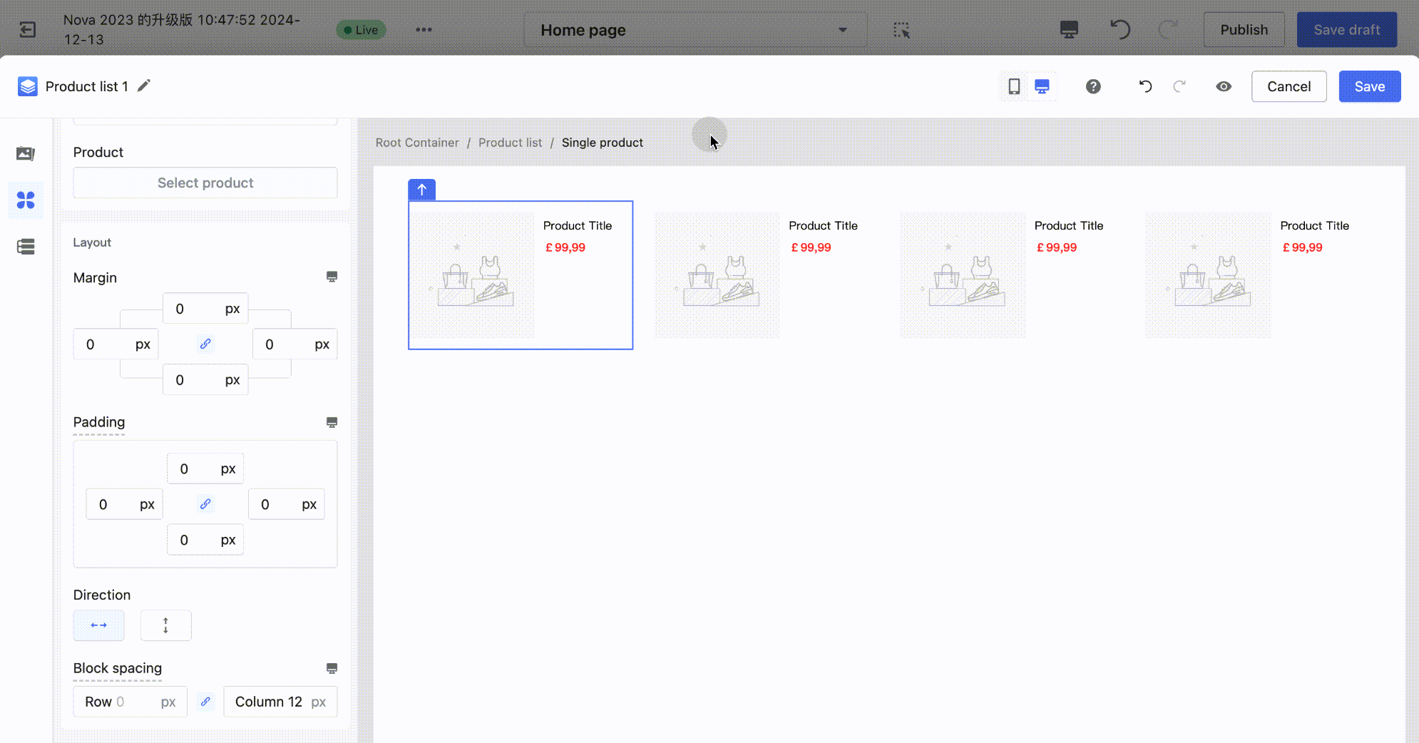
Click to select the single product container on the canvas (blue outline). In the left-side configuration panel, click Select Product, then check the products you want to bind in the popup window.
- Binding a Product List Component to a Product Data Source (Example: Vertical Product List):
Click to select the product list container on the canvas (blue outline). In the left-side configuration panel, click Select Product, then check the products you want to bind in the popup window.
At this point, all product components within the single product container will follow the product data source bound to the parent container, and the "Select Product" option will be disabled, preventing any changes to the product data source.
FAQ:
1. How to understand the reserved padding for Single Product and Product List components?
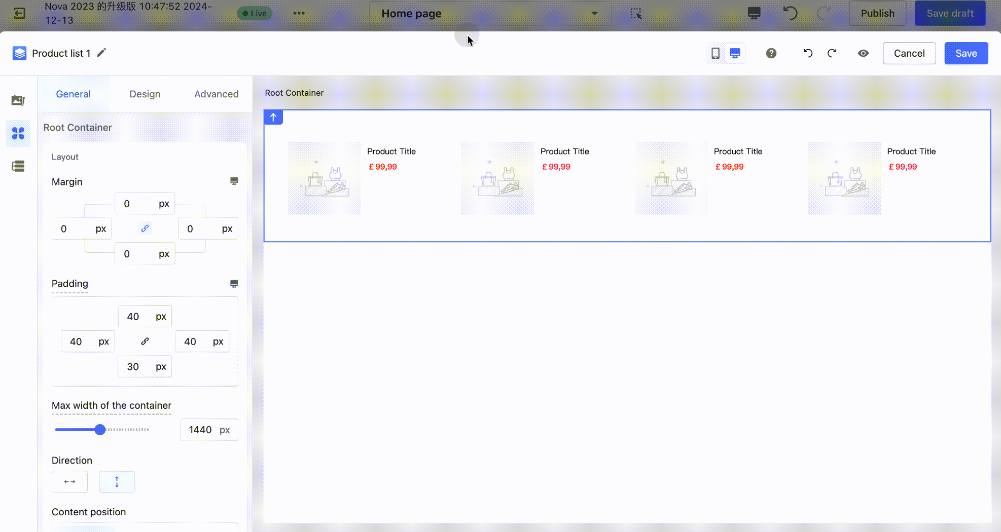
A: Both Single Product and Product List components consist of a container plus product information components (such as product images, product prices, etc.). The container components have a two-layer box structure. Taking a Single Product as an example: there is the parent container (blue outline) and the sub-container (column – yellow outline).
When components are dragged onto the canvas, the reserved padding is only for convenience in selecting and editing within the editor. It will not be displayed as padding on the customer-facing side (C-end). Therefore, the padding and margin configuration values of the component are initially set to 0. Only after manually entering padding values will the styles take effect on the C-end.
Tips
You can view the actual padding effect through Preview Mode.
2. Why can't the Product List component display the loading effect in the editor after binding a product data source?
A: The Page Builder editor environment does not support previewing the loading effect. It will load correctly in the theme editor and on the customer-facing side (C-end).


Comments
Please sign in to leave a comment.