The section spacing feature allows you to customize the white space for existing theme cards/sections on your homepage. This option is available for themes like Bamboo, Boost, Elegant, Eva, Halloween, Hero, Modern, Moon, Morning, Night, Nova2023, and Sweet. It supports most theme cards/sections, excluding slideshow and video sections.
Steps
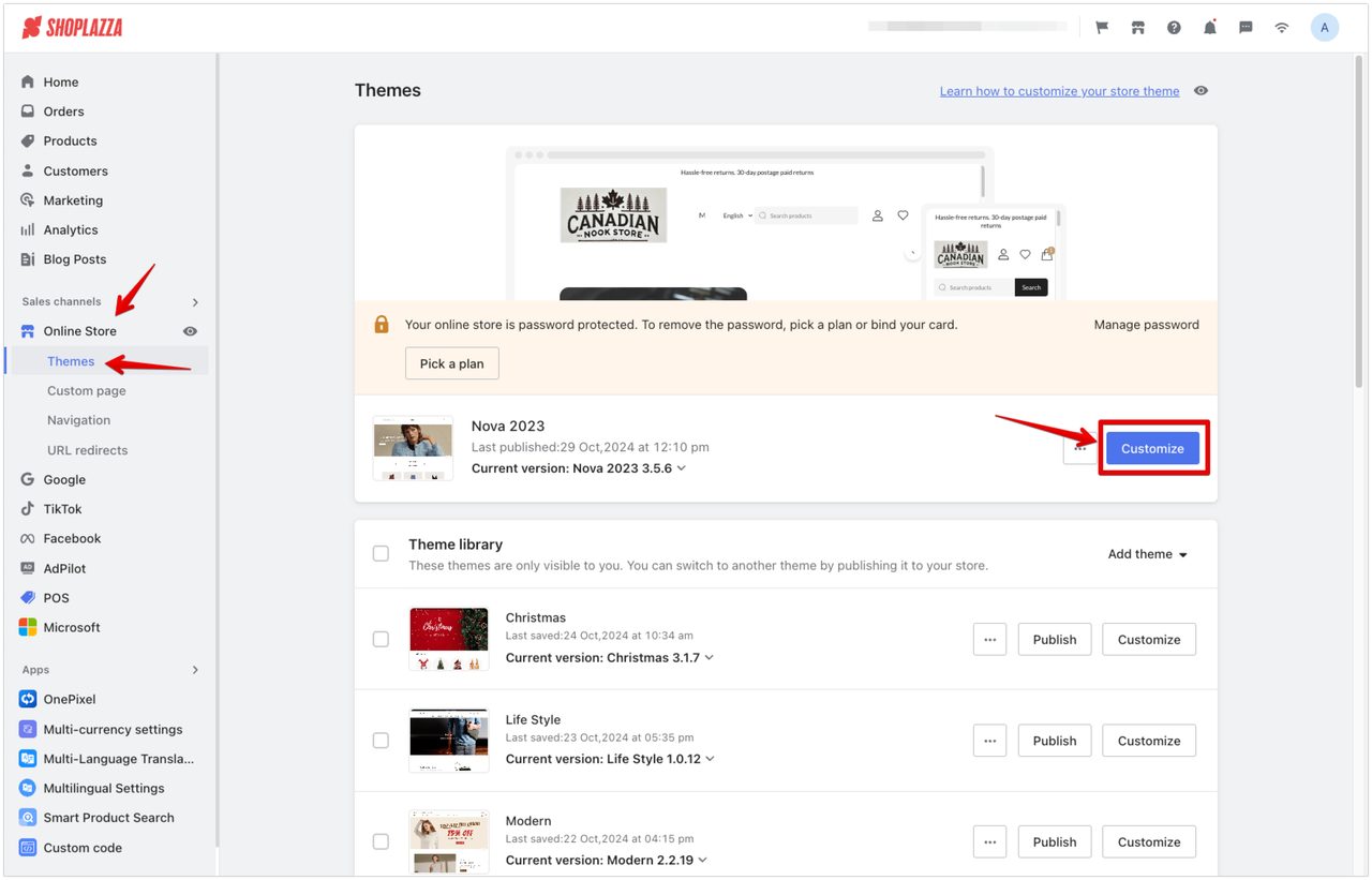
1. Customize your theme: Go to your Shoplazza admin > Store > Themes > Customize. Select your active theme and click Customize.
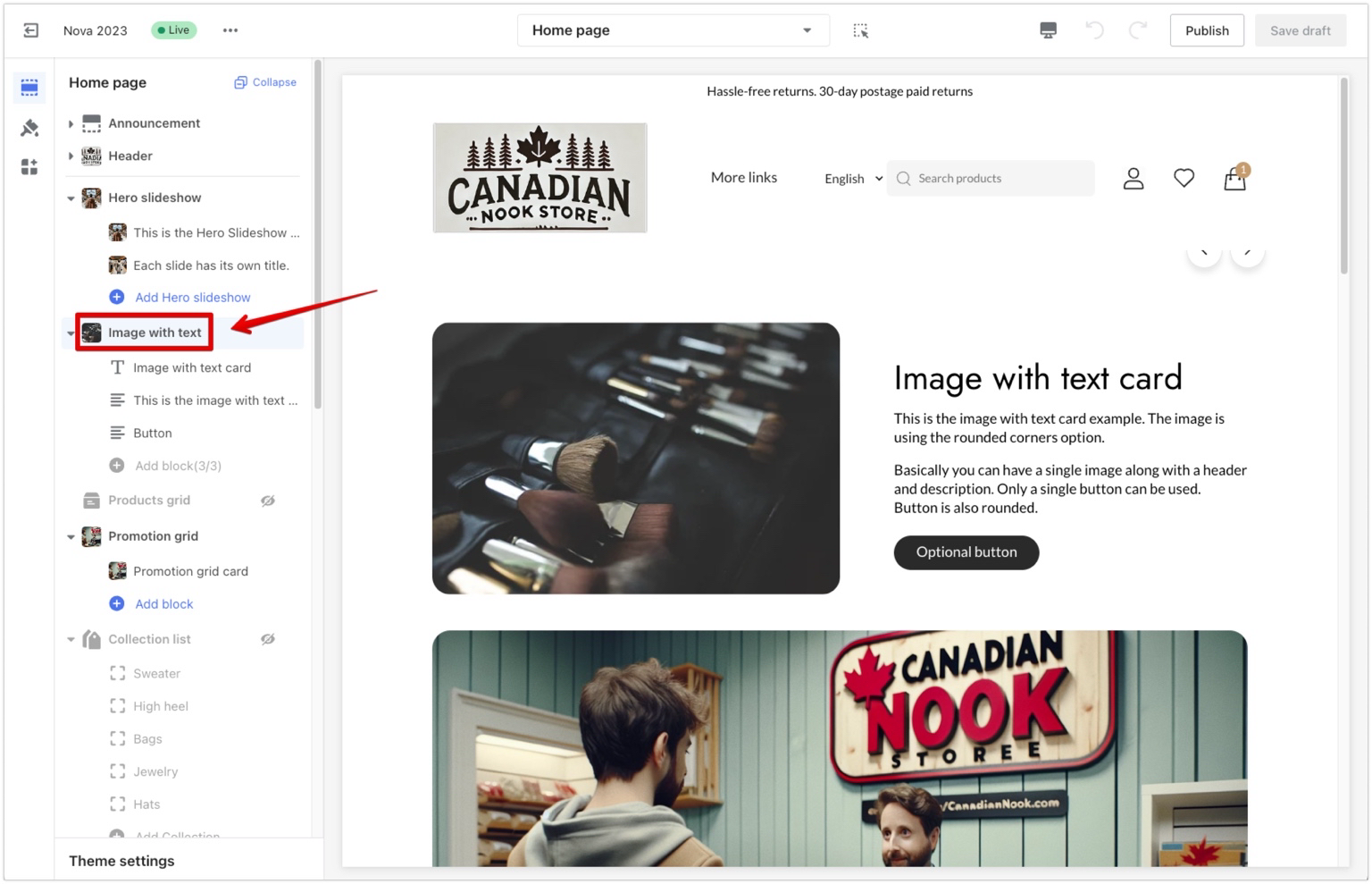
2. Choose a section: Click on the theme card/section title you want to adjust.
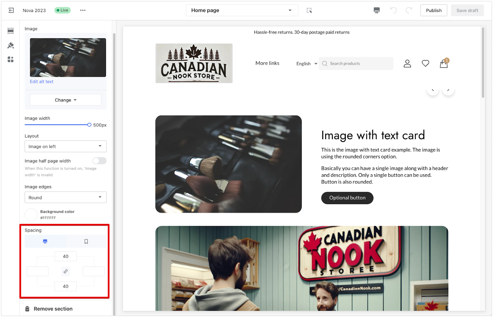
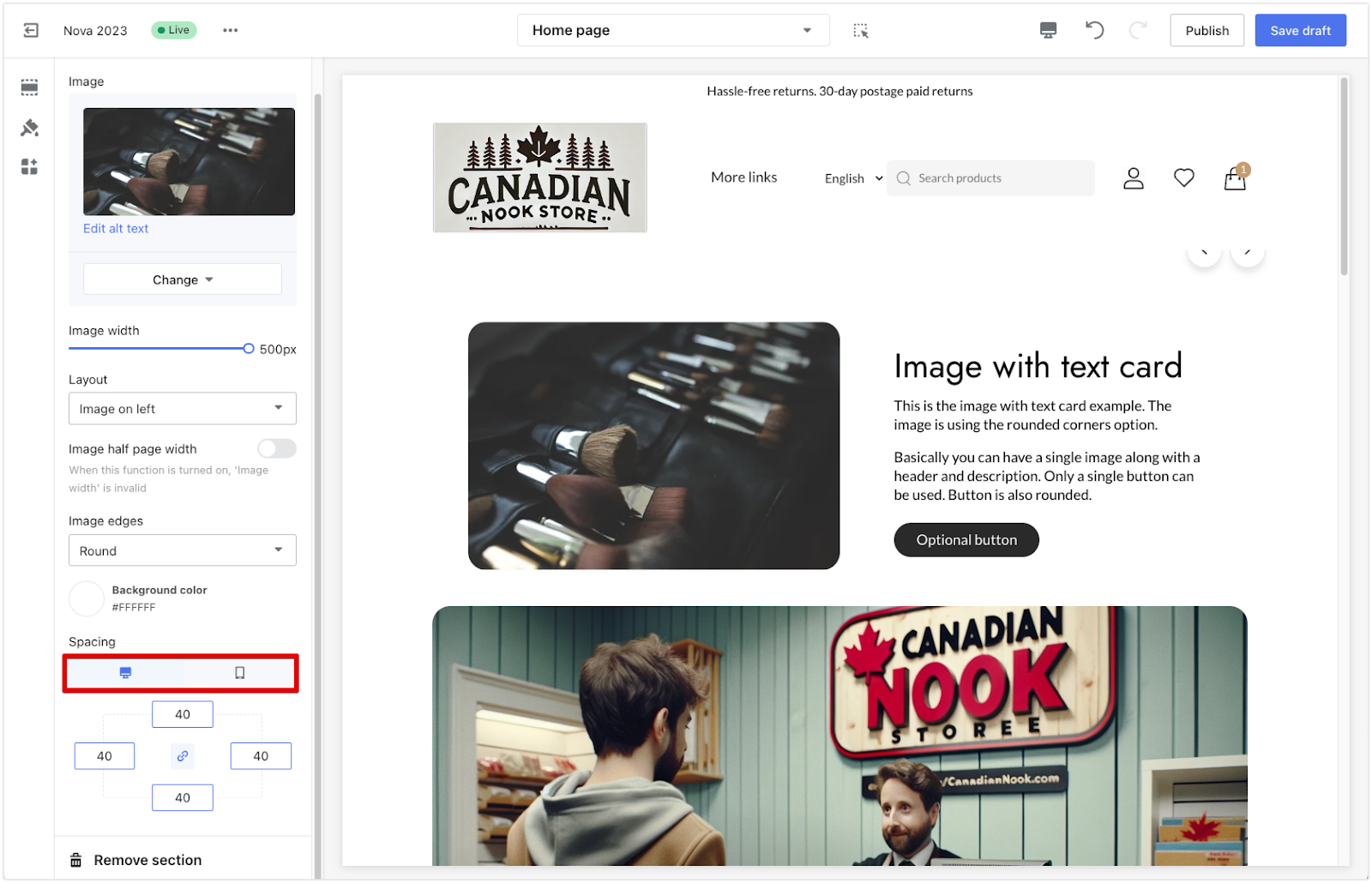
3. Adjust spacing settings: Scroll down to the Spacing settings. In the designated fields, enter values for the top, bottom, left, and right spacing. These values are measured in pixels (PX), where 1 PX represents a single pixel of space. Higher values add more space, while lower values reduce the spacing.
- Link button: Enabling the Link button will lock all four spacing values (top, bottom, left, and right), making them equal. Any change made to one value will automatically apply to the other three. To set different values for each side, ensure that the link button is disabled.
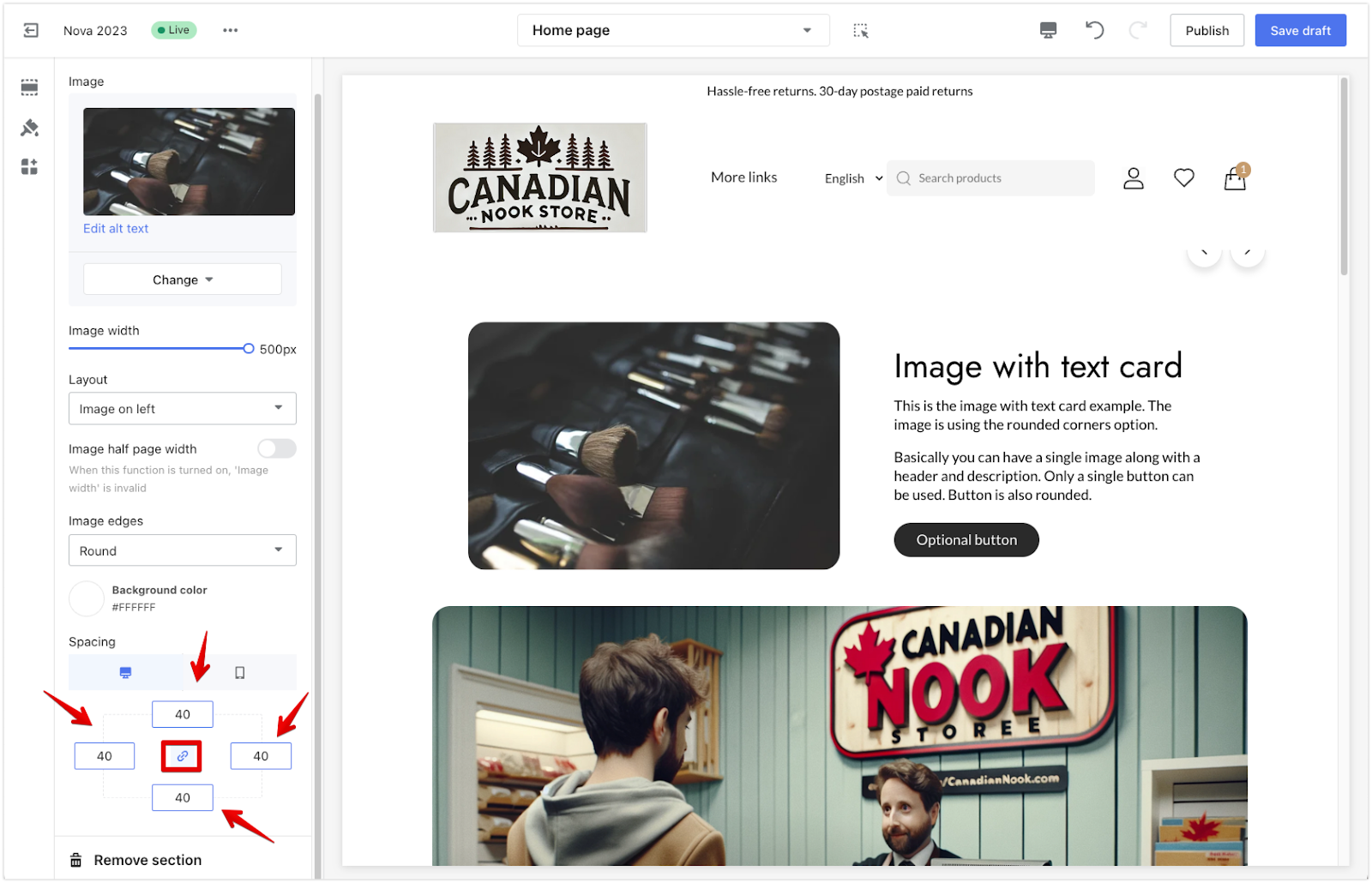
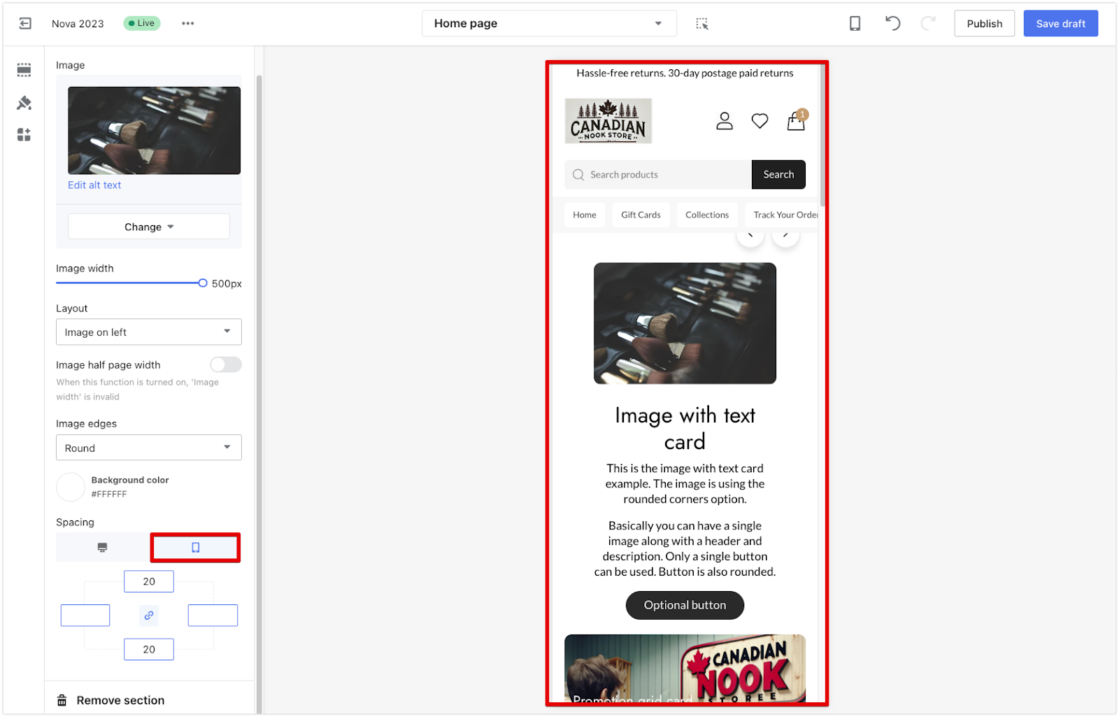
- Preview settings: The Preview icons located above the spacing settings allow you to toggle between desktop and mobile views. This helps you see how the spacing adjustments appear on different devices, ensuring a consistent layout across both.
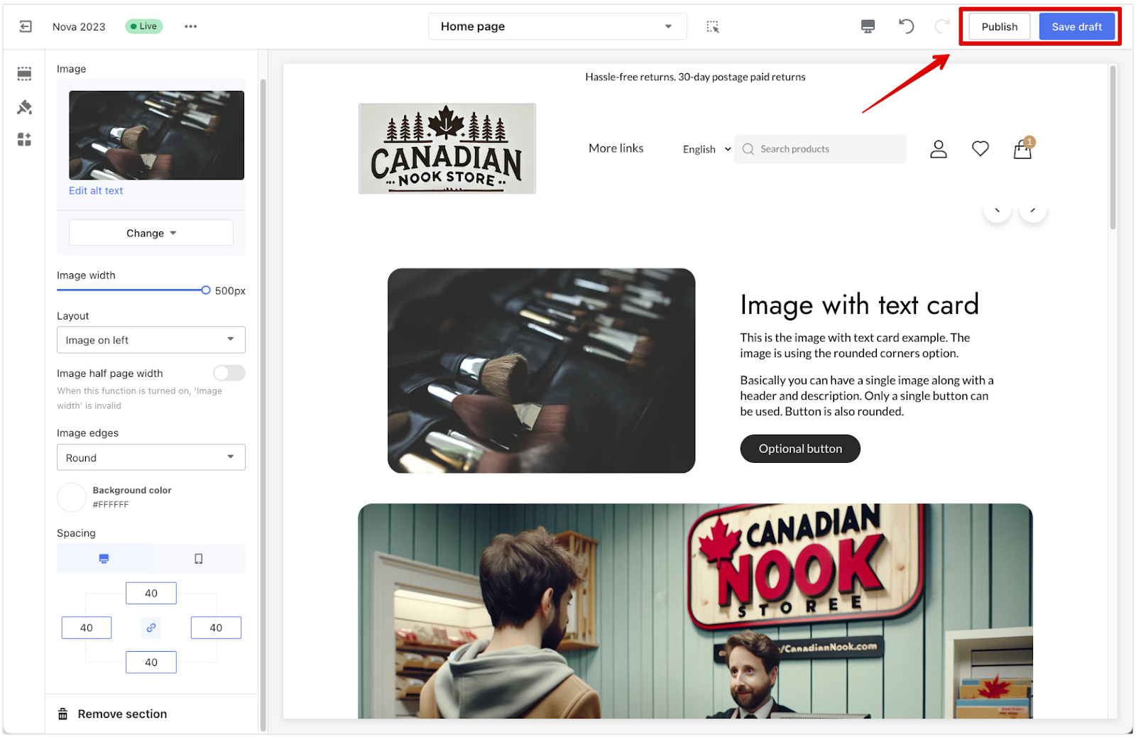
4. Save your changes: Once you’ve made the adjustments, click Save Draft or Publish to apply the changes to your live store.
Adjusting the spacing of your theme cards/sections helps create a balanced and visually appealing layout. Use the link button for uniform spacing or deactivate it for more customized adjustments. Remember to preview changes on both desktop and mobile for the best user experience.


Comments
Please sign in to leave a comment.