
Shoplazza themes are responsive, which means your online store can be viewed on desktop, mobile, and tablet. To improve how your content displays across devices and meet your design needs, many themes support editing content separately for PC and mobile. This allows you to adjust images and layouts to better suit different screen sizes and browsing habits.
Using built-in theme sections
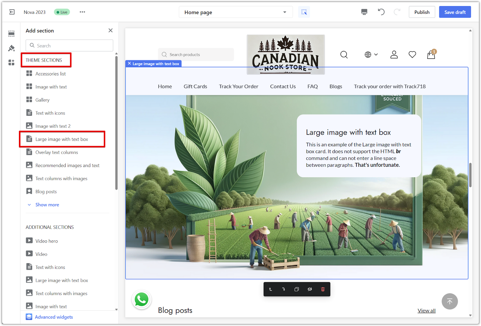
Many themes include sections that support uploading different content for desktop and mobile views. This is especially common in the Nova2023 theme series, where several sections allow for separate image uploads by device.
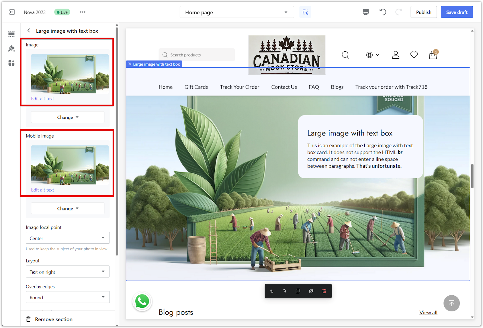
1. Upload separate images in supported sections: Some sections offer two upload areas for images, allowing you to display one version on desktop and a different one on mobile. This helps optimize how your visuals appear on each device.
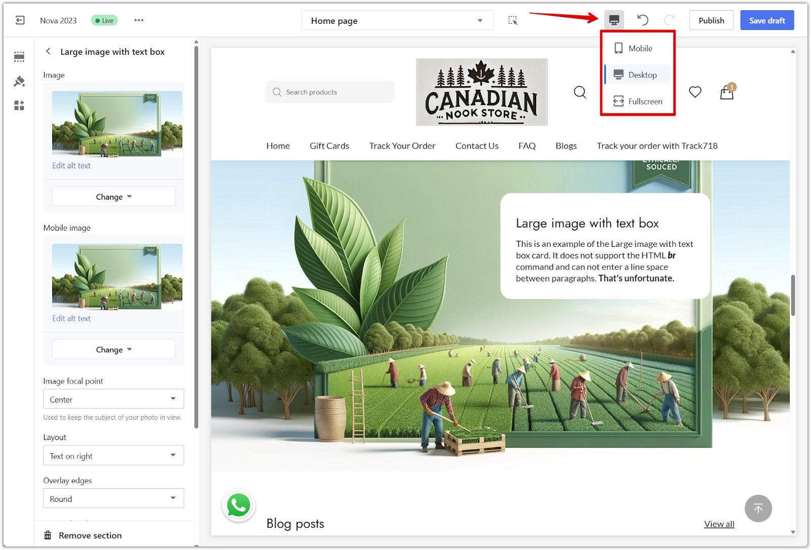
2. Preview the results on each device: After uploading your content, use the preview tool in the editor to check how each section appears on desktop and mobile. This ensures your layout stays clear and consistent across different screen sizes.
Note
To check which sections support separate uploads and what image sizes to use, refer to Recommended image sizes for theme cards. If a section includes separate dimensions for mobile, it supports uploading different content for each device. If only one size is listed, the same content will automatically adjust to fit all screens.
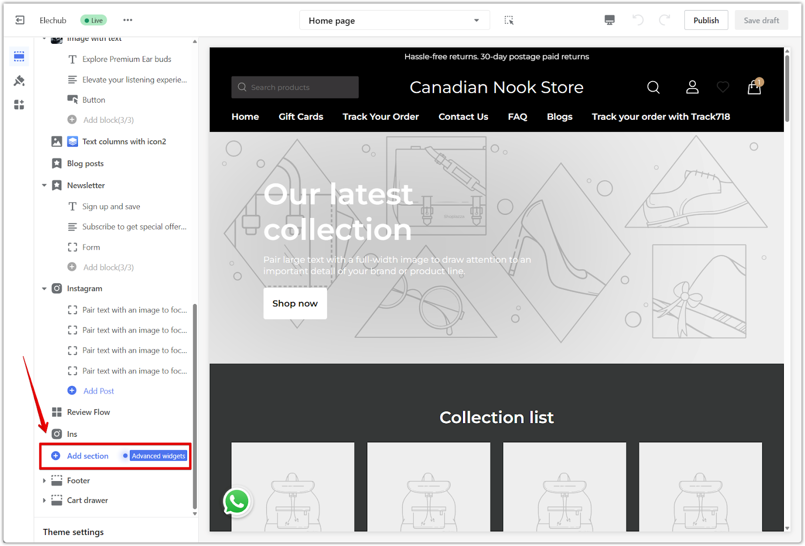
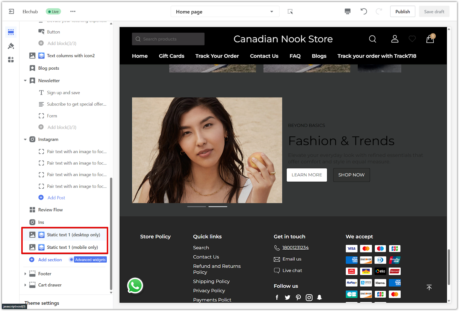
Using Advanced widgets with Page Builder
If the built-in sections do not support the layout or content you want, using Advanced widgets via the Page Builder allows for more customization. These can be used to control what appears on desktop and mobile separately. Advanced widgets are responsive by default, which means most templates will automatically adjust your content to fit both desktop and mobile screens. In many cases, you only need to upload an image or text block once, and it will scale appropriately across devices.
Adding an Advanced widget
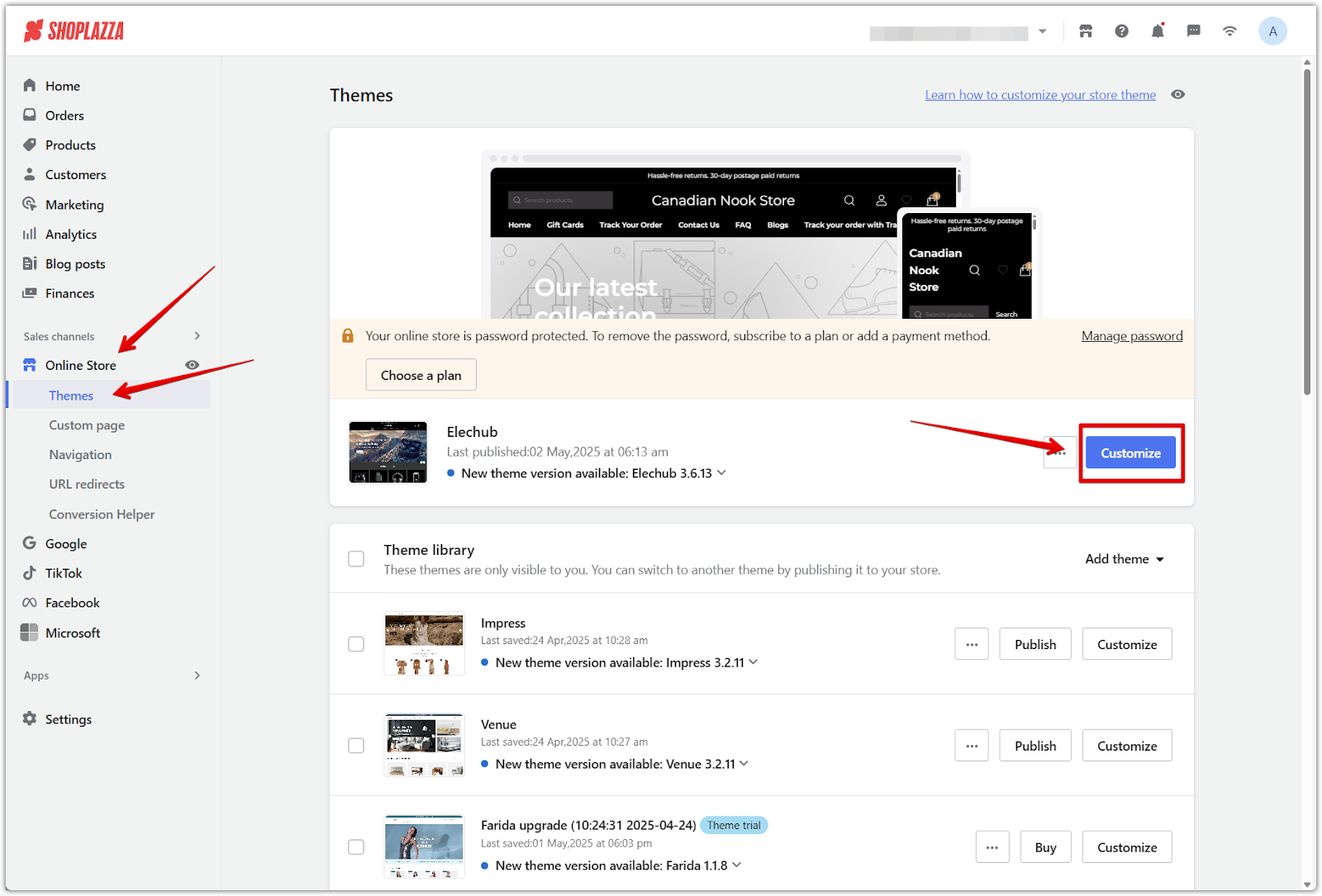
1. Open the theme editor: Go to Shoplazza admin > Online store > Themes, select your theme, then click Customize to open the editor.
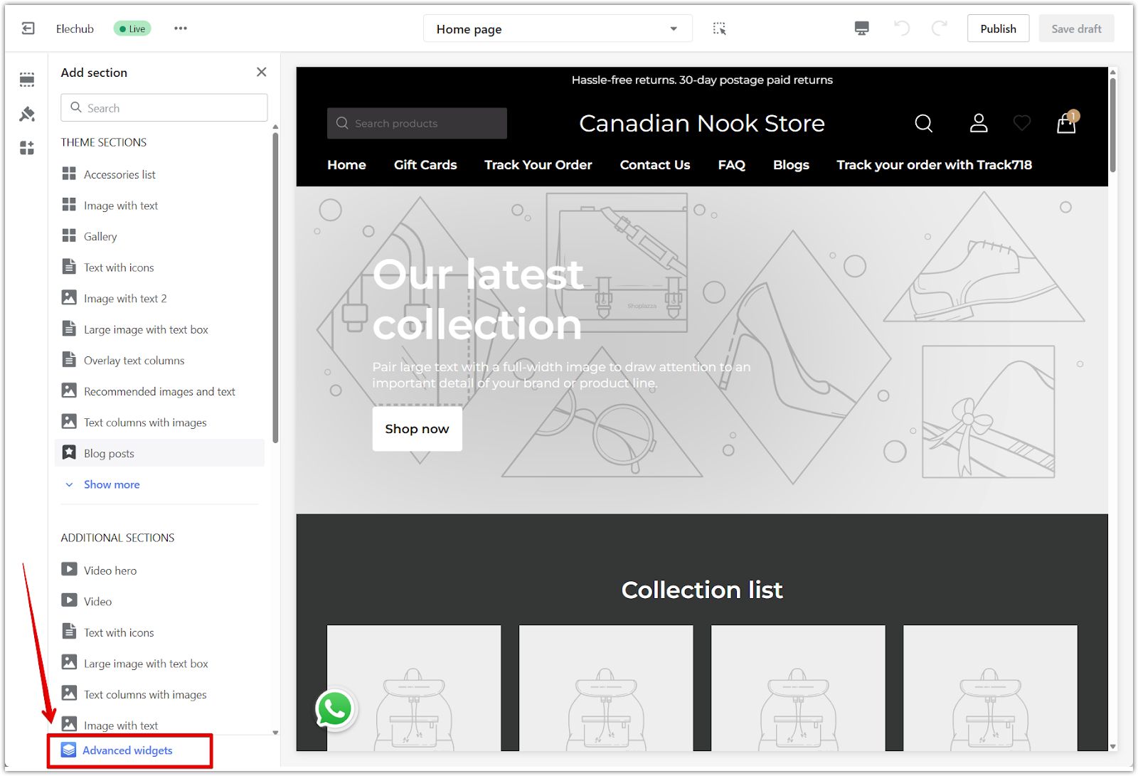
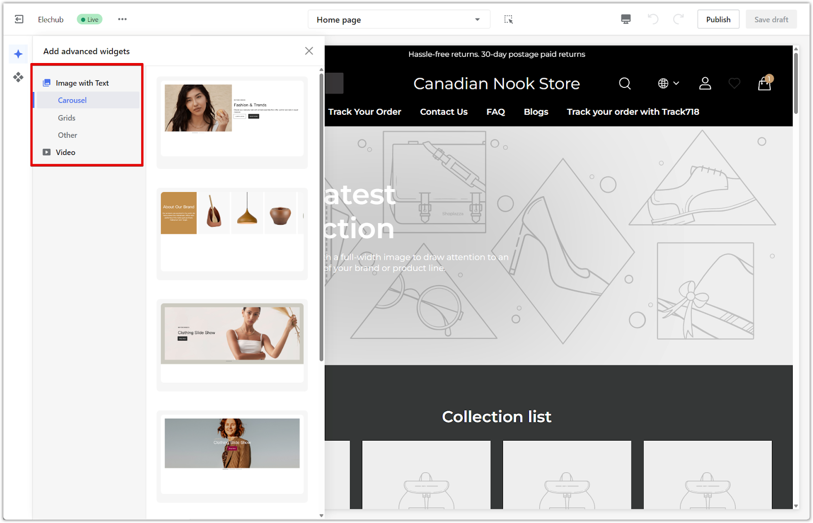
2. Add an Advanced widget: In the left-side panel, scroll to the bottom of the section list and click Add section. Select Advanced widgets to open the available templates.
Show different content on desktop and mobile
If you want to display different content on each device, add two of the same Advanced widgets. You’ll use one for desktop and one for mobile.
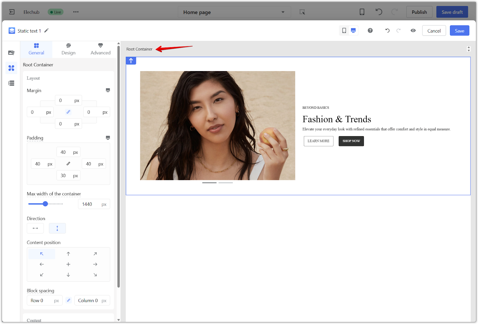
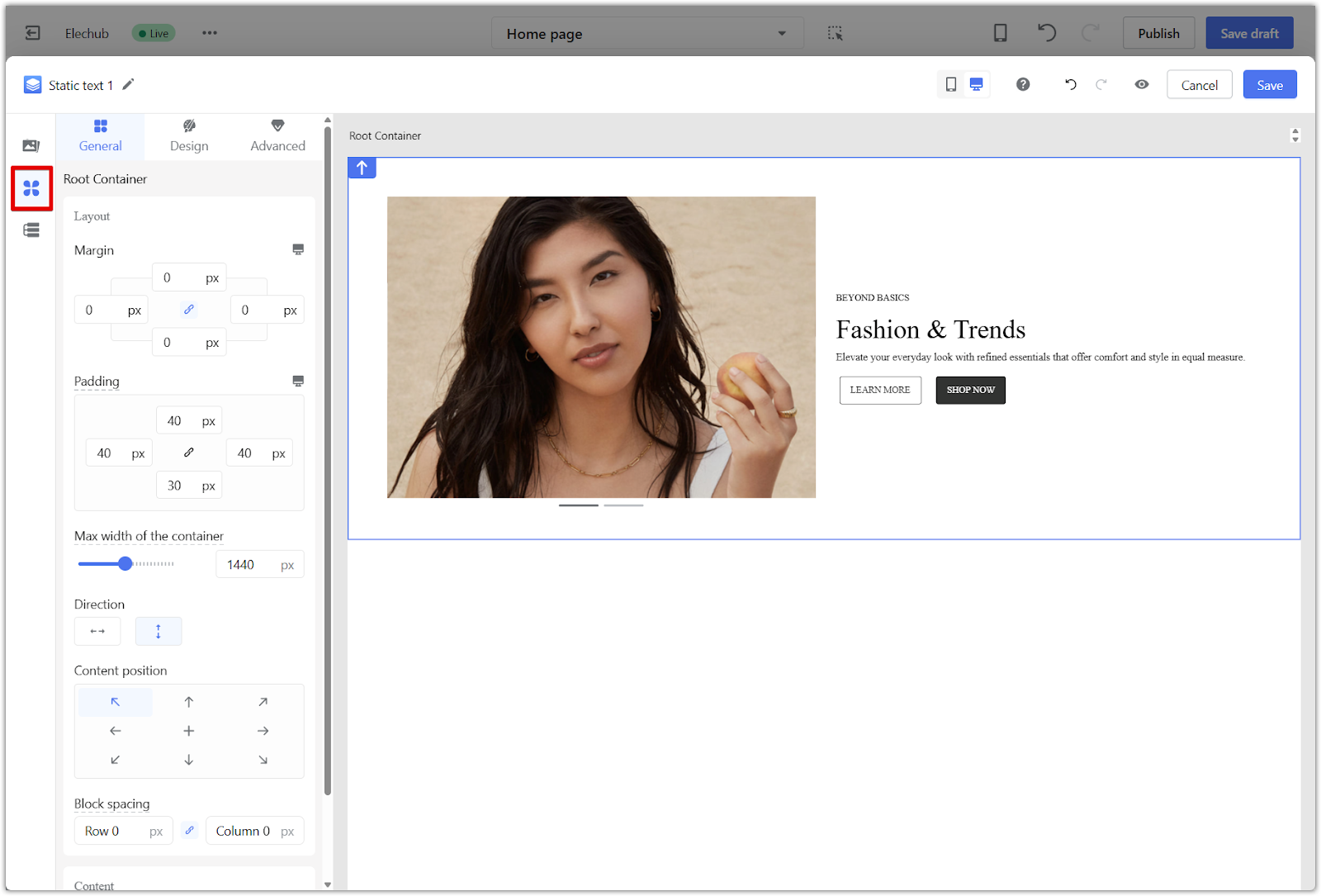
1. Click the widget container: Hover near the outside edge of the widget until a blue border appears around the full section. This is the main root container that controls visibility for the entire block.
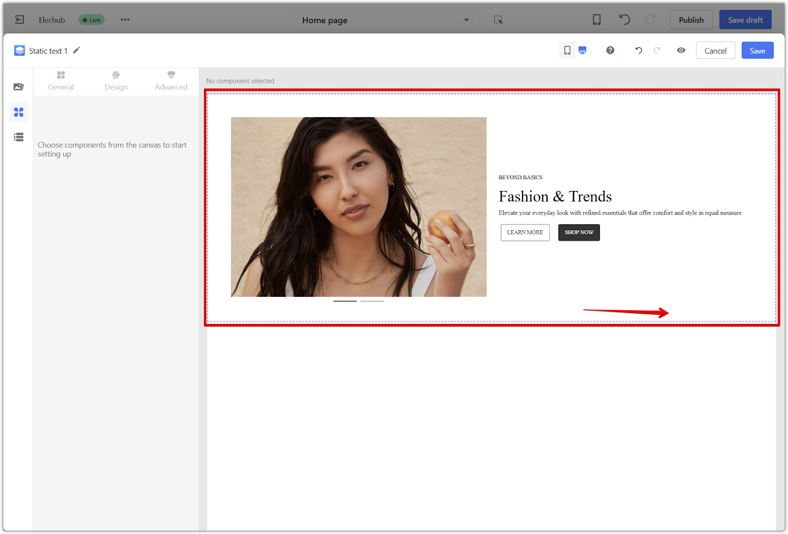
2. Attribute settings open automatically: After you click the container, the editor will automatically switch to the Attribute settings panel on the left side.
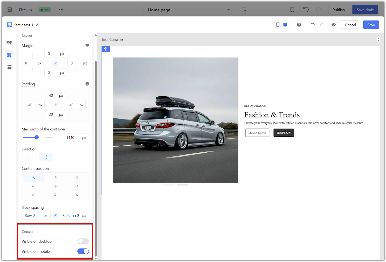
3. Set device visibility: In the Content section, use the toggles to choose whether the widget is visible on desktop, mobile, or both.
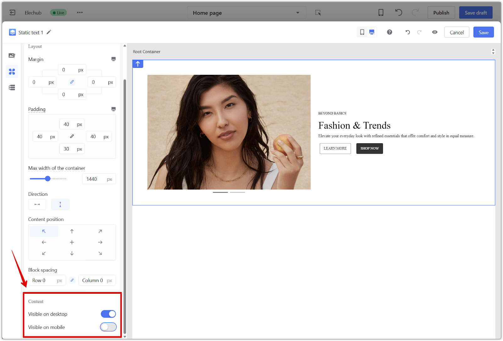
4. Upload different content: Repeat these steps for the second widget. Use different images or text depending on what you want to show for each device. One should be set to show only on desktop, and the other only on mobile.
For more details on using Page Builder features such as duplicating sections, adjusting layouts, and managing content visibility, visit the Page Builder | Quick Start Guide to the Editor.
Editing content separately for desktop and mobile helps your store look professional across all devices. Use built-in theme sections or Advanced widgets to customize the layout and improve the browsing experience for your customers.


Comments
Please sign in to leave a comment.