
Enhancing your website’s mobile view with submenu dropdowns can greatly improve user navigation and overall site performance. This feature allows users to explore submenus directly on the current page without having to load new pages. By making it easier for users to find and access information, you can create a smoother and more efficient browsing experience, leading to higher user satisfaction and engagement. This guide will walk you through the steps to enable submenu dropdowns for mobile display in the Farida theme.
Benefits of submenu dropdowns
- Reduce page jumps: Decreases loading and waiting times, making the user experience smoother and more efficient.
- Improve user experience: Allows users to quickly browse submenus without leaving the current page, reducing the risk of users getting "lost."
- Enhance information architecture clarity: Clearly displays the hierarchical structure of information, improving discoverability and accessibility.
- Encourage user exploration and discovery: Direct submenu expansion offers users opportunities to explore and discover new content.
- Increase user engagement: Users are more likely to interact with the website, boosting overall site activity.
Note
This feature is exclusive to and only supported by the Farida theme. It also supports RTL (right-to-left) style adaptation. Examples in this guide use the standard style.
Enabling submenu dropdowns
Enable submenu dropdowns to improve mobile navigation on your website. This feature allows users to access submenus directly on the current page, providing a smoother and more efficient browsing experience.
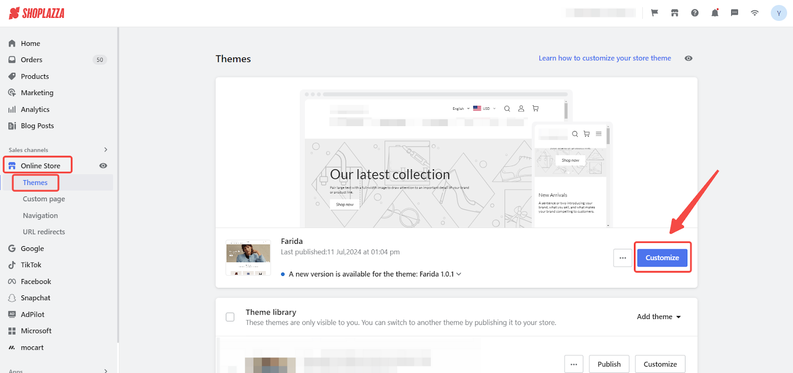
1. Access Shoplazza admin: From your Shoplazza admin, go to Online Store > Theme > Customize to begin.
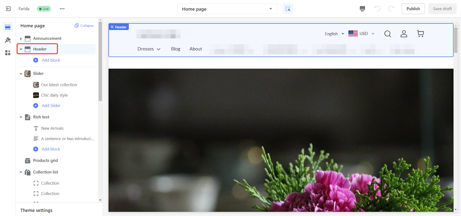
2. Access the header settings: In the theme editor, click on the Header section.
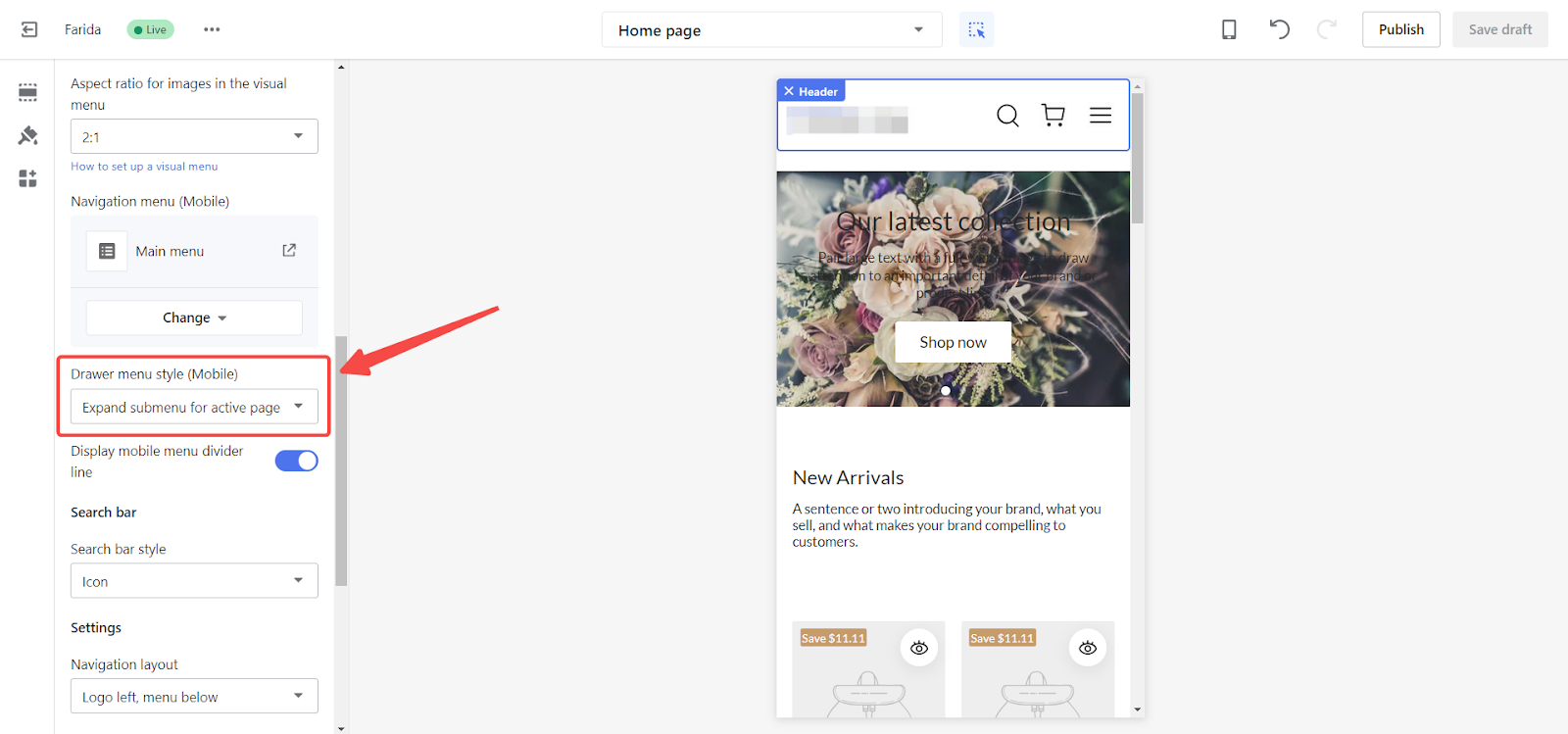
3. Enable submenu dropdowns: Scroll down to find the Drawer menu style (Mobile) section and select the option for Expand submenu for active page to enable submenu dropdowns.
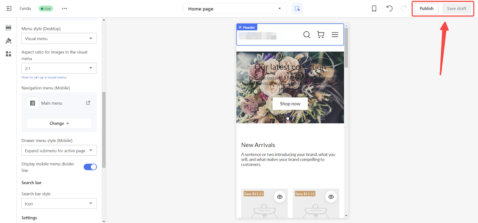
4. Save and Publish: Click Save draft and then Publish to apply the changes.
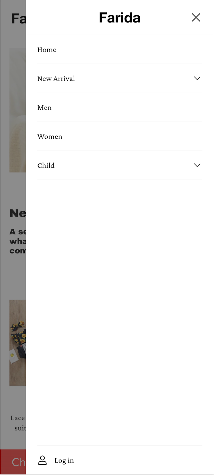
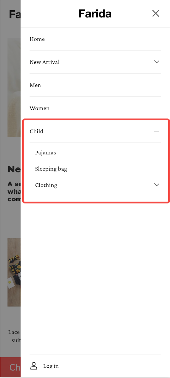
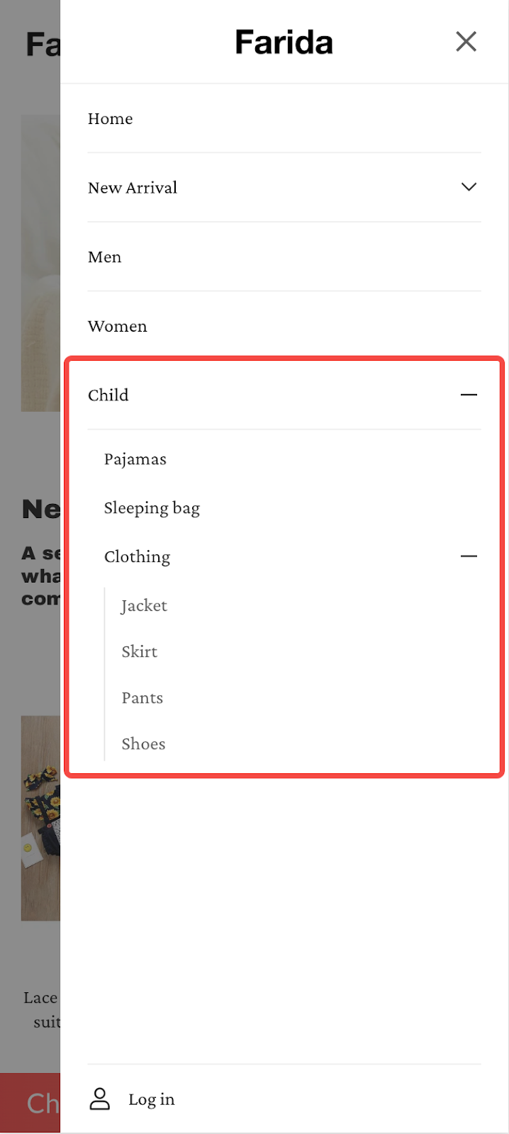
Mobile display demonstration
See how submenu dropdowns function on mobile devices. These examples illustrate how users can navigate through different menu levels, enhancing their browsing experience and interaction with your site.
|
Main menu navigation
|
Second-level menu
|
Third-level menu
|
 |
 |
 |
Completing these steps will enhance the user experience on your website’s mobile view, making navigation more intuitive and efficient. This will help users find what they are looking for quickly and easily, ultimately improving their interaction with your site and boosting engagement.


Comments
Please sign in to leave a comment.