
The Farida theme offers versatile layout options for product detail pages, catering to different browsing habits and enhancing the overall shopping experience. Customizing these layouts helps boost product appeal, increase conversion rates, and adapt quickly to market demands. This feature is exclusive to the Farida theme and supports RTL (right-to-left) style adaptation, ensuring a seamless experience for all users. Examples in this guide use the standard style.
Note
This feature is exclusive to and only supported by the Farida theme. It also supports RTL (right-to-left) style adaptation. Examples in this guide use the standard style.
Setting up product detail page layouts
Follow these steps to customize the layout of your product detail pages, ensuring they meet your customers’ browsing preferences and enhance their overall shopping experience.
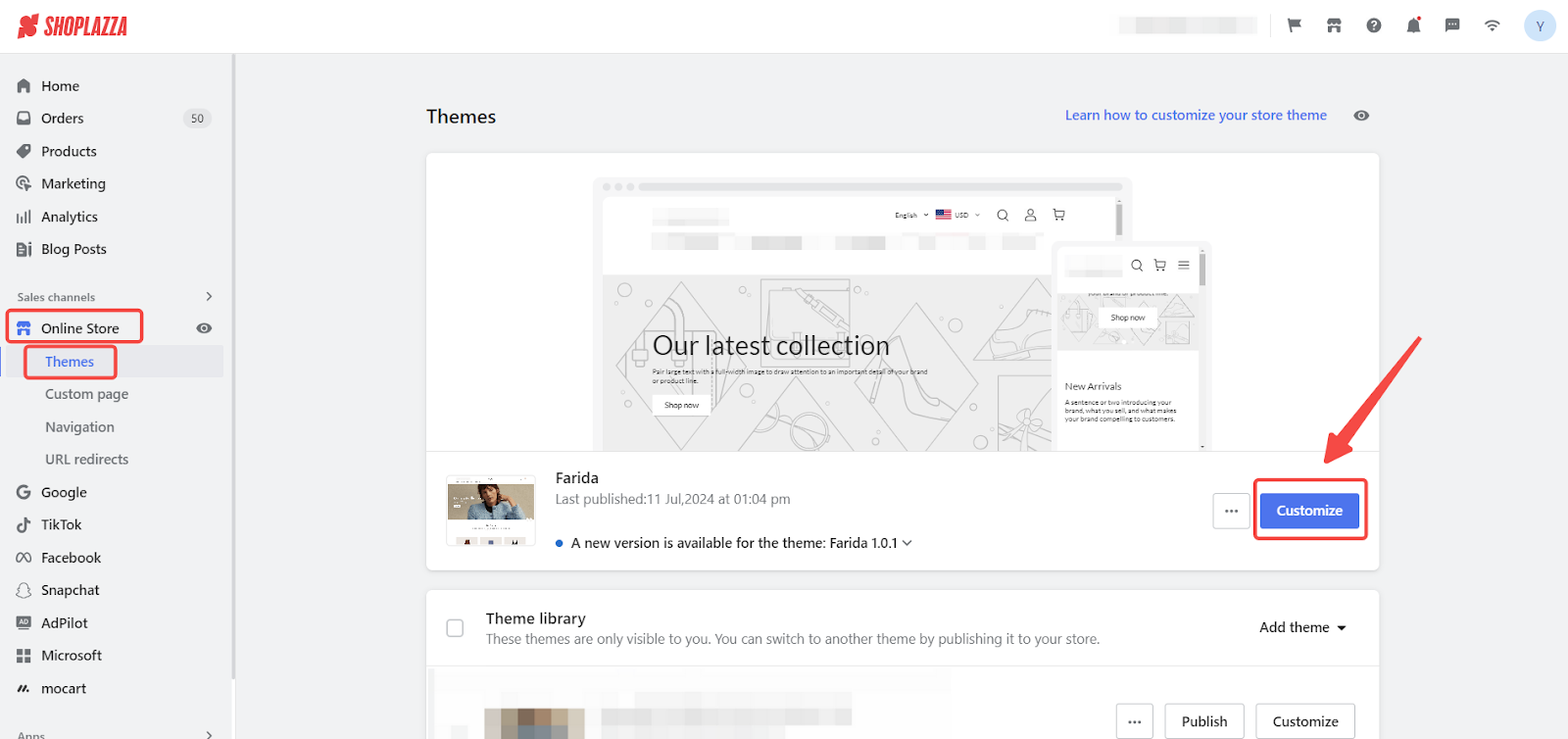
1. Access Shoplazza admin: From your Shoplazza admin, go to Online Store > Theme > Customize to begin.
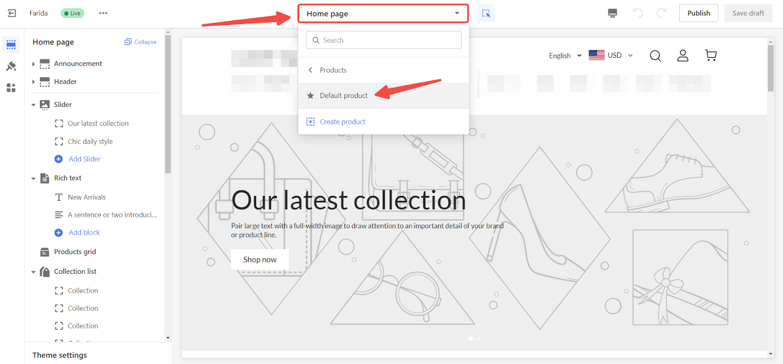
2. Open the product details page: In the theme editor, use the dropdown menu to select Product > Default product to access the default product details page for customizations.
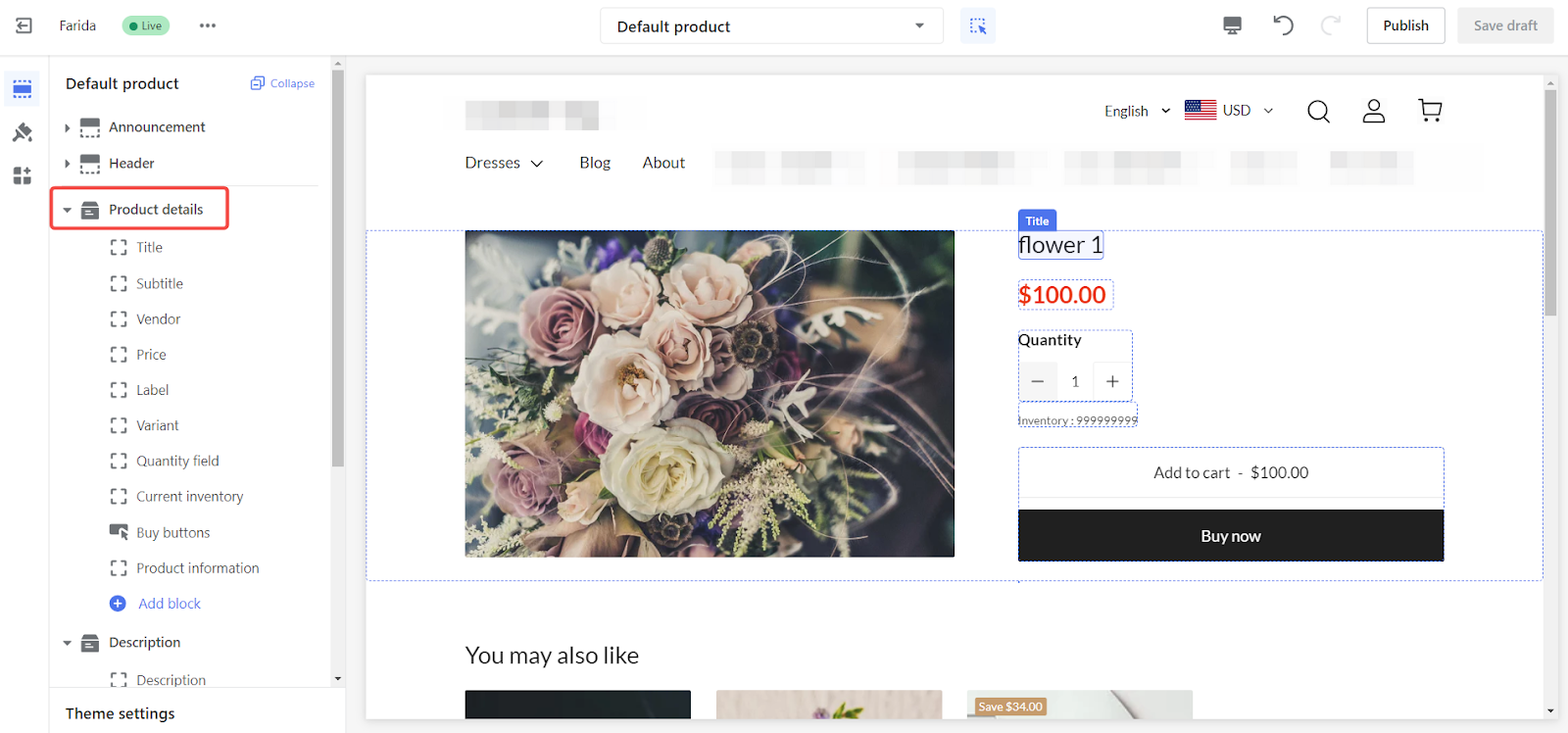
3. Select product detail settings: Click on Product detail on the left side to configure various aspects of your product detail pages.
Configuring PC layout alignment
Adjust the alignment and appearance of your product details on desktop devices to provide a visually appealing and user-friendly experience for PC users.
1. PC layout alignment: Choose either a Left-aligned or Centered content layout for the PC view to set the preferred alignment for your product details.
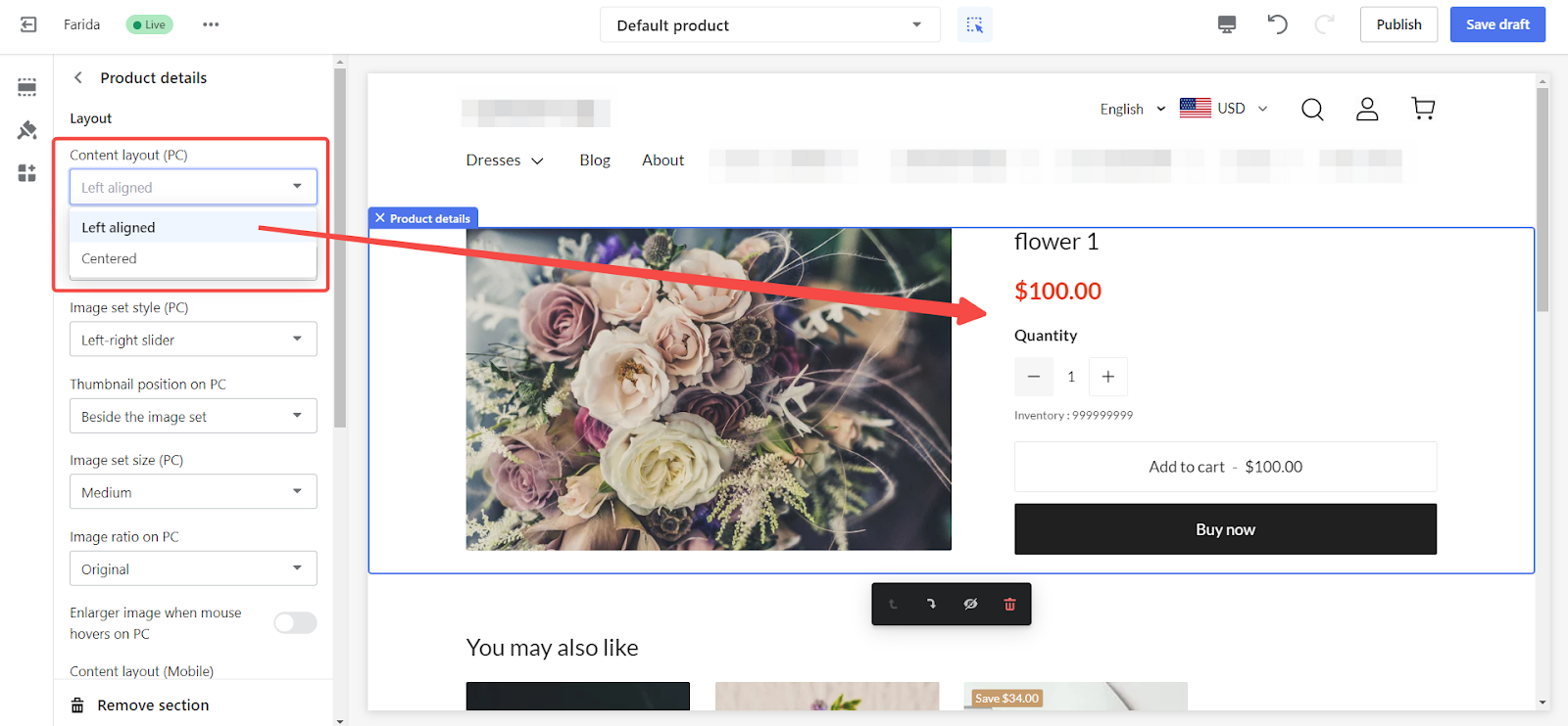
2. Adjust PC product detail settings:
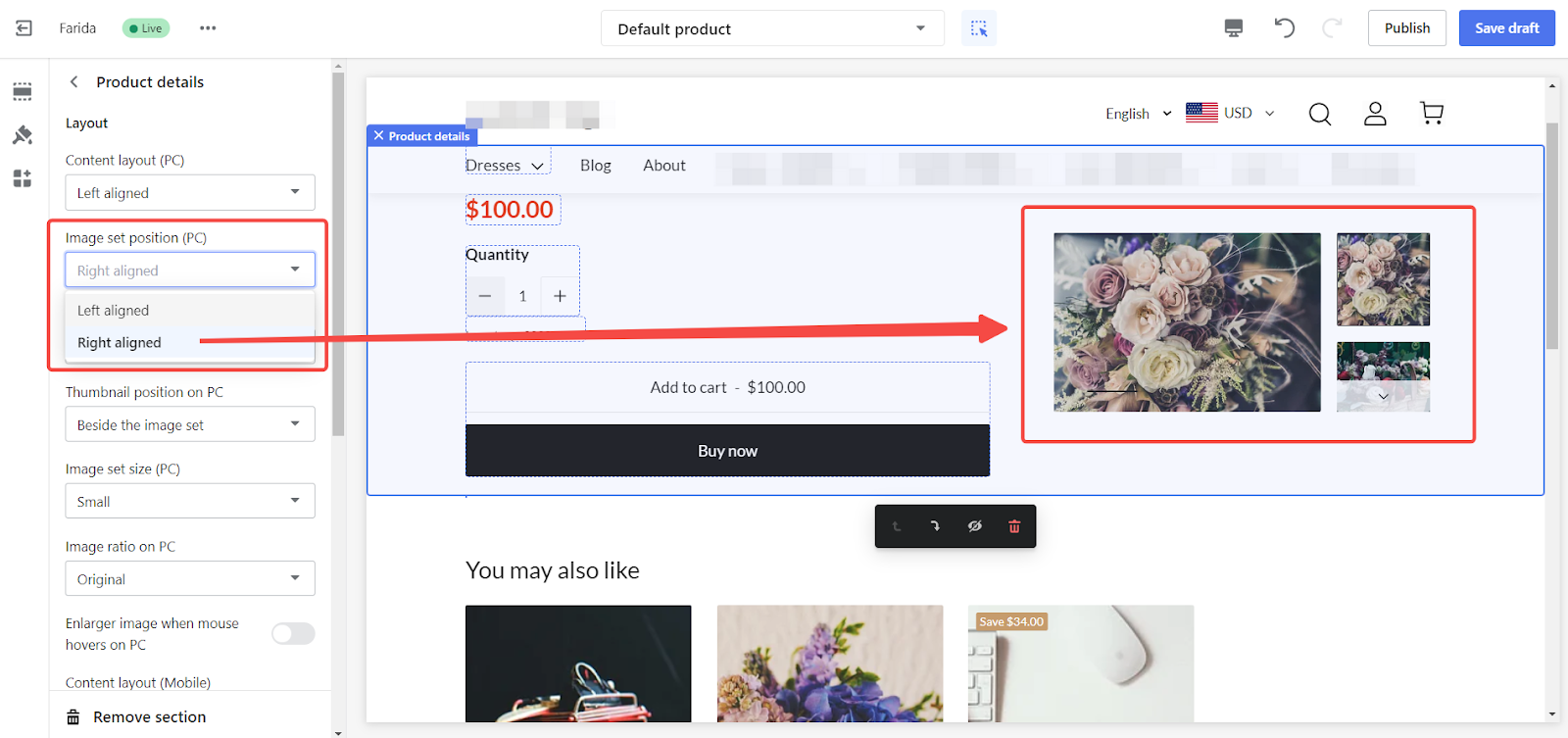
- Image position: Position the gallery to the left or right.
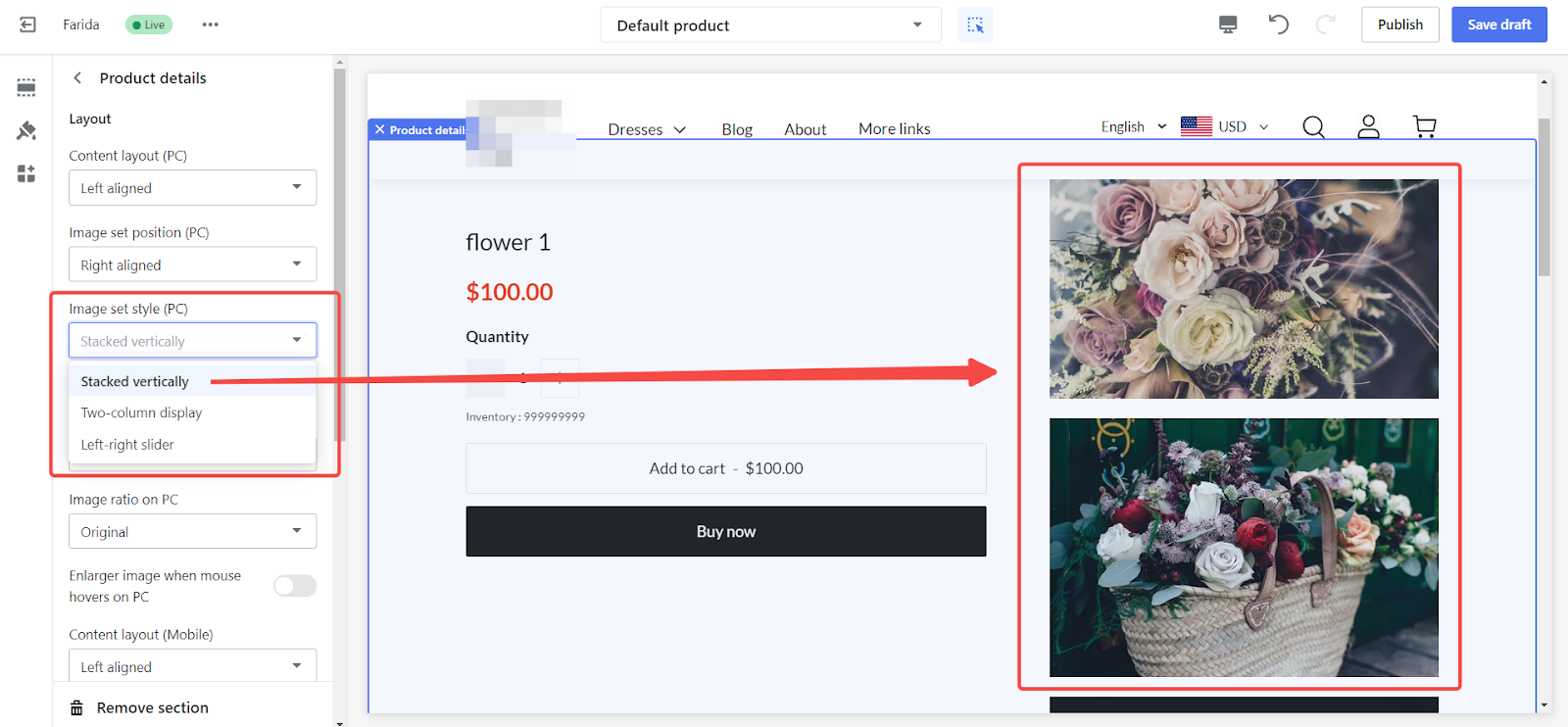
- Image style: Choose from options like Stacked vertically, Two-column display, or Left-right slider.
- Stacked vertically: Display product images in a vertical stack, allowing users to scroll through images in a single column.
- Two-column display: Arrange product images in two columns, providing a balanced and organized layout.
- Left-right slider: Use a slider to display product images side-by-side, allowing users to navigate through images horizontally.
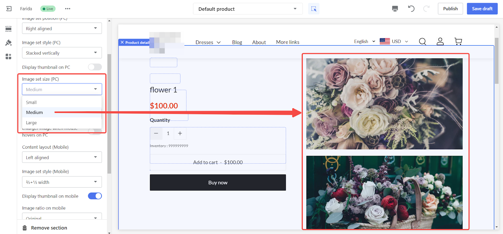
- Image size: Adjust the gallery size to Small, Medium, or Large.
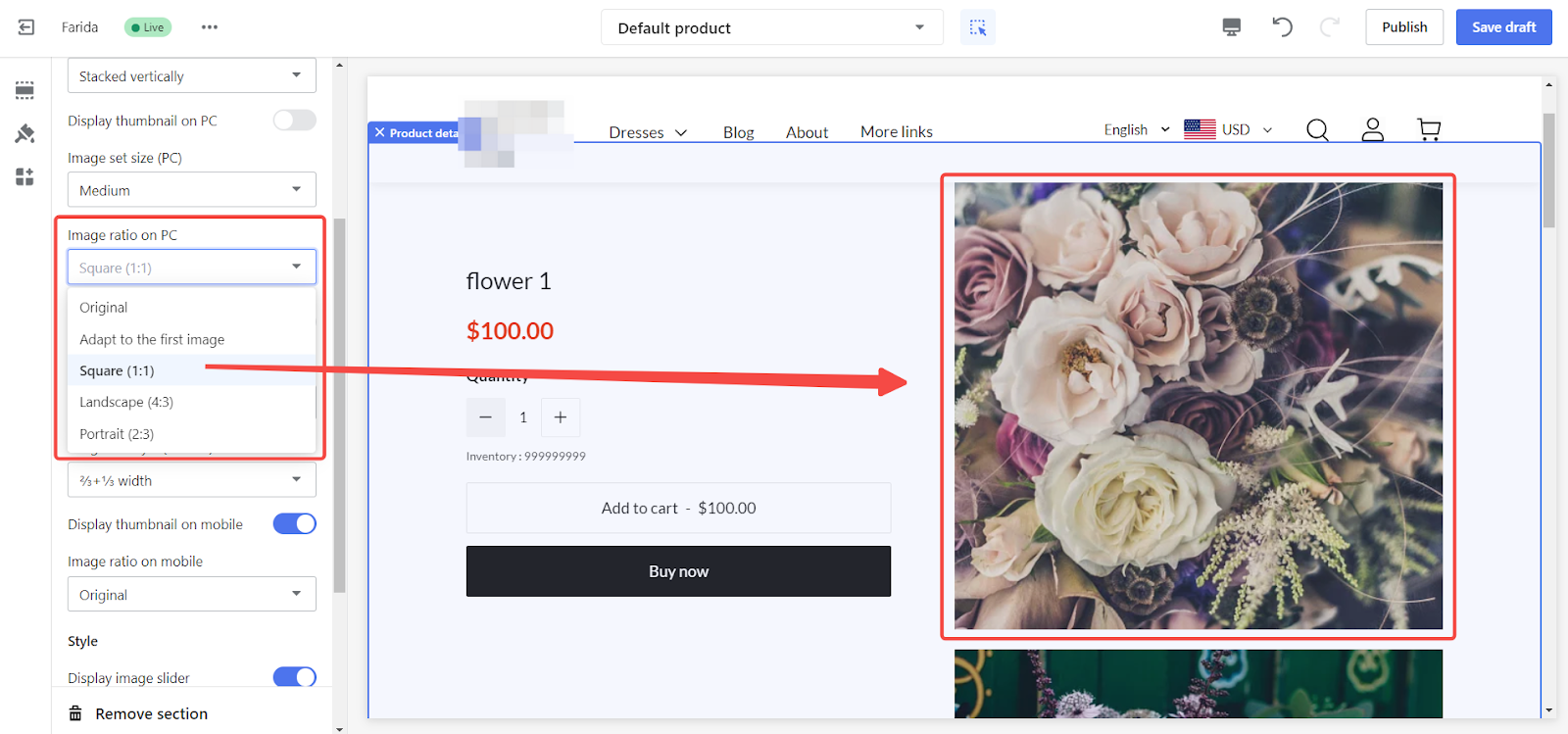
- Image ratio: Select the ratio for image proportions such as Original, Adapt to the first image, Square (1:1), Landscape (4:3), or Portrait (2:3).
- Original: Display images in their original aspect ratio without any cropping.
- Adapt to the first image: Adjust all subsequent images to match the aspect ratio of the first image in the gallery, creating a consistent visual appearance.
- Square (1:1): Crop images to a square format, making them uniform and visually neat.
- Landscape (4:3): Use a landscape format for images, which is wider than it is tall, suitable for broader, horizontal displays.
- Portrait (2:3): Use a portrait format for images, which is taller than it is wide, suitable for vertical displays.
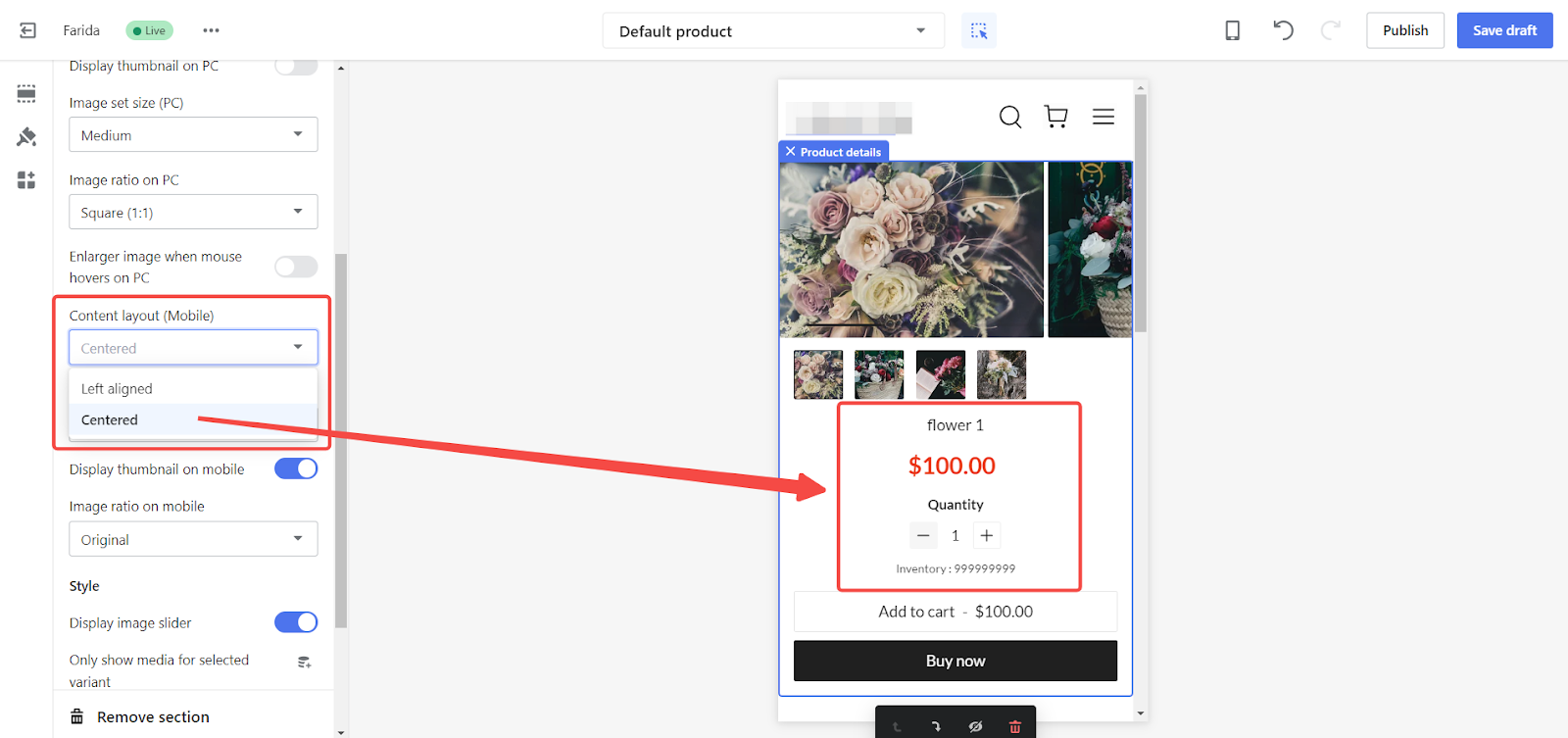
Setting mobile layout alignment
Customize the alignment and appearance of your product details on mobile devices to ensure a seamless shopping experience for users on the go.
1. Mobile layout alignment: Choose either Left-aligned or Centered layout to set the preferred alignment for your product details on mobile devices.
2. Adjust mobile product detail settings:
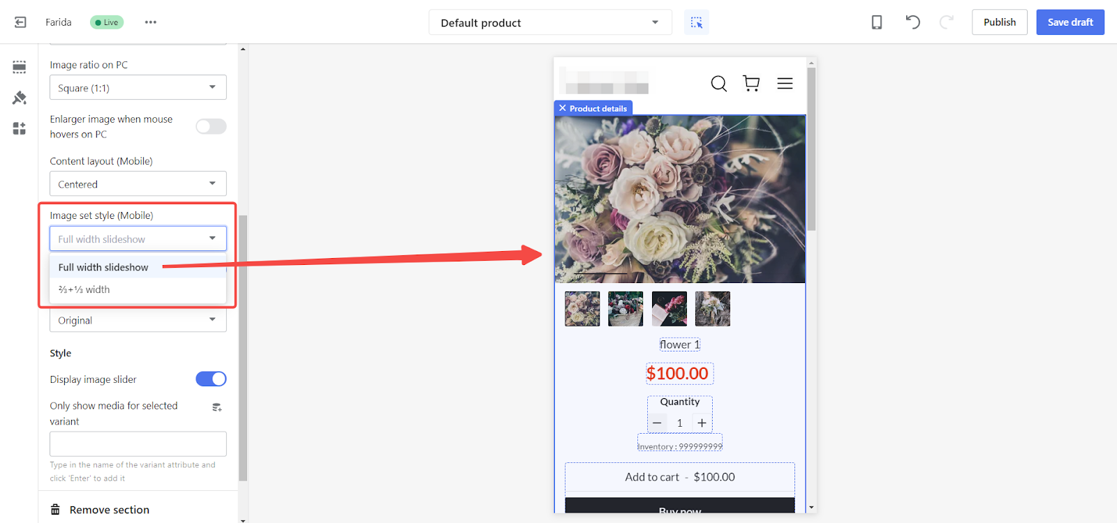
- Image style: Select from various display options to optimize the presentation of your product images on mobile devices.
- Full-width: Display product images in a full-width format for maximum visibility.
- 2/3 + 1/3 width: Arrange product images in a split layout, with the main image occupying two-thirds of the screen and additional images in the remaining one-third.
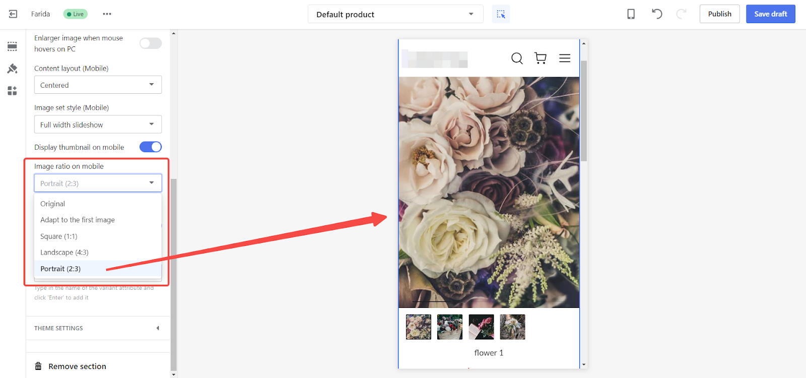
- Image ratio: Options include:
- Original: Display images in their original aspect ratio without any cropping.
- Adapt to the first image: Adjust all subsequent images to match the aspect ratio of the first image in the gallery, creating a consistent visual appearance.
- Square (1:1): Crop images to a square format, making them uniform and visually neat.
- Landscape (4:3): Use a landscape format for images, which is wider than it is tall, suitable for broader, horizontal displays.
- Portrait (2:3): Use a portrait format for images, which is taller than it is wide, suitable for vertical displays.
Saving and publishing changes
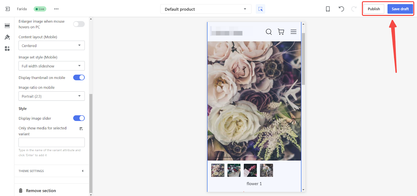
1. Save and Publish: Click Save draft to save your settings or Publish to make your changes live.
Completing these steps allows you to customize the layout of your product detail pages to better suit your customers’ preferences and improve their shopping experience.


Comments
Please sign in to leave a comment.