
The Geek theme, along with its related themes Christmas, Impress, Petonly, and Venue, offers a collection details page that can be customized to showcase products and enhance the shopping experience. Configure the available options to create a user-friendly and visually appealing experience that drives sales and reflects your brand's unique style. Learn how to unlock the full potential of the Geek theme's collection details page.
Access the collection details page
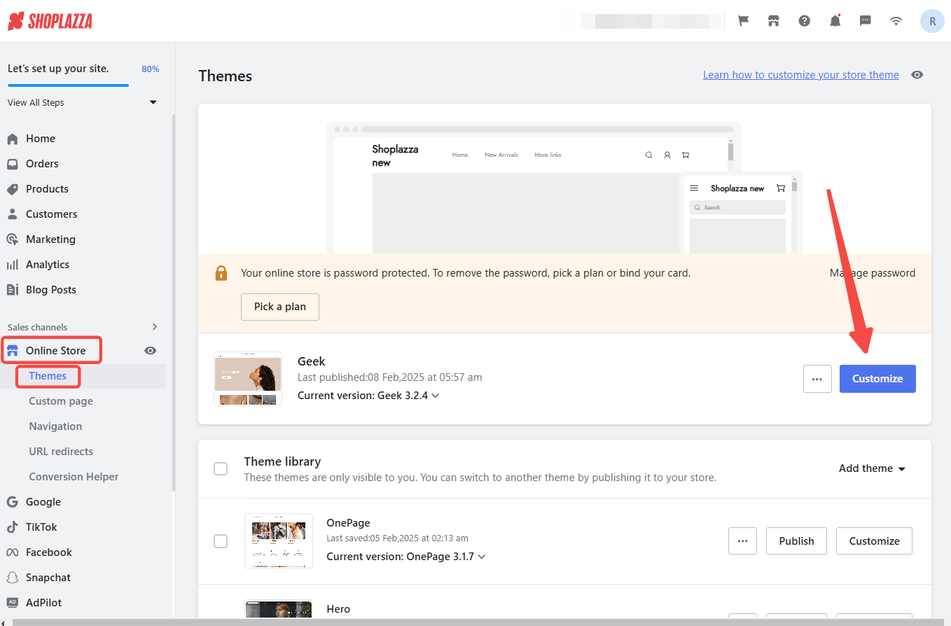
1. Access theme editor: Log in to your Shoplazza admin > Online store. Choose one of the Geek theme series mentioned above and click Customize.
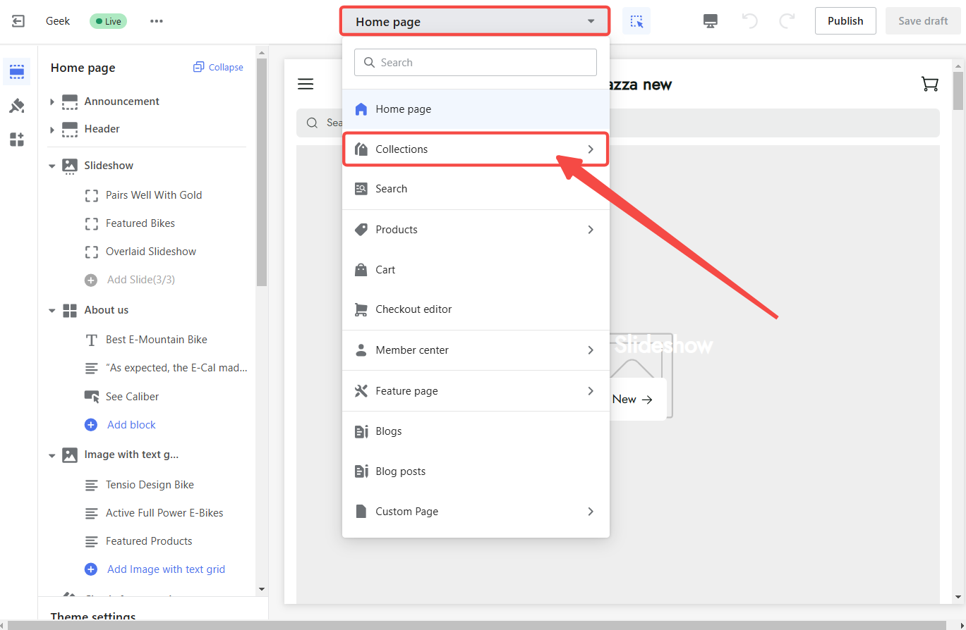
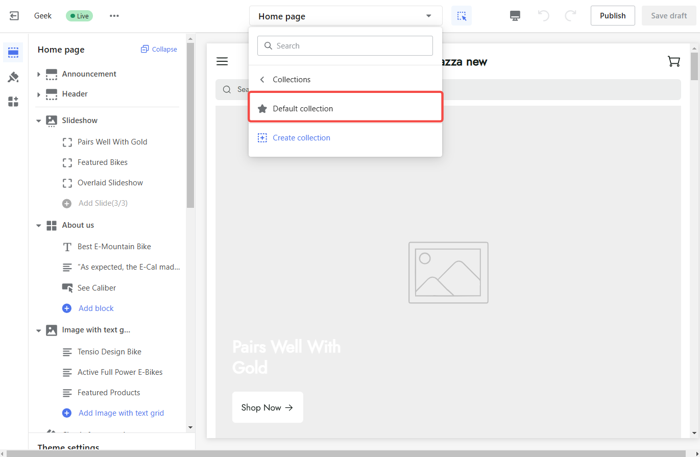
2. Search for the default collection page: Switch to Collection > Default Collection in the dropdown.
Note
Using the 'Default Collection' will change the collection page across your store. If you have a custom collection page, update that separately to reflect the changes.
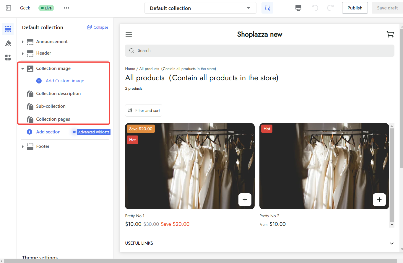
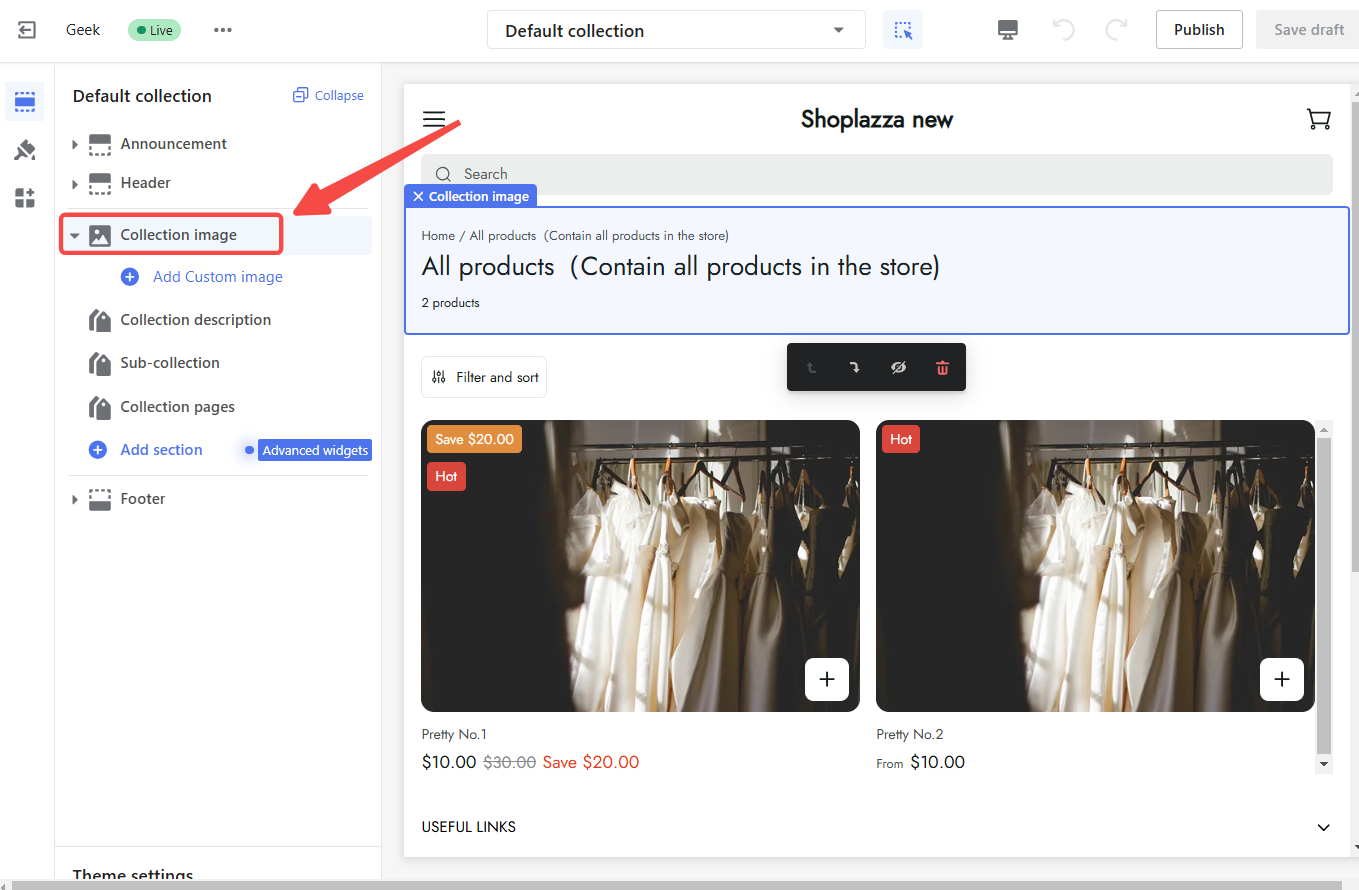
3. Enter the default collection details page: In the left settings section, click the card name to set the card content.
Collection image block
A well-designed collection cover creates a positive first impression. It should be visually appealing and informative, highlighting key information such as discounts, brand image, and product promotions. This attracts customers' attention and strengthens brand identity. To begin customizing:
1. Click block title to configure: In the left settings section, click on the Collection image section title to configure the cover's settings.
2. Adjust cover width: Set the desired width in pixels or percentages.
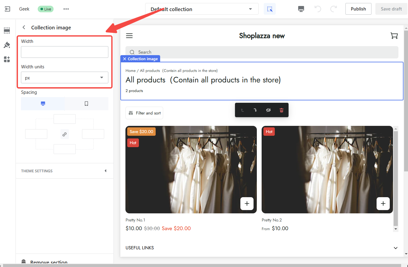
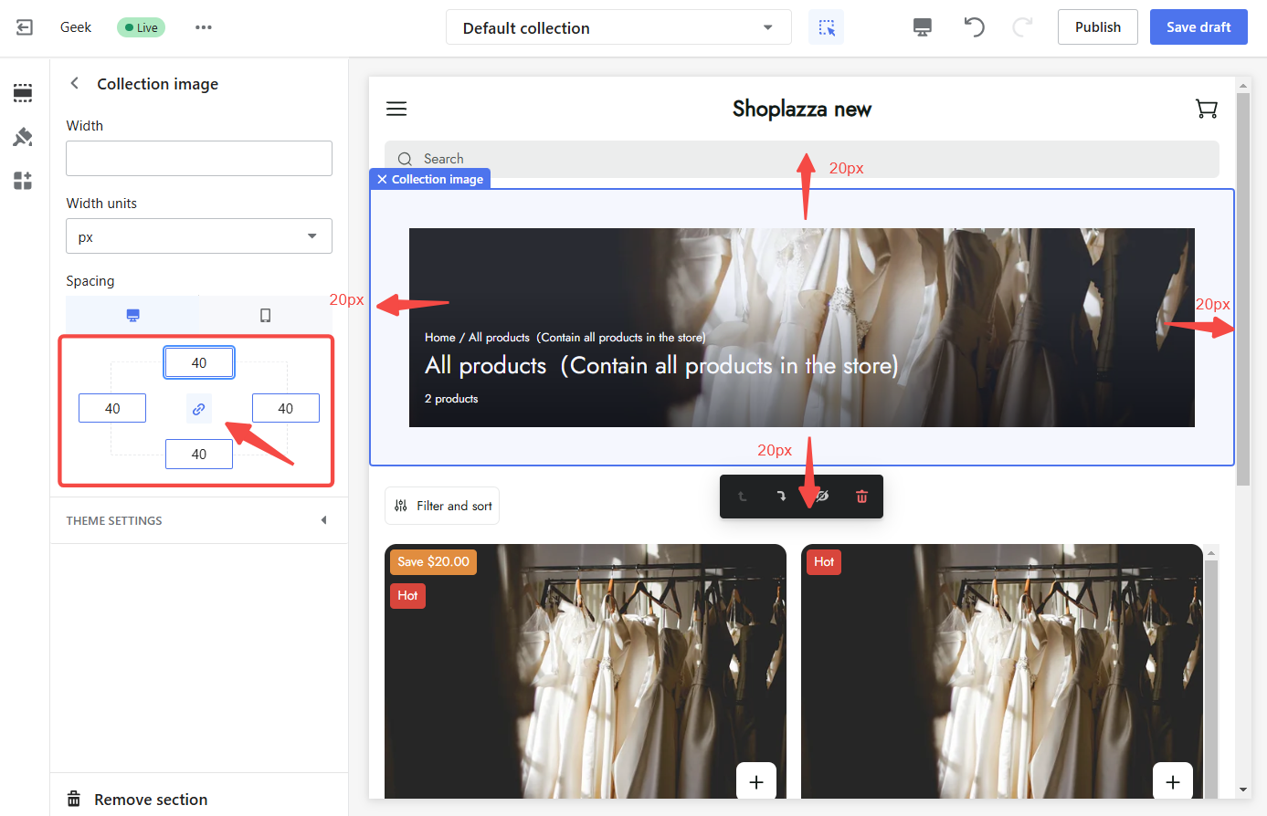
3. Modify spacing: Fine-tune the spacing around the card. Adjust the spacing uniformly by turning on the Link Icon and entering a value in pixels, or adjust each side individually by turning off the Link Icon.
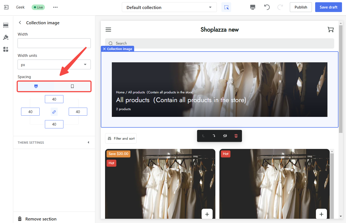
4. Preview: Click on Desktop or Mobile to preview how the cover looks on different devices.
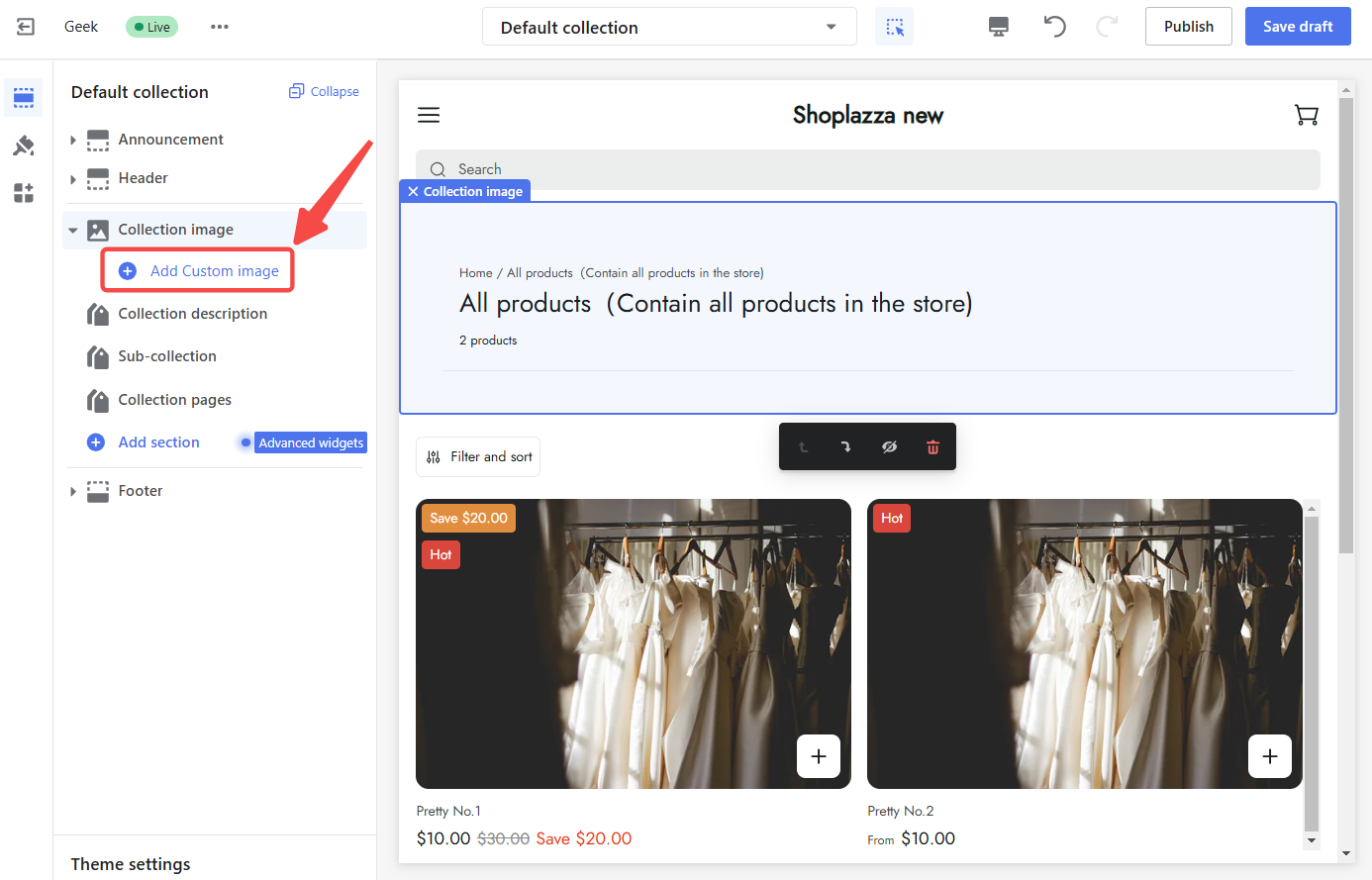
5. Add a custom cover: Go back to the main default collection page and click Add Custom image to upload a cover that best represents the collection.
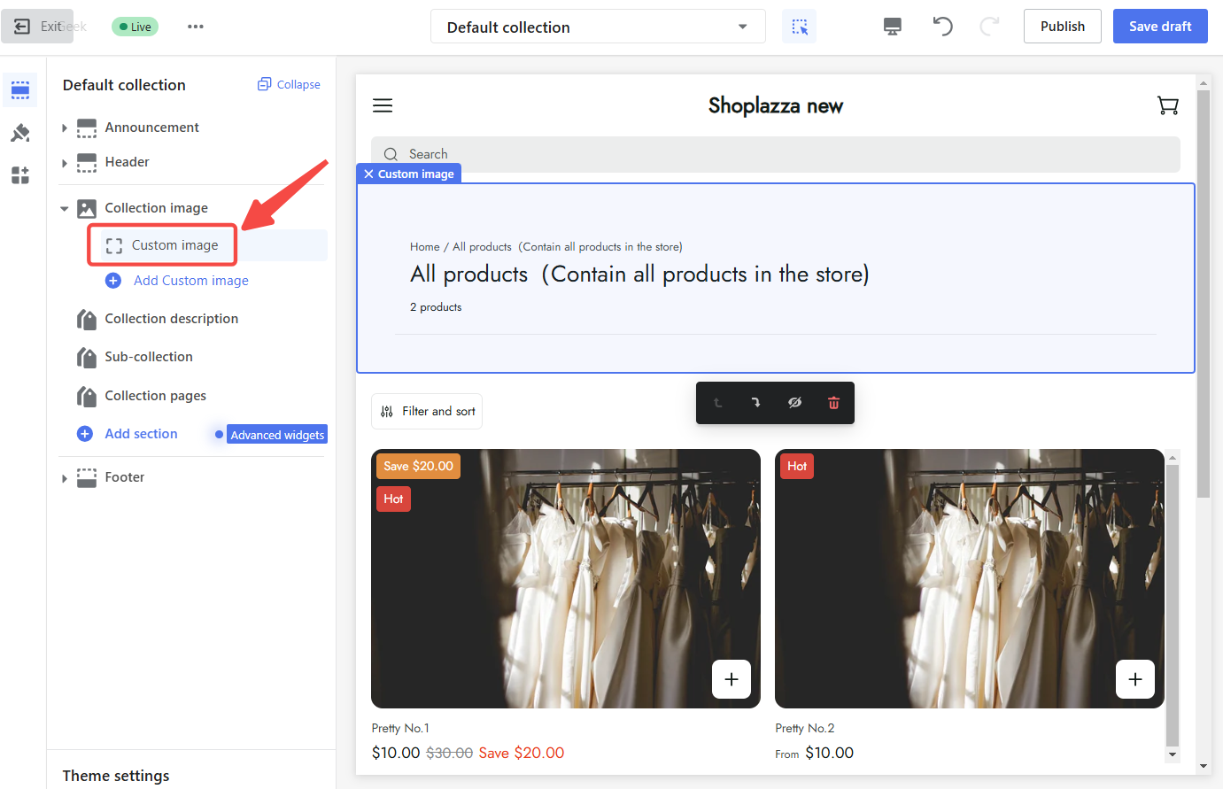
6. Click on the newly added block: To access the image settings, click on the custom image block you just added.
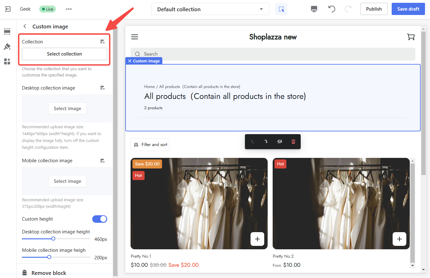
7. Customize cover settings:
- Select collection: Choose the specific collection.
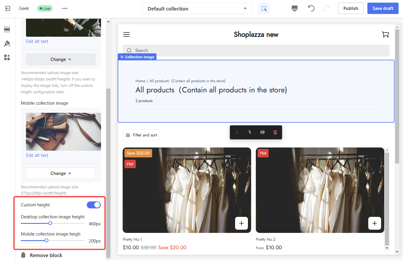
- Set cover for PC and mobile: Upload separate covers optimized for desktop and mobile devices.
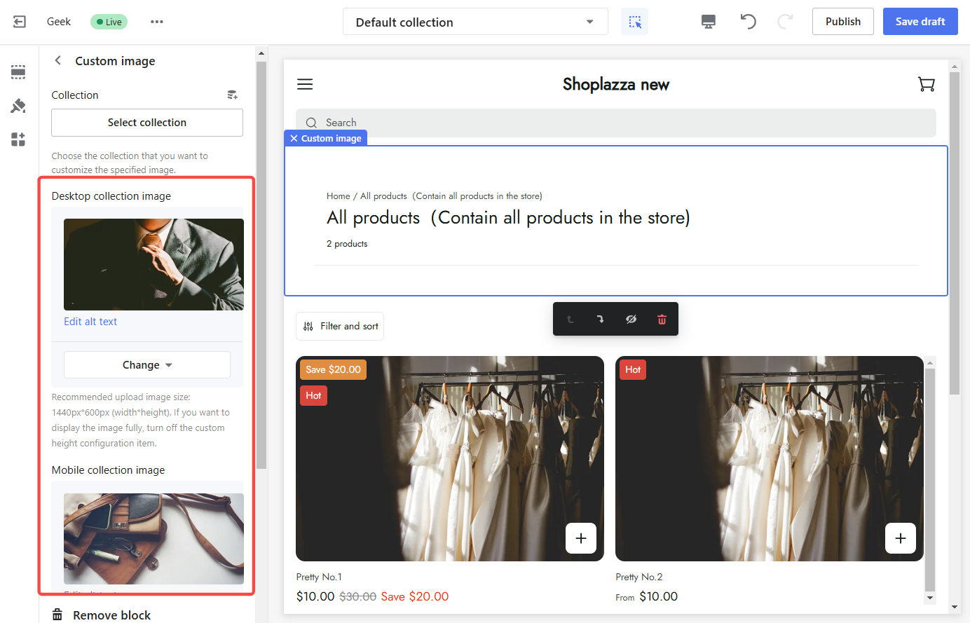
- Adjust cover height: Fine-tune the height of the cover.
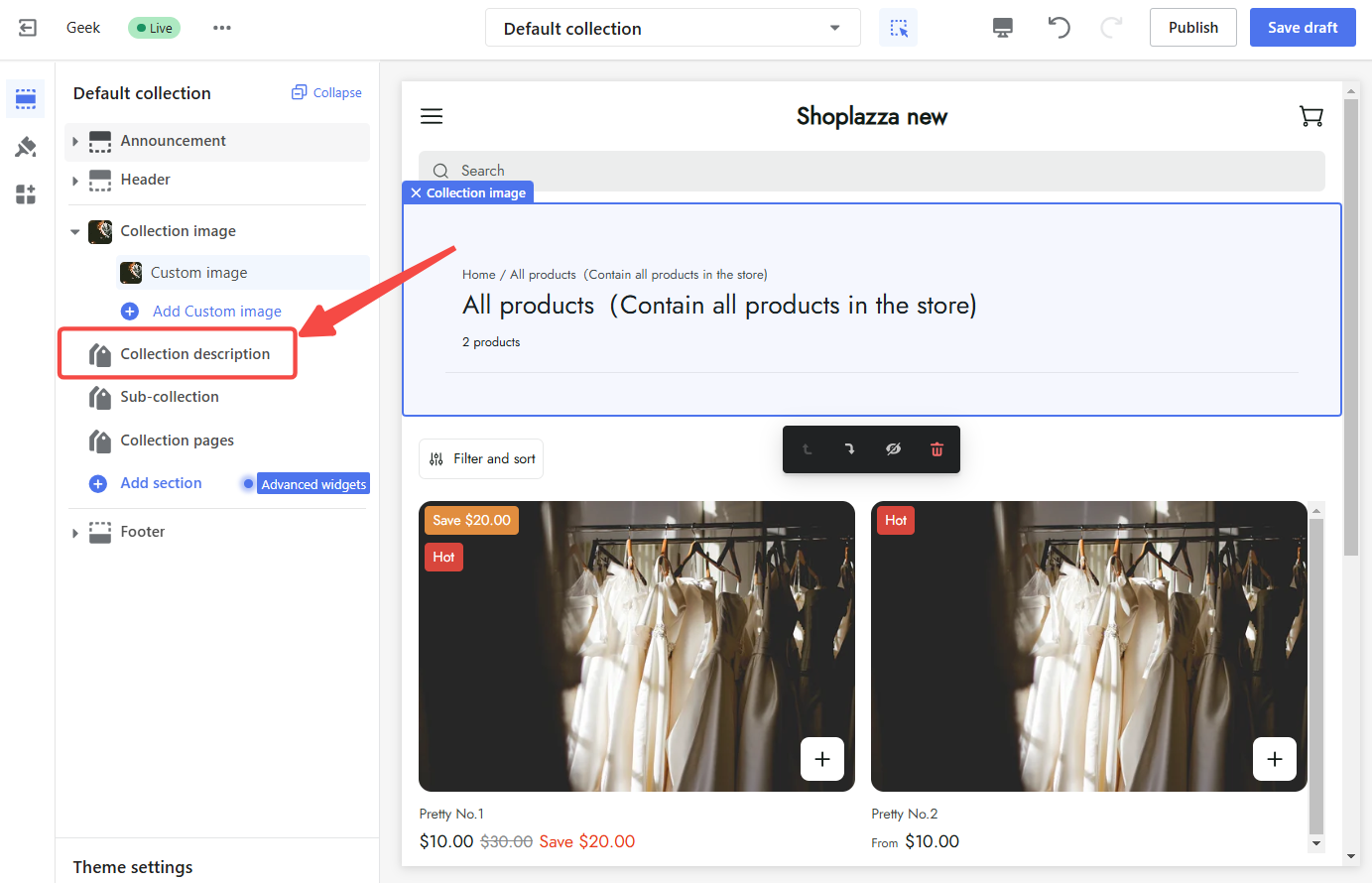
Collection description
A concise and informative collection description clearly explains the products within the collection. It should highlight the products' key features, benefits, and uses, allowing customers to make informed purchasing decisions.
To customize the collection description:
1. Configure collection description: To access its settings, click on the Collection description section title in the left settings section.
2. Adjust width: Set the desired width in either px or percentage.
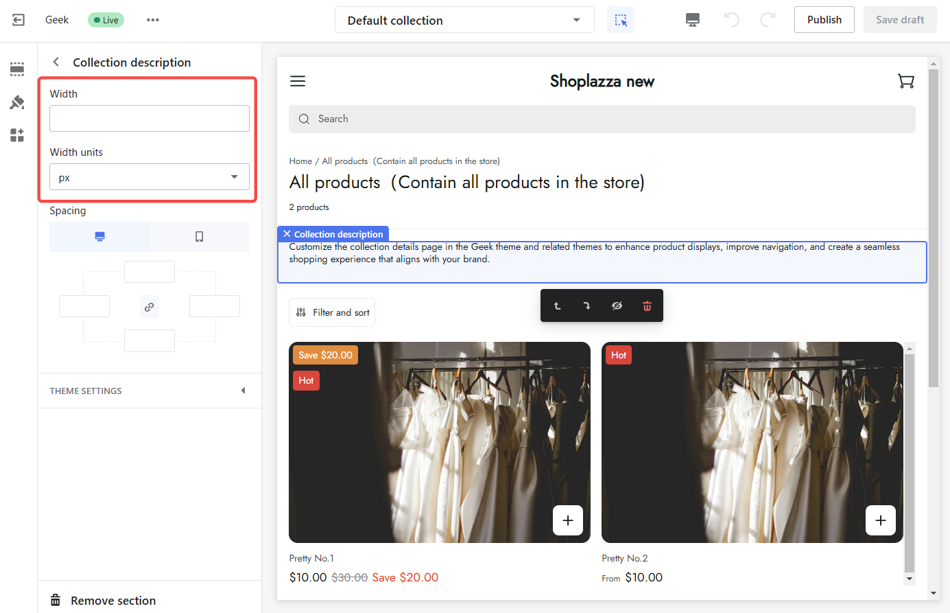
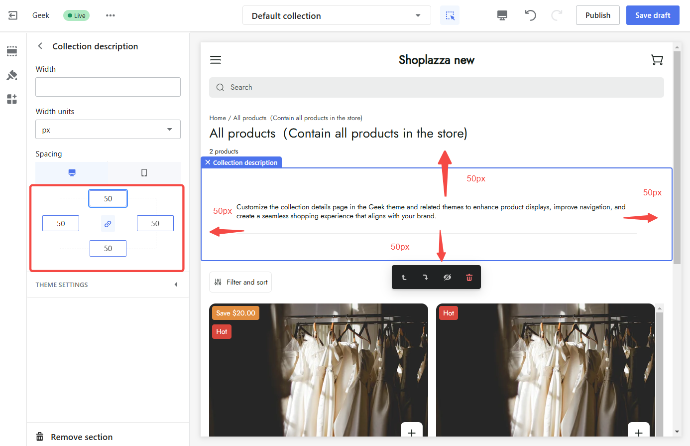
3. Modify spacing: Adjust the spacing around the description to ensure optimal readability and visual appeal.
Note
To add a collection description, navigate to your Shoplazza admin > Products > Collections to enter the collection details page.
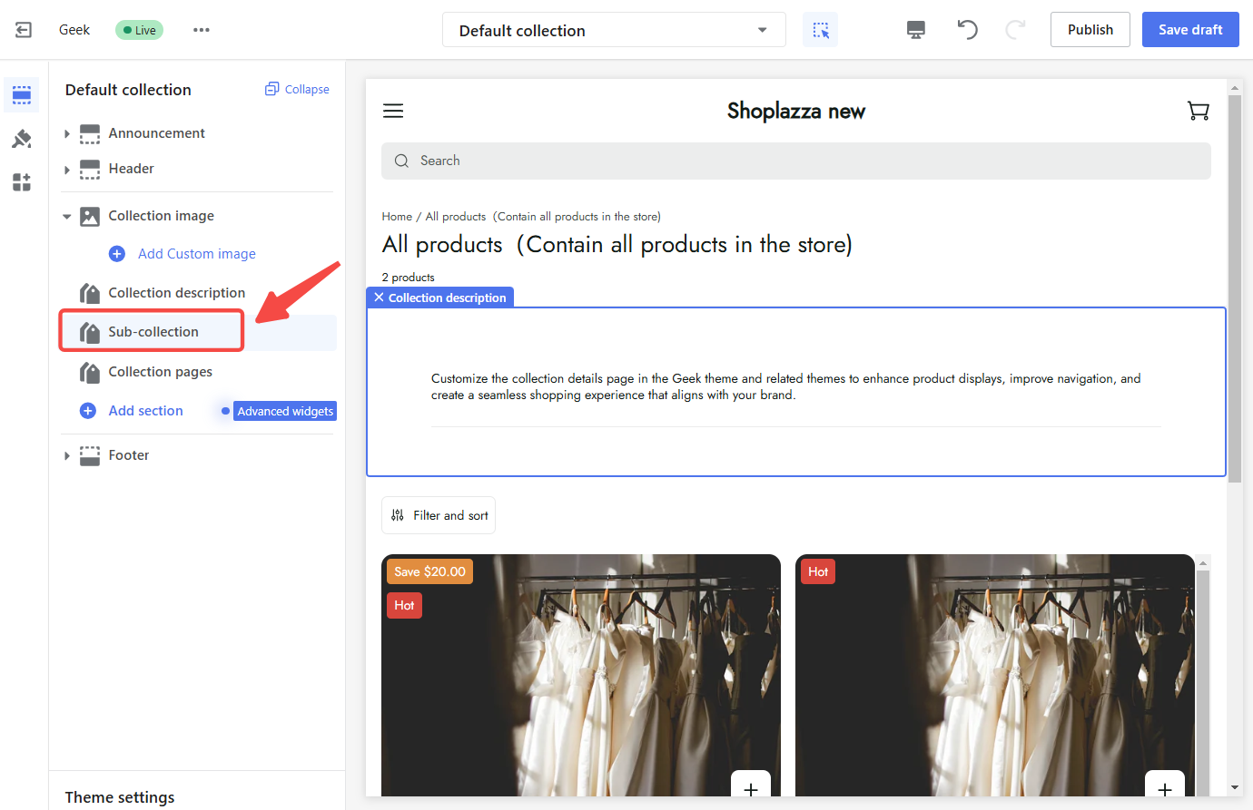
Sub-collection
Sub-collections allow you to organize and categorize products effectively. They provide a clear navigation path for customers to explore different product categories within a collection.
To configure sub-collections:
1. Configure sub-collections: Click on the Sub-collection section to configure its settings.
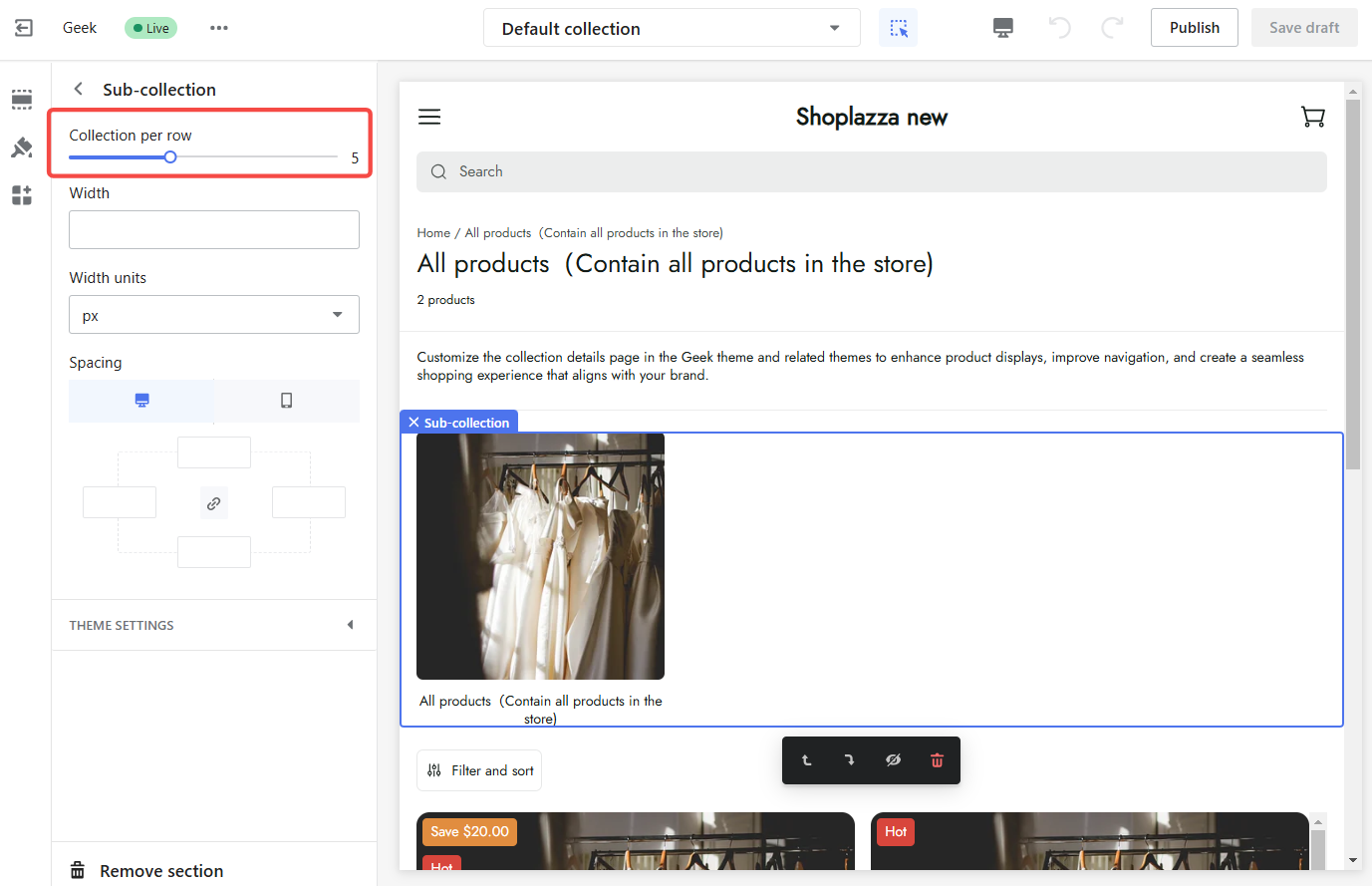
2. Set the number of collections per row: Determine how many collections to display per row.
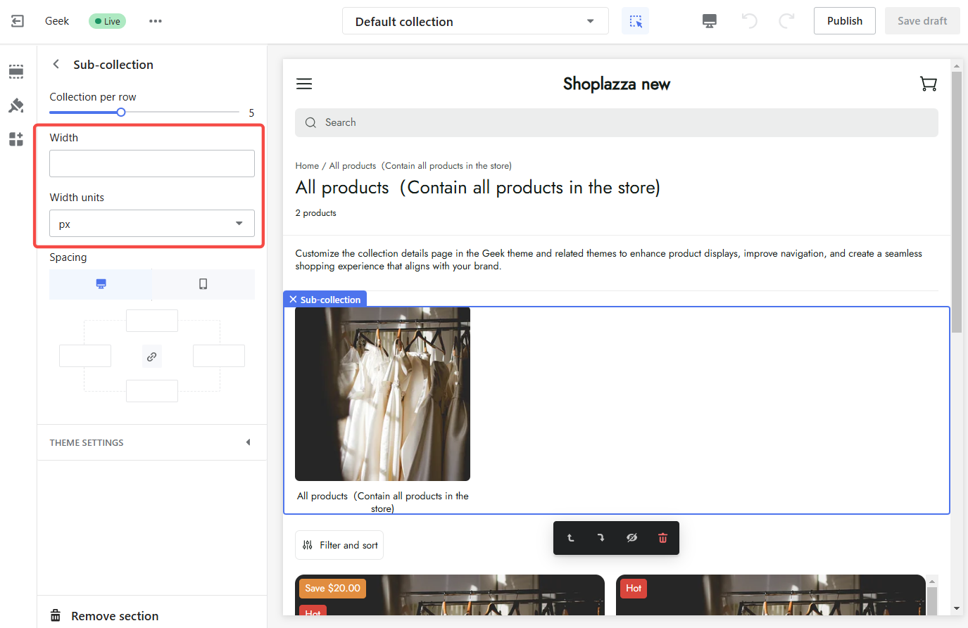
3. Adjust height: Set the desired height and units for sub-collections.
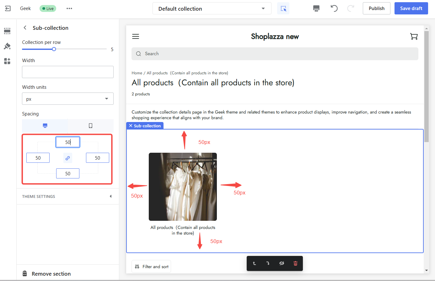
4. Modify spacing: Adjust the spacing between sub-collections to maintain a clean and organized look.
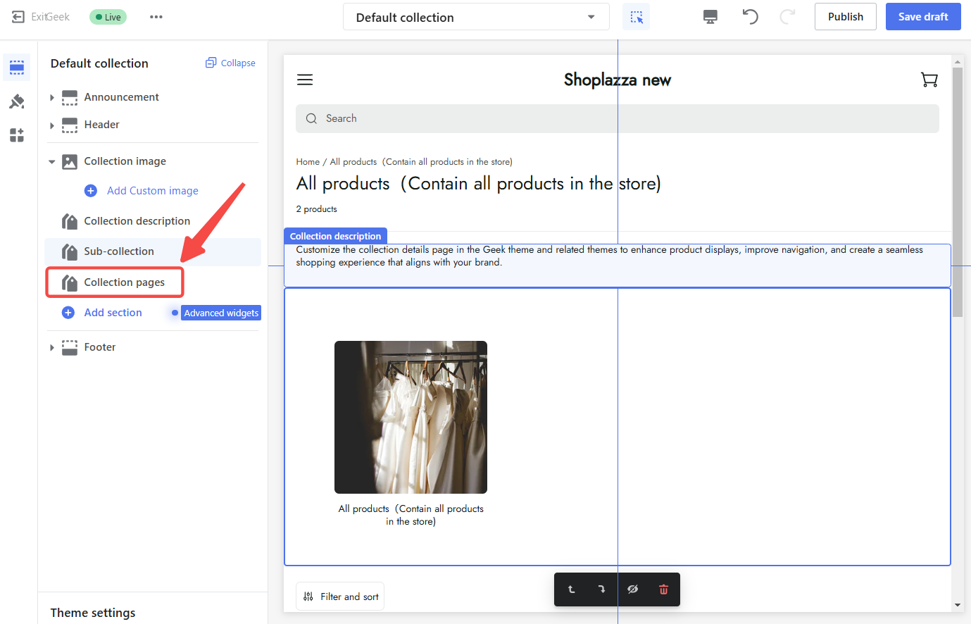
Collection page
The collection page is the heart of the collection details page, showcasing the collection name, product count, filters, and product information. Optimizing this page is essential for creating a seamless and engaging shopping experience.
To customize the collection page:
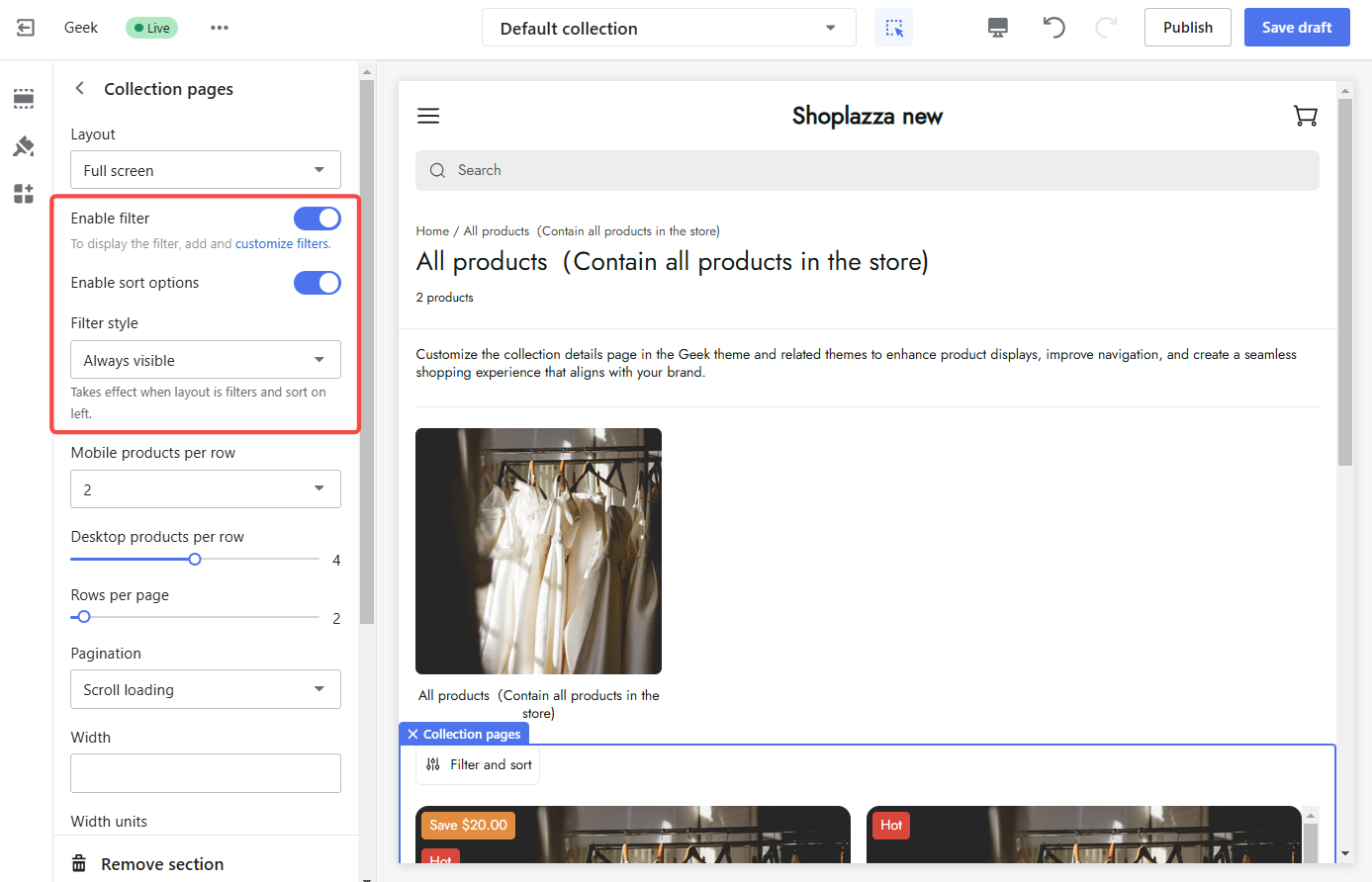
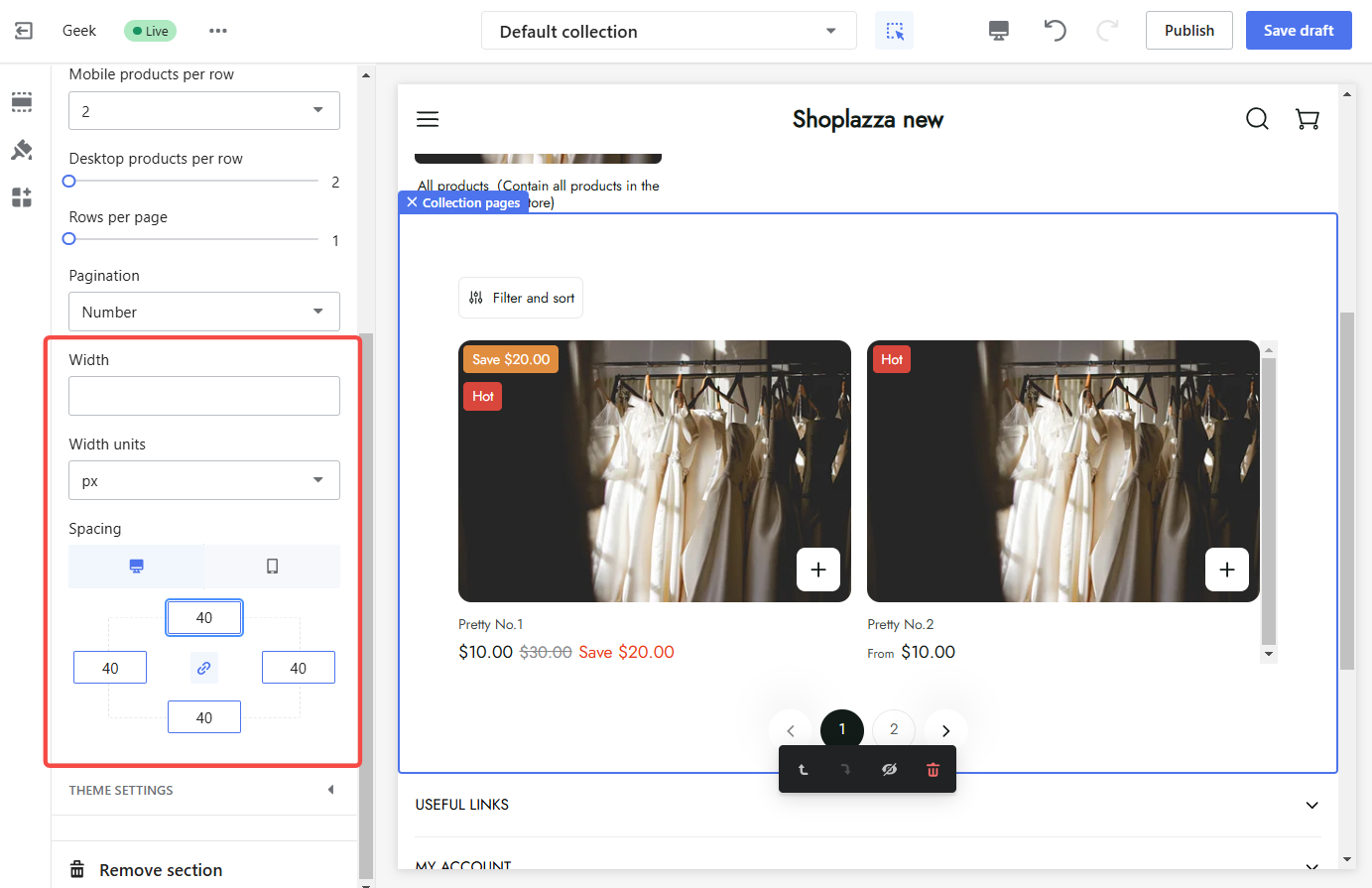
1. Configure collection pages: Click on the Collections pages section to configure its settings.
2. Configure layout: Choose from various layout options to best showcase products.
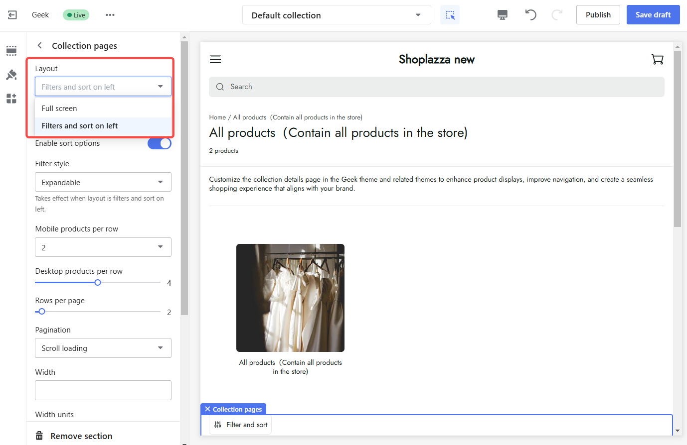
3. Manage filters and sorting: Customize filter styles and enable or disable sorting options to help customers find products easily while maintaining your store's aesthetic.

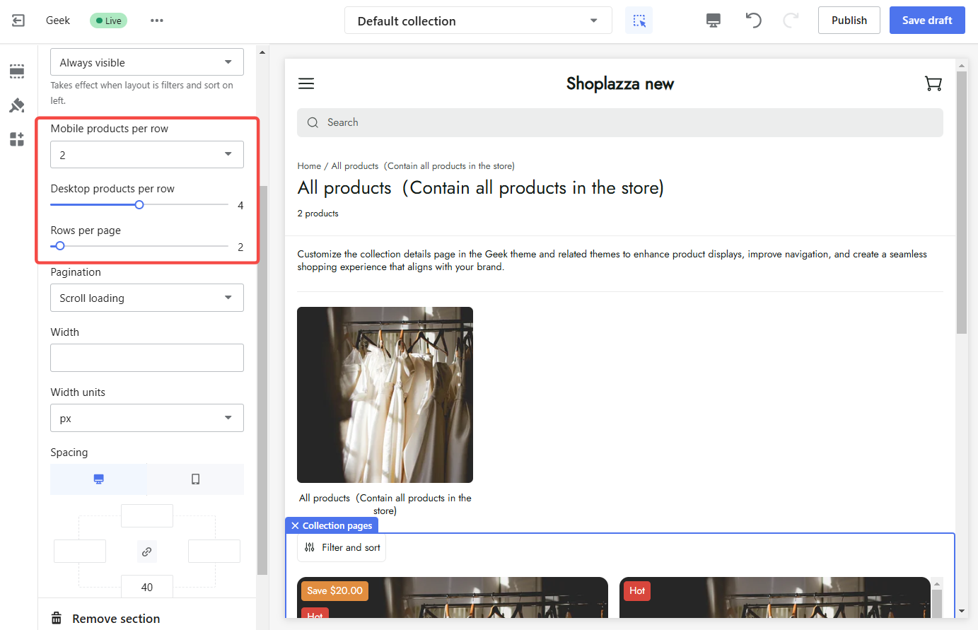
4. Adjust product display: Control the number of products per row and the number of rows per page for optimal display on both desktop and mobile devices.
5. Customize paging style: Choose a paging style that complements the overall design.
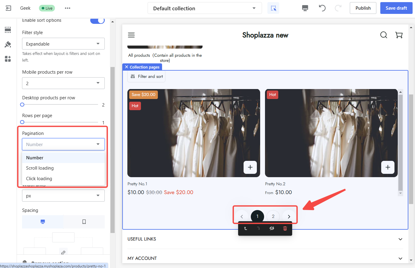
6. Modify page width and spacing: Adjust the width and spacing of the page to achieve the desired layout.
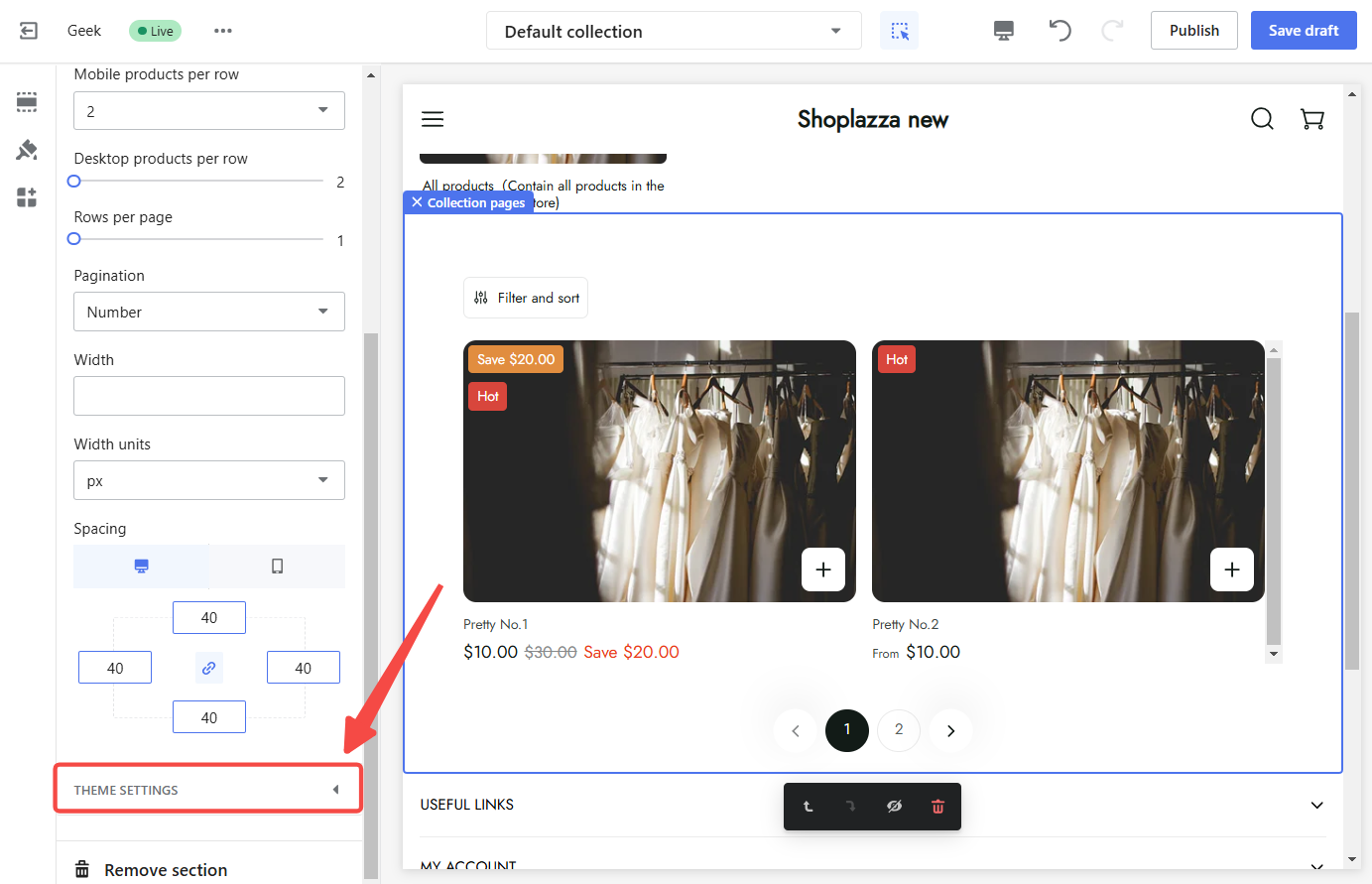
Theme settings
Theme settings provide additional control over the presentation and functionality of various elements on the collection page. These settings allow further refinement of the shopping experience, ensuring it aligns with your brand and customer expectations.
To configure theme settings:
1. Access theme settings: Scroll to the bottom of the Theme settings section and click on the title to access the available options.
2. Configure quick add to cart: Enable or disable the quick add to cart feature, allowing customers to add products to their cart without leaving the collection page.
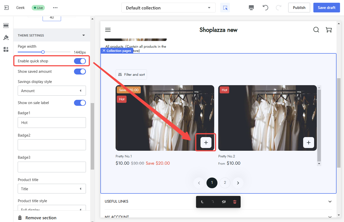
3. Manage discount display: Choose the discount amount or a discount tag on products, highlighting special offers and attracting customer attention.
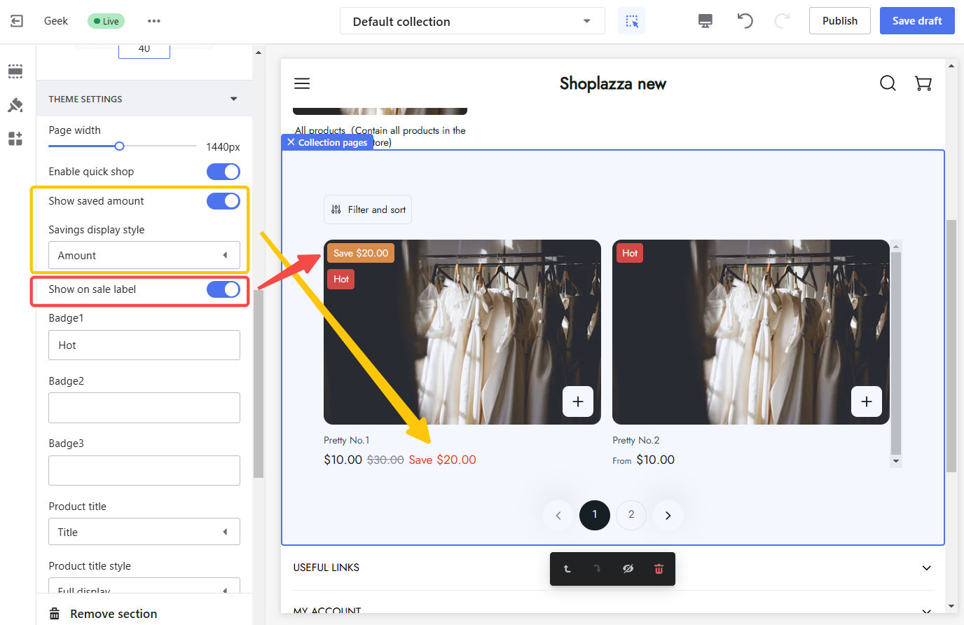
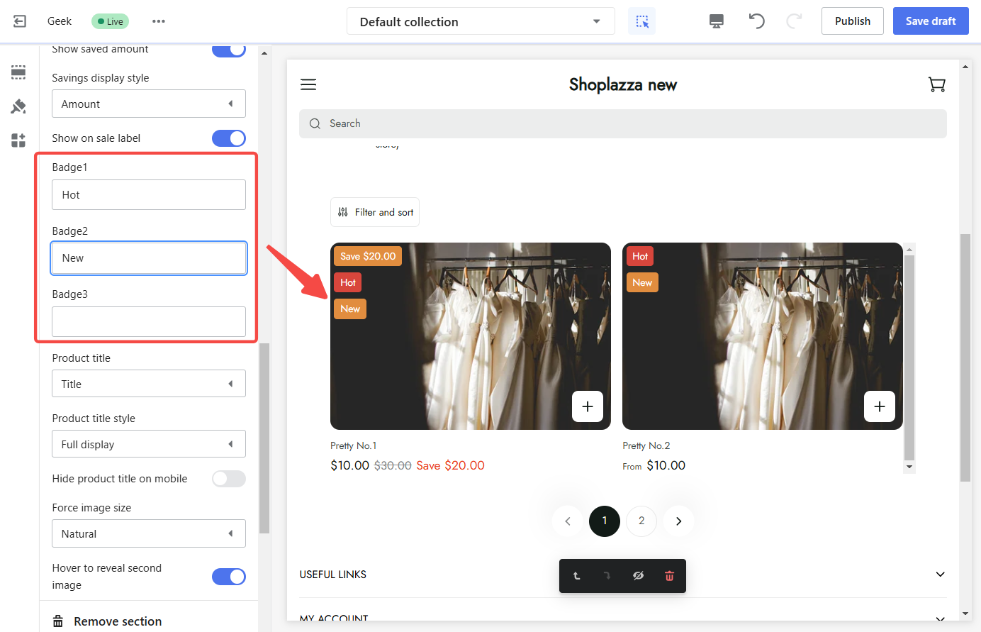
4. Configure product badges: Customize the display of sale labels or badges on products. Create custom labels to highlight specific products or promotions.
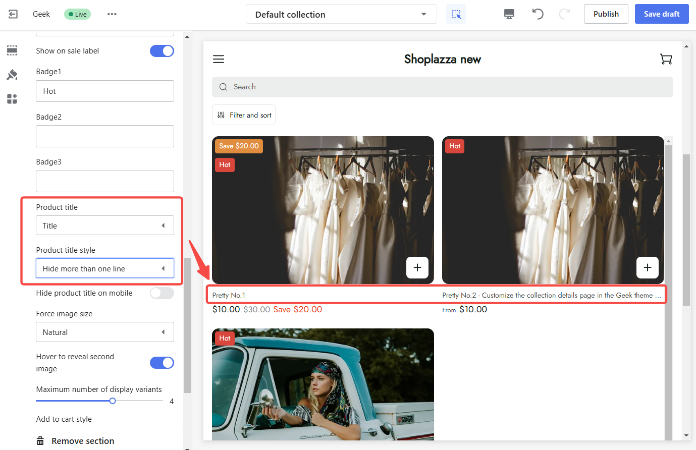
5. Configure product titles:
- Choose product title: Select whether to display the main title or subtitle of the product.
- Select product title style: Choose to display the full product title or only the first line.
- Hide product title on mobile: Enable the option to hide the product title on mobile devices for a cleaner look on smaller screens.
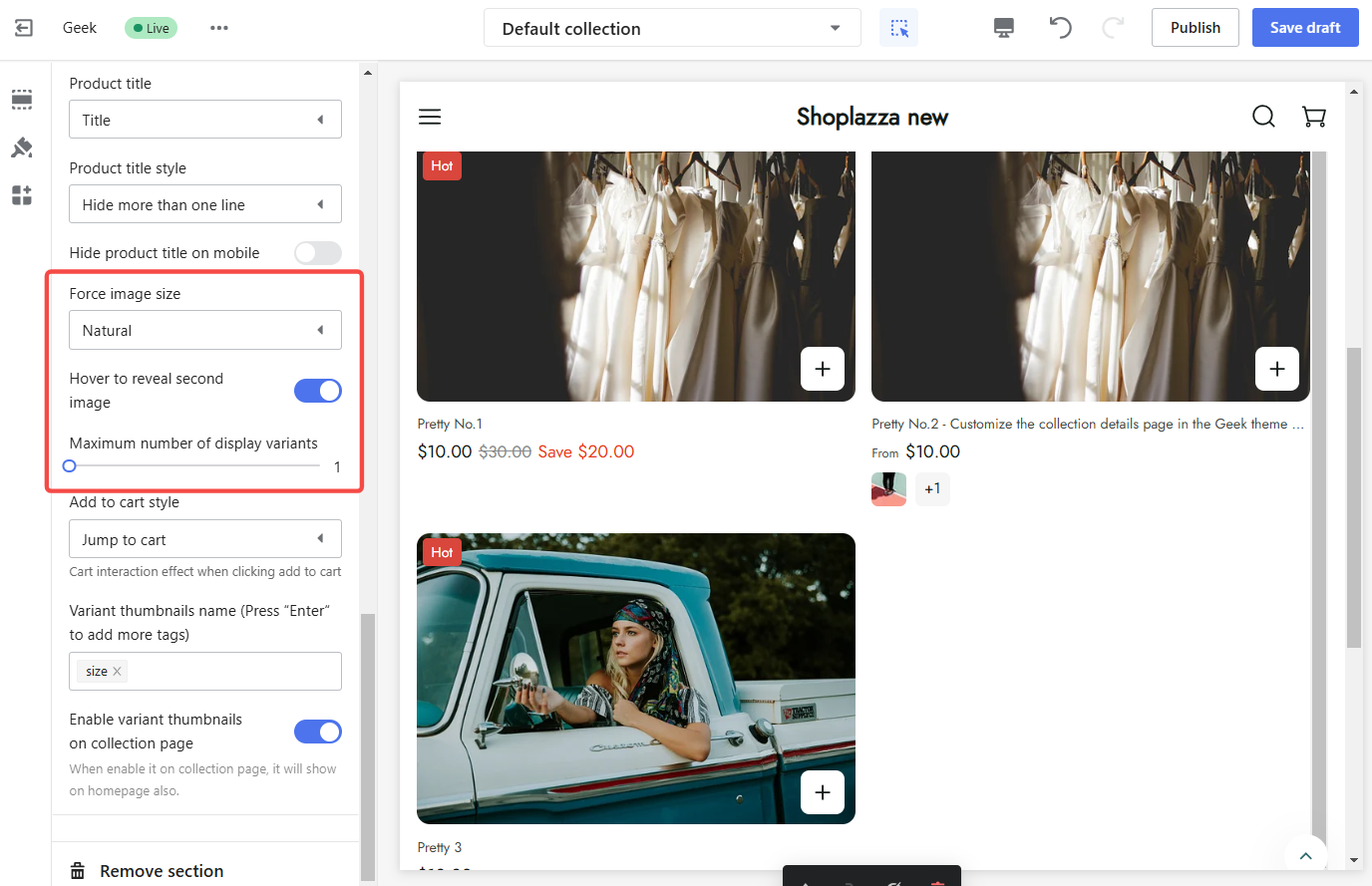
6. Configure product images and variants:
- Force image size: Select the desired image size: Natural, Square (1:1), Portrait (2:3), or Landscape (4:3).
- Enable hover to reveal second image: Turn on the option to reveal the second image when hovering over the product image.
- Set maximum number of display variants: Control the maximum number of variants to be displayed for each product.
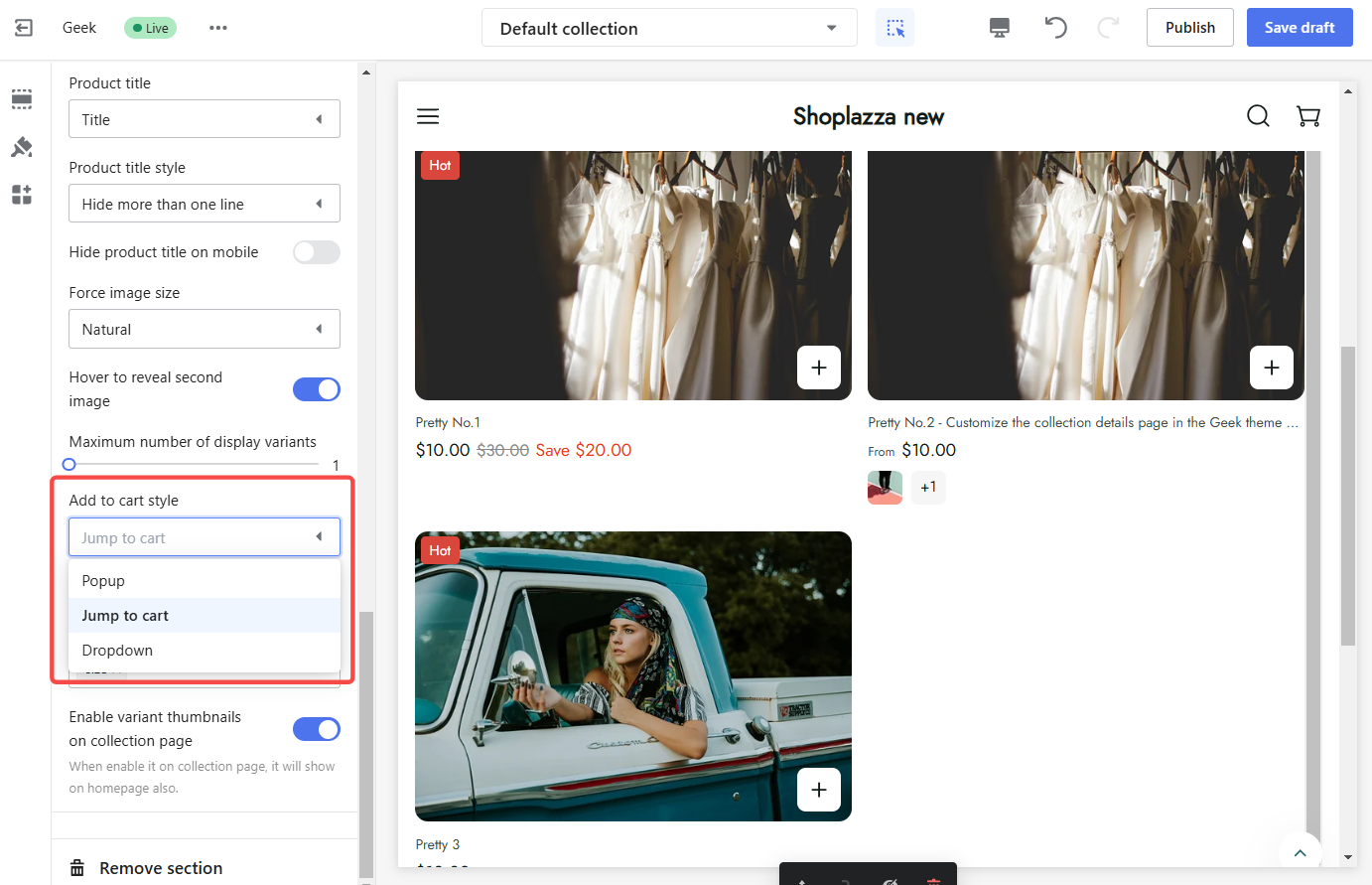
7. Add to cart style: Choose how the "Add to Cart" button behaves when clicked:
- Popup: Opens a popup window with product details and options.
- Jump to cart: Redirects the customer to the cart page.
- Dropdown: Dropdown: Opens a slide-in window from the right with product options.
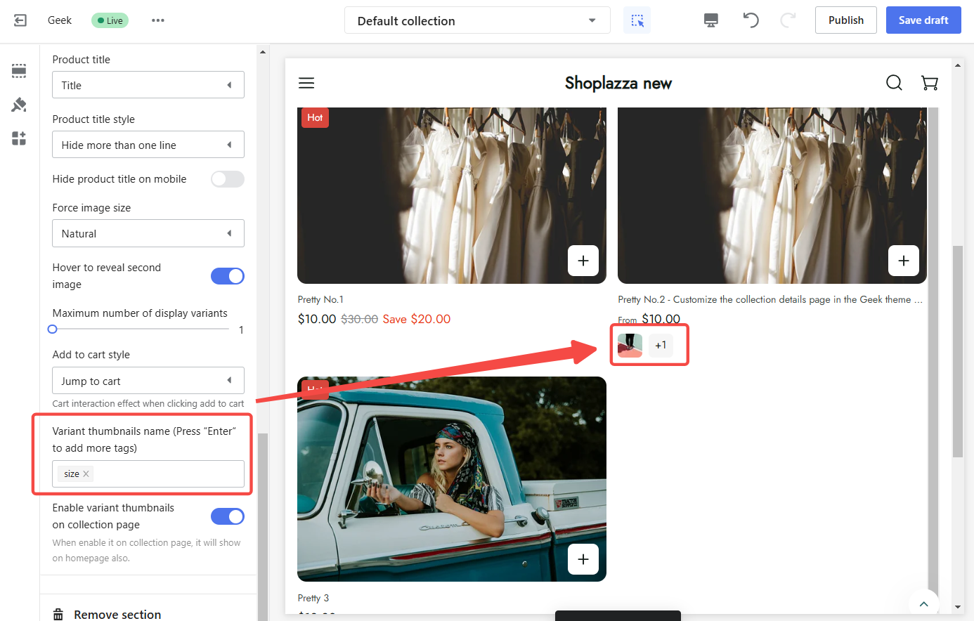
8. Variant thumbnails name: To display different product options, add variant names (e.g., "Size") in the Variant name field. Ensure the names match the attributes set on your product page under Products > All products > Select product > Variants settings. This alignment allows the system to show the correct images for each variant, enhancing the customer experience.
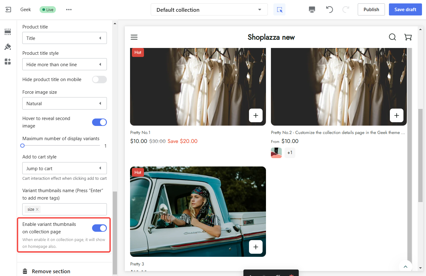
9. Enable variant thumbnails on the collection page: Turn on this option to display variant thumbnails on the collection page, allowing customers to preview different product options.
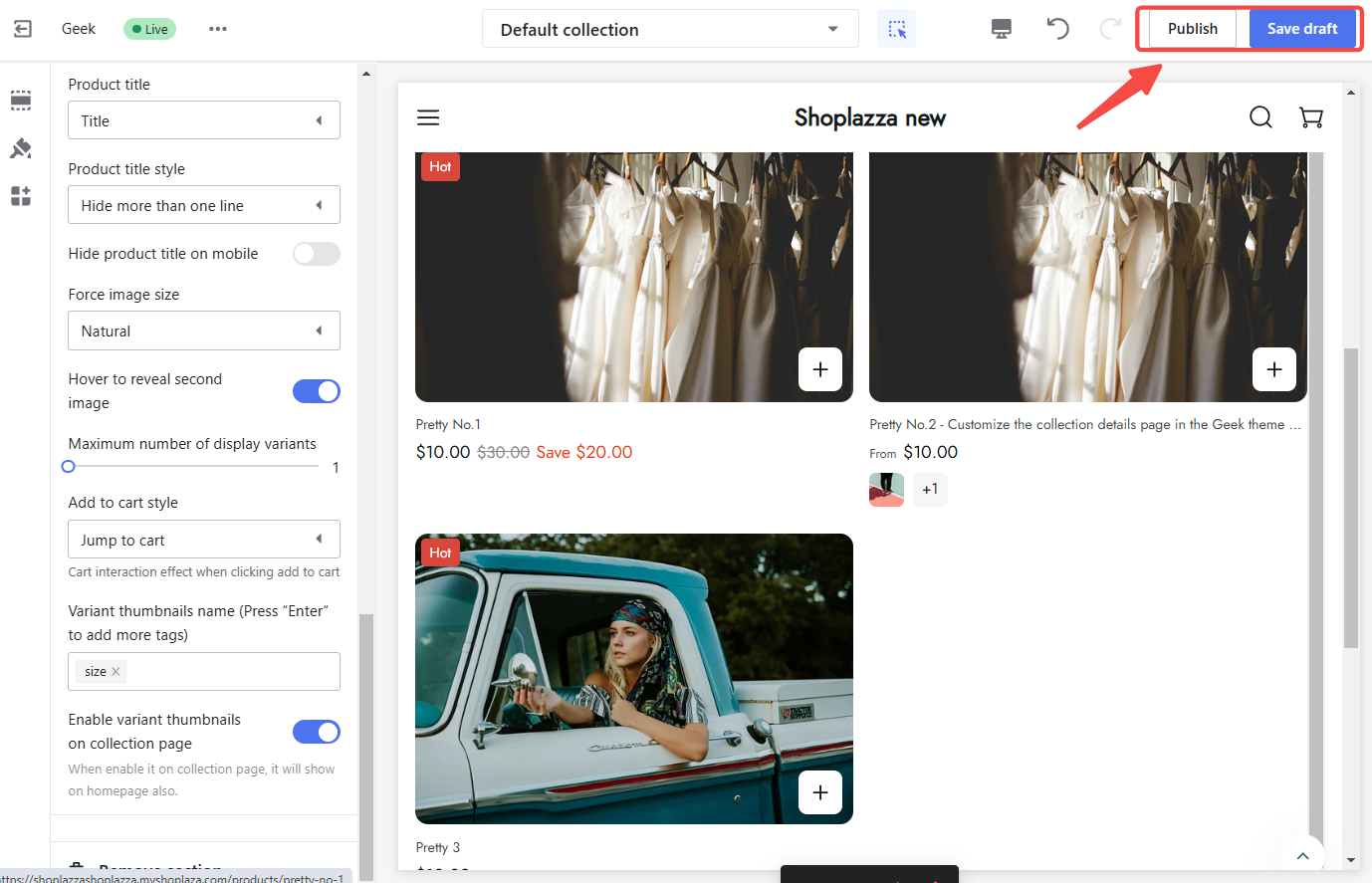
10. Publish or save draft: Once you have finished configuring the settings, click Publish to make the changes live on your store or Save draft to save the changes without publishing them.
The collection details page is a valuable asset for any online store. By utilizing the customization options available in the Geek theme and related themes, create a unique and engaging shopping experience that reflects your brand and drives conversions. Experiment with different settings to find the perfect combination that maximizes your store's potential.


Comments
Please sign in to leave a comment.