
The Overlay text column section is a flexible layout that lets you pair images with text and apply a color overlay for better readability. It’s ideal for highlighting promotions, brand messages, or featured content in a way that’s both visually striking and easy to read.
You can adjust the overlay color and transparency to match your store’s look and improve text visibility. This section is available in the Hero, Halloween, and Modern themes in the Shoplazza Hero theme series.
In this guide, you’ll learn how to add and configure the Overlay text column section using the theme editor.
Adding the Overlay text column section
Add the Overlay text column section from the theme editor. After adding it, move it anywhere on the page using drag and drop.
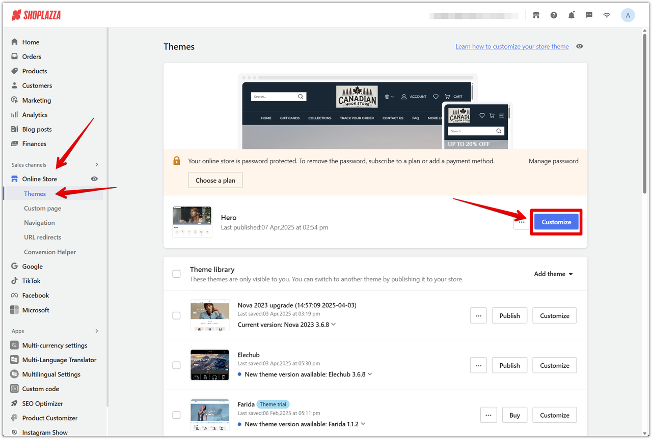
1. Go to the theme editor: From your Shoplazza admin > Online Store > Themes, click Customize next to the Hero theme.
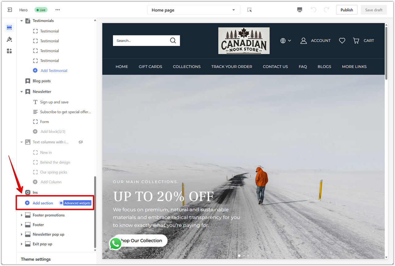
2. Add the section: Click Add section in the left-side menu to view the list of available sections.
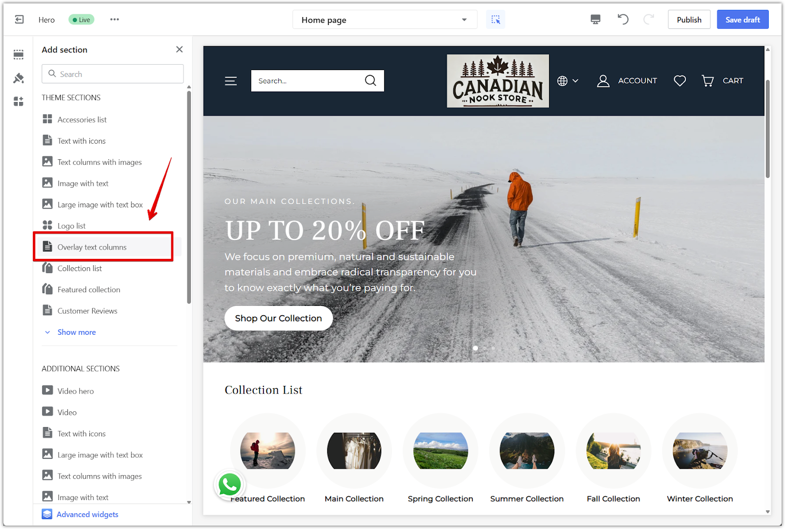
3. Select the section: Scroll down and click Overlay text columns under Theme sections.
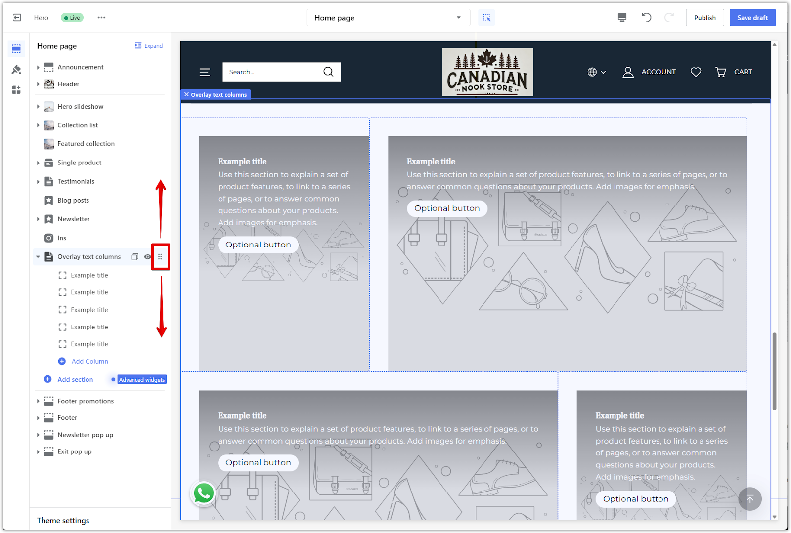
4. Reposition the section: Click and drag the section using the drag handle icon to place it where needed.
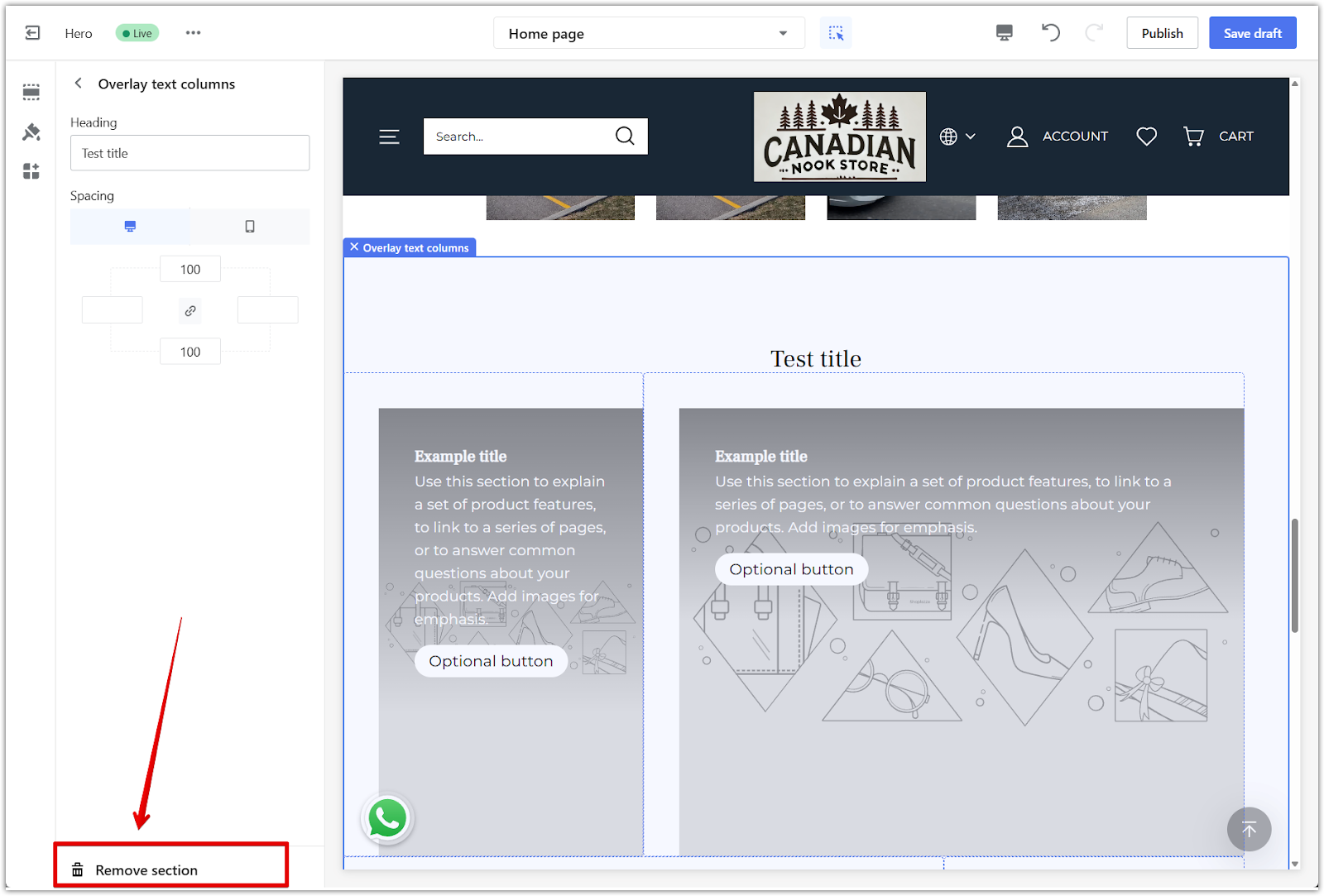
5. Remove the section: Click the section name to open its settings, then scroll down and click Remove section to delete it from the layout.
Configuring the Overlay text column section
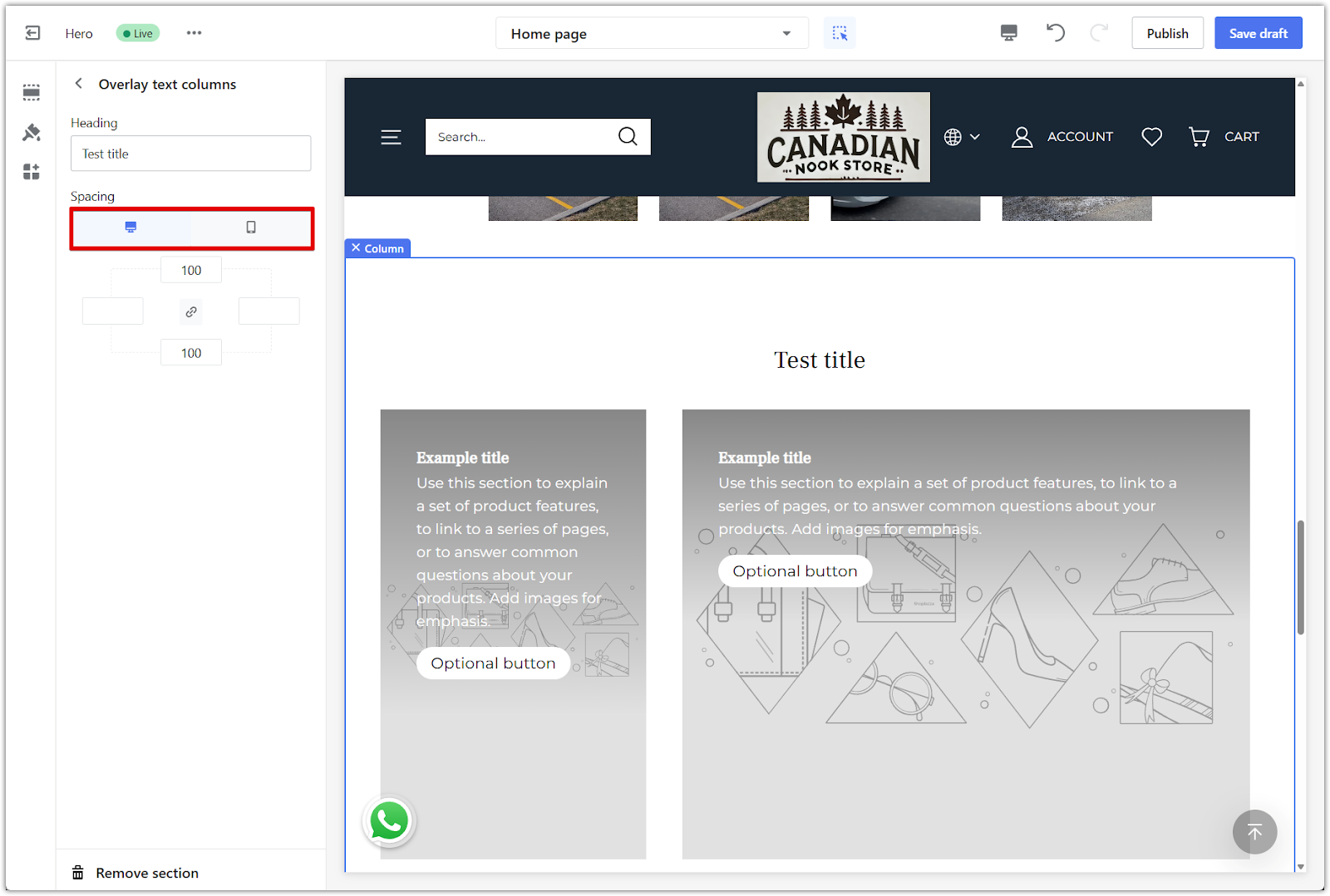
Use the general settings panel to control layout spacing, section headings, and how the section appears across devices. These settings apply to the entire Overlay text column section.
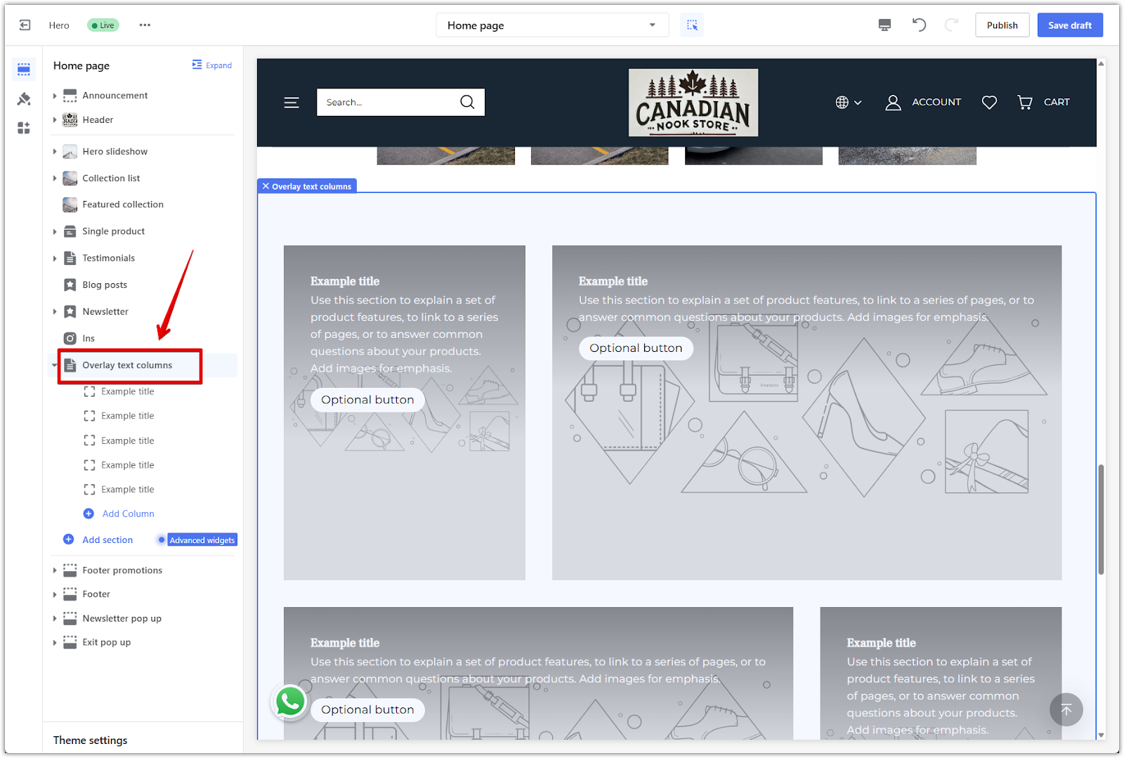
1. Access section settings: Click the section title to open the general settings panel.
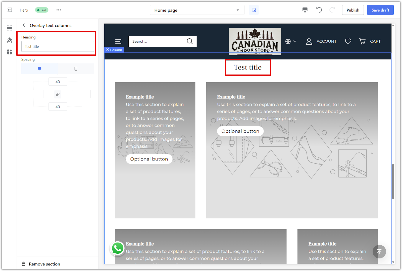
2. Edit the header: Enter a title in the Heading field to display at the top of the section.
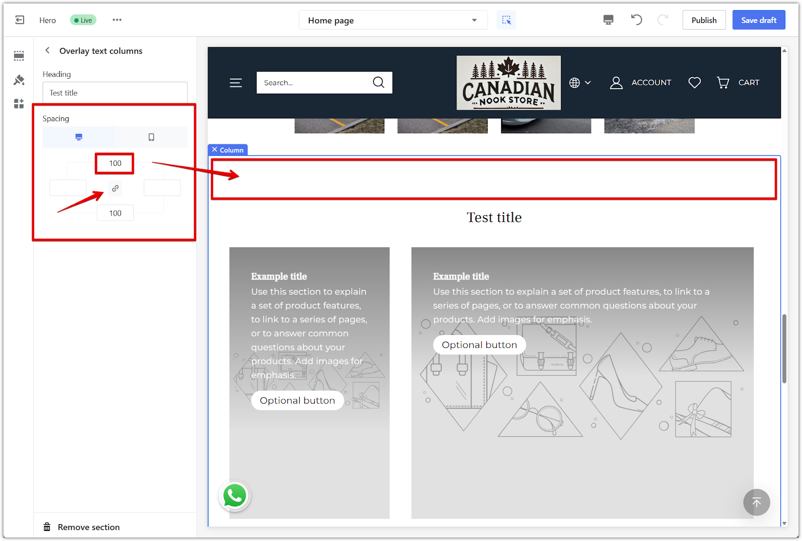
3. Set spacing: Adjust the spacing around the section using the padding controls. Click the link icon to apply the same padding to all sides, or unlink to set each side independently.
4. Preview layout: Switch between desktop and mobile views to see how the section appears across devices.
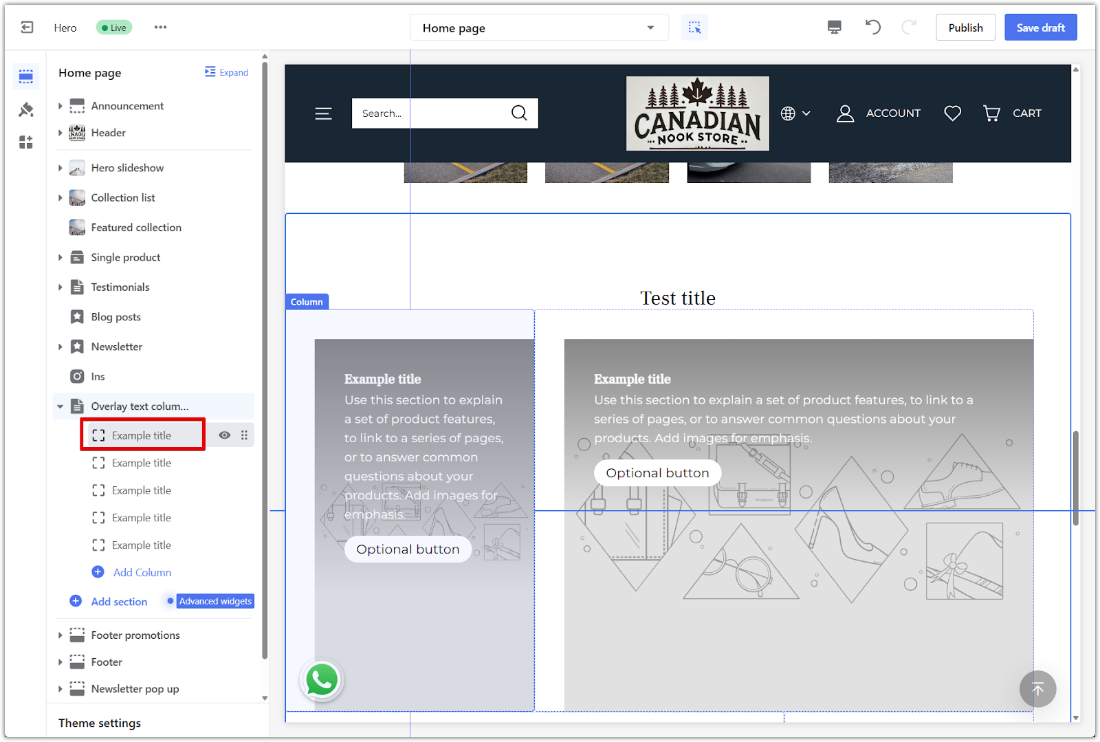
Editing individual blocks
Click a block inside the section to customize its content. Each block contains an image, text, a button, and color overlay settings.
1. Open block settings: Click a block inside the section to access its content and design settings.
2. Add an image: Click Select image to upload an image that supports your message.
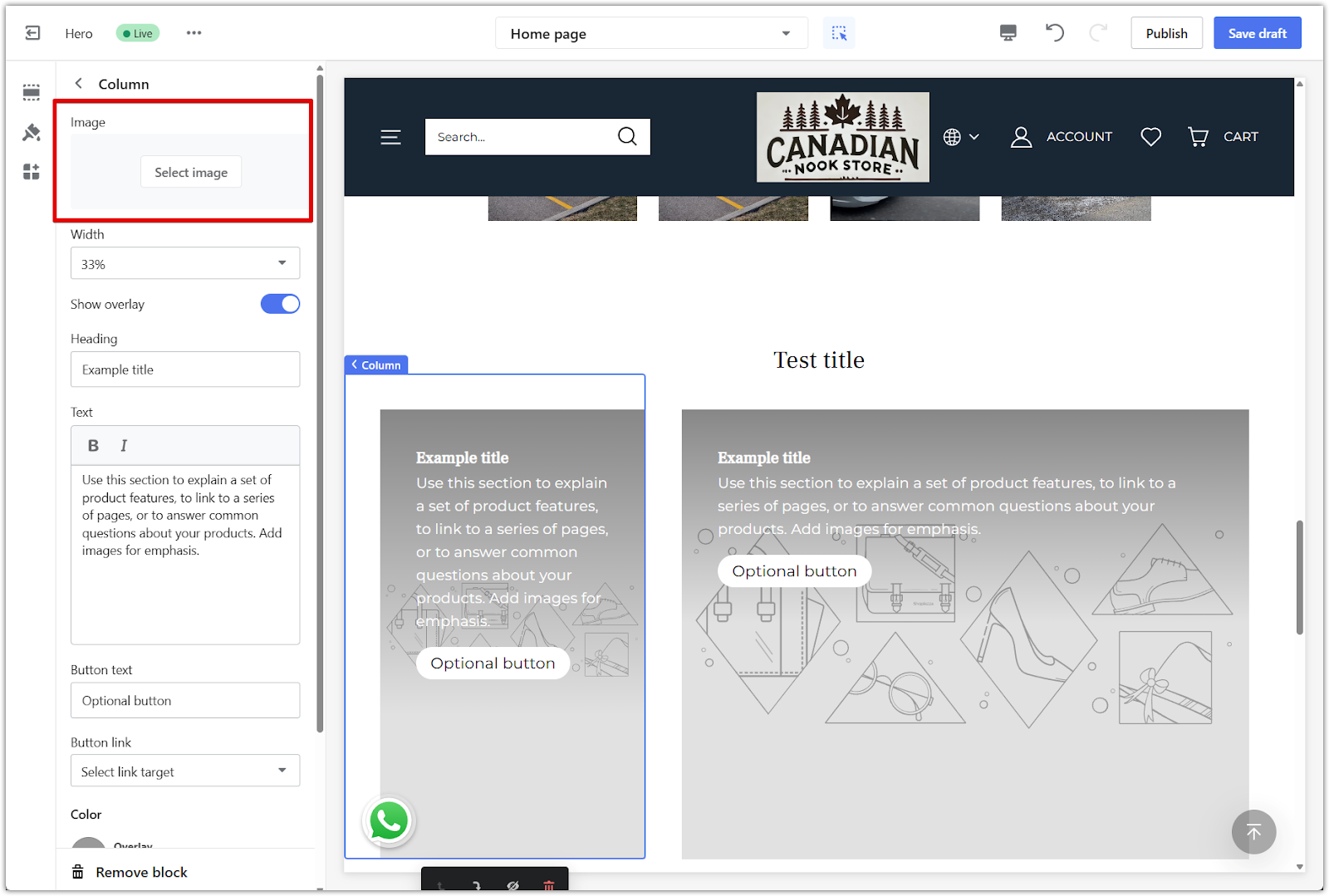
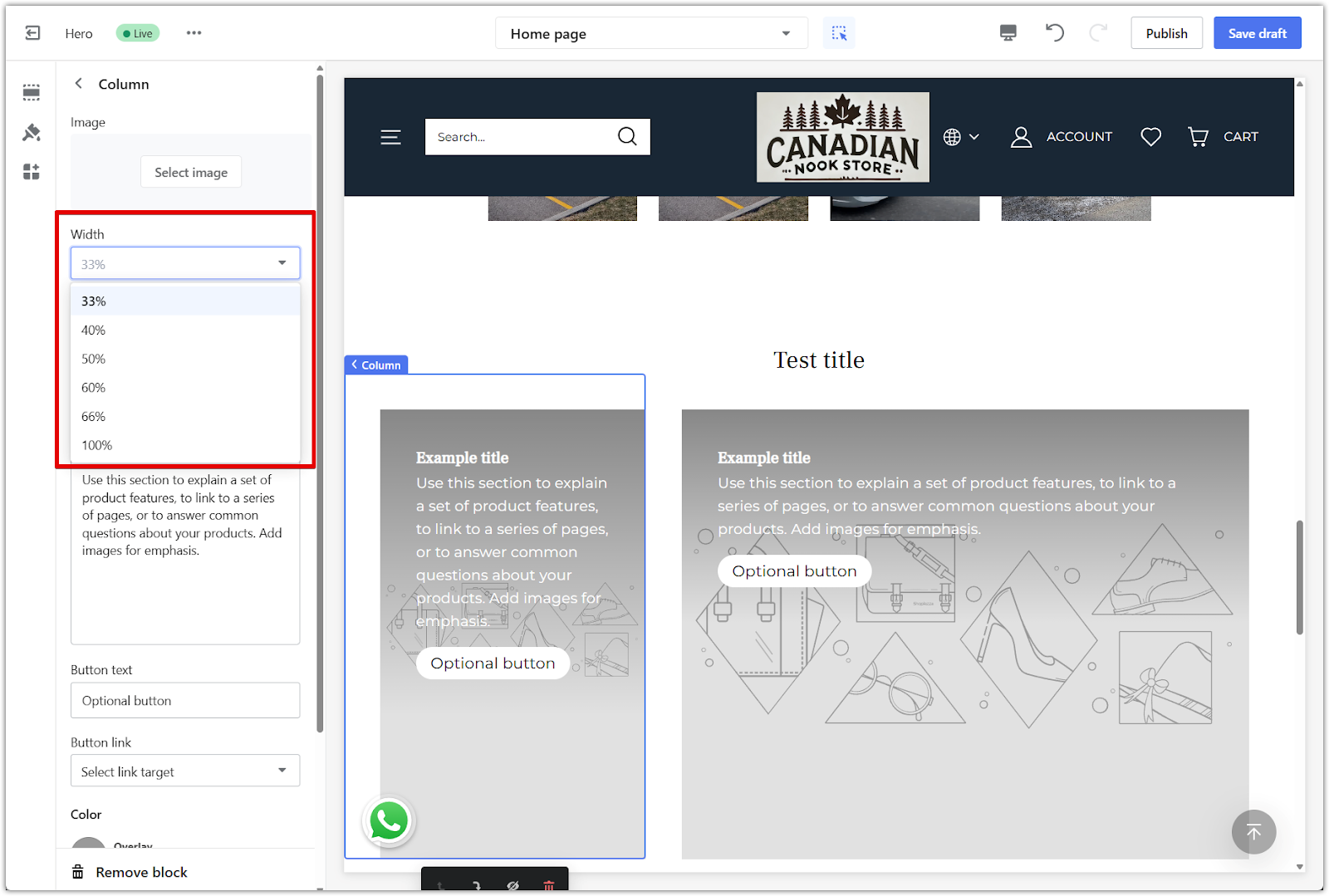
3. Set image width: Use the Width dropdown to control how much horizontal space the block takes up. Options range from 33% to 100%, allowing you to adjust how many blocks appear in a row. For example, selecting 33% allows three columns per row, while 50% creates a two-column layout. Choosing 100% displays the block as a full-width row.
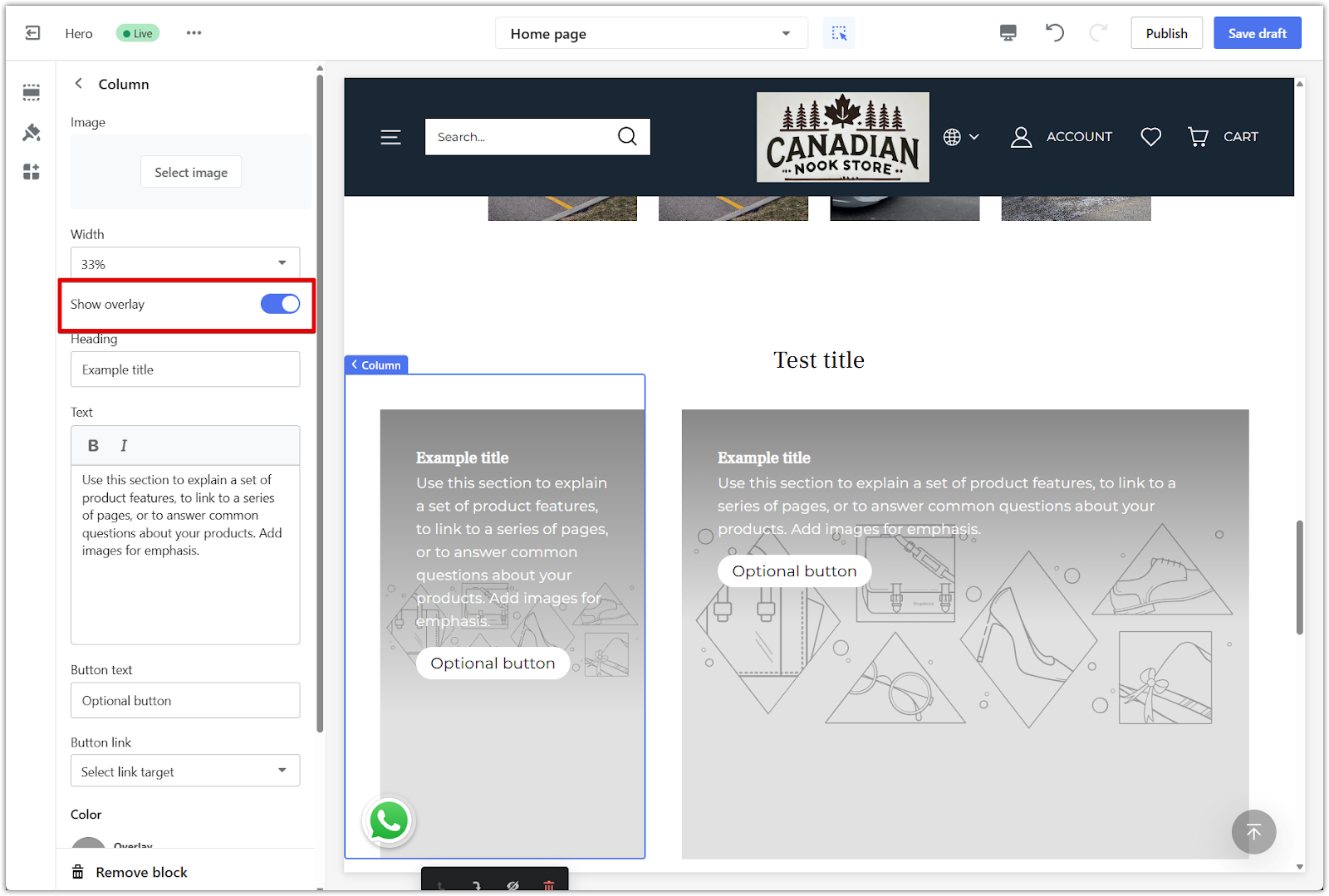
4. Enable overlay: Turn on Show overlay to darken the image slightly so the text stands out.
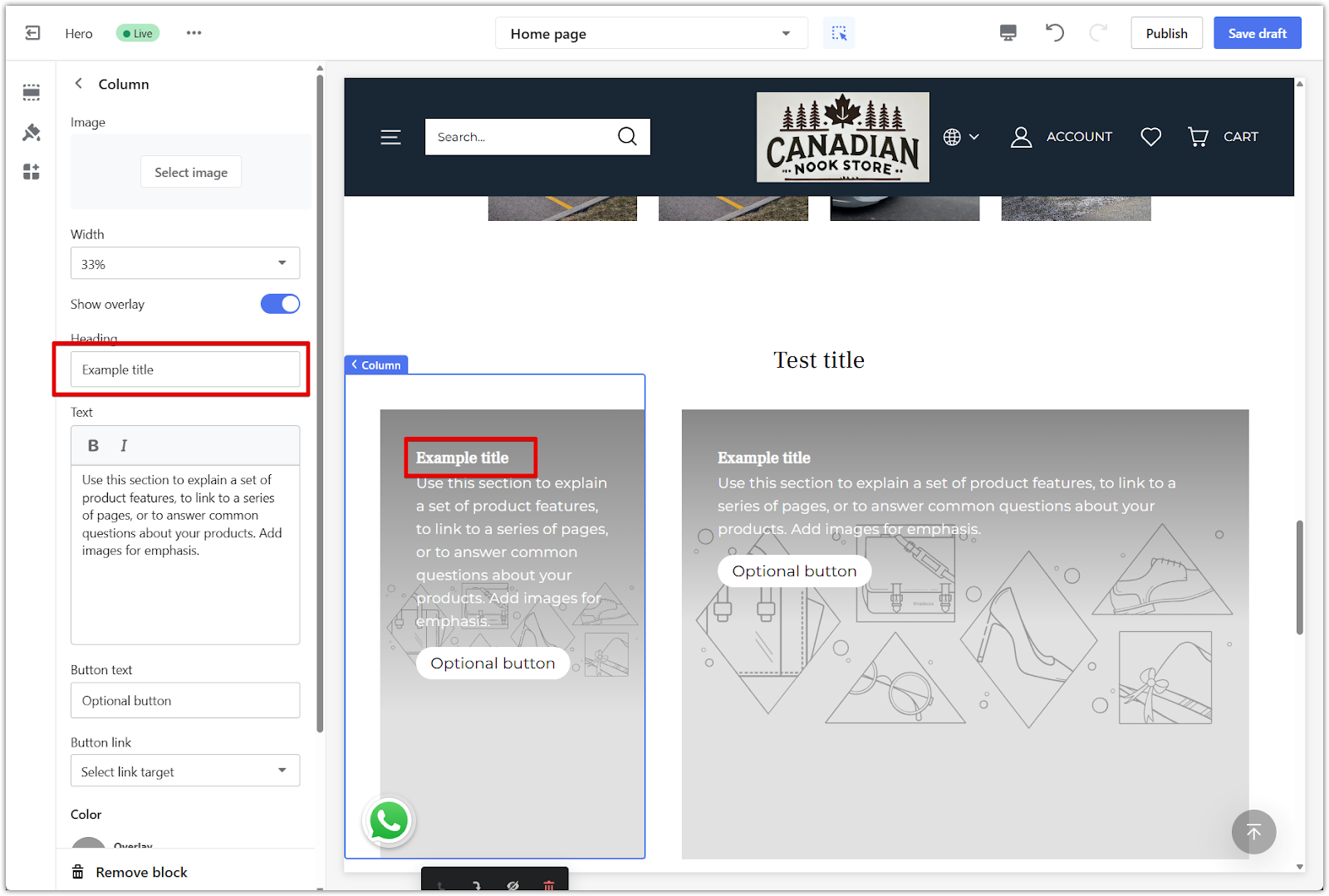
5. Add a heading: Enter a short title in the Heading field.
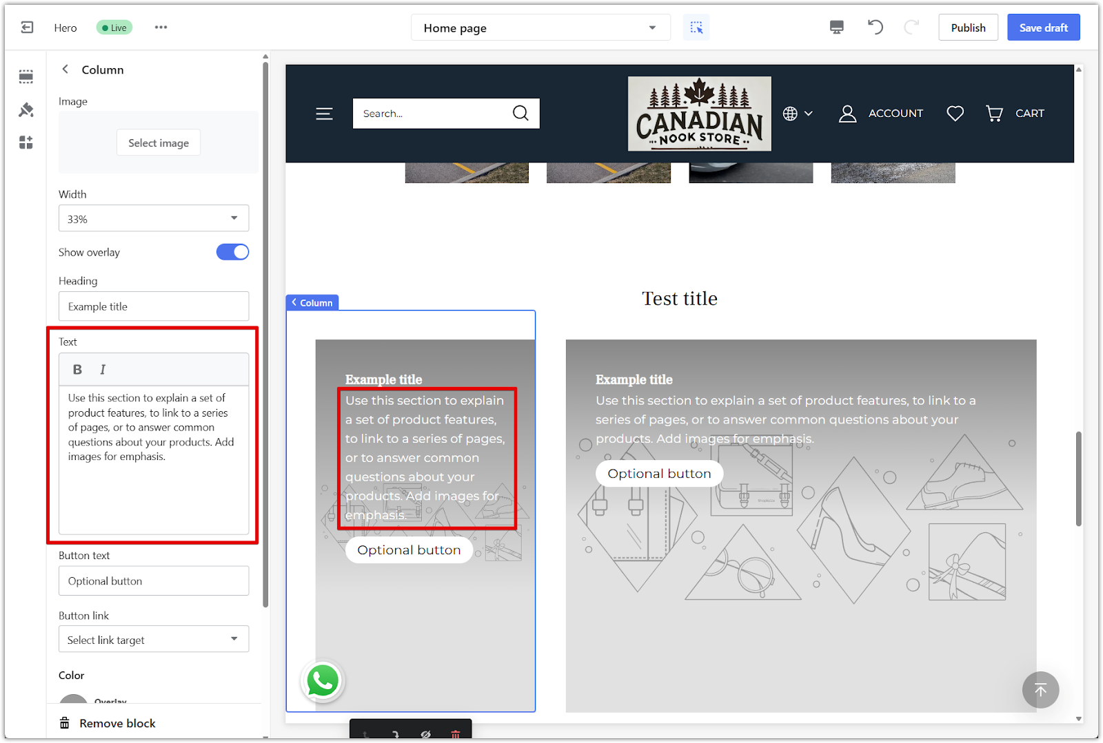
6. Add supporting text: Use the Text field to provide context, a description, or a message.
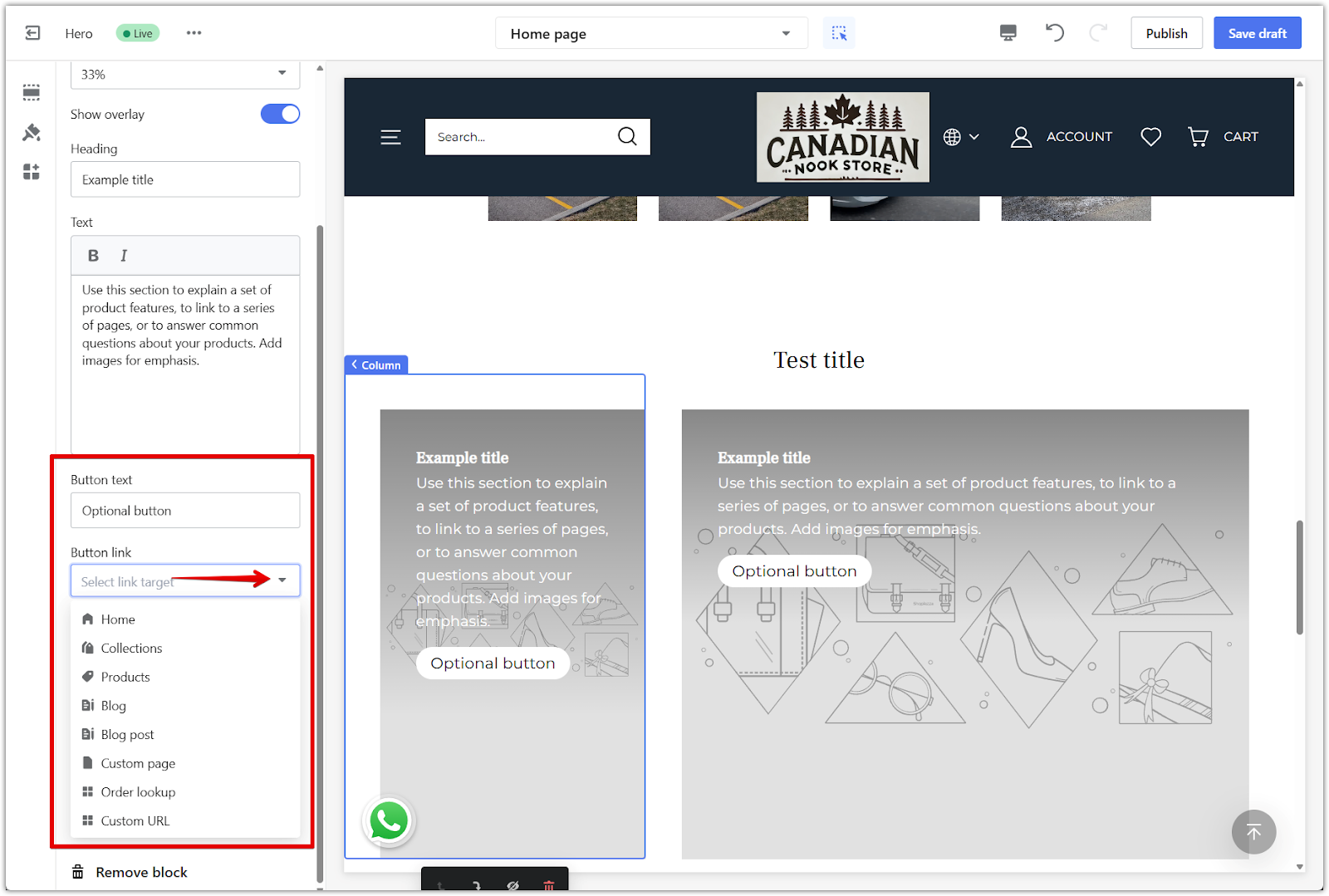
7. Add a button: To include a button, enter text in the Button text field and choose a destination using the Button link dropdown. Leave the text field blank to hide the button entirely.
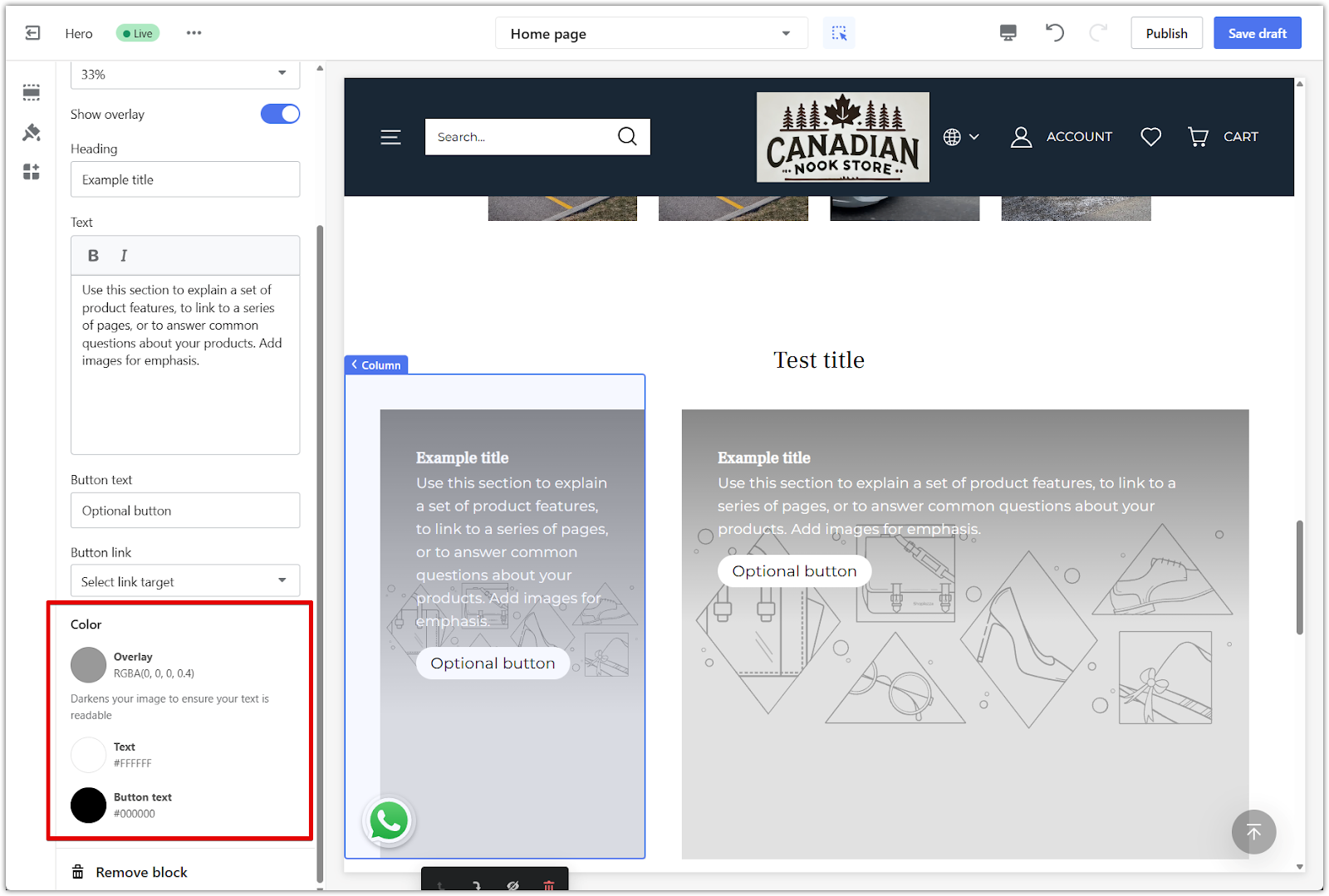
8. Customize colors: Adjust the overlay, text, and button colors to match your store’s branding and improve readability.
- Overlay: Choose a color and opacity level for the overlay layer.
- Text: Set the color for the heading and supporting text.
- Button text: Adjust the button label color for contrast.
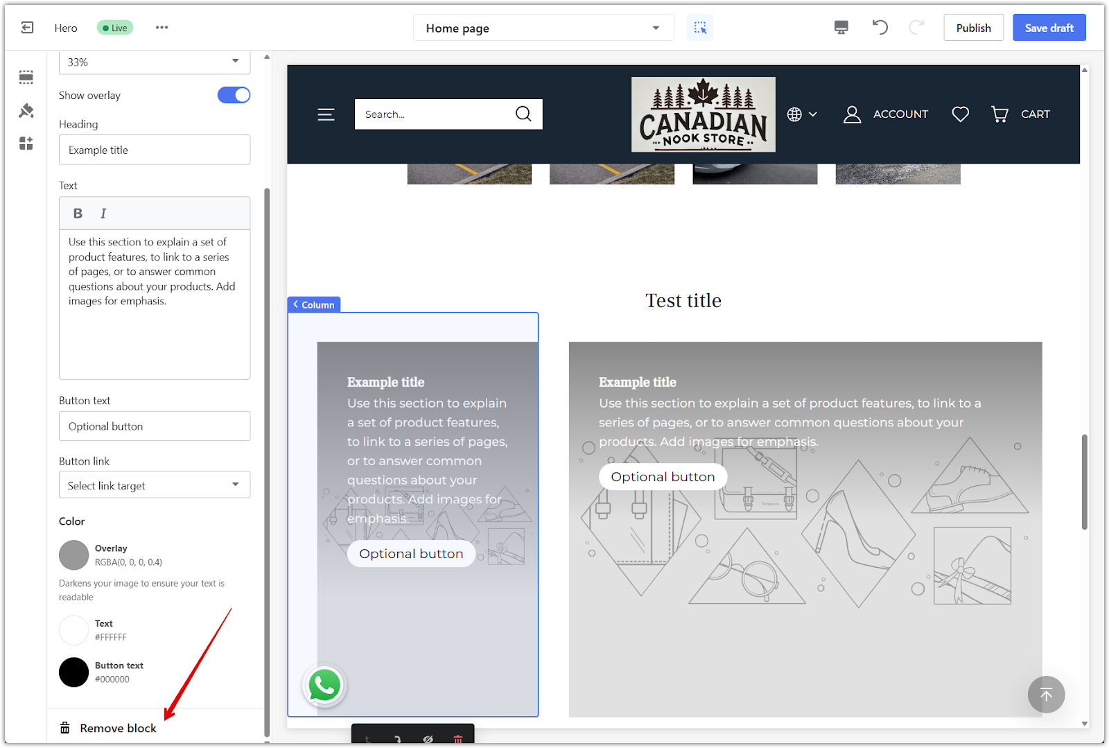
9. Remove the block: Scroll down and click Remove block to delete the content block.
The Overlay Text Column section provides a clean, image-focused layout with flexible content blocks. It’s a practical way to highlight features, promotions, or brand messages while keeping text easy to read through careful use of spacing, overlays, and visual balance.


Comments
Please sign in to leave a comment.