
The product image gallery in the Reformia theme is a comprehensive upgrade of the traditional product detail page layout, offering more flexible interactions and enhanced visual presentation. While retaining core product information such as images, titles, and prices, it introduces multiple gallery display options to meet the needs of more refined operations across different business scenarios. This article will introduce the "Product Image Gallery" feature on the product detail page.
Steps:
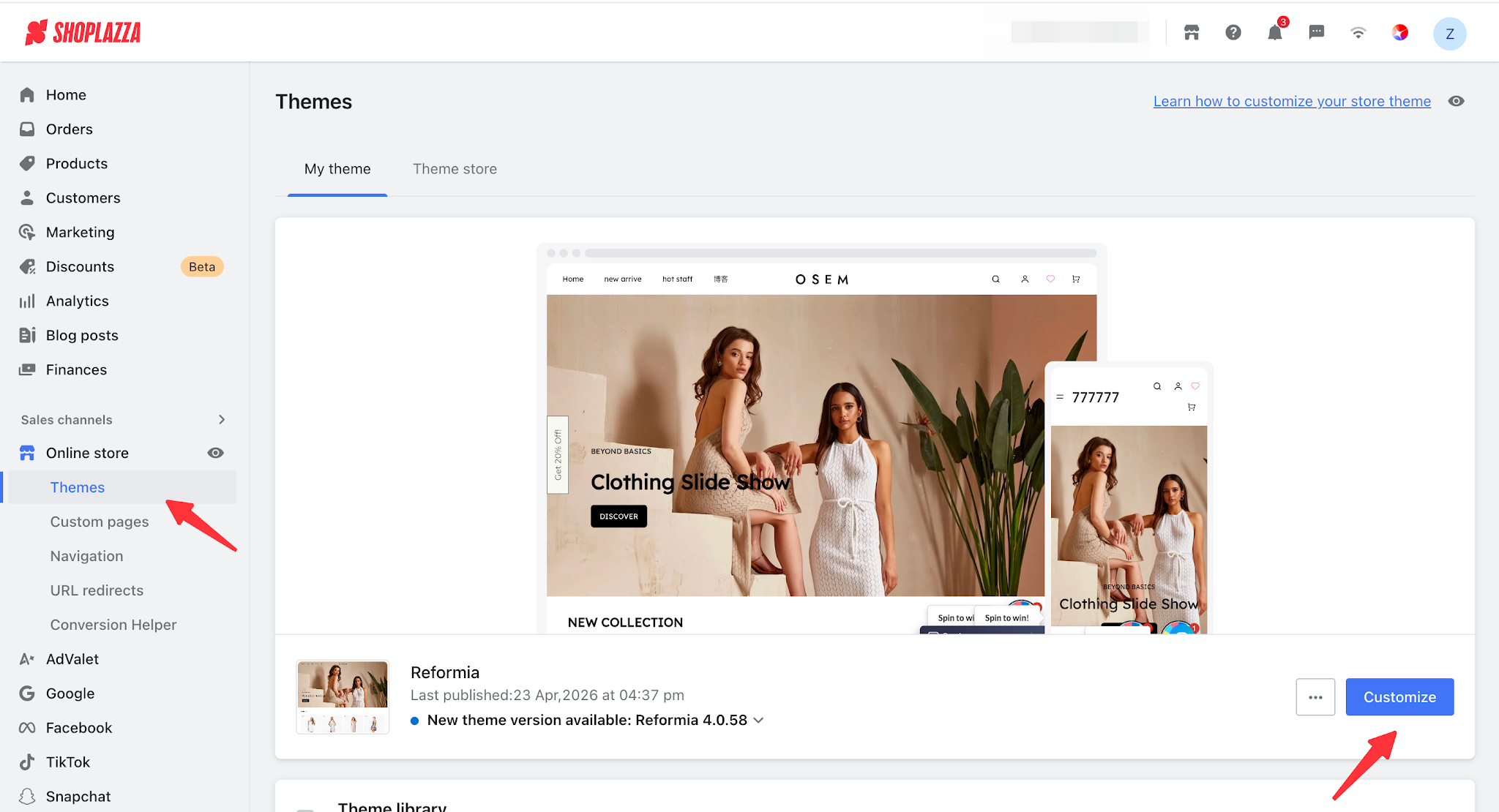
1. Log in to your Shoplazza admin panel, go to Online Store > Theme Editor, and click the Customize.
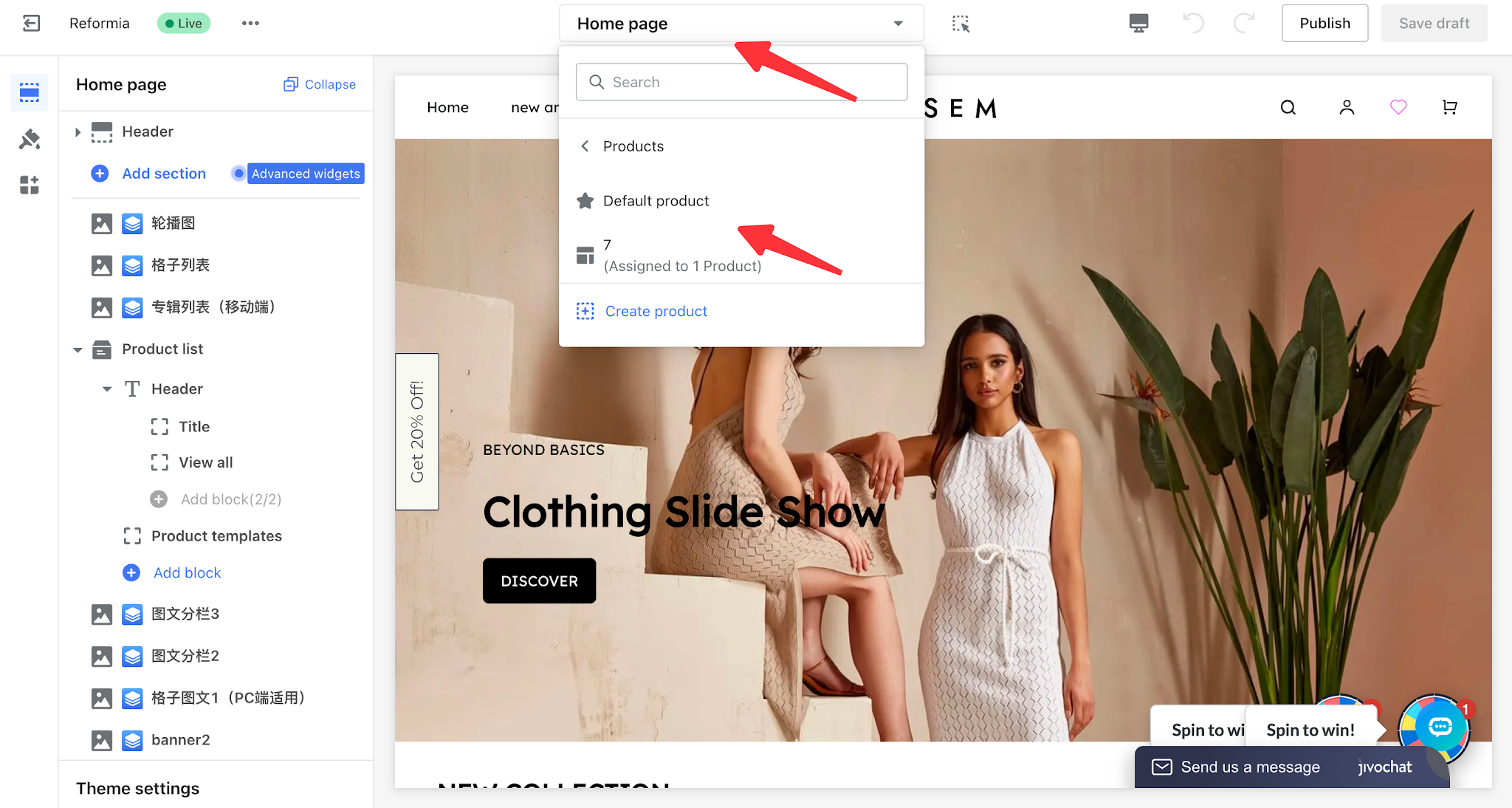
2. Click the page switcher at the top of the theme editor, then select the default product detail page to start editing.
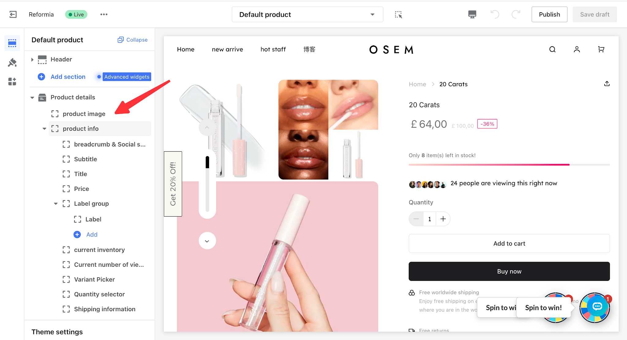
3. Click Product Image under the product detail section to start editing.
I. General Settings
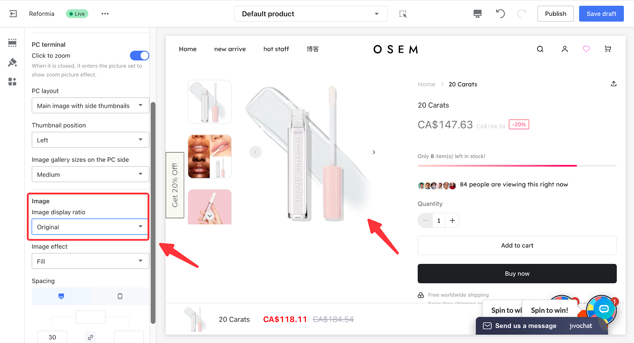
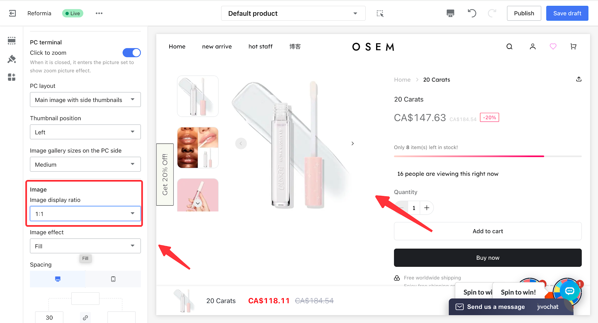
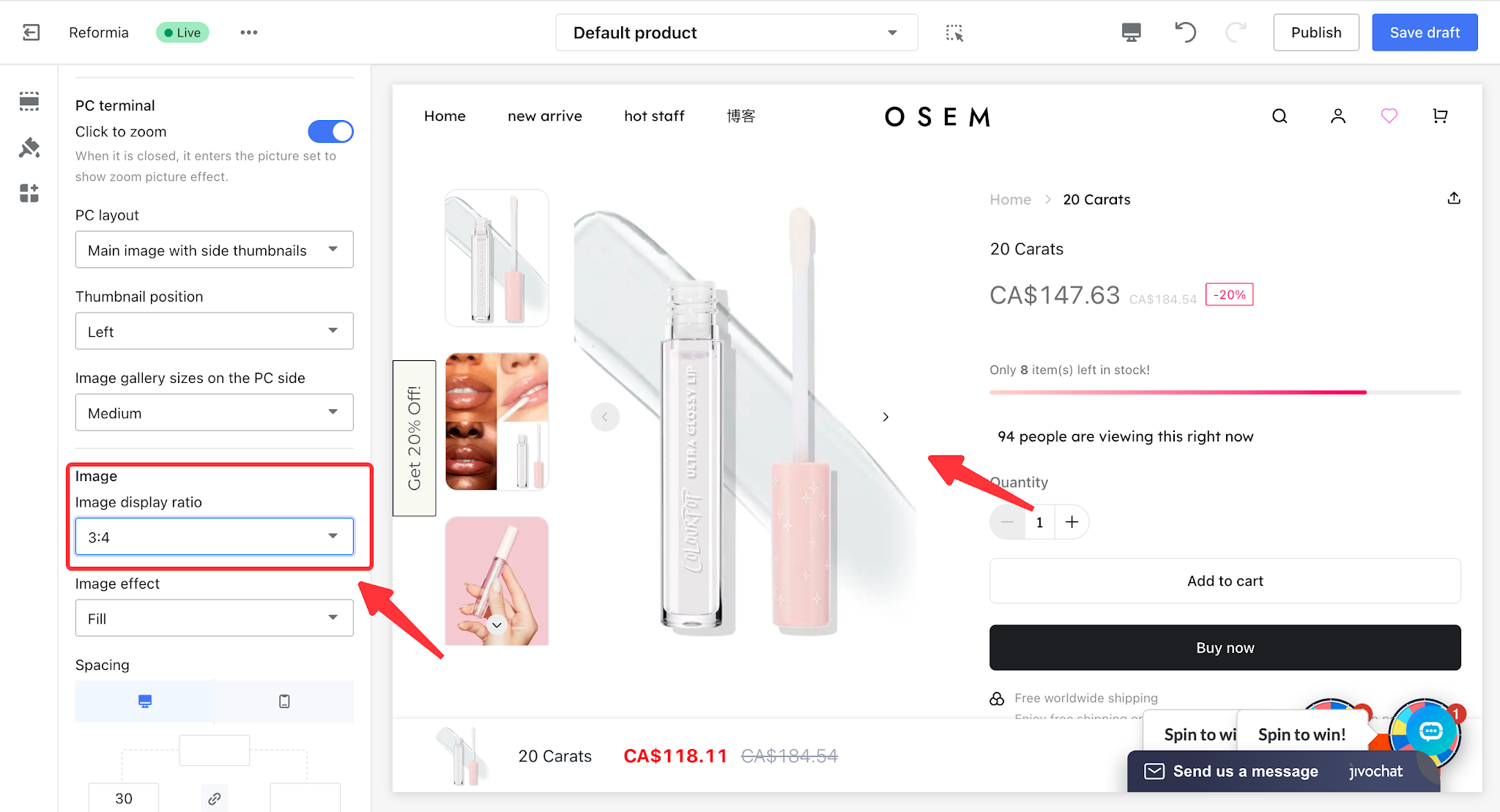
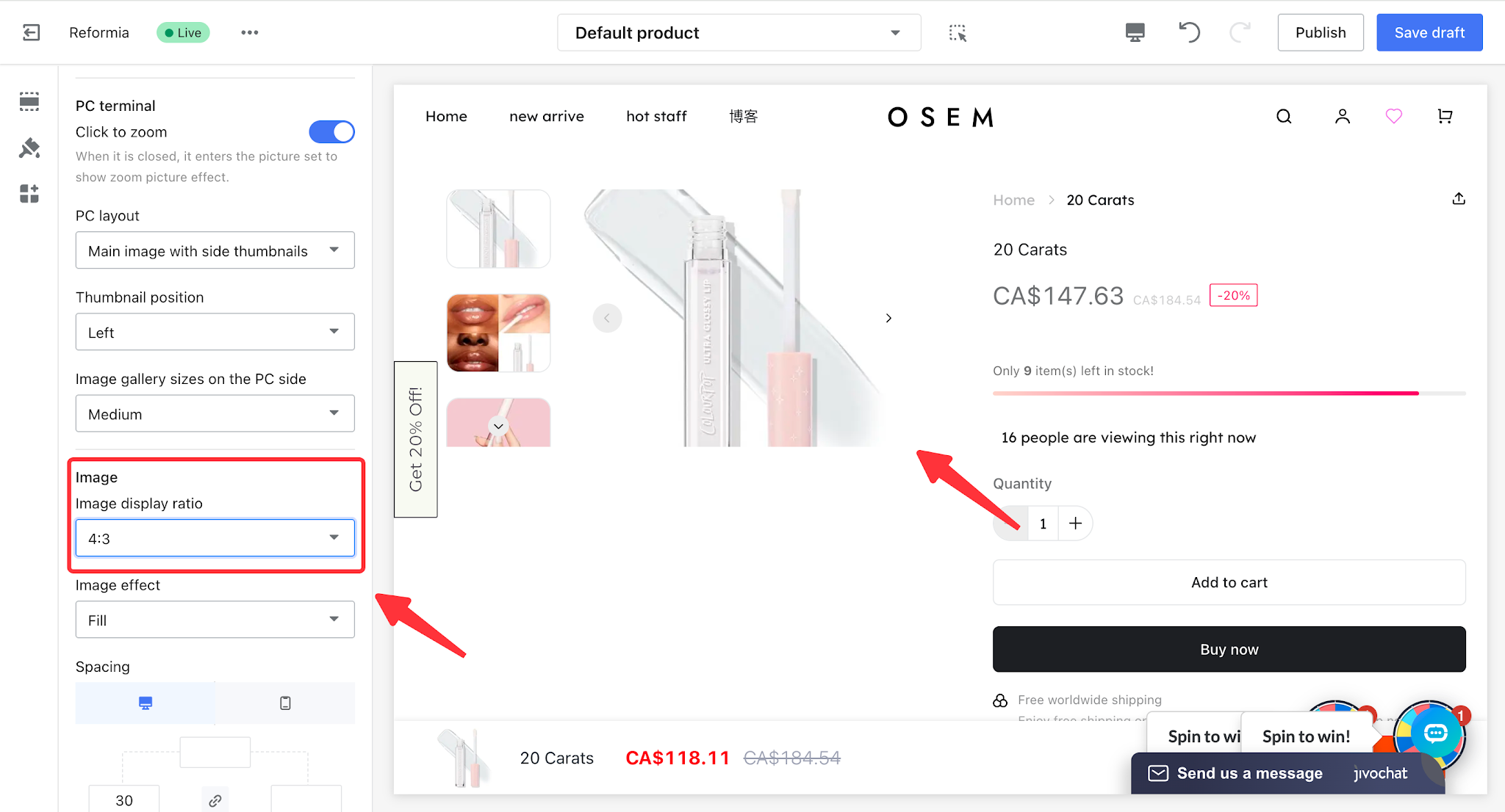
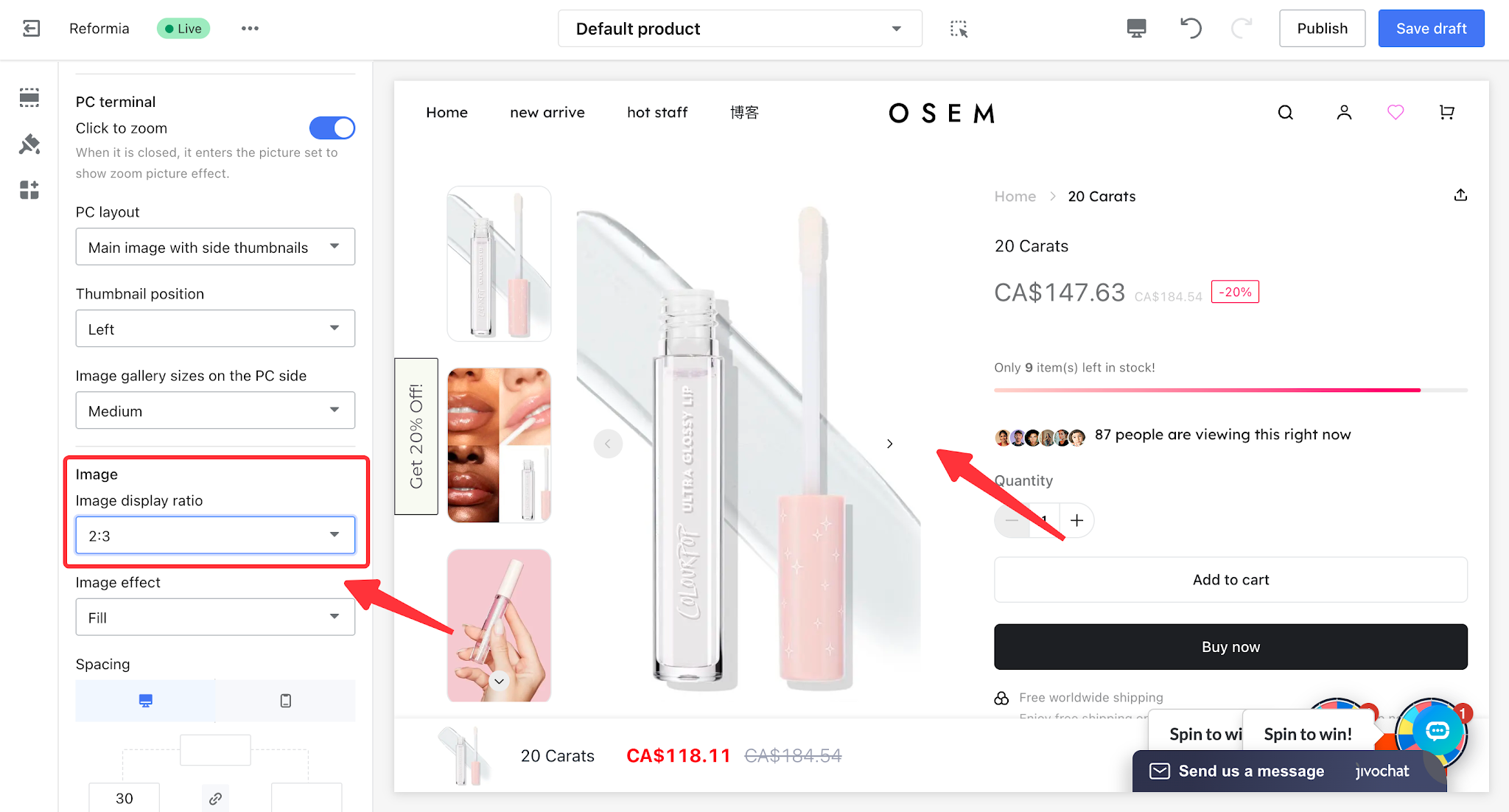
1.1 Images
- Image display ratio: can be set to Original, 1:1, 3:4, 4:3, or 2:3.
Image display ratio
| Size ratio | Display effect |
Original size
|
| |
| 1:1 |
| |
3:4
|
| |
| 4:3 |
| |
| 2:3 |
|
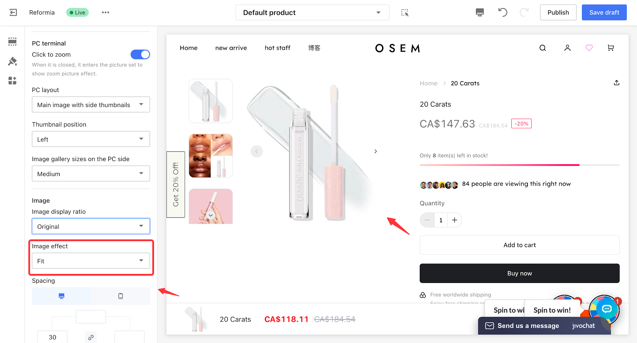
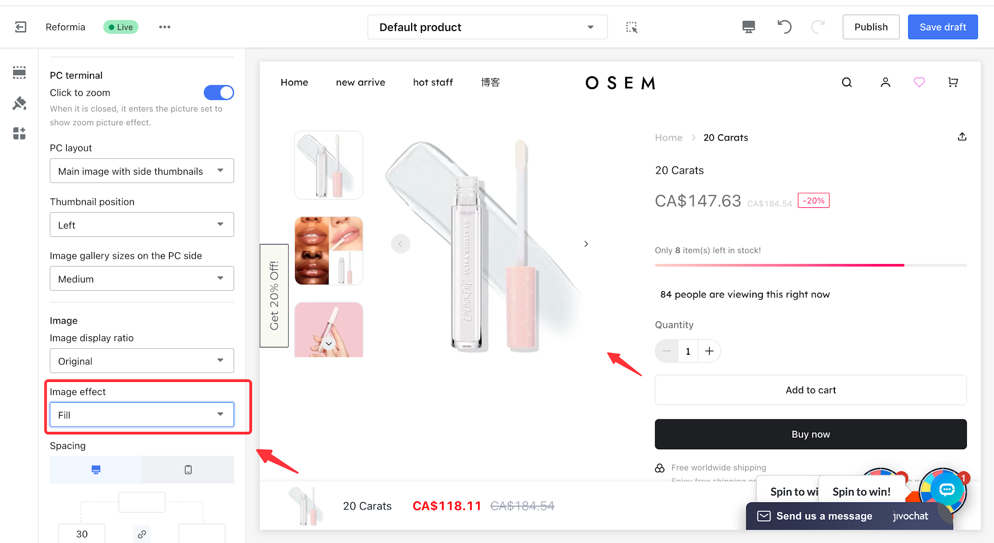
- Image display effect: can be set to Fit or Fill.
Fit: Ensures the entire image is displayed without cropping or stretching, prioritizing the complete product appearance and all details, and avoiding any missing content in the display.
Fill: Makes the image fully cover the gallery container without leaving any empty space, prioritizing a clean and fully covered visual presentation.
This article uses a 4:3 image ratio as an example to compare the Fit and Fill display effects.
| Fit | Fill |
|
|
II. PC settings
2.1 Click to enlarge image
Core purpose of click-to-enlarge images: to allow customers to view product details that are not clearly visible in smaller containers, thereby improving customer trust.
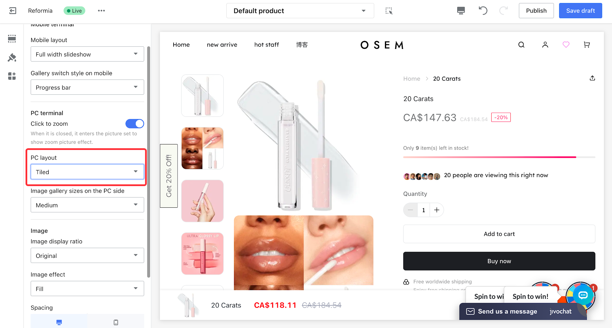
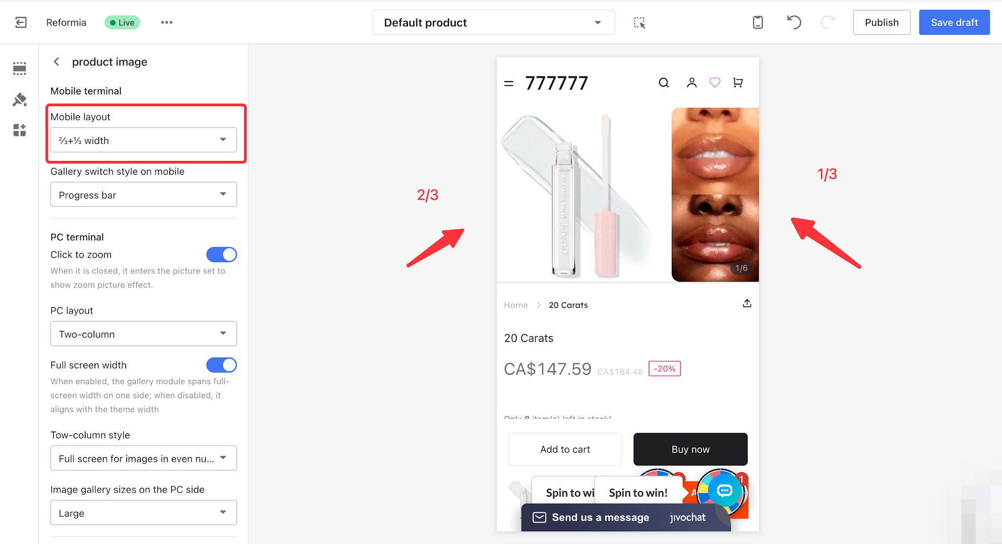
2.2 PC Layout
PC layout can be set to Grid, Two Columns, Side-by-Side Single Image, or Focus Carousel layout.
2.2.1 Tiled
The grid layout is clean and consistent with a fast visual rhythm, allowing customers to quickly browse using a “view image → decide preference → click” flow.
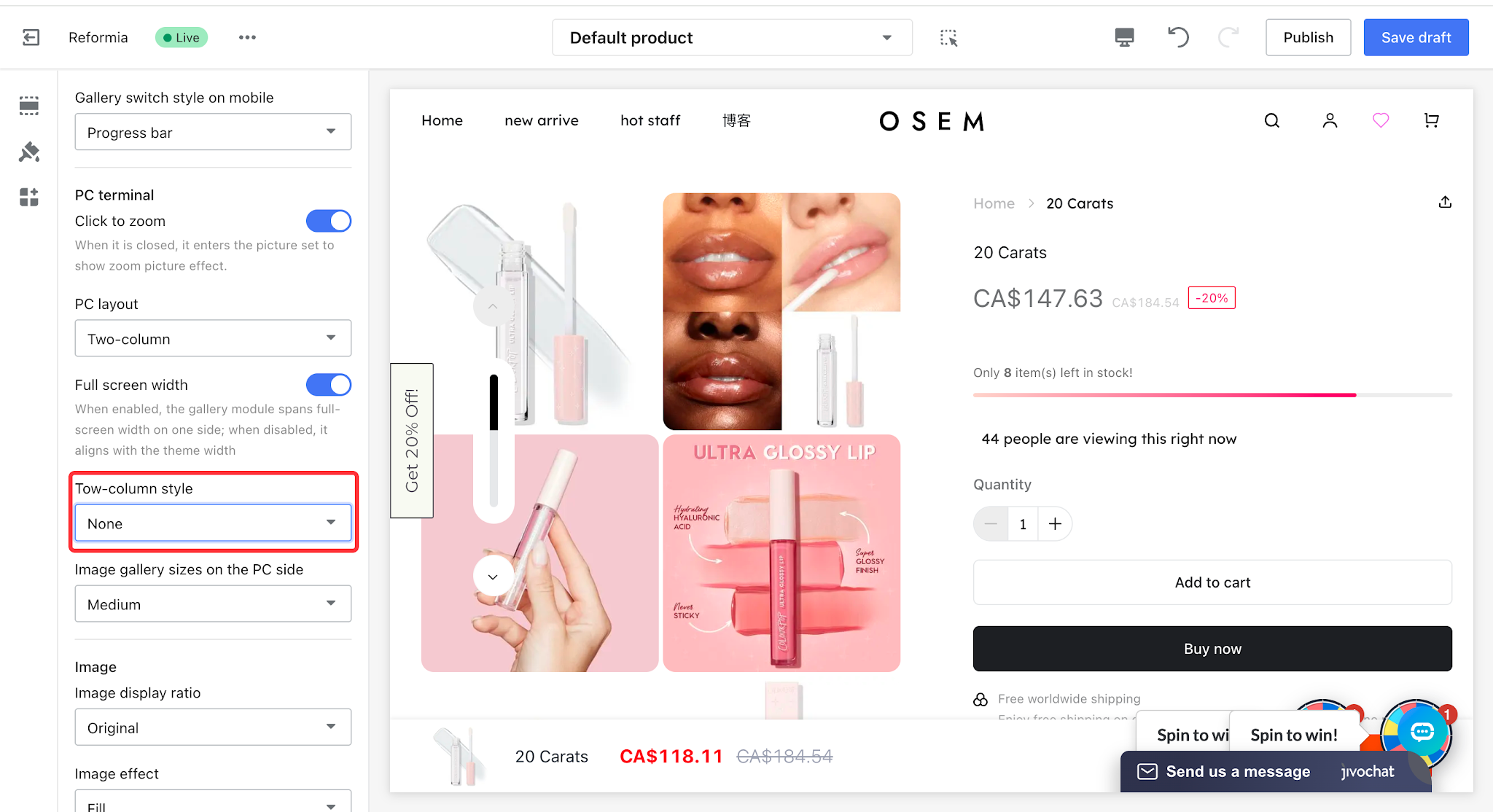
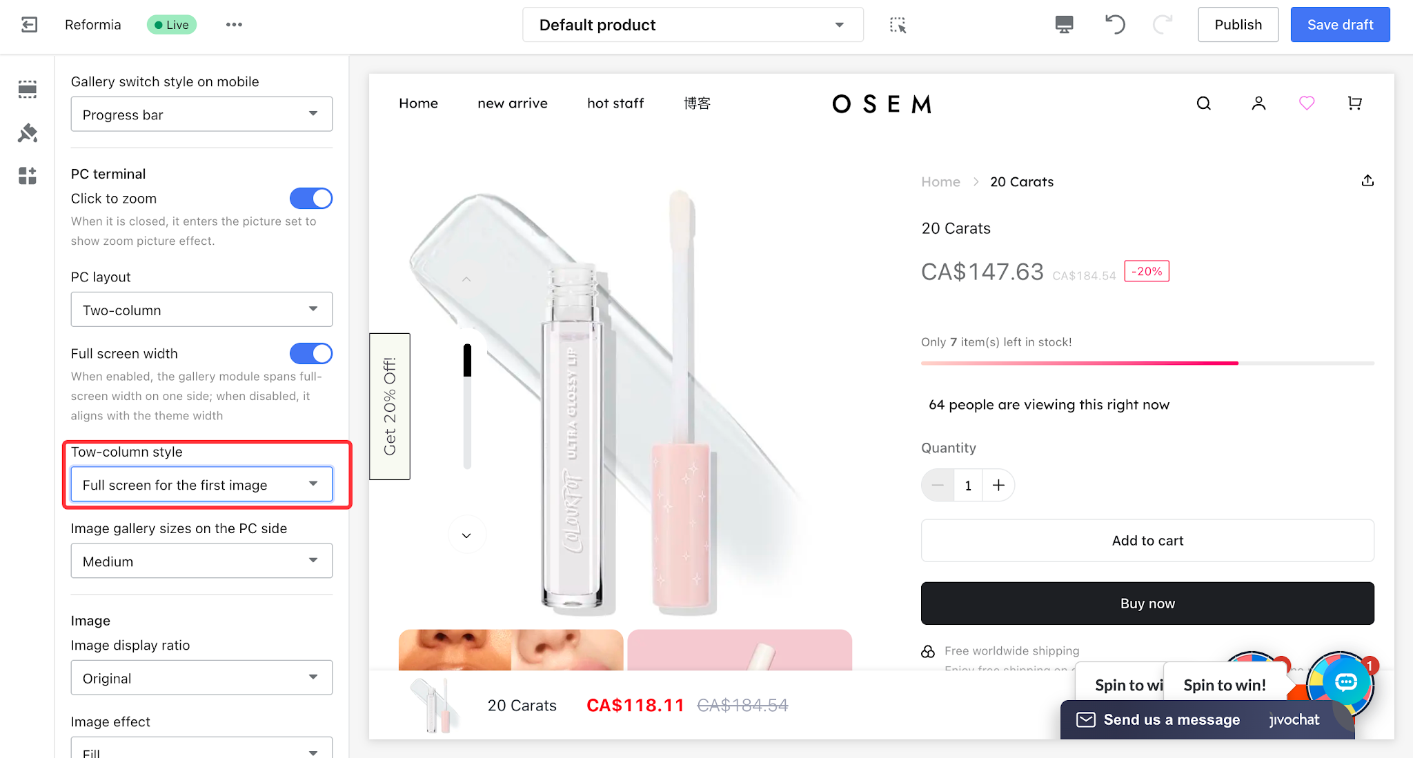
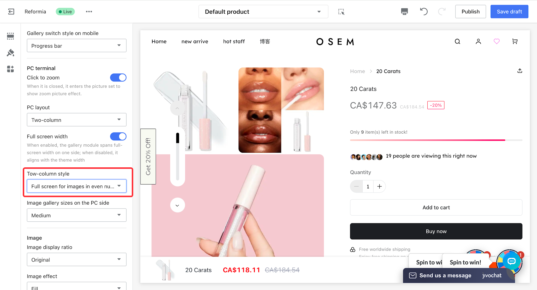
2.2.2 Two Columns
The core purpose of the two-column layout is to balance the visual presentation and reduce excessive scrolling. It offers three style options: None, First image full-width, and Even-numbered rows full-width.
| Style | Description | Display effect |
None
| All product images are displayed in a two-column layout |
|
| First image full-width | The first product main image is displayed in full width. |
|
Even-numbered rows full-width
| Product images in even-numbered rows are displayed in full width, while other product images are displayed in a two-column layout. |
|
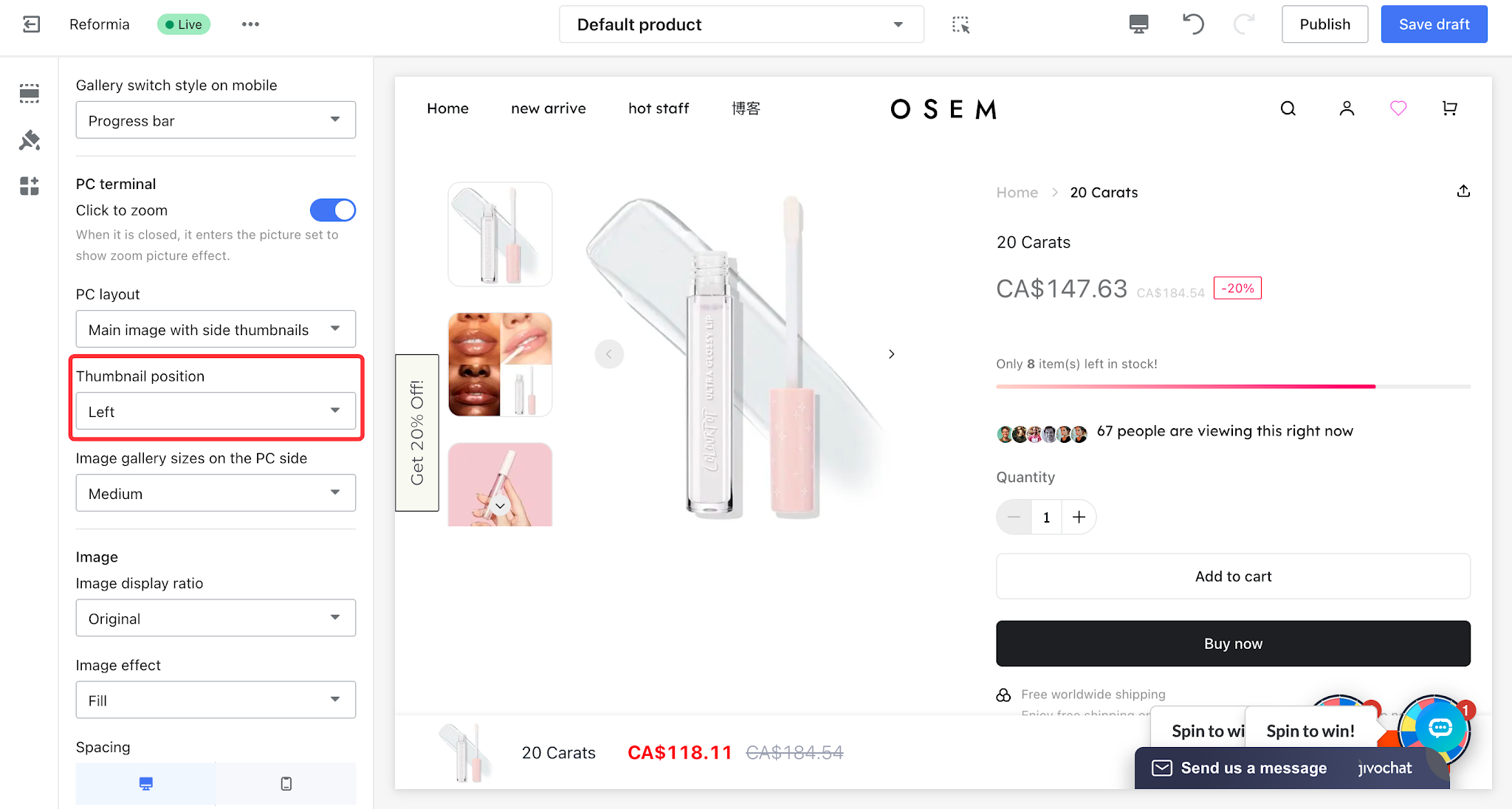
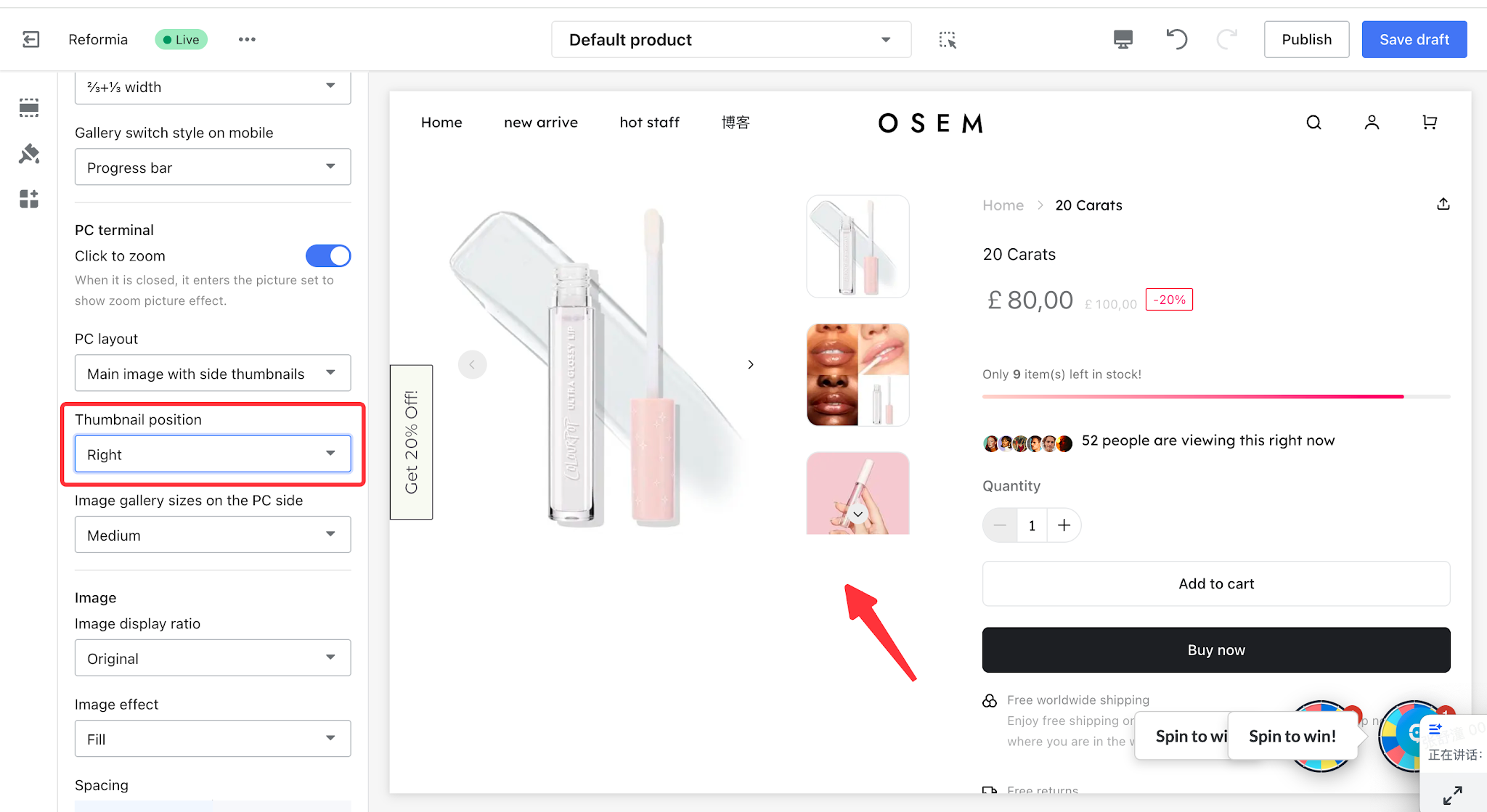
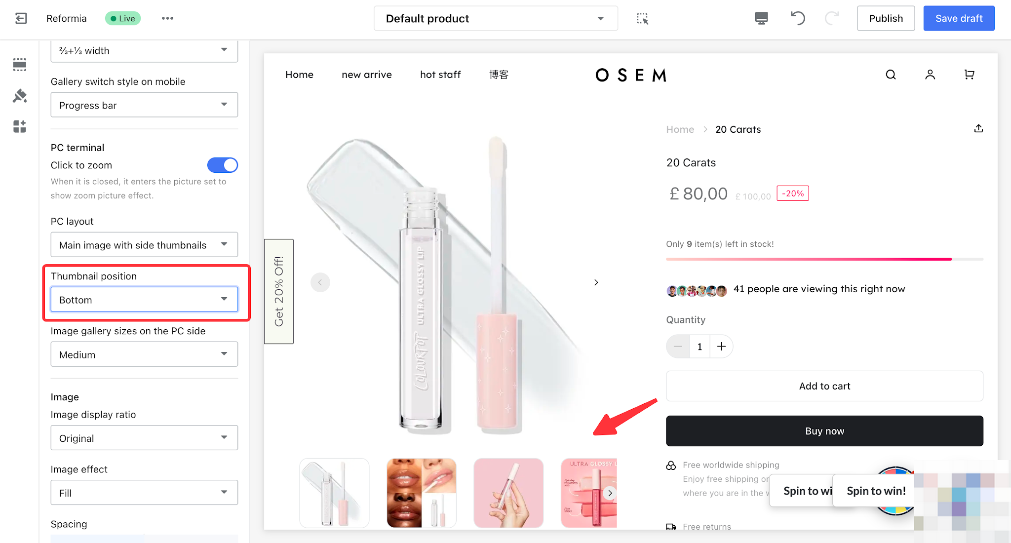
2.2.3 Main image with side thumbnails
Allows customers to quickly find the image they want through thumbnails displayed alongside the main image. The thumbnail position can be set to left, right, or bottom.
| Thumbnail position | Display effect |
Left |
|
right |
|
Bottom |
|
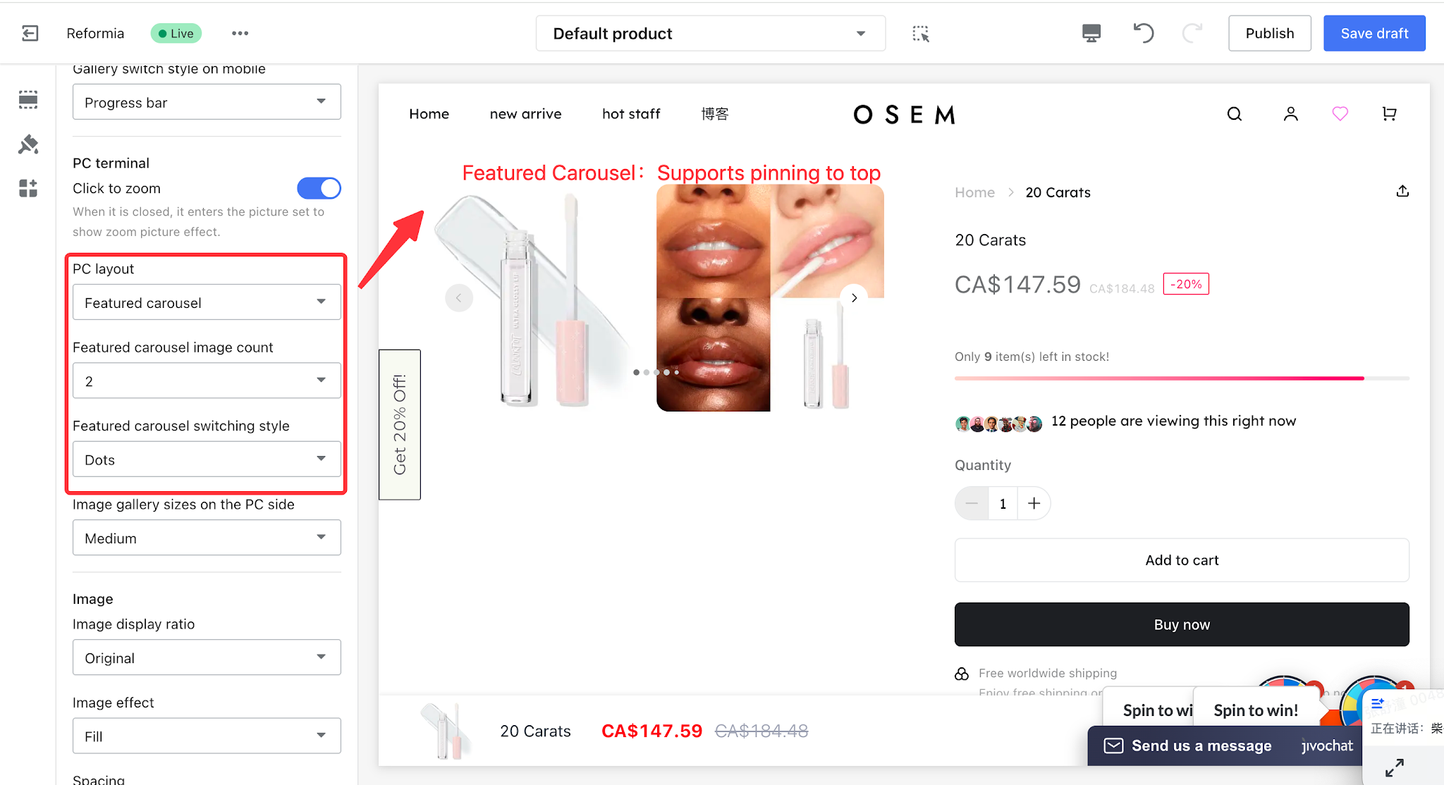
2.2.4 Featured Carousel
The featured carousel delivers richer display content, guiding customers to browse in order to effectively boost conversion rates and user experience. It supports adjusting the number of main images and gallery switching styles.
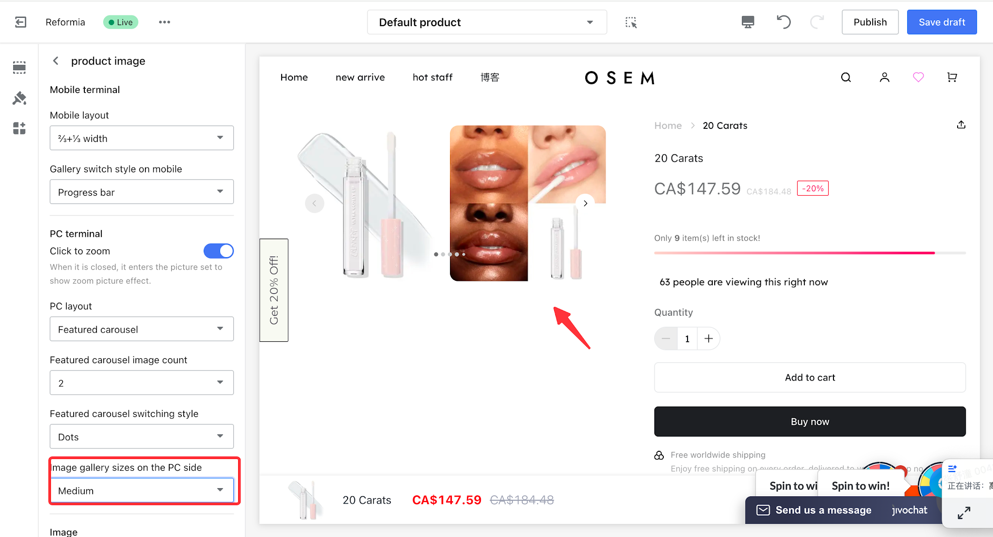
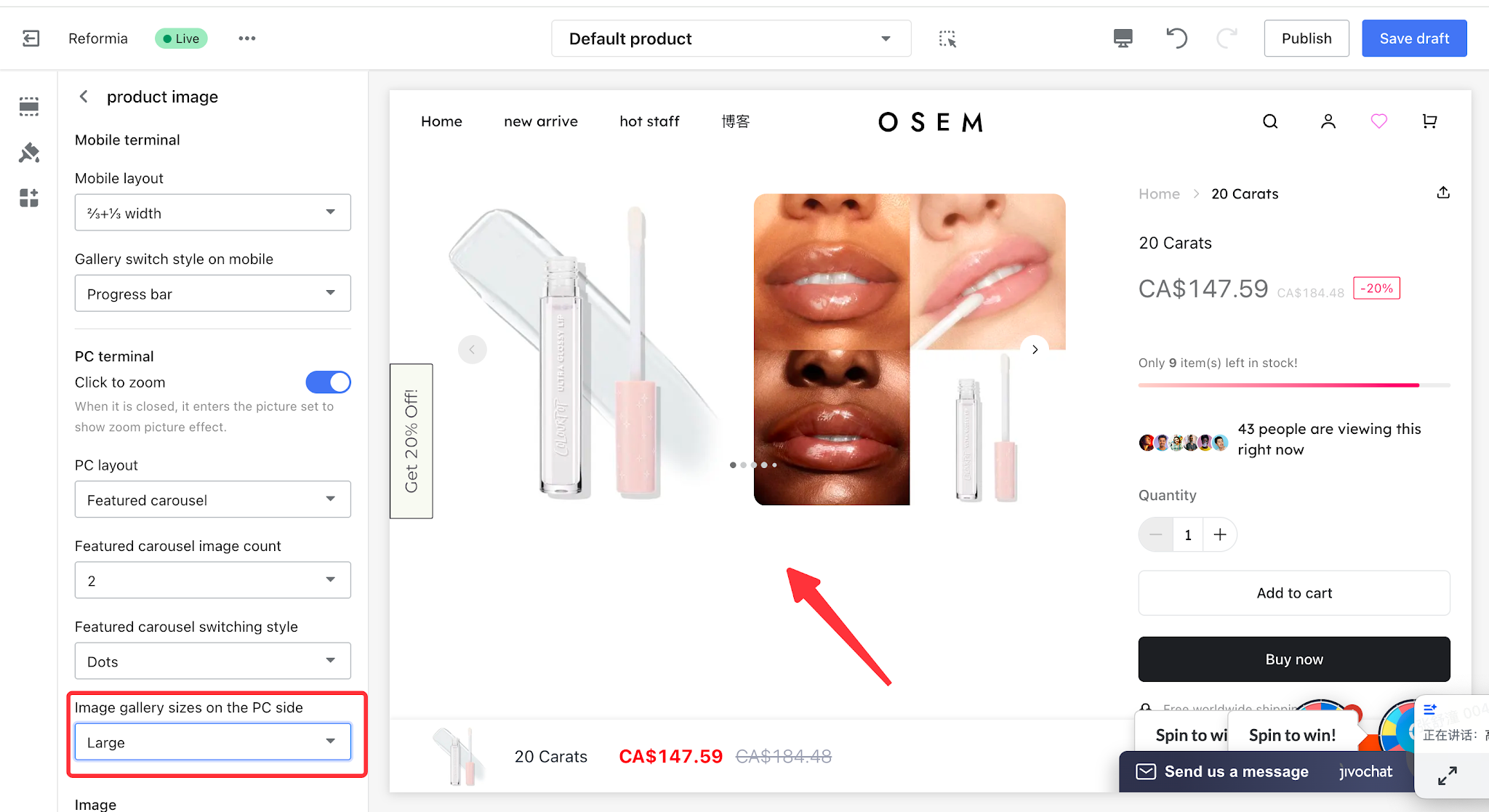
2.3 PC Gallery Dimensions
Three display modes are available: Small, Medium and Large.The display size of images can be controlled by adjusting PC gallery dimensions.It balances information display and page layout based on diverse presentation requirements, delivering optimized user experience.
| PC Gallery Dimensions | Display Effect |
| Small | img src="https://cnres.appracle.com/489cdd4d3cb47fcf4e26a9464ef131cd.png"
|
| Medium |
|
| Large |
|
III. Mobile Settings
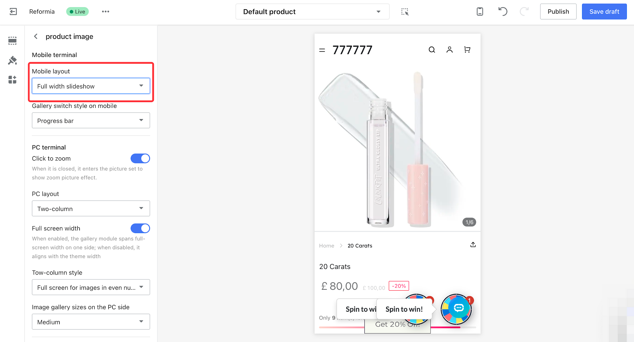
3.1 Mobile Layout
Mobile layout configuration helps enhance user experience. Two layout options are available: 2/3+1/3 width and full width, delivering distinct display effects.
| Mobile Layout | Display Effect | Advantages |
2/3+1/3 width
|
| Information is more comprehensive with refined layout.
|
| Full width slideshow |
| Concise and clear, fully presenting product details.
|
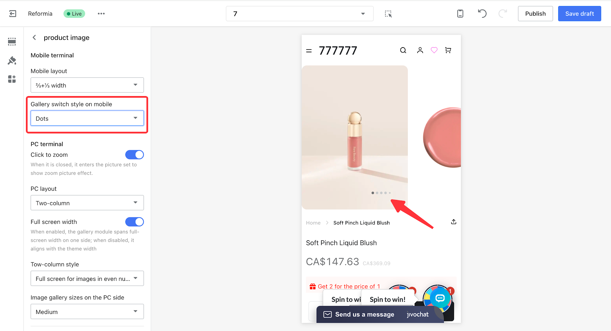
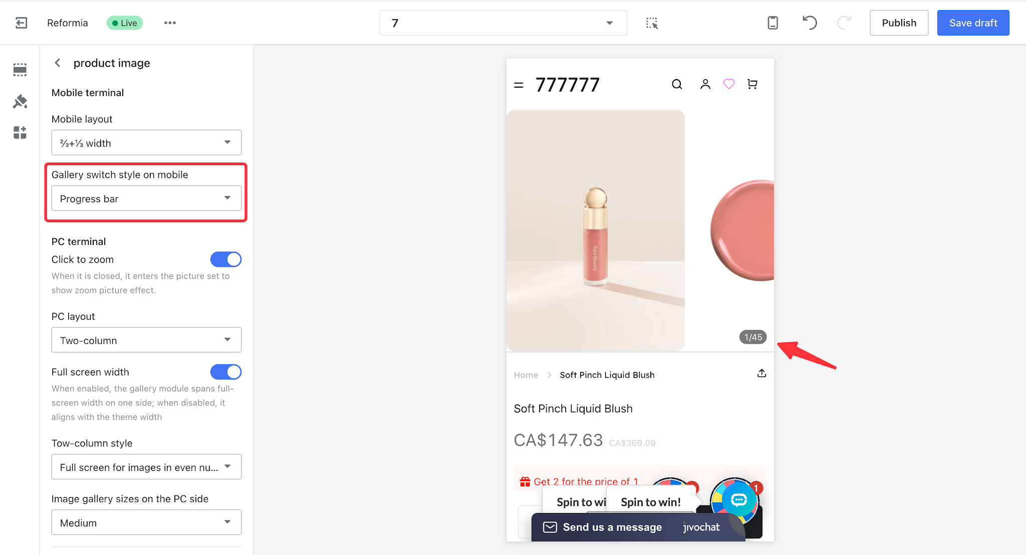
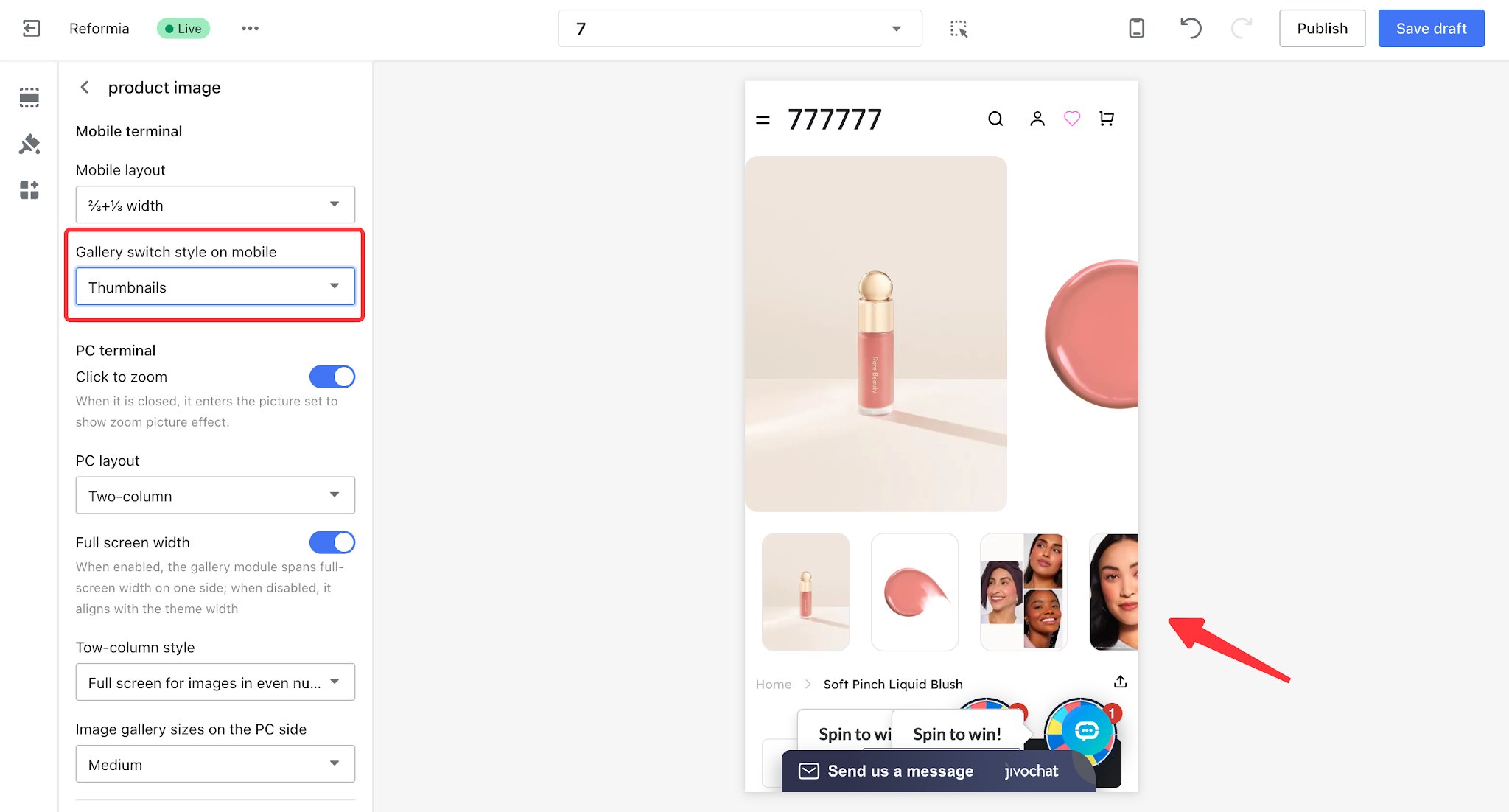
3.2 Mobile Gallery Switching Style
The mobile gallery switching style can be divided into dots, progress bar, and thumbnails, and you can choose according to your actual business needs.
| Mobile gallery switching style | Display effect |
| Dots |
|
| Progress bar |
|
Thumbnails
|
|


Comments
Please sign in to leave a comment.