
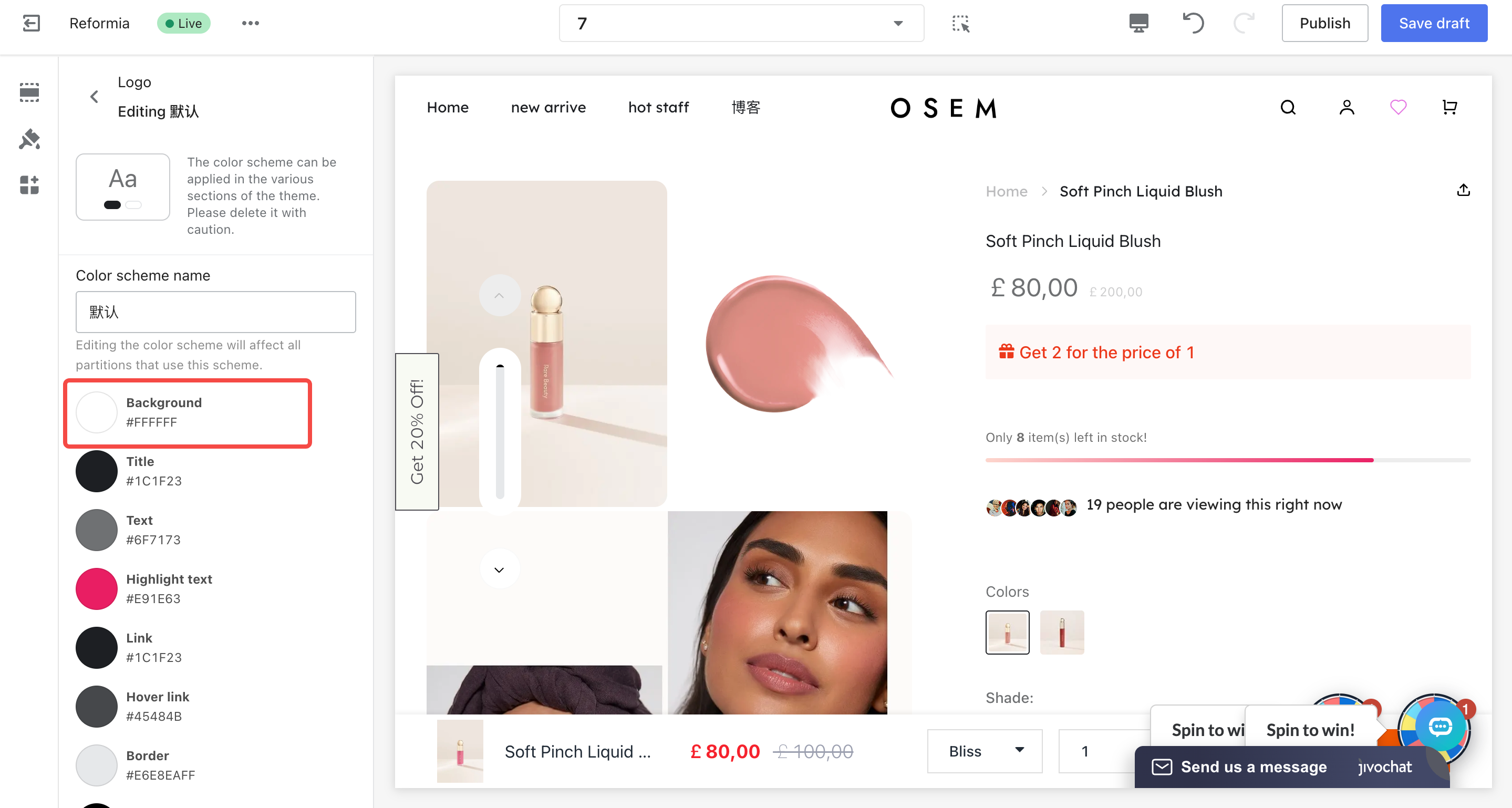
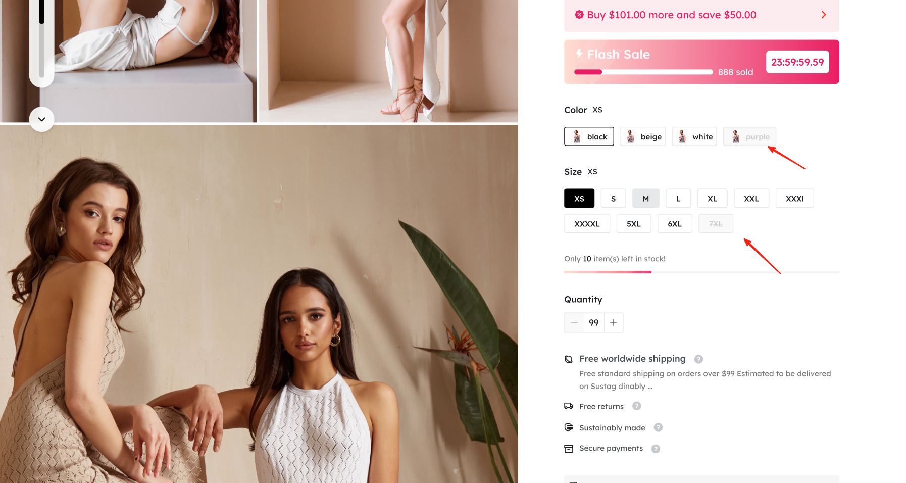
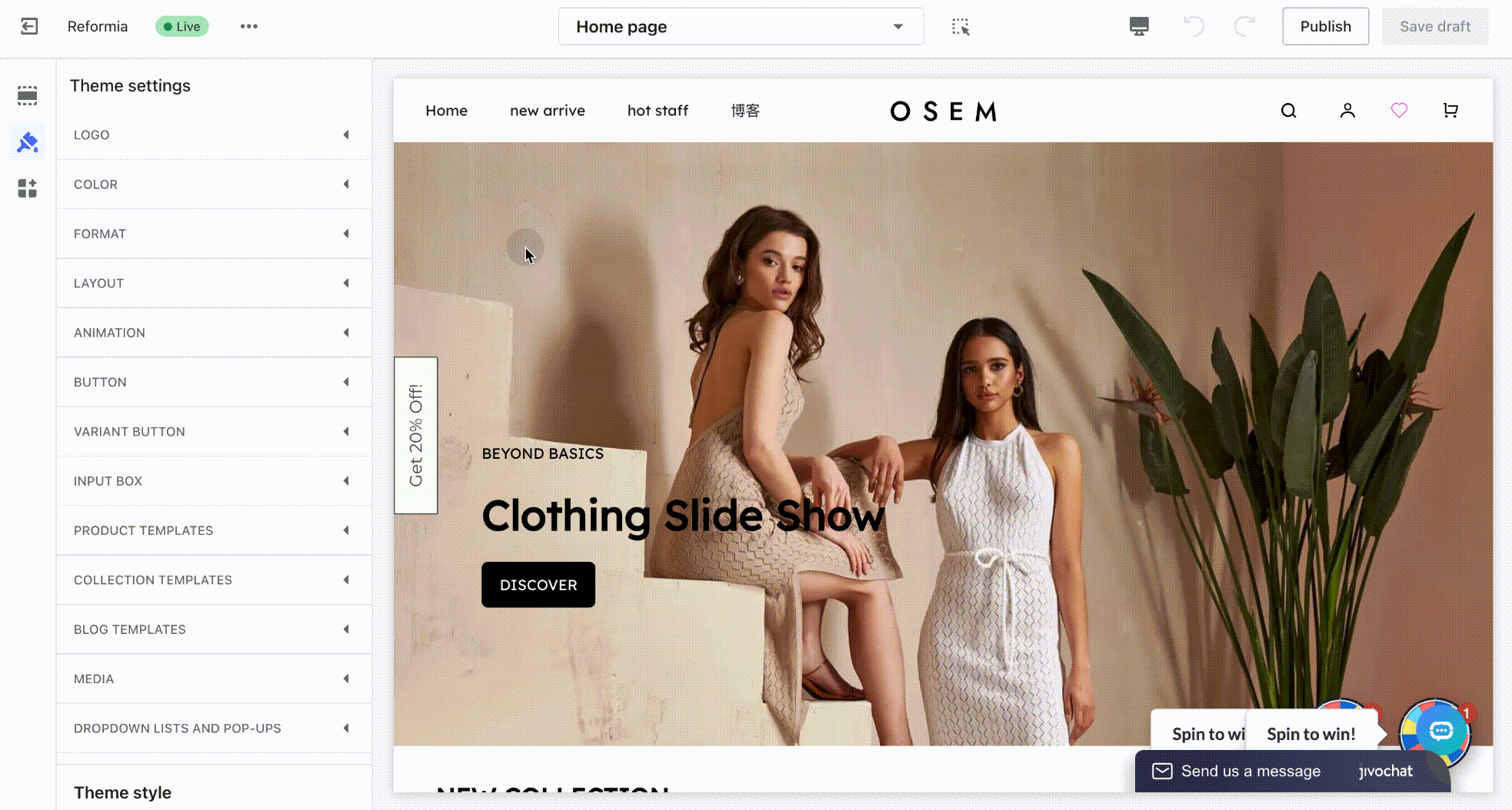
The color scheme of a cross-border independent store directly affects buyers’ trust and their willingness to place an order. For example, unclear button colors may make it difficult for customers to find the “Add to Cart” button, while low contrast between text and background can make information hard to read. A well-designed color scheme can effectively improve conversion rates. The Reformia theme provides multiple color schemes, and different modules can use different schemes. This article aims to guide you in understanding which frontend elements of the store correspond to backend color settings and how to modify them.
Function Description
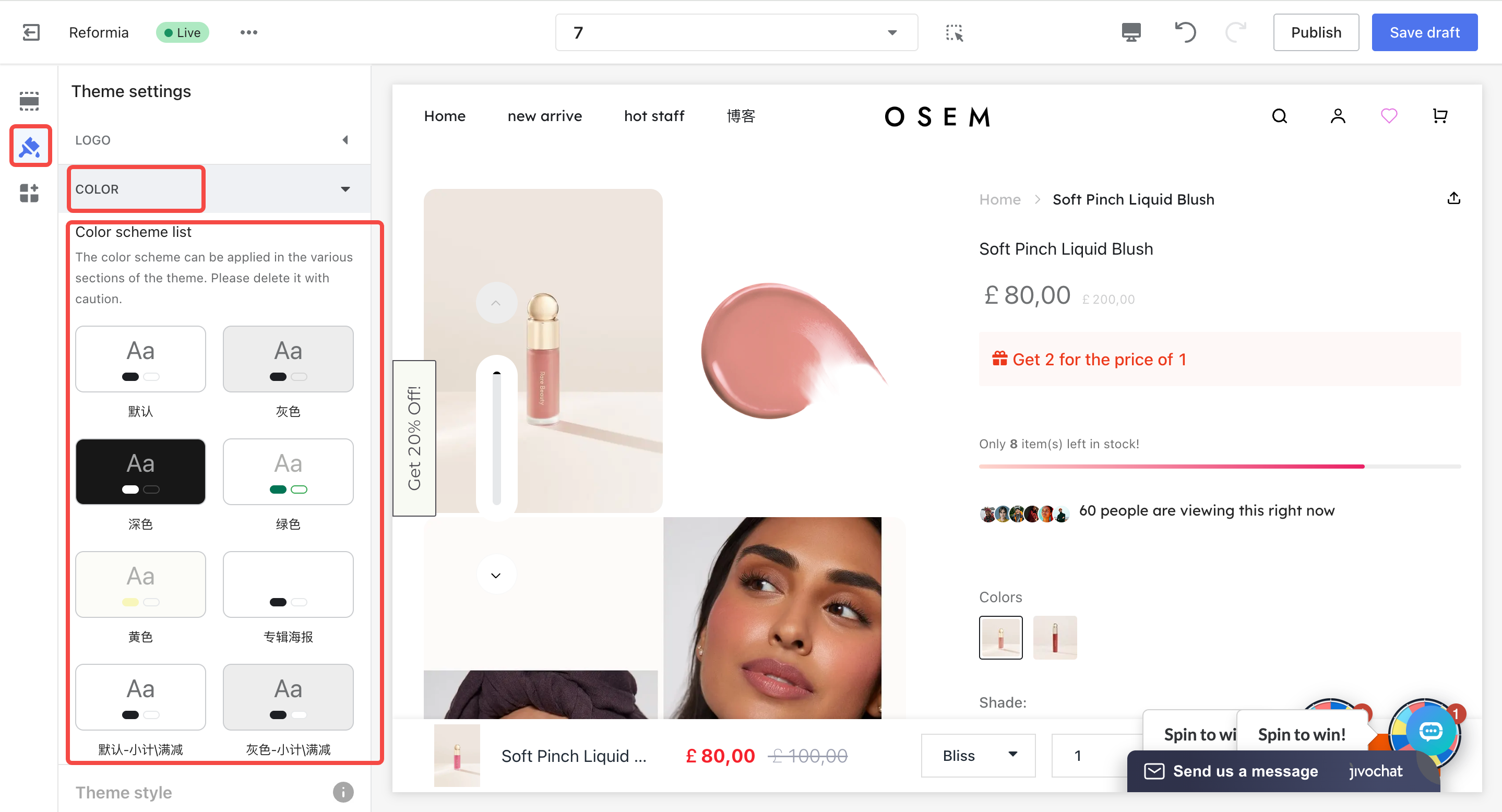
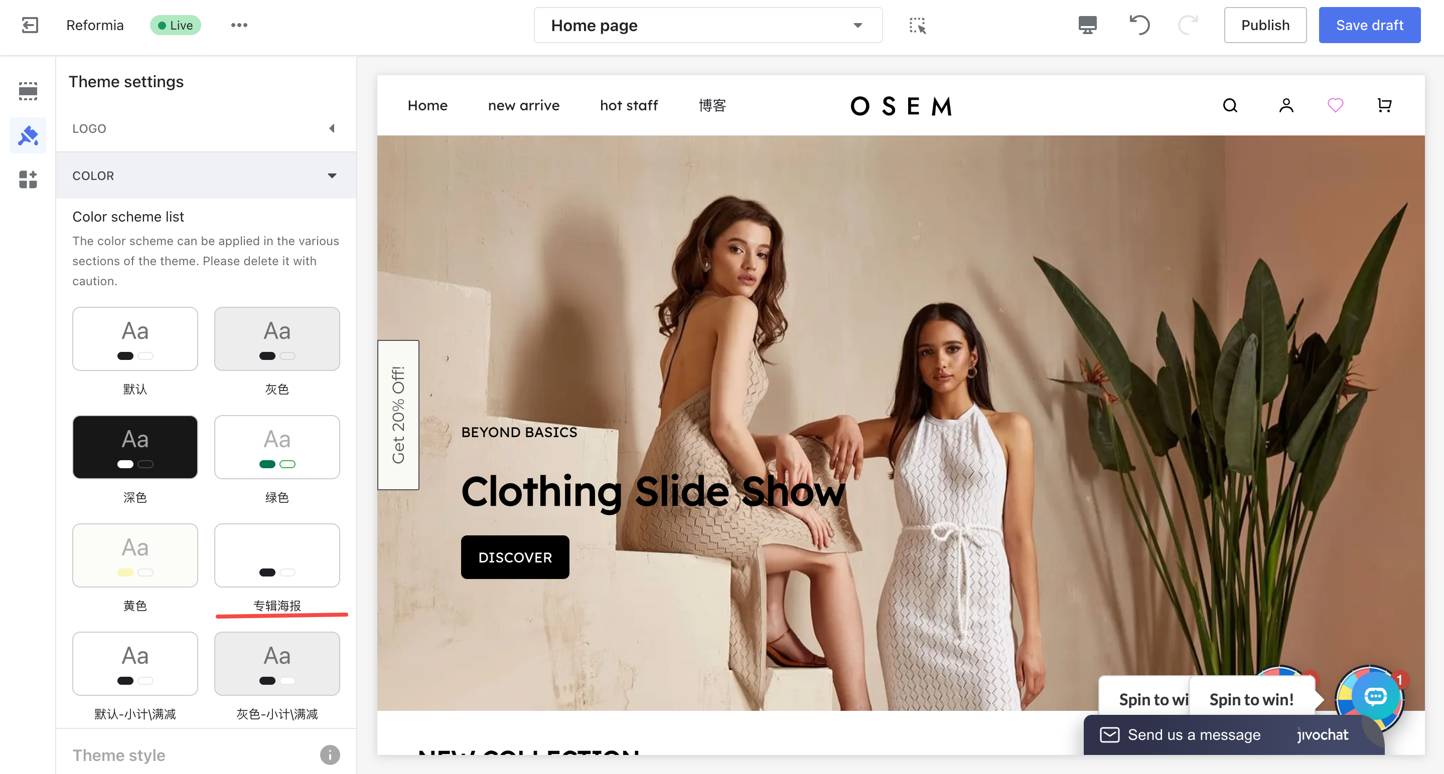
Color Scheme Overview
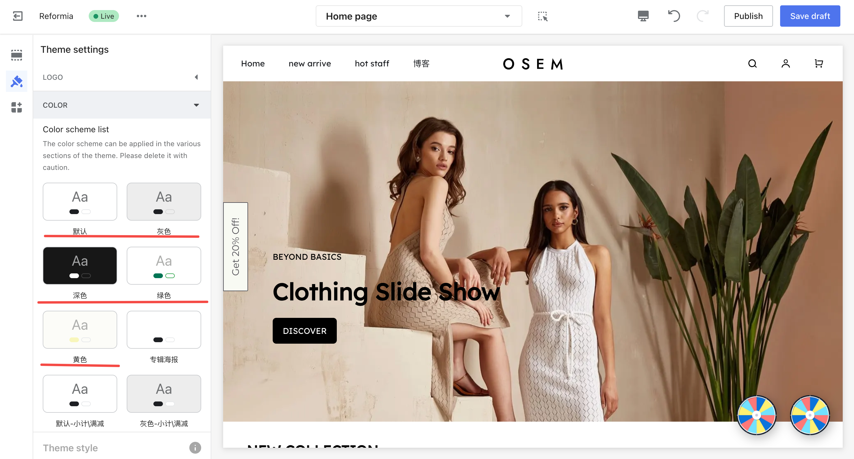
The backend provides 5 pre-built color schemes, each corresponding to different usage scenarios.
Note
After selecting a scheme, there is no need to adjust the details immediately. You can save it first and fine-tune individual settings later at any time.
| Color Scheme Combination | Applicable Scenarios | Configuration Entry |
Default + Default – Subtotal \ Discount + Album Poster
| General e-commerce scenarios (such as fashion / electronics, etc.) | Global Settings → Colors
|
| Green + Green – Subtotal \ Discount + Album Poster | Eco-friendly / Health-related products | Same as above |
| Yellow + Yellow – Subtotal \ Discount + Album Poster | Promotions / Discount campaign pages | Same as above |
Light + Light – Subtotal \ Discount + Album Poster
| Minimalist style or premium brand websites
| Same as above |
| Dark + Dark – Subtotal \ Discount + Album Poster | Minimalist style or premium brand websites | Same as above |
Common Page Elements & Corresponding Configuration Items
| Configuration Category | Included Attributes | Affected Website Areas |
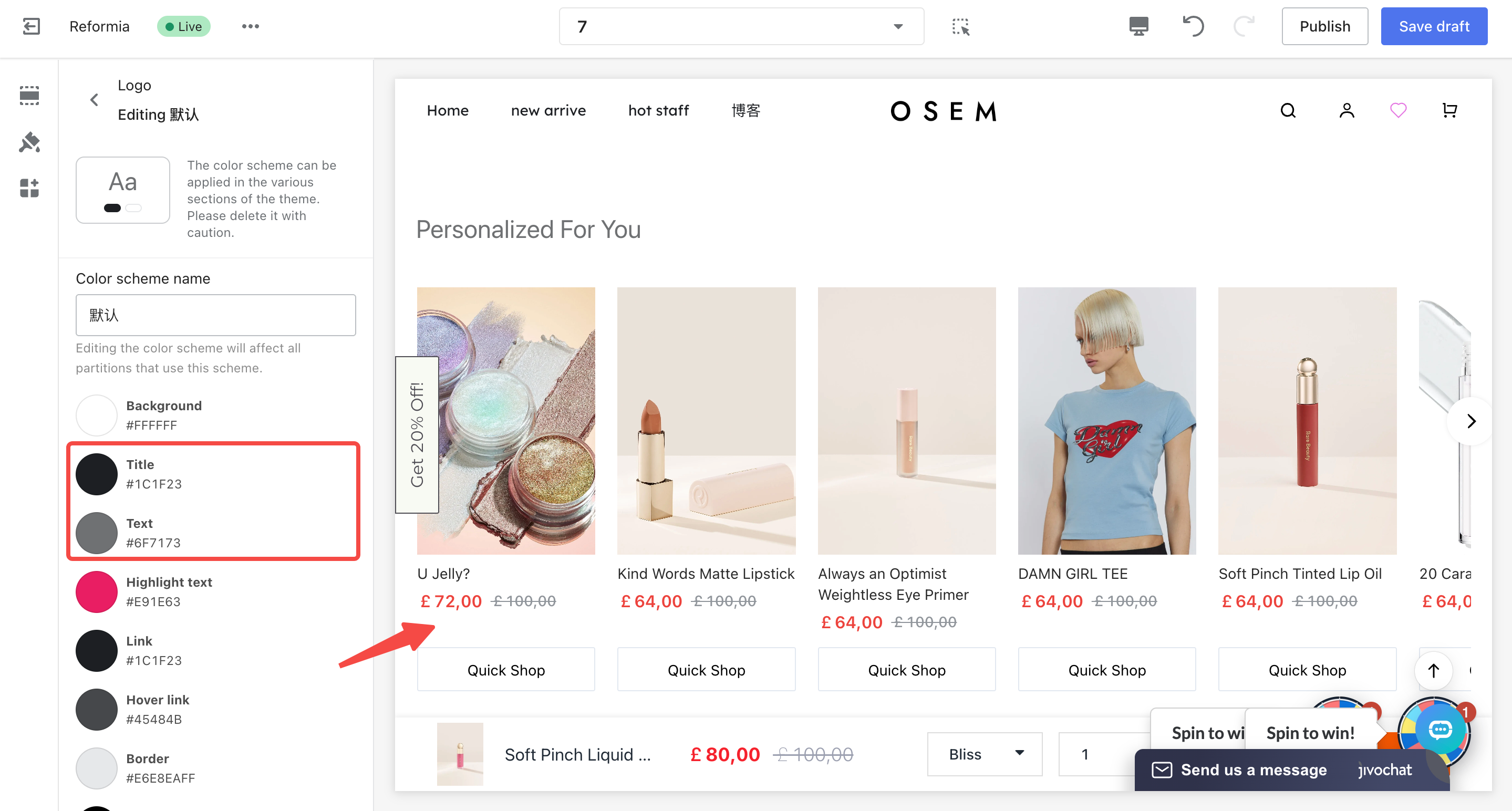
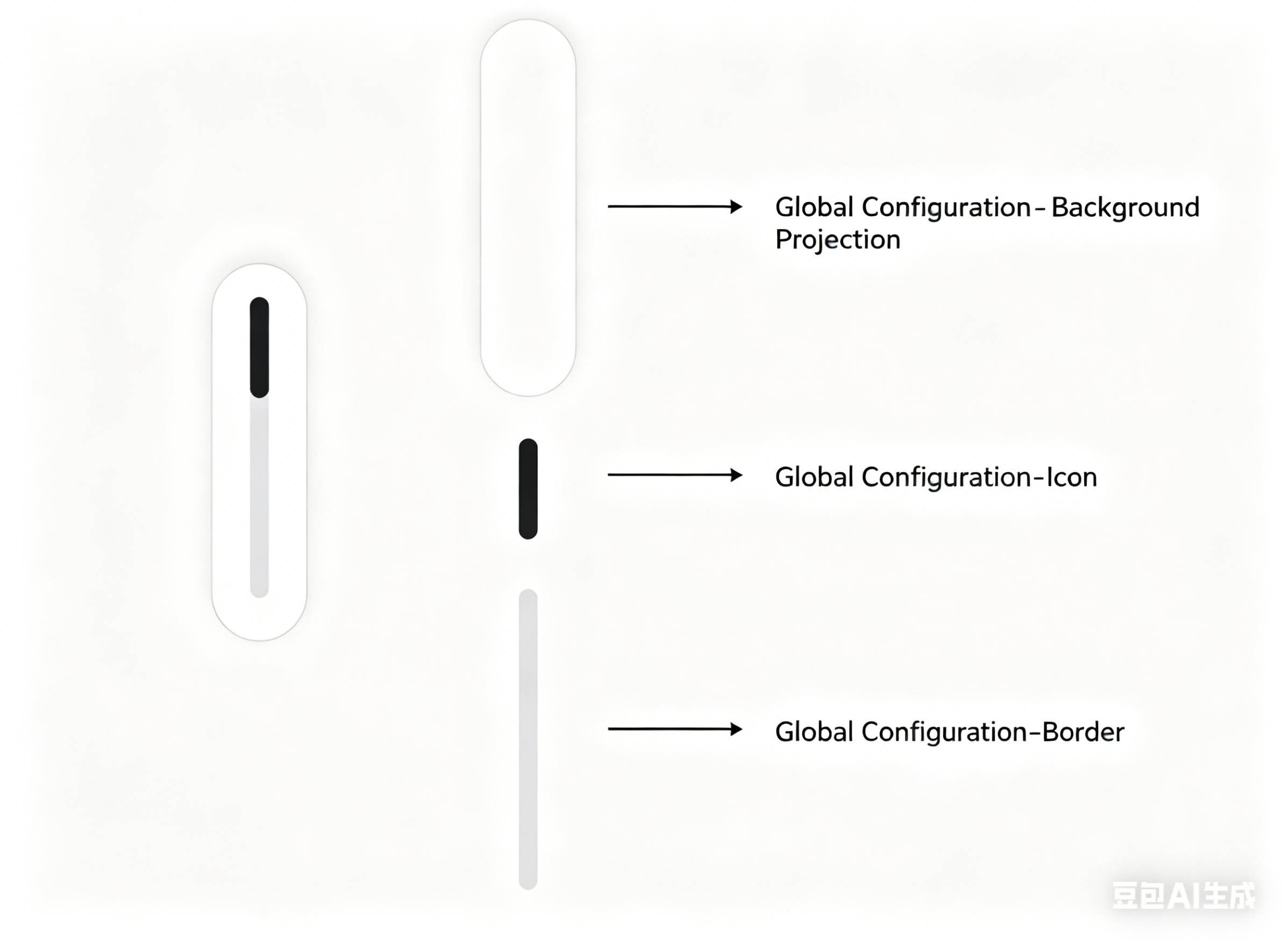
| Theme setting | Background, title/text, highlighted text, links, borders | Basic styling for the entire website |
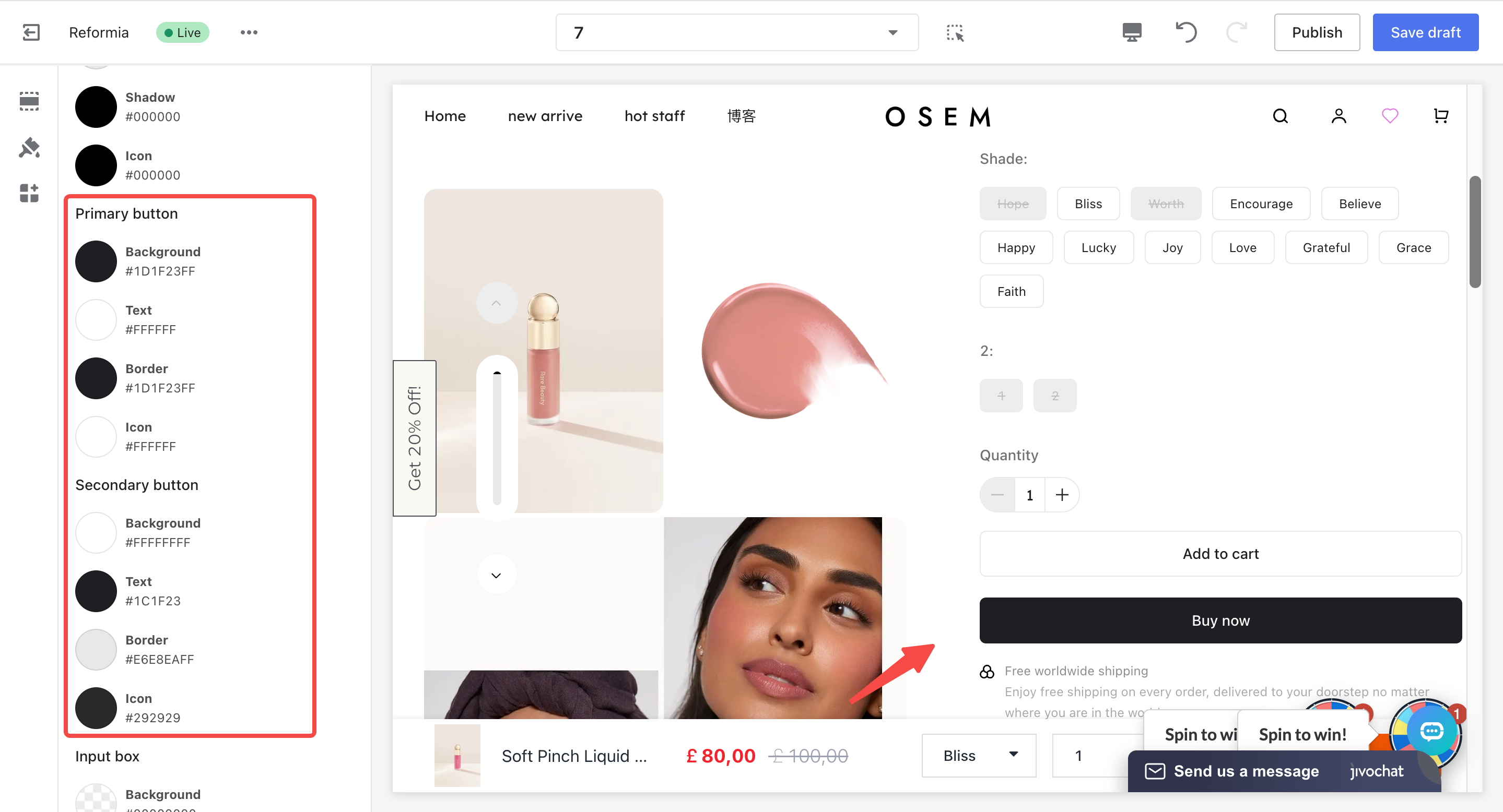
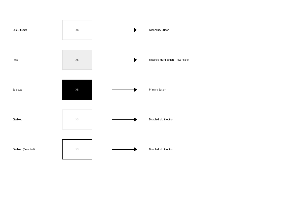
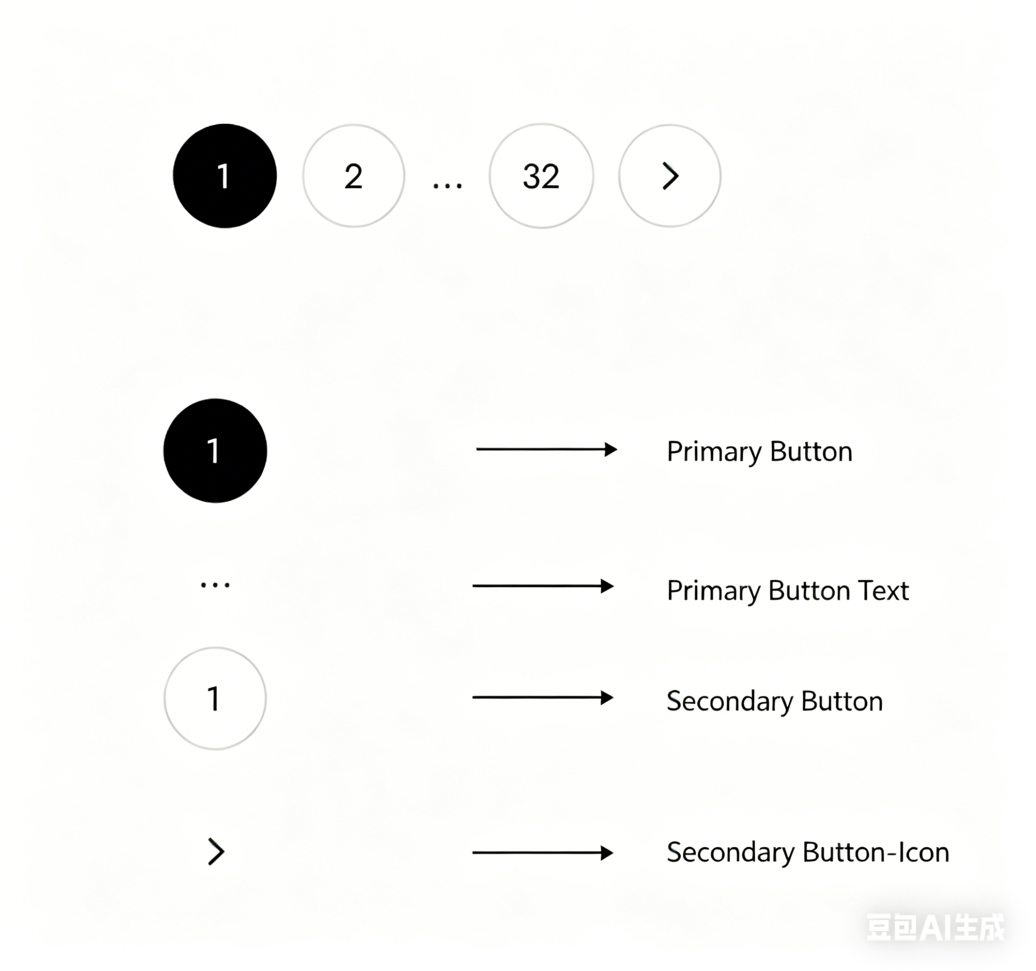
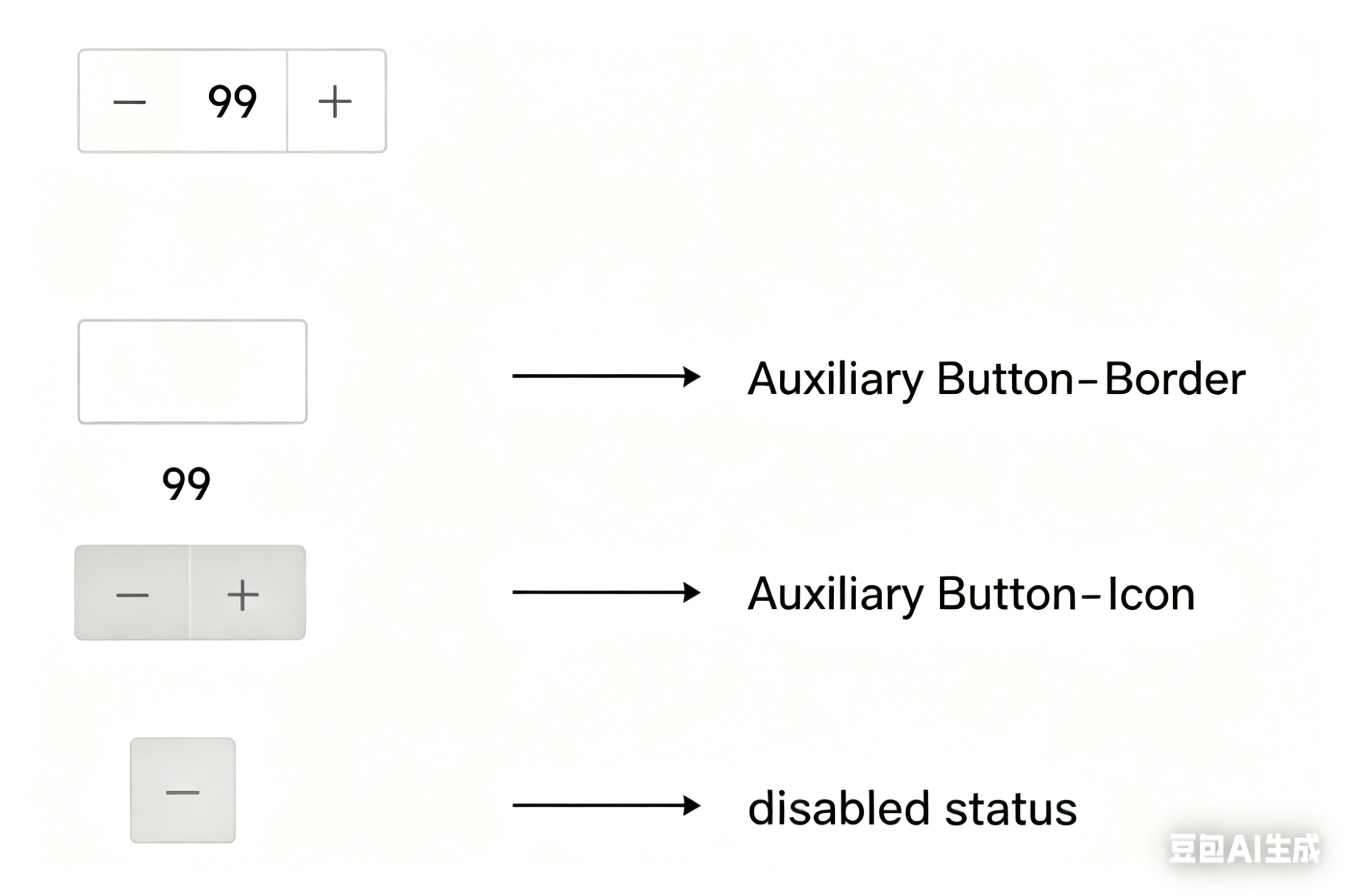
| Primary / Secondary Buttons | Background, text, borders, icons | Text buttons across the site, such as Add to Cart / Checkout / card buttons / secondary link buttons |
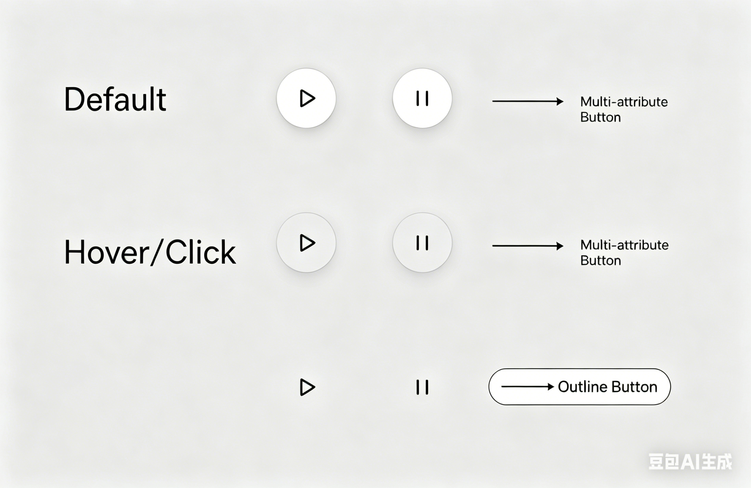
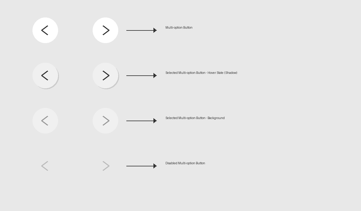
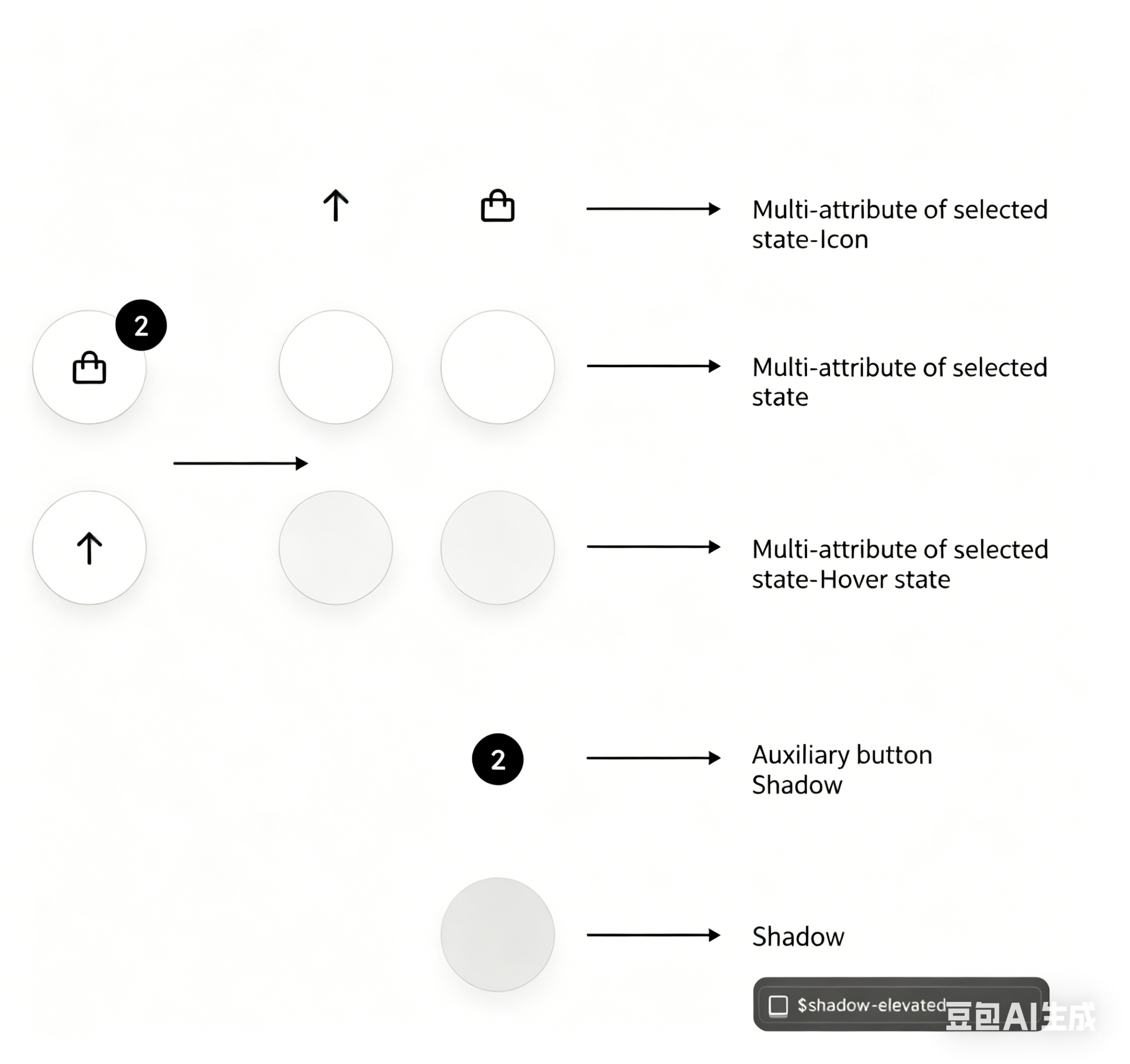
| Multi-attribute Buttons | Background, text, hover background, hover text, icons | Product variant buttons, such as size / color attribute buttons |
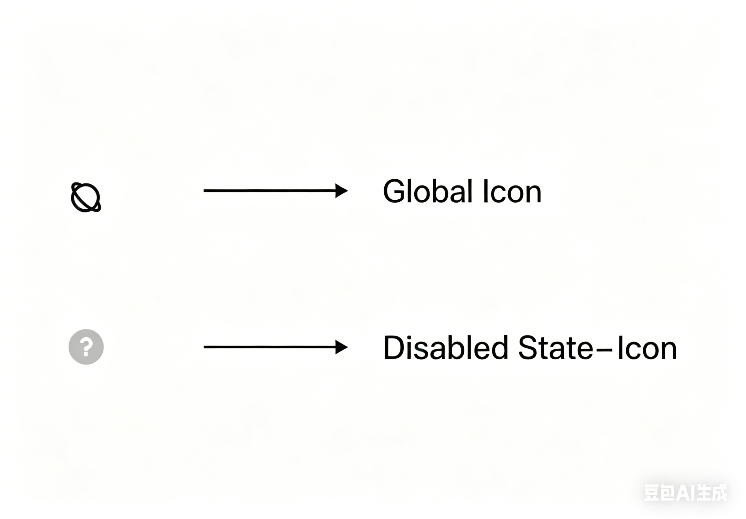
| Disabled State | Background, text, borders, icons | Color settings for non-clickable elements, such as variant buttons and toggle switches |
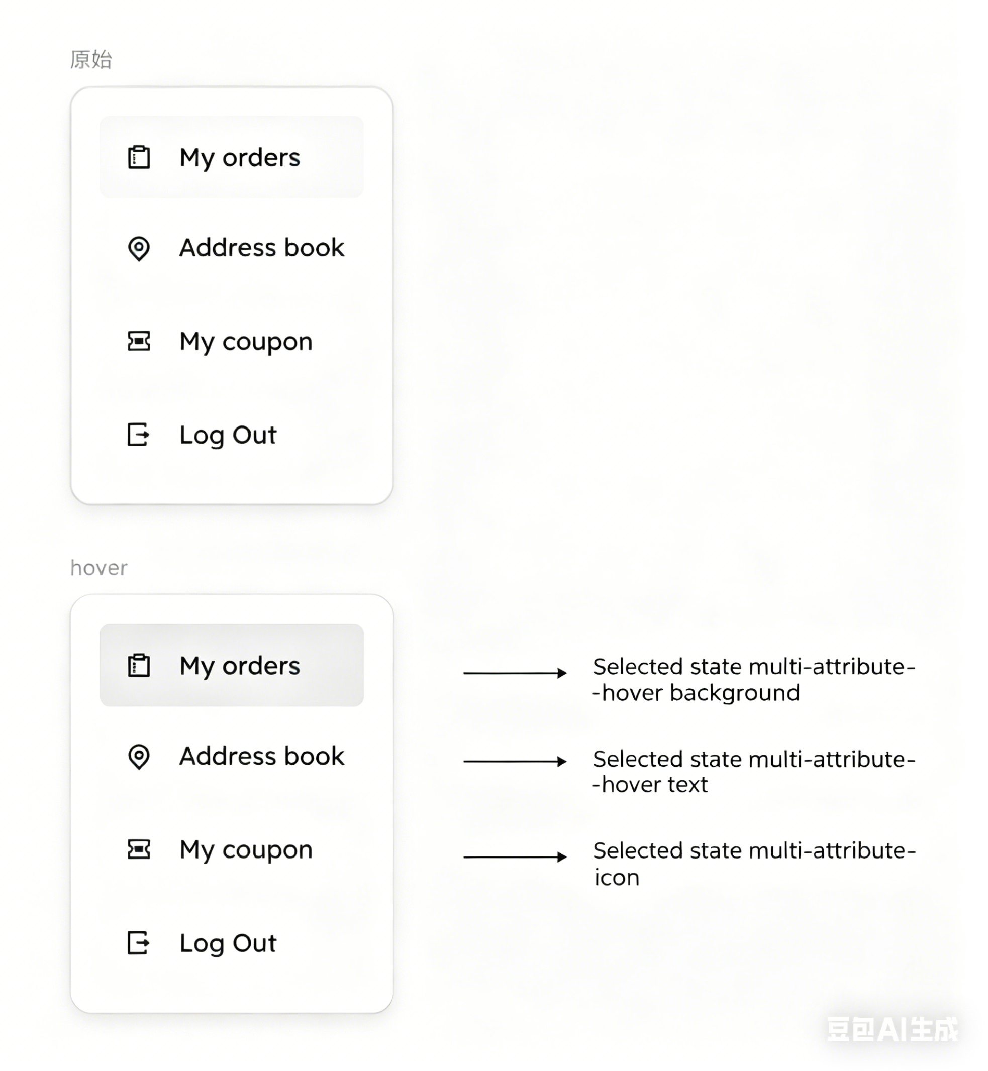
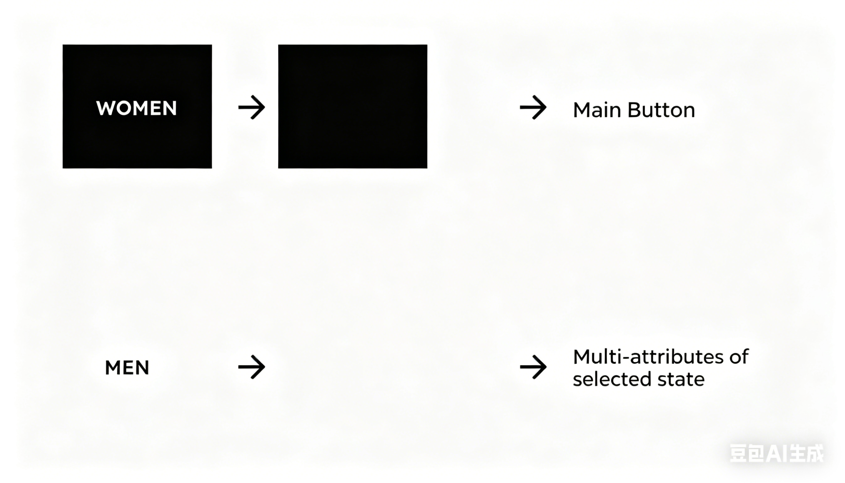
| Selected State (Multi-attribute) | Background, text, hover background, hover text | Color settings for selected modules, such as selected menus / size options / site switch buttons |
Please refer to the table below:
| Module | Configuration Item Name | Corresponding Image Display |
| Theme setting | Background |
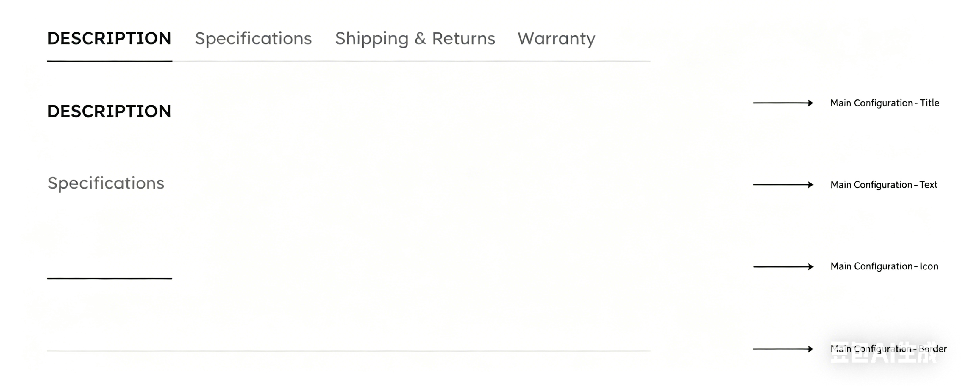
|
| Title / Text |
| |
| Highlight text |  | |
Link Hover link |  | |
| Border |  | |
| Shadow |  | |
| Icon |  | |
Primary /secondary button
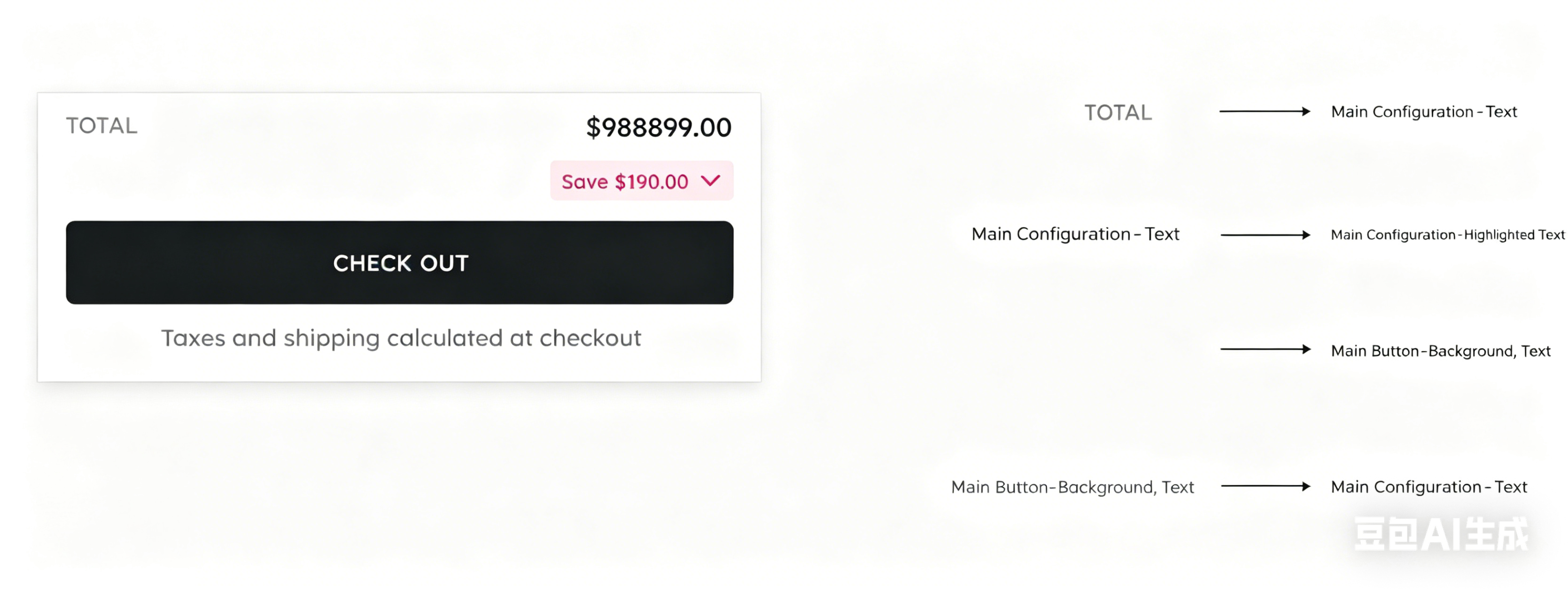
| Background |
|
| Text | ||
| Border | ||
| Icon | ||
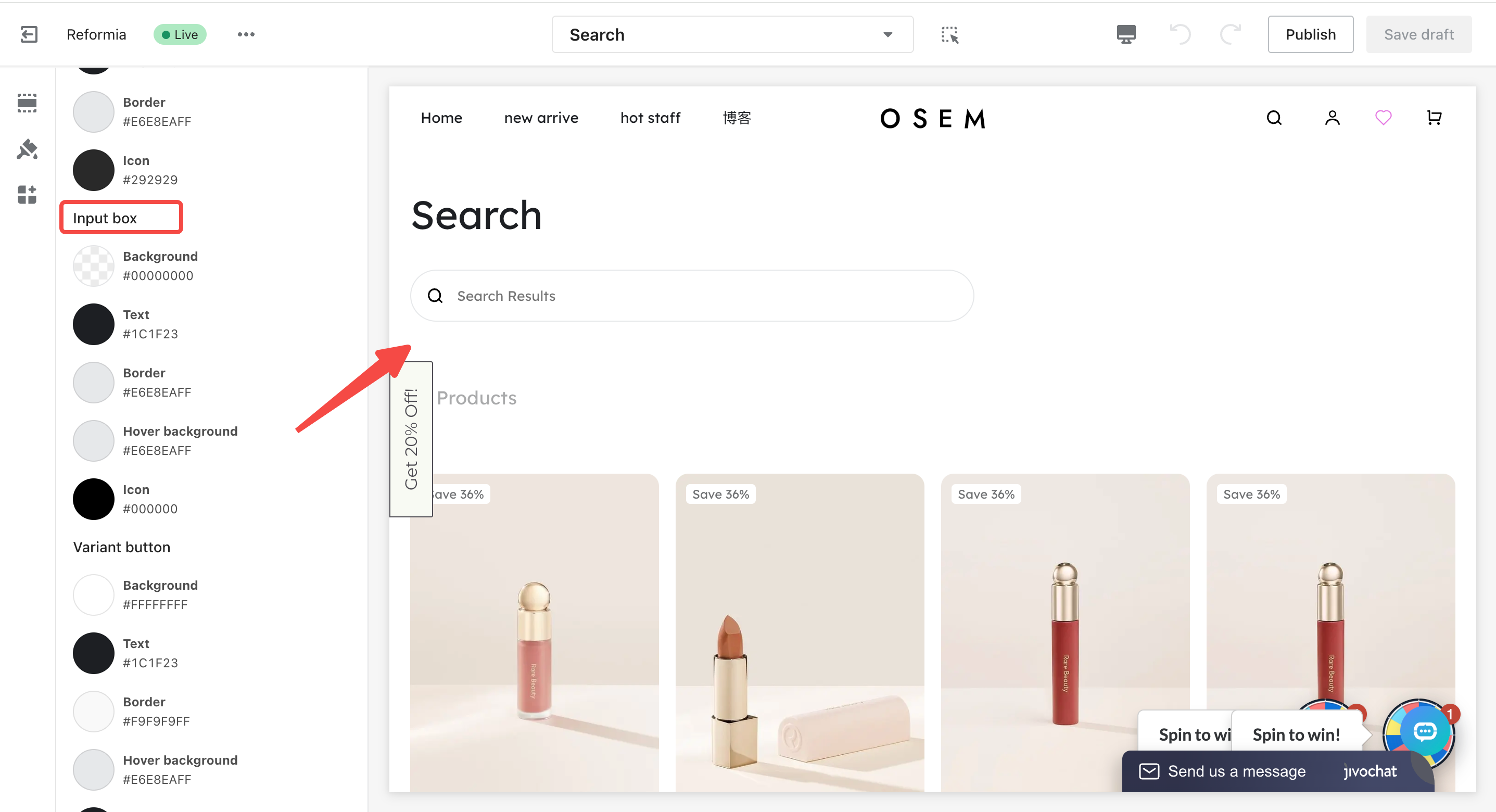
| Input box | Background |
|
| Text | ||
| Border | ||
| Hover background | ||
| Icon | ||
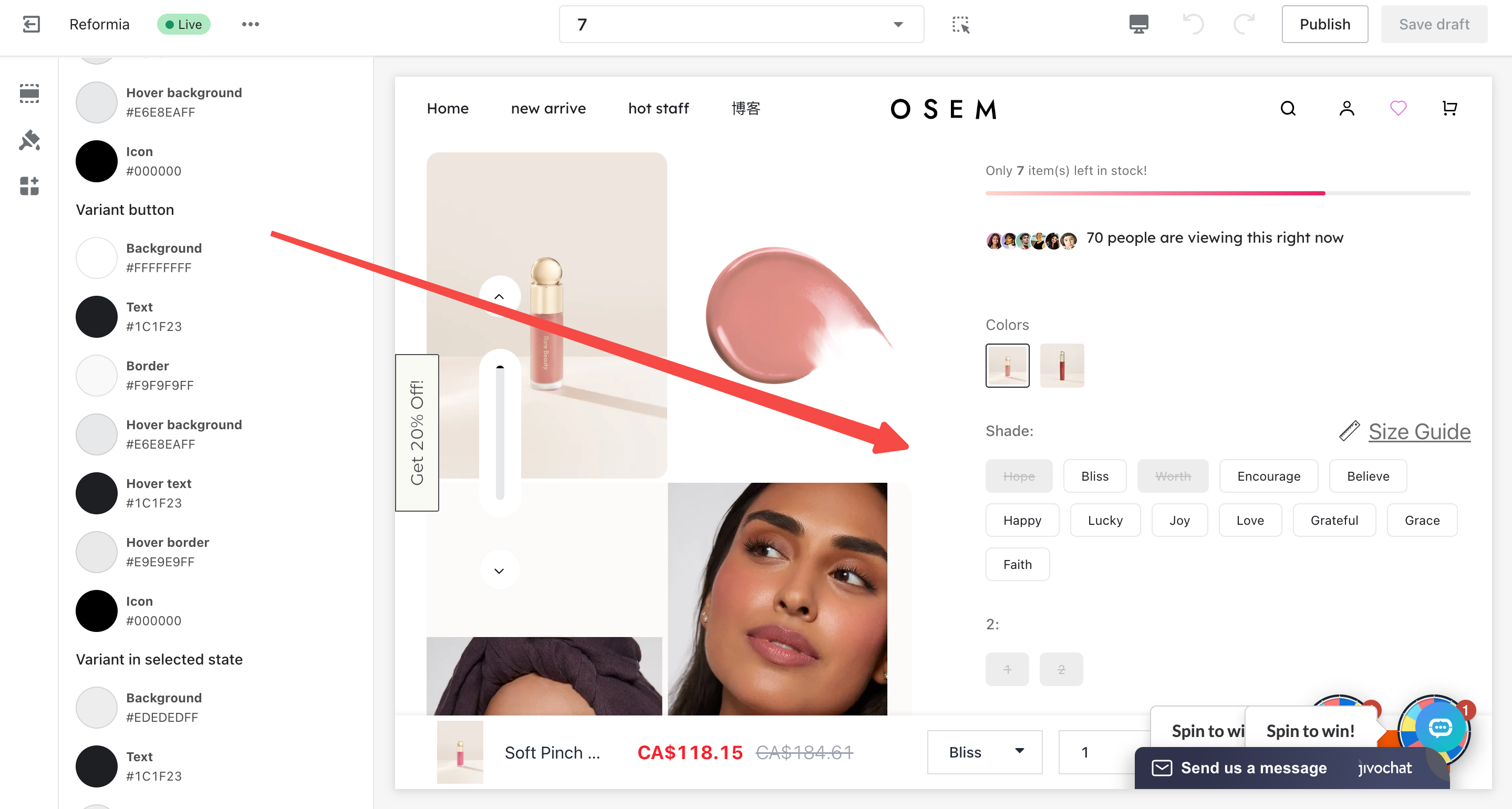
| Variant button | Background |
|
| Text | ||
| Border | ||
| Hover background | ||
| Hover text | ||
| Hover border | ||
| Icon | ||
| Variant in selected state | Background |  |
| Text | ||
| Border | ||
| Hover background | ||
| Hover text | ||
| Hover border | ||
| Icon | ||
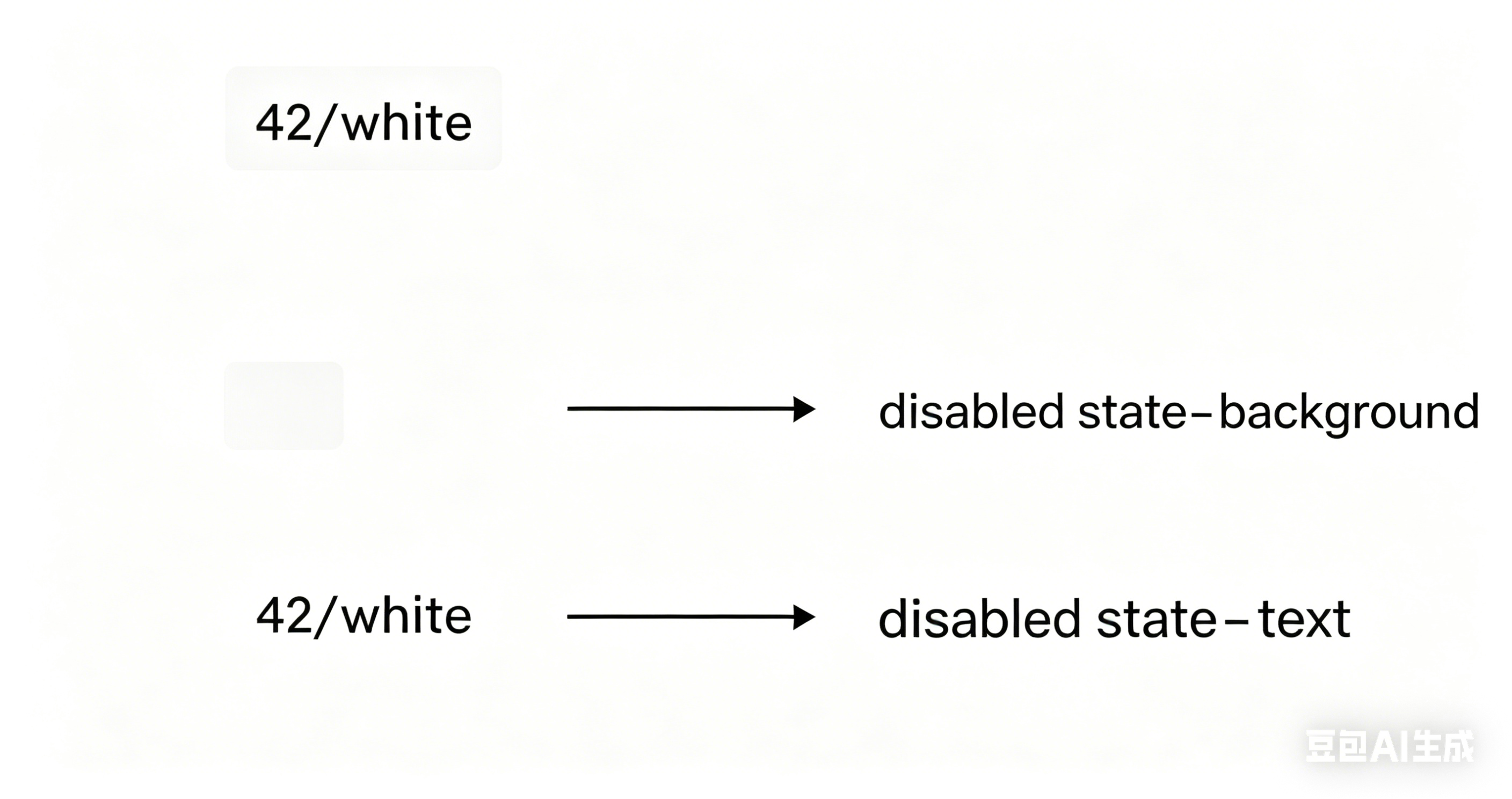
| Disabled state | Background |
|
| Text | ||
| Border | ||
| Icon | ||
| Selected border |
| The actual colors mapped to the elements | ||
| Module | Setting Name | Image Preview |
The theme already includes the following color schemes: Default, Light, Dark, Green, and Yellow. The corresponding color schemes control the following modules: | ||
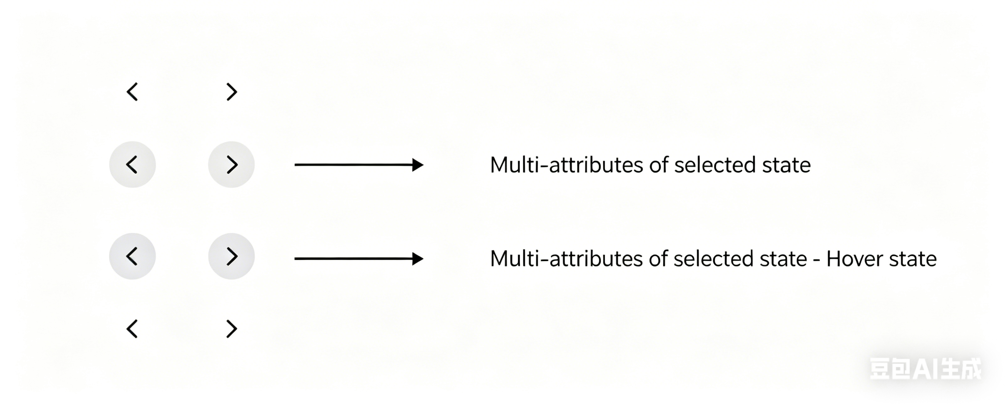
Product switch button
| Multi-variant button, selected variant state, disabled state
|
|
Variant options
|
Secondary button, selected variant state, primary button, disabled state
|
|
Floating shopping cart icon
| Secondary button, selected variant state
|
|
| Pagination controls | Primary button, secondary button
|
|
| Breadcrumbs | Disabled state
| 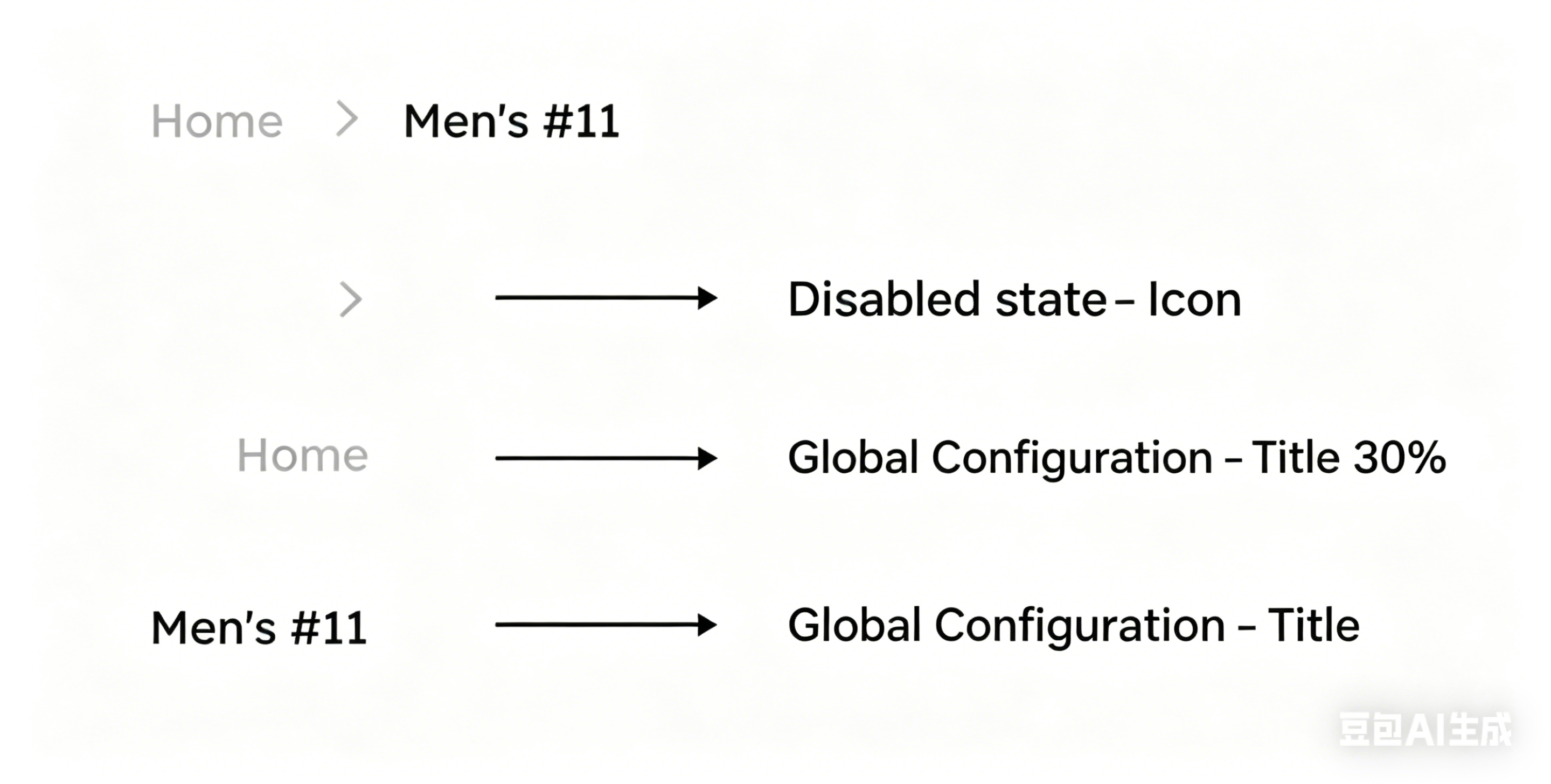 |
| Product switch button 2 | Selected variant state
|  |
Dropdown options
| Selected variant state | 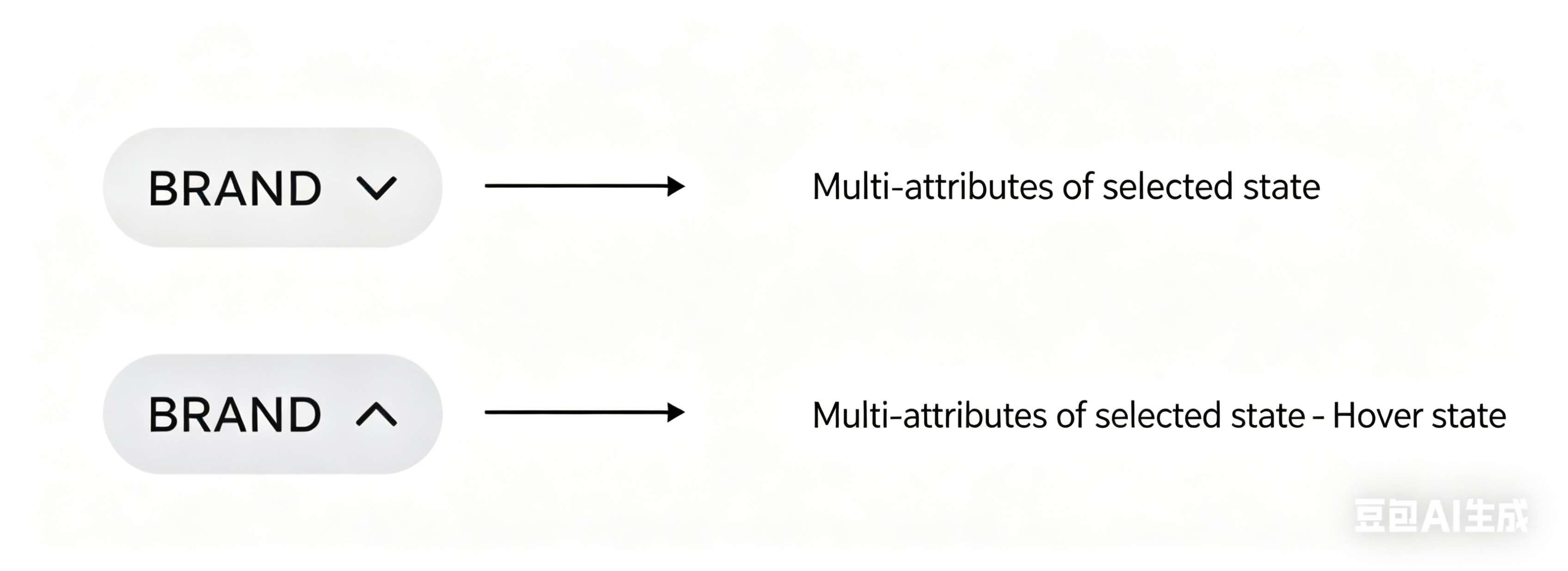 |
Cart SKU
| Disabled state
|  |
| Quantity selector | Secondary button, disabled state
|
|
| Login popup | Multi-variant button, selected variant state
|  |
| Product details page – progress bar | Global icon, border
|  |
| Product details page | Global icon, disabled state
|  |
| Player | Multi-variant button
|  |
| Site switcher | Primary button, selected variant state
|  |
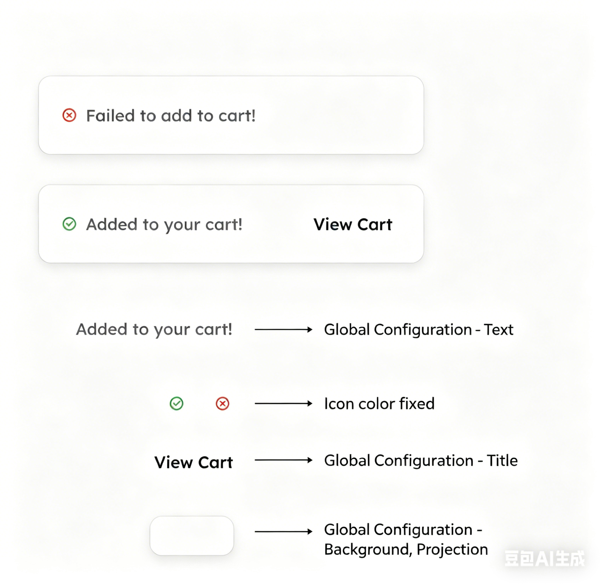
The theme already includes the following color schemes: Default – subtotal / discount, Light – subtotal / discount, Dark – subtotal / discount, Yellow – subtotal / discount, Green – subtotal / discount.
The corresponding color schemes control the following modules: | ||
| Added to cart successfully | Global text, titles, background, shadows Icons use fixed (hard-coded) colors
|
|
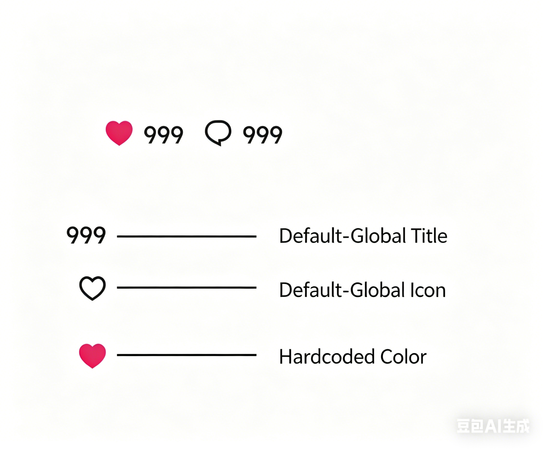
Instagram comment icon
| Global, titles, icons Like (+) icon uses a fixed (hard-coded) color
|  |
| Menu | Selected state with multiple attributes / Multi-attribute selected state | 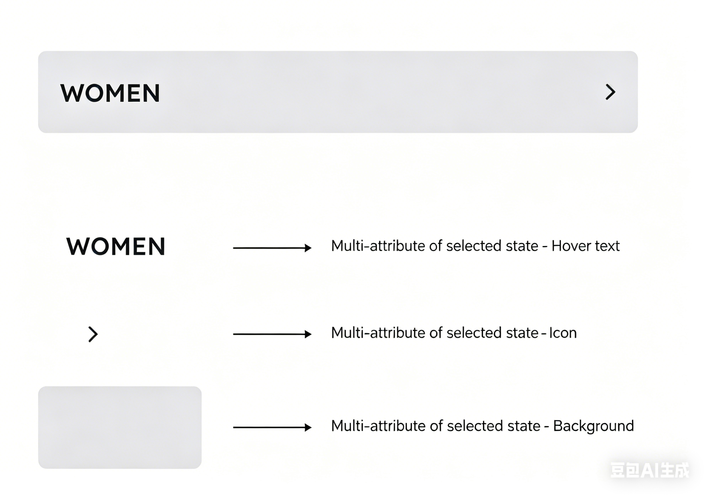 |
| Product details – description | Theme setting
|  |
| Subtotal | Theme setting 、primary button
|  |
| Subtotal – label | Selected state with multiple attributes | 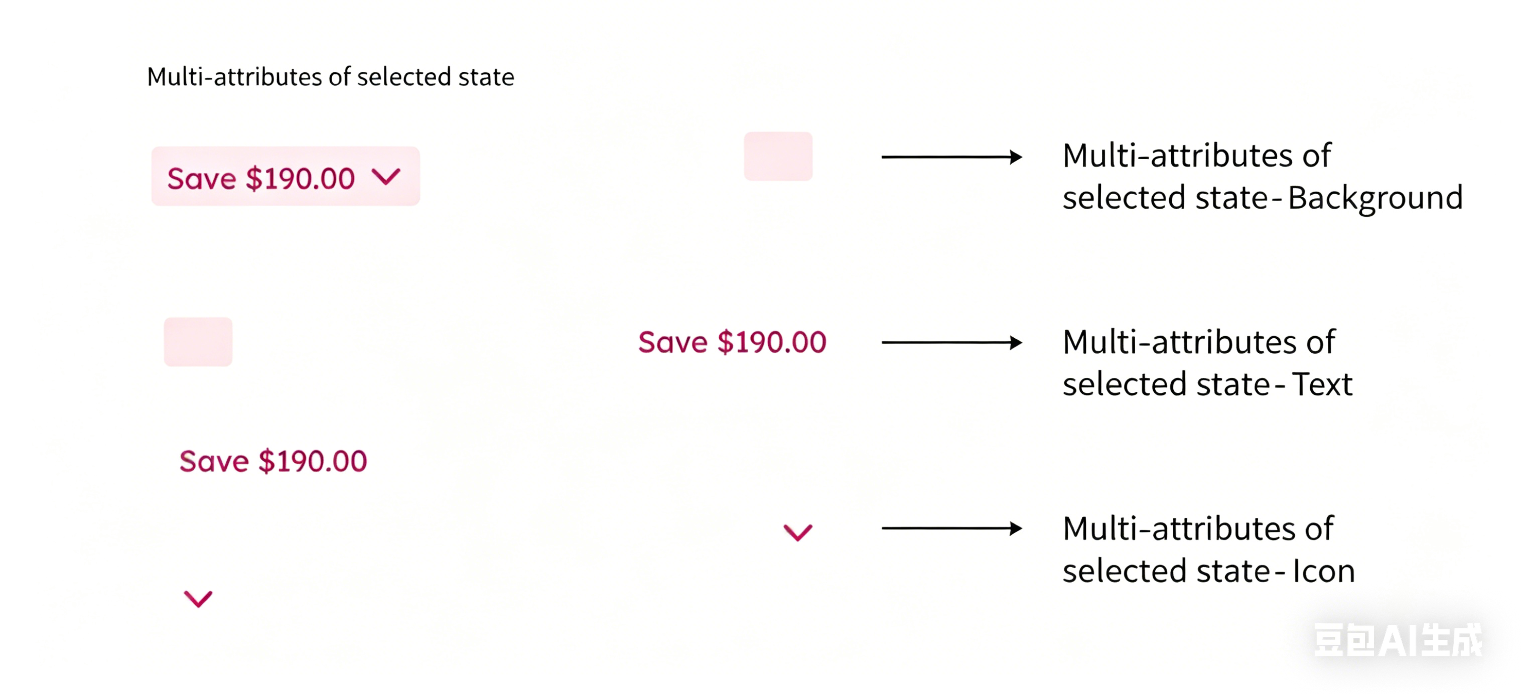 |
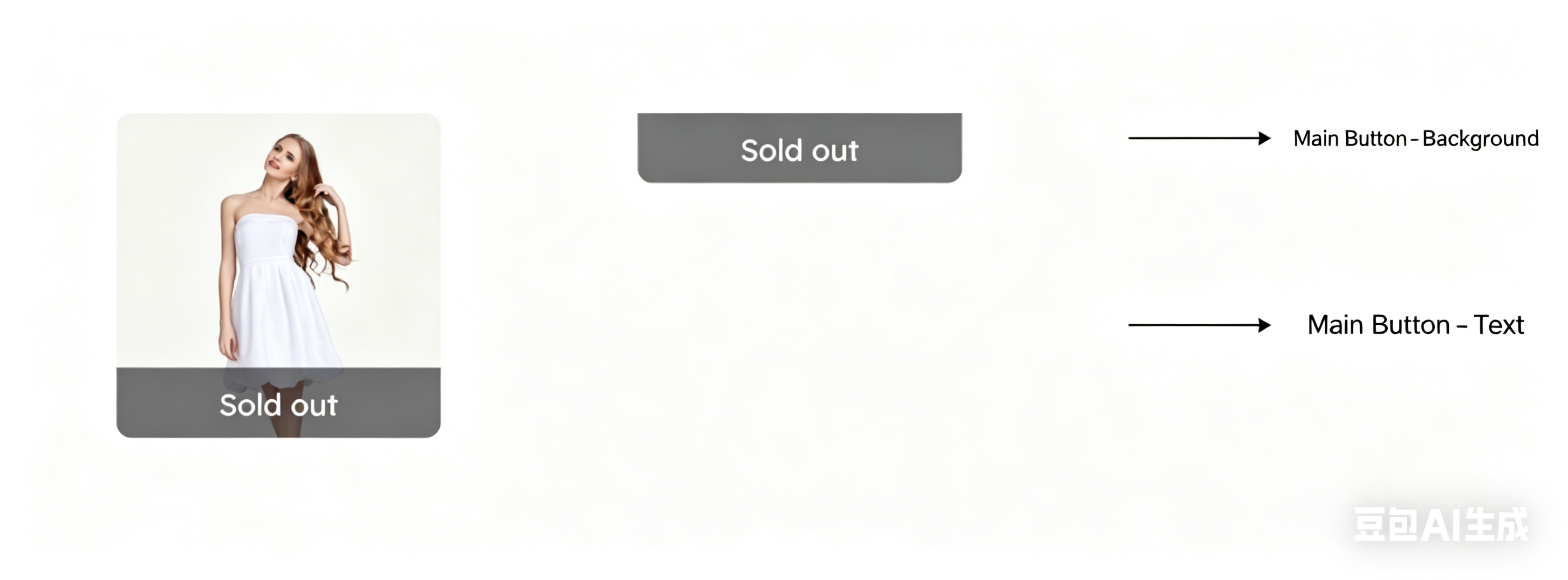
| Product – out of stock | Theme setting |
|
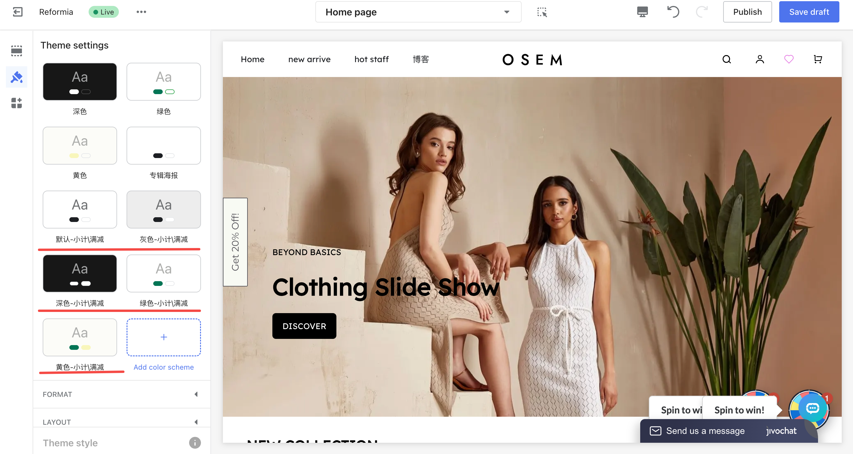
Existing theme color scheme: Album cover
The corresponding color scheme controls the following modules: | ||
| Album – poster | Theme setting , disabled state |
|
Case
Q: If the album text in the album details page is hard to read on the album cover, how should it be adjusted?
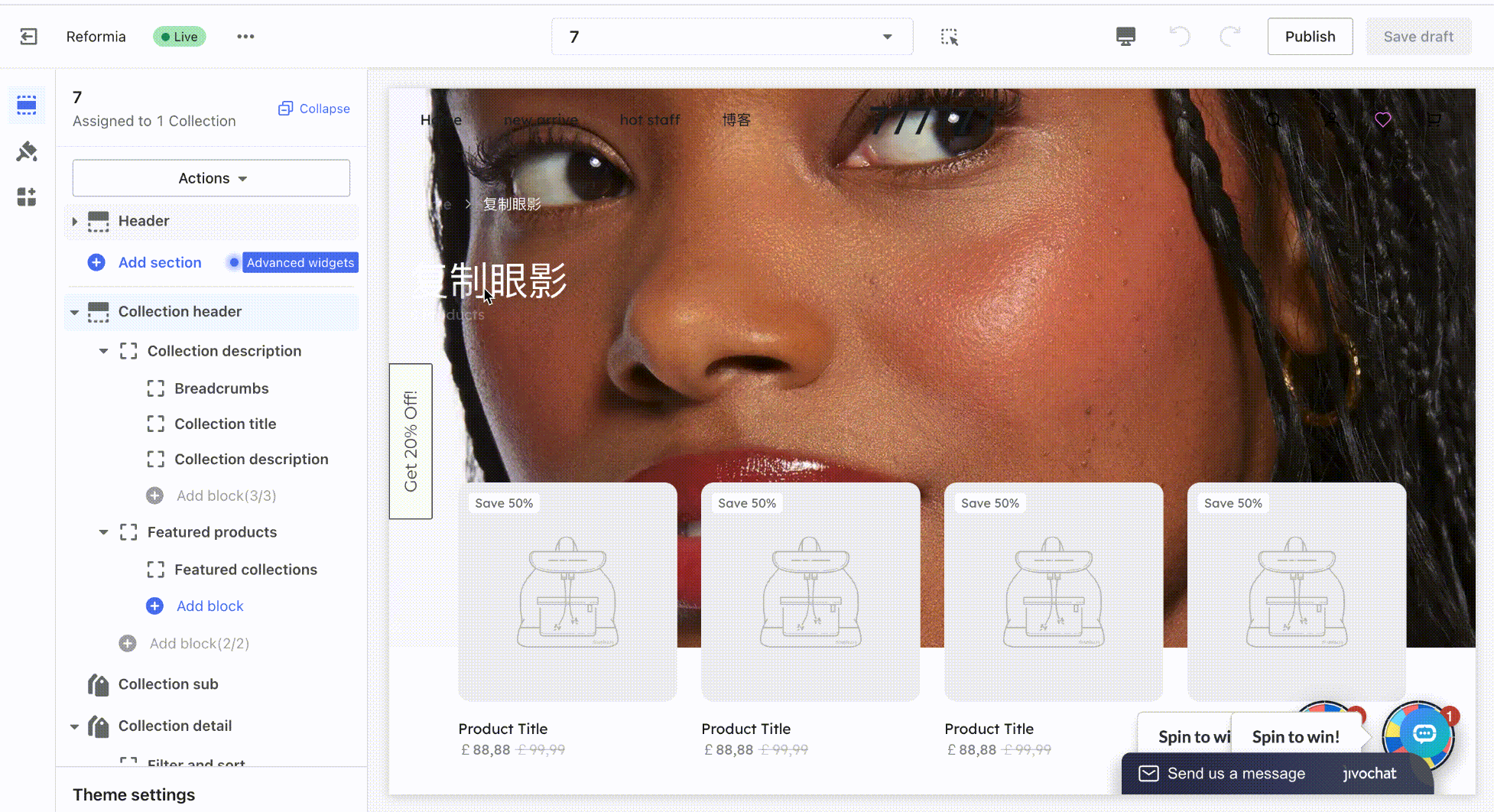
1. Locate the front-end element you want to modify; for example, in this case, the text on the album cover.
2. Find the nearest card and its associated color scheme. Click to edit the color scheme. You can see that the album text belongs to the album header card, so locate the corresponding color scheme in the album header.
3. Find the configuration item that controls the text color, adjust the color setting, and the change will take effect immediately.
The album text includes the title and body text, so you should modify the global title and global text in the color scheme.
Operation demonstration:
Modify the color of a specific element
Steps:
1. Locate the front-end element you want to modify (e.g., product tags, buttons, navigation menu, etc.).
2. Find the nearest card, then locate its associated color scheme and click “Edit color scheme.”
- Example: To change the color of the icon on the right side of the page header.
- Path: Go to Page Header > Color Scheme > Edit.
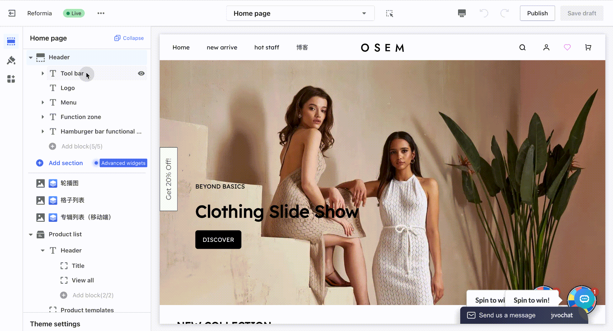
3. Find the configuration item that the icon is linked to, change its color setting, and the update will take effect immediately.
New color scheme
To ensure consistent styling across your store, the current color scheme is applied to multiple cards. If you only need to modify the colors of a single module, we recommend creating a new color scheme and applying it exclusively to that specific module.
Steps:
1. Navigate to Theme Settings > Colors, create a new color scheme and modify the default values of the corresponding settings.
2. Locate the front-end element you wish to edit, such as the card containing header icons.
3. Change its assigned color scheme.


Comments
Please sign in to leave a comment.