Effective visuals are essential for capturing the attention of your readers. Aligning images with text aids in better understanding, and incorporating multiple images can increase reader engagement by showcasing a range of content. Nova 2023's Image with text 2 feature provides extra space for highlighting collections or product pages, with the option to add buttons. This feature enhances your content with dynamic visuals and layered images, simplifying complex ideas for your customers.
Adding the Image with text 2 section
Add the Image with text 2 section to the store. This section combines images and text in an informative and eye-catching way. Follow these steps:
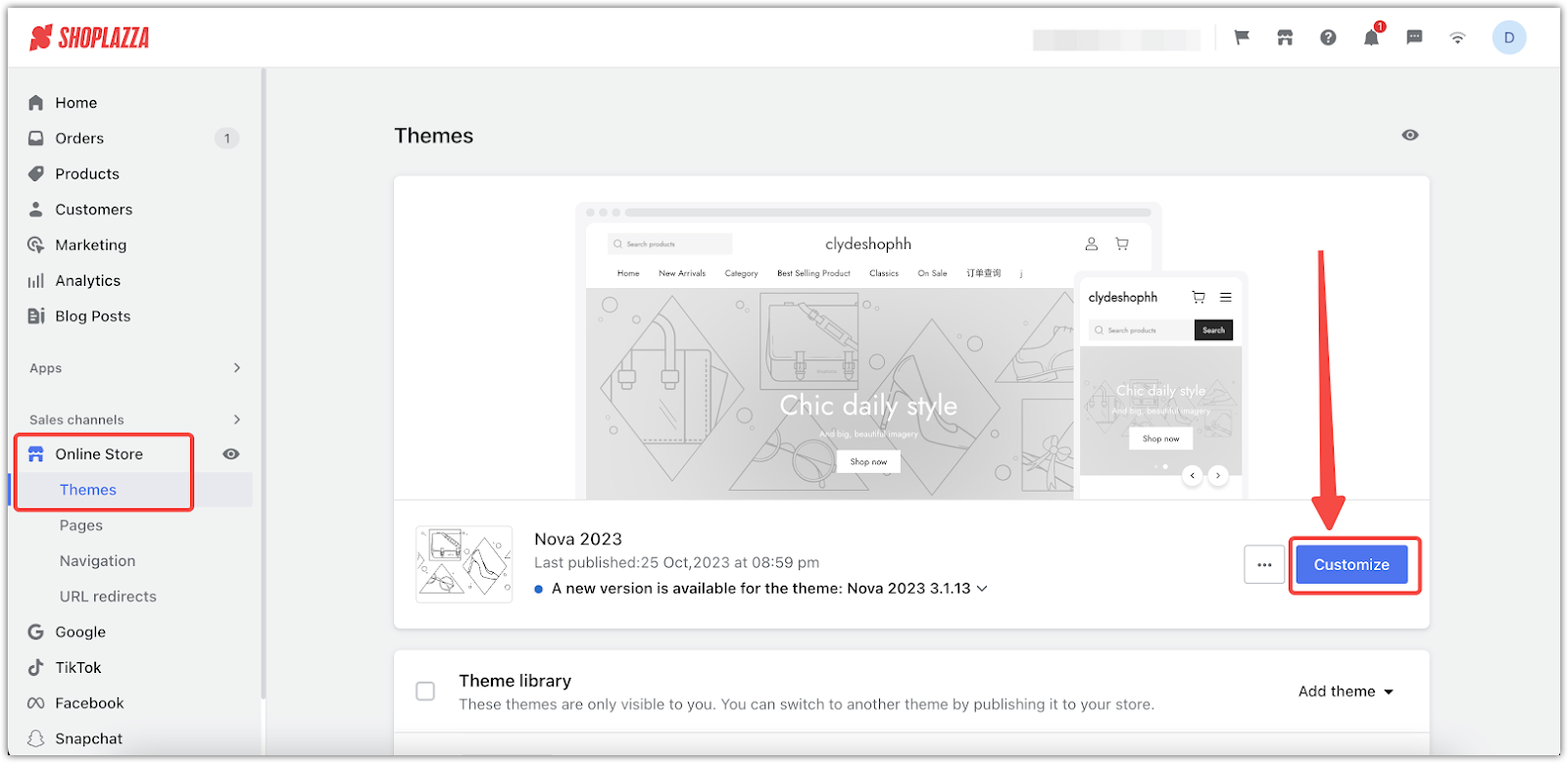
1. Access the theme editor: From your Shoplazza admin > Online store > Themes, select your theme and click Customize.
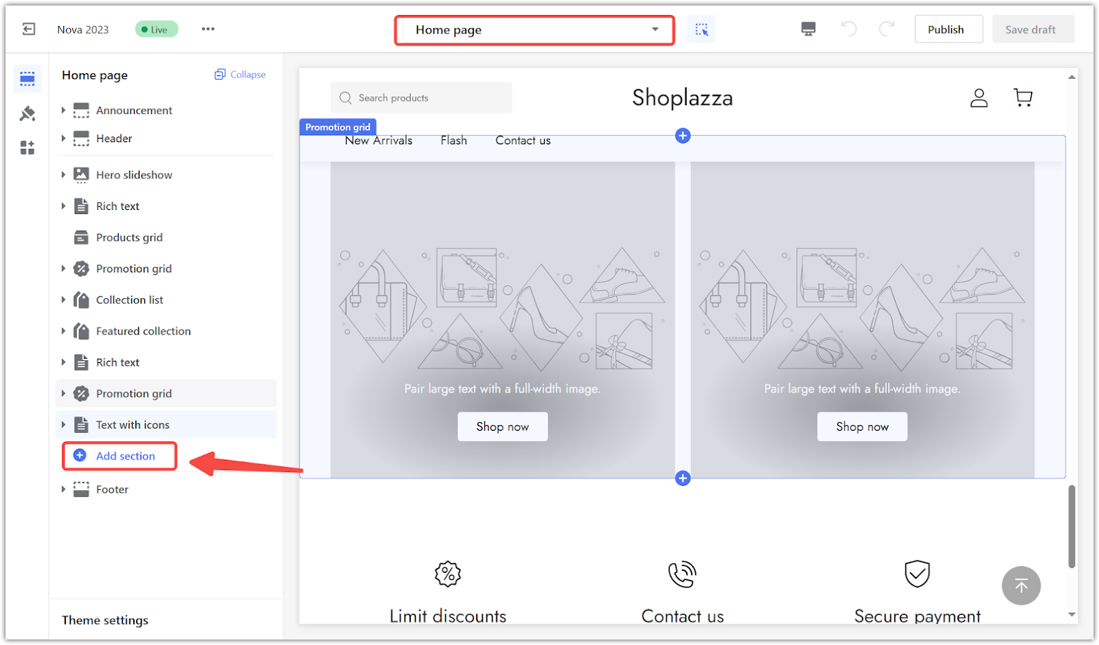
2. Add the section: Click the Add section to see more available sections for this theme.
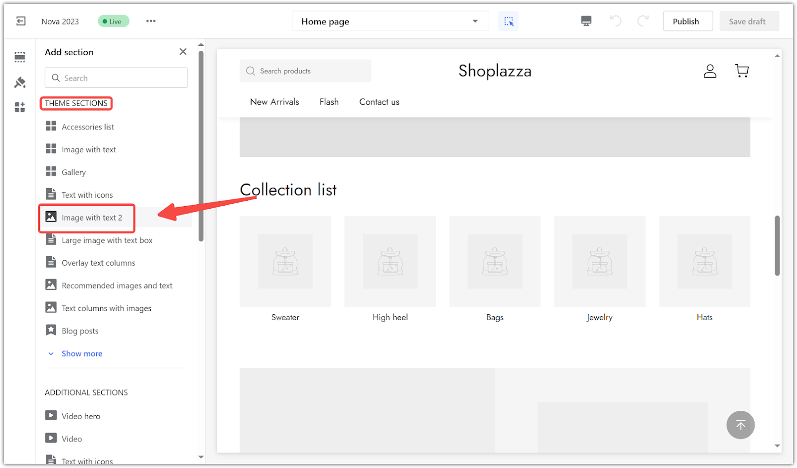
3. Select the section: Under THEME SECTIONS, select Image with text 2, and customize your configurations.
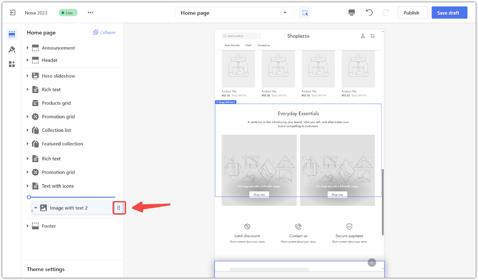
4. Reposition the section: To reposition the Image with text 2 section, use the Drag indicator to place it anywhere on the layout.
5. Add a secondary image: To enrich your content's relevance, add a secondary image to the primary subject in the Image with text 2 section. Choose a cover photo from your library and another for a layered effect. Adjust the image width for optimal placement.
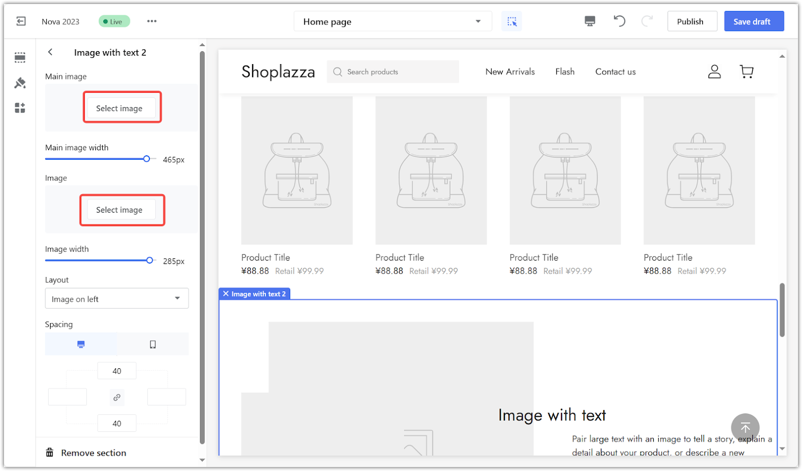
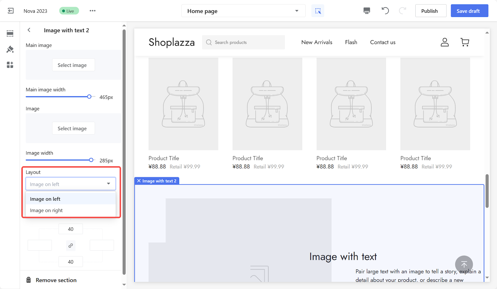
6. Change the image position: In the Layout section, change the position of images to show on the left or right.
Section padding
Control over spacing creates a polished look for an online store. Adjusting the padding around the Image with text 2 section allows for fine-tuning the visual balance of the page:
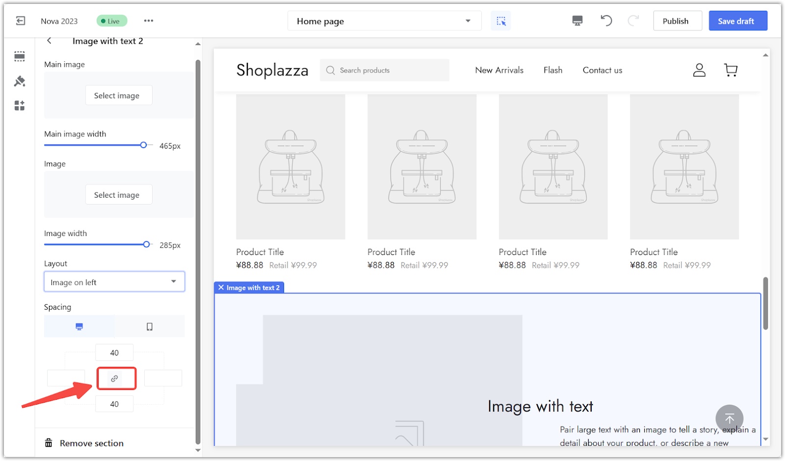
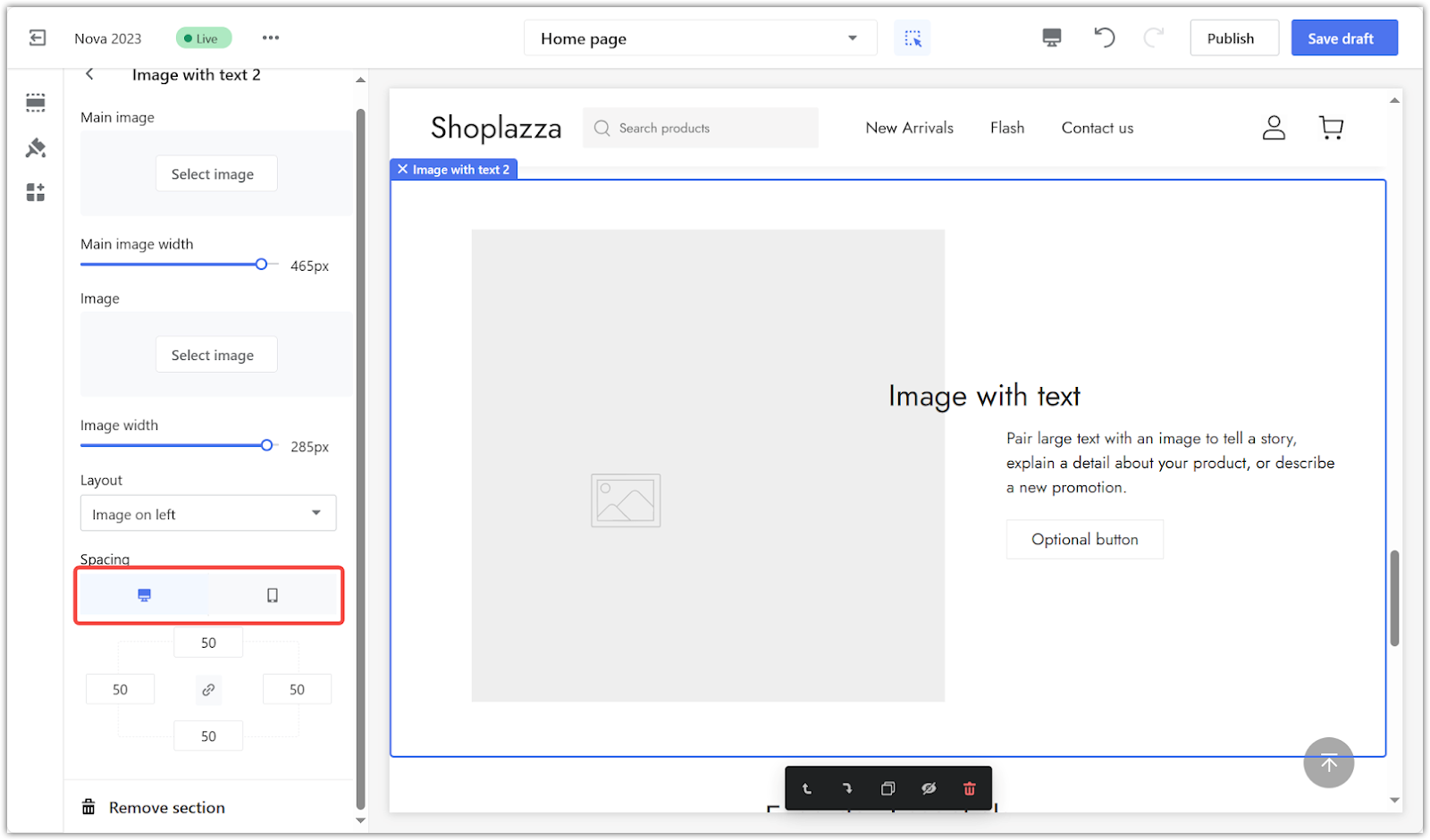
1. Adjust spacing: The padding editor generates extra space around the section you create. Activate the linkage icon and type a value (measured in pixels) in 4 columns to add buffers around the section. Alternatively, manually adjust each input by disabling the linkage icon in the centered area.
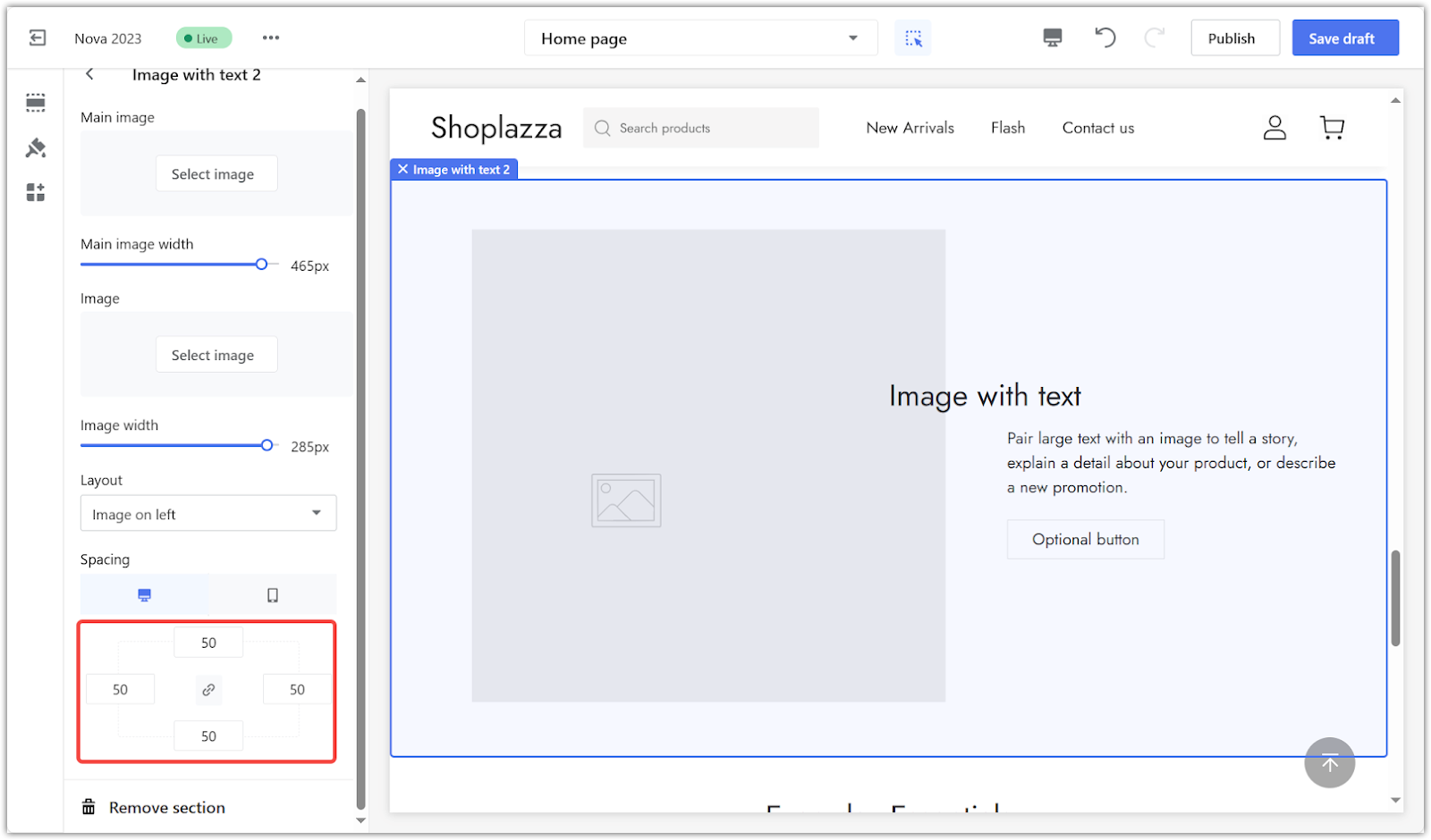
2. Example: The screenshot below is an example using 50px spacing on each side.
3. Preview: Select to preview on desktop or mobile to ensure spacing adjustments look perfect on all devices.
Heading & text
Clear headlines and text are important for engaging the audience and communicating the brand message. Adding text to the Image with text 2 section helps customers understand products and offerings:
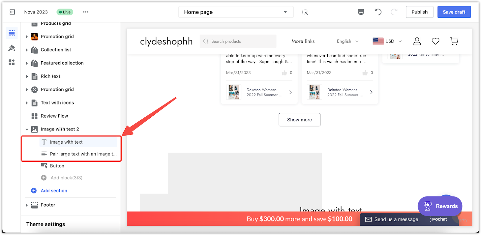
1. Edit content: Refer back to the main page; edit your heading and text body separately for this section.
Buttons
The placement of buttons can improve the user experience and drive conversions. Including a button in the Image with text 2 section guides customers towards desired actions, such as exploring a collection or making a purchase:
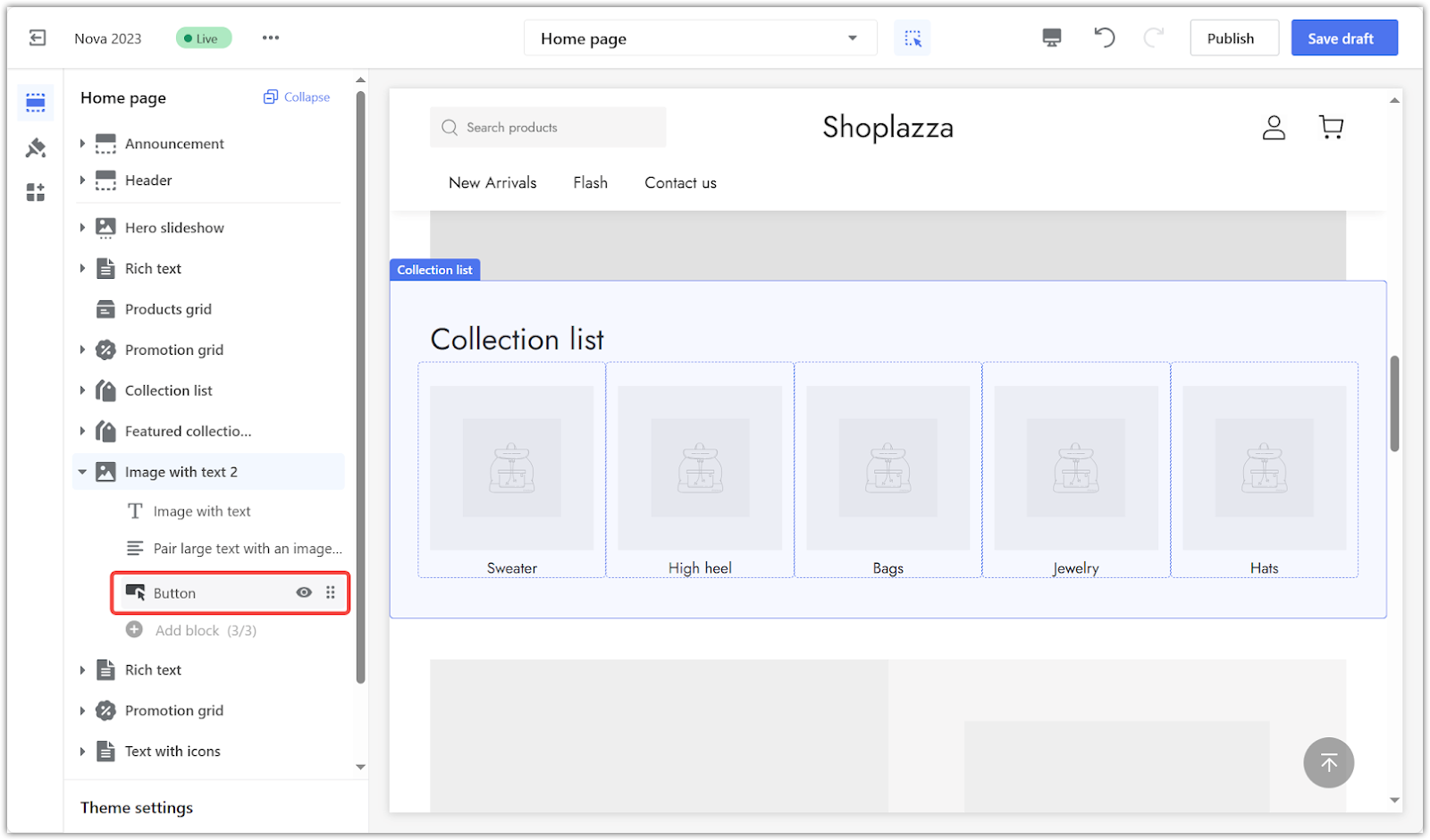
1. Add a button: Set up the button to enhance functionality. This feature boosts efficiency by directing customers to other store pages or external sources.
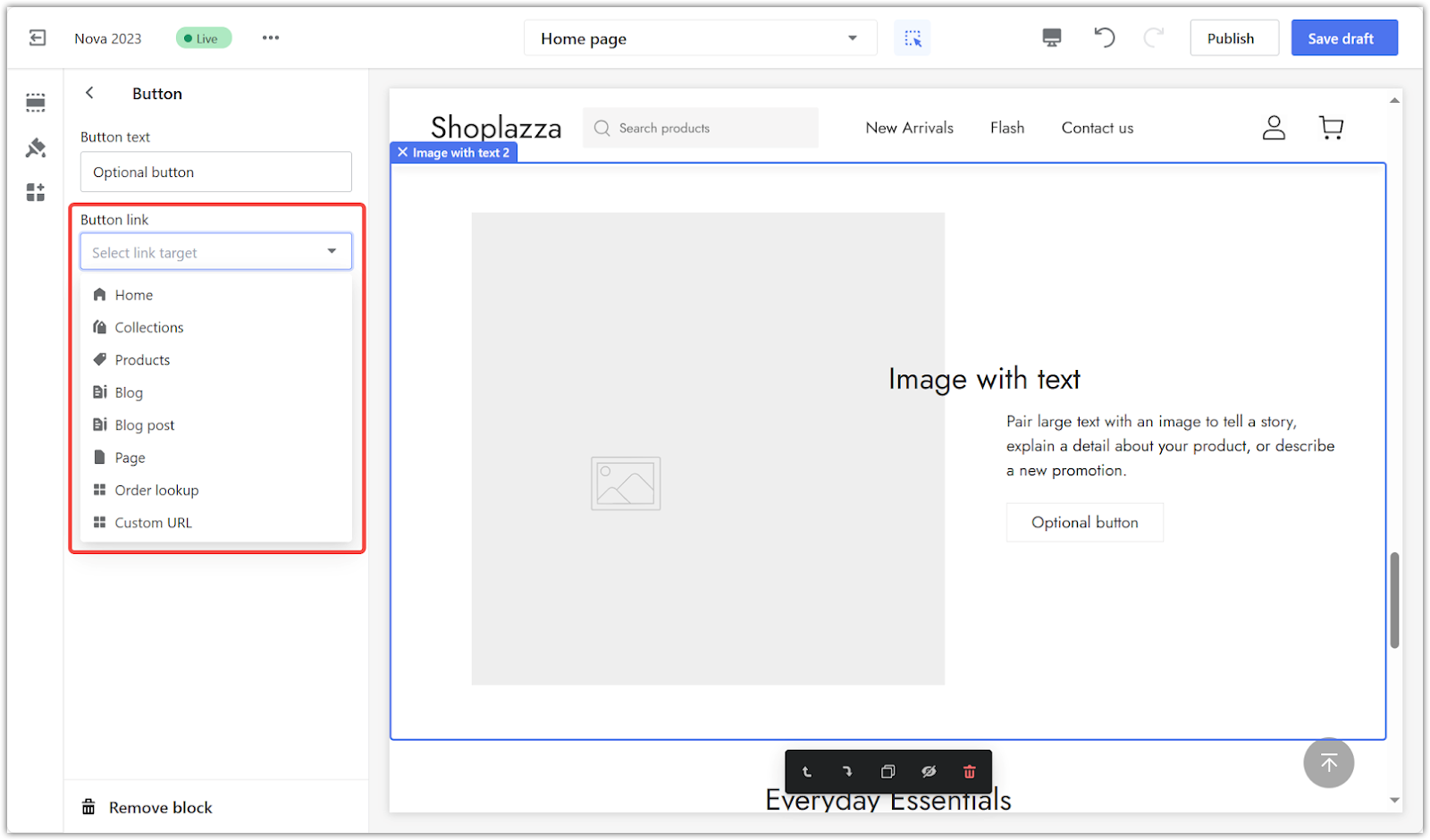
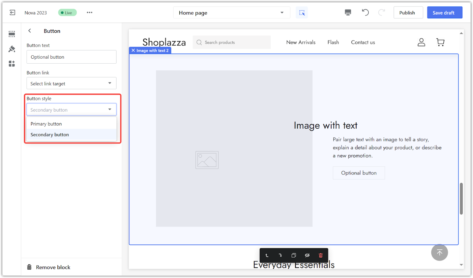
2. Configure the button: In settings, input the button text and choose a link.
3. Choose button style: Choose the default style for your button:
- Primary button: A high-contrast, standout button.
- Secondary button: A low-contrast, background-blending button.
The success of your online store heavily hinges on its visual appeal. Choosing images to complement your text is key to crafting a brand atmosphere. Remember, the right visuals can elevate your brand's identity.


Comments
Please sign in to leave a comment.