A Recommended image and text section allows you to showcase multiple images and text to highlight products or collections. For instance, you can use it to promote a new product line or a seasonal collection. With a flexible layout and optional buttons, this section helps share your brand story and direct customers to your collections, increasing engagement and visibility. This section is particularly useful when you want a flexible layout to display multiple images or aim to increase brand awareness.
Below are steps to add a Recommended image and text section to your store theme.
Adding a recommended image and text section
This category guides you through the simple process of adding a Recommended image and text section to your store theme, ensuring it is positioned effectively within your layout.
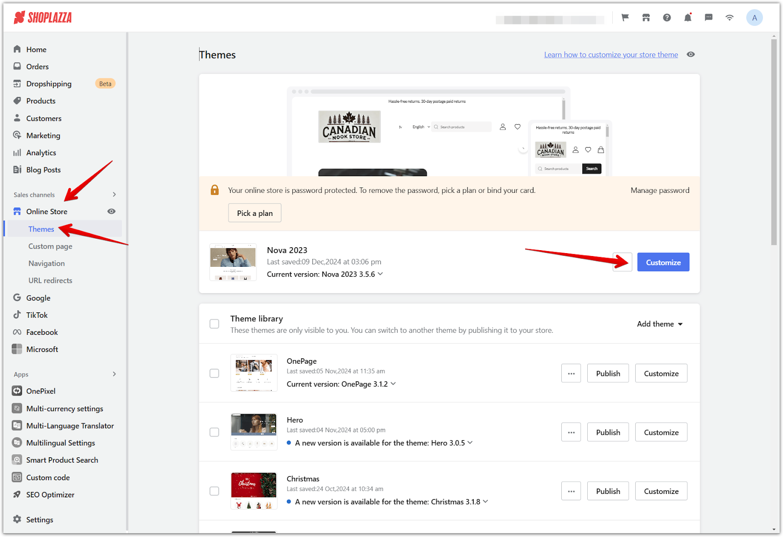
1. Access the theme editor: From your Shoplazza admin > Online store > Themes, click Customize next to the target theme.
2. Add the section: Scroll down and click the Add section to browse available options for your theme.
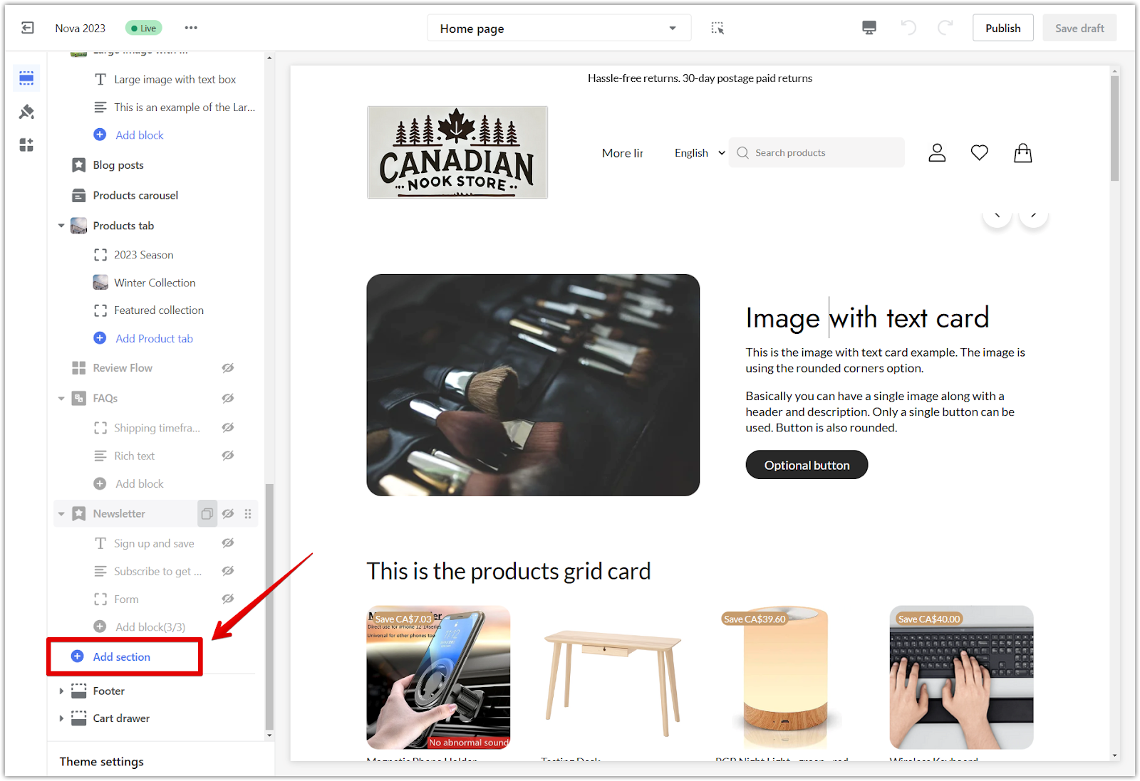
3. Locate the section: Under Theme sections, select Recommended image and text to add it to your theme.

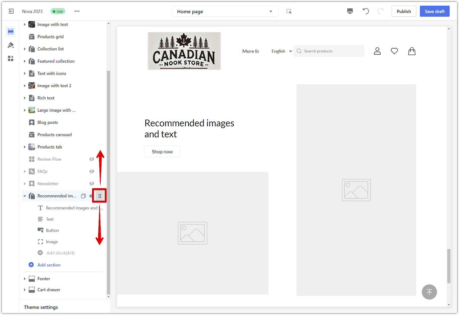
4. Reorganize the layout: You have full control over the layout. Use the drag icon to reposition the section as needed, giving you the power to design your store as you envision.
Setting up your recommended image and text section
This category covers the exciting customization options available for the Recommended image and text section, enabling you to tailor its appearance and functionality to suit your brand.
1. Click on the card title: Click on the card title in the theme editor.

2. Main image: Select an image from your Library to use as the cover photo for this section.
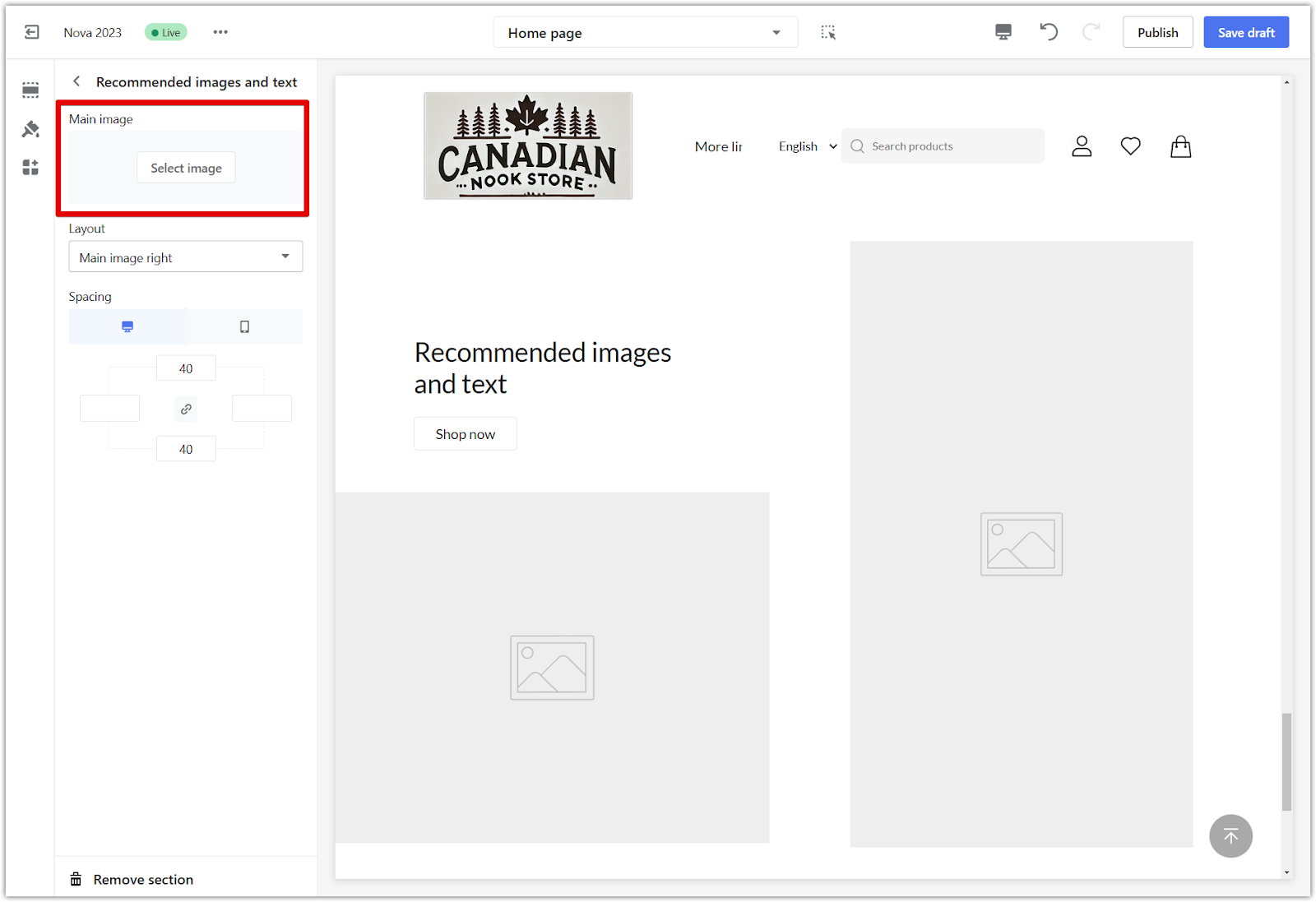
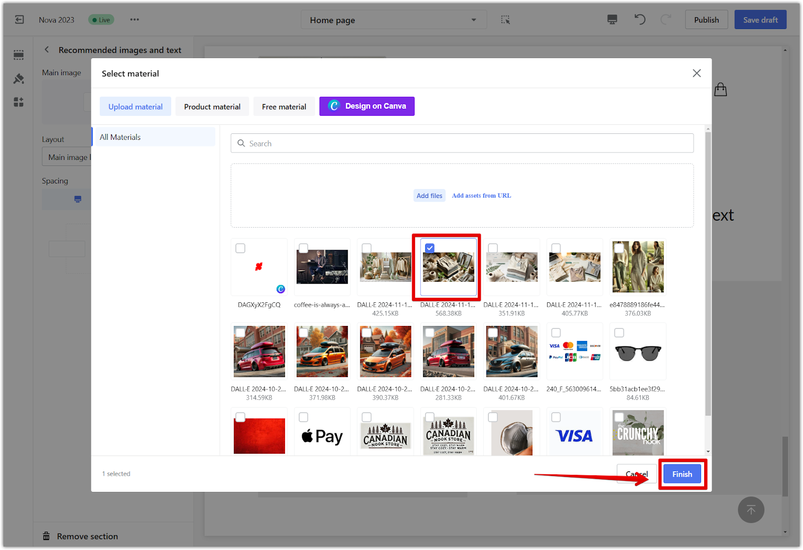
3. Layout: Choose to display the main image on the left or right to adjust the visual flow.

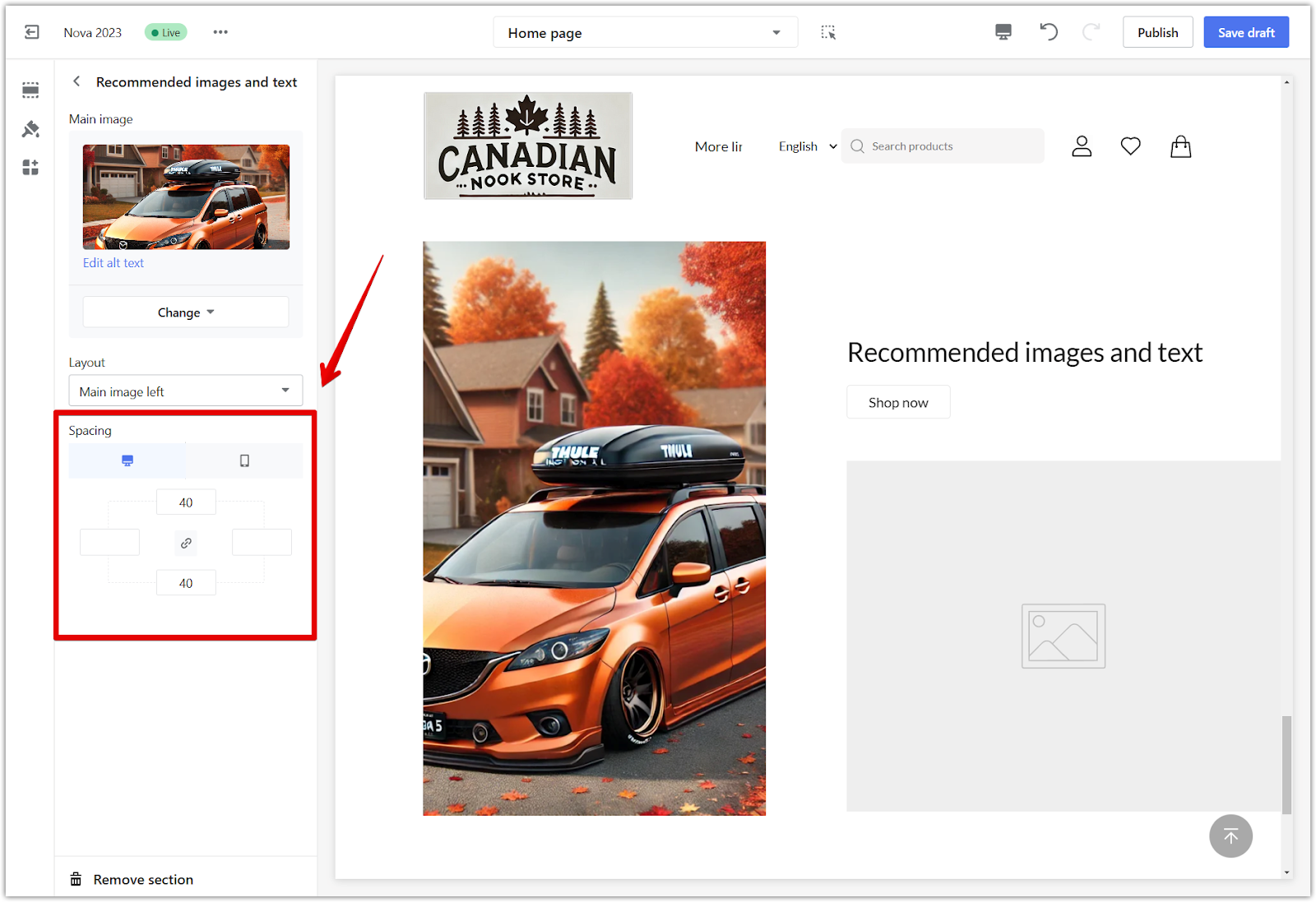
4. Section padding:
- Add extra space around the section by activating the linkage icon and typing a value (measured in pixels) into one of the four padding columns.
- Disable the linkage icon and input separate values to adjust each side manually.
- Use desktop and mobile previews to confirm optimal spacing.
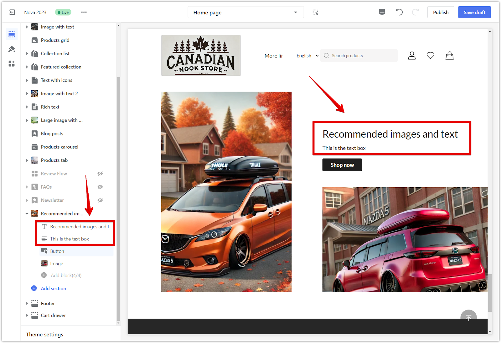
5. Headings and text: Return to the main editor to modify the heading and text for this section.
6. Buttons: Customize the button label and link it to a page from the dropdown menu.
- Button Link: Assign the button to any of your pages or even a custom URL.
- Primary button: Creates a standout look with high contrast against the background.
- Secondary button: Offers a subtle appearance with lower contrast.
- To modify button colors, navigate to Theme settings > Color in the main theme editor.

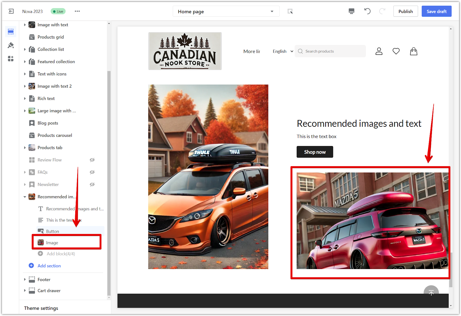
7. Additional images: To enhance the section's visual appeal, add a secondary image from your Library, such as a collection cover photo.
The Recommended Image and Text section is a great way to enhance your store and share your brand’s story visually. Customizing its settings and layout lets you create a compelling and engaging customer experience.


Comments
Please sign in to leave a comment.