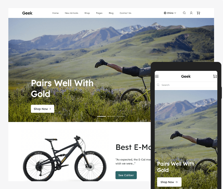
 Intentionally simple, mobile first theme optimized for small screens and optimized for speed. From touch-based interactions to horizontal scrolling, settings and features are tailor made for mobile devices. The Geek theme was designed to showcase images to support visual brand storytelling all while providing a visual experience to increase conversion rates and maximizing your marketing strategy.
Features
- Up to 3 announcement bars that rotate.
- Showcase all of your websites through your storefront with the multi-website feature.
- Sticky Header option that stays on your screen while scrolling through the page.
- Built-in Mega Menu feature that shows several menus from one dropdown.
- Built-in feature to add social media icons in the footer (Facebook, Instagram, Pinterest, etc.) along with a newsletter sign up form.
- Quick Add to cart.
- "Snowflake" feature for use when celebrating the holidays.
- Image with text switch feature that encourages interaction from your customers.
- 3 collection styles.
- 3 image with text styles.
- 26 optional features such as embedding video on your home page, exit popups, call to action section, and more, to increase conversion rates.
Preview the Geek theme here .
The new standard in customizability and speed
Use drag-and-drop sections and blocks to create custom pages throughout your store without special coding. The Geek theme comes with flexible, well-designed blocks for images, products, video, and more.


Comments
Please sign in to leave a comment.